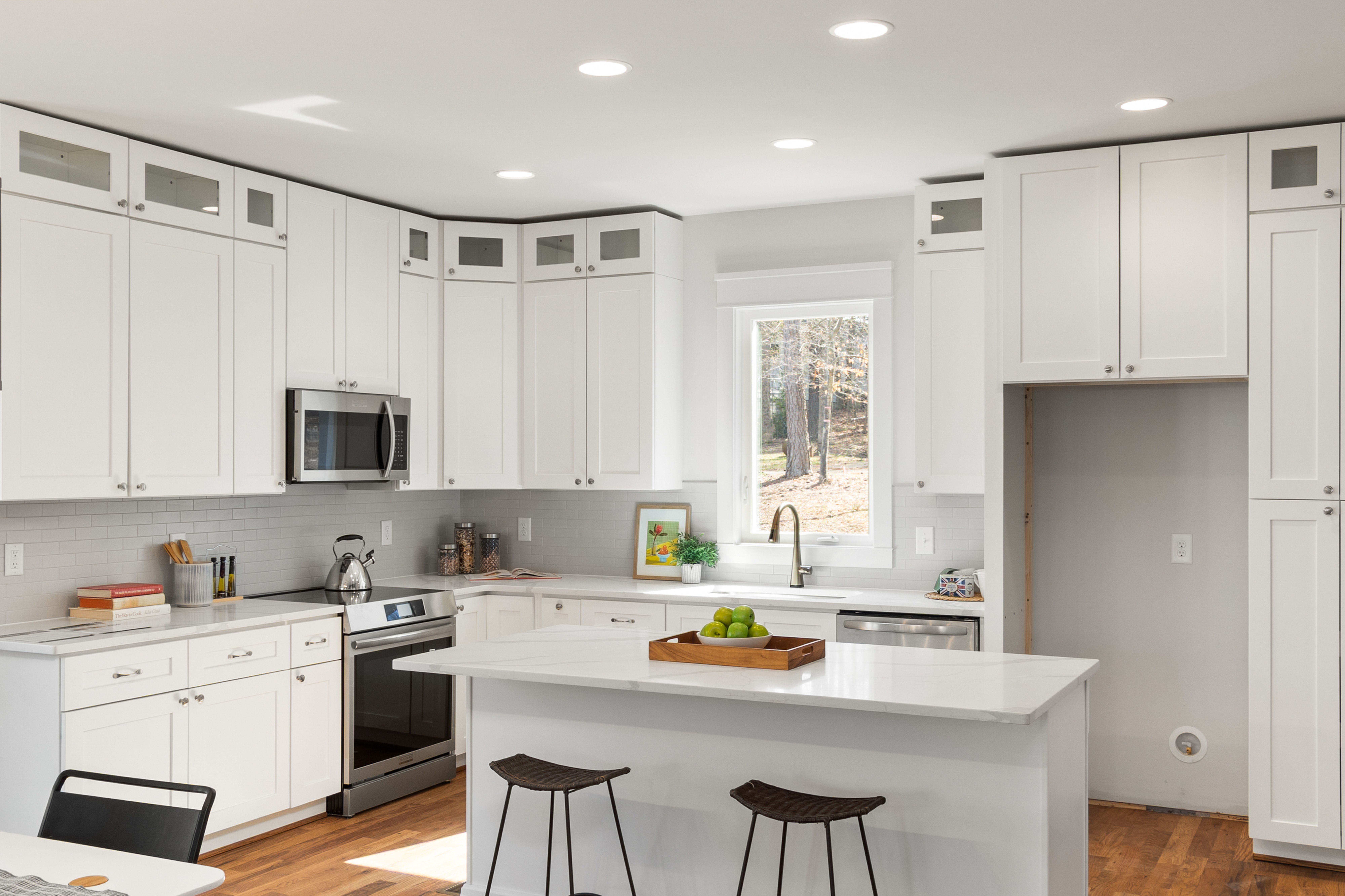
Map the Daylight Path Before Choosing White
A coastal kitchen is often described as bright, but brightness depends on where the light enters, what blocks it and which surfaces receive it. Identify the strongest window and the path daylight takes across the room before selecting pale finishes. Warm white or light cabinetry can help distribute that light, but it should support the actual daylight pattern rather than substitute for it.
Decide Whether Blue Echoes the View or Creates Distance
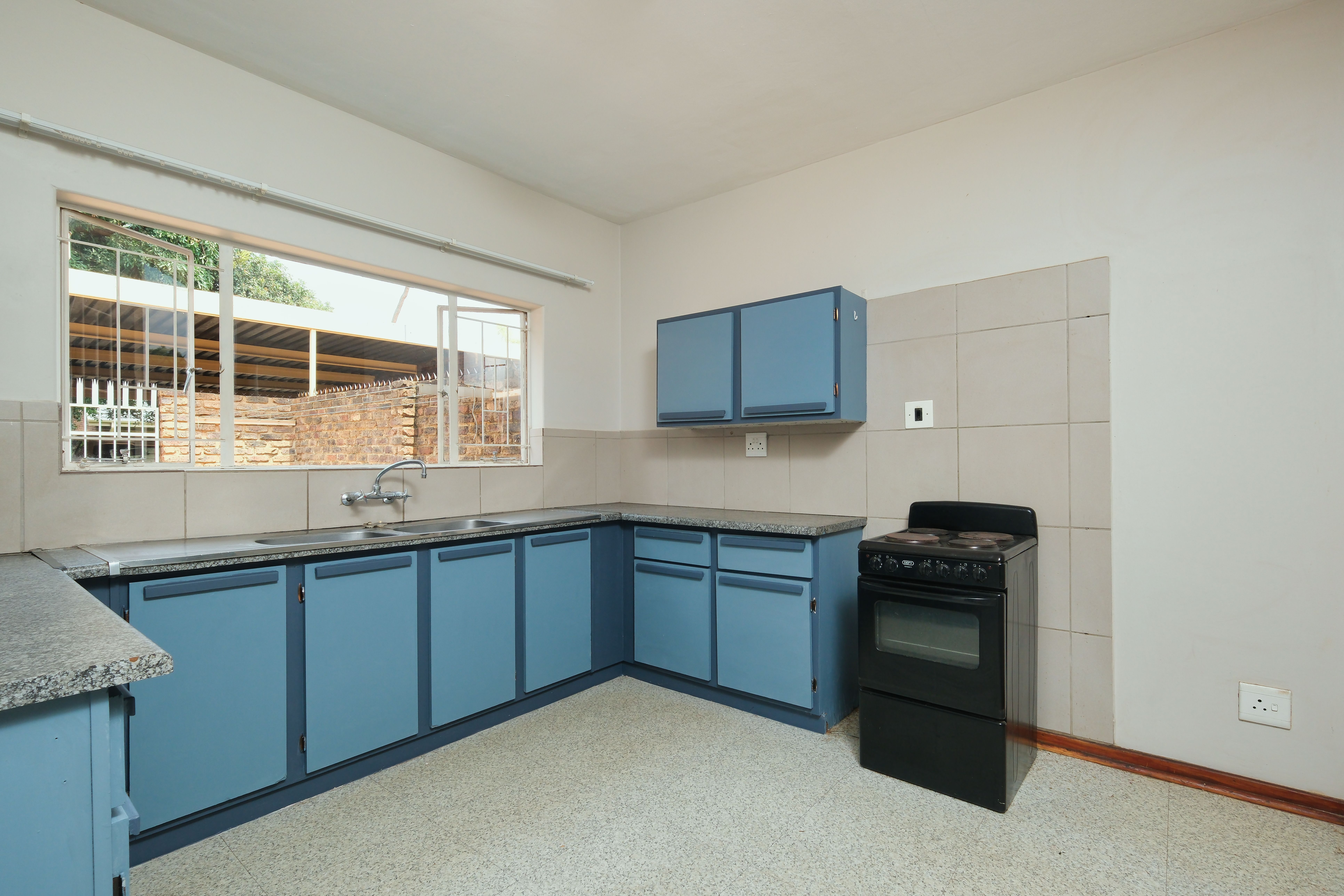
Soft blue, grey-blue and blue-green behave differently depending on what is visible outside. Near sea, sky or garden color, a related shade can extend the view inward; in an urban setting, a more muted blue may create the sense of distance and calm instead. Give the color one coherent cabinet or wall field so the relationship reads architecturally rather than decoratively.
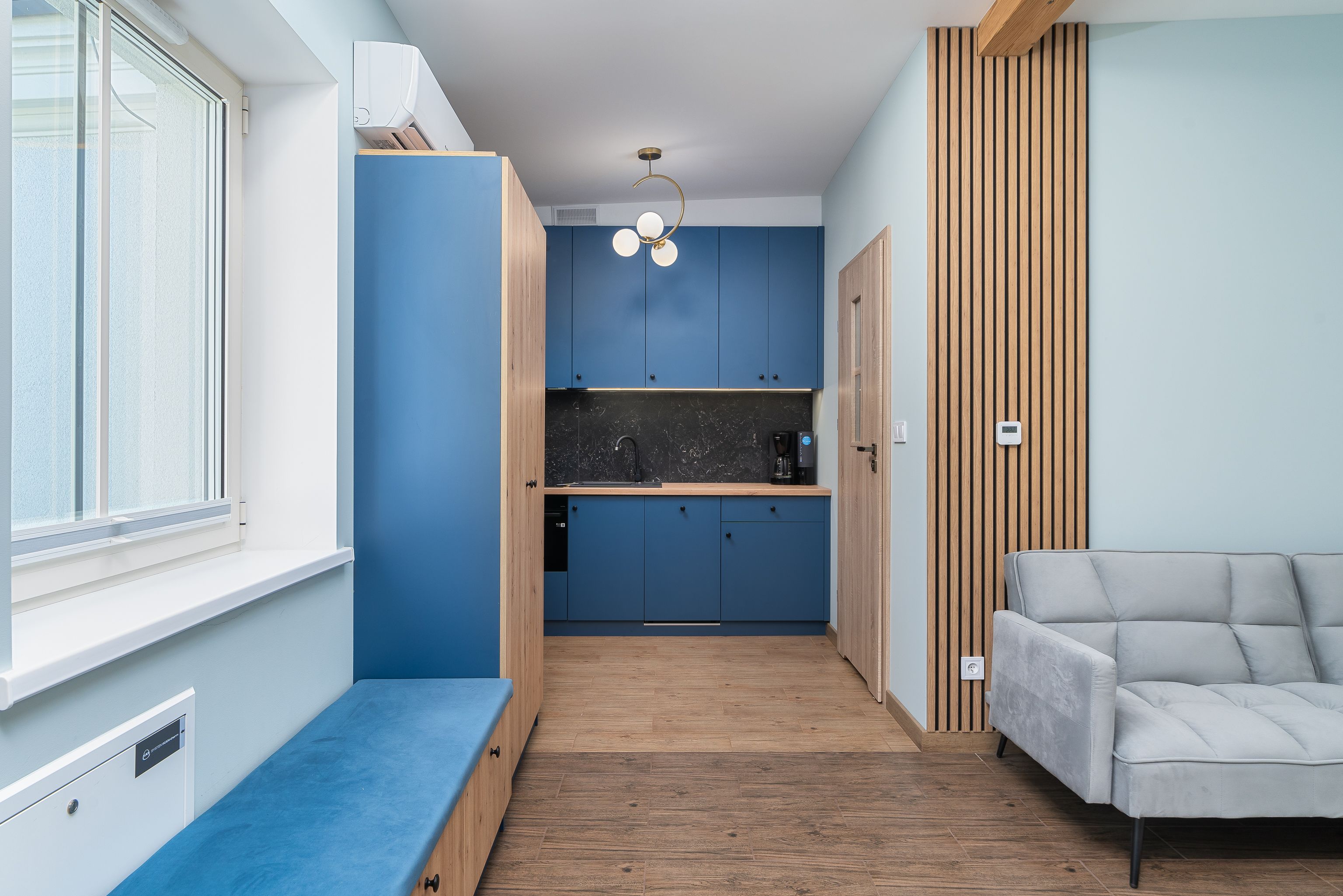
Use Timber as the Inland Counterweight
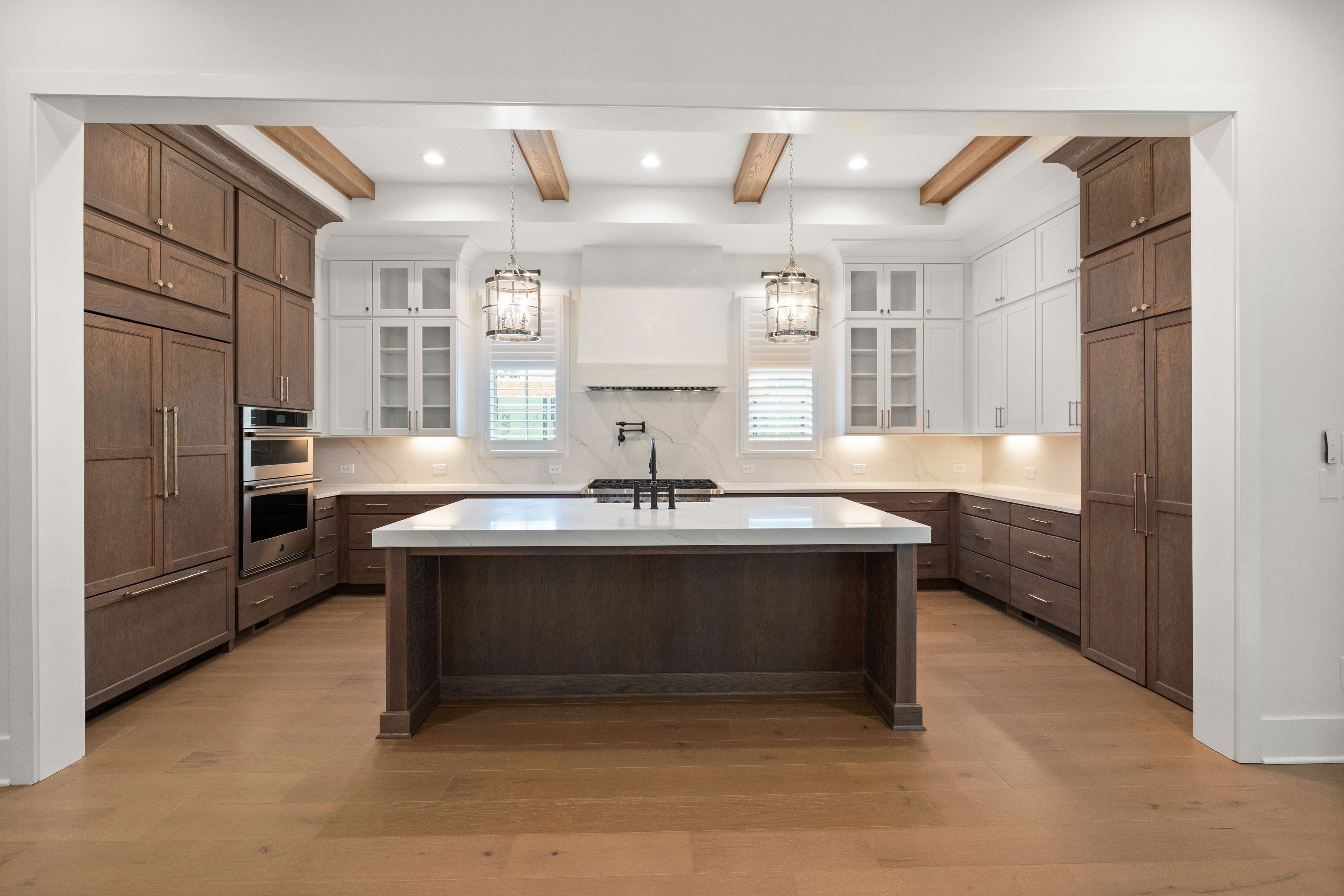
Timber prevents a pale coastal palette from floating away visually by adding weight, grain and a warmer reference to land rather than sea. Use it on a table, floor, island face or selected cabinetry at enough scale to stabilize the room. The goal is not simply to make white warmer, but to give the light palette one grounded material.
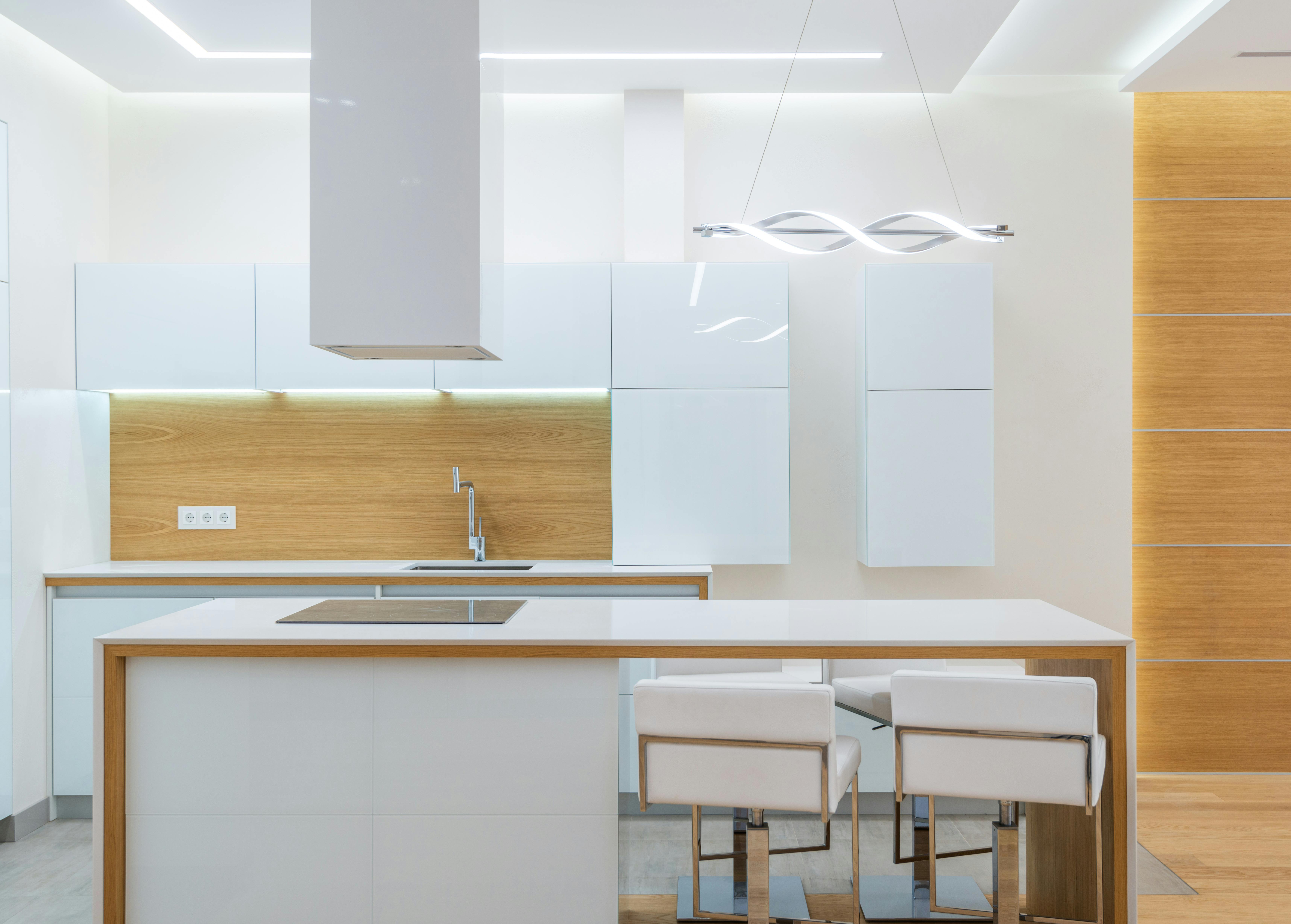
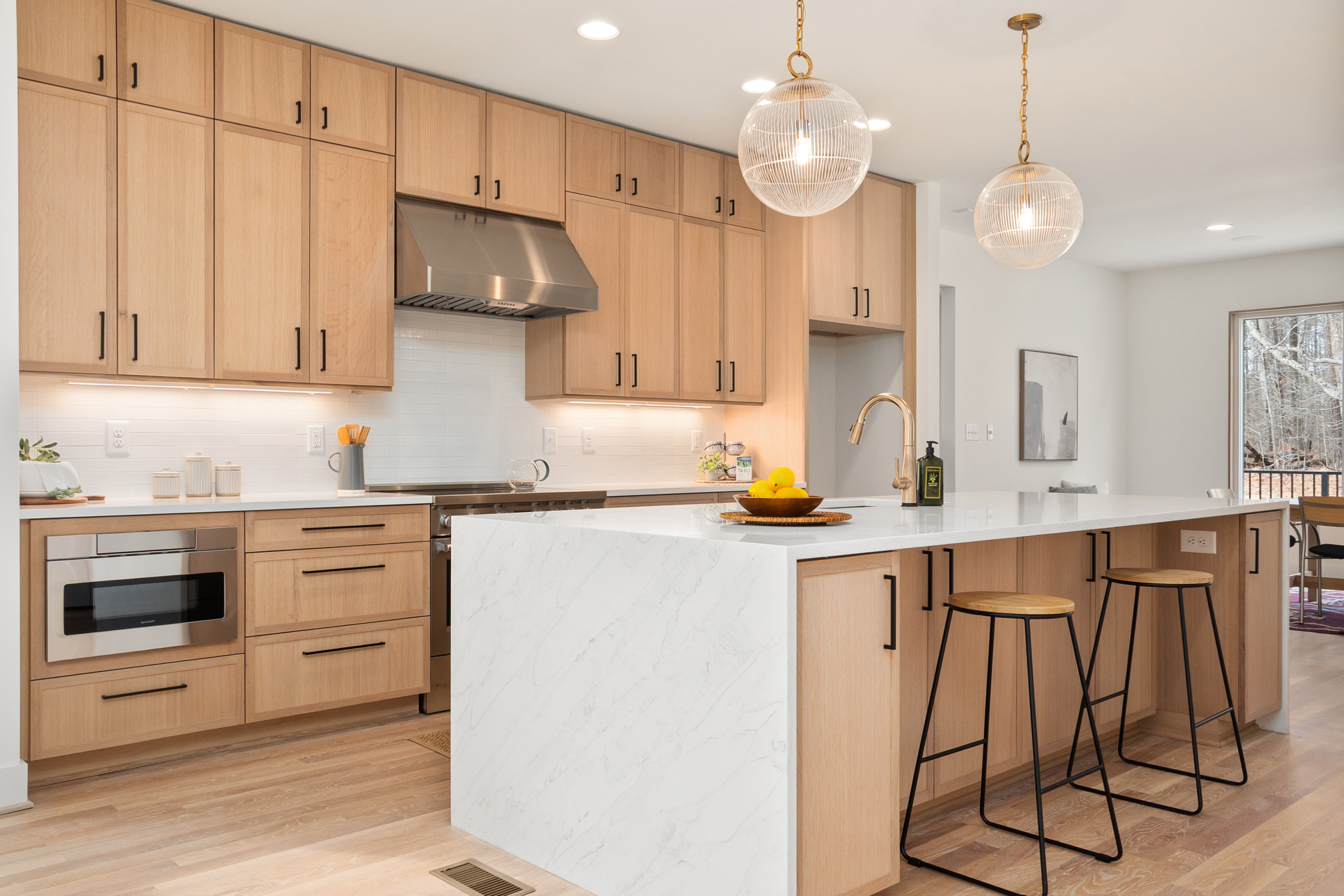
Choose Stone for Low Glare as Well as Lightness
Pale stone can reflect useful light, but highly polished surfaces may create glare near strong windows. Honed, softly veined or lower-reflectance finishes can keep the room bright while allowing the material to remain comfortable to look at through the day. The stone should feel mineral and quiet rather than become a second dramatic focal point.
Keep the Window Zone Visually Light
Open shelving is most useful in coastal kitchens when it avoids turning the brightest part of the room into a wall of storage. A short shelf or low display near the window can preserve more light and visual depth than dense upper cabinetry. Use it for a small daily category and keep the strongest daylight path as open as the plan allows.
Use Woven Texture as a Dry-Zone Softener
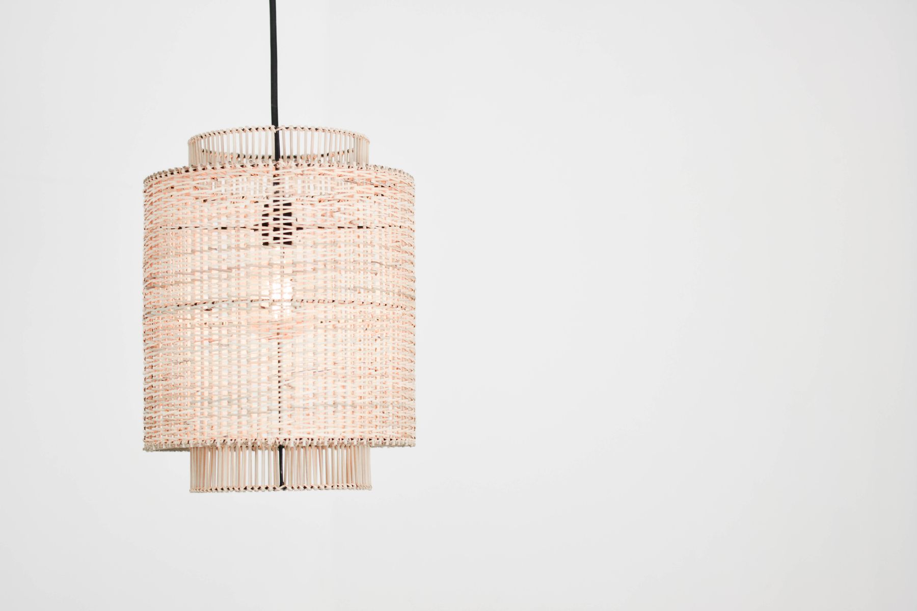
Cane, rattan or woven fiber can introduce shadow and tactile softness, but it belongs best in a relatively dry location such as seating, a pendant or blind. The natural variation works because it contrasts with smooth cabinetry and stone. One clear woven element is enough to suggest relaxed texture without turning the kitchen into beach-themed styling.

Use Deeper Color to Anchor the Brightest Room
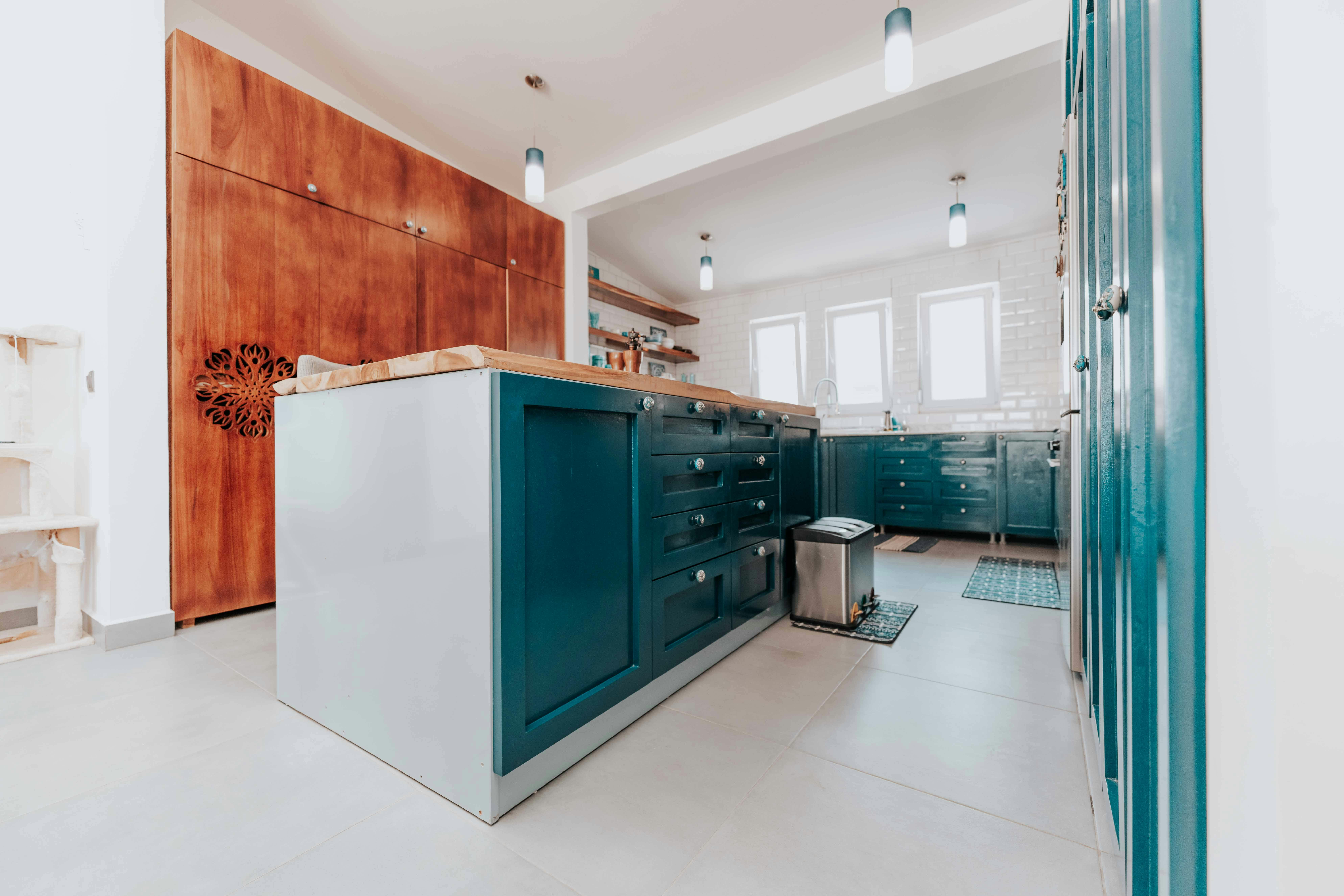
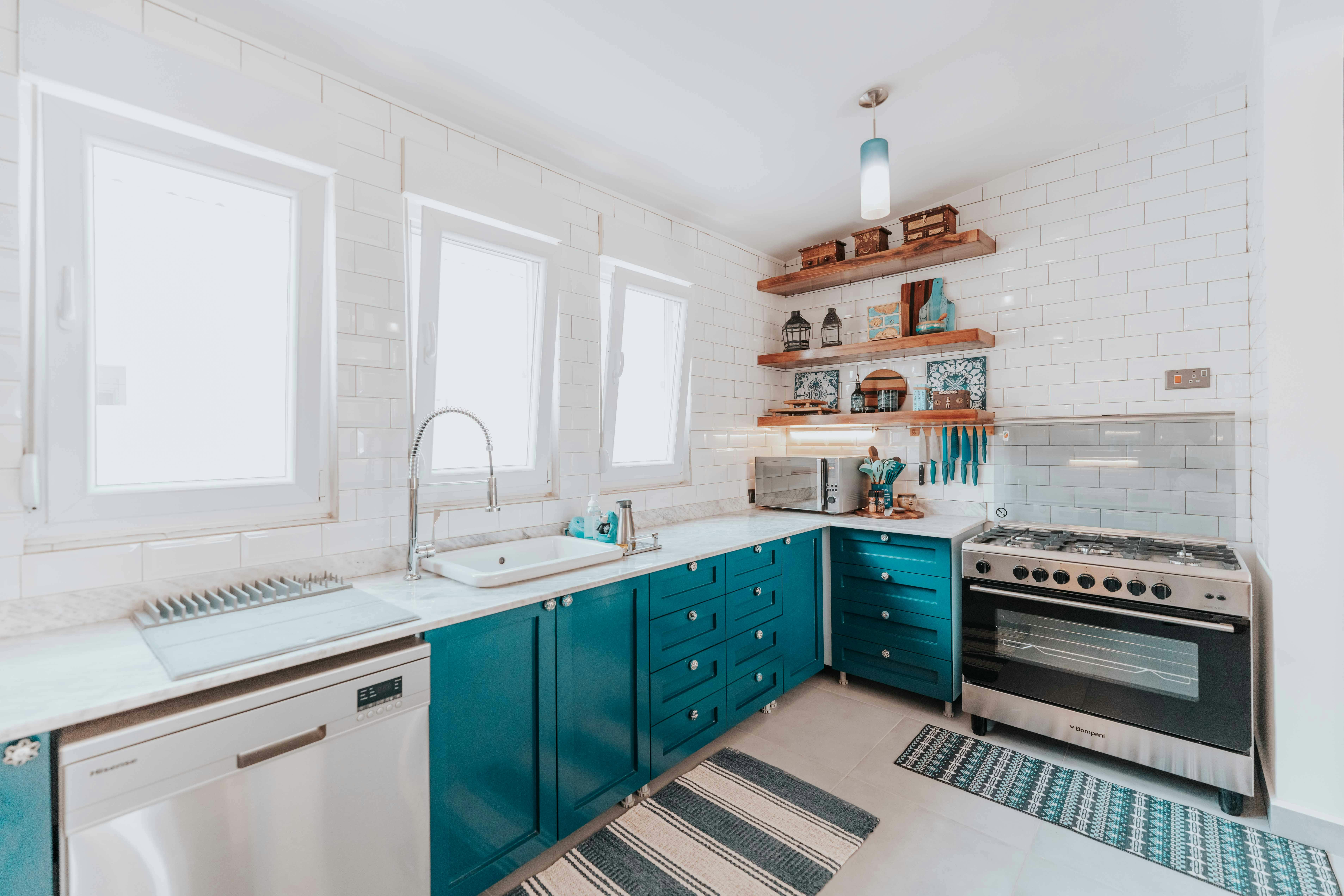
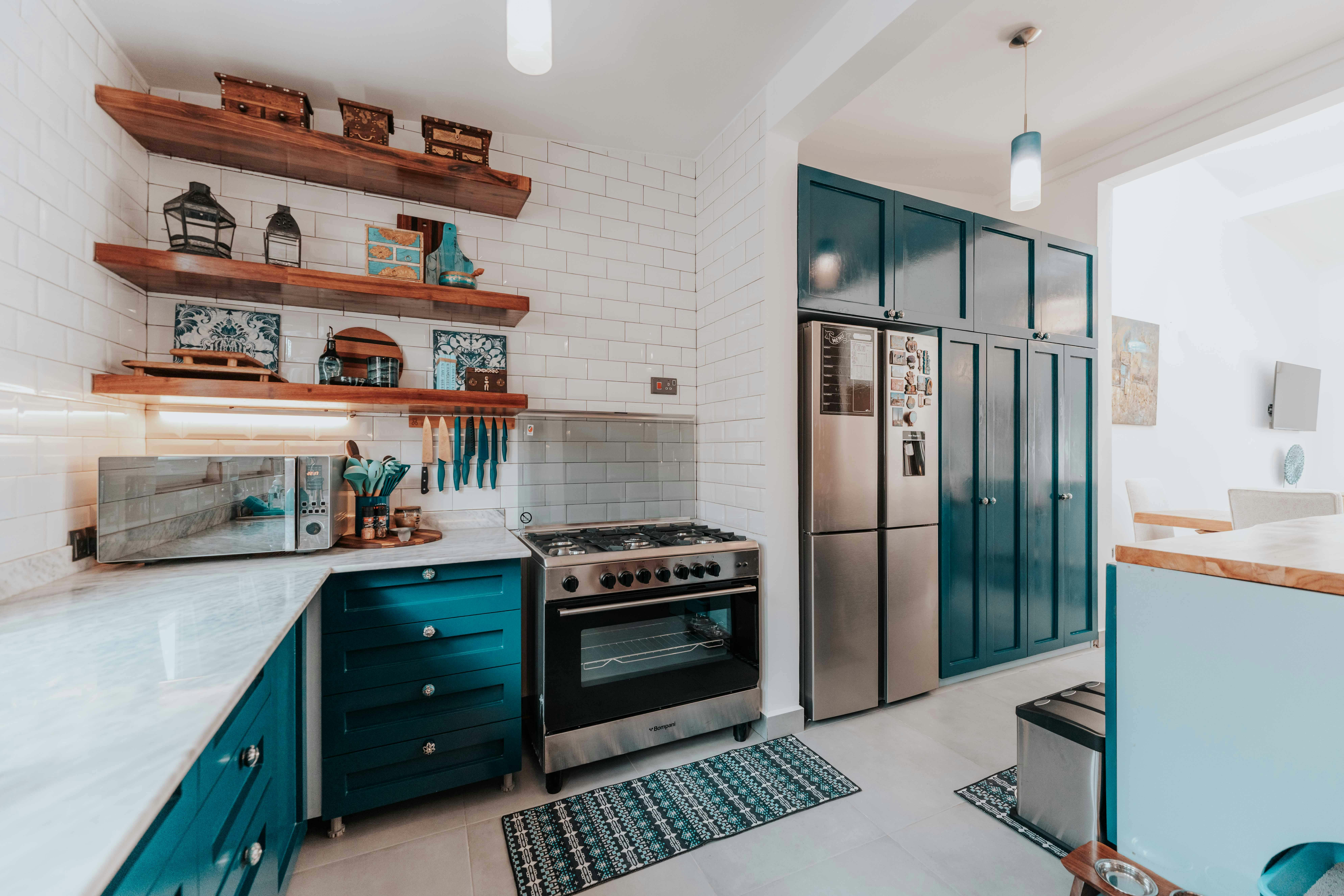
A deeper blue or blue-grey island can provide the visual weight a very pale room lacks, especially when daylight makes perimeter surfaces appear even lighter. Treat it as one grounded volume rather than a generic accent. The island should help balance the brightest side of the kitchen and remain coherent with the window view.
Choose Hardware That Does Not Turn the Palette Nautical
Nickel, stainless steel, brushed brass or dark metal can all work. Keep shape and finish straightforward so hardware supports cabinetry instead of introducing literal maritime cues. The metal should relate to appliances and light quality more than to a preconceived coastal shopping list.
Protect the Window as the Primary Focal Resource
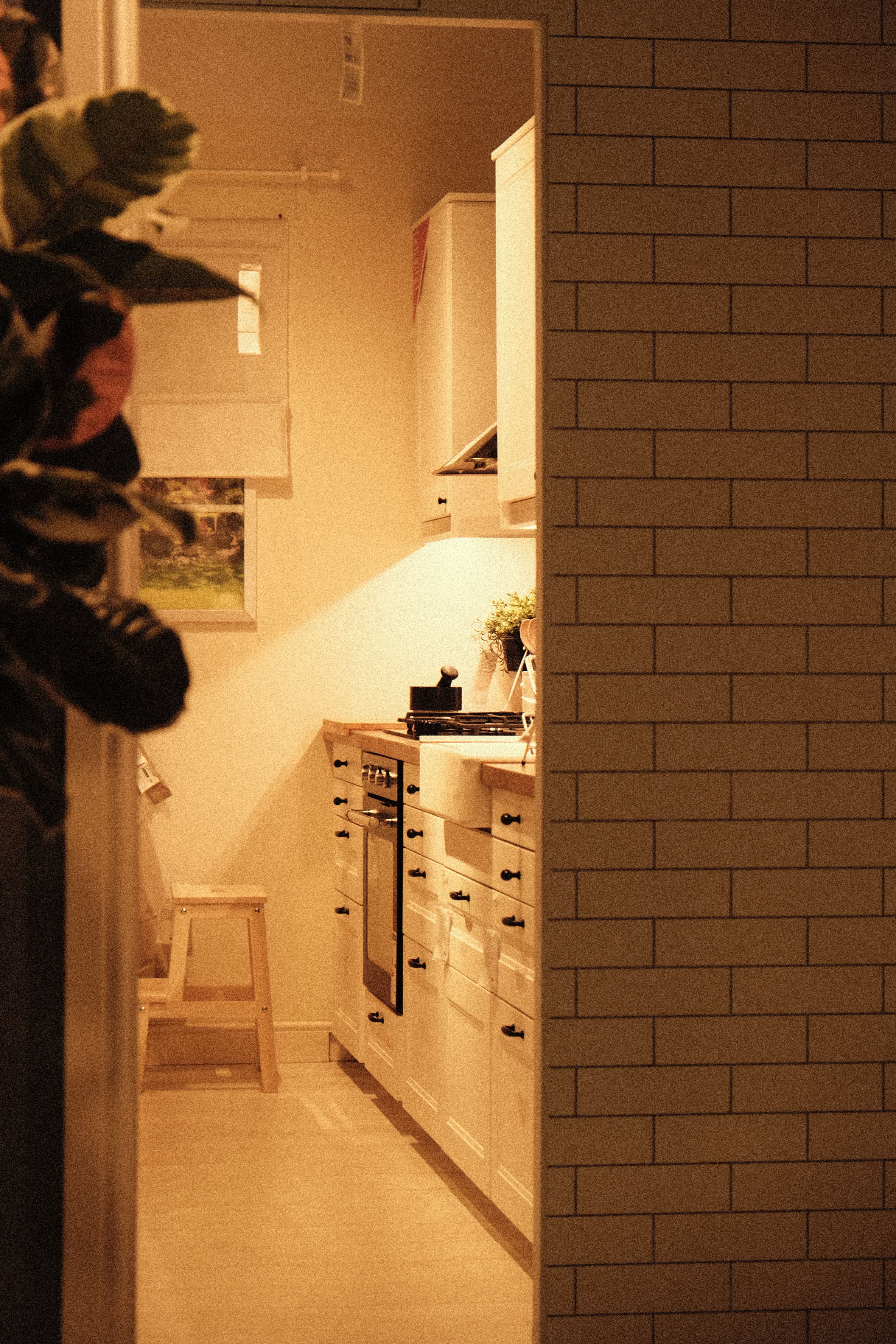
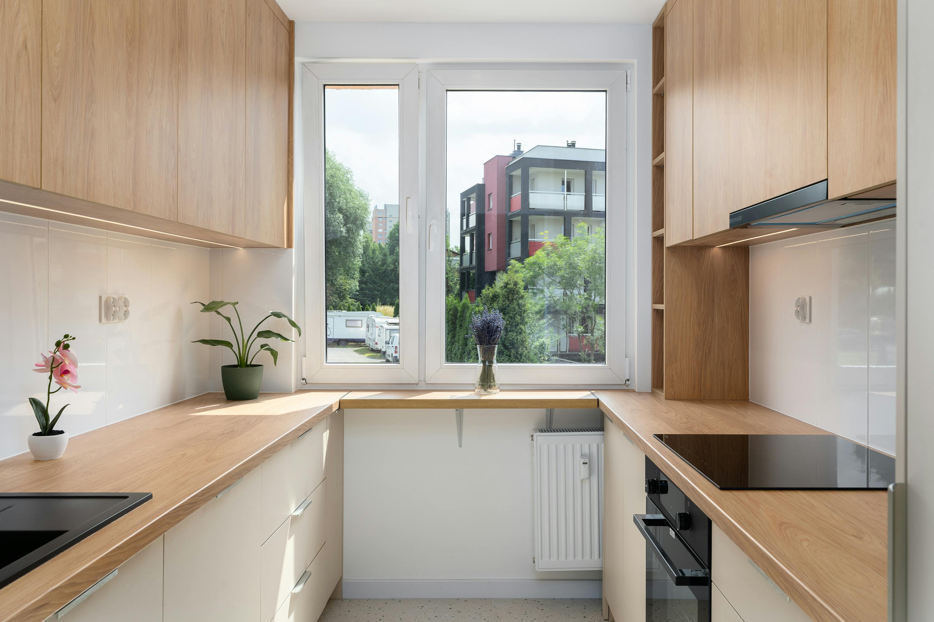
In a genuinely coastal-feeling room, the window, sky light or outdoor connection often contributes more atmosphere than any decorative feature. Avoid crowding that area with tall storage, dense display or an oversized pendant when the plan allows. At night, layered warm light should preserve material softness without trying to imitate daylight.
Create Visual Depth Instead of Forcing All-White
A small coastal kitchen can feel open through layered depth: a pale foreground, one blue or timber mid-ground and a clear view toward a window or adjoining room. All-white surfaces may reduce contrast but can also flatten the space. Preserve one real preparation surface and one open sightline, then use color or timber deliberately to establish distance.