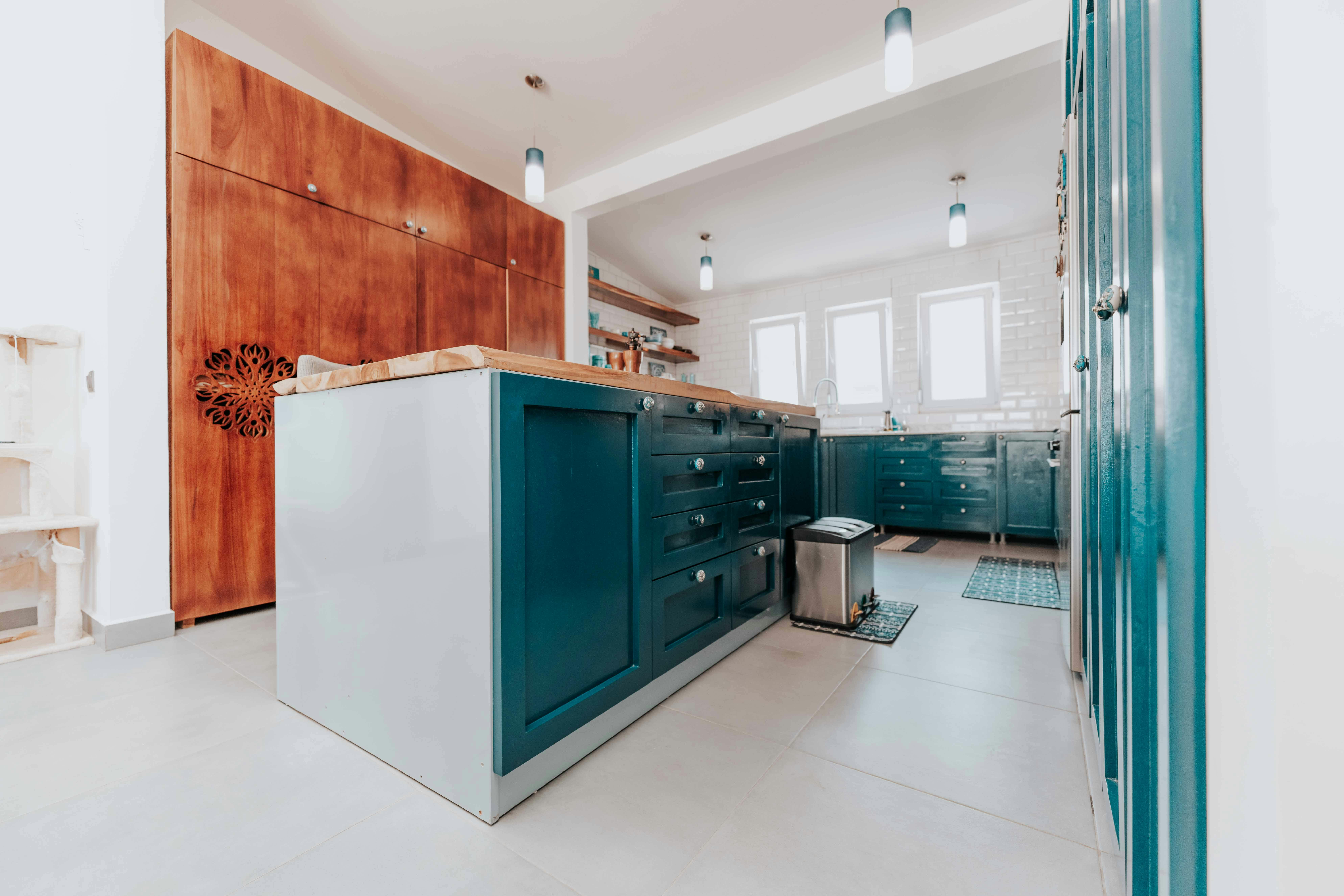
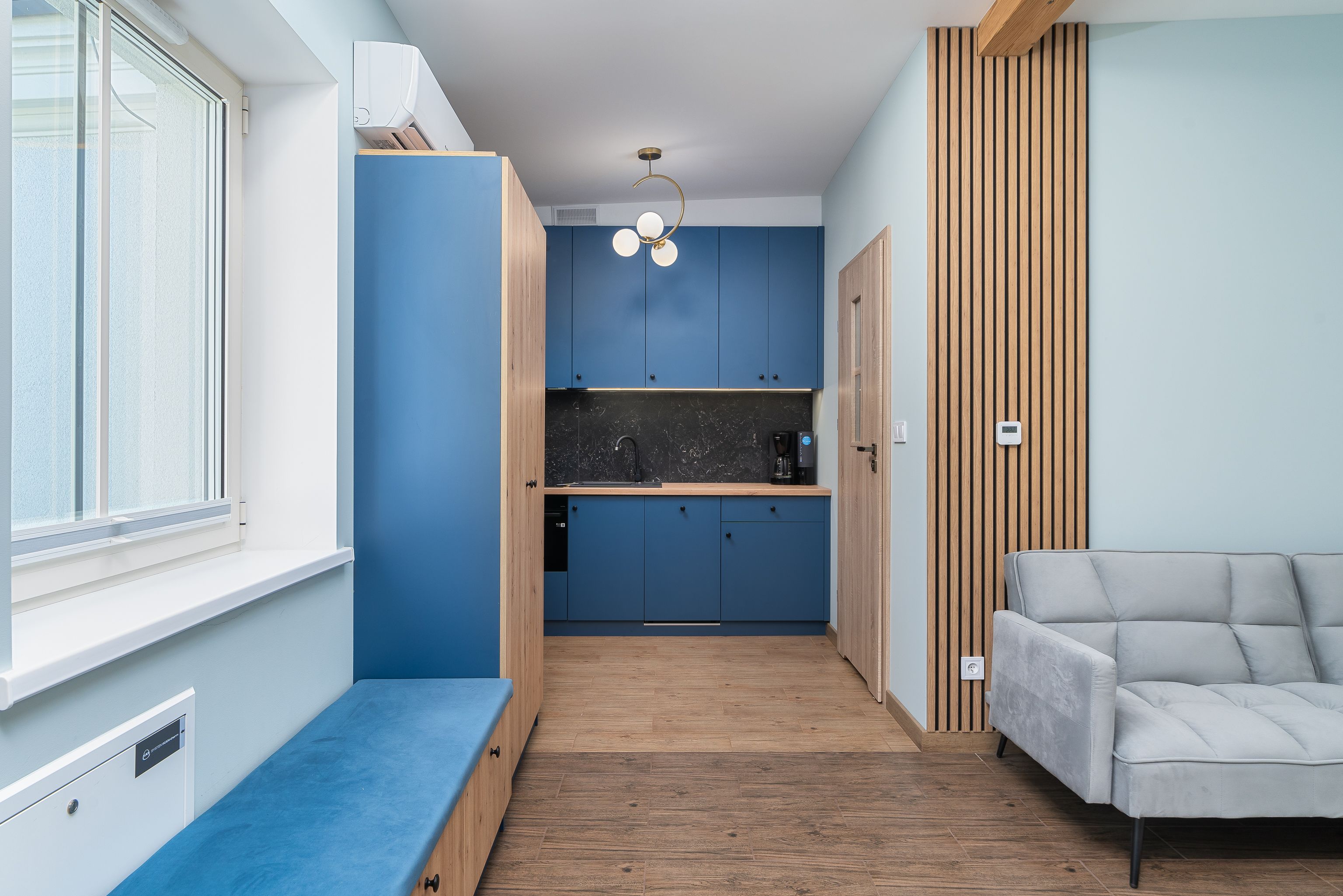
Decide What Job the Blue Is Doing
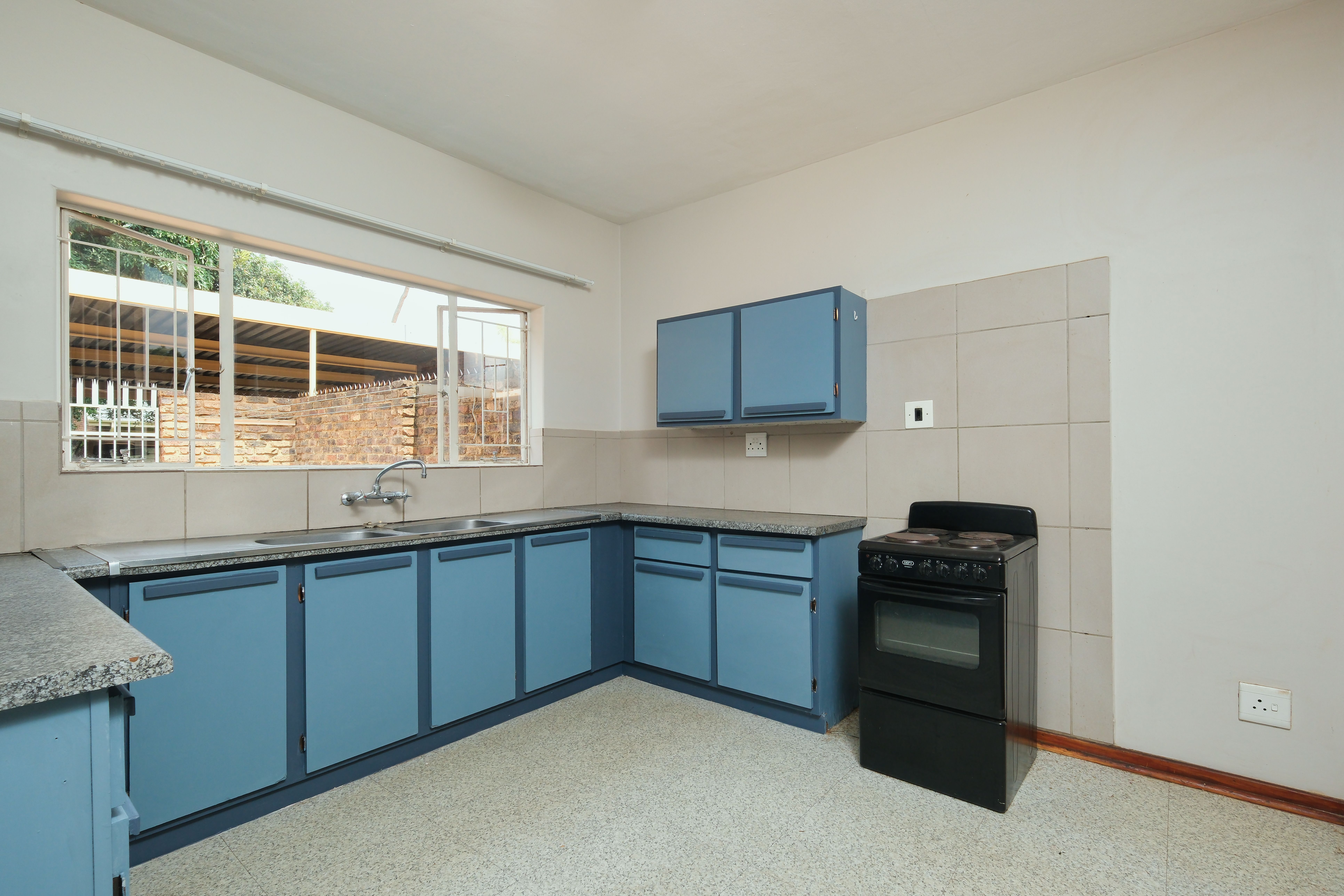
Powder blue, teal and navy do not perform the same role. A greyed pale blue can cover a large cabinet area and behave almost like a neutral; teal carries more visible color and often needs quieter surrounding finishes; navy can make joinery feel like a single dark furniture piece. Decide whether blue is supposed to recede, identify the fitted cabinetry or become the first thing you notice. That role determines how much color the room can carry more usefully than a shade name alone.
Treat Navy as Joinery, Not an Accent Color
Navy is strongest when a cabinet run reads as one coherent piece of fitted architecture. Long elevations, tall pantry walls and integrated appliances allow the color to form a deliberate mass instead of appearing as repeated blue fragments. Keep enough light at the worktop and around door edges that the joinery remains legible after sunset. Once the navy mass is doing its job, resist the urge to prove the palette by repeating small blue accessories everywhere else.

Use Saturated Blue Where You Want the Eye to Land
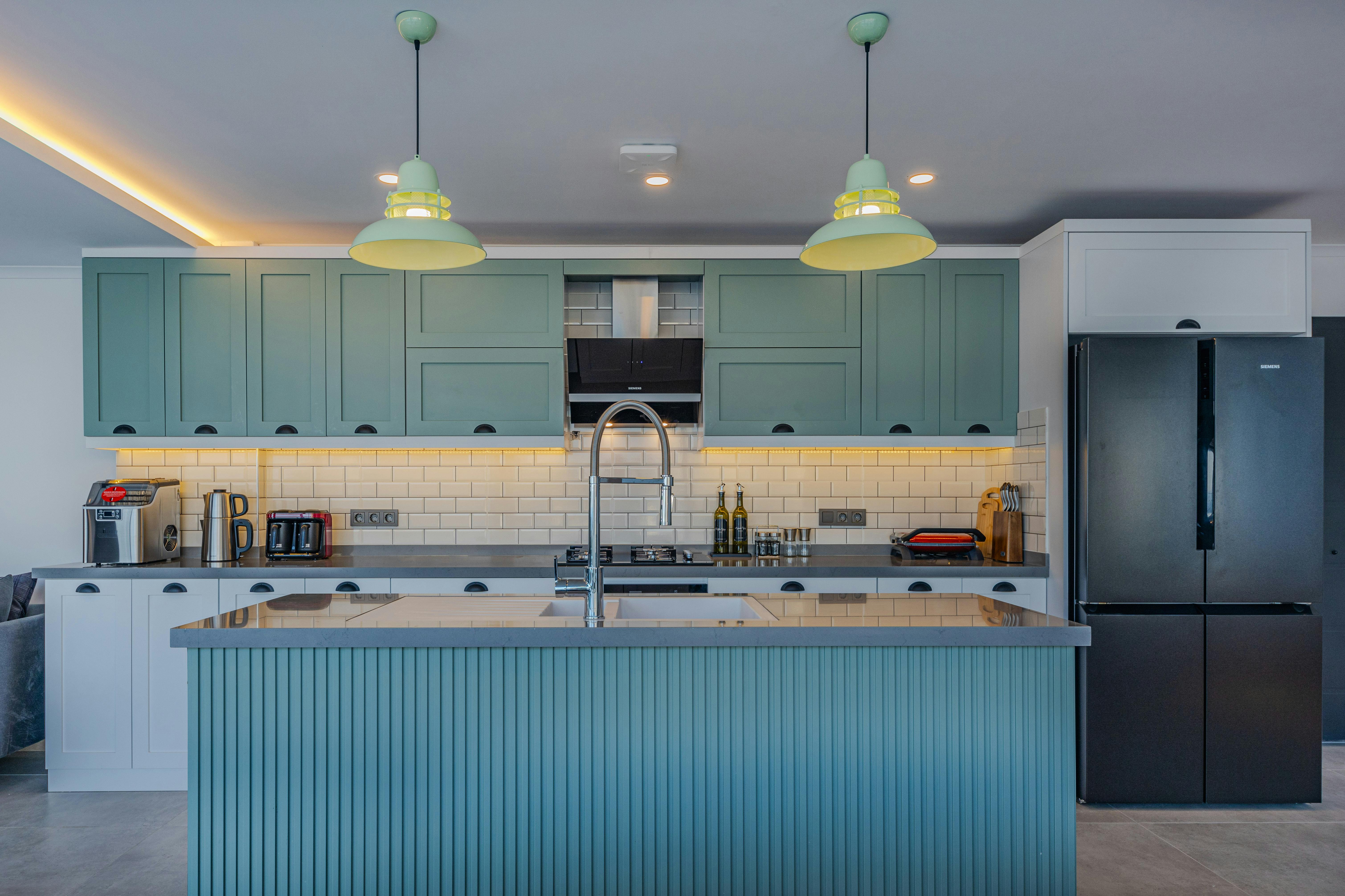
An island is a useful place for a stronger blue because it already occupies the center of many kitchen sightlines. Cobalt, teal or a clean mid-blue can act as one bounded visual event while the perimeter stays quieter. The important decision is not simply to make the island different, but to decide whether it should be the room's first focal point. If it is, let the surrounding cabinetry, stools and lighting support that hierarchy instead of creating several competing blue moments.
Choose Timber That Changes the Blue on Purpose
Wood does more than make blue feel warmer. Pale oak can make navy feel fresher and more relaxed, walnut can push the same blue toward a more formal furniture-like character, and redder woods create a stronger complementary contrast. Choose timber for the direction you want the blue to take rather than adding wood automatically. A substantial floor, island panel or cabinet bank gives a clearer relationship than a collection of small wooden accessories.
Avoid Accidental Coastal Coding in Blue-and-White
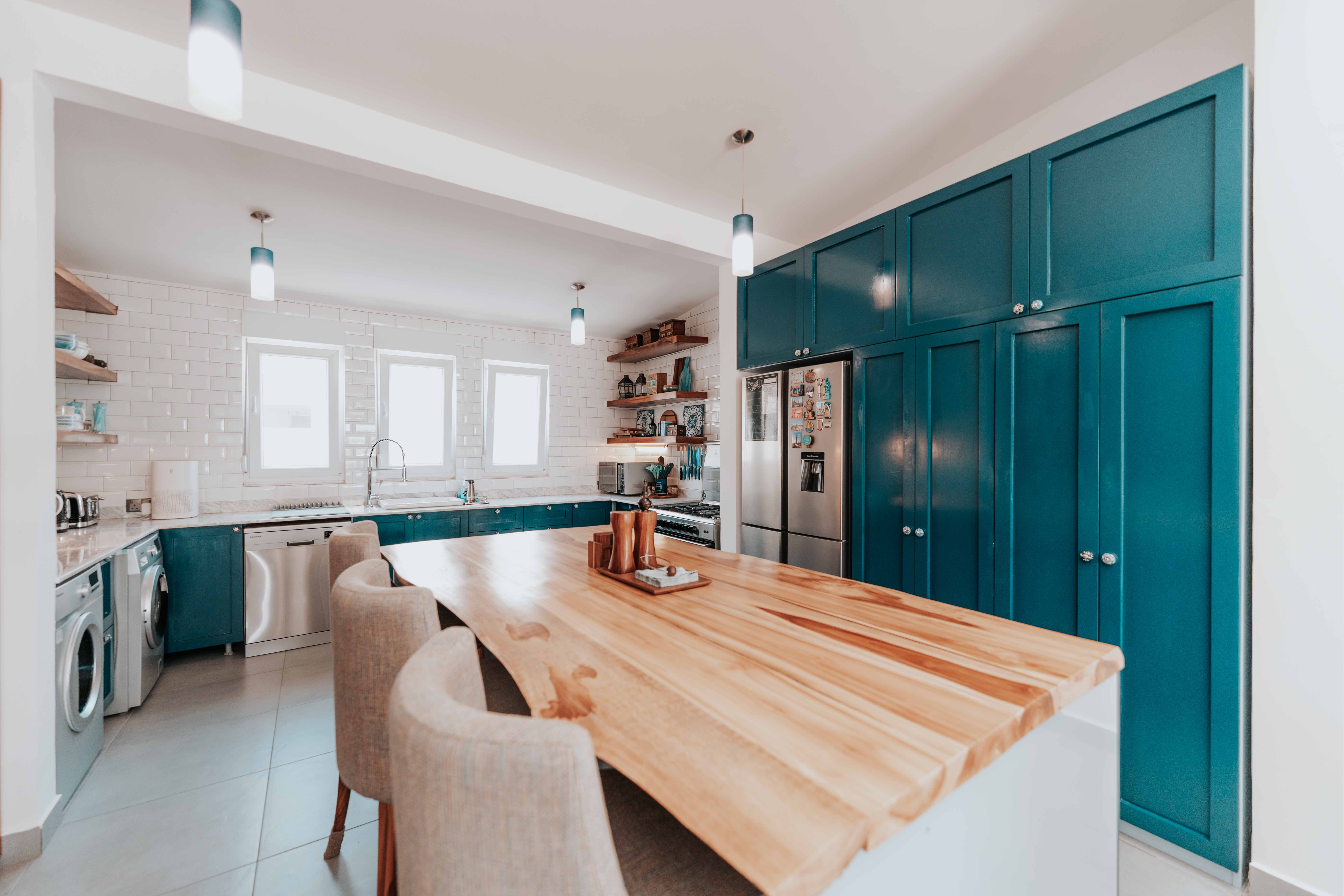
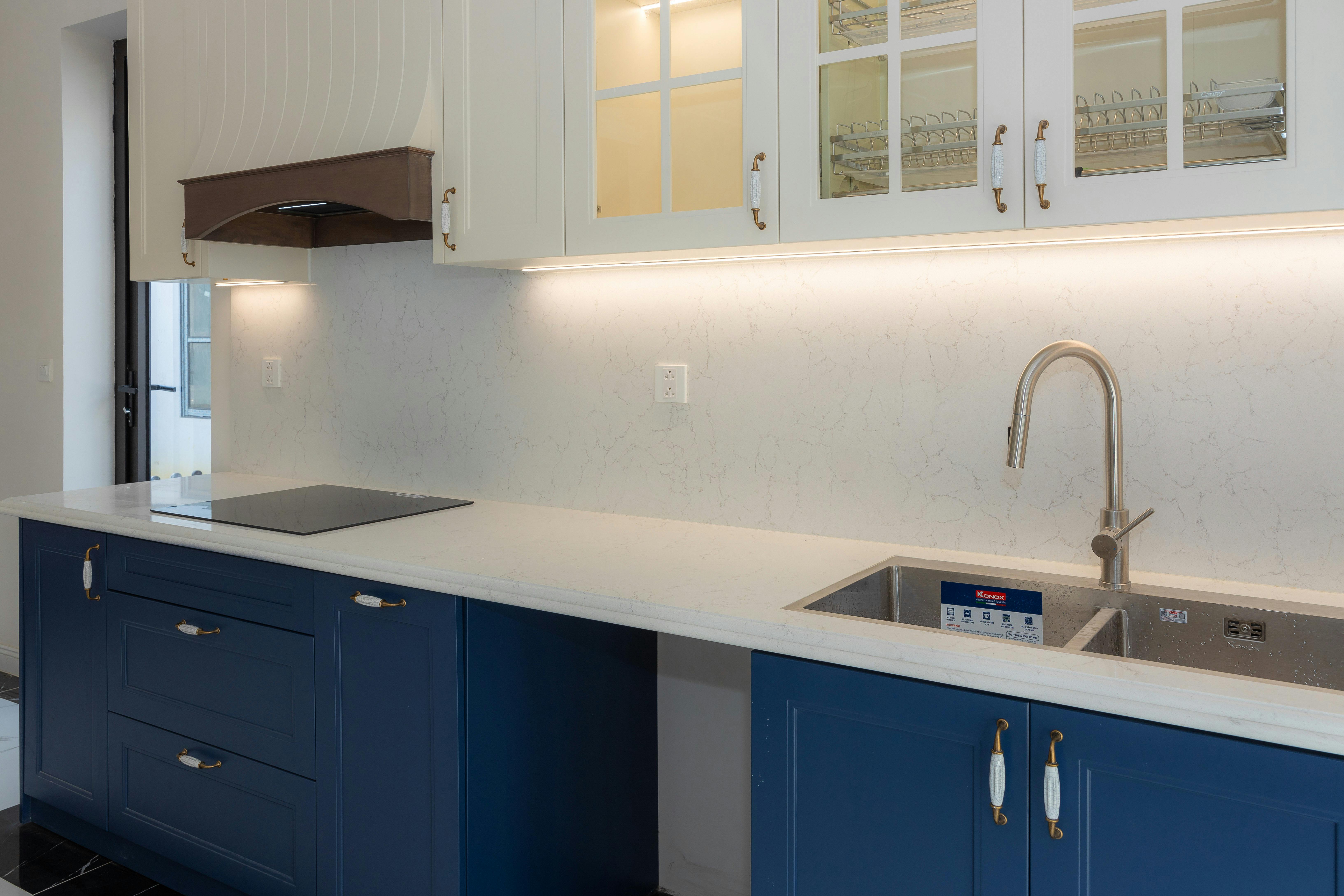
Blue cabinetry with crisp white stone is a strong combination, but it can signal a coastal or nautical direction even when that was not the intention. If you want a more urban, formal or contemporary result, change one of the supporting cues: use warmer veining, a taupe or greyed stone, darker flooring, stainless steel or richer timber instead of stacking blue with every light seaside-associated material. Pale stone can still provide useful contrast; the point is to control the associations around it.
Give Strong Blue Breathing Room
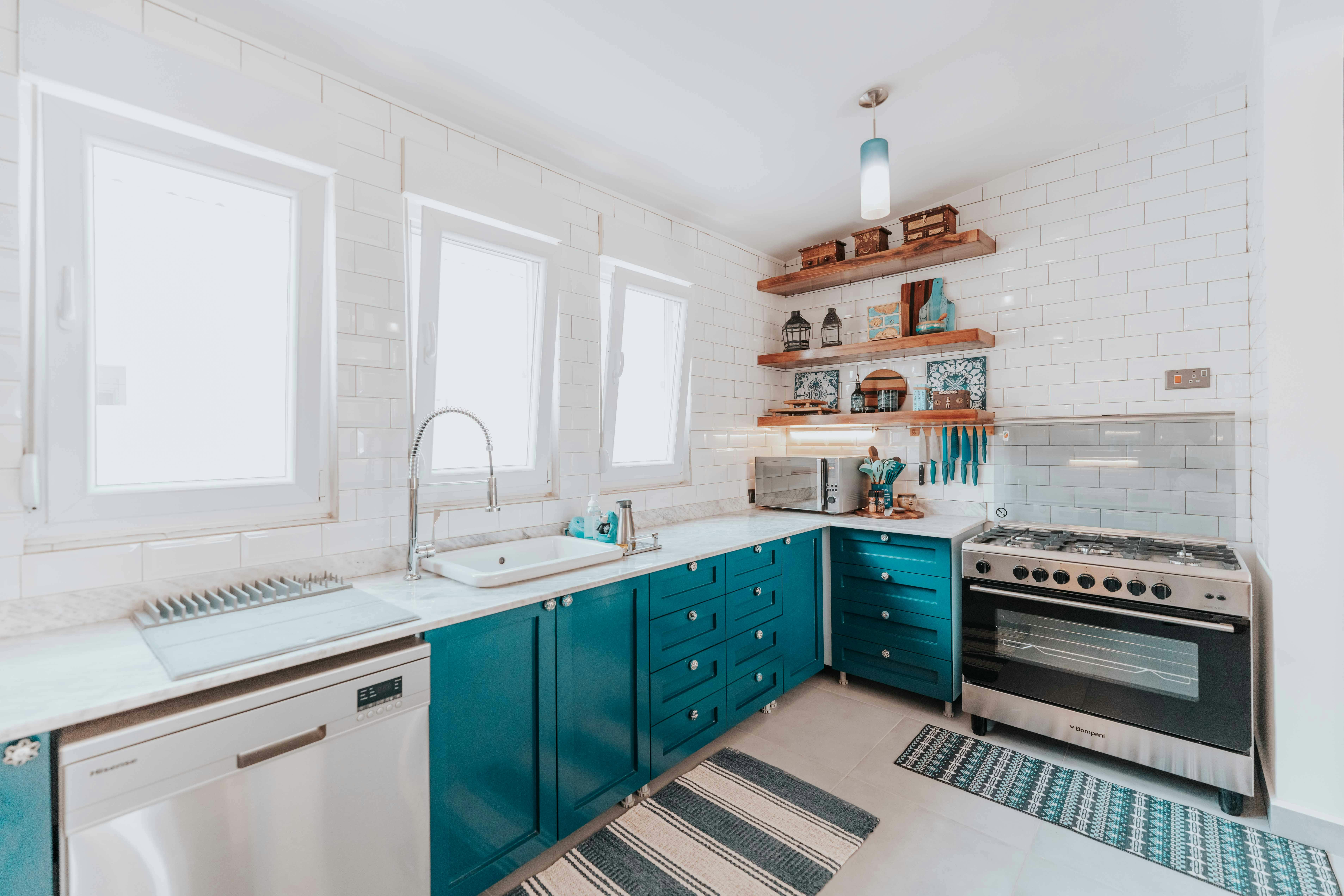
Large blue elevations can become visually dense when every centimetre is closed cabinetry. A short timber shelf, glazed section or open niche can create a deliberate pause in the color and expose wall, objects or another material. Keep that pause functional: everyday cups, bowls or oils earn their place more convincingly than a shelf added only to decorate a blue wall. The goal is relief, not more visual activity.
Choose Whether Blue Feels Crisp, Heritage or Graphic
Metal finishes can push the same blue in very different directions. Stainless steel and nickel make pale blue or navy feel cleaner and more technical; brass and bronze can pull it toward a warmer, more traditional or furniture-like character; black creates a stronger graphic edge. Decide which reading you want before distributing the finish across handles, faucet and lighting. The metal should steer the blue, not simply match a mood board.
Check What Happens to Blue After Sunset
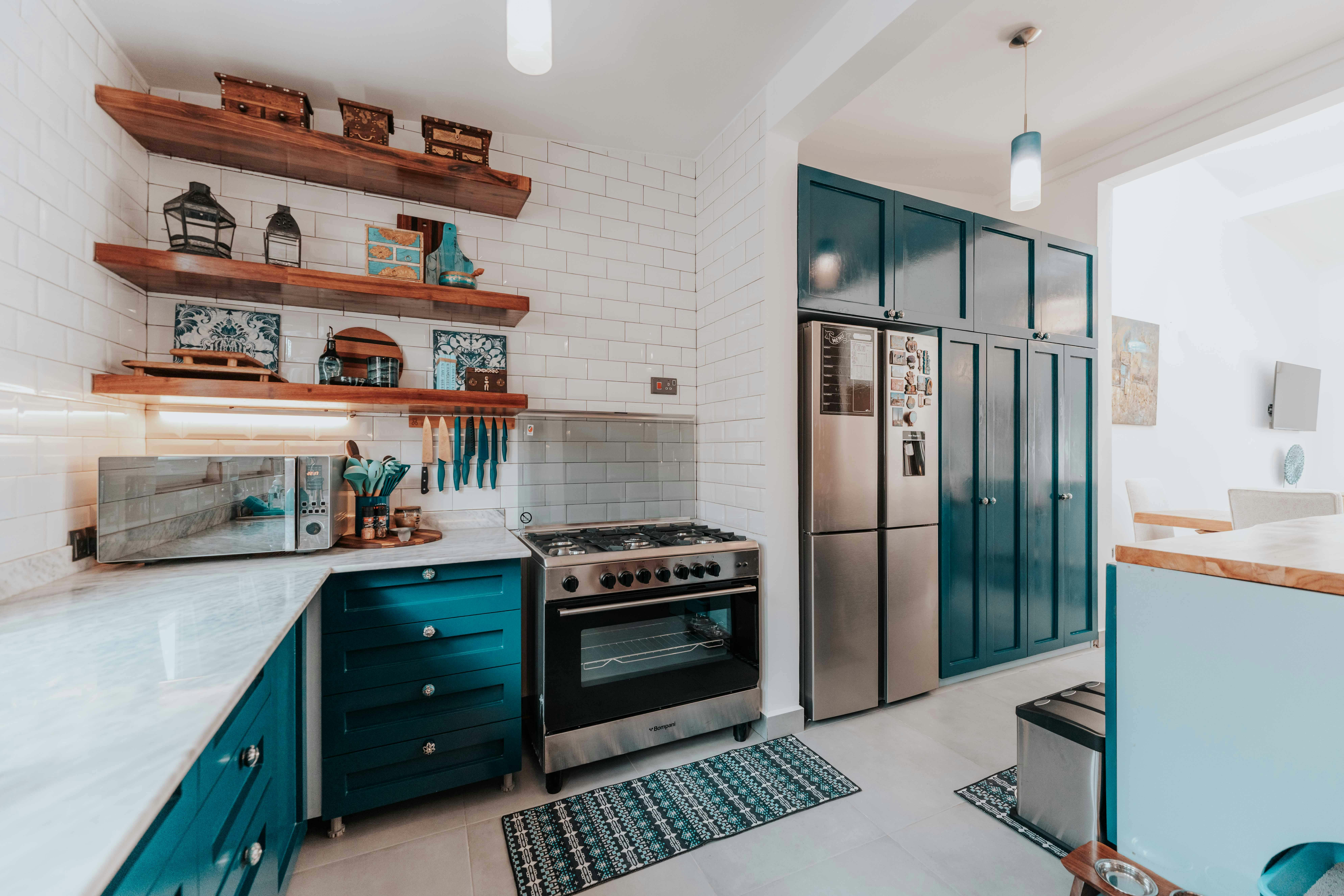
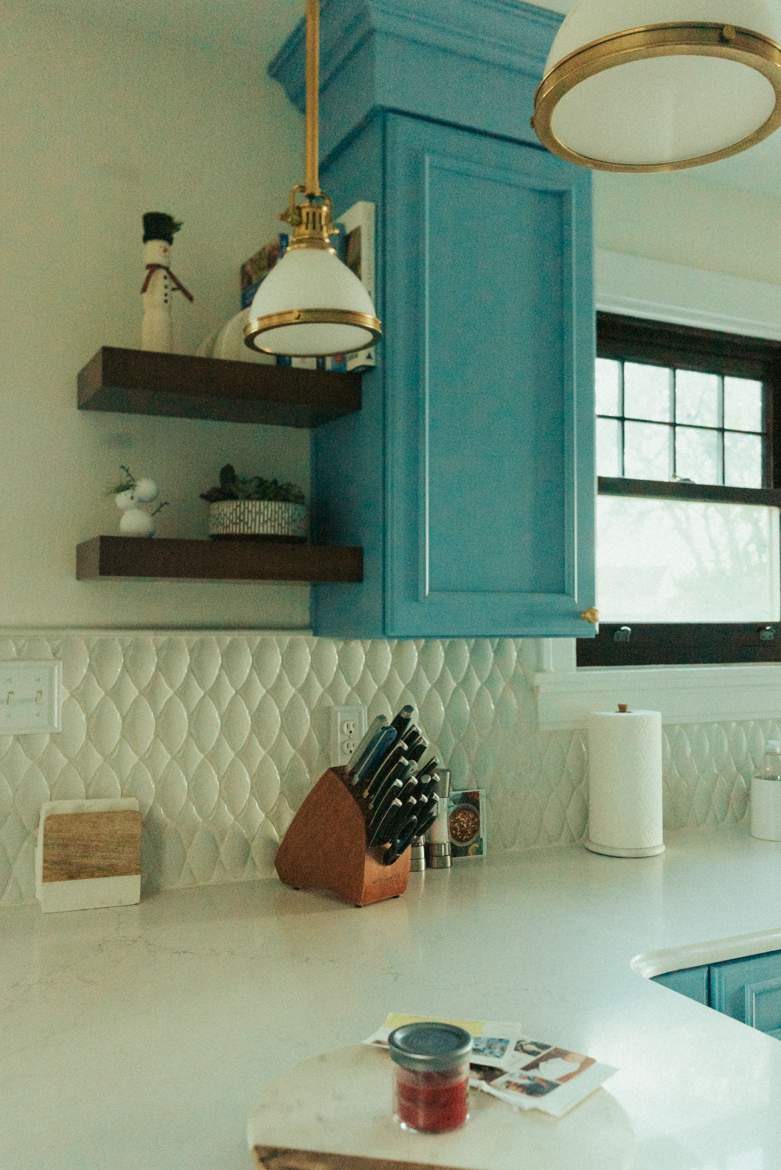
Blue often loses more apparent color than expected when daylight disappears. A greyed blue can become muted, teal may lose some of its green direction and deep navy can approach black on broad cabinet fronts. Layer task light at the worktop with enough ambient light to preserve the cabinet edges, then judge whether the evening version of the kitchen still feels intentional. Do not choose daytime color and nighttime lighting as separate decisions.
Echo Blue Across Open Plan Without Matching It
A blue kitchen can belong to a larger room without repeating the exact cabinet paint on dining chairs, curtains and accessories. A softer blue-grey textile, one darker artwork detail or a related but less saturated tone can create continuity while allowing the dining area to keep its own identity. Think in families and sightlines rather than exact matches. The kitchen should feel connected from the sofa or table, not replicated.
Use Value Contrast, Not a Ban on Navy, in Small Kitchens
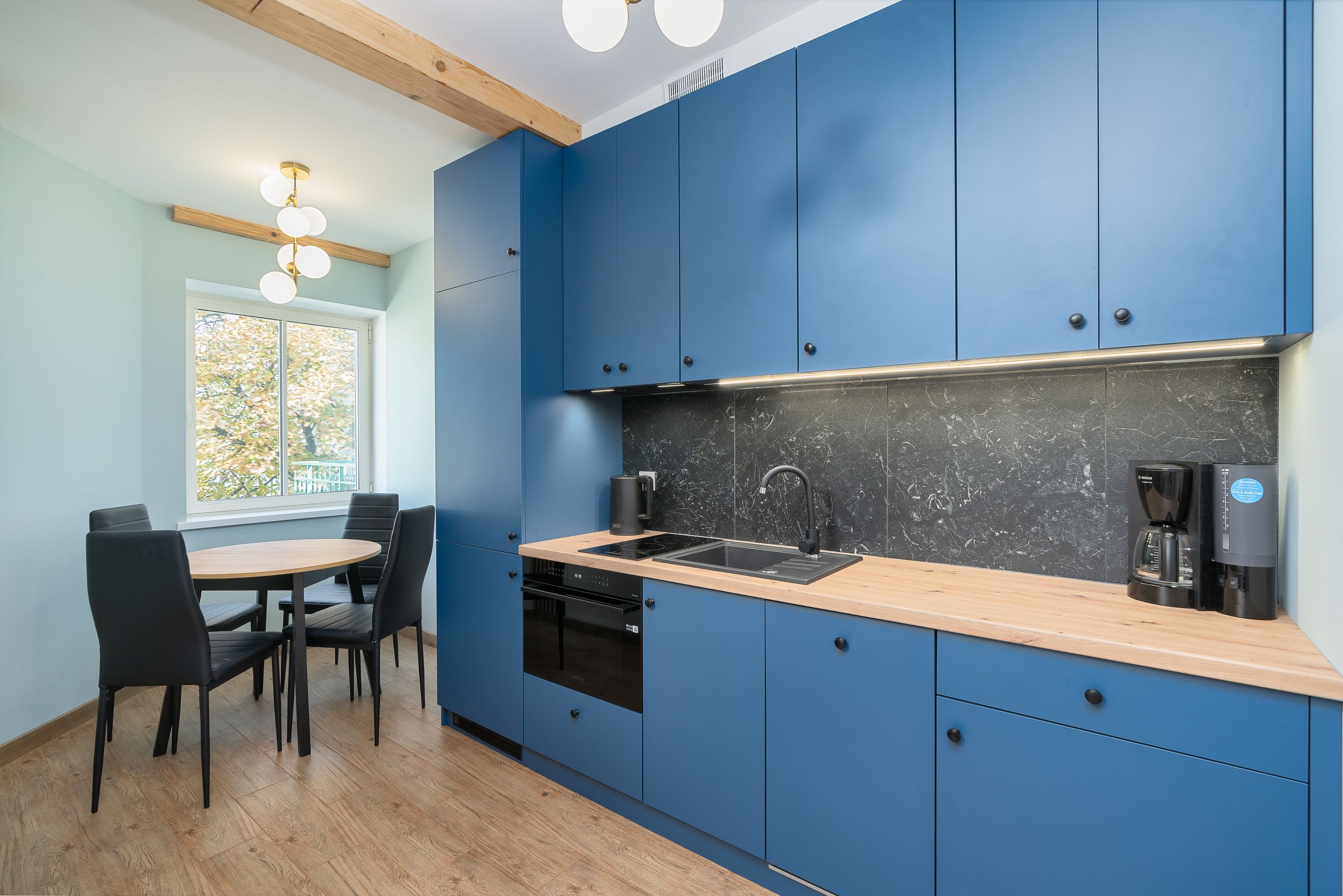
A compact kitchen does not automatically require pale blue. Navy can work when the room preserves clear value boundaries: a lighter worktop, visible wall area, a readable floor and useful task light keep the dark joinery from erasing the layout. Pale blue can cover more surface comfortably, but it is not a substitute for good spatial organization. Choose the depth of blue according to how clearly the room's planes remain separated.