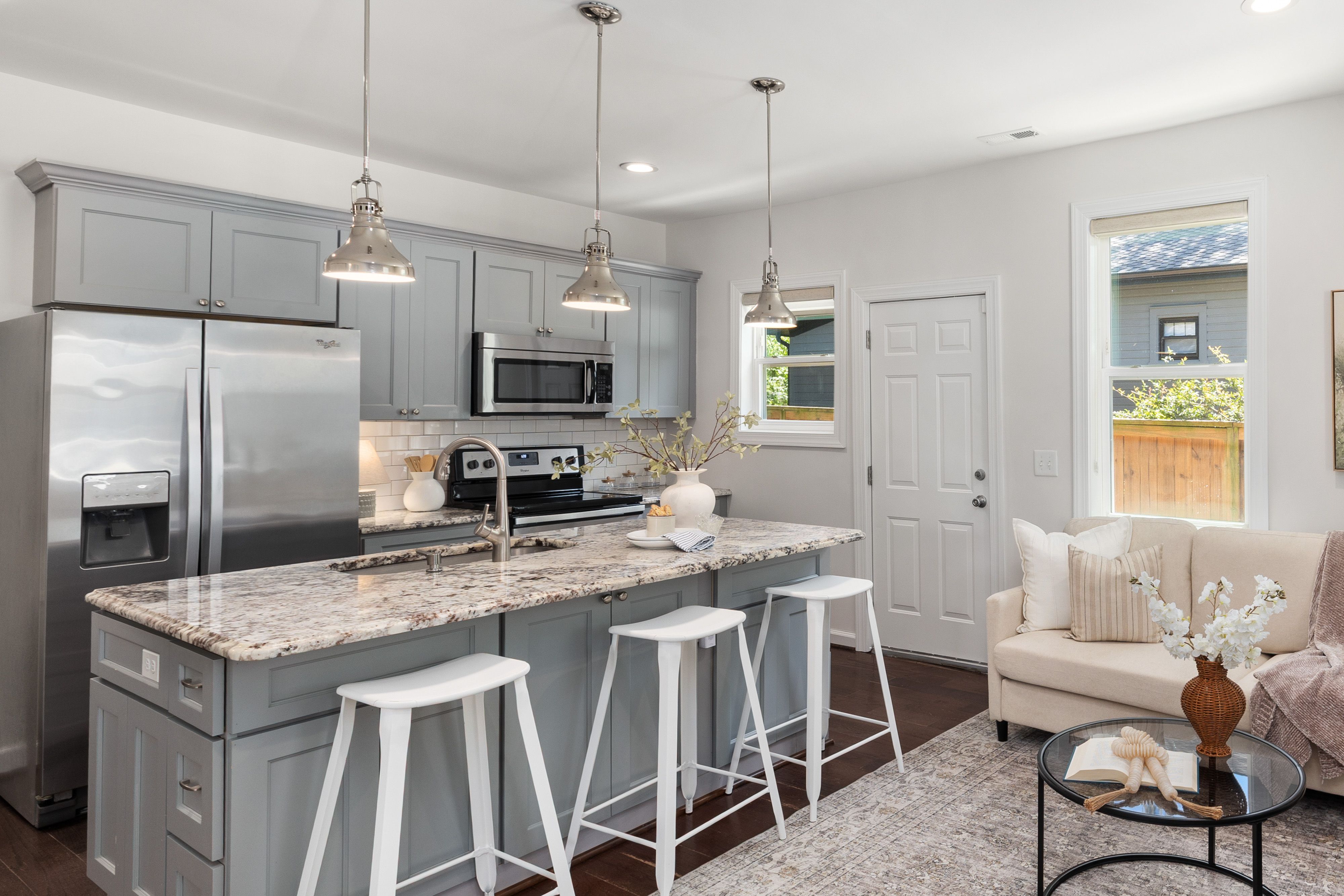

The Fixed Materials Come Before the Grey Swatch
Grey borrows heavily from what surrounds it. A cabinet sample that looks balanced in isolation can turn blue beside honeyed oak, green beside certain stones or beige beside a crisp white wall. Start with the elements that are hardest to change: flooring, worktop, appliance fronts and the daylight entering the room. Then choose a grey that either bridges those temperatures or creates a deliberate contrast. This reverses the usual paint-first process and makes the palette easier to control.
A Value Ladder Before Another Grey
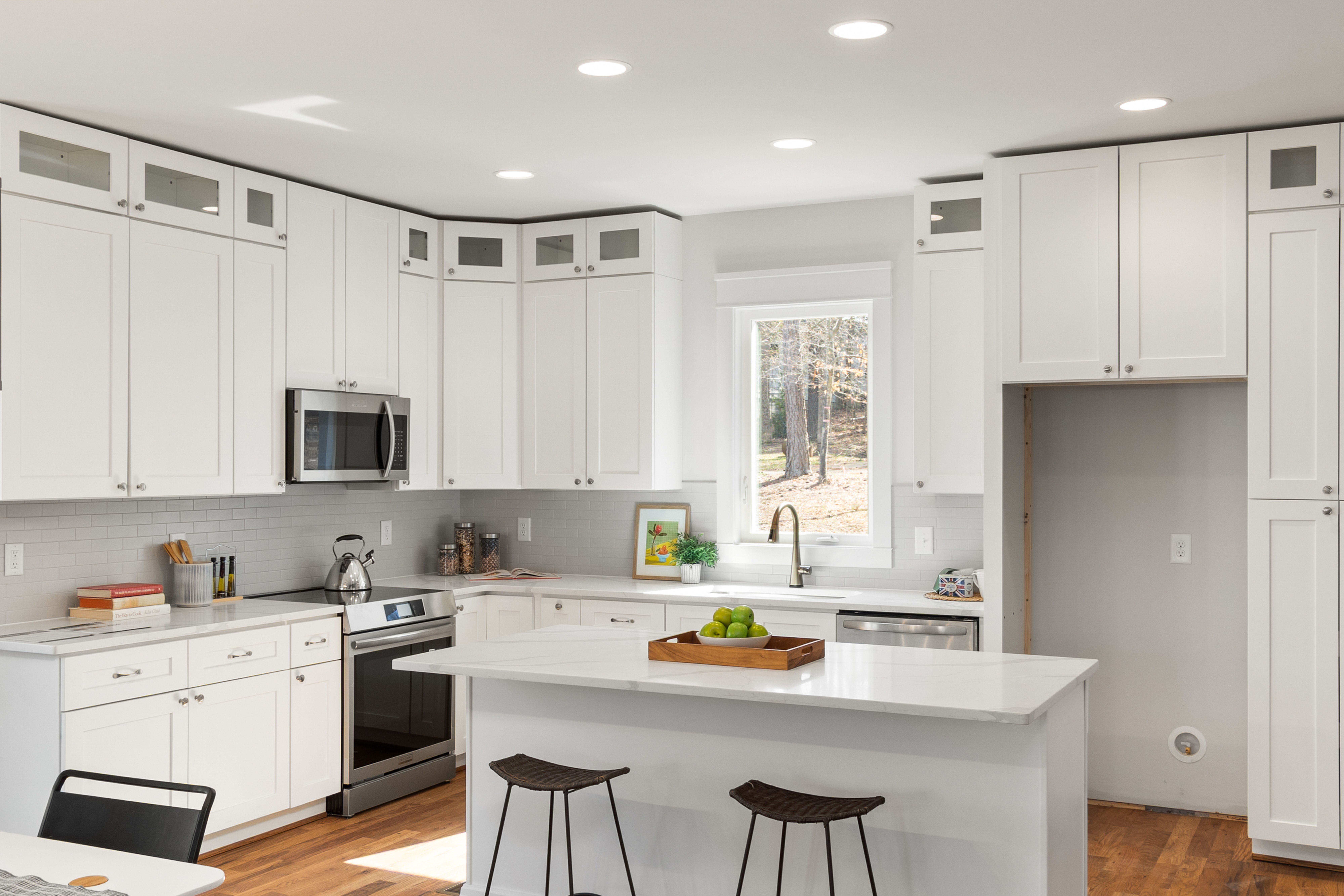
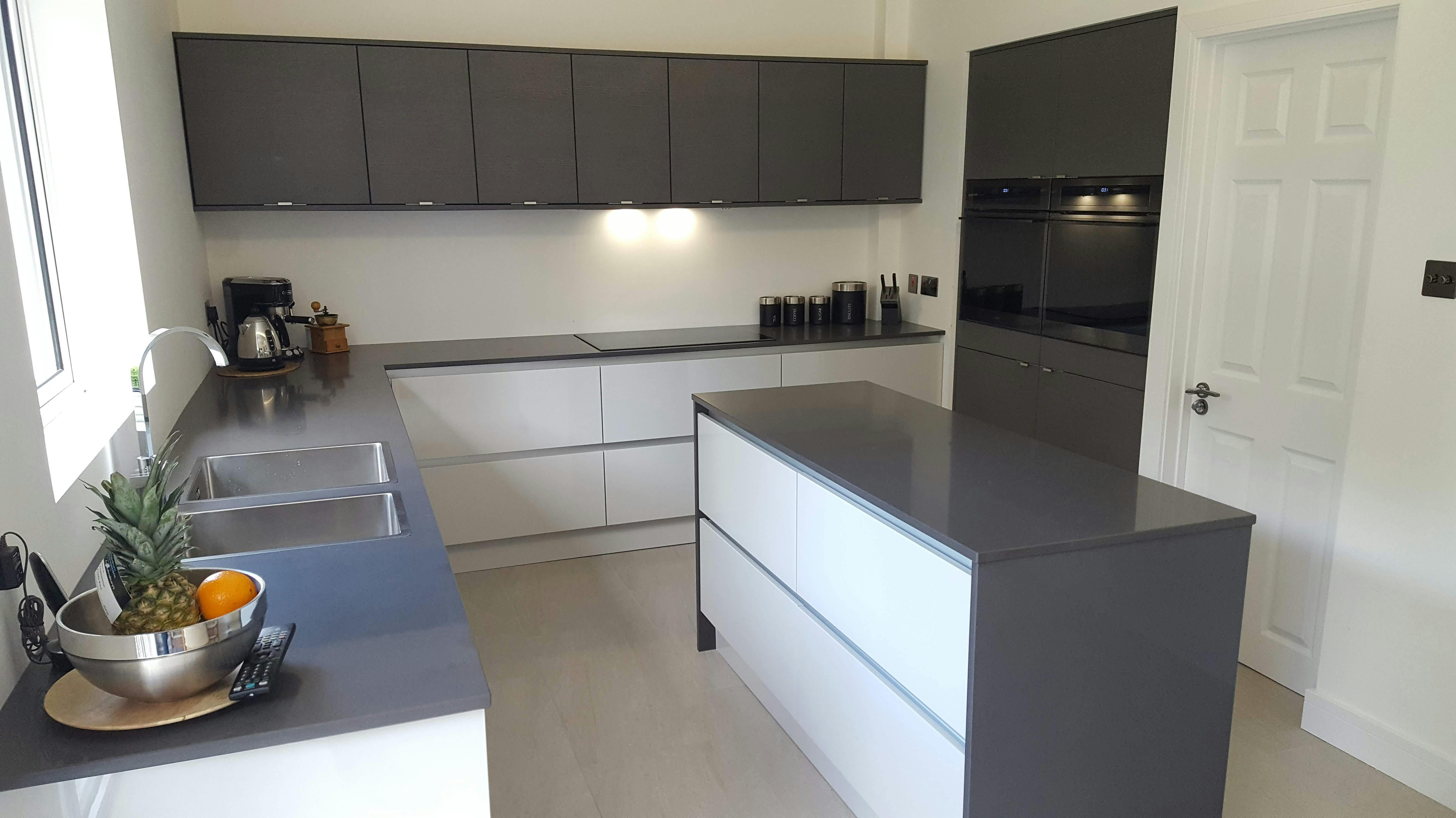
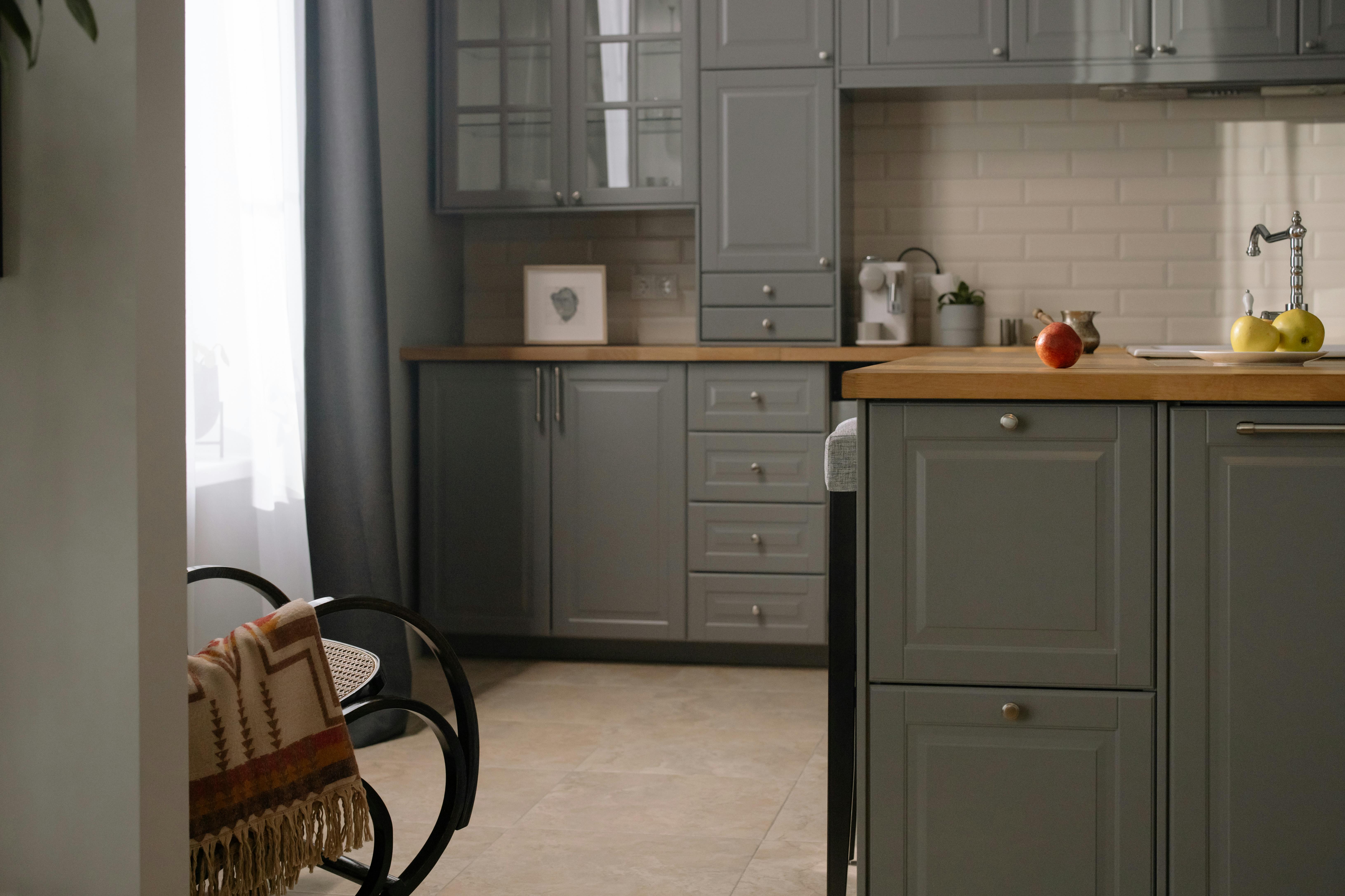
Pale grey is useful not simply because it feels lighter than charcoal, but because it can establish the top of a deliberate value ladder. Decide which surface should be lightest, which should sit in the middle and where the darkest note belongs. A pale cabinet run can reveal door profiles without becoming white, while a mid-grey island or darker floor supplies enough separation to keep the room legible. Problems begin when every large surface lands in the same middle-grey band.
Charcoal as the Full Stop
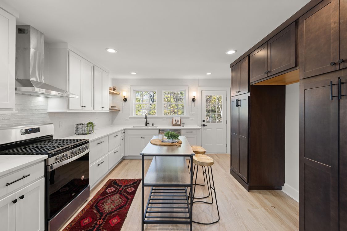
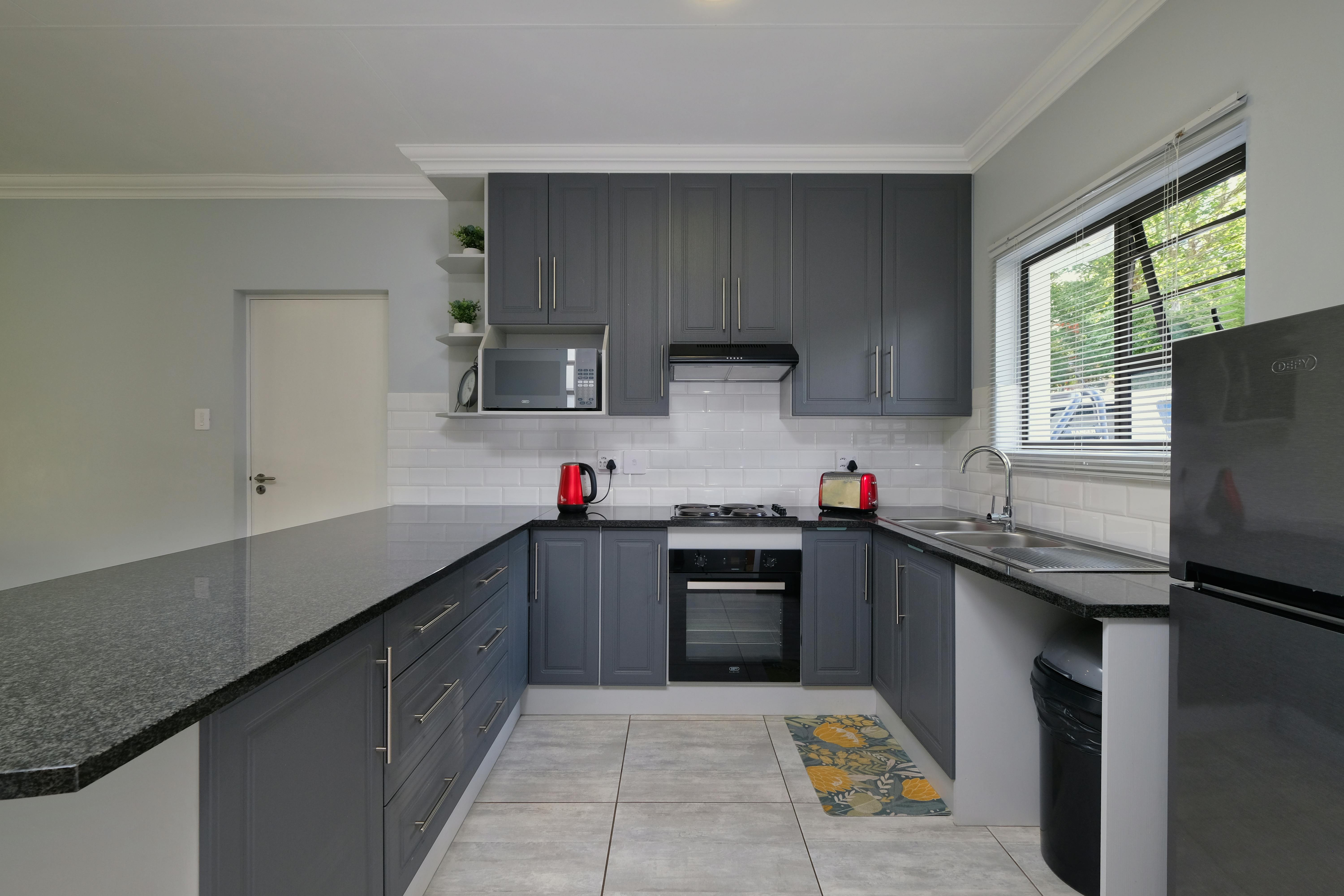
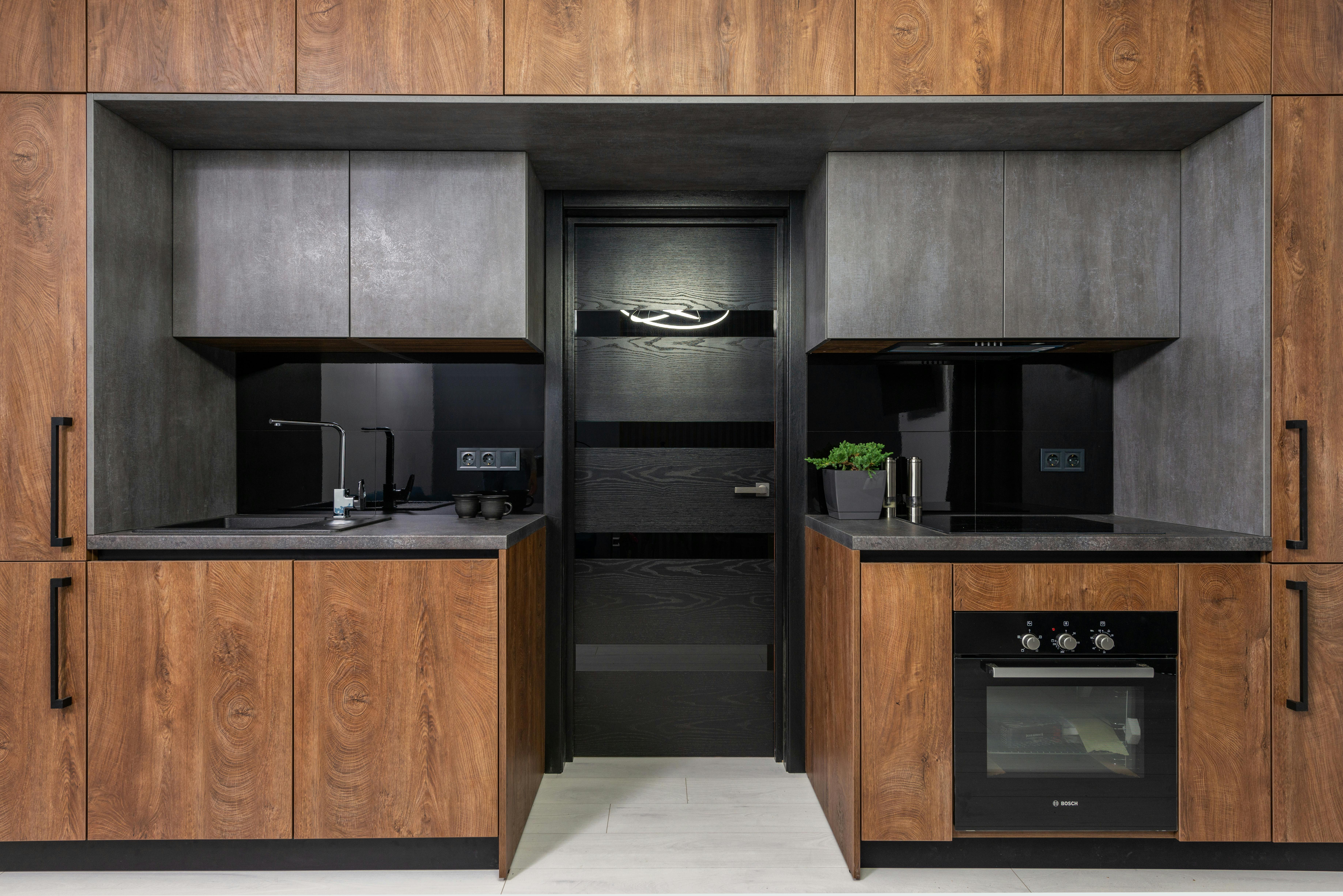
Charcoal is most convincing when it ends a composition rather than covering every available cabinet. A tall storage wall, one island or a single lower run can provide the darkest value the room needs and make paler greys feel intentional by comparison. Because charcoal has strong visual weight, repeating it on every small fitting can dilute that effect. Give the darkest grey one clear architectural role, then let lighter surfaces do the separating.
When Wood Corrects the Temperature
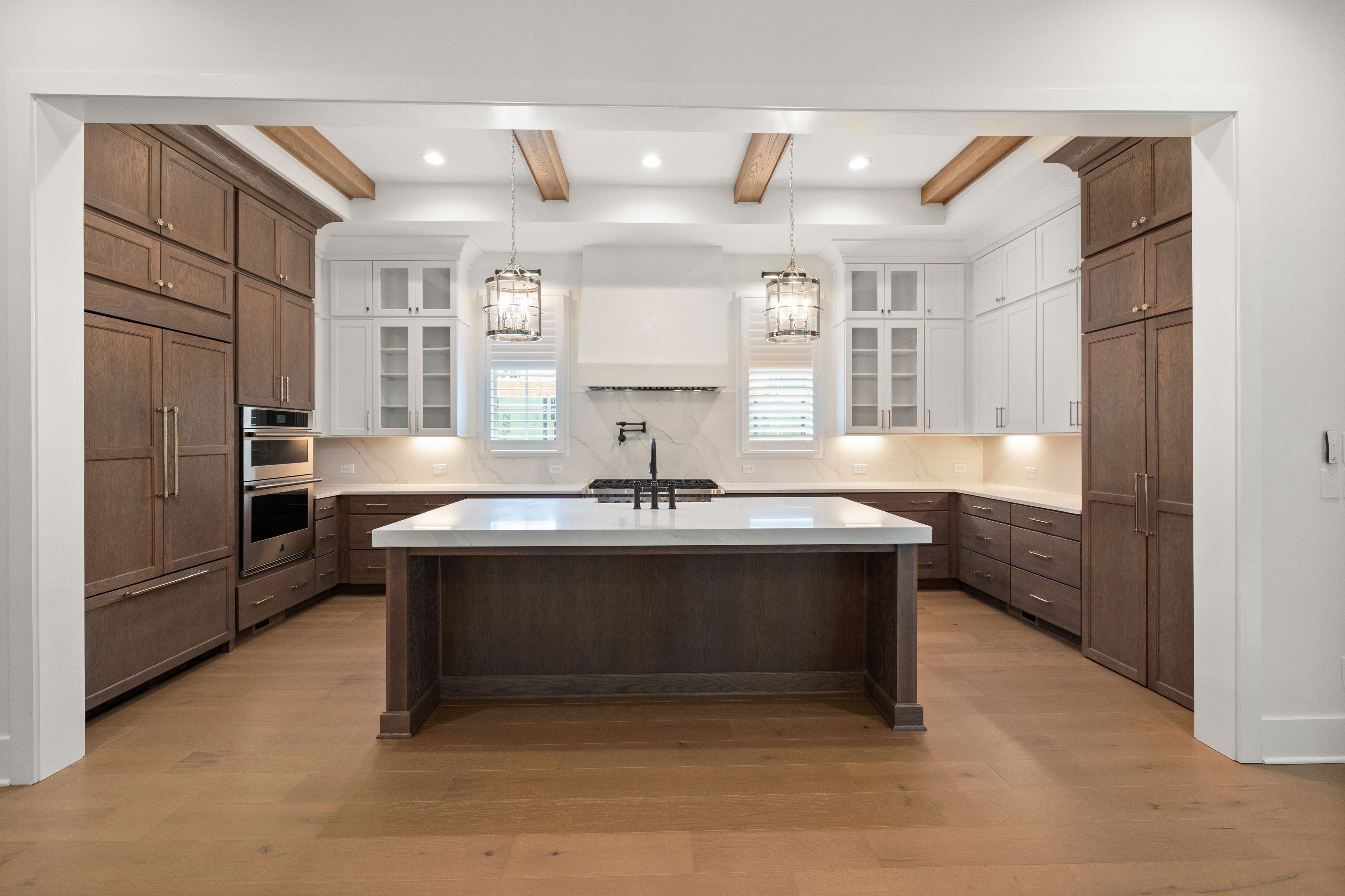
Timber changes the perceived temperature of grey, but the useful question is which correction the room needs. Honeyed oak can pull a cool grey toward balance, pale ash can keep a warm mushroom grey quiet, and walnut can create a sharper value contrast against a lighter cabinet color. Treat the wood as part of the color calibration rather than as a mandatory recipe for making grey feel cozy. One substantial timber surface usually gives a clearer result than scattered wooden accessories.

The Worktop as a Break in the Grey Family
A grey kitchen often becomes monotonous when the worktop is chosen as one more near-match. Stone can do a better job when it deliberately breaks the family through veining, warmth or a noticeably lighter or darker value. Pale marble or quartzite can introduce movement above flat mid-grey cabinetry, while a darker worktop can give pale grey a firmer horizontal boundary. The goal is not maximum pattern; it is a surface that prevents cabinet, worktop and backsplash from reading as one continuous grey field.

Finish Separates Similar Greys Better Than Near-Matching Paint
When several grey surfaces sit close in value, finish becomes the cleanest way to separate them. Matte paint, honed stone, handmade tile, brushed metal and woven fabric respond to light differently even when their color is related. That is usually more convincing than trying to find three paints that are almost identical. Keep one undertone family reasonably consistent, then let texture and reflectivity create the distinctions.
Can the Island Bridge Warm and Cool Zones?
In an open-plan room, a grey island can mediate between a cooler kitchen and a warmer living or dining palette. A mushroom or taupe-grey island can pick up timber and upholstery without forcing the perimeter cabinetry to match, while a cooler mid-grey can connect stainless steel or blue-toned stone to the rest of the room. Judge the island as a shared object between zones, not only as a kitchen accent.

Metal as an Undertone Check
Metal can expose a grey's undertone surprisingly quickly. Polished chrome and stainless steel may make a blue-grey feel crisper, while brass beside the same cabinet can reveal green or beige notes that were less obvious on the sample card. Use that reaction diagnostically before deciding the finish hierarchy. Once the cabinet color is settled, choose the dominant metal according to whether you want to reinforce its temperature or counter it.
Removable Layers for Post-Installation Tuning
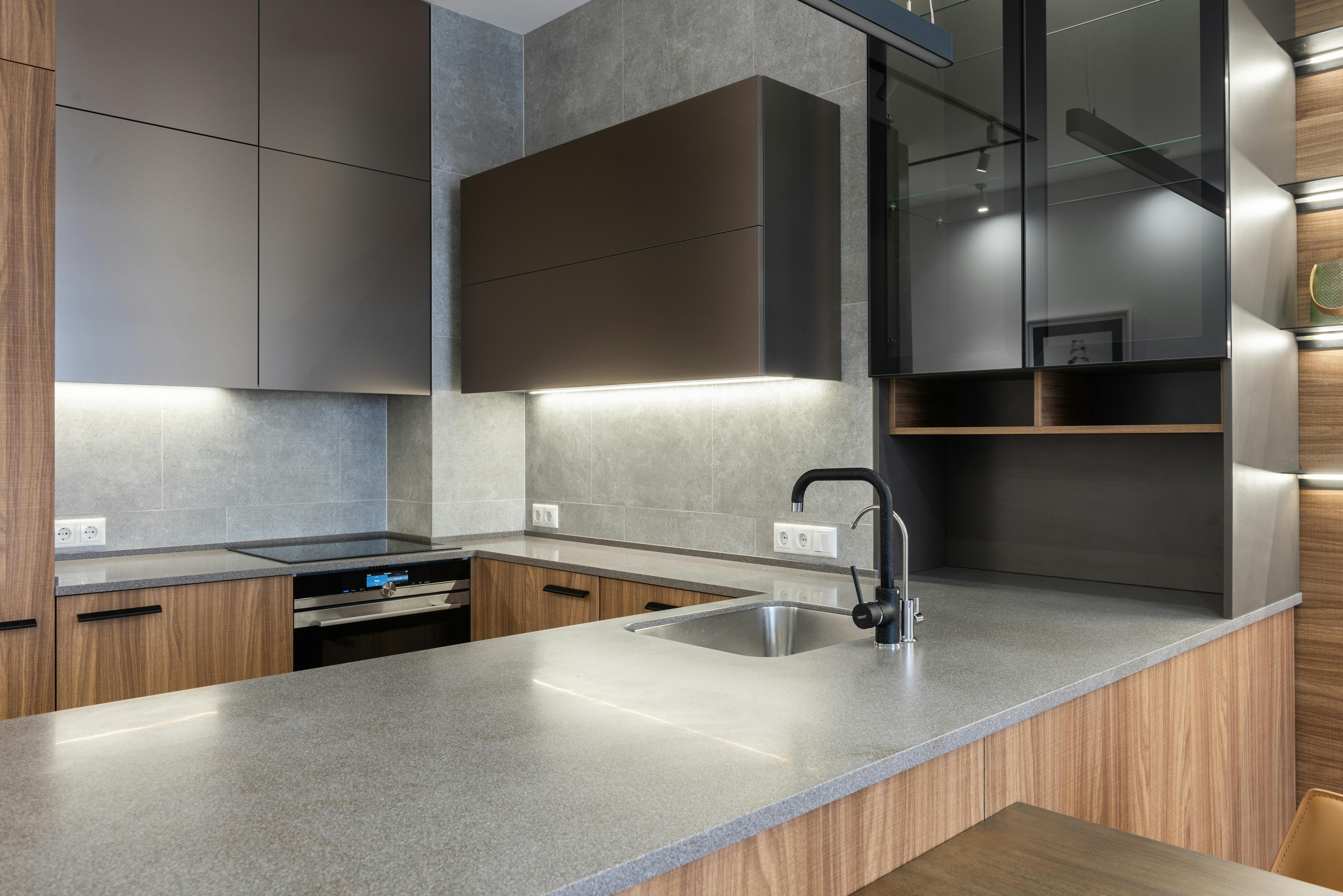
Grey is unusually responsive to small shifts in surrounding temperature, which makes textiles useful as a final tuning layer rather than simple decoration. A warm runner, oatmeal stool fabric or muted blue shade can nudge the room without reopening permanent finish decisions. This is most useful after the cabinetry, stone and lighting are installed and you can see whether the completed kitchen feels colder, flatter or harder than expected.

The Grey Kitchen Night Test
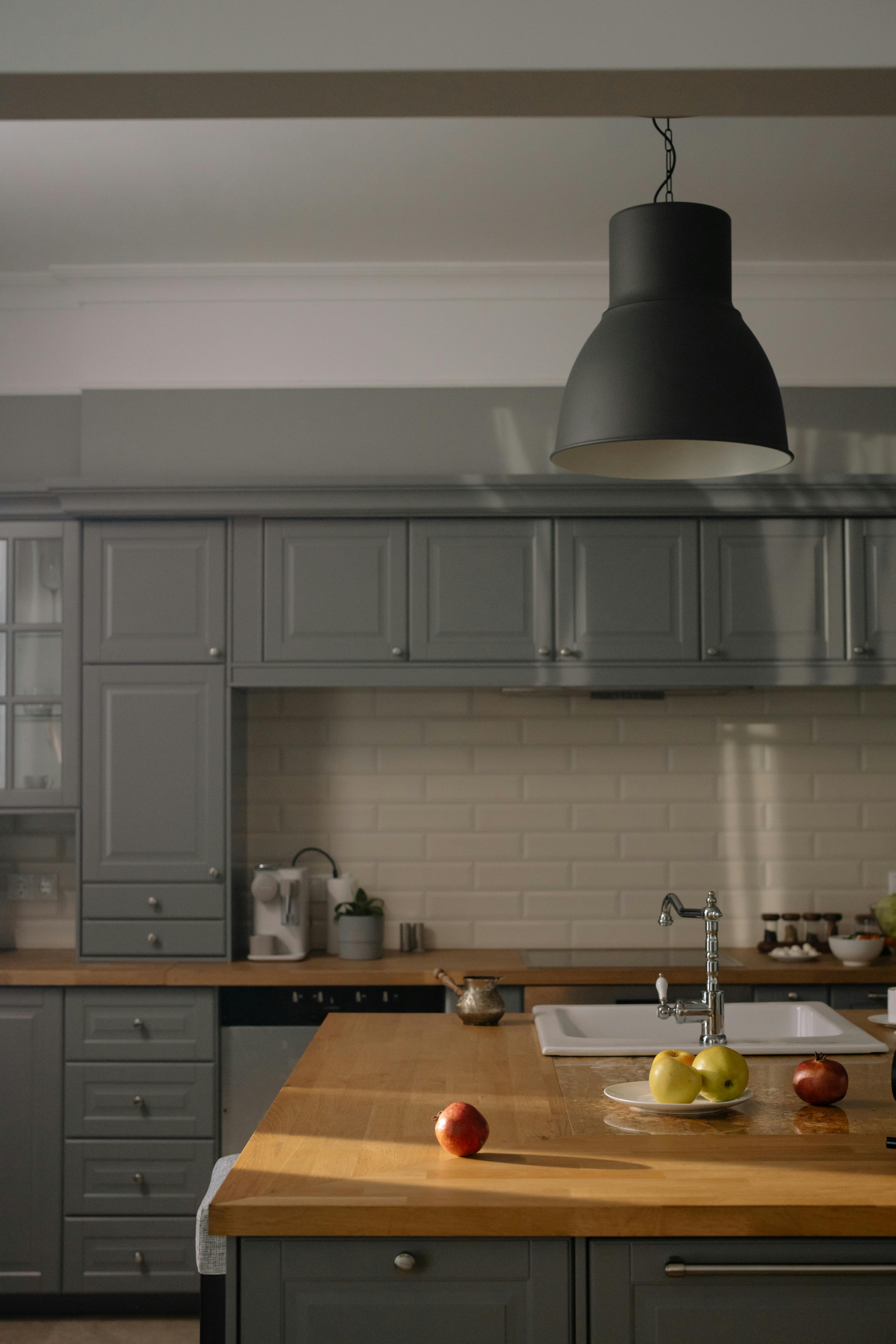
Grey that feels nuanced in daylight can collapse into one middle value after sunset. Test the finished palette with the daylight gone and ask whether cabinet edges, worktop, backsplash and floor still read as separate planes. Under-cabinet task lighting may restore the worktop boundary; a warmer lamp may soften a cool scheme; too much even ceiling light may flatten texture. The night test is less about making the room brighter than about preserving the value hierarchy you designed during the day.