Decide Whether Green Should Read as Neutral, Earthy or Saturated
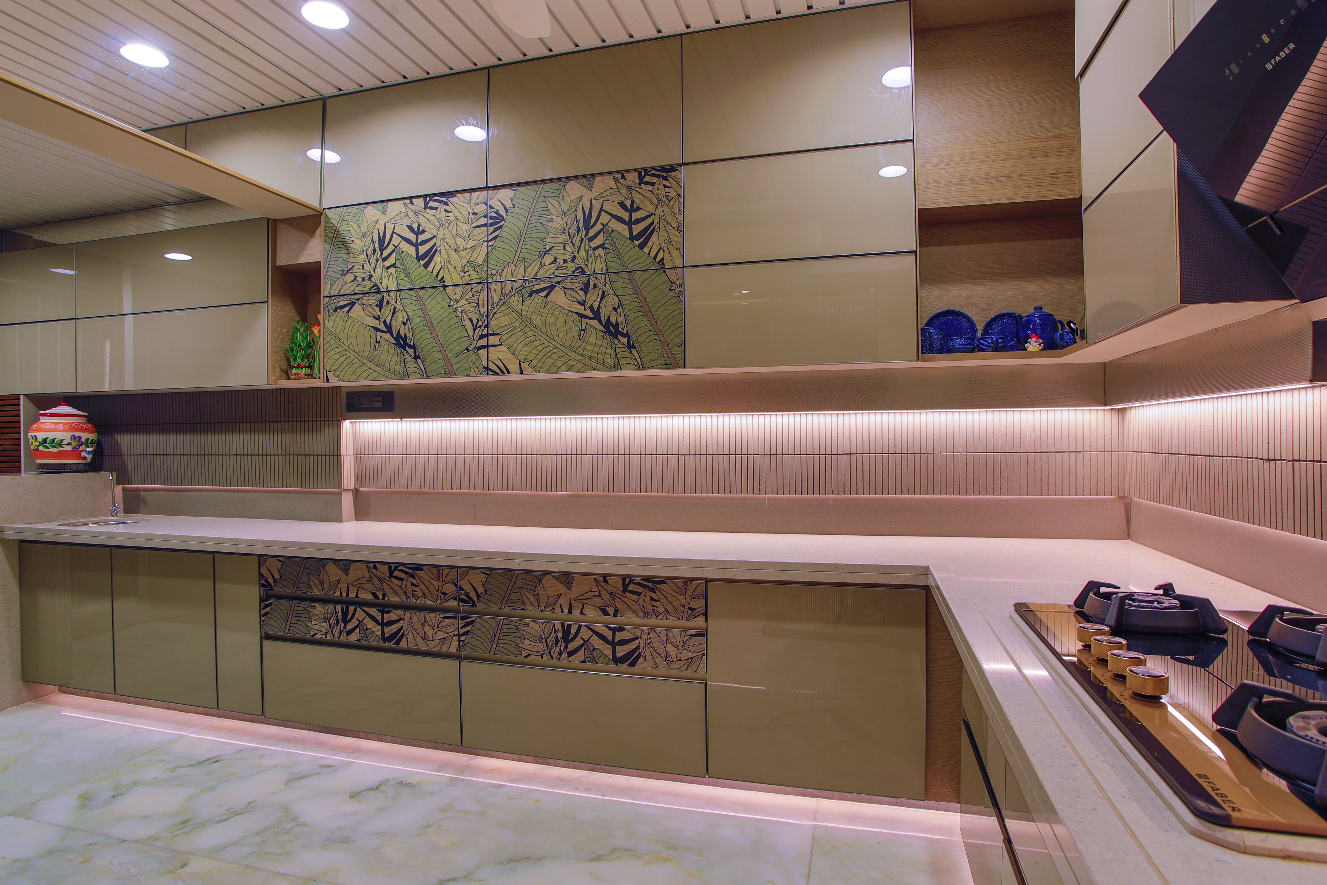
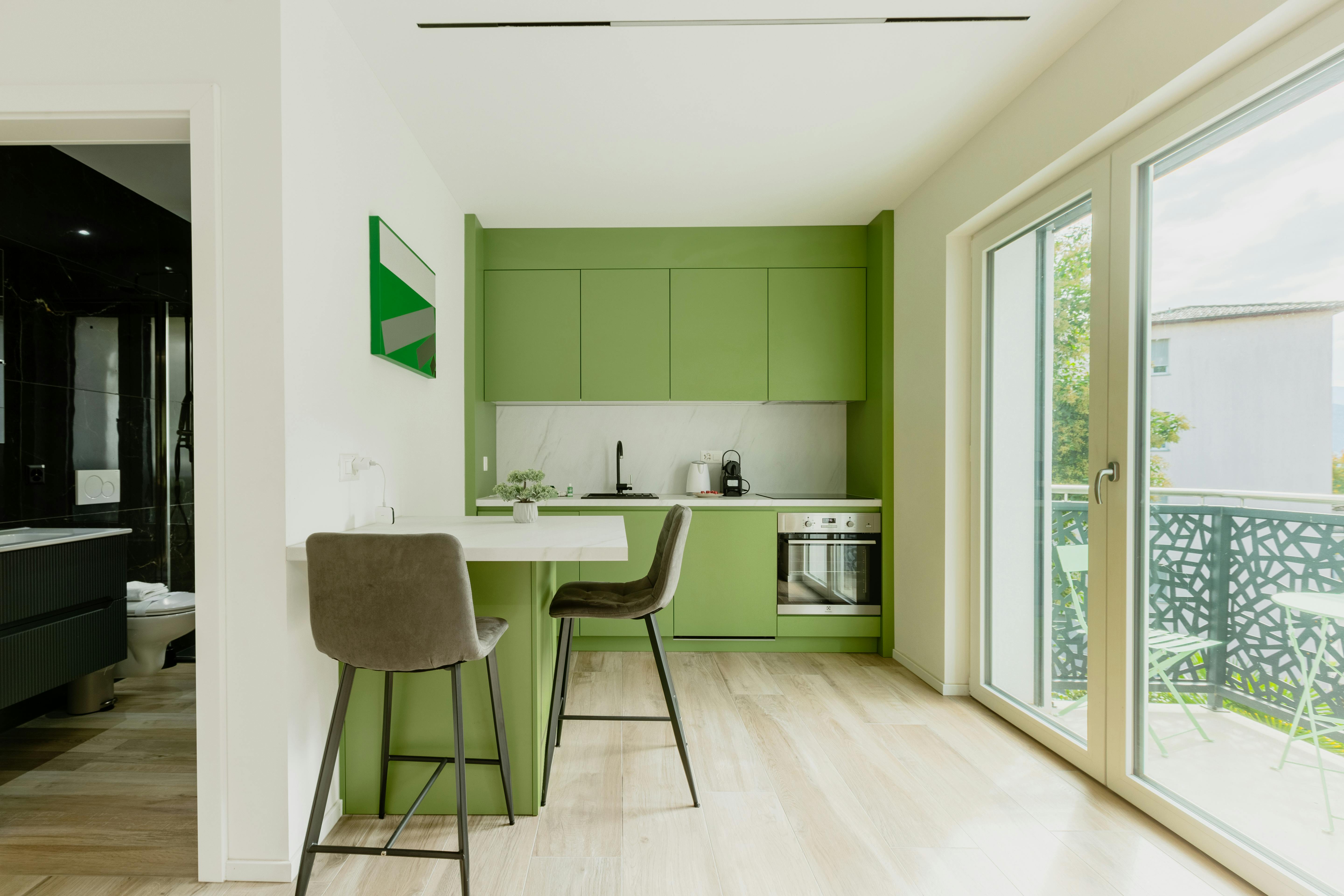
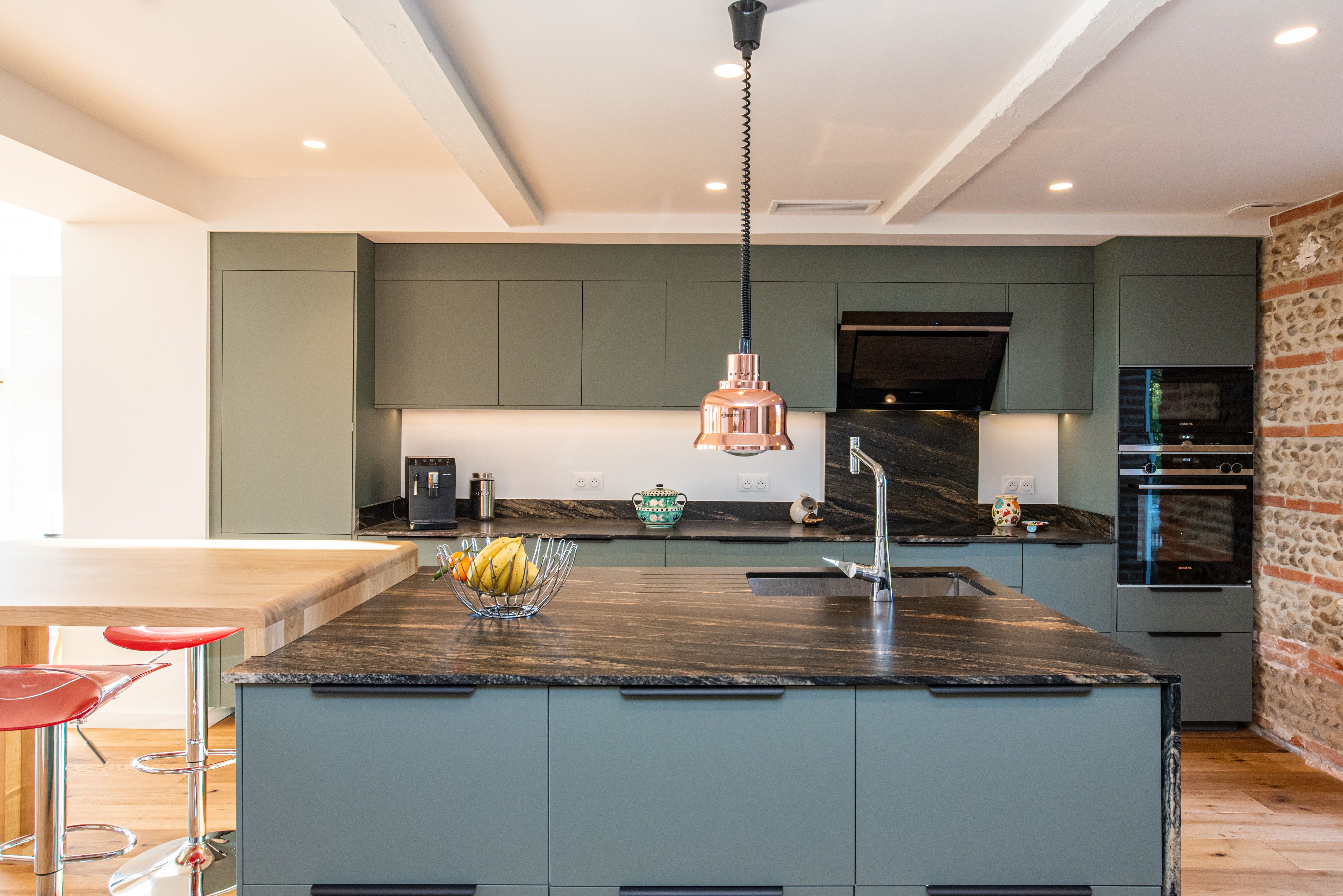
A greyed sage can cover a large area and behave almost like a neutral, olive carries more earthiness and yellow, while forest or bottle green becomes a stronger architectural color. Start by choosing that role rather than comparing dozens of unrelated greens. Once you know whether the room needs quiet, warmth or depth, the undertone becomes easier to judge beside the floor, worktop and daylight.
Know When Forest Green Has Become Nearly Black
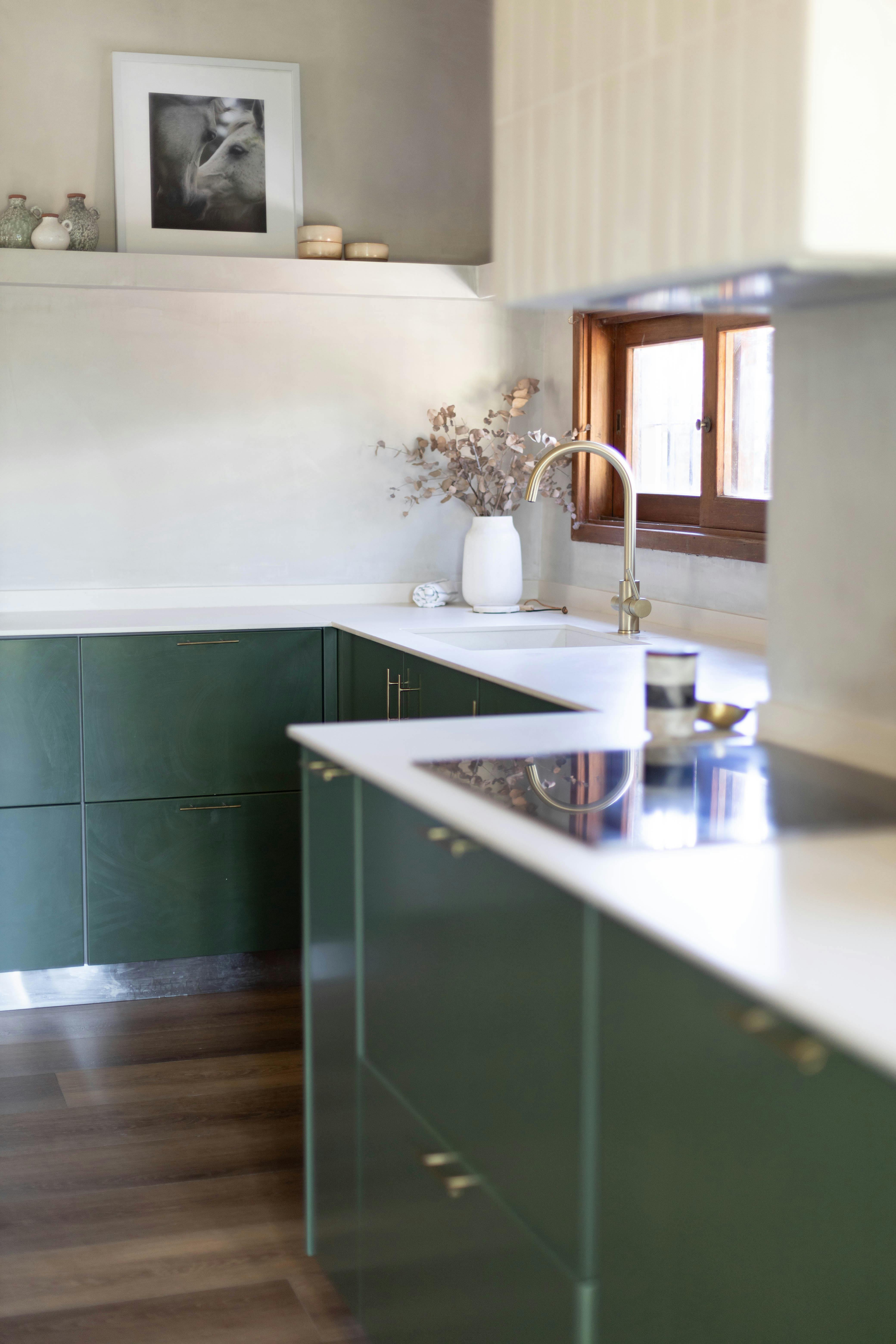
Deep forest green can cross a threshold where the eye reads it first as a dark mass and only second as green. That can be powerful on a pantry wall, long cabinet run or island, but it changes the design problem: edge definition and light become as important as color. If the green disappears toward black in the room's evening conditions, preserve lighter boundaries at the worktop, wall or floor rather than trying to rescue it with more decorative accents.


Match Green to the Wood's Temperature, Not to 'Nature'
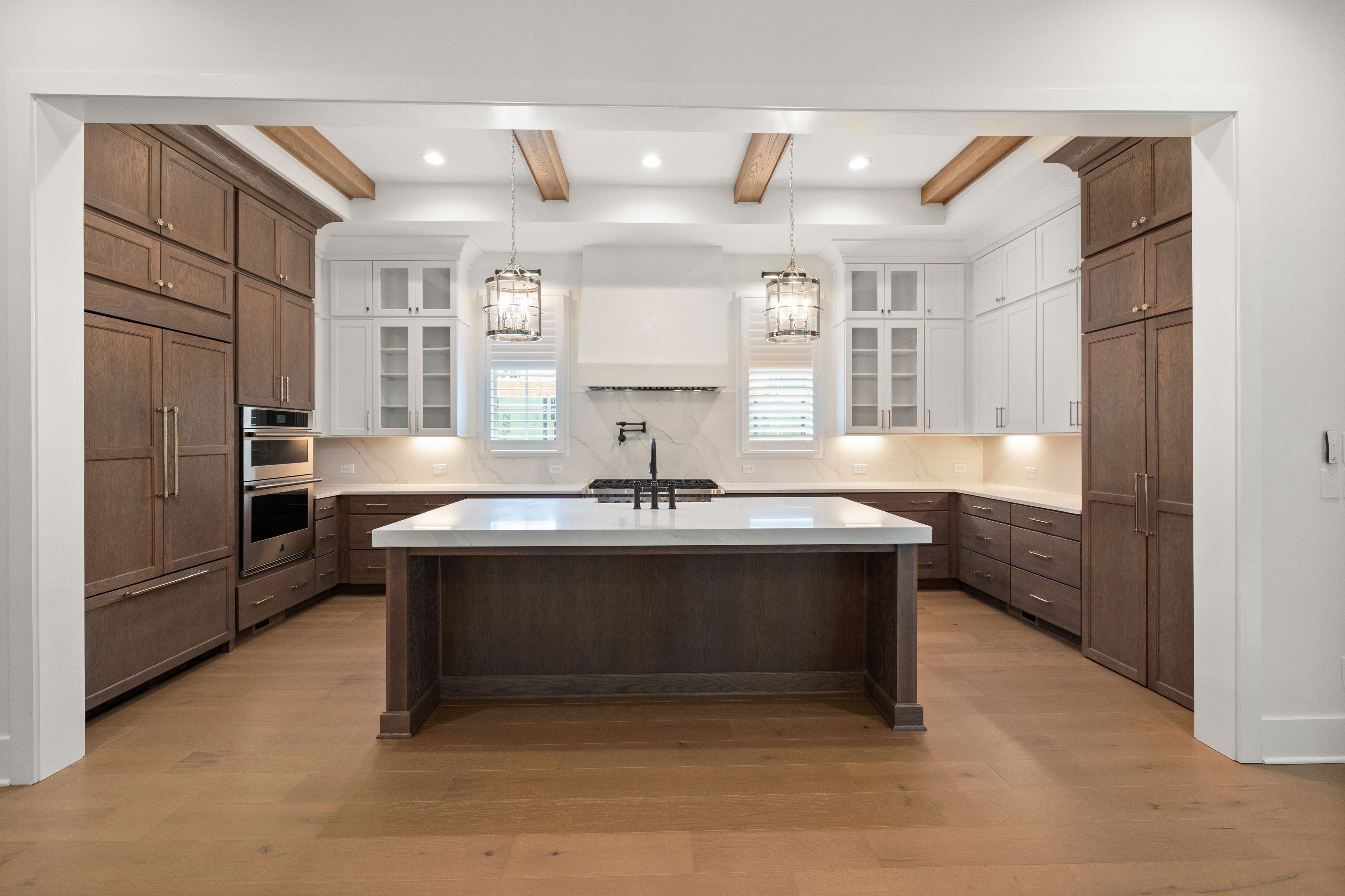
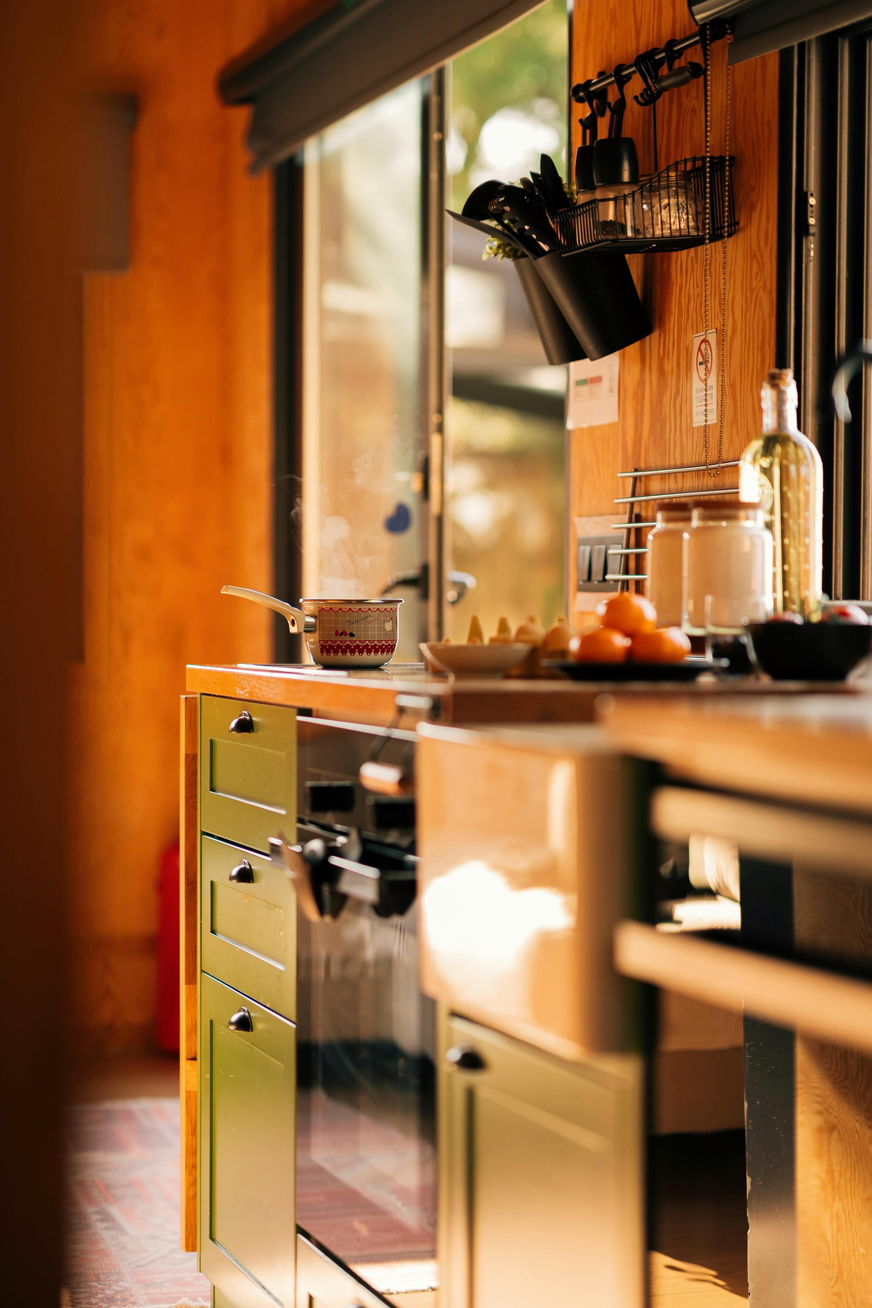
Green and timber are often called natural partners, but some combinations become muddy because their undertones are too similar. Yellow-green beside honeyed oak can intensify warmth until the palette loses definition, while blue-green against orange-toned timber creates a stronger contrast. Sage with pale oak can stay quiet; olive with walnut can feel richer and heavier. Judge the relationship by temperature and value rather than assuming that anything botanical will automatically agree.
Control How Much Tradition the Stone Adds
Green cabinetry with pale veined stone can quickly acquire a traditional or luxurious character, particularly when the stone pattern is pronounced. That may be exactly right, but it should be a choice rather than an accident. A quieter quartzite or low-contrast surface keeps the green more contemporary; expressive marble makes the worktop a second decorative voice. Decide how much historical or formal weight the stone should add before choosing the slab.
Do Not Assume Green Needs Brass
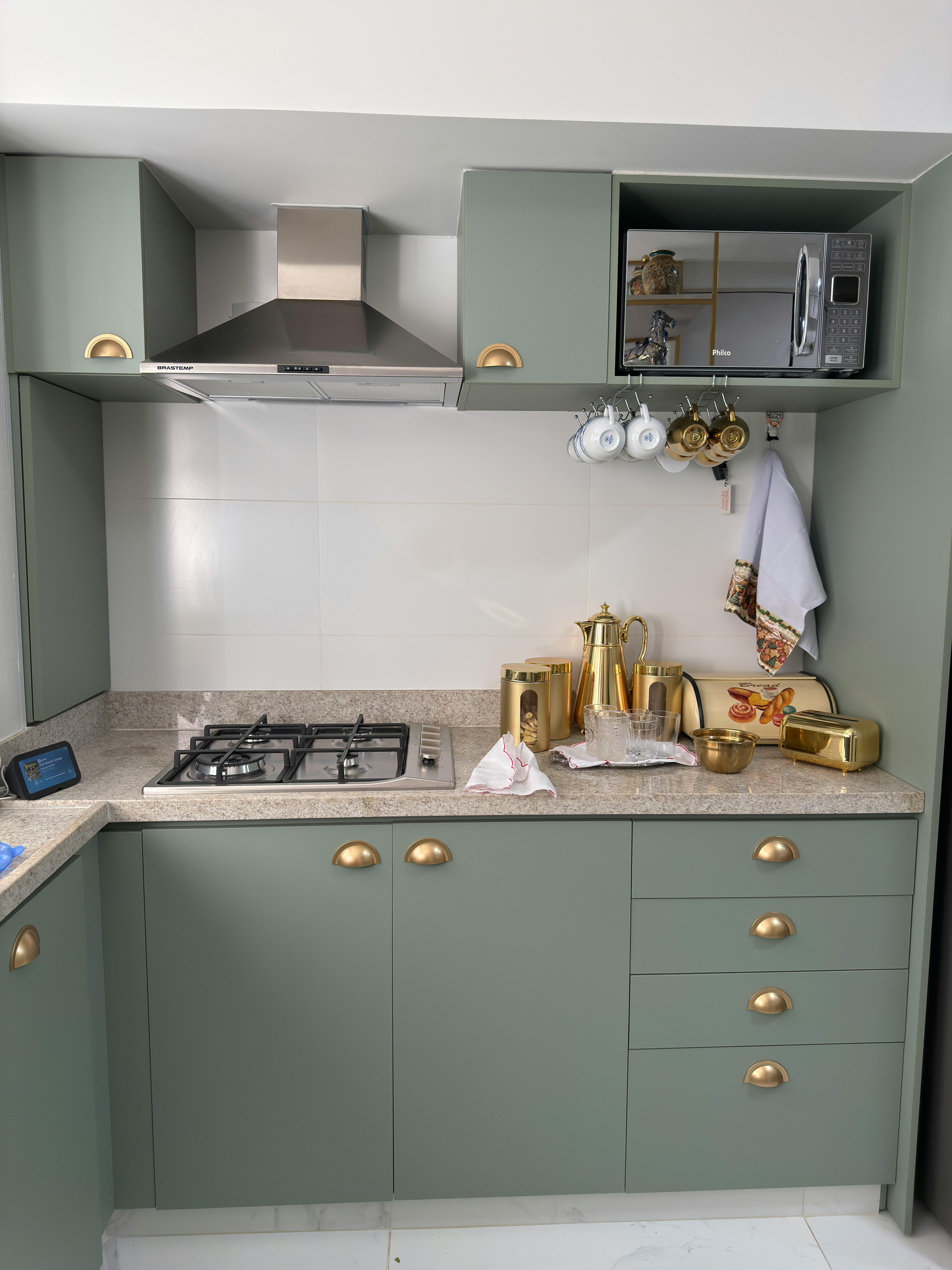
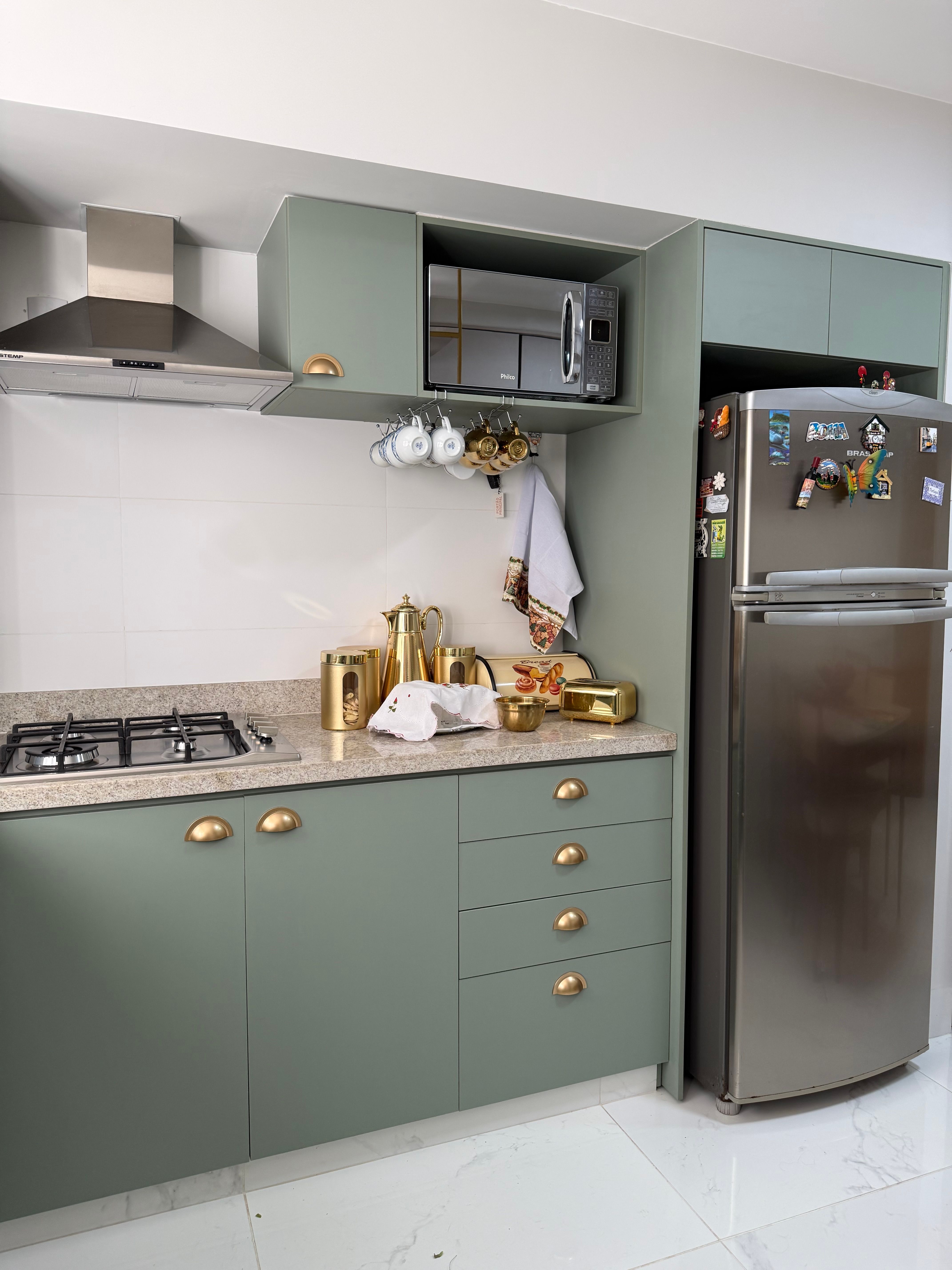
Brass is a familiar partner for green, but using it automatically can push the room toward a heritage or decorative reading. Stainless steel and nickel can make sage or olive feel cleaner and more functional, while black hardware creates a quieter graphic edge. Warm metal still works beautifully when that is the intended direction. The useful decision is whether the hardware should reinforce the green's warmth, cool it or largely disappear.
Give Green a Neutral Pause Where the Work Happens
Saturated green becomes easier to read when the worktop and backsplash create a quieter band through the middle of the cabinetry. Cream, pale stone or restrained tile can separate upper and lower masses without turning the room into a stark high-contrast composition. Think of this zone as visual recovery as well as a working surface: it gives the eye somewhere neutral to land between large areas of color.
Treat the Window View as Part of the Green Palette
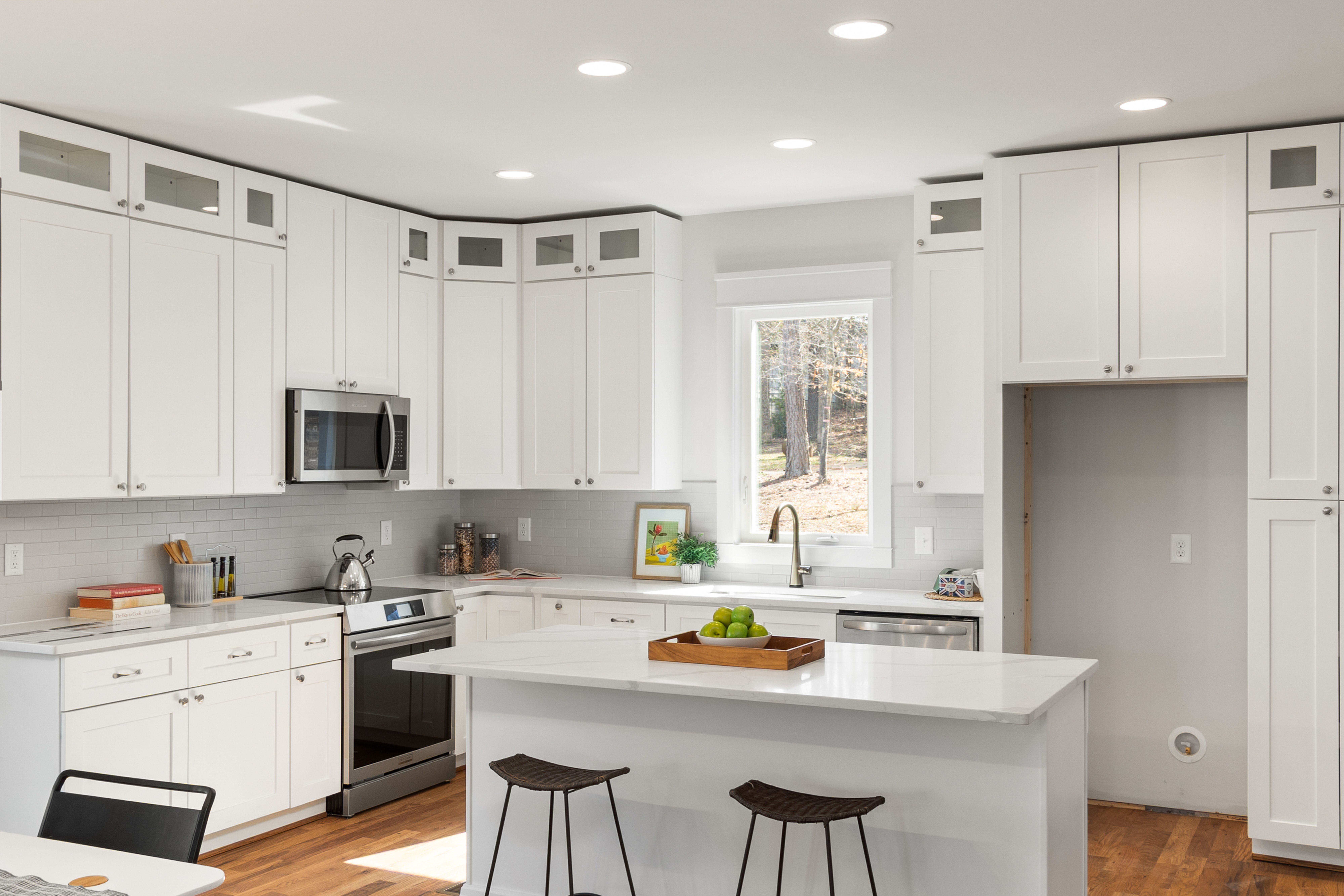
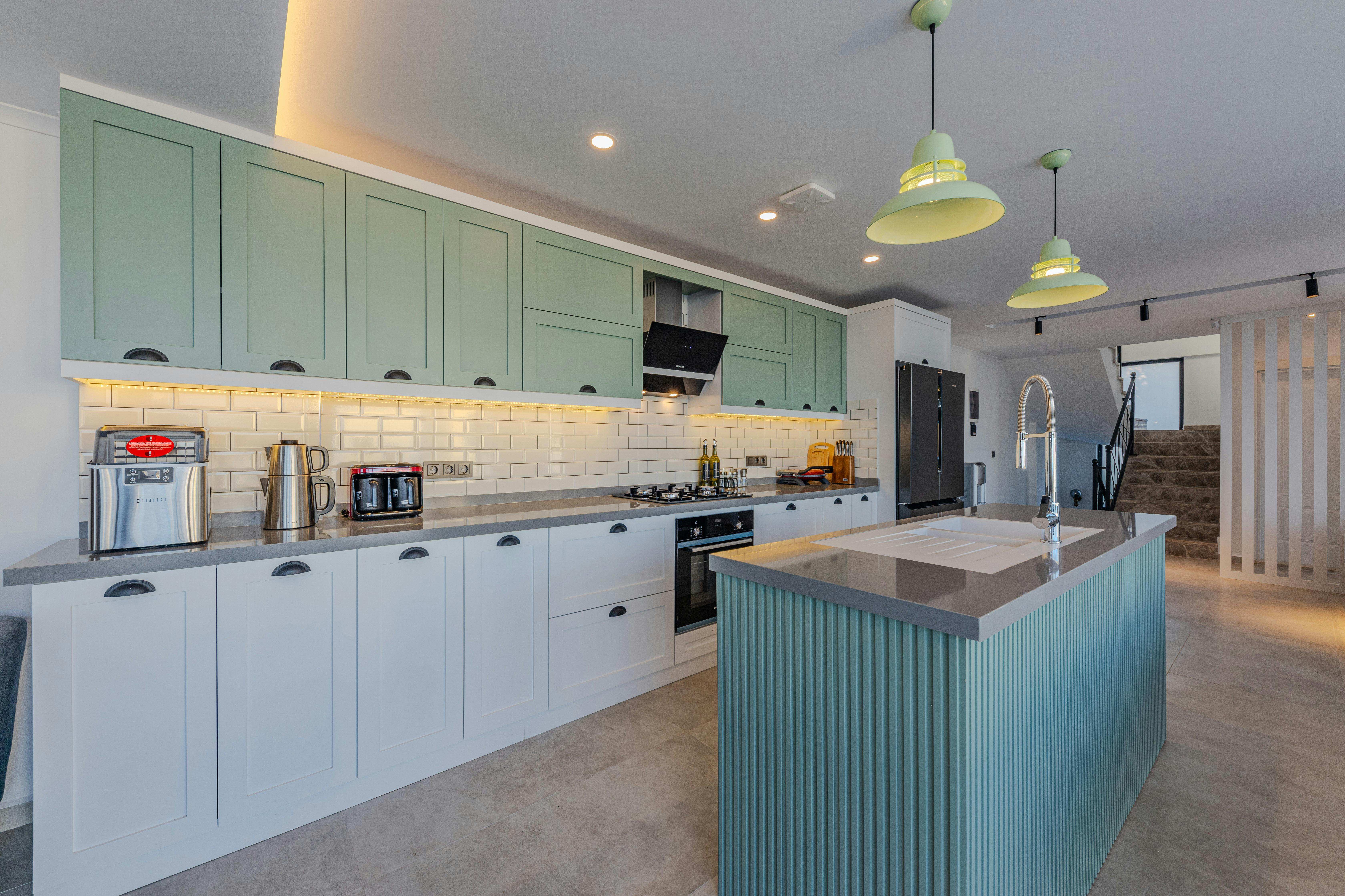
A kitchen that looks onto trees or a garden already contains a changing field of green beyond the glass. Decide whether the cabinetry should extend that relationship or stand apart from it. Sage may blur gently into a leafy view, while a darker blue-green can create separation; in winter, the same window may contribute far less green than in summer. Judge the cabinet color with the exterior view visible instead of treating daylight as colorless.
Pair Green Outside the Botanical Comfort Zone
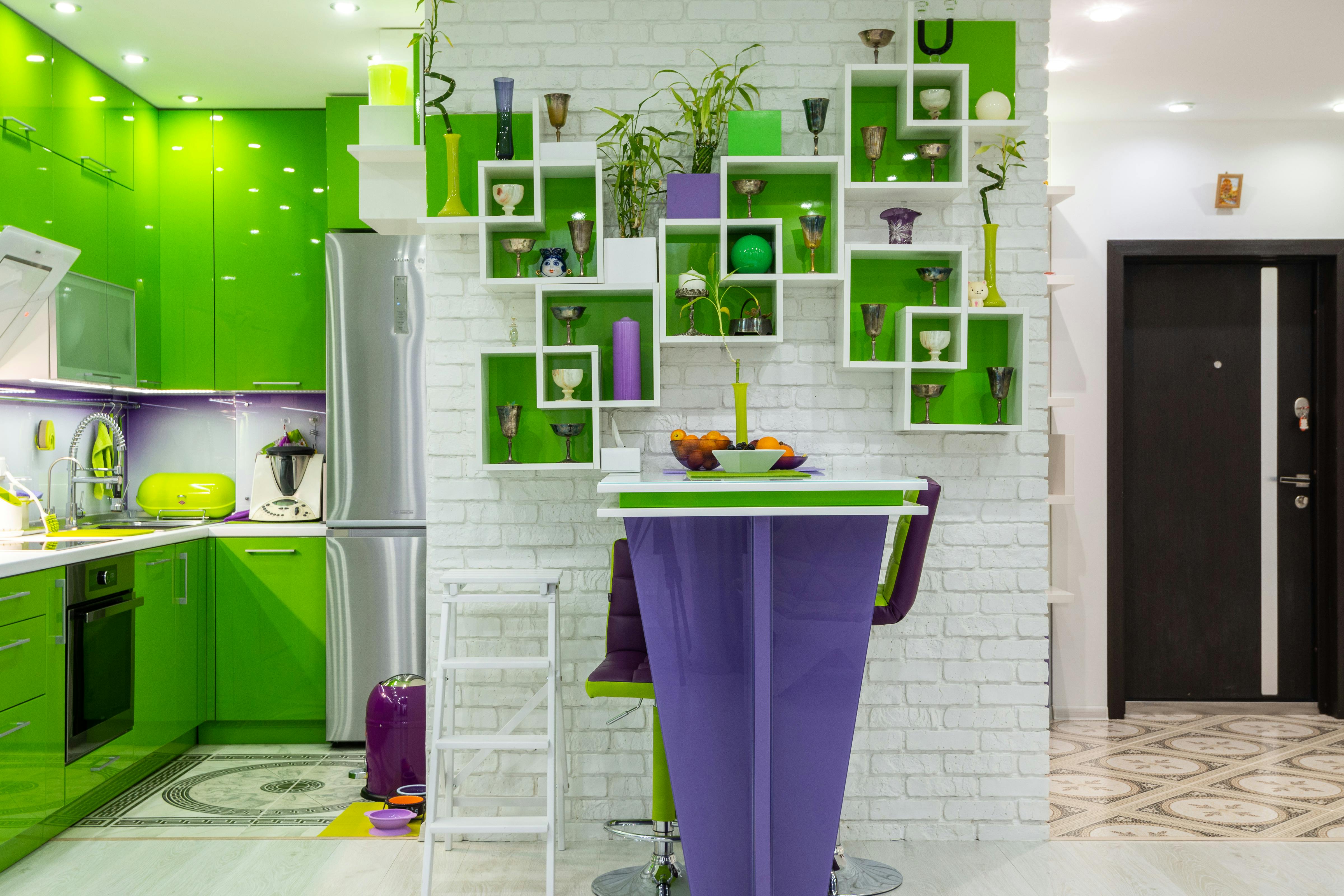
Green does not need to be surrounded by plants, beige and timber to feel coherent. Terracotta can sharpen olive, lavender can create a more unusual complementary tension, and cobalt can make a brighter green feel intentionally graphic. Keep one of those relationships dominant rather than collecting several novelty colors. A controlled non-botanical pairing is often more distinctive than repeating every expected natural cue.
Let Stainless Steel Stop Green Becoming Too Precious
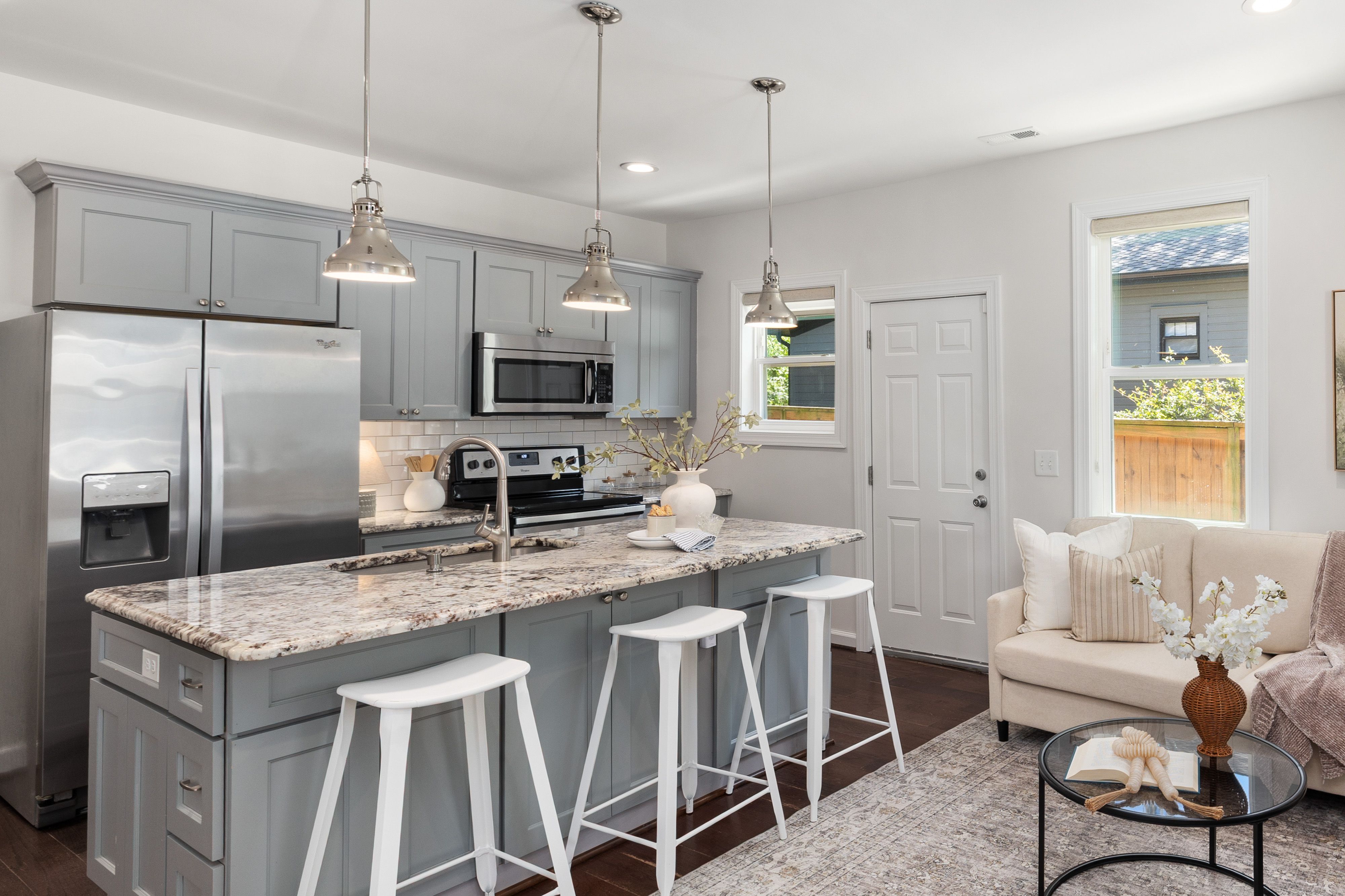
Visible stainless steel can be useful precisely because it introduces a cool, functional material that resists an overly styled green-and-brass scheme. Appliance fronts, a range or a sink can make sage feel more contemporary and forest green more utilitarian. There is no need to panel every appliance simply to preserve color continuity. Align the stainless elements carefully and let them act as deliberate equipment within the composition.
Reduce Visual Noise When the Cabinet Color Already Has Personality
Green cabinetry already supplies a strong visual identity, so open storage and display need more discipline, not more decoration. Let closed storage absorb packaging and occasional equipment, then keep a small number of functional objects visible where they are genuinely used. This is especially important with saturated or deep green, which can turn every shelf into a high-contrast backdrop. The color needs breathing room to remain the main idea.