Let the Cabinetry Support Daily Life
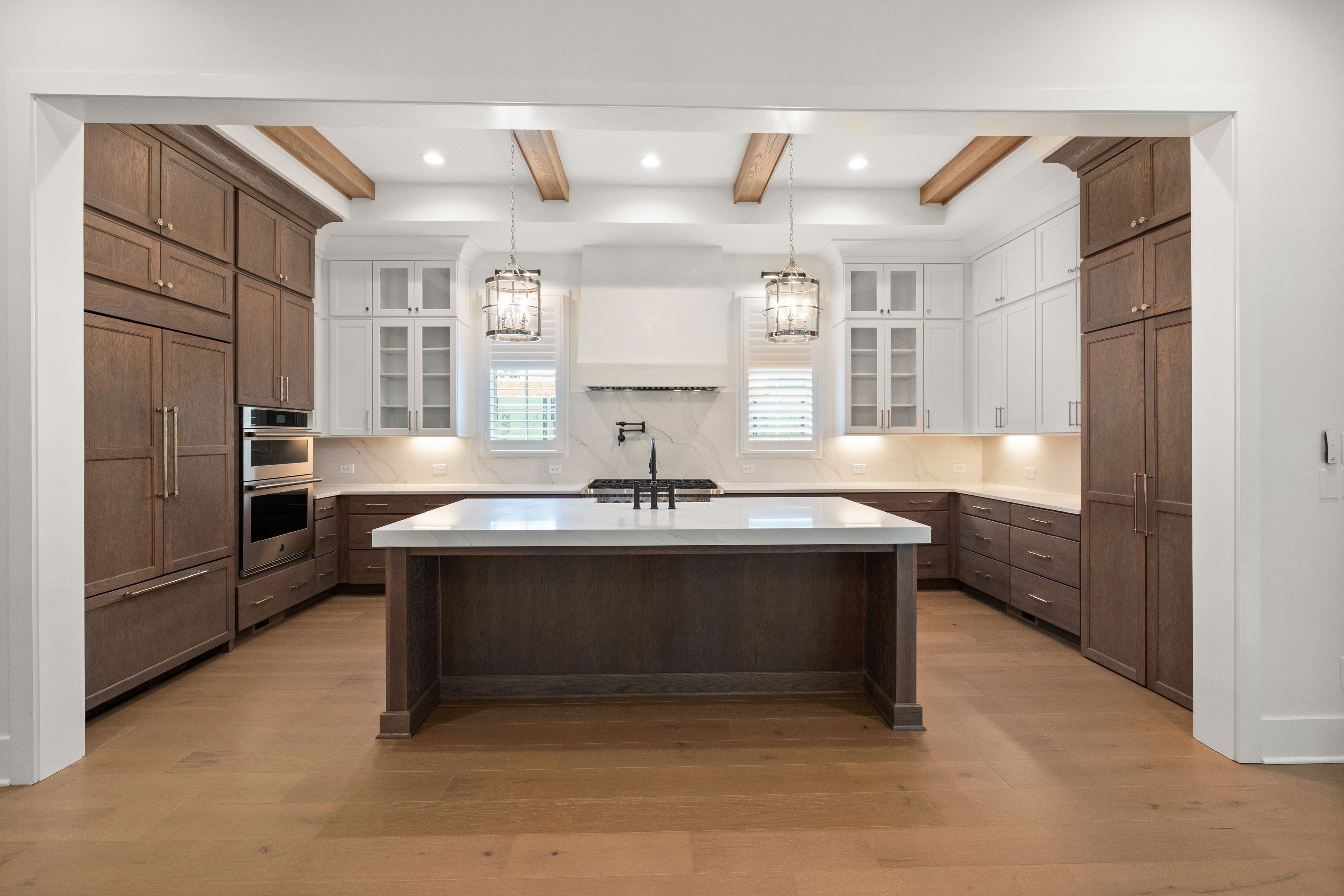
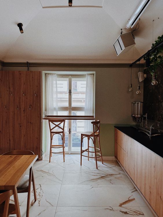
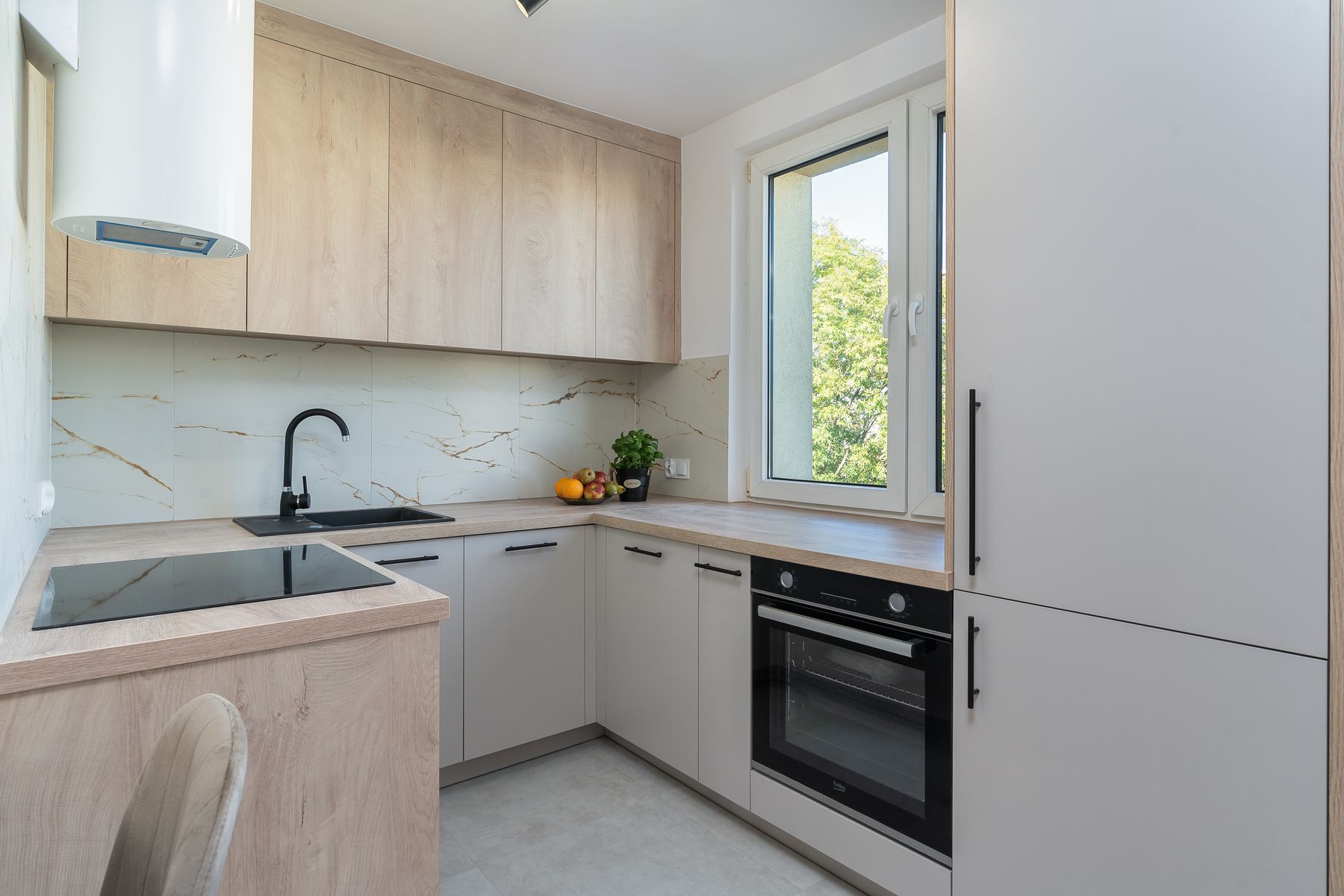
Cabinet fronts should create a calm background for a room that may also contain a table, visible utensils and ordinary family routines. Simple slabs or modest framed doors can both work when the main elevation stays coherent. The point is not to erase every handle or object but to keep fitted storage from becoming the loudest thing in the room.
Choose Timber for Use and Age, Not Just Pale Color
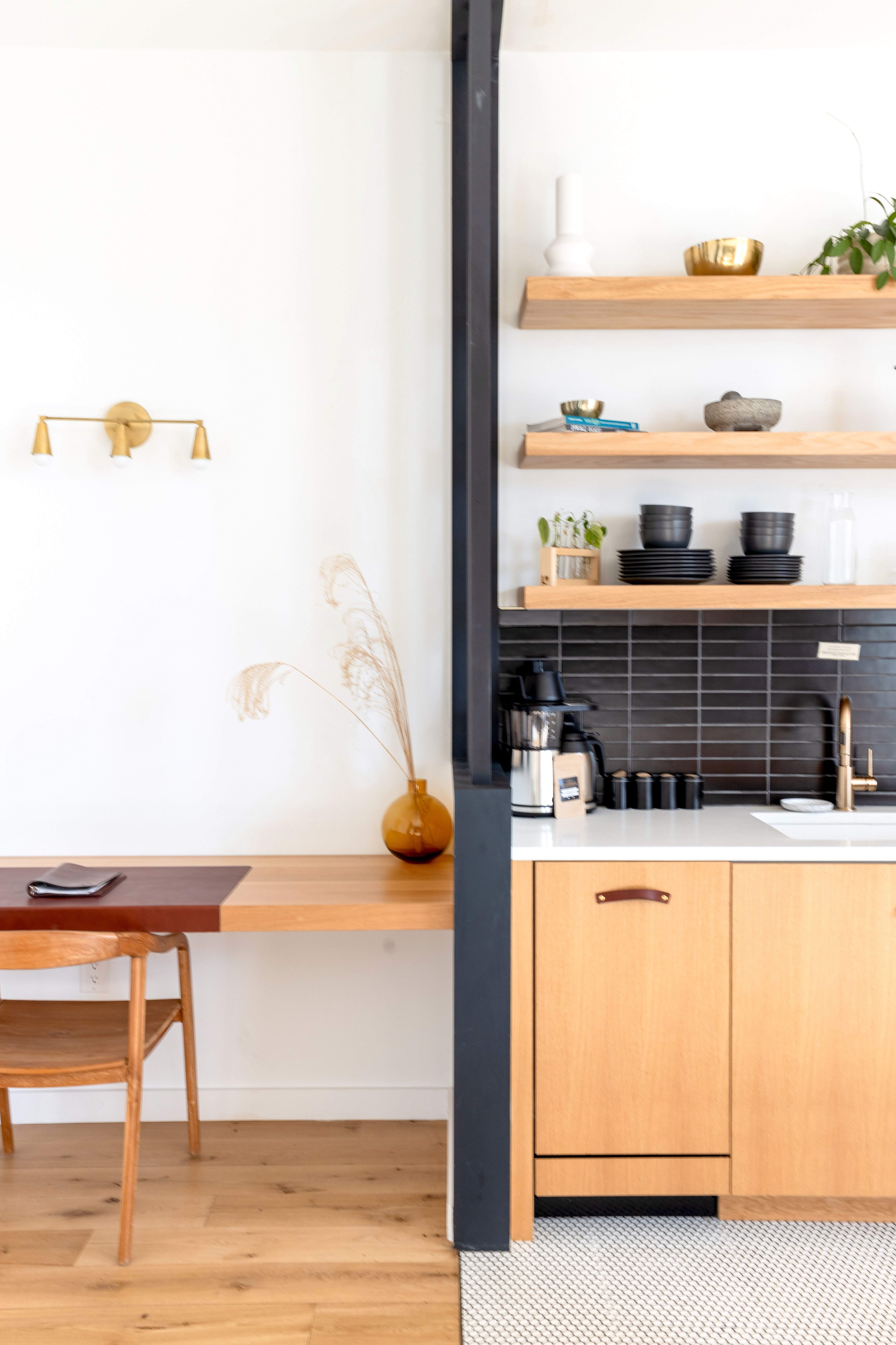
Pale oak is familiar, but the stronger Scandinavian idea is honest timber that can show grain, wear and repair without becoming precious. Use wood where touch and daily use justify it: a table, cabinet front, shelf or floor. Slight variation between pieces can make the room feel collected rather than showroom-matched.
Design Storage Around the Daily Reset
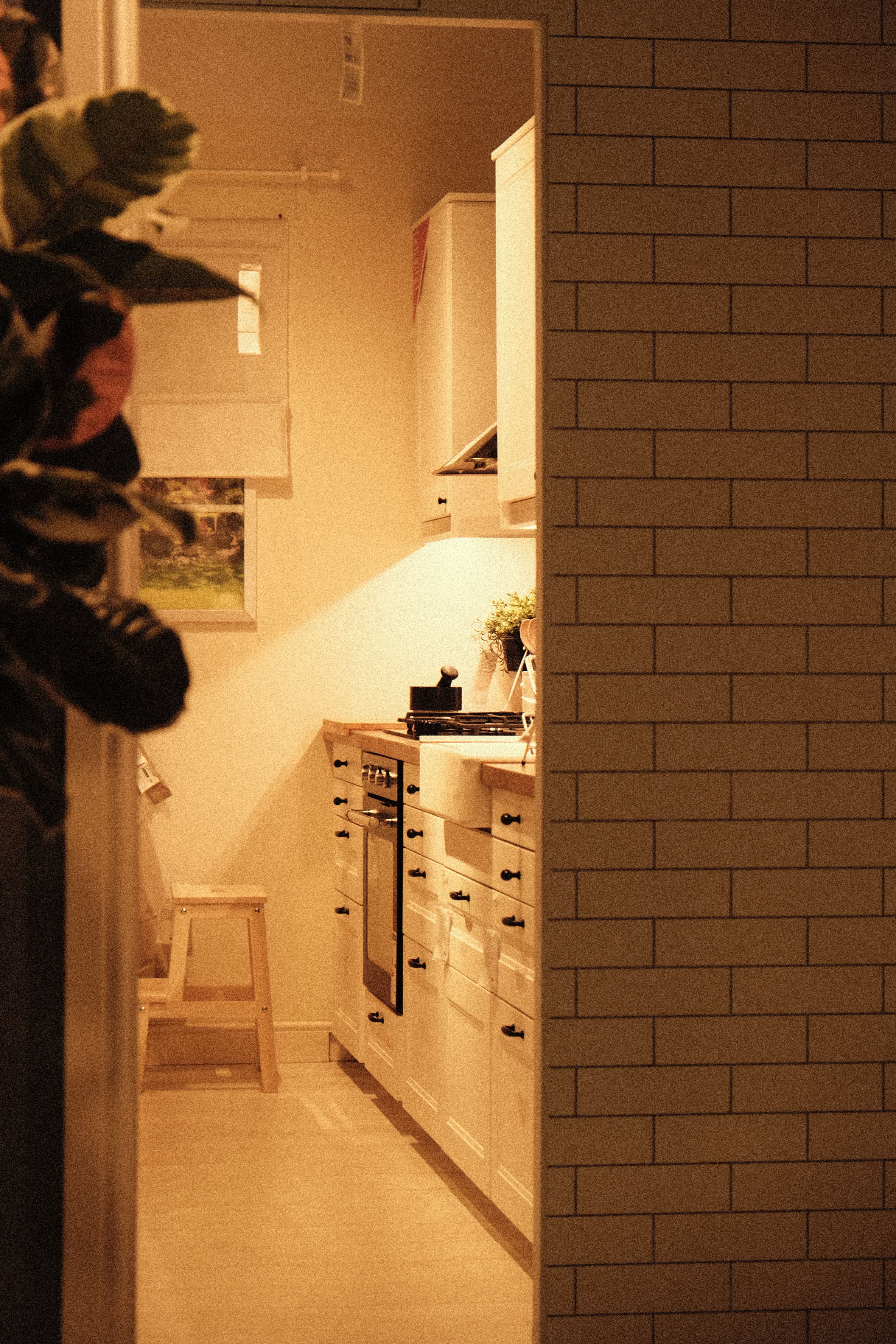
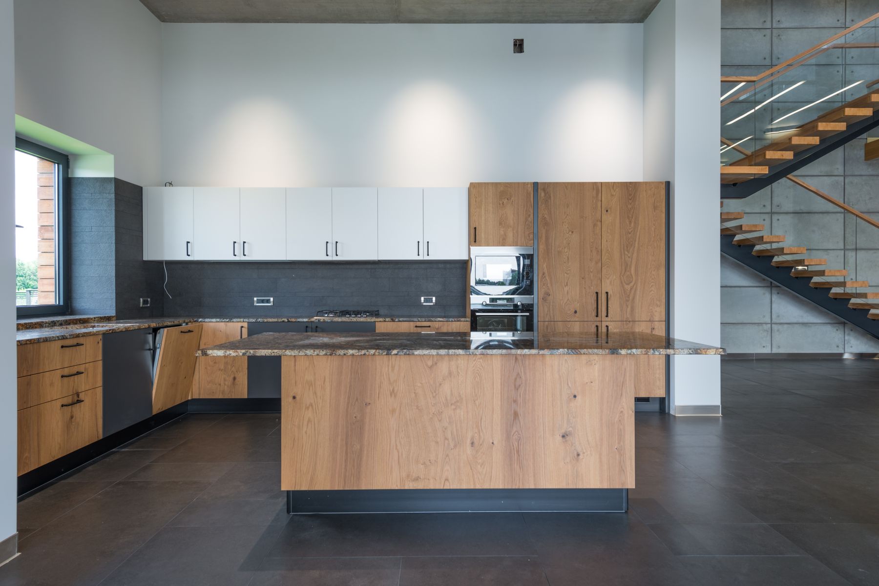
Storage should follow the way the household actually cooks and clears away. Keep cups near the morning routine, pans near cooking and packaging behind closed doors, while a few frequently used objects may remain visible. The goal is a fast, intuitive reset rather than a perfectly hidden kitchen that is inconvenient to use.
Build Several Small Pools of Useful Light
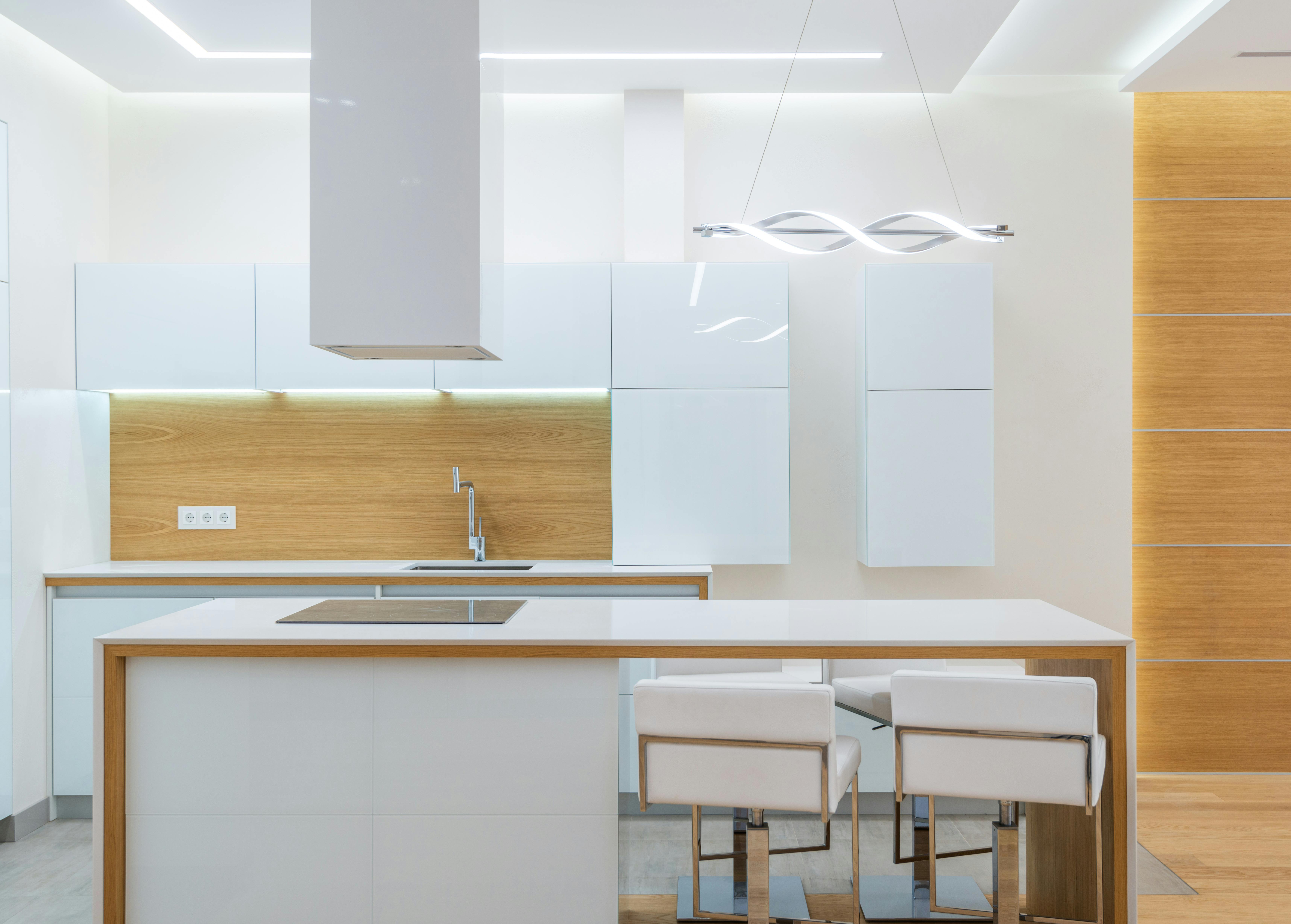
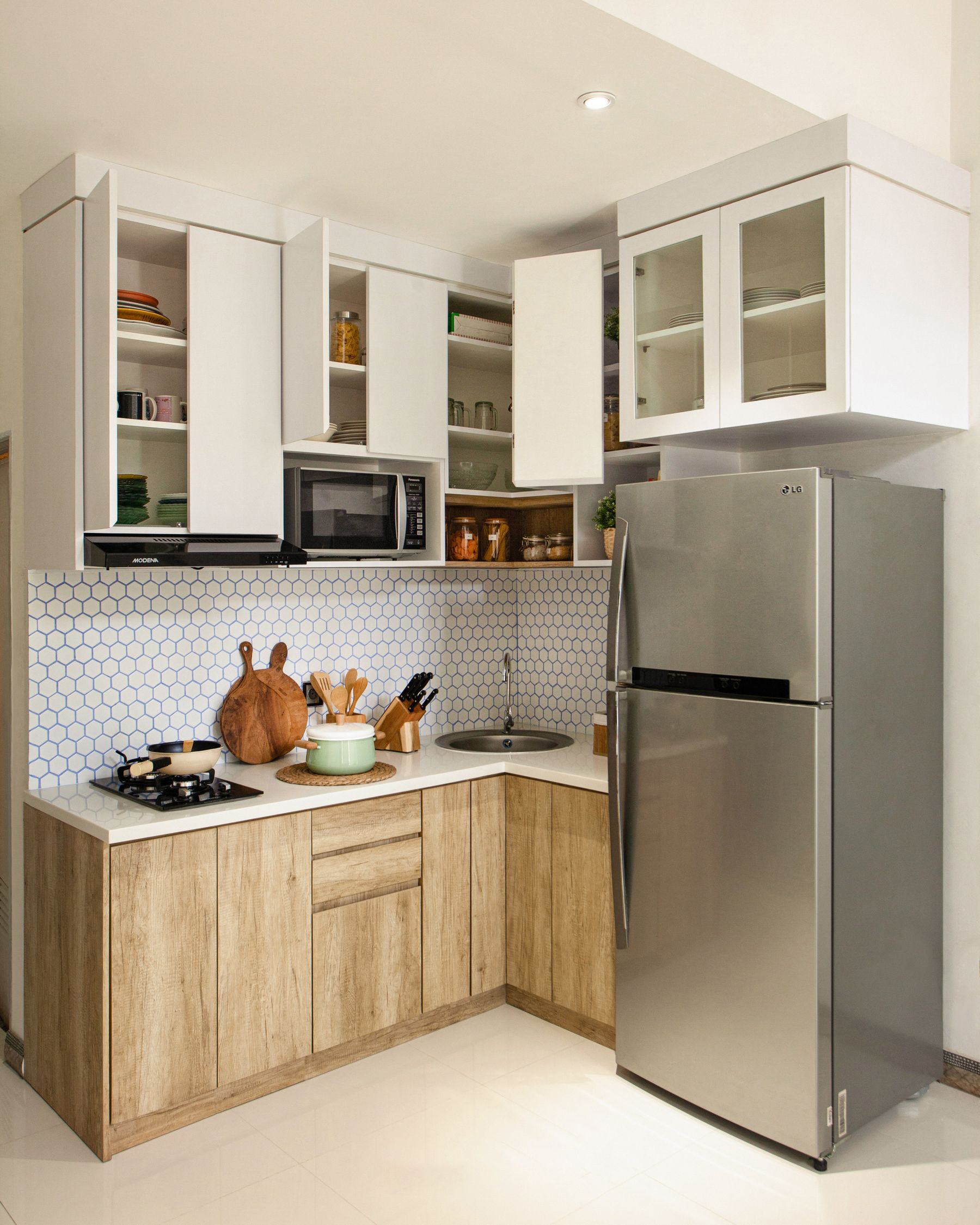
One decorative pendant does not create comfort on its own. Task light at the counter, a well-scaled fitting over the table and a softer evening source can make different parts of the kitchen usable without flooding the whole room with one harsh layer. Keep the fixtures visually simple if the materials and daily objects already provide character.
Let Useful Objects Show Evidence of Life
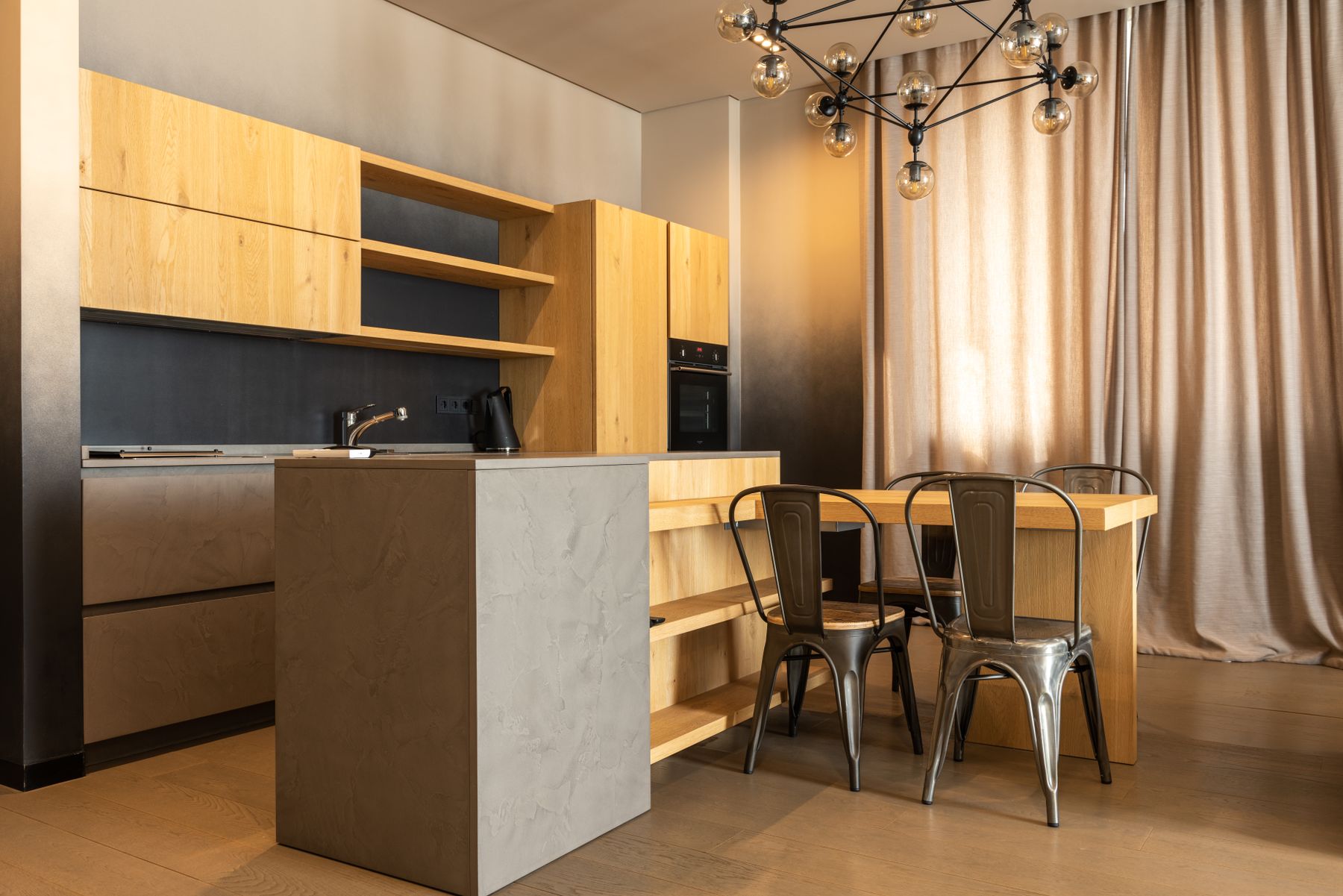
A Scandinavian kitchen does not need to hide every cup, bowl or pan. Visible objects can make the room feel inhabited when they are genuinely used and grouped by function. The distinction is between useful presence and decorative accumulation. One short shelf of everyday ceramics can carry more character than several styled shelves full of objects chosen only for display.
Use Muted Color as Part of the Room, Not an Accent Quota
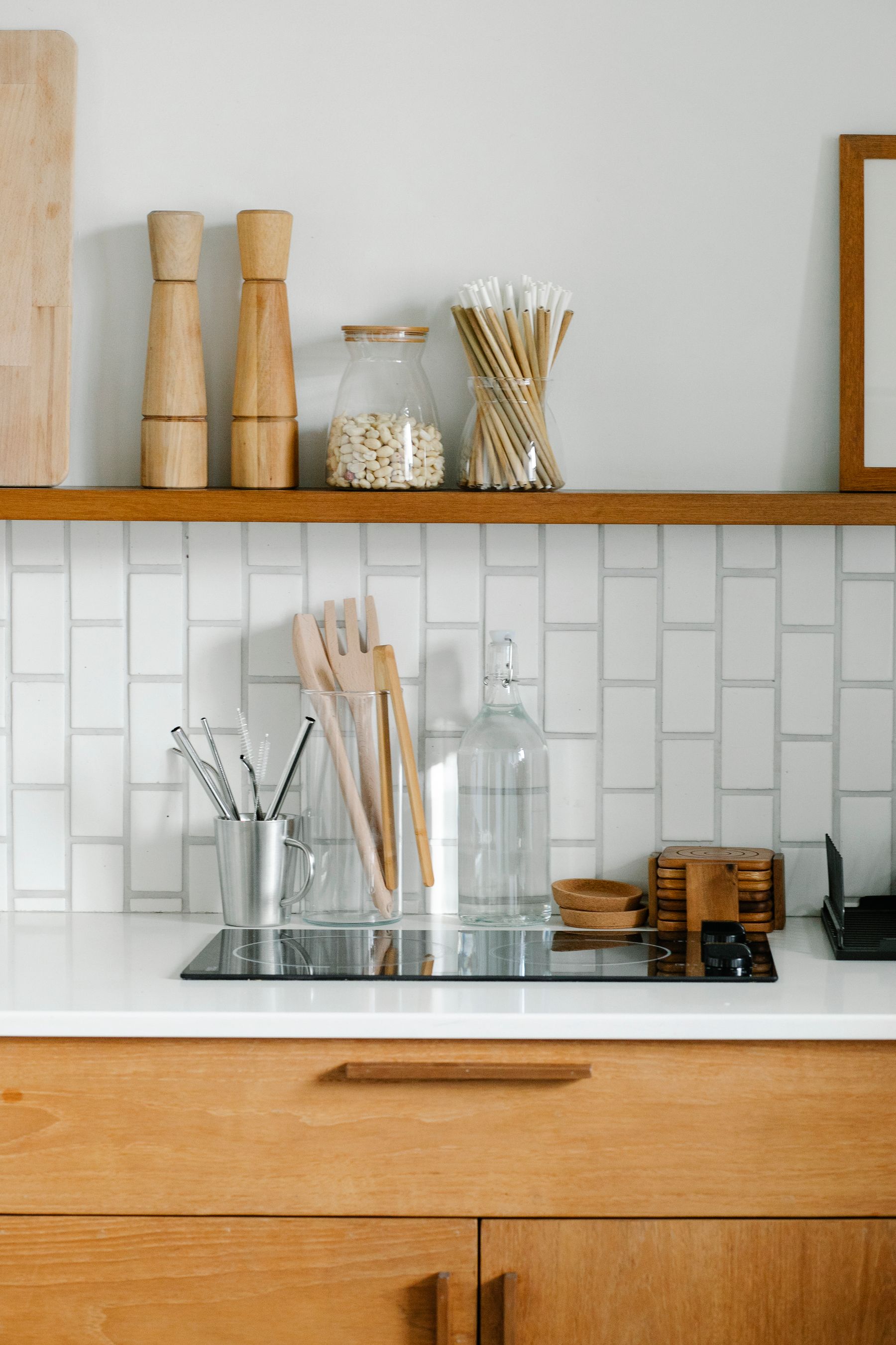
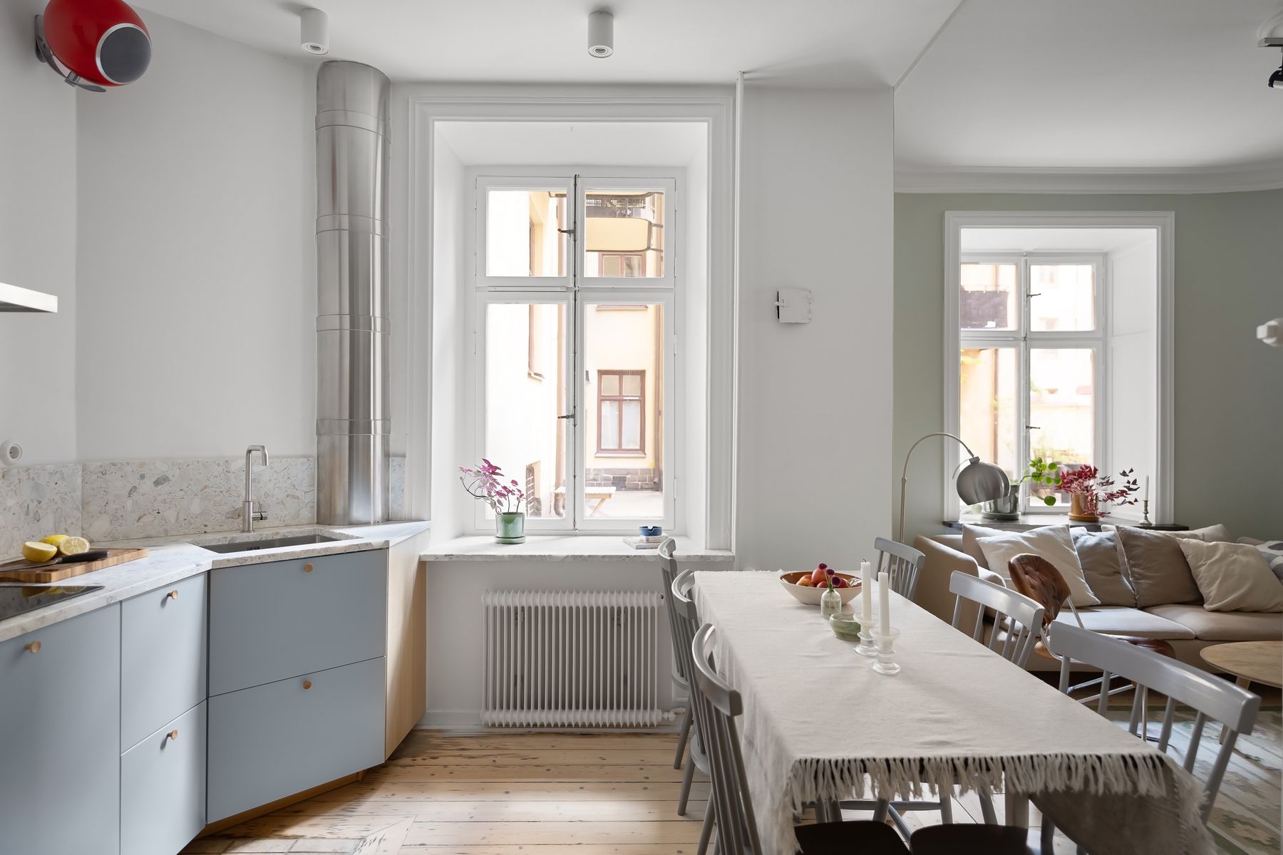
Soft green, blue-grey, ochre or another restrained color can belong on cabinetry, a curtain or dining furniture when it improves the composition. There is no requirement to keep the room white, and there is no need to repeat the color in every accessory. Let it appear at a meaningful scale, then allow timber and light surfaces to connect the rest.
Treat the Table as Social Infrastructure
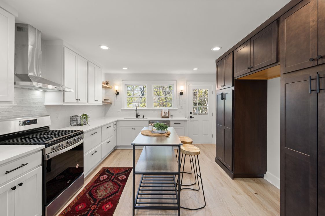
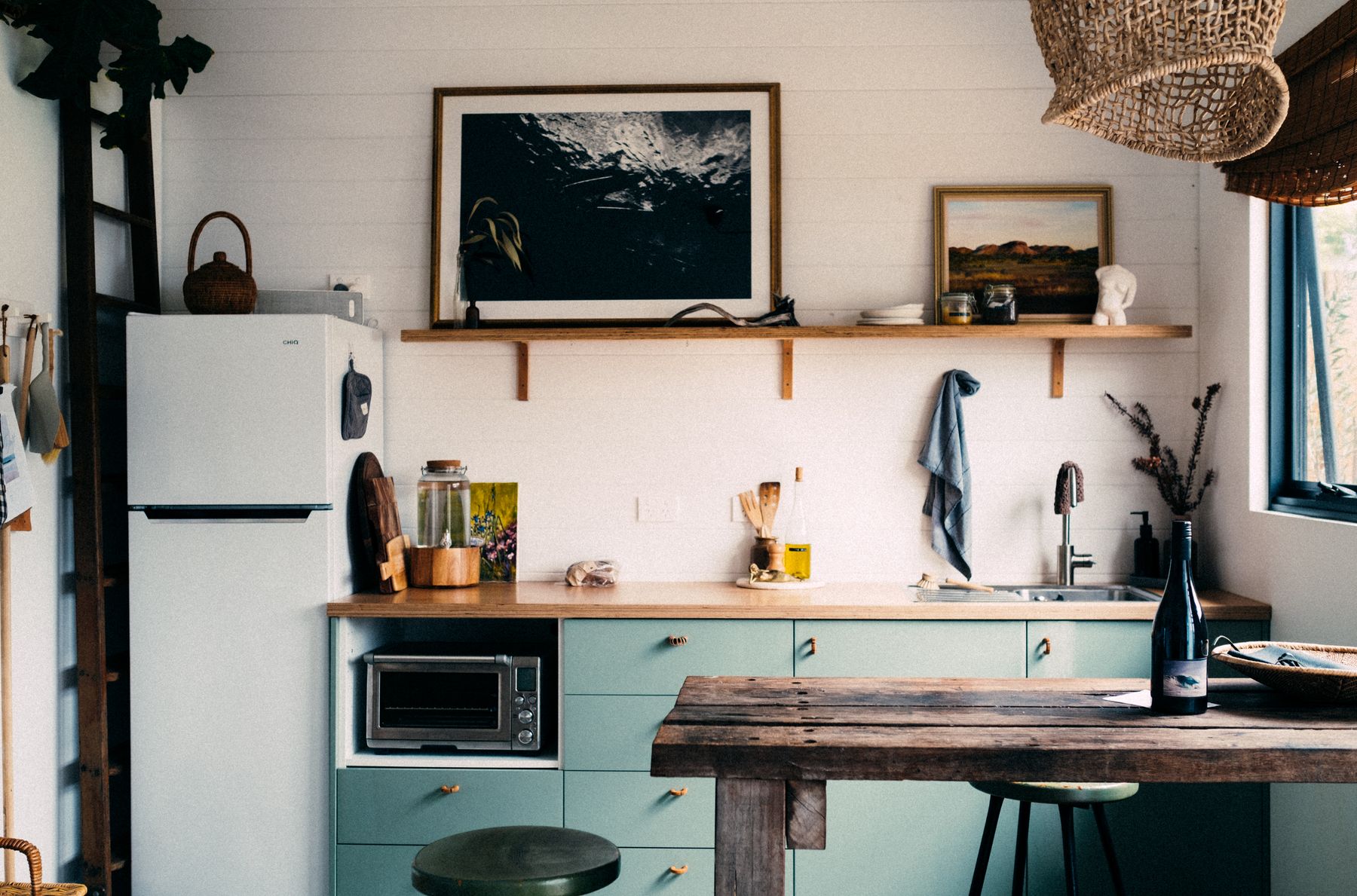
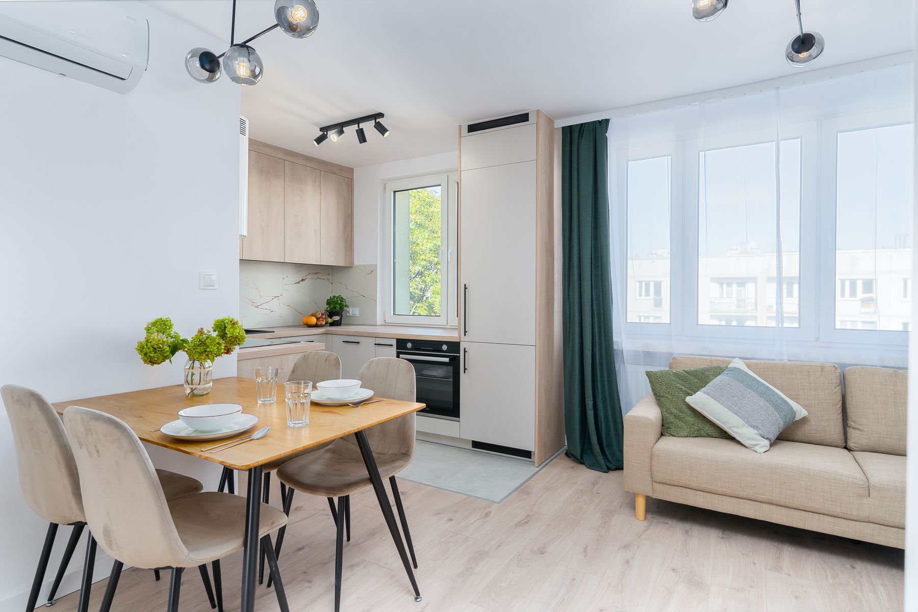
A dining table or compact eating spot can be more central to a Scandinavian kitchen than an oversized island. It creates a place for meals, homework, conversation and preparation while remaining visually lighter and easier to move around. Choose the table by the room's actual routines and leave enough clearance for chairs to work without blocking the kitchen route.
Protect Daylight Before Whitening the Room
Pale finishes can help a room feel light, but they cannot replace clear access to the window. Keep tall storage and dense display away from the strongest daylight where possible, then use timber, textiles and modest texture to prevent the room becoming stark. Brightness should come from planning and light distribution, not an all-white rule.
Use Dark Contrast Only Where It Clarifies
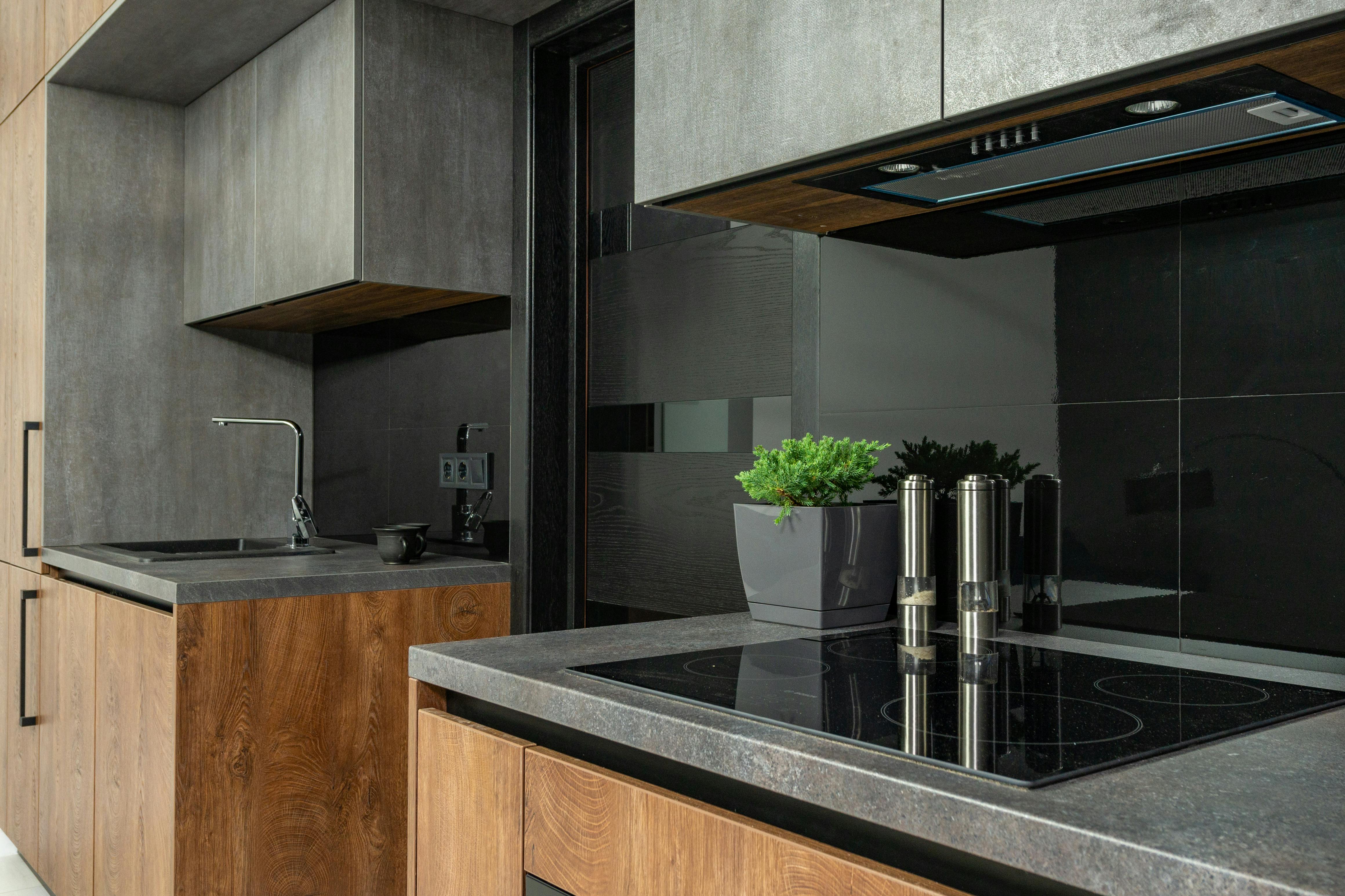
A faucet, chair, pendant or worktop edge can give pale materials definition, but outlining every surface in black quickly turns the scheme graphic. Use a dark value where it helps a boundary or object read clearly and allow the rest of the room to remain softer. One well-placed anchor is enough.
Let One Older or Moveable Piece Break the Matching Set
Scandinavian interiors often feel more human when the fitted kitchen is not the only source of character. A dining table, chair, cabinet or shelf that can move, age or be repaired gives the room a different time scale from the joinery. It does not need to match the kitchen timber exactly; a related tone and compatible weight are enough.