Give the Dominant Wood One Clear Role
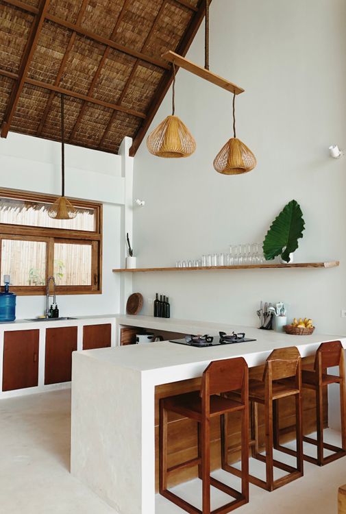
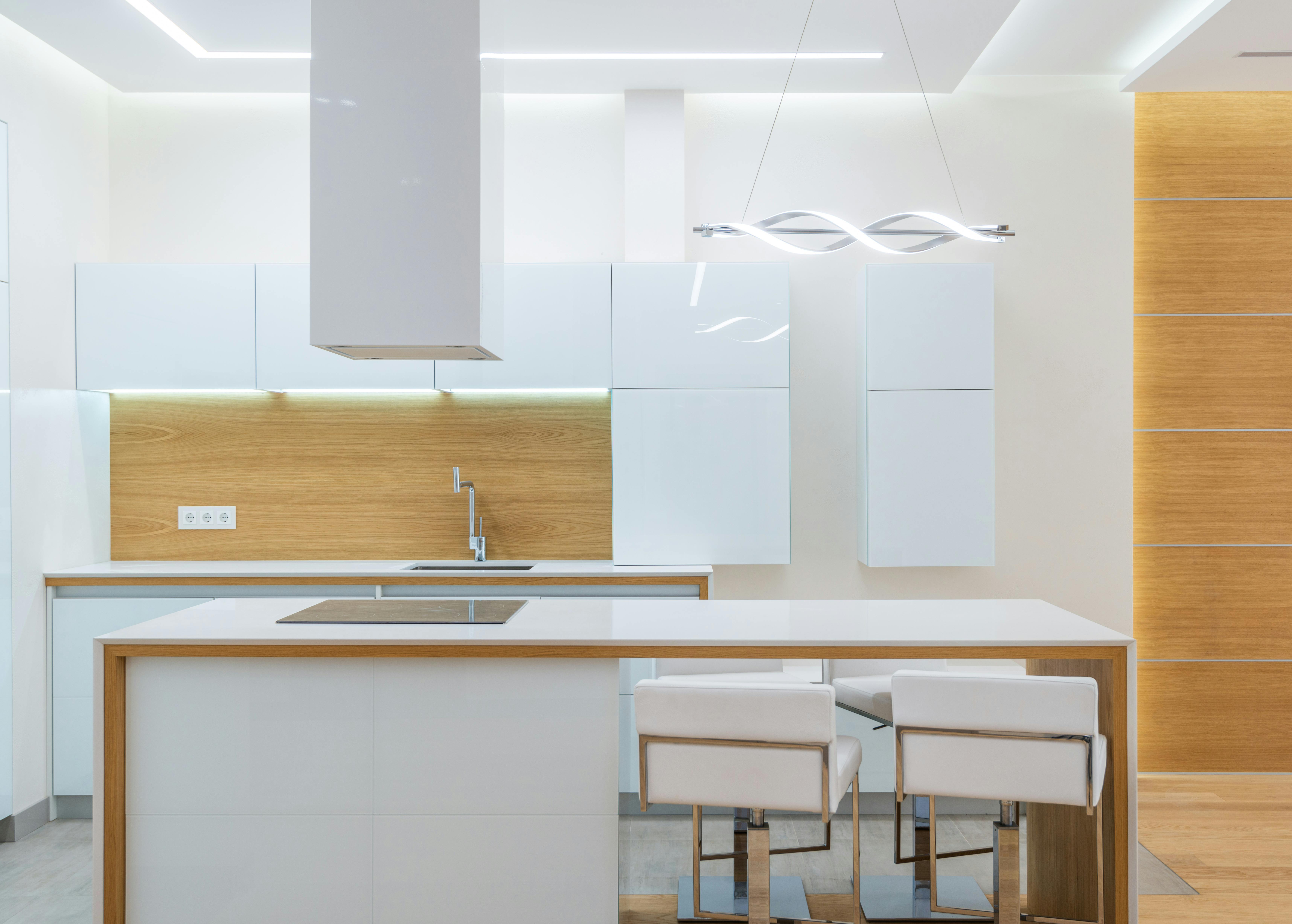
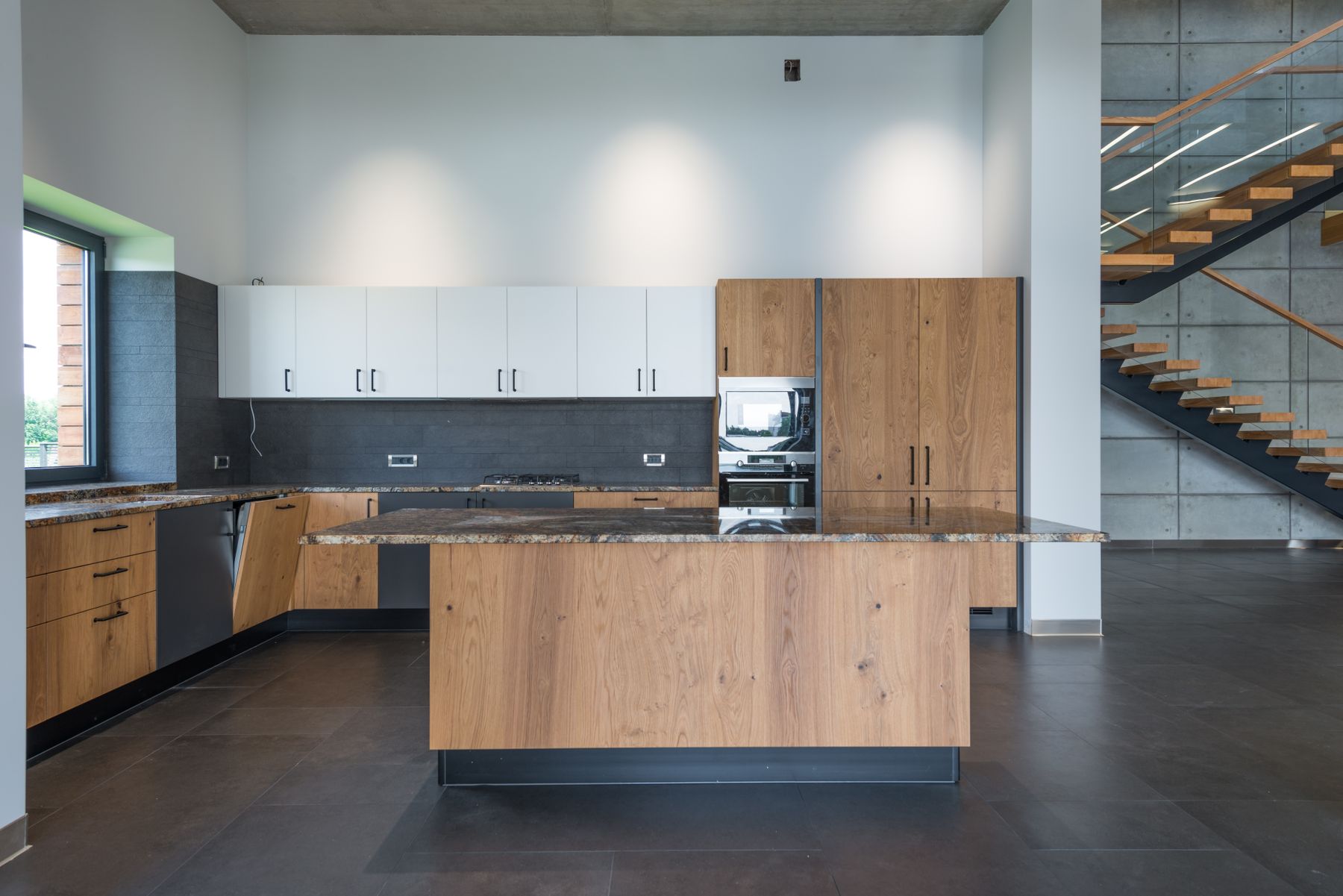
Wood often carries the warmth of a Japandi kitchen, but it should not automatically cover floor, cabinets, shelves and furniture in one matching finish. Choose the dominant timber first and decide what it is doing: forming the cabinet mass, grounding the island or anchoring the dining area. Once that role is strong enough, secondary wood can remain quieter.
When Joinery Becomes Quiet Enough for Materials to Lead
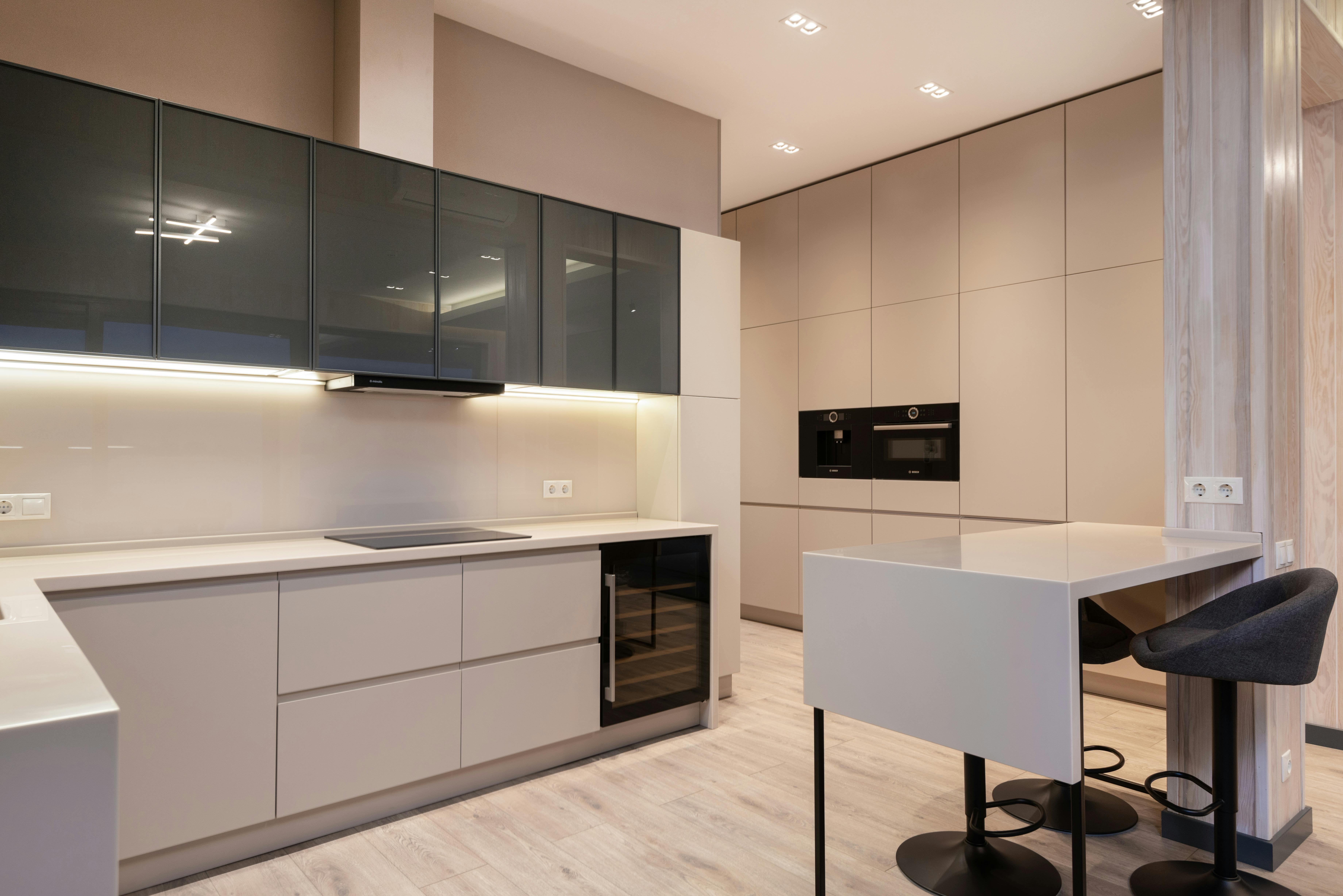
Simple cabinet lines allow grain, stone and proportion to become more visible. Flat fronts are one route, but modest framing or practical hardware can still work when the elevation remains calm. The aim is not to imitate a specific national style through door details; it is to prevent joinery from competing with the material hierarchy.
Active Grain Against a Quiet Mineral Plane
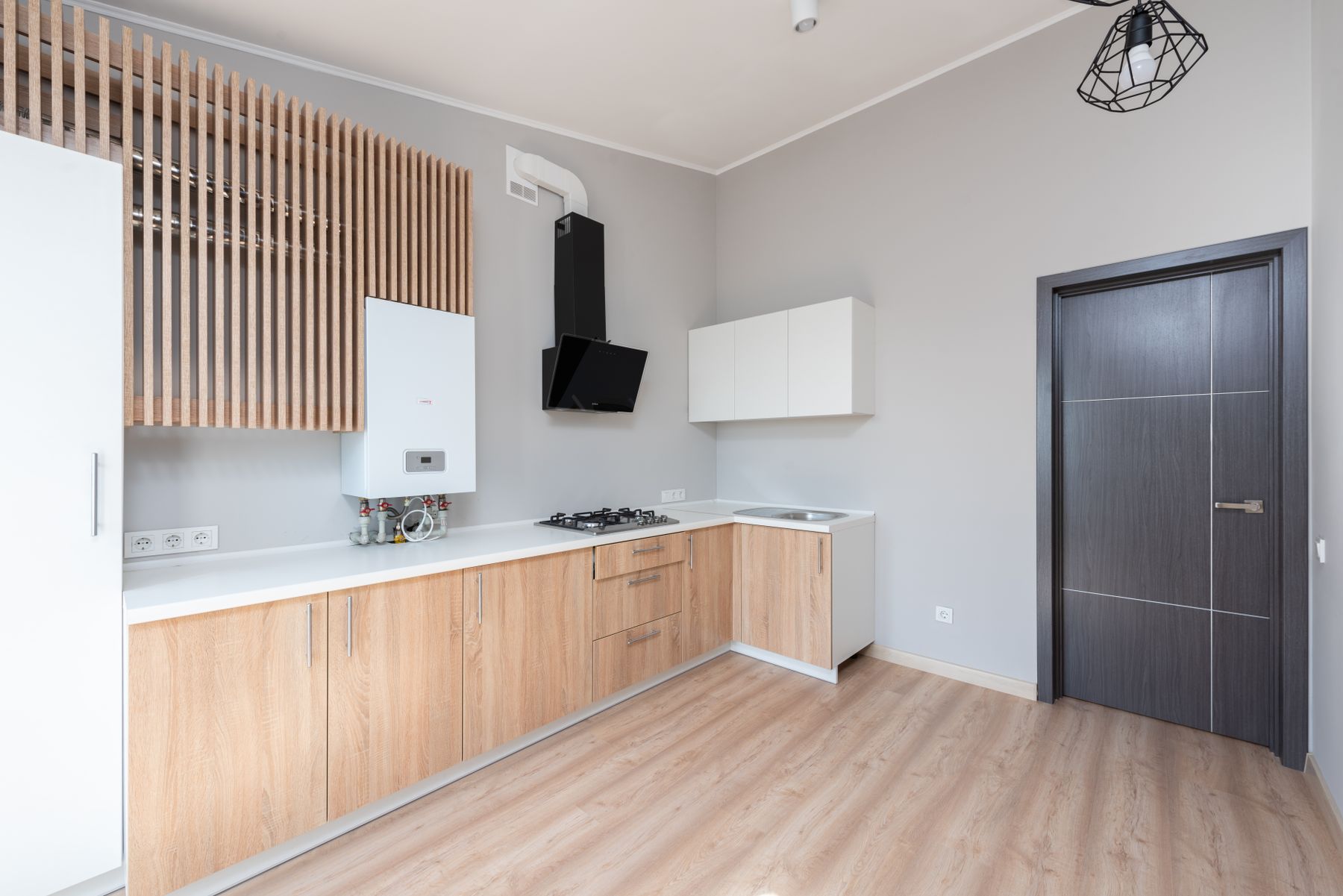
When timber already has strong grain, the worktop can provide visual rest through fine mineral texture, restrained mottling or a calm solid value. If the stone is highly expressive, reduce the wood movement instead. Japandi benefits from one tactile surface leading at a time rather than several natural materials competing to look handcrafted.

One Dark Anchor Sets the Value Hierarchy
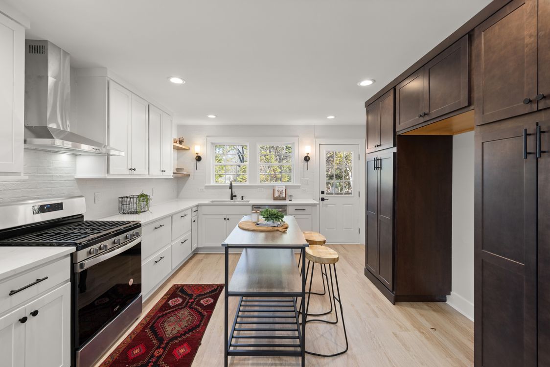
Charcoal, black or deep brown can give pale timber and mineral surfaces a clear point of contrast. Concentrate the dark value in one useful role—a faucet, lower cabinet zone, appliance group or dining chair set—rather than outlining every object. The anchor should help the eye understand the composition, not become a repeated graphic motif.
Counter Space as Working Restraint
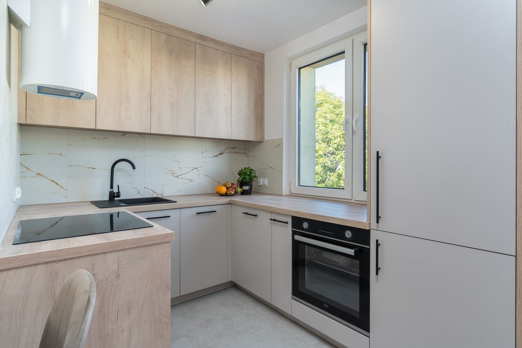
A calm counter should still support tea, coffee, chopping and ordinary cooking. Group the few objects that genuinely belong there and give each group a clear boundary, leaving another stretch free for work. The purpose of empty counter is not visual purity; it is to let material and routine coexist without constant rearranging.
Tactile Objects Must Earn Their Place Through Use
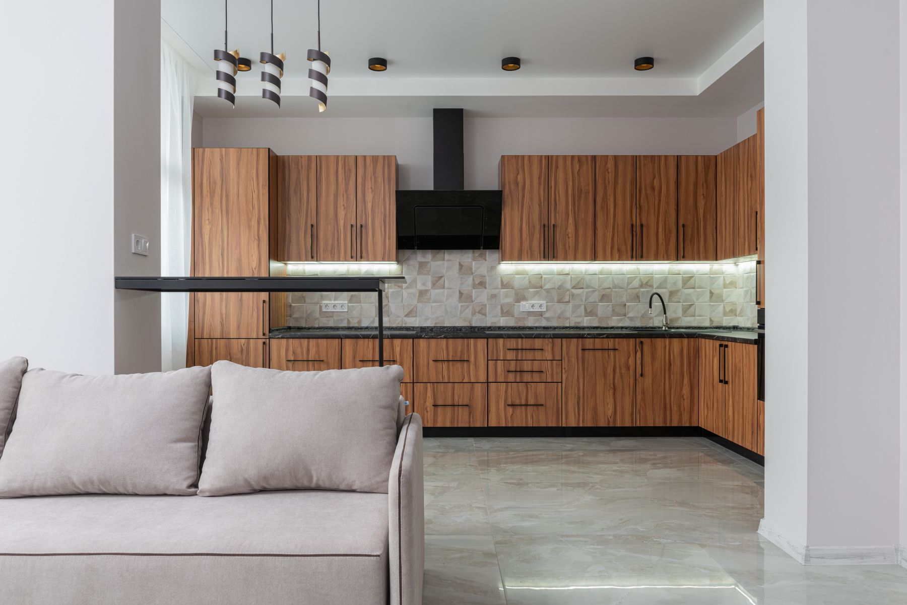
Ceramics, wood tools and vessels can add shape and texture, but they should not function as proof of the style. Prefer objects that are used, handled or filled regularly, and let variation in form or glaze provide enough character. A few useful pieces with breathing room feel more consistent with the hybrid than a shelf of decorative craft objects.
Open Storage as a Single Gesture
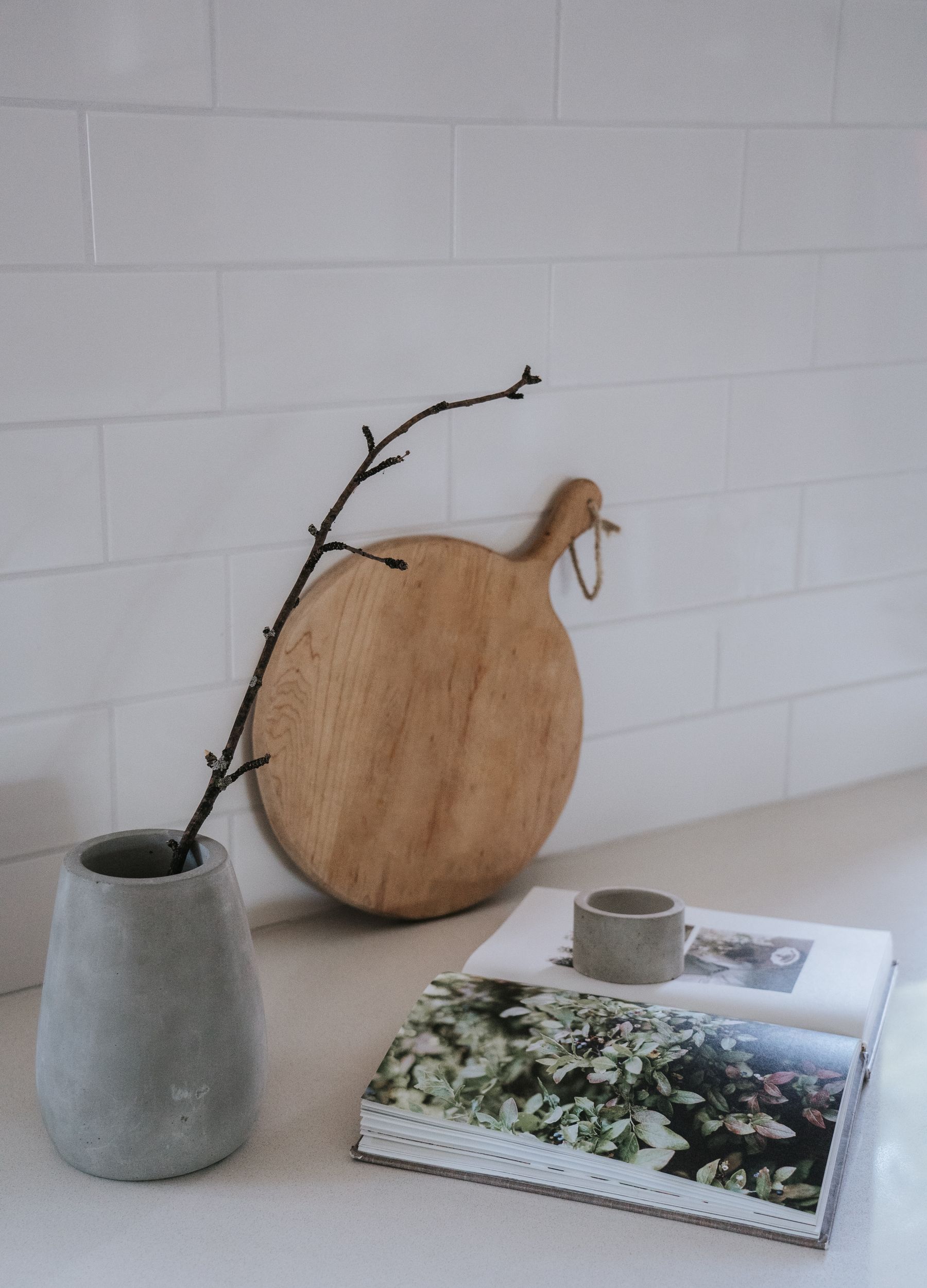
One short shelf or niche can hold a stable daily category while closed storage handles packaging and occasional equipment. A full wall of display quickly turns restraint into curation work. Keep the open element proportionate to the room and stop when the useful category has a home.
Where Scandinavian Comfort Corrects Excessive Restraint
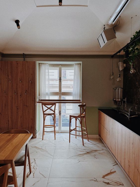
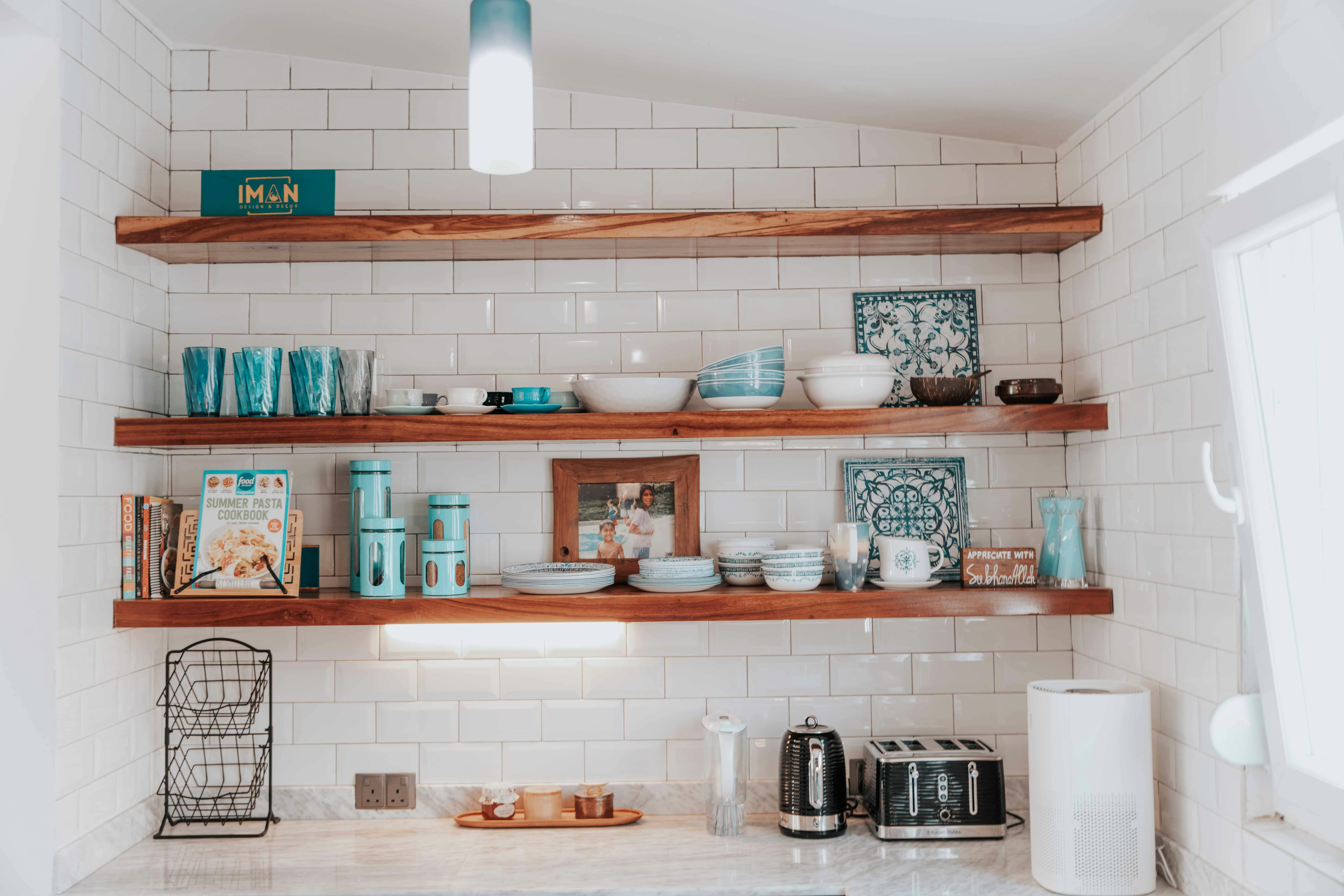
The Scandinavian side of Japandi matters most where the body meets the room. Comfortable stools, a supportive dining chair or a rounded table edge can keep the kitchen from becoming a composition that is beautiful but unfriendly to use. Choose ergonomics and durable textiles before pursuing a low or sculptural silhouette for its own sake.
Light Should Reveal Material, Not Whiten the Room
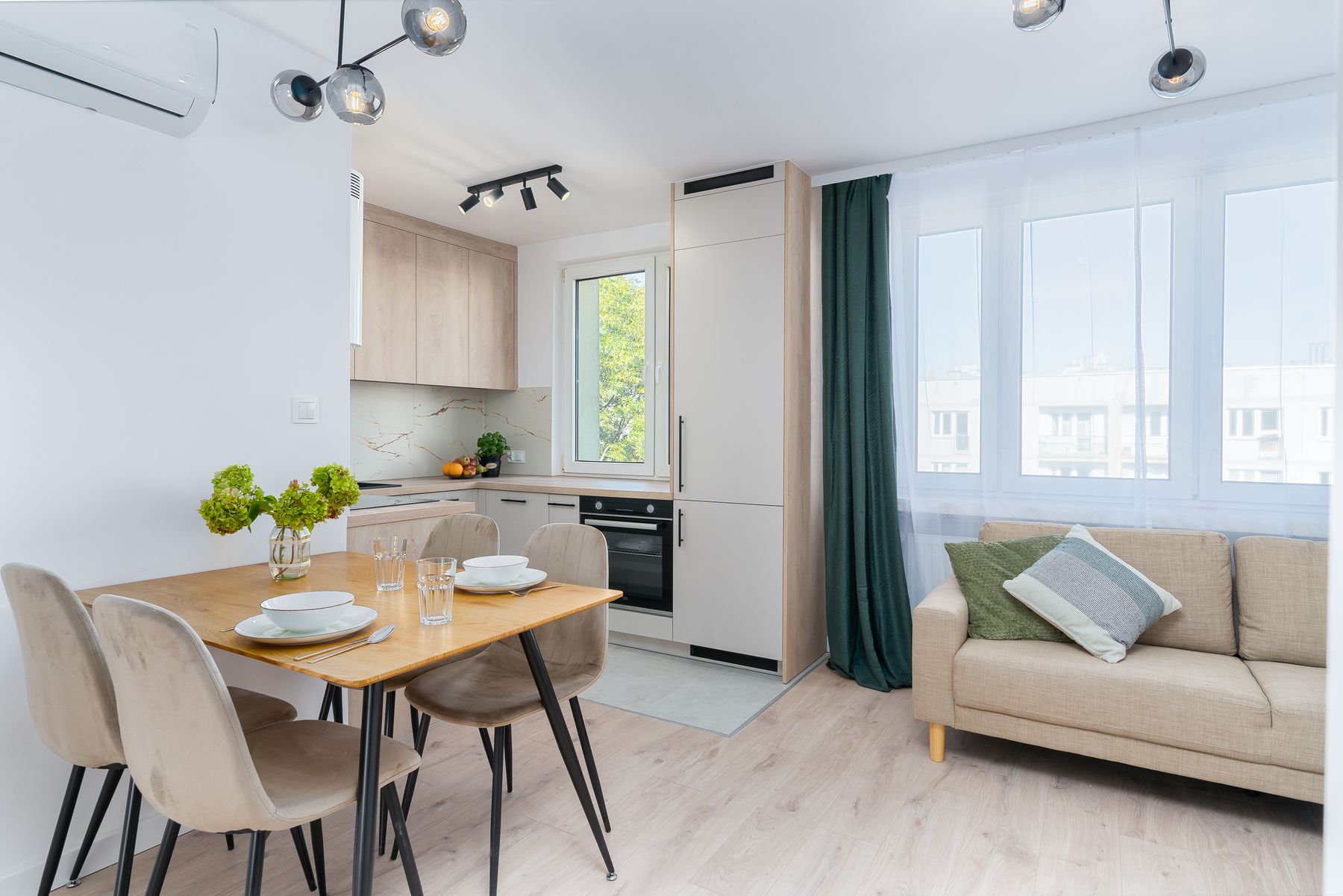
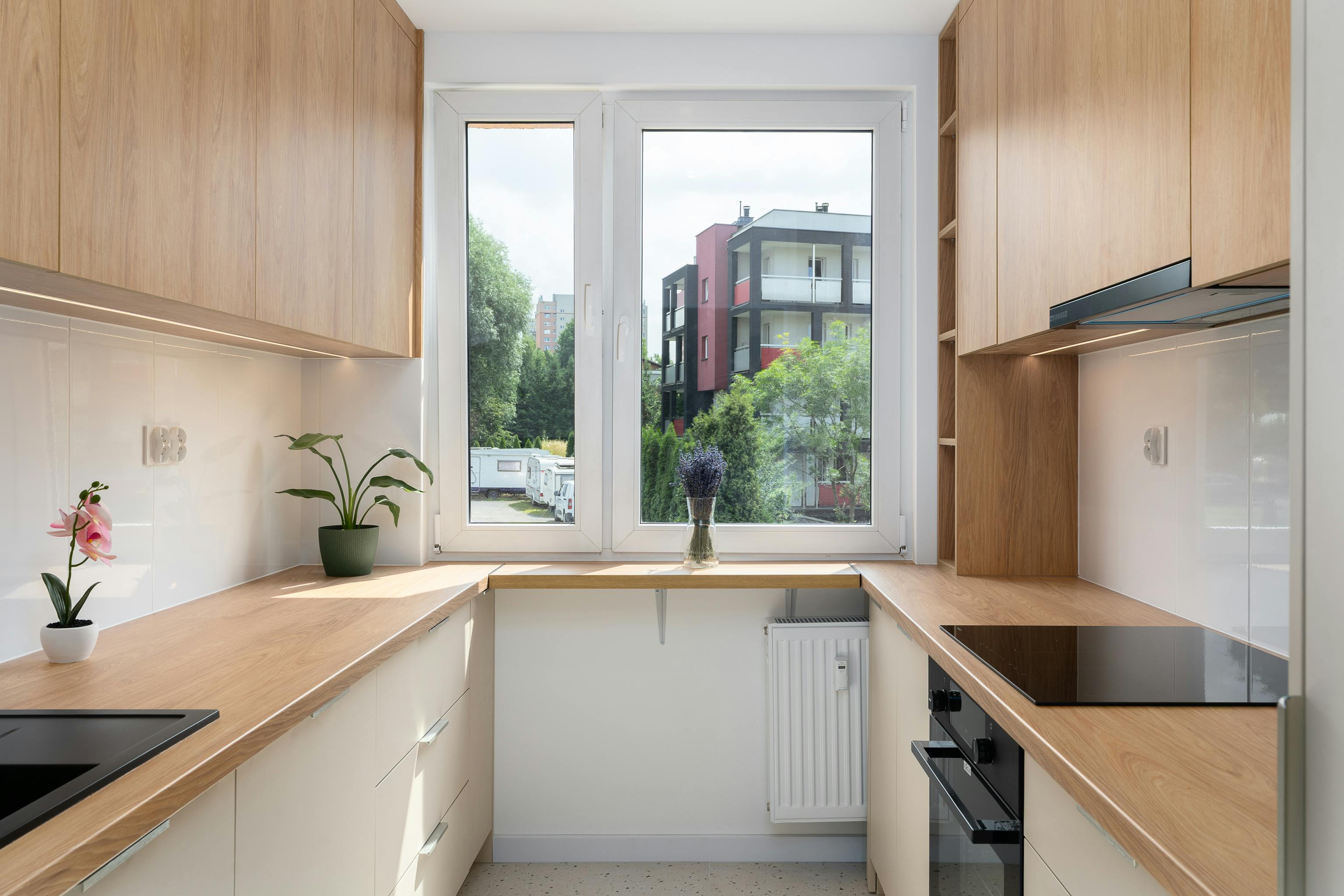
Daylight gives timber grain, matte stone and plaster enough variation that fewer decorative layers are needed. Protect the strongest window area where practical, but do not assume every surface needs to become pale. At night, lower and warmer task or ambient sources can preserve the same tactile hierarchy without flooding the room uniformly.
Finish With a Three-View Edit
Japandi restraint is easiest to judge from the main entrance, the working position and the seated dining position. From each view, identify the dominant material, the dark anchor and the area of visual rest. If every view introduces a new focal object, shelf or symbol, the room is carrying too much. Stop editing when the hierarchy is clear from all three positions.