Decide Where the Backsplash Ends
A backsplash can stop beneath upper cabinets, rise to a shelf or continue across a larger feature wall. The right extent depends on splashes, wall geometry and how cabinet runs terminate. Draw the end points around windows, range hood and exposed wall before ordering tile. An arbitrary strip that stops halfway across a visible wall can look less resolved than a smaller, carefully bounded field.
Use White Tile for a Working Rhythm
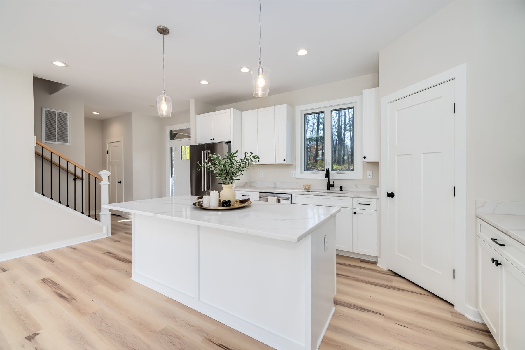
White tile does not have to disappear. Size, joint spacing, finish and grout create a rhythm behind the counter, while wood cabinets or open shelves supply warmth. Compare the tile's undertone with the actual sink, counter and paint so the whites do not clash. A more reflective surface may brighten the work area but can also reveal glare from under-cabinet lights.
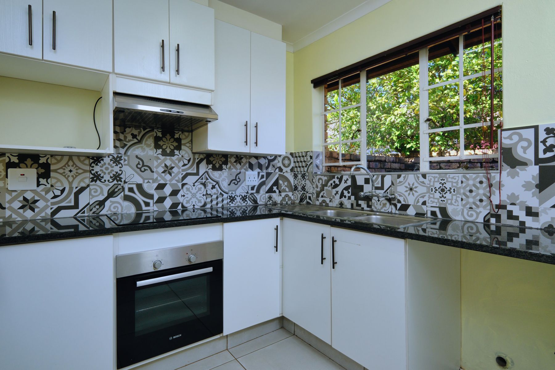
Let Pattern Be the Focal Point
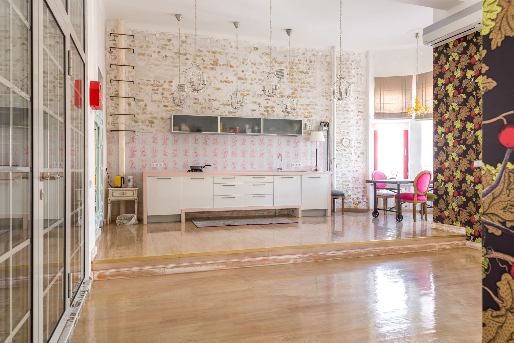
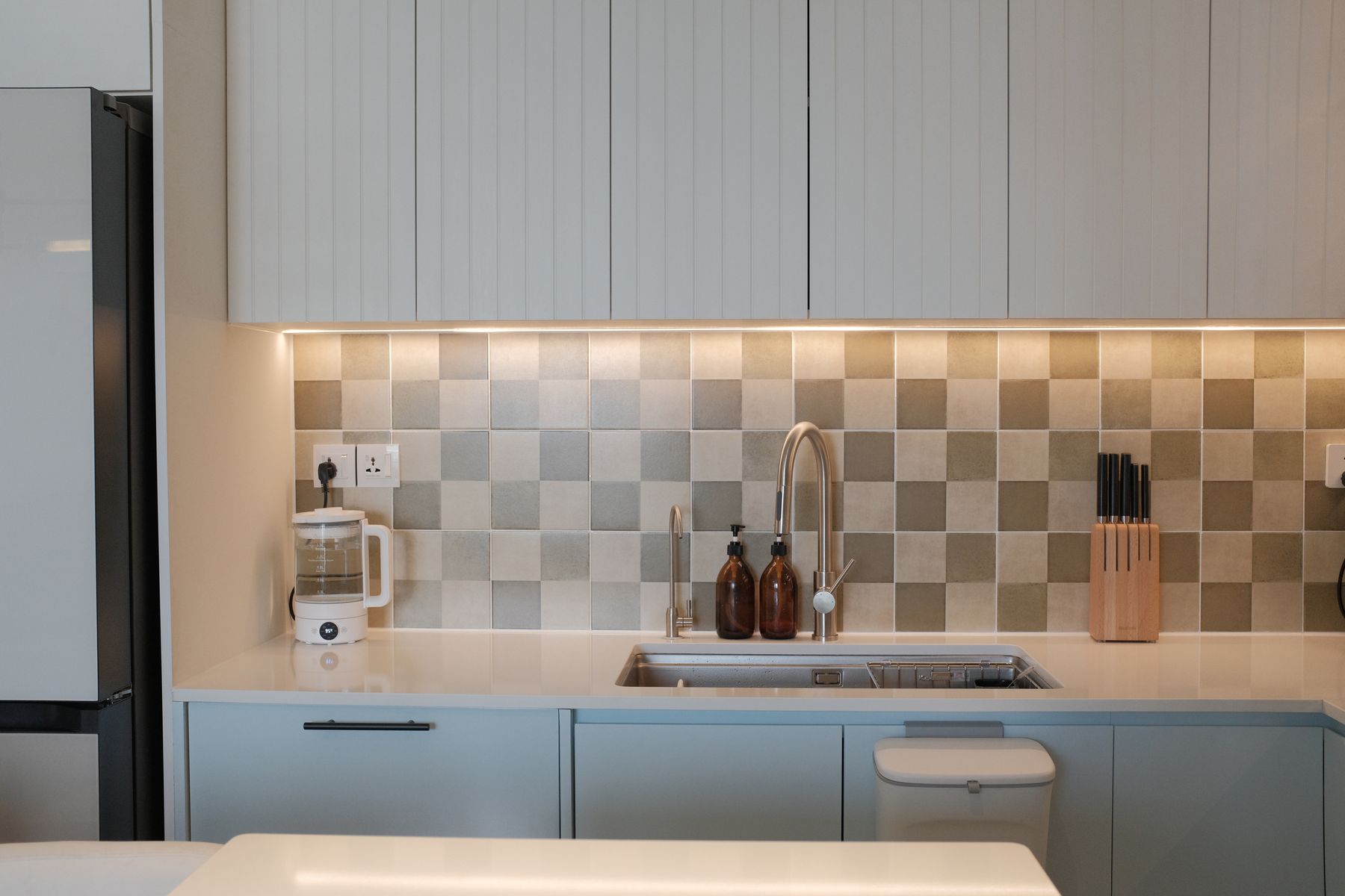
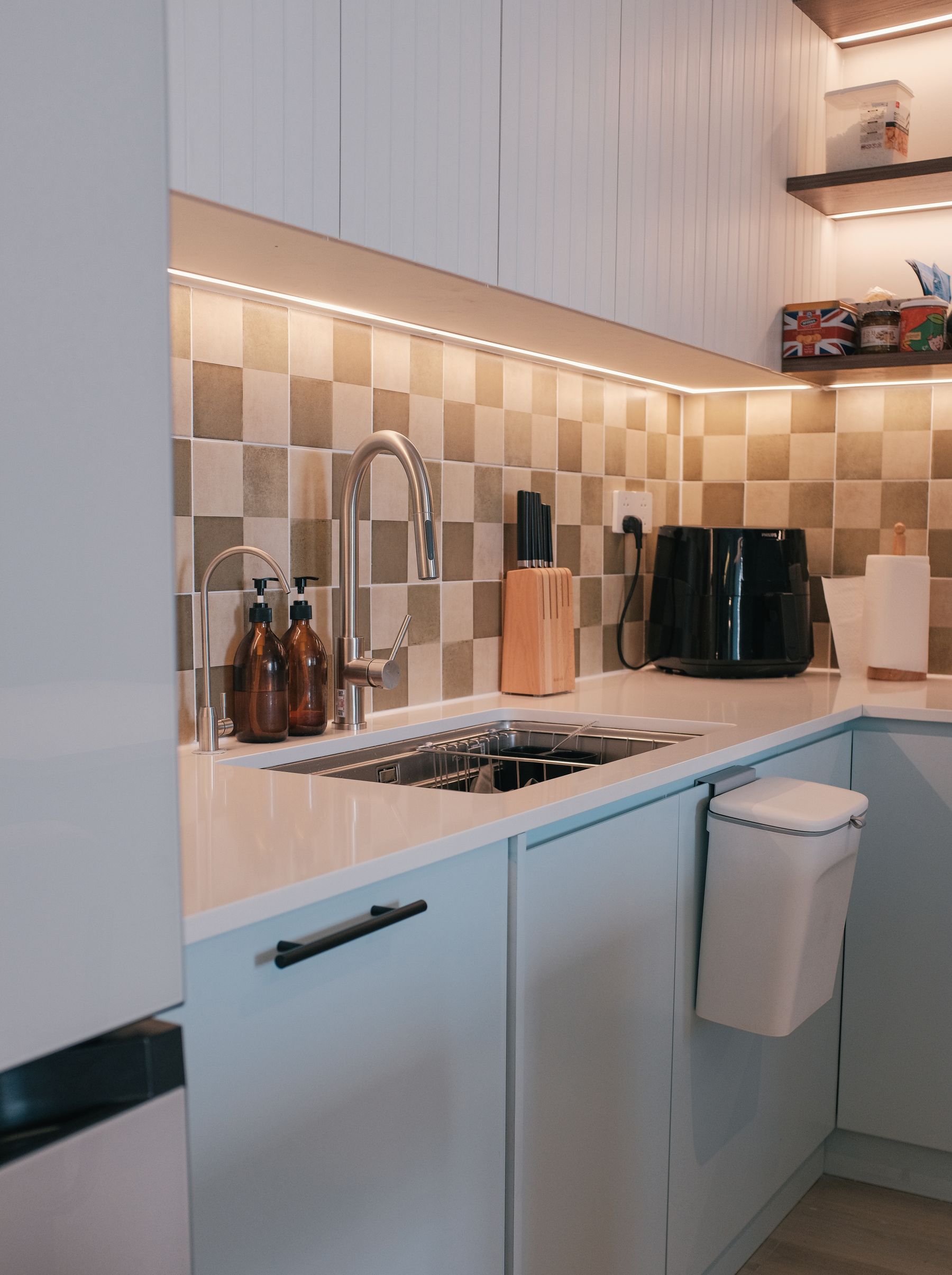
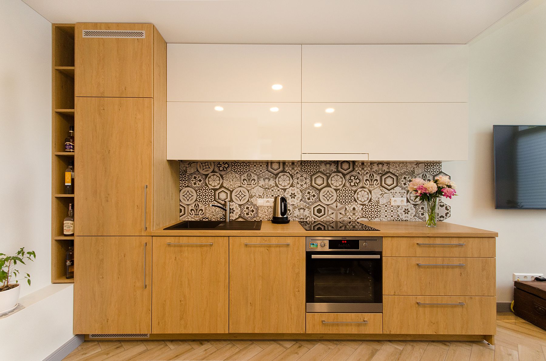
Patterned tile works best when its scale is visible from the main viewing position and its color has a clear relationship to the cabinetry. Too many competing patterns on counter, floor and wall make the working zone hard to read. Mock up several repeats, not one tile, and check how the pattern meets outlets, corners and the range. The cut pieces at the edges can change the effect considerably.
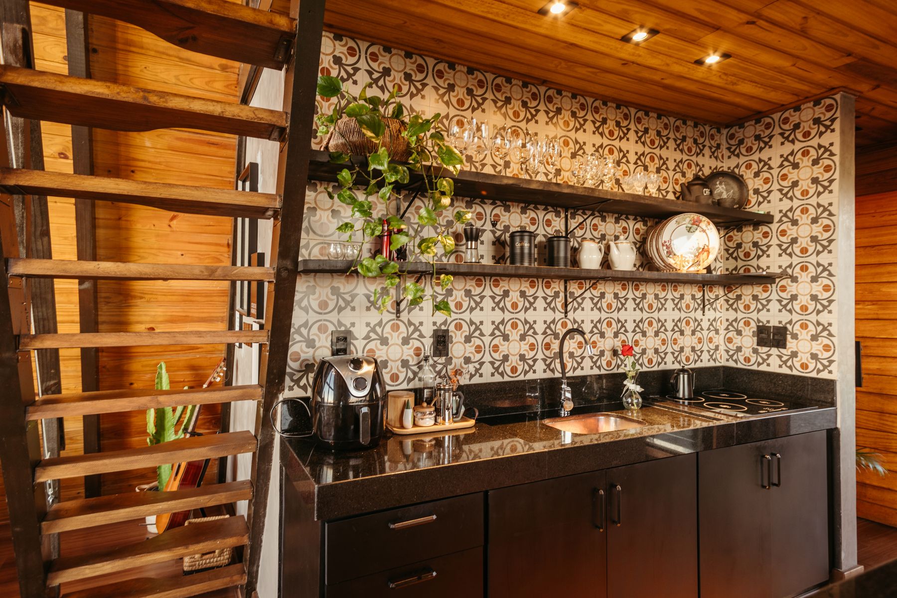
Give an Ornate Wall a Quieter Cabinet Base
When the backsplash carries an intricate motif, simple cabinetry and restrained worktops give it room to register. A shelf can interrupt the pattern and provide an endpoint, but it should be placed for reach and cleaning as well as composition. Review how the design looks around small wall interruptions; a busy field cut by many switches and outlets may need a different tile size or a calmer pattern.
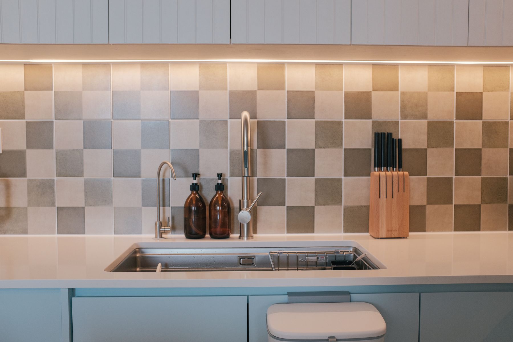
Keep the Backsplash Close to the Counter Tone
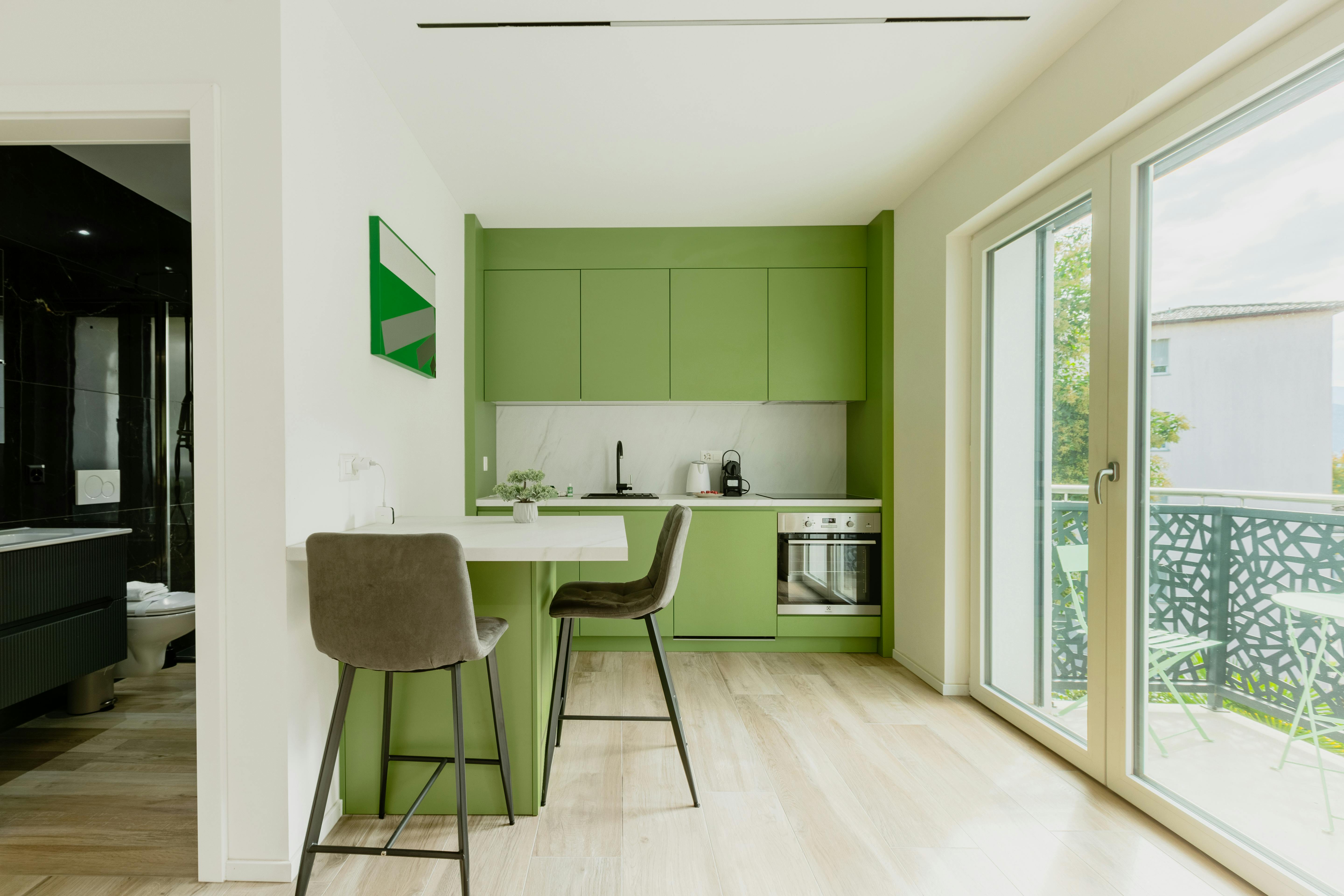
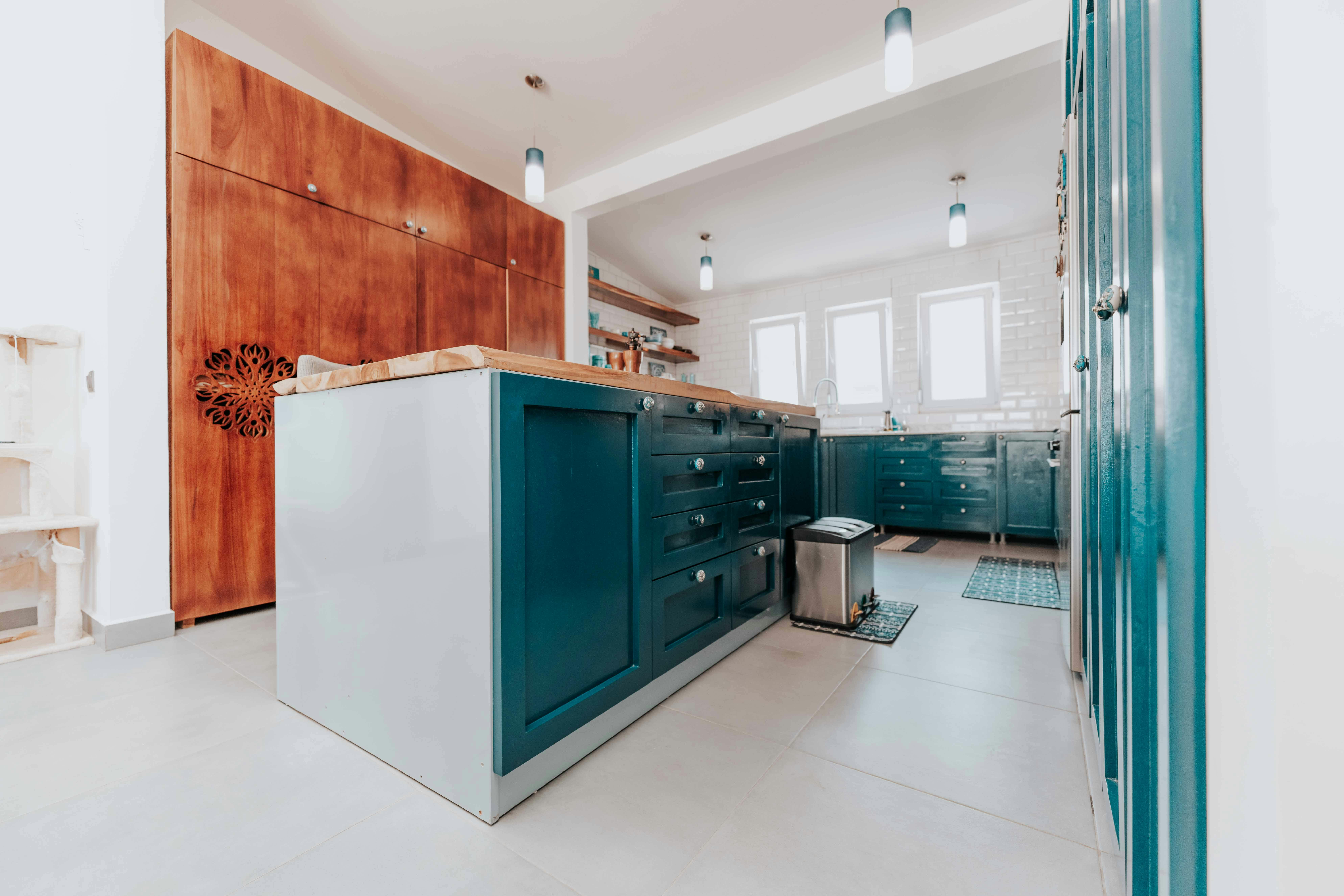
A backsplash close in value to the worktop can form one calm working band, particularly beneath saturated blue or green cabinetry. It does not need to be an exact match, but undertones should be compared under both daylight and task light. Decide whether the grout should blend or articulate the tile; a small joint color change can make a quiet wall much busier.
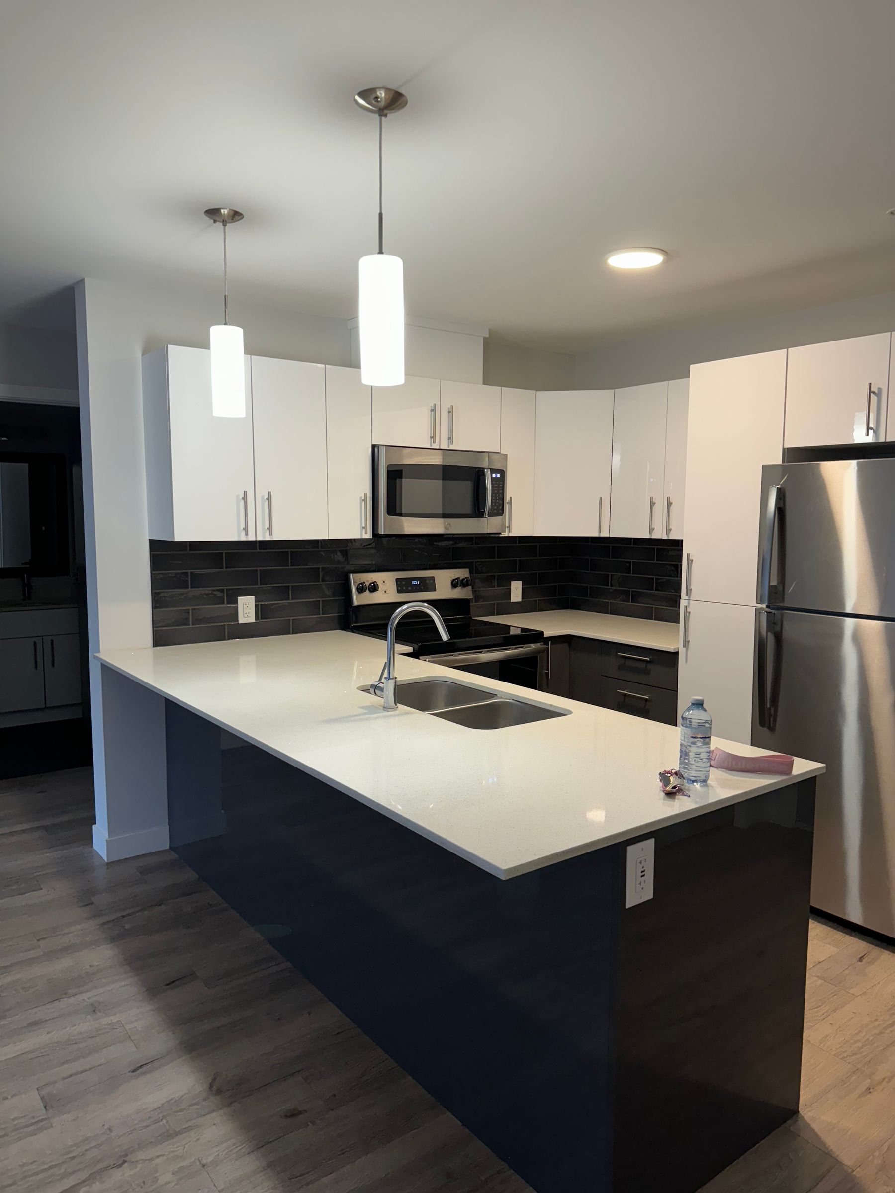
Use Dark Texture Without Losing the Work Zone
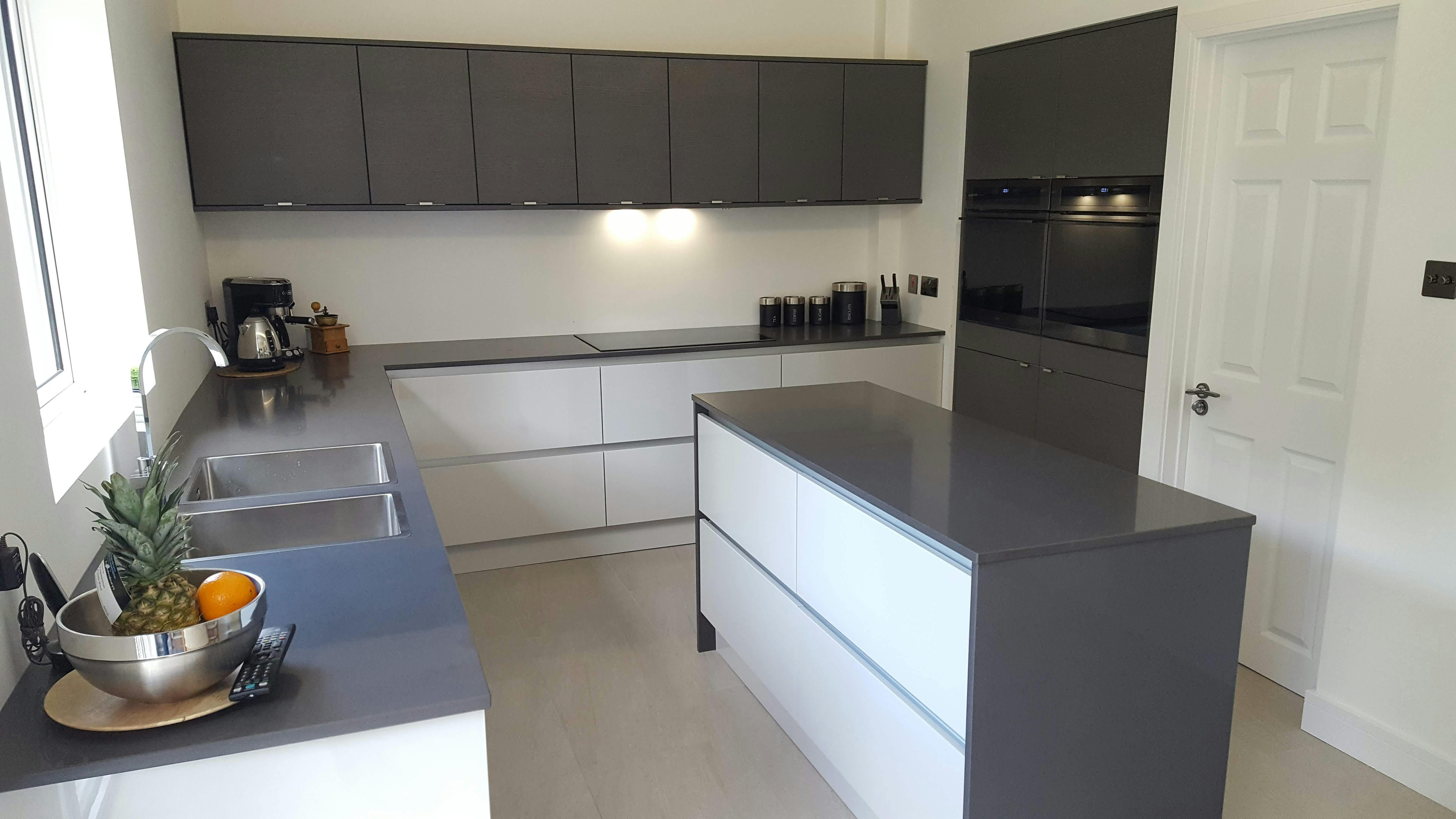
A dark backsplash can add depth behind pale, grey or black cabinets when its texture and sheen remain visible. Plan enough light at the worktop; a dramatic wall does not compensate for shadowed chopping and cleanup. Check whether a textured surface is practical for the location, especially where grease or water will need frequent wiping. Material suitability matters more than the mood it creates in a distant view.
Use Small Tile to Give a Compact Run Scale
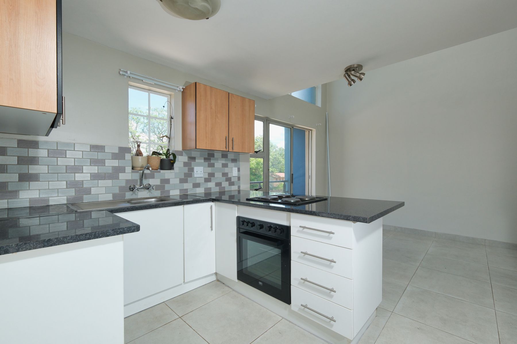
In a compact kitchen, small tile or a repeated geometric shape can give the backsplash interest without asking for another cabinet color. The many joints become part of the design and part of the cleaning routine. Check the tile scale against cabinet widths and outlet positions, then make sure the pattern has a deliberate termination at the edge of the run.
Treat Exposed Brick as a Material Decision
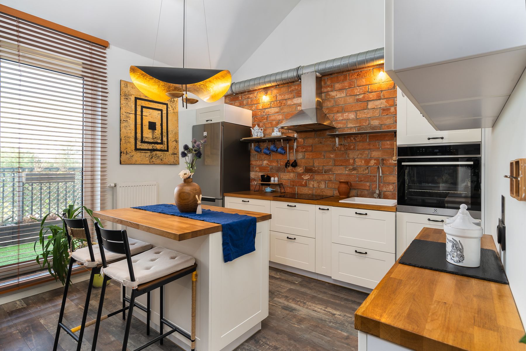
Exposed brick can make the working wall the main texture in a kitchen. Its joints and surface are different from smooth tile, so cleaning and protection near sink and range deserve careful thought. A transparent panel or another suitable local protection may preserve the larger brick effect while making the most exposed area easier to maintain. Do not assume a beautiful original wall is automatically a complete backsplash solution.
Resolve the Grout and Cleaning Plan
Grout is a visible part of tiled backsplash design, not an afterthought. A close match calms the grid; a contrasting joint emphasizes shape and layout. Ask the installer and material supplier about the suitable grout and cleaning approach for the specified tile and exposure. Review the junction with counter, corners and outlets as a whole; a tidy technical detail helps the visual design endure everyday use.