Start With a Shaker Frame, Then Look at Its Width
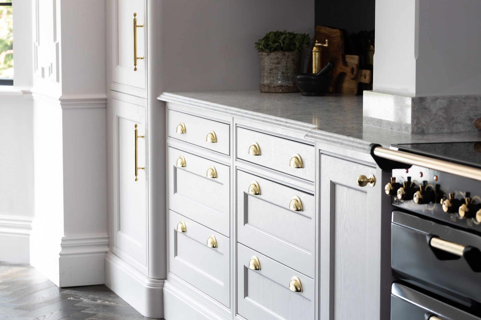
The pale gray cabinets here make the familiar Shaker idea easy to read: a flat center panel sits inside a defined frame, and separate drawer fronts repeat the geometry at a smaller scale. Cup pulls and knobs on the drawers, with a slim bar handle on the tall door, add a traditional note, but the quiet paint color keeps the look from turning fussy. It’s a dependable starting point for a kitchen that has to sit comfortably with both older and newer furniture.
The real choice isn’t just “Shaker or not.” It’s how wide the frame is. A broad rail turns each front into a strong rectangle; a slim one lets a long run of doors recede. On a shallow drawer, even a small change in rail width shifts the proportions, so set a full-size door sample beside a drawer sample before you sign off on a whole room.
Choose a framed front when you want visible structure without carved detail. If your floor or tile is already busy, a slimmer frame is often the more convincing version. Whether the doors are inset or overlay, and how the boxes and hinges are built, can’t be read from the front of a door, so settle those specifications separately.
Let Flat-Front Cabinets Calm a Busy Kitchen
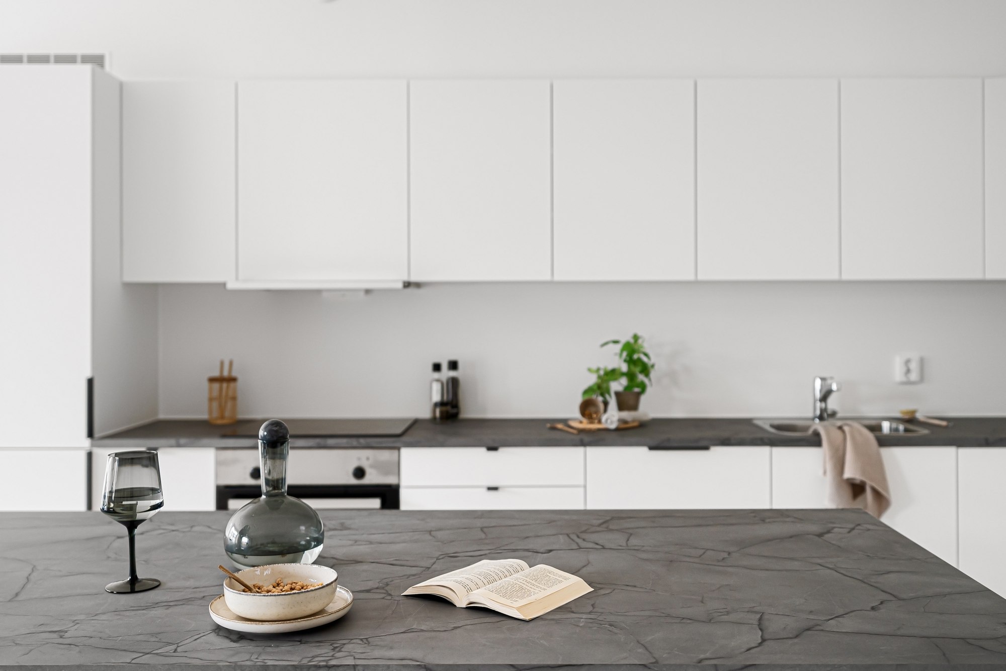
Here the white cabinet fronts form almost one continuous surface behind a dark gray island. With no raised rails and only unobtrusive hardware, nothing competes with the broad counter, the plant, or the small objects along the backsplash. Flat fronts are often called minimalist, but their real advantage is more specific: they reduce the number of lines repeated across the wall.
That makes them a good partner for veined marble-look stone, patterned backsplash tile, or a row of colorful stools. Decide where you want visual detail before choosing the door. A plain front can look remarkably warm beside wood, while a framed front can look busy in a room that is otherwise simple.
Flat doesn’t automatically mean handle-free. Look closely at a full-size sample: the finished edges, how the pulls or opening mechanism work, and how the finish looks in sidelight. The longer the uninterrupted run, the more any misaligned gap will show. It’s an appearance choice, not proof of better cabinet construction.
Gather Tall Cabinets Into One Deliberate Wall
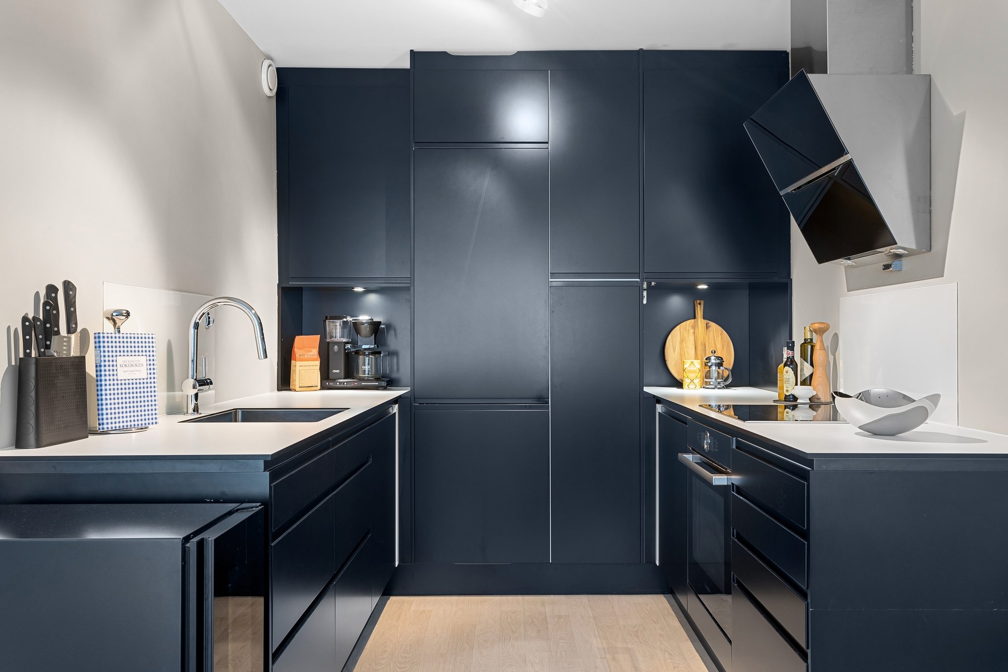
The dark cabinetry at the back of this compact kitchen reaches nearly to the ceiling, giving the room a clear destination. Instead of punctuating every wall with a separate tall unit, the design keeps one strong vertical block and lets the countertops and pale wall read as lighter, lower elements.
This is worth considering if you need a pantry, refrigerator surround, or appliance tower but dislike the stop-and-start effect of single tall cabinets. Grouping tall units gives a calmer elevation, though it only works if the wall is long enough to take the whole bank.
Measure the actual wall and map every door swing before committing. Windows, vents, electrical points, appliance clearances, and the route between work areas can all decide whether one bank is sensible. The NKBA Kitchen & Bath Planning Guidelines, now in their fifth edition, are a better starting point for layout checks than proportions guessed from a photo. For fuller circulation decisions, see our kitchen layout guide.
Let Rich Wood Grain Give Simple Cabinets Character
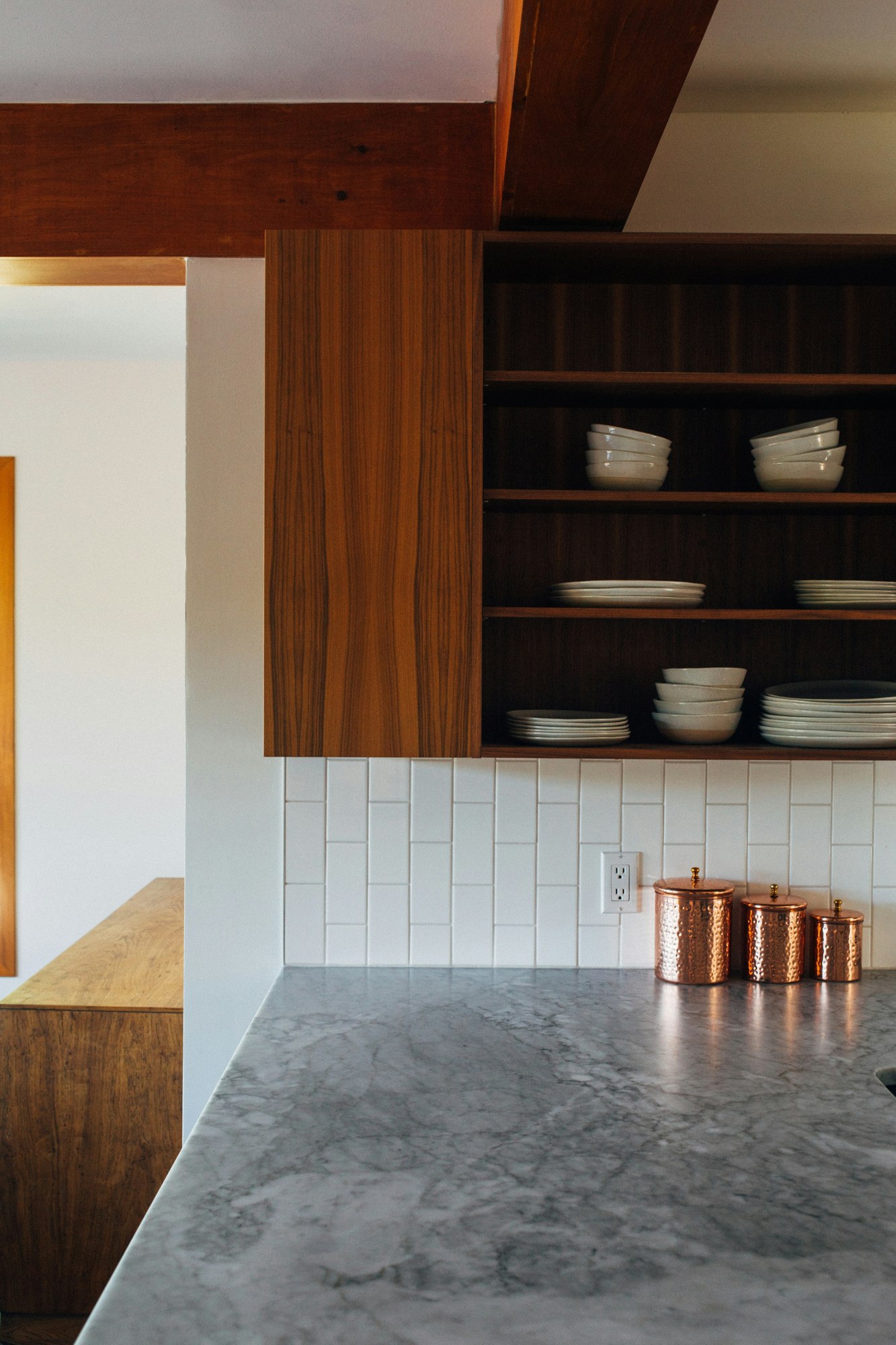
A simple upper cabinet can carry more character through its wood grain than through an elaborate door profile. In this close view, deep-toned grain stands out beside a pale wall and tile backsplash, while an open shelf gives the darker surface room to breathe. The pattern of the wood becomes the feature, even though the cabinet shapes themselves are straightforward.
Give pronounced grain a defined place: an upper bank, a tall panel, or one island face. A smaller block can read like a piece of furniture; covering a whole wall makes the grain a much stronger part of the room. The image does not establish the wood species, veneer construction, or finish system, so ask the cabinetmaker for samples and the actual specification.
Hold the wood sample against your flooring and look from the doorway and your usual seat. If its undertone or grain direction fights the existing wood, you may prefer to use the material on fewer fronts. If you prefer a painted cabinet wall, the next idea shows how much difference a small warm-metal detail can make without introducing another wood surface.
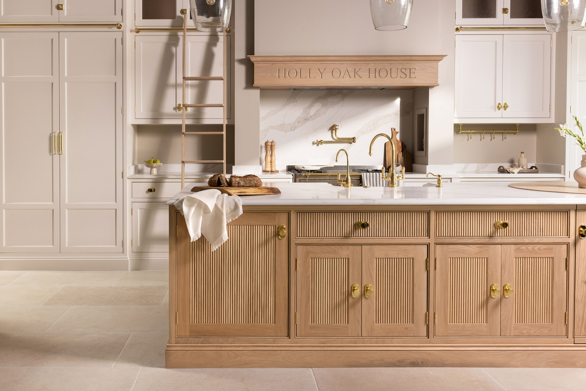
Give Pale Cabinet Drawers Warmth With Small Brass Knobs
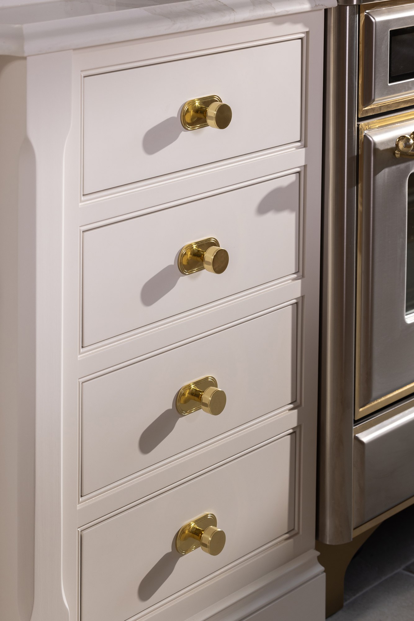
Here, small ribbed brass-toned knobs sit against pale framed drawer fronts. The doors carry the room’s soft, traditional geometry; the warm metal adds just enough contrast to make each drawer easy to read. Unlike a bold handle that draws a line across an entire drawer bank, these compact fittings work as repeated points of detail.
This is a useful direction if you already like your cabinet color and door profile but the hardware feels anonymous. Repeat one knob shape and finish across neighboring small drawers, then look at the bank from a few steps back. On broader drawers, compare a single knob with a pair or a more comfortable pull before deciding. Keep the choice consistent with the actual front sizes instead of ordering the same fitting for every door.
Check the hardware’s projection, grip and mounting against a full-size drawer sample; a delicate detail still needs to be comfortable with wet hands. If you are reusing existing fronts, measure hole spacing before replacing pulls, and do not assume a new knob will cover old holes. The next section looks at an entirely different question: defining a broad run of near-black cabinets with light surrounding surfaces.
Make Black Cabinets Read Clearly Against Light Surfaces
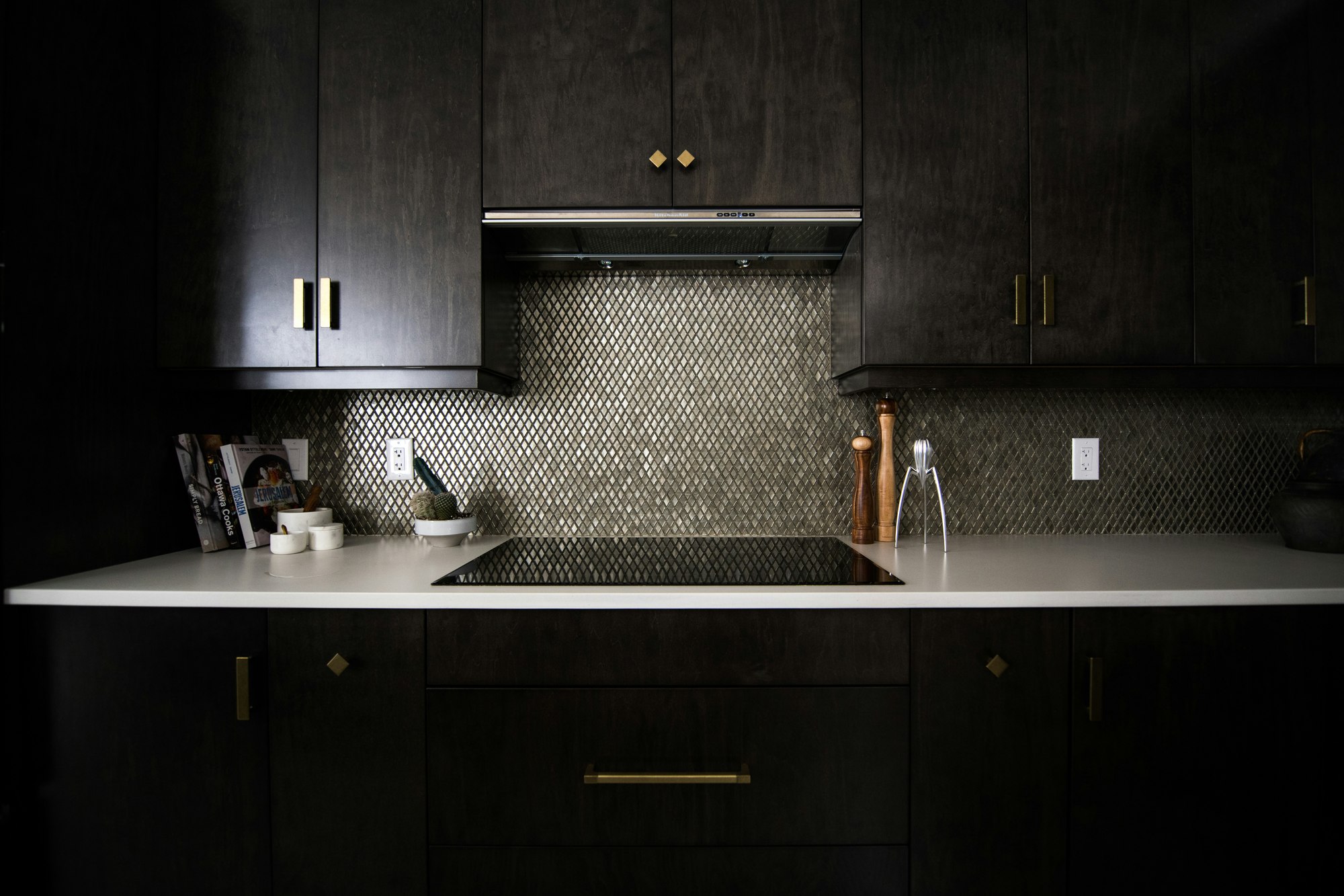
The near-black cabinet fronts here have visible wood texture, slim brass-toned pulls, and a pale counter running just above them. That light horizontal line does important work: it traces the edge of the dark cabinet mass and keeps the doors from turning into one indistinct patch.
If you’re considering black or deep charcoal, choose the neighboring surfaces at the same time. A white or pale stone-look counter gives dark fronts a crisp outline. A darker counter can be dramatic too, but the result is more continuous, and the door edges rely more on hardware and lighting for definition.
Take the finish sample into your real kitchen, not just a showroom, and look at it in diffuse daylight, under task lights, and with the lights off. Matte, gloss, and textured finishes behave differently on actual doors, so don’t assume dark paint is automatically easier or harder to clean. Our black kitchen ideas cover the broader palette; this detail is about cabinet readability.
Keep a Compact Kitchen on One Cabinet Rhythm
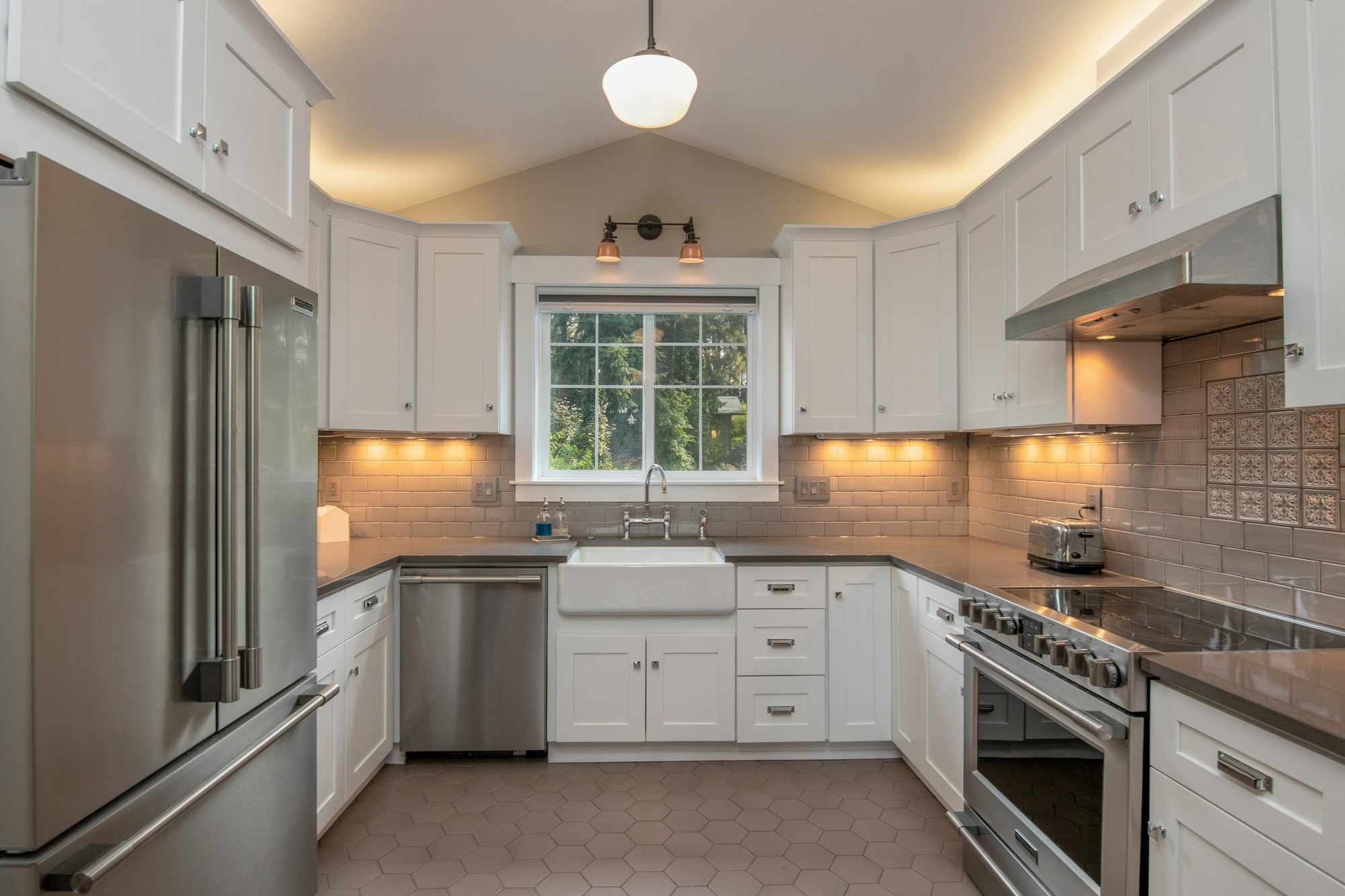
The window over the sink is the best feature of this compact U-shaped kitchen, and the cabinets help you look at it. The same light framed doors run along every wall, with the refrigerator and range interrupting the pattern only where they have to. The eye follows one steady rhythm instead of stopping at a succession of competing door styles.
In a small kitchen, one consistent profile is often more useful than several attractive styles used together. Keep tall storage grouped where the plan allows, and avoid alternating an isolated tall cabinet with a gap and another tall cabinet just to fill wall space. If you want variation, try it in the backsplash, a counter material, or one distinct end cabinet.
A photo can’t tell you the aisle width or whether appliance doors clear each other. Mock up the actual door, drawer, and appliance swings on a measured plan, then check the applicable planning guidance before you place an order.
Let a Soft Cabinet Color Carry the Room
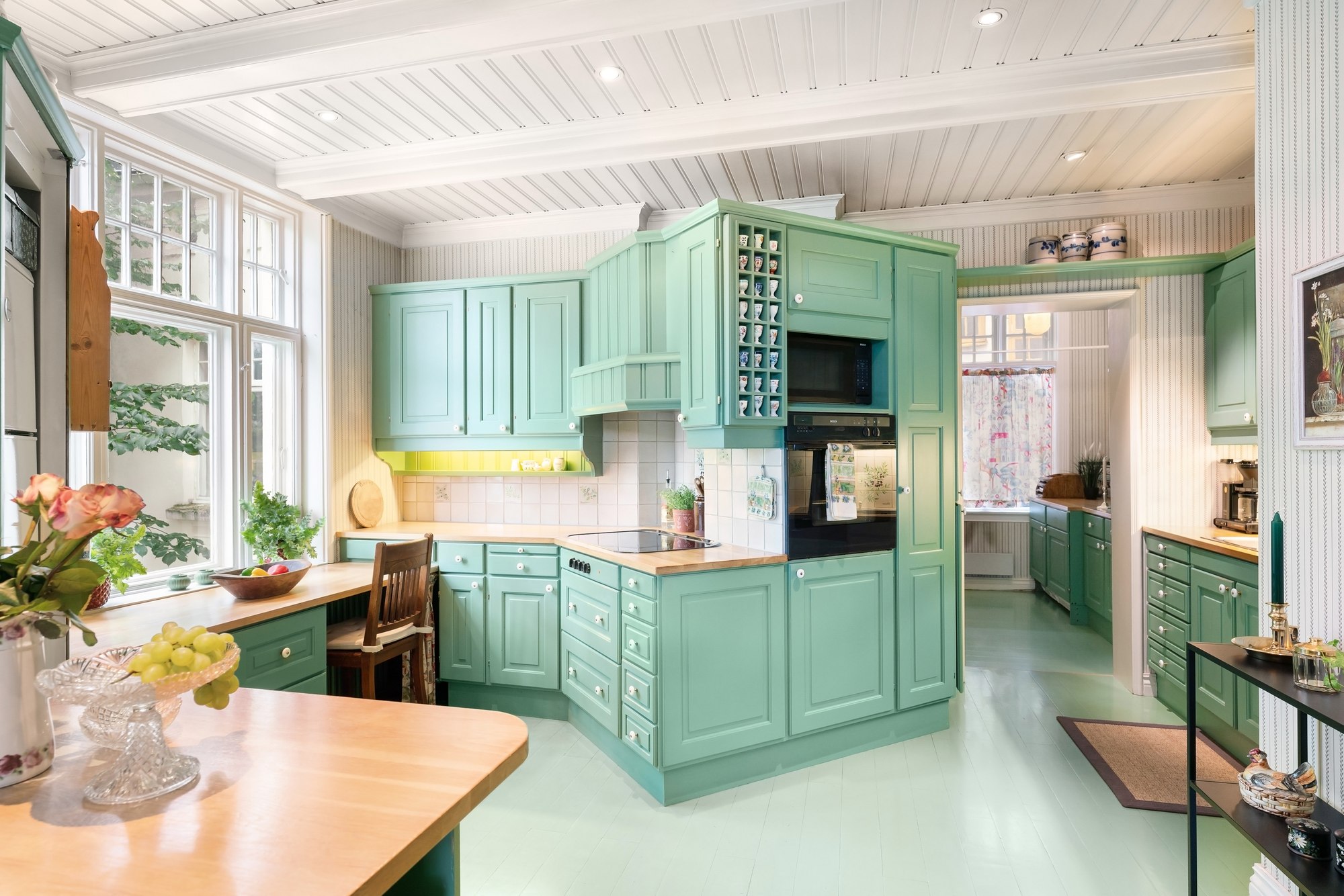
This soft green kitchen commits to its color. Painted fronts repeat around the room’s corners and tall units instead of appearing on one isolated accent cabinet, and even the floor picks up a paler version of the green. White beadboard walls and ceiling and warm wood countertops keep the color from feeling heavy, while the sheer amount of green makes it unmistakably the main cabinet finish.
This approach suits you if you love a color enough to live with it on large repeated surfaces. It has more presence than a colored island alone and usually needs fewer competing accents. Choose the saturation alongside the floor, counter, and trim rather than picking a swatch in isolation.
Test a door-size sample vertically in daylight and under the lighting you actually use for cooking. A small chip can flatter a hue that feels unexpectedly intense across a whole wall. For variations on sage, olive, and other green palettes, see our separate green kitchen ideas guide; the cabinet lesson here is the discipline of repeating a finish.
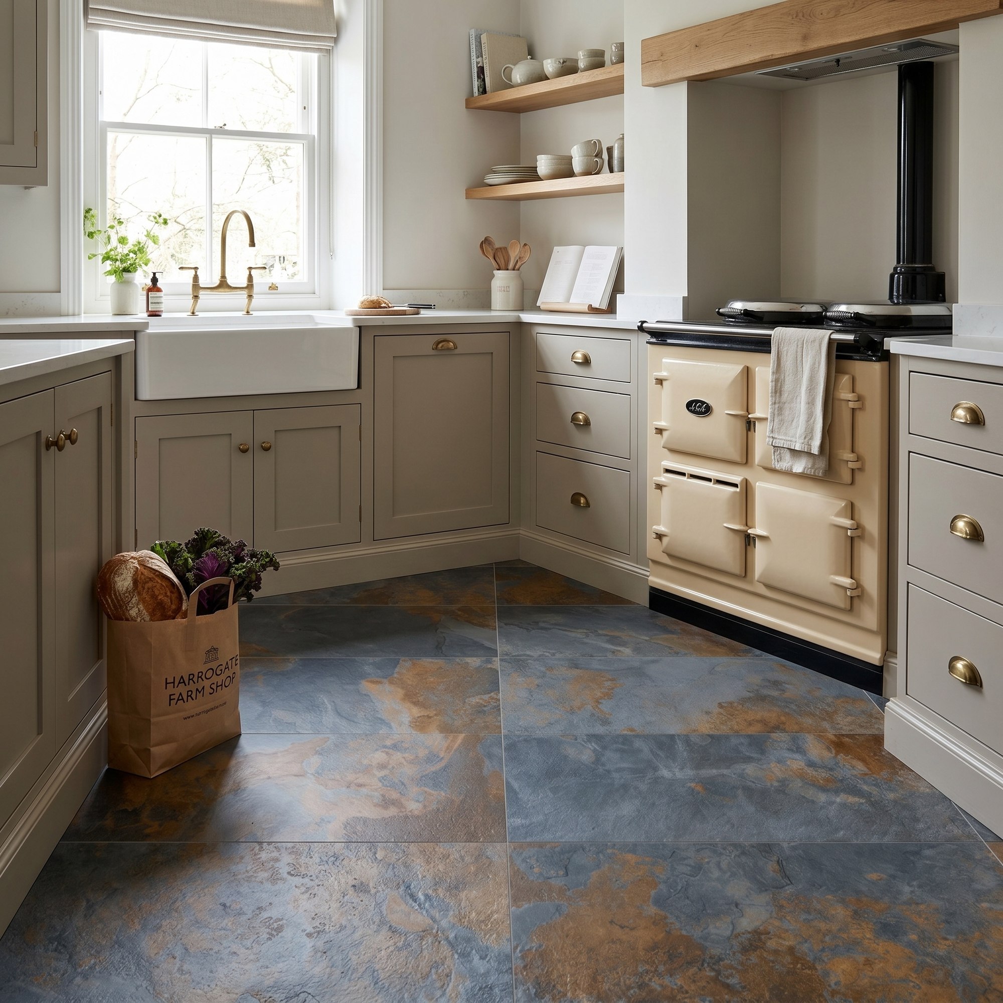
Quiet the Base Cabinets When the Floor Is Expressive
Blue-and-rust floor tile takes the lead in this kitchen. Warm gray-taupe base cabinets sit under the countertop as one settled band, a cream range anchors the corner, and open shelves keep the upper wall uncrowded. The restrained cabinet color makes the patterned floor look intentional rather than incidental.
If the floor is the feature you want to keep, compare cabinet colors against its quietest neutral. A warm greige bridges aged wood, light walls, and complex tile more gently than stark white. That makes it especially useful when you’re refreshing cabinets without touching a floor that already sets the room’s personality.
Hold samples upright beside the floor and against the wall; a finish that looks neutral lying flat on a table can turn cool or pink when vertical. The photo comes from a tile supplier, so it shows a successful visual relationship, not the cabinet’s paint code or maker.
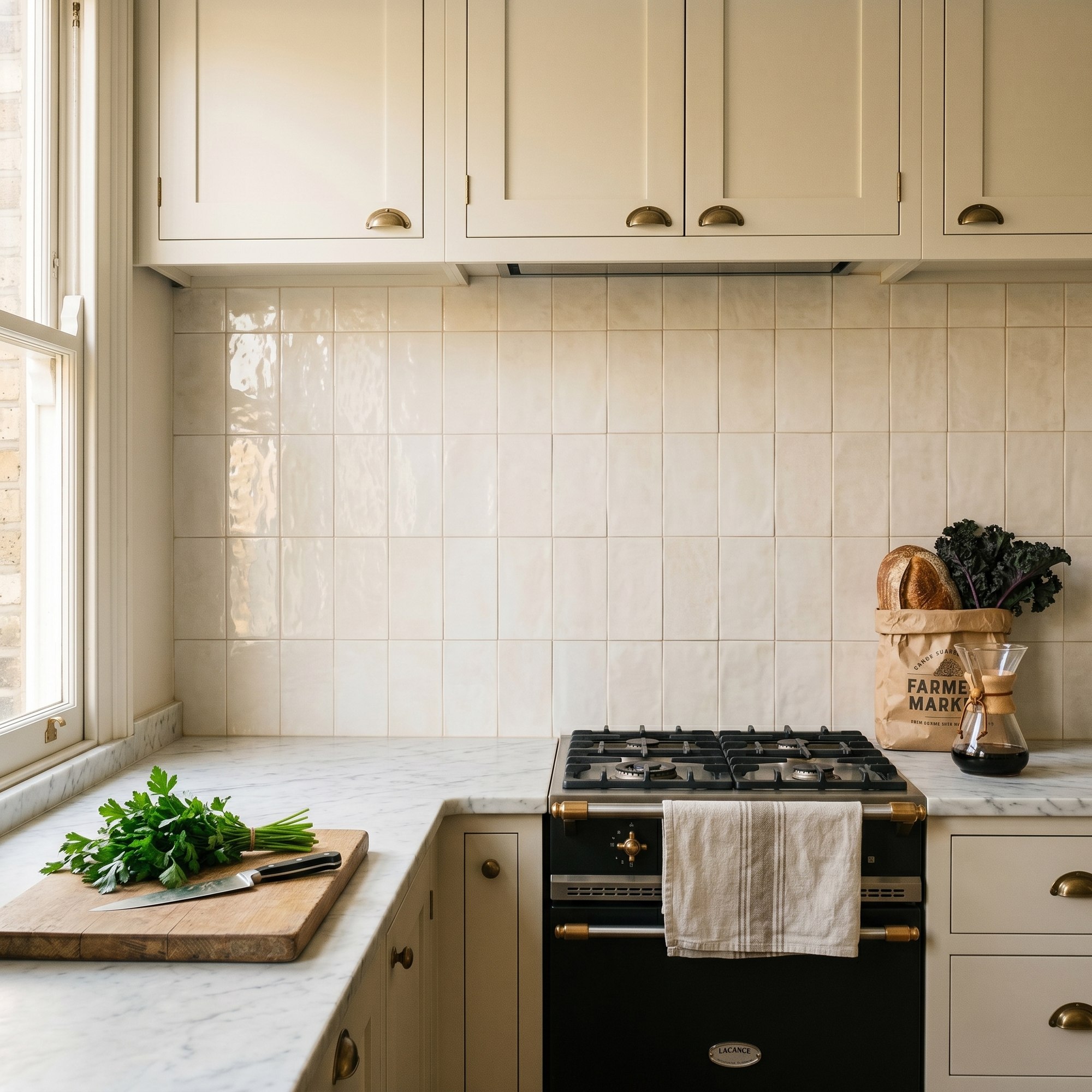
Layer Cream Cabinets Against Pale Tile
Cream cabinet doors, warm off-white wall tile, and brass cup pulls make this kitchen a study in near-matches. The surfaces are close in color but different in texture: the glazed tile catches small highlights that the painted panels don’t, so the cabinets stay legible without bold contrast.
This is a useful alternative to the all-white kitchen that relies on a single shade across every finish. Choose a warm or cool direction first, then ask for cabinet, counter, and backsplash samples together. A barely visible difference in a store can feel stronger once tile covers a whole wall.
Test the combinations in direct morning light and after dark. If the cabinets look yellow beside a blue-white tile, the pairing may be the problem rather than either product. Let the pulls and countertop provide small points of contrast; you don’t need to darken an entire wall to create definition. The tile supplier credited here doesn’t establish the cabinet paint formula.
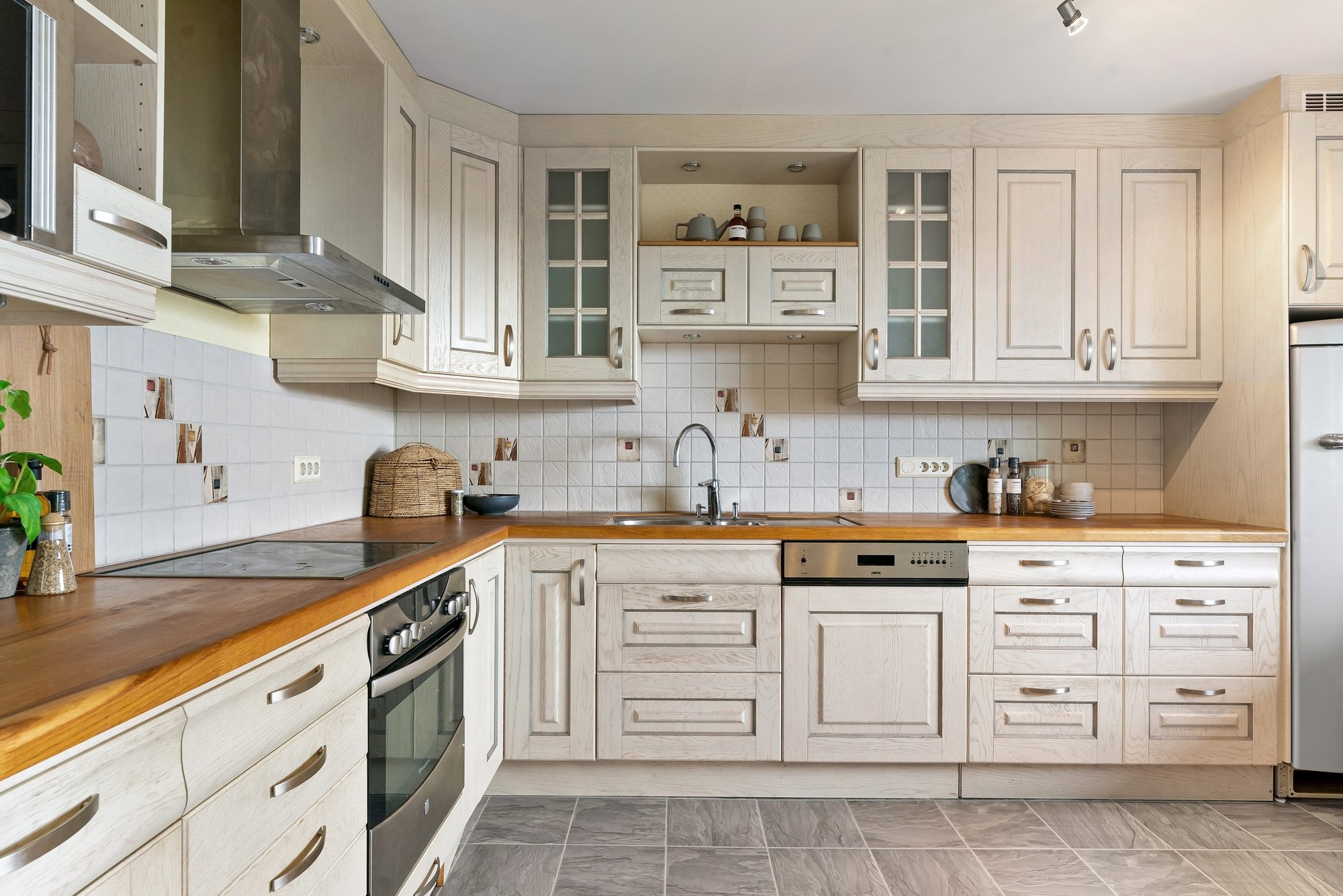
Interrupt Solid Uppers With a Few Glass Doors
A cluster of glazed upper doors breaks up the cream cabinet elevation in this traditional kitchen. The frames match the solid doors, but the panes give glimpses of dishes and shelves behind them. It’s a controlled way to add openness without giving up every cabinet front.
Choose glass for a group of doors whose contents you’re comfortable seeing. Clear glass rewards an orderly display; other glass finishes change how much shows, but the specific product and its safety specifications come from the supplier. Glass doors on one short stretch usually read as a feature, while glass scattered across a long wall can feel busy.
Treat whatever sits behind the glass as part of the composition. A modest set of everyday dishes looks good; mismatched packaging and crowded shelves are harder to hide. If that’s your normal routine, fully closed uppers may give you the calmer kitchen you actually want.
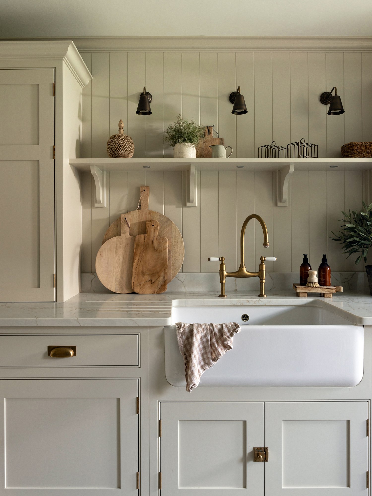
Replace a Heavy Row of Uppers With Open Shelves
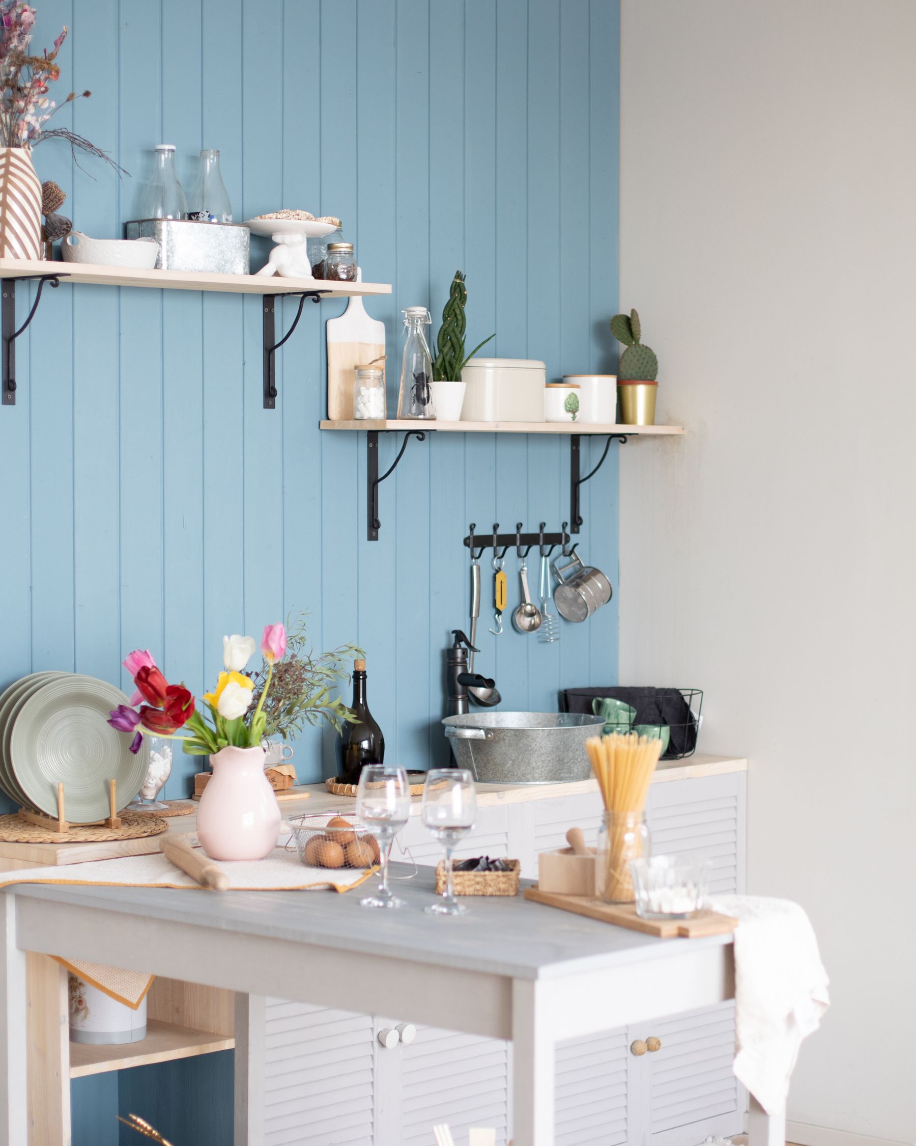
In this sink view, solid pale base cabinets provide the working storage, while open shelving makes the wall above feel lighter. The shelf holds a few useful and decorative objects instead of continuing the cabinet doors all the way up.
Open shelves don’t automatically create more storage. They trade concealed volume for visibility and quick access to whatever sits on them. Try one short stretch where you can keep the contents edited, rather than replacing every upper because a photo looks airy. A recessed display niche can create a similar break with less exposed shelf.
Consider splashes, cooking residue, and how often you’ll move things. Shelves have to be fixed to the real wall structure and rated for the intended load; a styled photograph can’t tell you the permitted capacity. For organizers, pantry systems, and more detailed storage choices, see our kitchen storage ideas.
Make the Pantry Cabinet Part of the Elevation
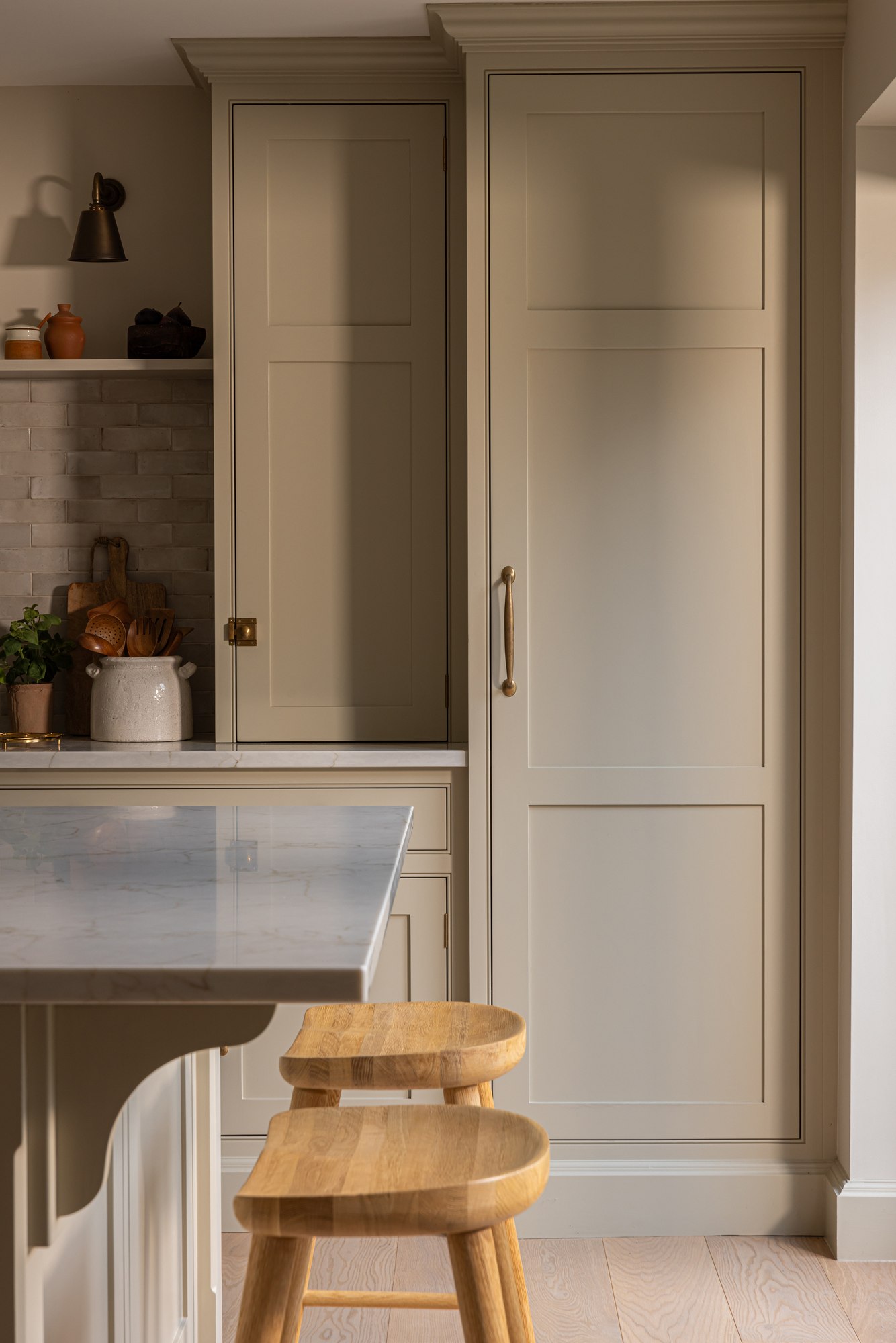
The tall paneled cabinet in this kitchen reads as part of the room’s architecture rather than a freestanding afterthought. A slim open niche beside it and the lower island in front give it a clear boundary, so the tall door can be substantial without dominating every sightline.
When planning a pantry cabinet, first decide which wall should carry the tall storage. An isolated tower can work well at the end of a run; several tall elements are often calmer when grouped into one bank. Sketch the doors open as well as closed, including nearby island stools and the walking route.
Don’t infer pull-out trays, adjustable shelving, or interior capacity from closed doors. Ask for a drawn interior elevation before choosing accessories, and keep enough accessible counter space elsewhere. A cabinet can look beautifully composed and still be inconvenient if daily-use items end up too far from the work area.
Treat Wall Ovens as Part of a Cabinet Wall
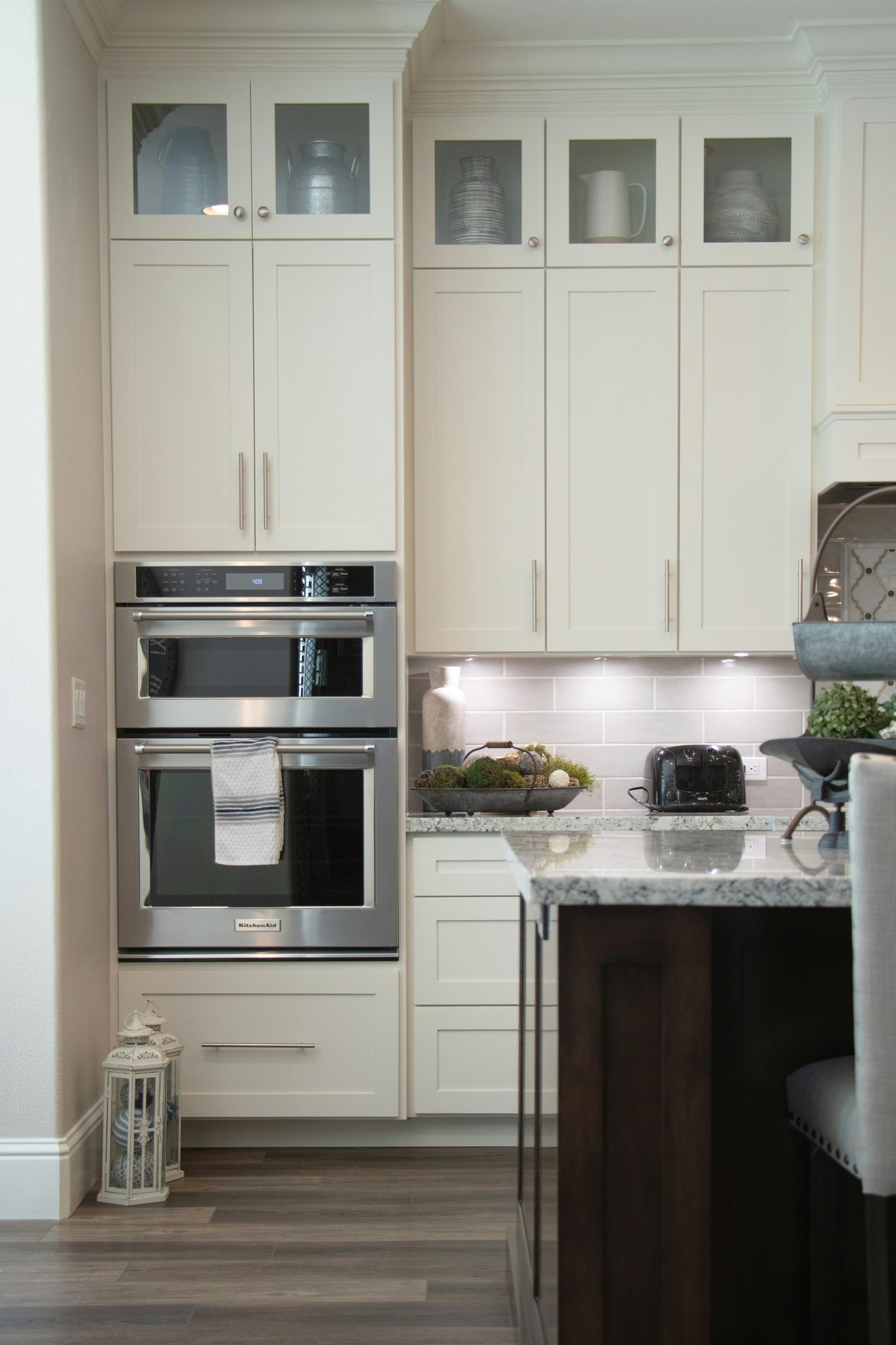
Two stainless wall ovens sit inside a tall white cabinet bank in this photograph. Doors above and below line up with the appliance openings, and glass-front uppers finish the stack, so the ovens read as one planned feature rather than equipment dropped between unrelated cabinets.
If a wall oven is central to your remodel, design the surrounding elevation around the exact model you’ve selected. Door heights, adjacent drawers, and nearby counter landing space should be worked out together. A symmetrical drawing is appealing, but the manufacturer’s installation instructions matter more than matching lines for their own sake.
For safe planning, check the manufacturer’s current cutout, ventilation, heat-clearance, electrical, and access instructions with your kitchen professional. Those details vary by model, and a photograph is not a template for building oven cabinetry. The visual lesson is simply to fold the appliance openings into a coherent tall run.
Repeat Island Color Along the Lower Cabinets
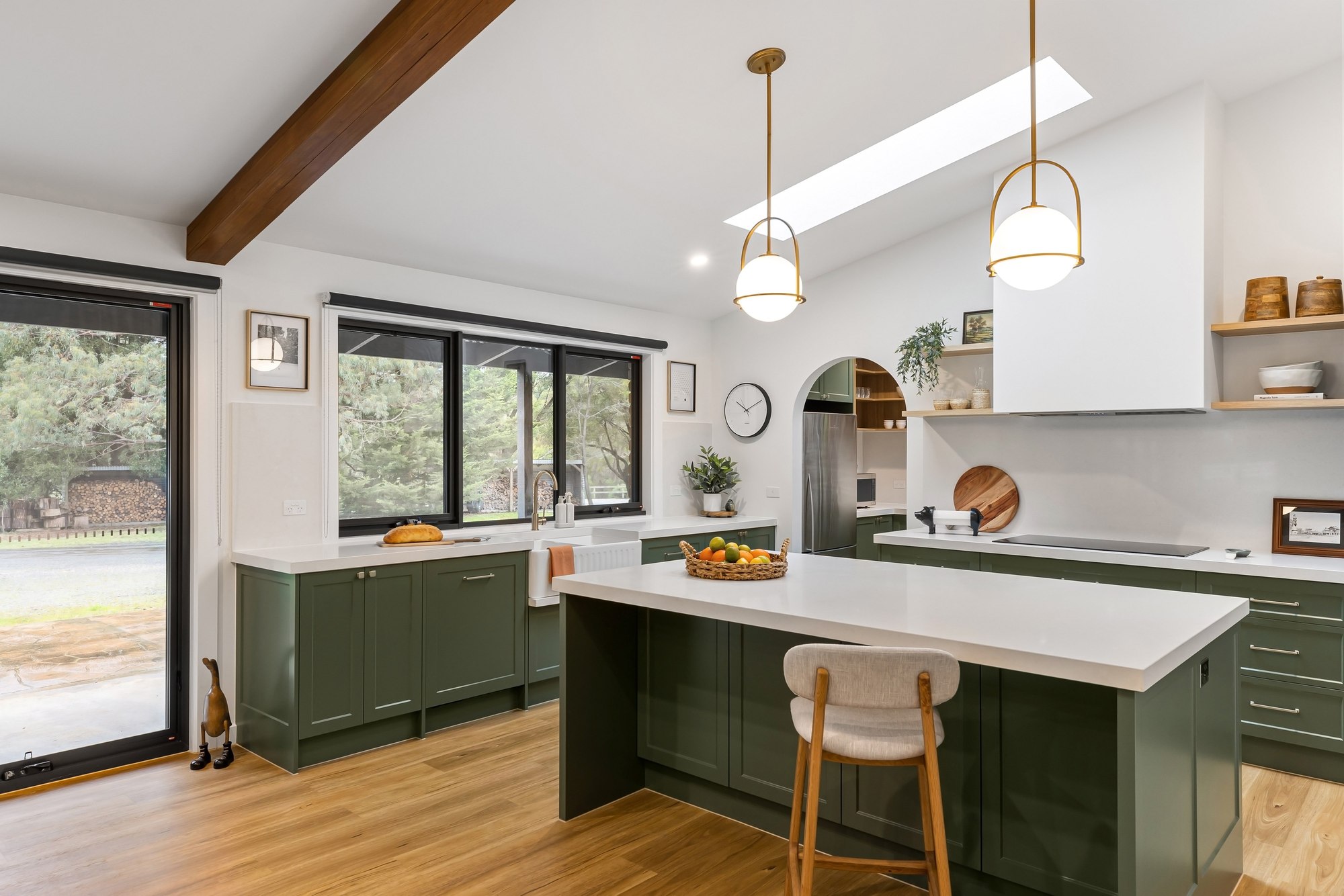
Deep olive green covers both the island and the perimeter base cabinets in this bright kitchen, while the walls, hood, and open shelving above stay light. The color stays below counter height, preserving a lighter feeling overhead, and it feels more unified than a single green island standing alone in a white room.
Choose repetition when you want the island to belong to the whole kitchen. Choose an accent-only island when you’d rather keep a neutral perimeter and make the center the focal point. Neither is universally better; the difference is how far your eye travels before meeting the same color again.
You can apply the same principle with navy, muted terracotta, or warm gray. What matters is controlling where the second color appears: repeat it deliberately on a whole lower run instead of introducing one unrelated colored door. The exact green shown isn’t a documented paint specification.
Use Long Pulls to Draw Stronger Lines Across Drawers
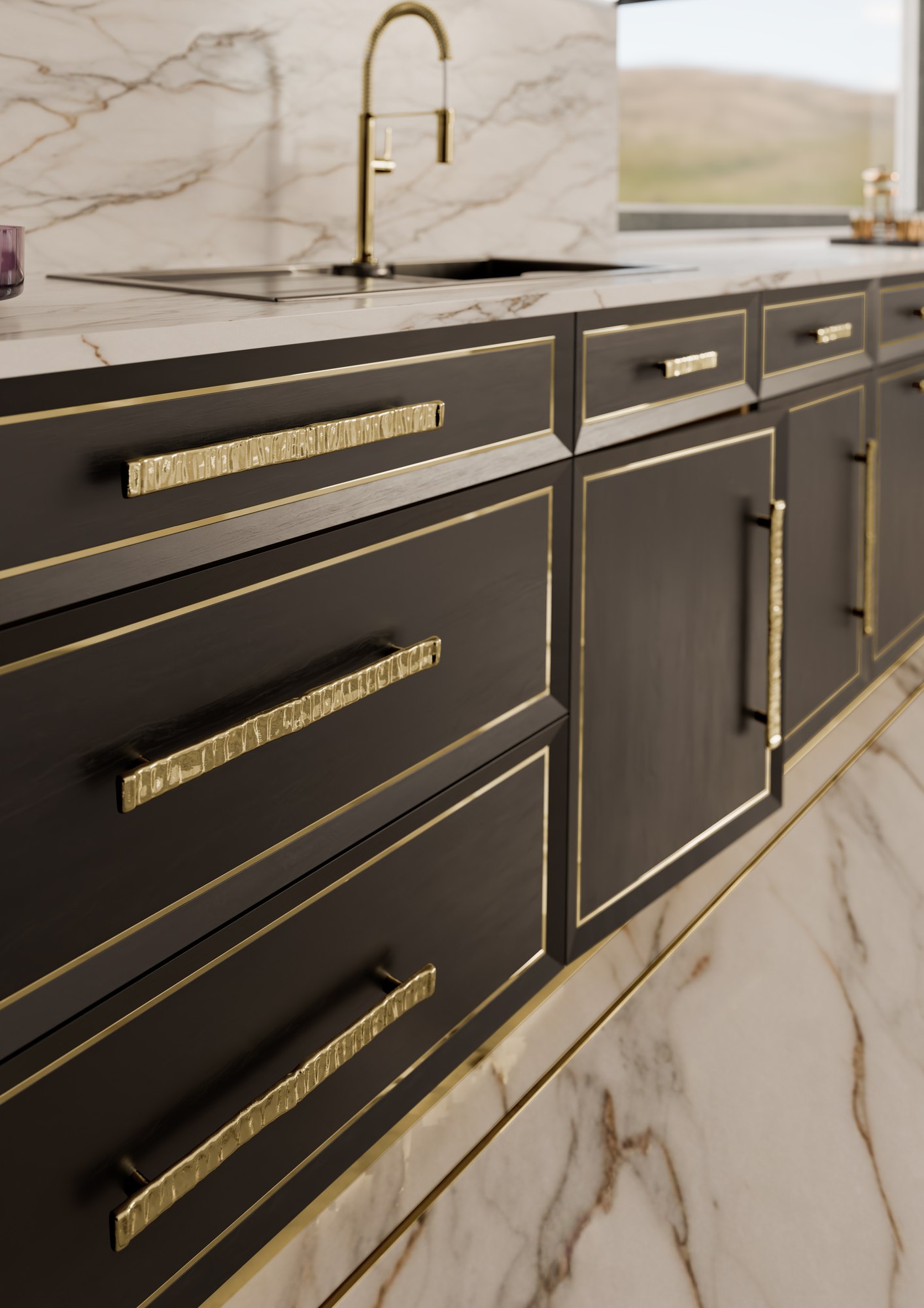
Hardware can change the visual scale of a drawer bank. In this close-up, long warm-metal bars with a hammered surface stretch across dark drawers edged in thin brass trim. From a few steps away, the pulls register as repeated horizontal strokes; only up close do you notice the texture of the metal.
Choose a pronounced bar when the drawers are wide enough for its length to feel deliberate and you want the hardware to become part of the cabinetry’s graphic pattern. For a quieter effect, compare a shorter pull on a full-size front, keeping the spacing consistent from drawer to drawer. Before ordering, test the grip, the distance the hardware projects into a walkway and its compatibility with your existing mounting holes. The best size is the one that looks convincing from the doorway and remains comfortable in use.
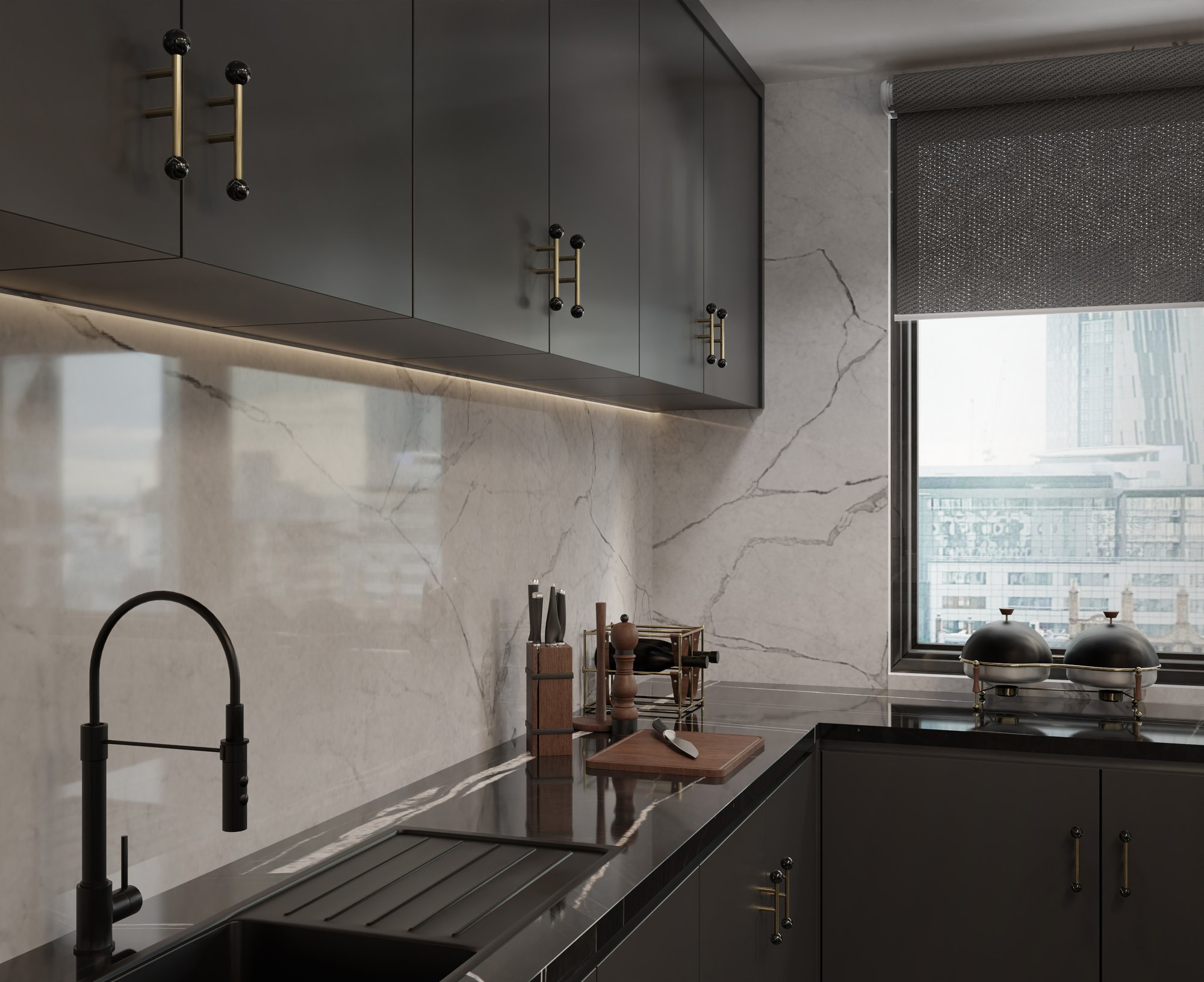
Place Dark Cabinetry Where Daylight Defines It
This wider view makes a point the earlier dark-cabinet close-up can’t: the near-black doors sit beside a window and a pale veined backsplash, with a soft strip of light under the uppers. Daylight and that backsplash outline the run and show where each door begins and ends, even though the counter itself is dark. The same finish might feel much heavier against a dim wall with nothing reflective nearby.
If your room has a window near the sink or on a side wall, think about how dark cabinets will sit relative to that light. A pale backsplash gives the cabinetry a boundary against the rest of the room, and as this photo shows, it can do that job even when the counter is dark. Under-cabinet task lighting improves working visibility, but the exact specification should follow your layout.
Photographs are taken under particular lighting. Bring the intended door sample into your room and check it when the window is bright, when daylight is fading, and with the kitchen lights on. A black cabinet that looks blue, gray, or nearly flat in different light isn’t necessarily the wrong choice; it’s information you want before ordering.
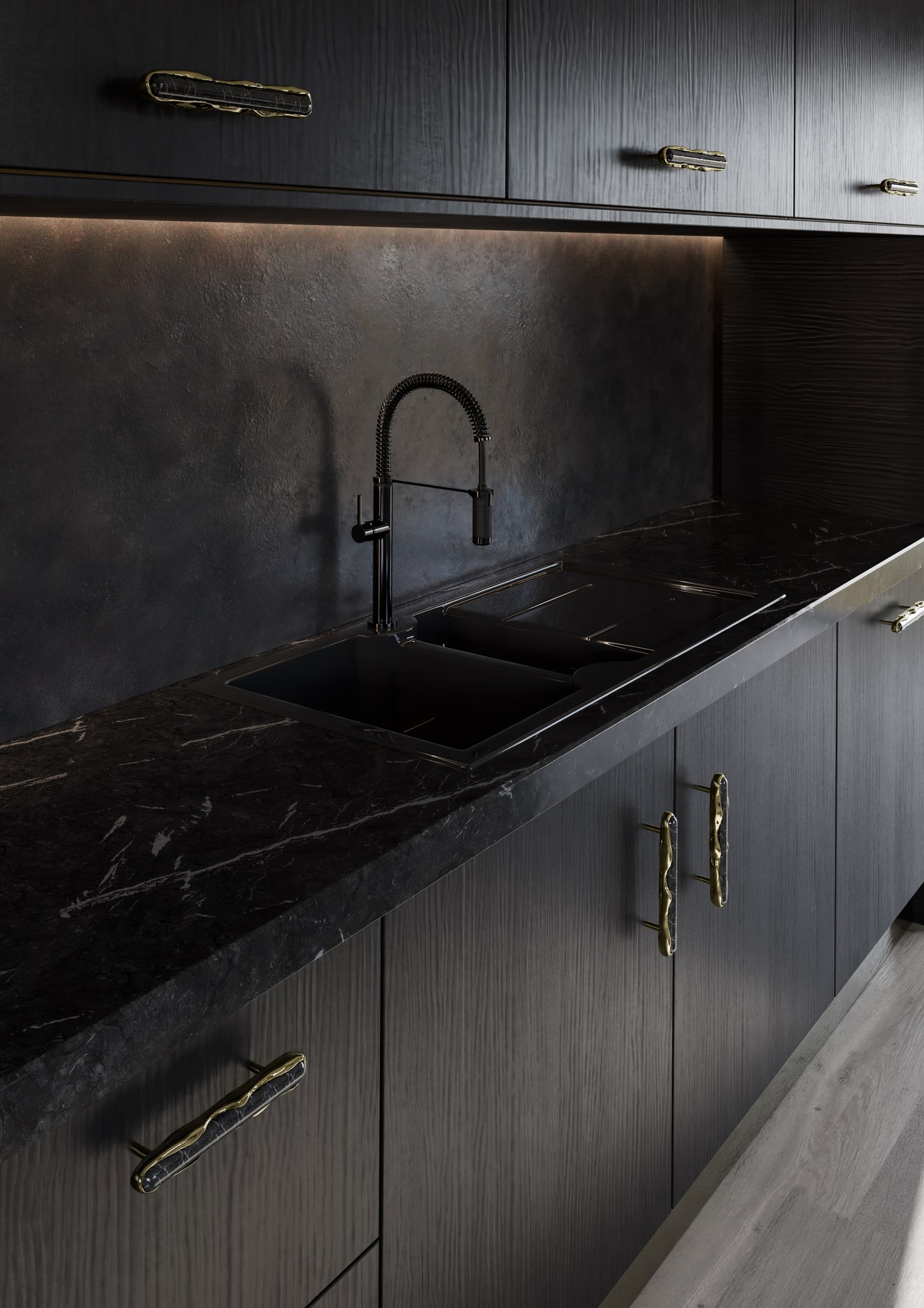
Let One Tactile Pull Lift a Dark Cabinet Front
The close-up of these dark, visibly textured doors puts the hardware in the foreground. Elongated, irregular brass pulls with a contrasting stone detail give each front a small crafted focal point. In a room this tonal, the pulls do the talking, so there’s no need for a loud cabinet color.
This is an intentional pairing of two textures, not a rule that textured doors always need plain hardware. The grain gives the dark fronts a fine vertical rhythm, while the irregular brass-and-stone fittings create small points of relief. Because the pulls repeat in one shape and finish and the rest of the scheme is restrained, the two textures can work together rather than competing. If a kitchen already has strongly patterned backsplash tile, veined counters and several metal finishes, a simpler pull may be the more effective choice. Section 16 concerns the length and line of a handle; here the decision is how its material feels and looks against the cabinet face.
The source card identifies the photographed PullCast Tiffany hardware and its brass and Guatemala marble elements; it doesn’t certify the cabinet substrate or the hardware’s suitability for every drawer. Check the product’s current dimensions, mounting, and finish options for your installation.
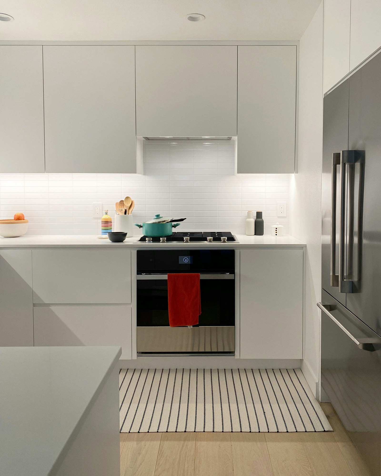
Make a Small Handle-Free Kitchen Feel Defined
This compact kitchen uses pale flat doors and almost no visible pulls. The cabinets merge into a quiet field around the cooking area, while a dark-fronted built-in oven, a stainless refrigerator, and the fine joints in the white tile keep the arrangement from becoming featureless. The effect depends on a few clear boundaries rather than decorative door frames.
On a short wall, this can be more persuasive than mixing several profiles or accent colors into limited space. If the nearly all-white look feels too spare, a deeper countertop adds a clear line without changing the door profile. Unlike the larger flat-front kitchen in idea 02, every door here opens in close quarters, next to the range and refrigerator, so the opening method needs to be comfortable where people actually stand.
The absence of visible handles doesn’t tell you whether a cabinet uses a push latch, a finger pull, or another mechanism. Try the real door and drawer operation, especially with wet hands or while carrying items. The room should be simple to look at and straightforward to use.
How to choose your direction
Start by saving two cabinet images that disagree with each other. One might use framed doors and pale paint; another might use flat fronts and visible wood grain. Ask which distinction would matter most from your kitchen doorway. Then sketch where the tall storage belongs, where the light arrives, and how much color you really want repeated.
Before ordering, place a real door sample next to the countertop and floor, and test one or two hardware choices at the size of your drawers. If you’re keeping the cabinet boxes, find out whether replacement fronts or new pulls are compatible with the actual construction. When you compare manufacturers, ask for documentation of the specific cabinet line and any certification they claim. The Kitchen Cabinet Manufacturers Association explains what its A161.1 cabinet quality certification covers and how certified products are identified; a photograph cannot establish that a pictured cabinet line is certified. The best-looking cabinet idea is the one that still makes sense after those practical checks.