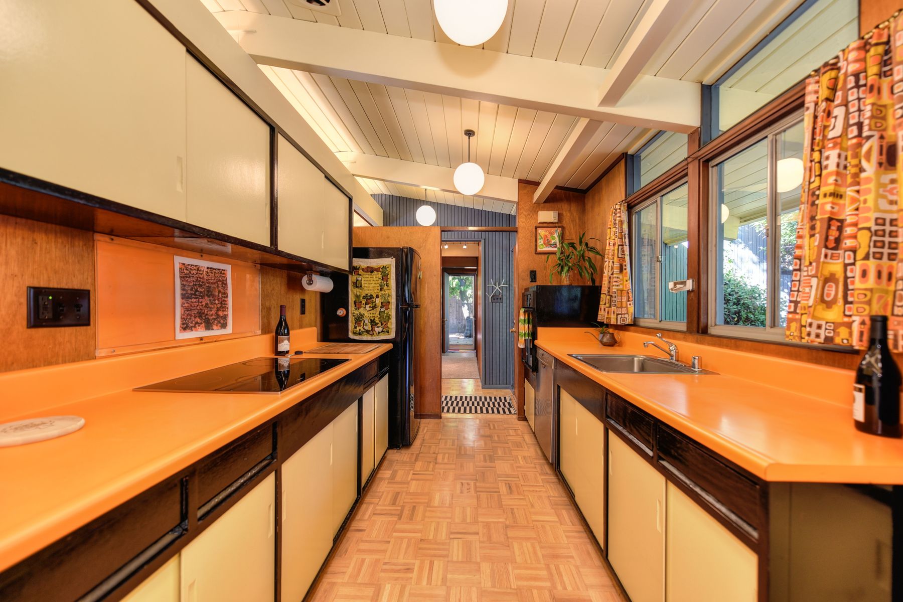
Choose the Decade Before the Color Statement
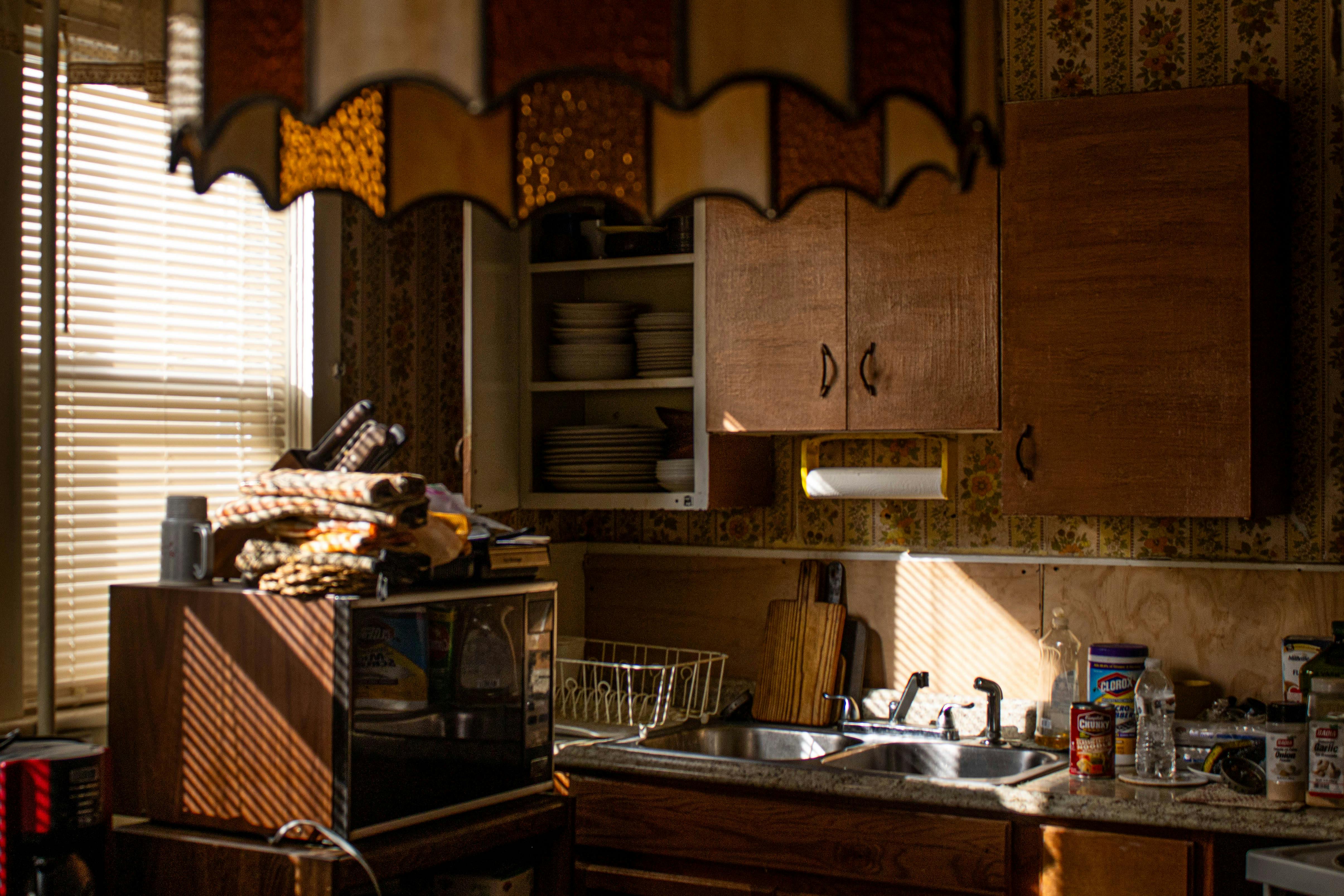
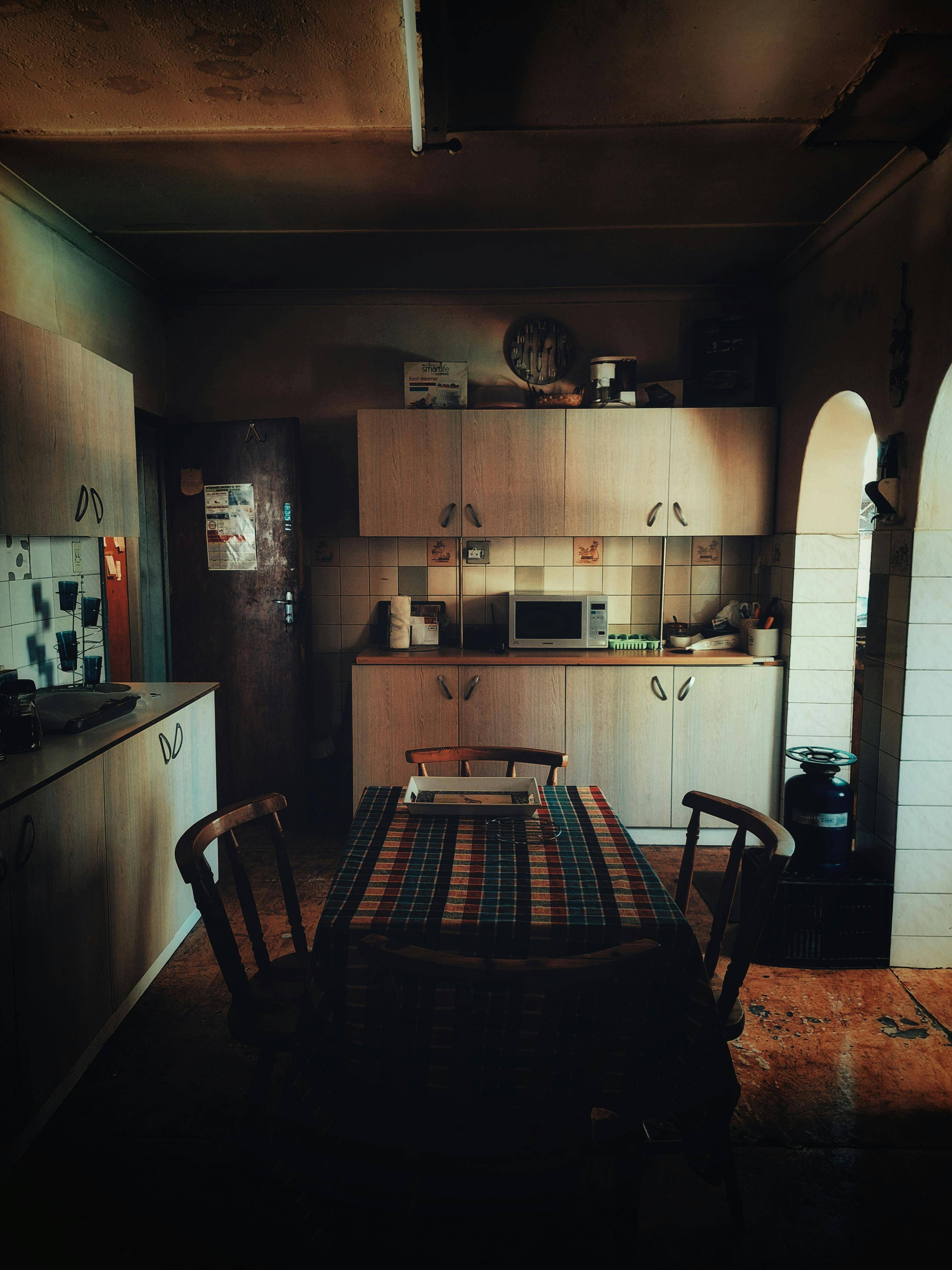
A bright counter, laminate edge or colored work surface only feels retro when its palette belongs to a broader era direction. Decide whether the room leans 1960s mod, 1970s earthy, 1980s graphic or another compatible band first, then choose the counter color. This prevents a bold surface from becoming an isolated novelty.
Build an Era-Specific Color Hierarchy
Retro palettes are strongest when one color leads, one supports and a neutral keeps the composition readable. Olive, mustard and brown produce a different revival from turquoise, white and chrome or red, black and cream. Keep the palette small enough that the period signal is clear from across the room.
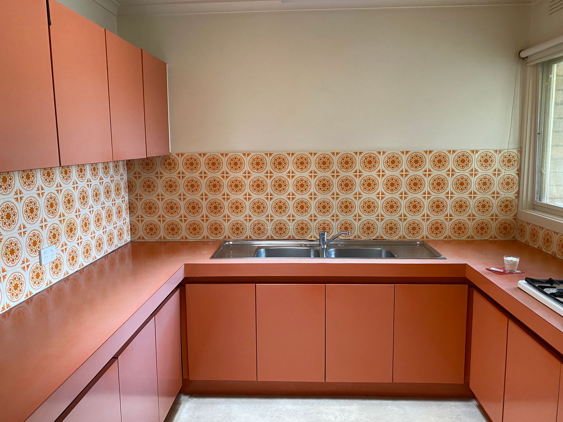
Use Pattern as Structure, Not Nostalgia Confetti
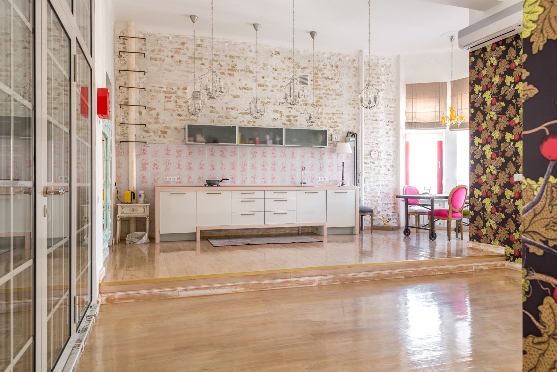
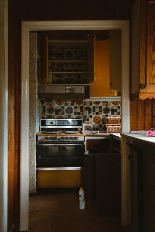
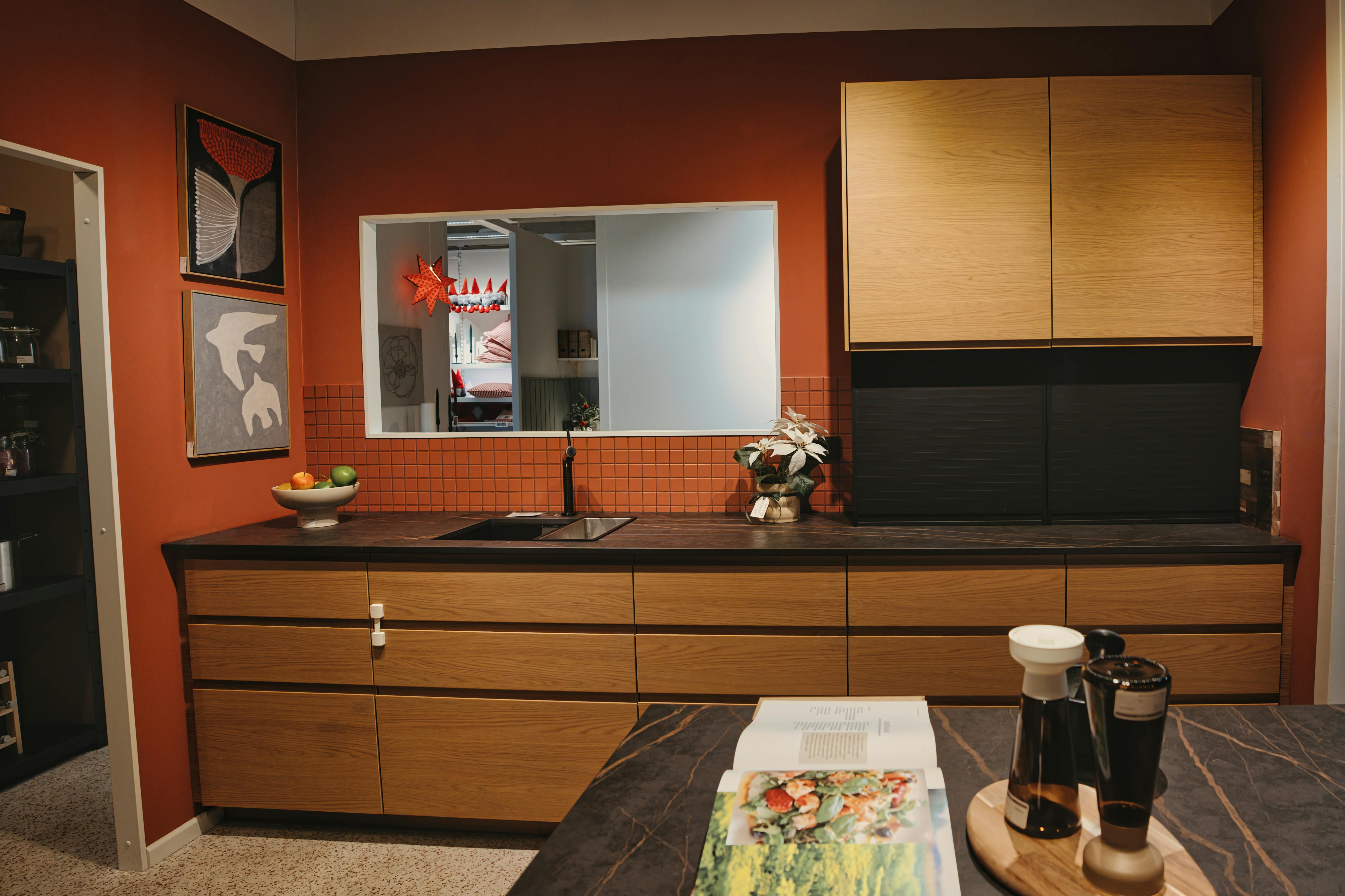
Square tile, repeating motifs and graphic backsplashes can establish a period rhythm when they occupy one bounded plane. Avoid repeating the same nostalgic pattern on floor, walls, textiles and accessories. One strong grid or repeat gives the kitchen more confidence than many small references.
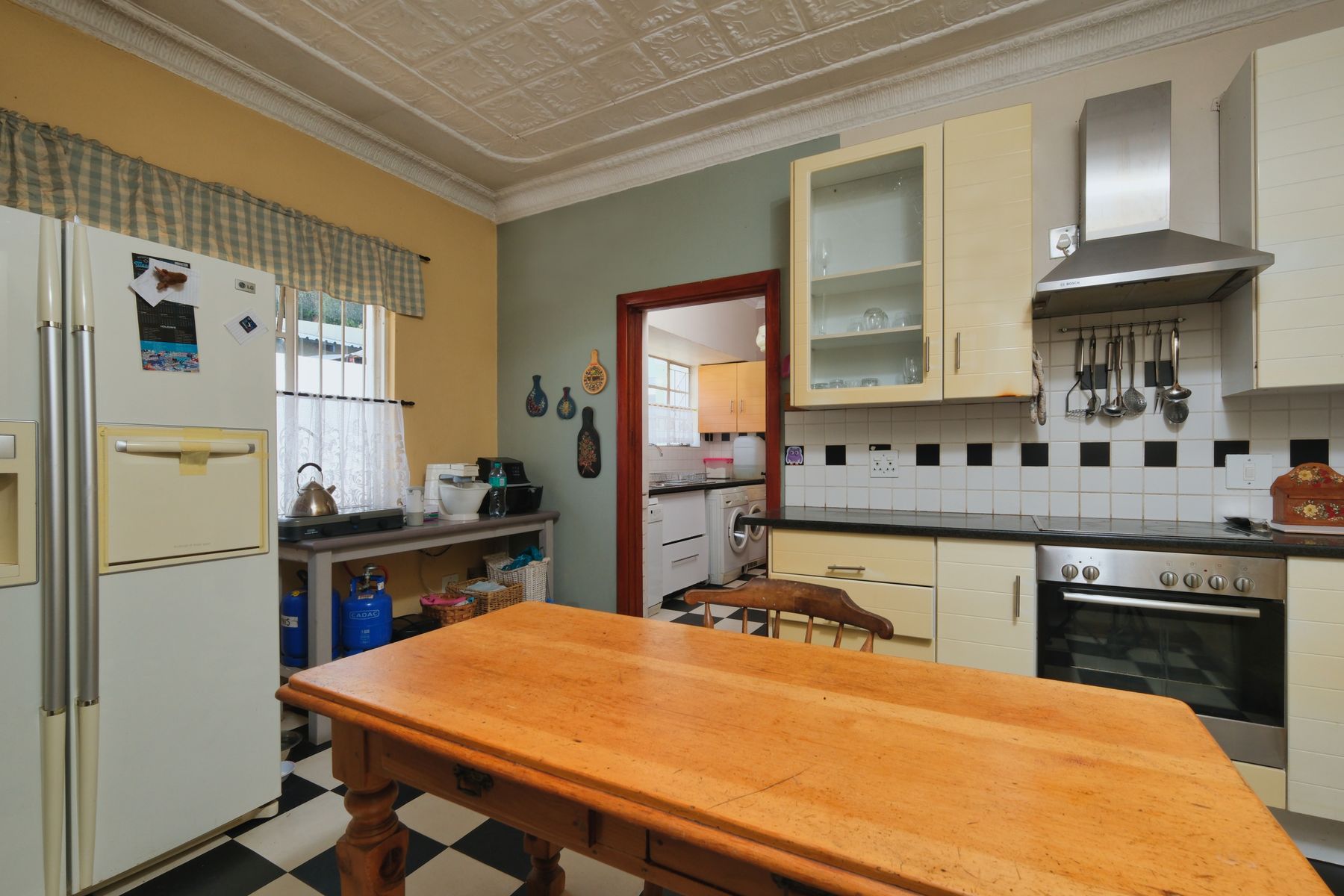
Let One Graphic Grid Anchor the Room
A checkerboard or other clear floor grid can carry much of the retro energy on its own. When the floor is strong, cabinet fronts and work surfaces often need less pattern and fewer decorative details. The contrast between graphic ground and plain verticals keeps the room sophisticated rather than theatrical.
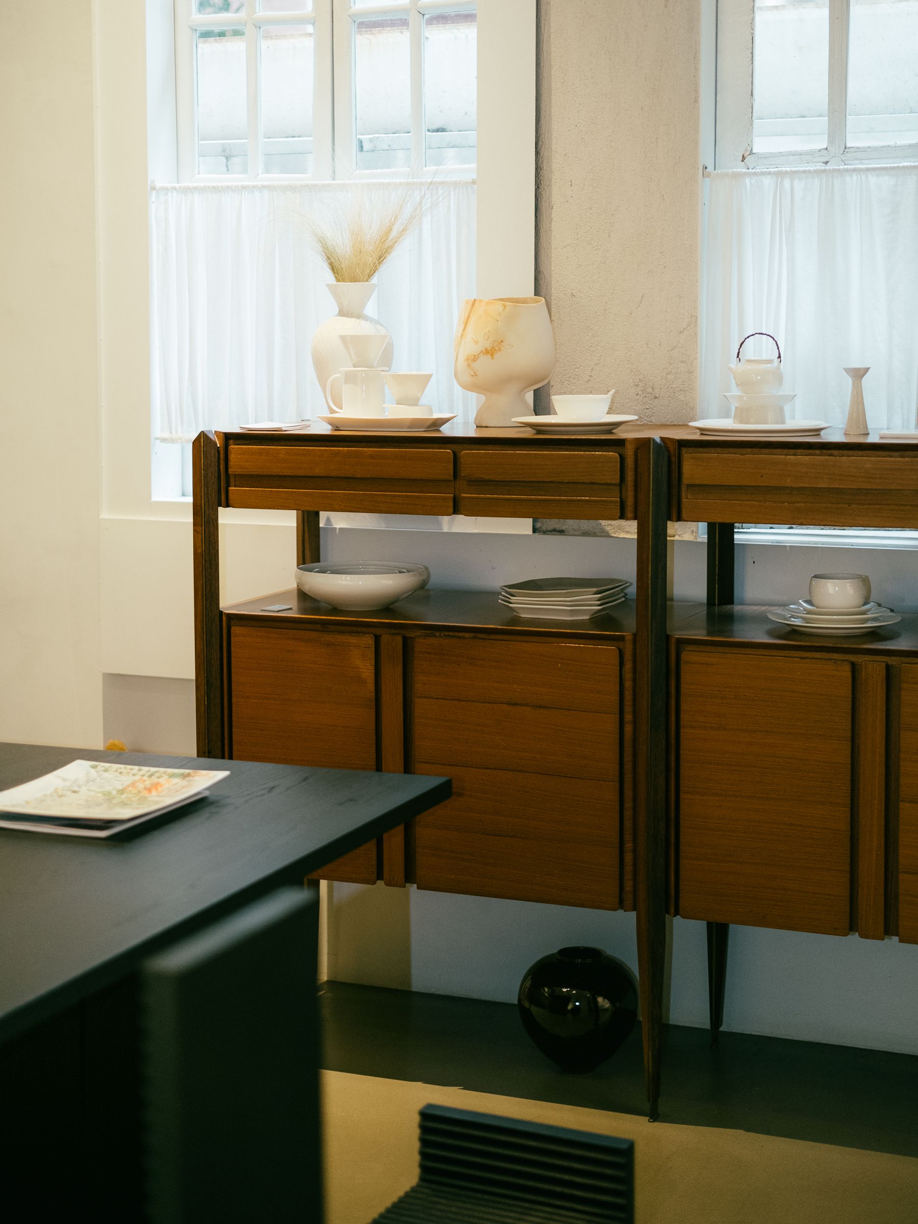
Use One Furniture Silhouette to Carry the Era
A sideboard, table or compact storage piece can introduce tapered legs, rounded corners or another era-specific silhouette without rebuilding the fitted kitchen. Give the piece a real job and let it stand apart from the cabinets. A recognizable furniture form can signal the decade more effectively than novelty accessories.
Use Textile Pattern at Human Scale
A curtain, seat fabric or table textile can introduce period color and repeat close to the body without becoming part of the permanent architecture. Keep the pattern smaller or softer than the main floor or backsplash so it supports the era rather than starting a second graphic system.
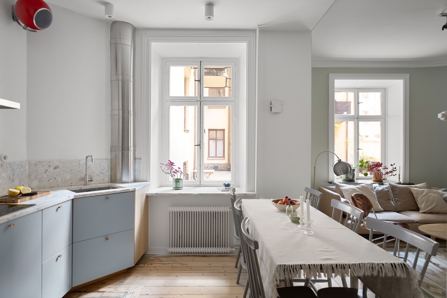
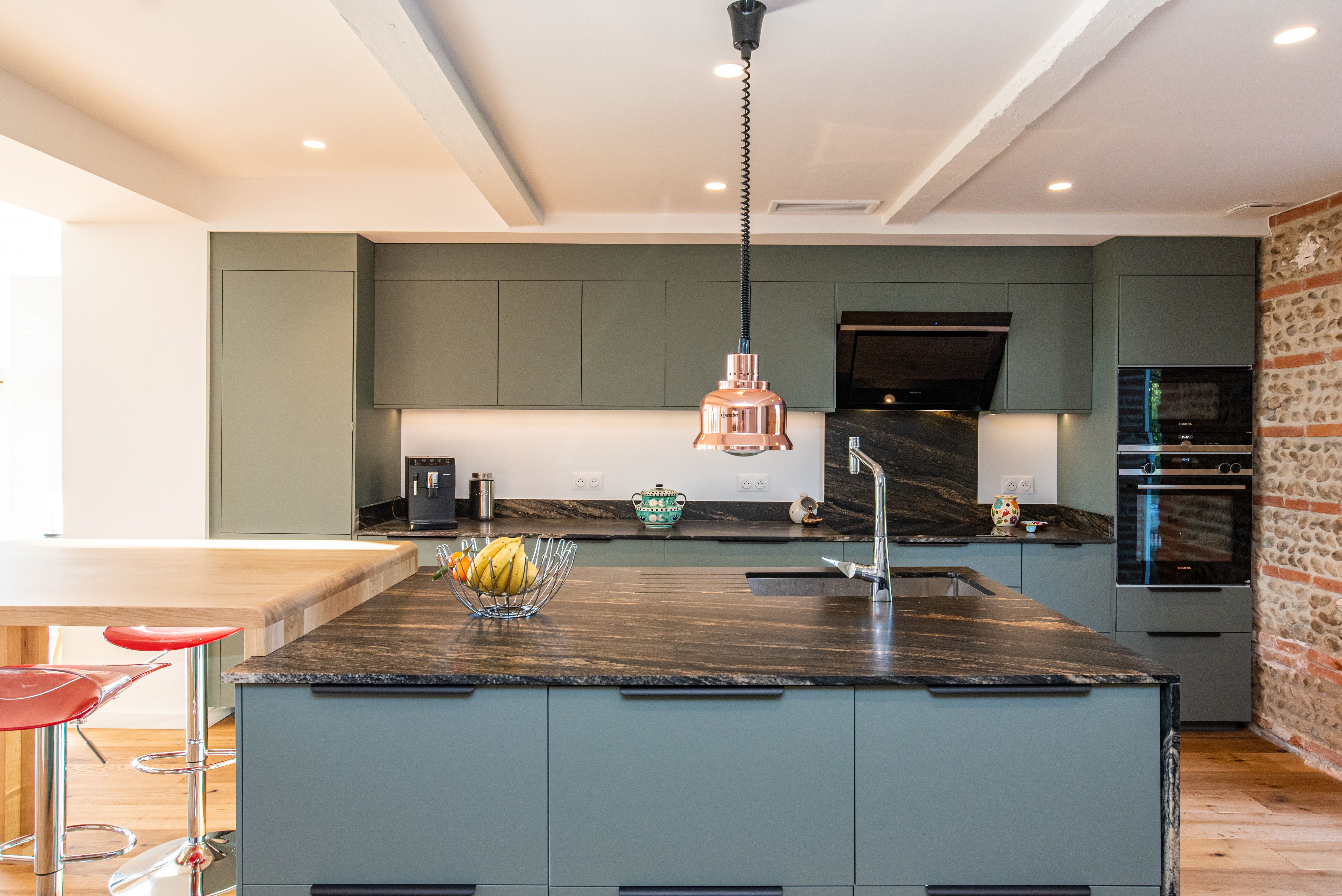
Move Beyond the Retro Cliché Palette
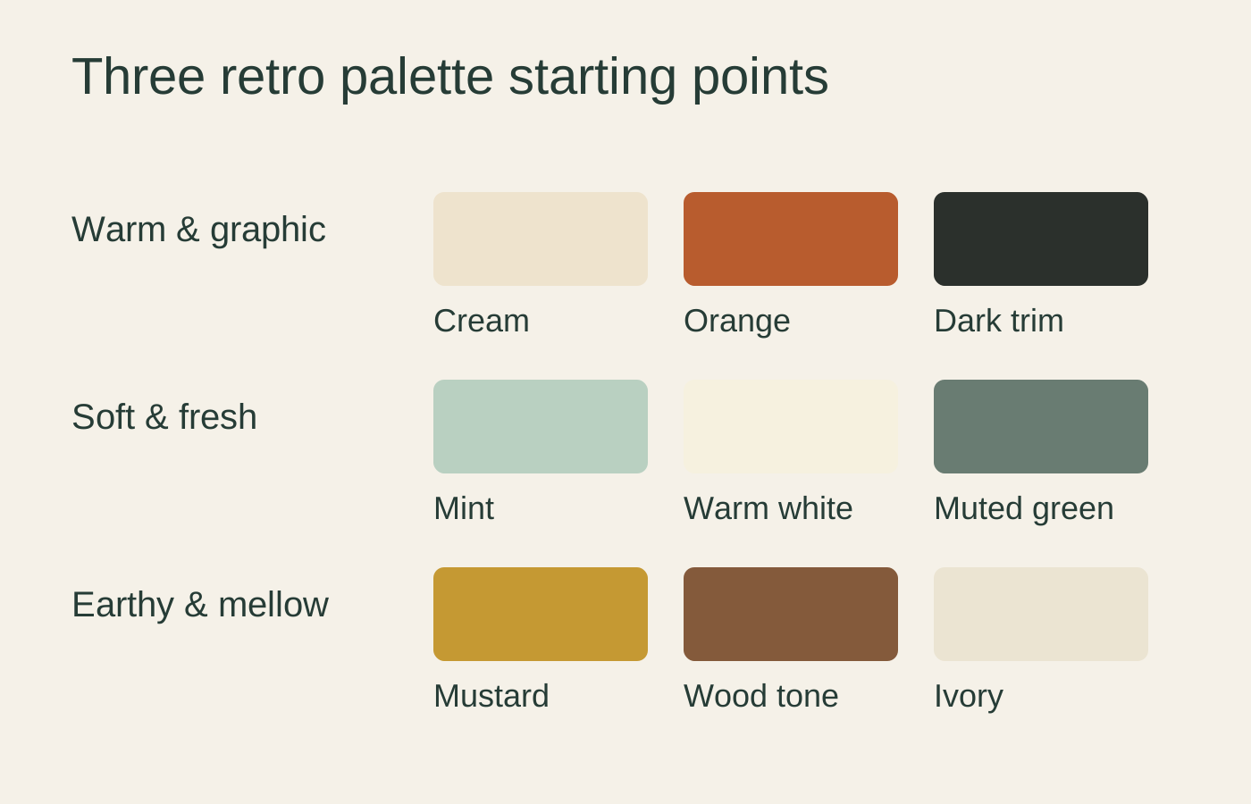
Retro does not require orange, avocado and red in the same room. Muted green, blue, cream, brown, burgundy or other decade-appropriate colors can create a more controlled revival. Choose color according to the specific era story rather than a generic nostalgia palette.
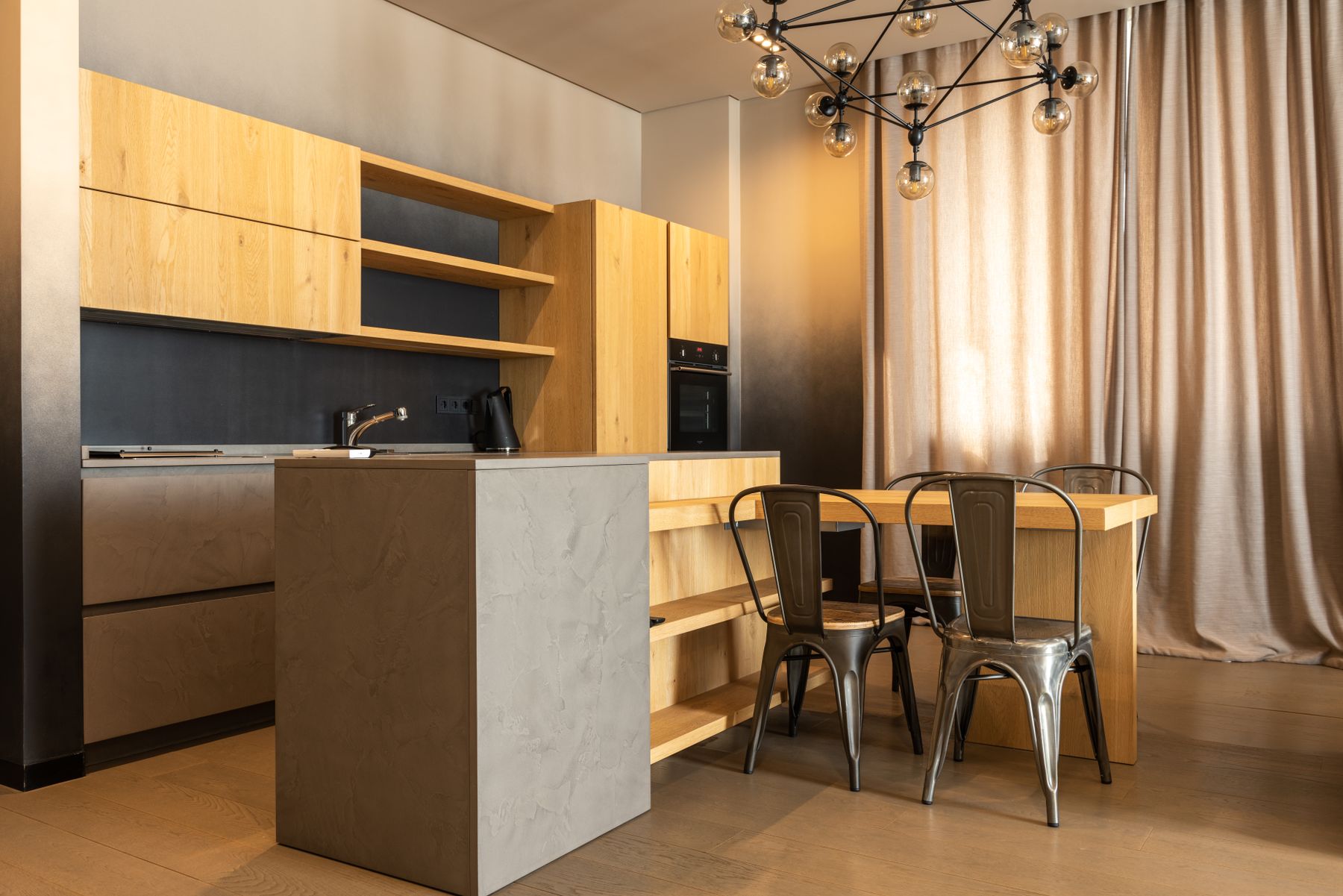
Let Lighting Carry a Recognizable Silhouette
Globe, mushroom, opal or chrome lighting can add a clear period silhouette, but the fixture should still be scaled and positioned for the room. Use one family of shape and rely on separate task lighting for the worktop where necessary. The form should support the chosen decade rather than simply read as 'old-fashioned.'
Keep Technology Current Unless the Appliance Is the Point
A retro kitchen does not need a reproduction refrigerator or vintage cooker. Current appliances can sit quietly within colored cabinetry and patterned surfaces, allowing the revival to come from palette and form. If one appliance is deliberately chosen as an era statement, make it the exception rather than forcing every machine to participate.
Know Where Retro Ends and Vintage Begins
A genuine old sign, light, table or utensil can add character, but the room remains retro when the overall composition is a deliberate contemporary revival. Vintage design begins to depend more on the provenance, condition and accumulated history of the actual objects. One real older detail can enrich retro without changing its basic logic.