Treat Monochrome as a Value Plan, Not a Style
Black and white is a color structure, not shorthand for modern minimalism. It can sharpen an Art Deco room, clarify traditional paneling, quiet a collected interior or give contemporary furniture stronger silhouettes. Begin by identifying what the palette must organize: architecture, a conversation group, a fireplace, art or a difficult open plan. This keeps the article distinct from [Minimalist Living Room Ideas](/living-room/minimalist-living-room-ideas/), where reduction is the governing decision. Here a room may be layered and decorative, provided its light and dark values remain deliberately composed.
Choose the Dominant Value Before Counting Objects
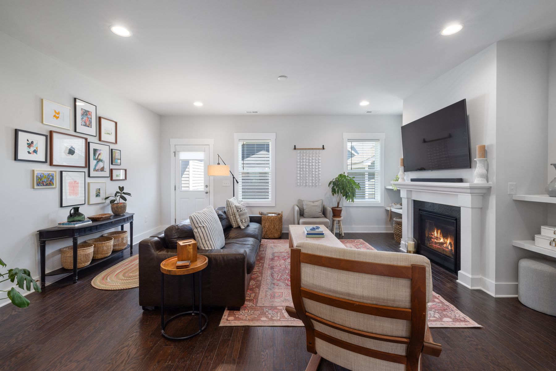
Do not aim for an equal number of black and white things. Decide which value owns the largest planes, then place the other where it can organize them. A white-dominant room may use one black sofa, fireplace or window grid as ballast. A black-dominant room needs a pale seating group, ceiling or rug large enough to preserve usable light and visible edges. Photograph the empty shell and shade its major planes on paper; this reveals whether the room needs a dark volume, a dark outline or simply one grounded furniture group.
Use Middle Values to Keep the Two Extremes Legible
The strongest monochrome rooms rarely contain only optical white and absolute black. Charcoal, smoke, warm off-white, veined stone, aged metal, timber and natural shadow create transitions that make both extremes easier to live with. Middle values are especially useful around large upholstery, where a pure black sofa can become a visual hole and a brilliant white one can detach from the floor. Keep the primary read black and white, but allow one or two material families to bridge the gap. The result feels dimensional rather than filtered.
Decide Whether Black Is Mass, Outline or Rhythm
Black can perform three different jobs. As mass, it appears in a sofa, fireplace breast or full wall and gives the room gravity. As outline, it defines window frames, furniture legs, picture frames or trim. As rhythm, it repeats in measured intervals such as shelves, sconces or a patterned textile. Choose one primary job and let the others remain quieter. Rooms become restless when a black sofa, black wall, black frames and black accessories all compete at equal strength. One clear role produces more authority than twenty matching accents.
Choose the Pale Field by Its Exposure
White is the active background of the scheme, so its undertone affects every black edge. Cool daylight can make a blue-leaning white feel severe, while a creamy white beside cool grey stone may appear yellow. Test large samples beside the floor, sofa fabric and window trim at morning, midday and evening rather than choosing from a small card. If the room contains warm timber or aged brass, a softened white usually makes the contrast feel intentional. Reserve a cleaner white for elements that truly need to look crisp.
Keep the Brightest Opening From Flattening the Scheme
A black silhouette placed against a bright window may disappear in backlight, while white upholstery can flatten when it receives undifferentiated frontal sun. Arrange the main contrast so daylight travels across surfaces and reveals their texture. Sheer curtains can soften glare without dissolving the window line; a darker curtain can frame the opening but should not become the only visible mass when closed. If screen use matters, resolve reflection and seating direction before styling. [Living Room Lighting Ideas](/living-room/living-room-lighting-ideas/) expands the functional plan beyond the palette.
Let Surface Prevent a Clinical Read
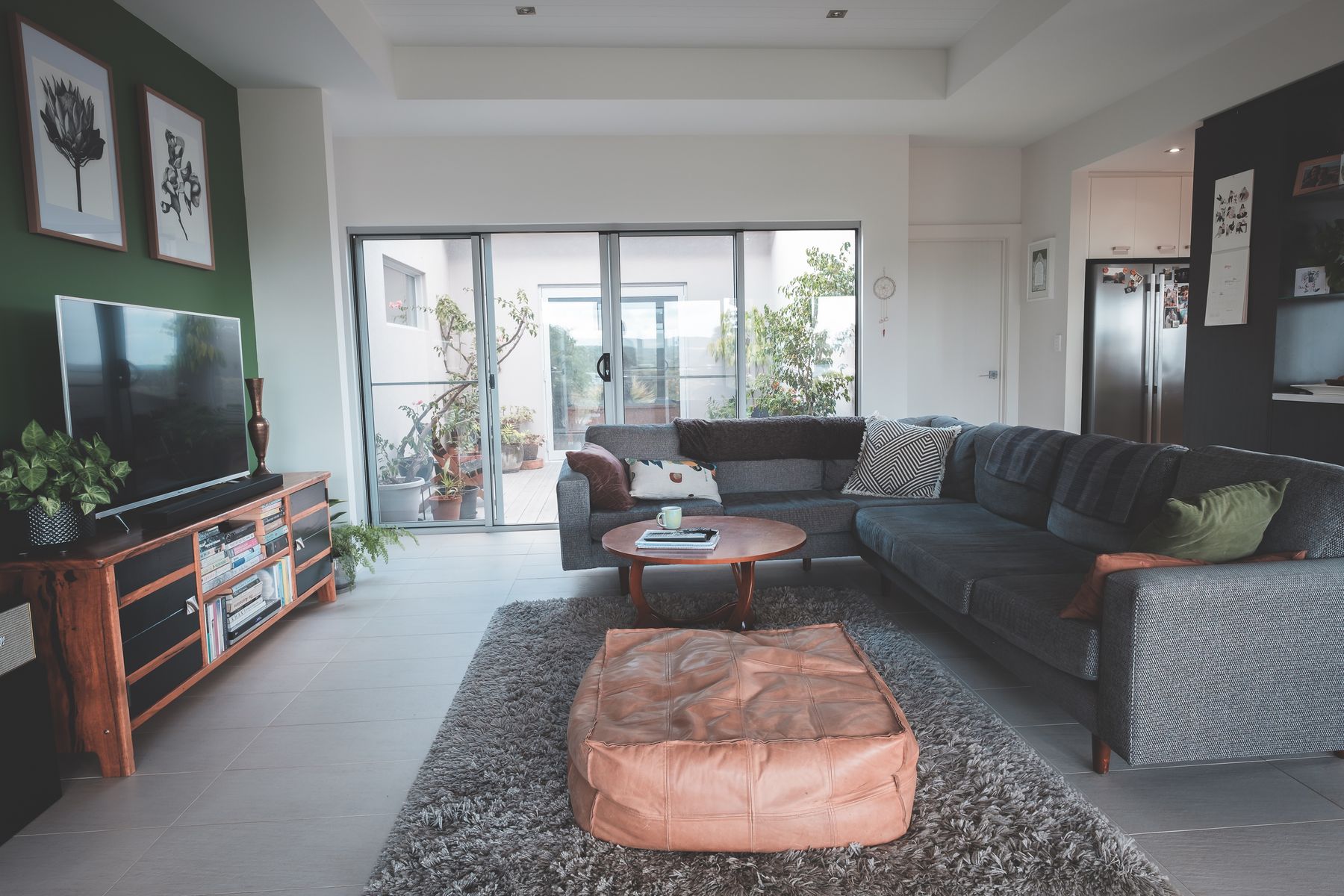
Warmth does not require turning black and white into a beige room. It can come from boucle loops, linen slubs, wool pile, timber grain, handmade ceramic, leather and the softness of indirect light. Keep their hues restrained but let their surfaces remain visible. A matte black cabinet beside a woven off-white sofa carries more depth than glossy black beside flat synthetic white. Use one tactile material at body level and one harder material at architectural level, then stop before every surface becomes deliberately textured.
Give One Plane the Graphic Move
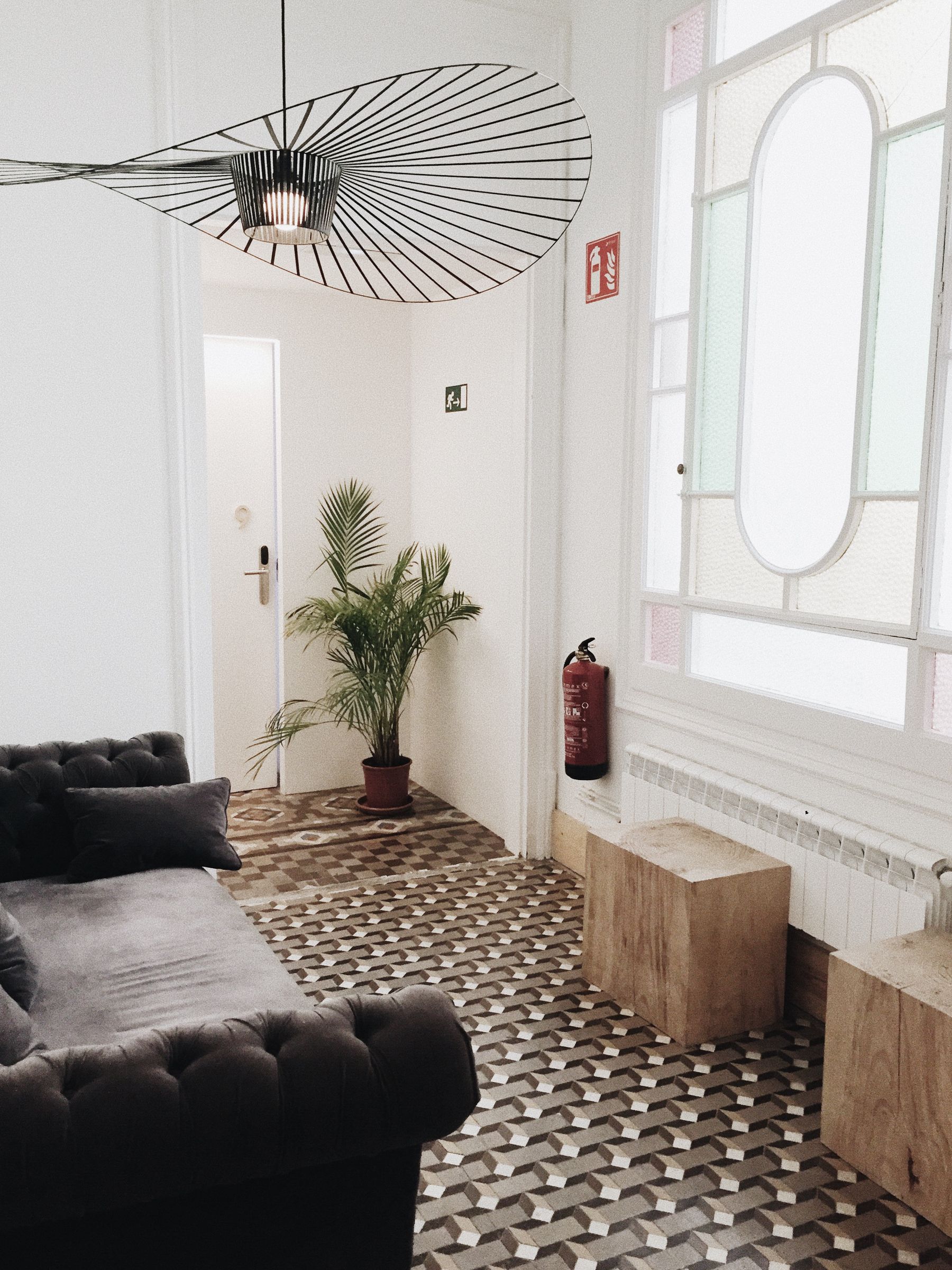
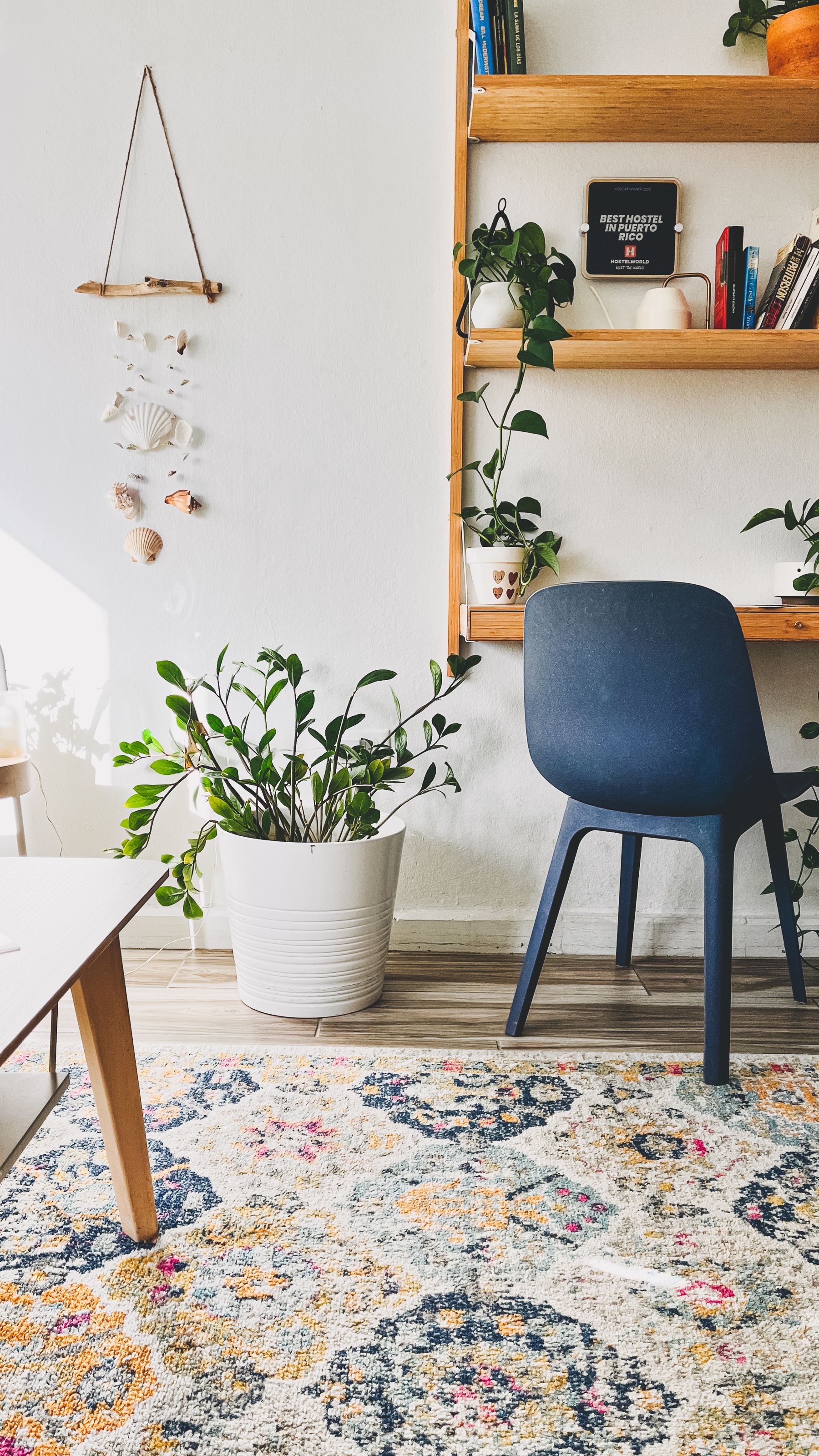
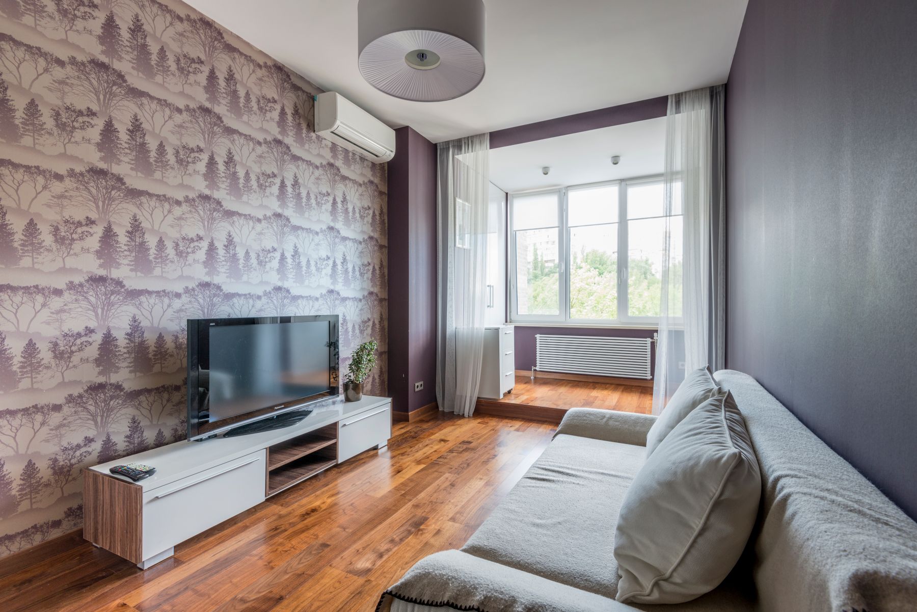
Choose whether the strongest black-and-white pattern belongs on the floor, wall, curtains or one major upholstered piece. Repeating high-contrast pattern on several planes creates vibration rather than cohesion, particularly in rooms seen from a distance. A graphic rug can hold a simple seating group; wallpaper can structure an otherwise plain shell; curtains can add vertical rhythm where the architecture lacks it. Once the leading plane is chosen, let supporting patterns use a smaller contrast range or a different scale. [Living Room Rug Ideas](/living-room/living-room-rug-ideas/) helps with fit and furniture relationships.
Separate Stripe, Check and Organic Pattern Jobs
Black-and-white pattern is not one category. Stripes direct the eye and can stretch a short wall or emphasize height. Checks create a stable grid but become visually insistent at large scale. Organic marks soften rectilinear furniture and introduce irregularity. Assign each pattern a job, then vary its scale rather than repeating the same motif on rug, cushions and art. Two patterns usually coexist more calmly when one is architectural and regular while the other is loose and textile-like. Solid black and white areas need enough space between them to reset the eye.

Let Grain Form the Midpoint
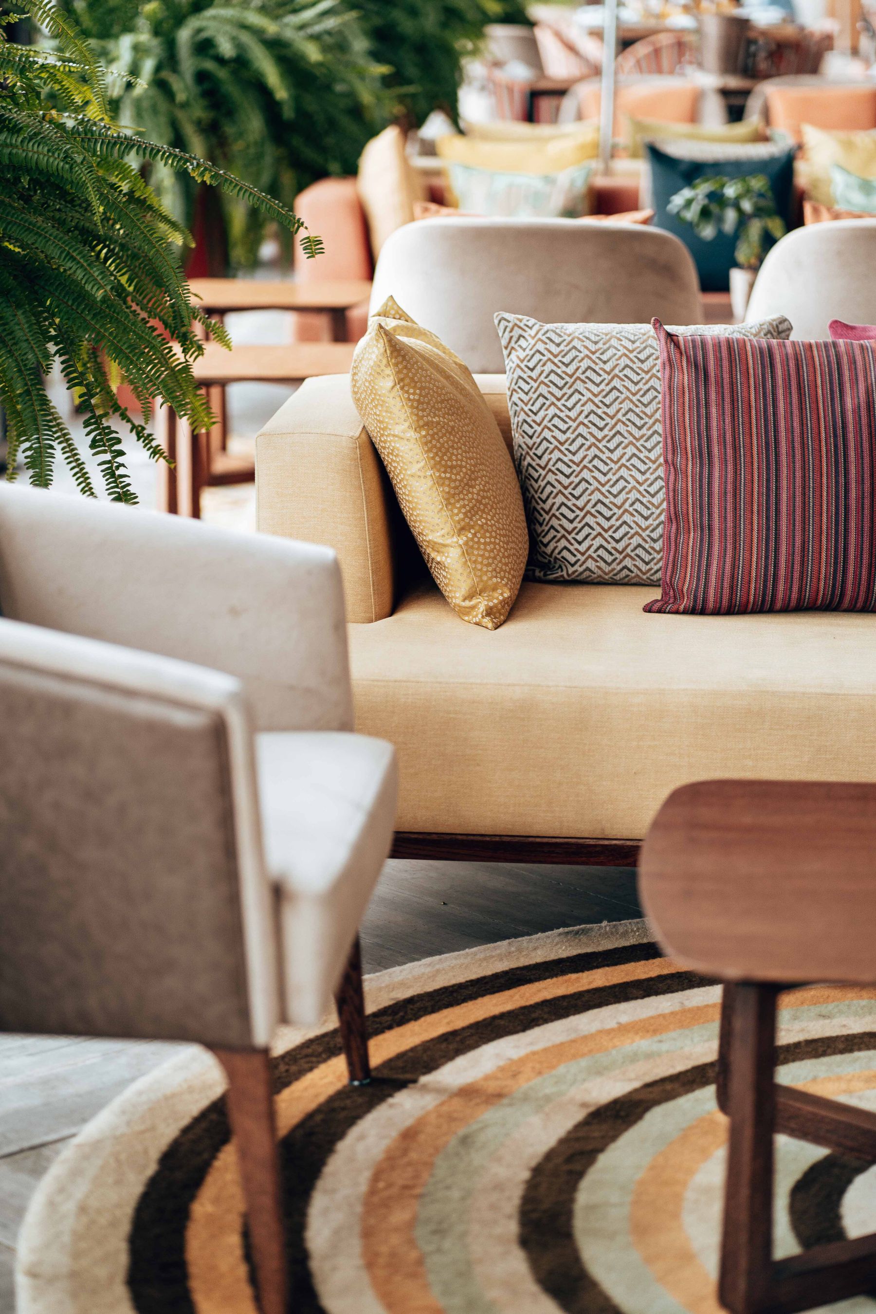
Timber earns its place when it connects the two values through grain and warmth, not when it is added nervously because monochrome feels cold. Choose one dominant wood temperature and repeat it in two or three structurally useful places such as a table, cabinet and chair frame. Pale oak keeps a white-led room open; walnut can give a black-led room a legible middle band. Avoid mixing several unrelated orange, grey and red woods. The monochrome framework should remain obvious even when every timber piece is mentally removed.
Keep the Dark Anchor's Edges Visible
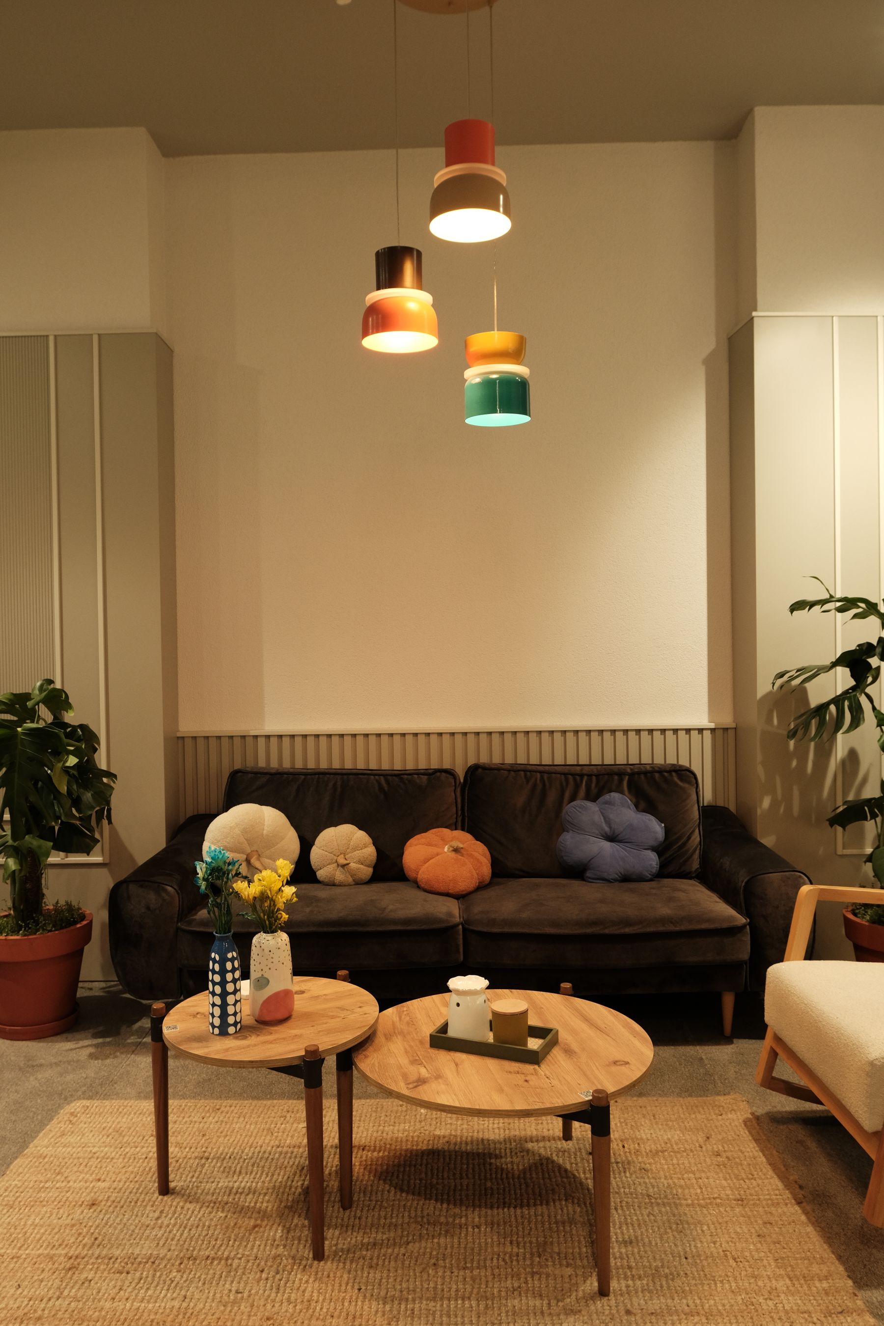
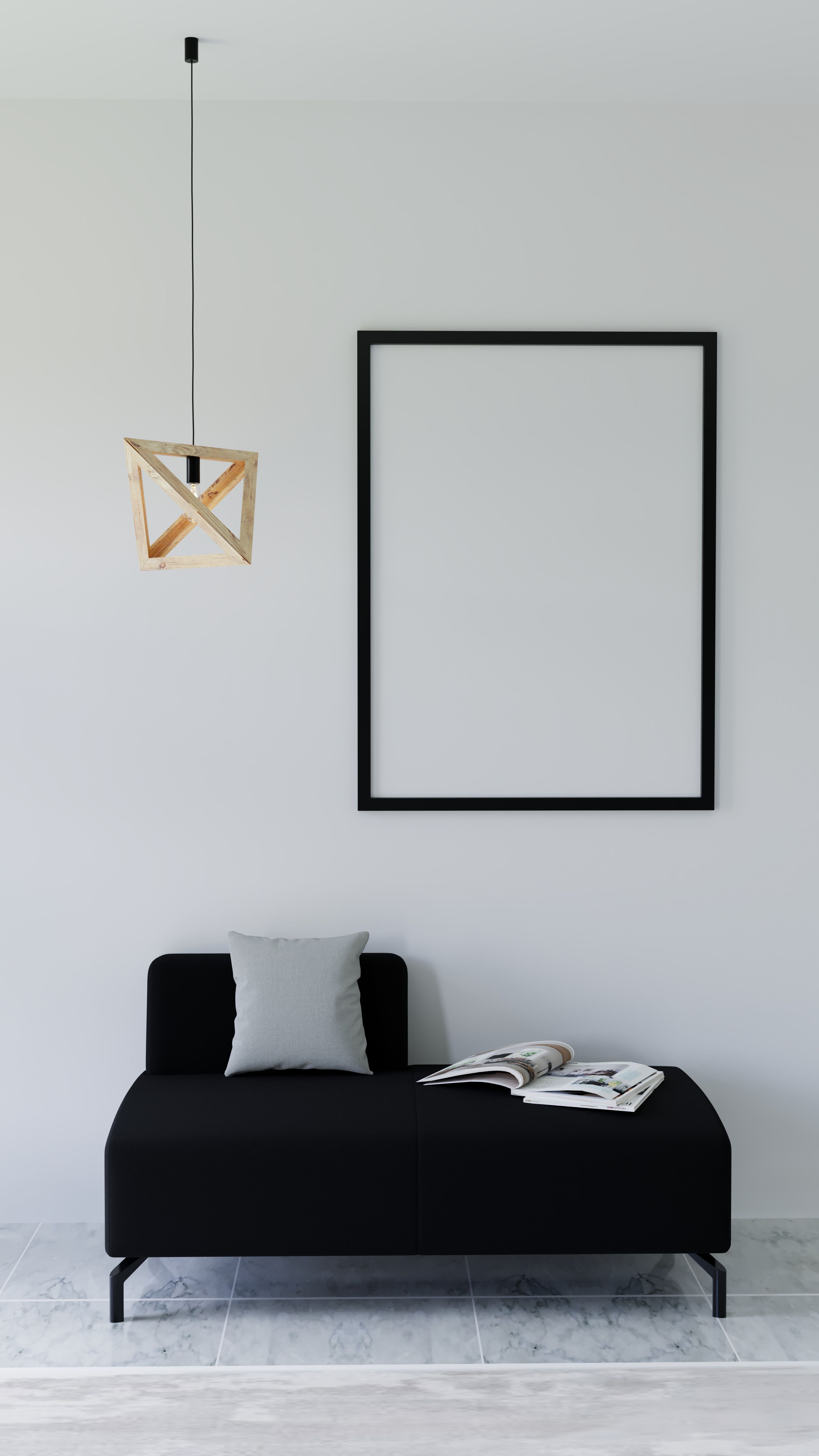
A black sofa is a major visual mass, not a neutral default. It works best against a wall or curtain that separates its outline and with enough pale floor or rug around it to reveal the base. Texture matters: velvet absorbs light, leather reflects it and a coarse weave breaks the mass into smaller highlights. Avoid surrounding the sofa with black tables, black art and a black rug unless the intention is deliberately immersive. Keep the reachable surface useful and lighter or warmer so everyday objects do not disappear.
Ground the Pale Anchor With Shadow
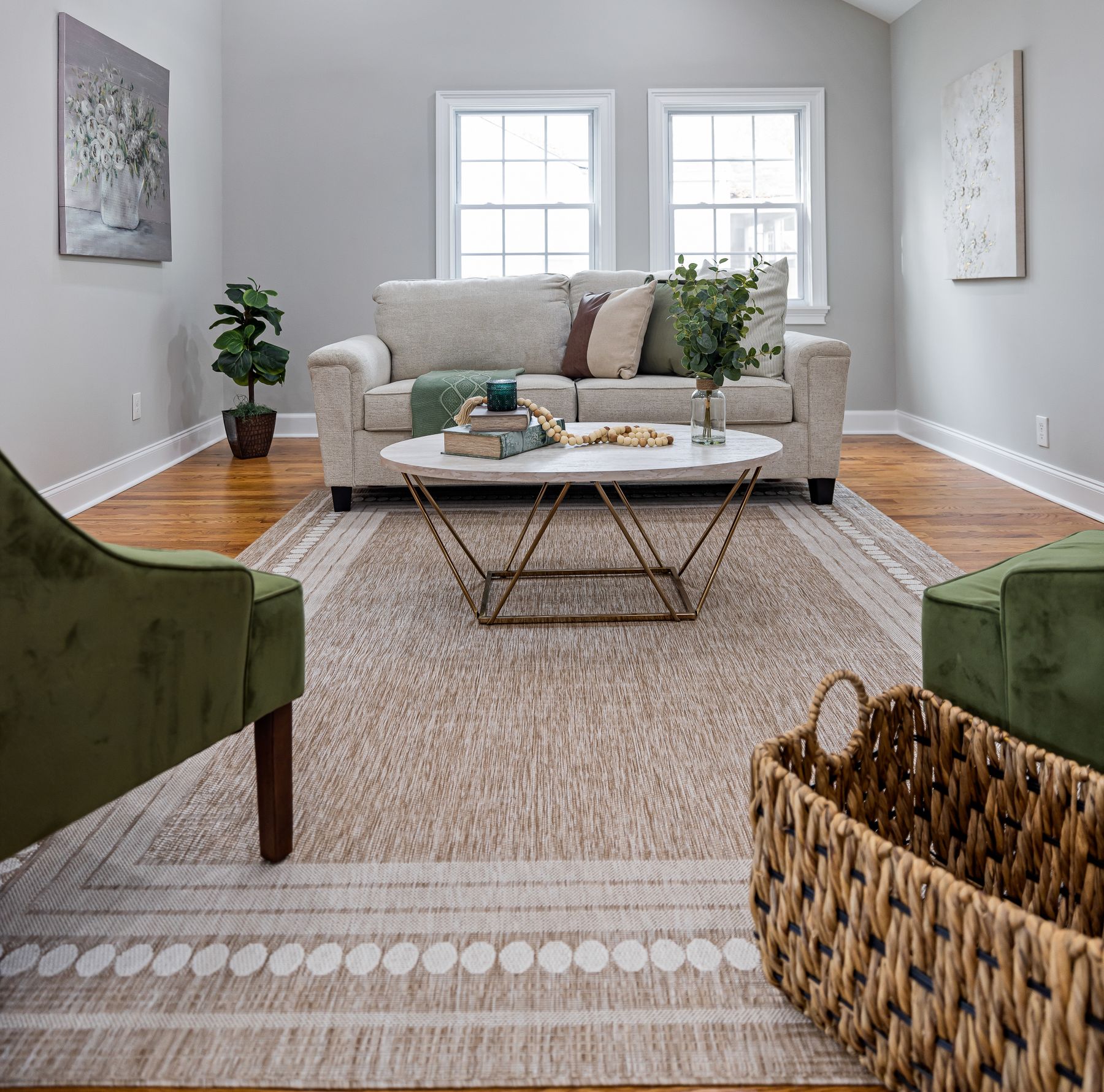
A white sofa needs a visible relationship to the floor. Use a rug with a mid-value pattern, dark legs, a nearby black table or the sofa's own shadow line to prevent it from floating. Choose an off-white that relates to the walls without matching them exactly, and evaluate fabric care against the household rather than the photograph. Removable covers may be useful only when their construction and cleaning guidance suit real routines. The goal is relaxed contrast: the sofa should invite use, not advertise its vulnerability.
Balance the Group by Visual Weight
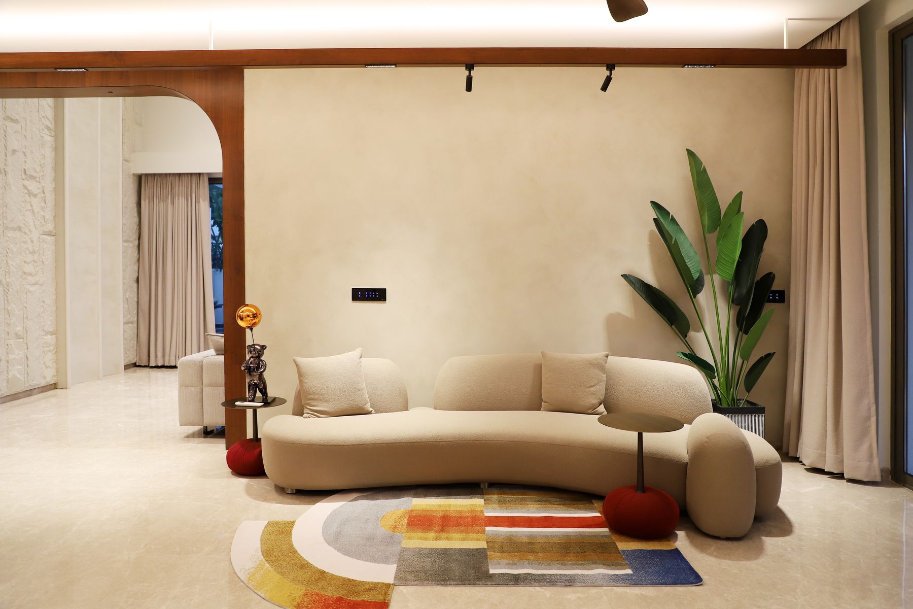
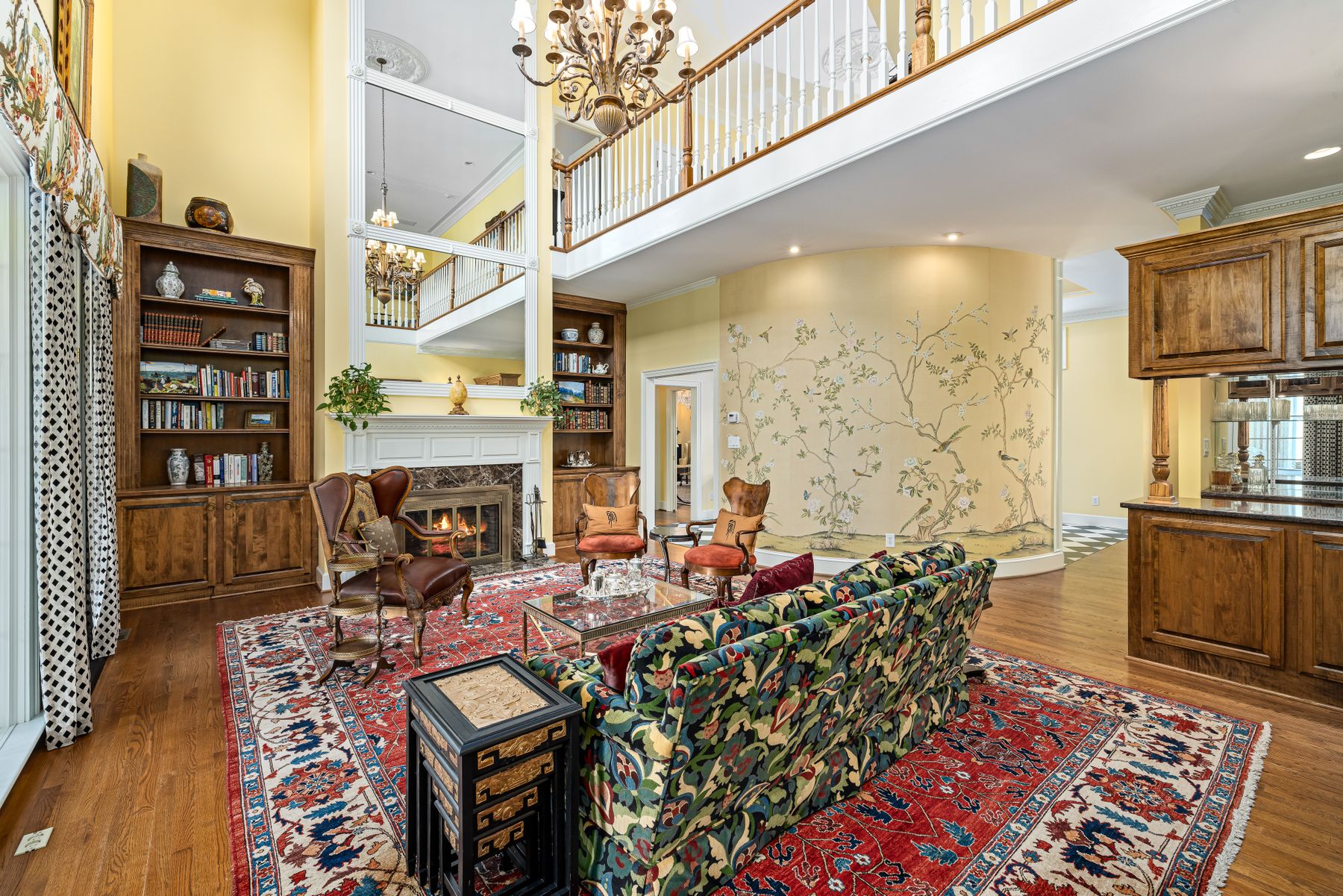
A dark sofa on one wall and several pale chairs on the other can make the room lean visually even when the floor plan is symmetrical. Balance mass, not item count: one substantial black sofa may need two lighter chairs plus a dark table between them, or a pale sofa may need one black chair and a strong fireplace opposite. Keep seats close enough for conversation and give each a reachable surface. The palette should clarify the group rather than turn furniture arrangement into a checkerboard.
Treat the Television and Fireplace as Existing Black Shapes
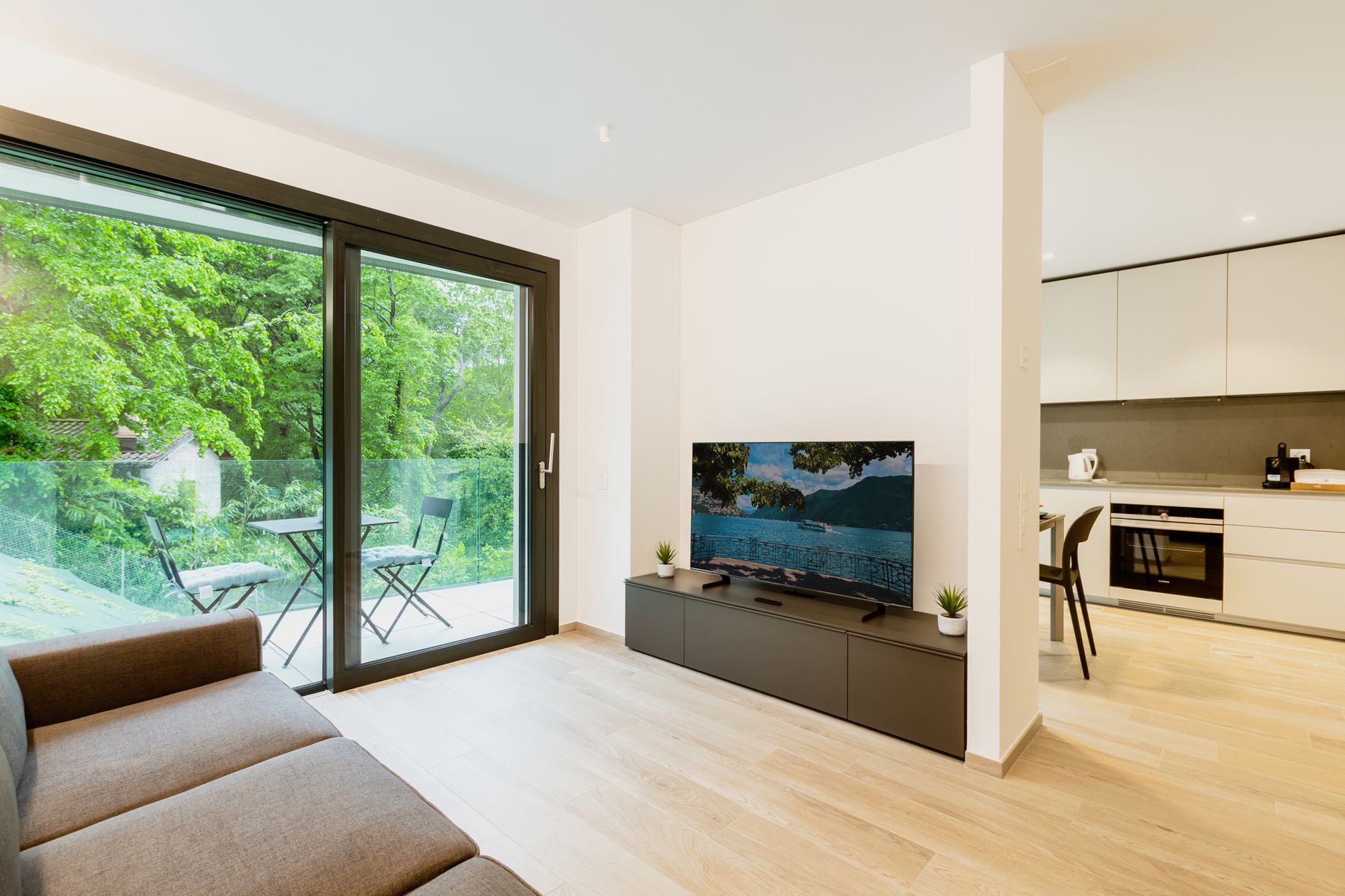
A television is often the largest black rectangle in the room when switched off, and a fireplace opening may create a second. Include both in the value plan instead of decorating around them afterward. A dark media wall can reduce contrast around the screen, while a pale wall makes the rectangle explicit; either is valid if the composition is intentional. Avoid adding small black frames simply to make the television look related. Resolve viewing height, glare, ventilation and equipment access first, then decide whether the screen should merge or remain visible.
Script the Evening Room So Black Does Not Collapse
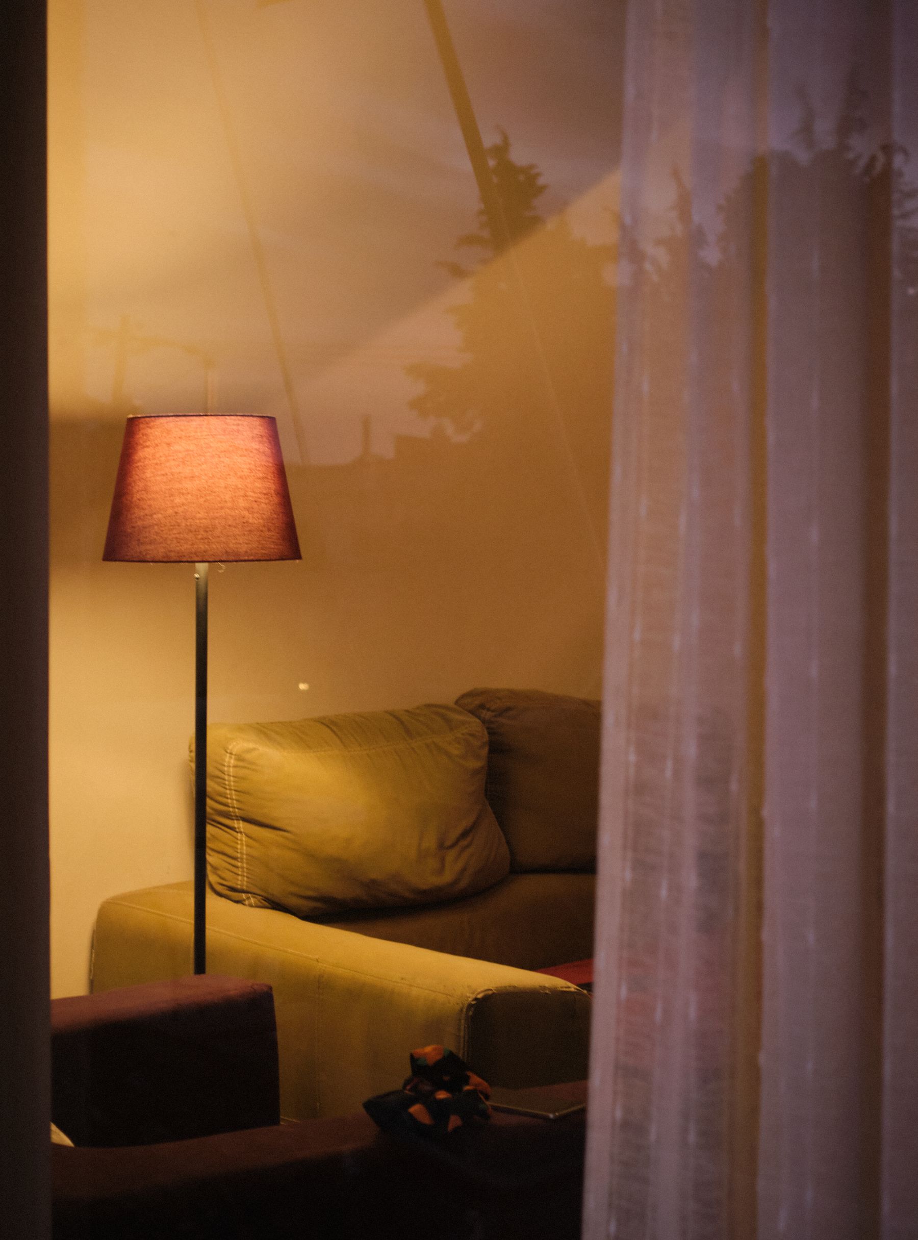
At night, black walls, upholstery and furniture can merge into one undifferentiated area. Use light to reveal the front edge of a sofa, the face of art and the route between seats rather than simply washing the ceiling. A shaded floor lamp can separate a dark chair from its background; concealed shelf light can reveal depth; a table lamp makes hands, books and drinks visible. Keep color temperature consistent enough that the whites do not fragment into unrelated cream, grey and blue patches.
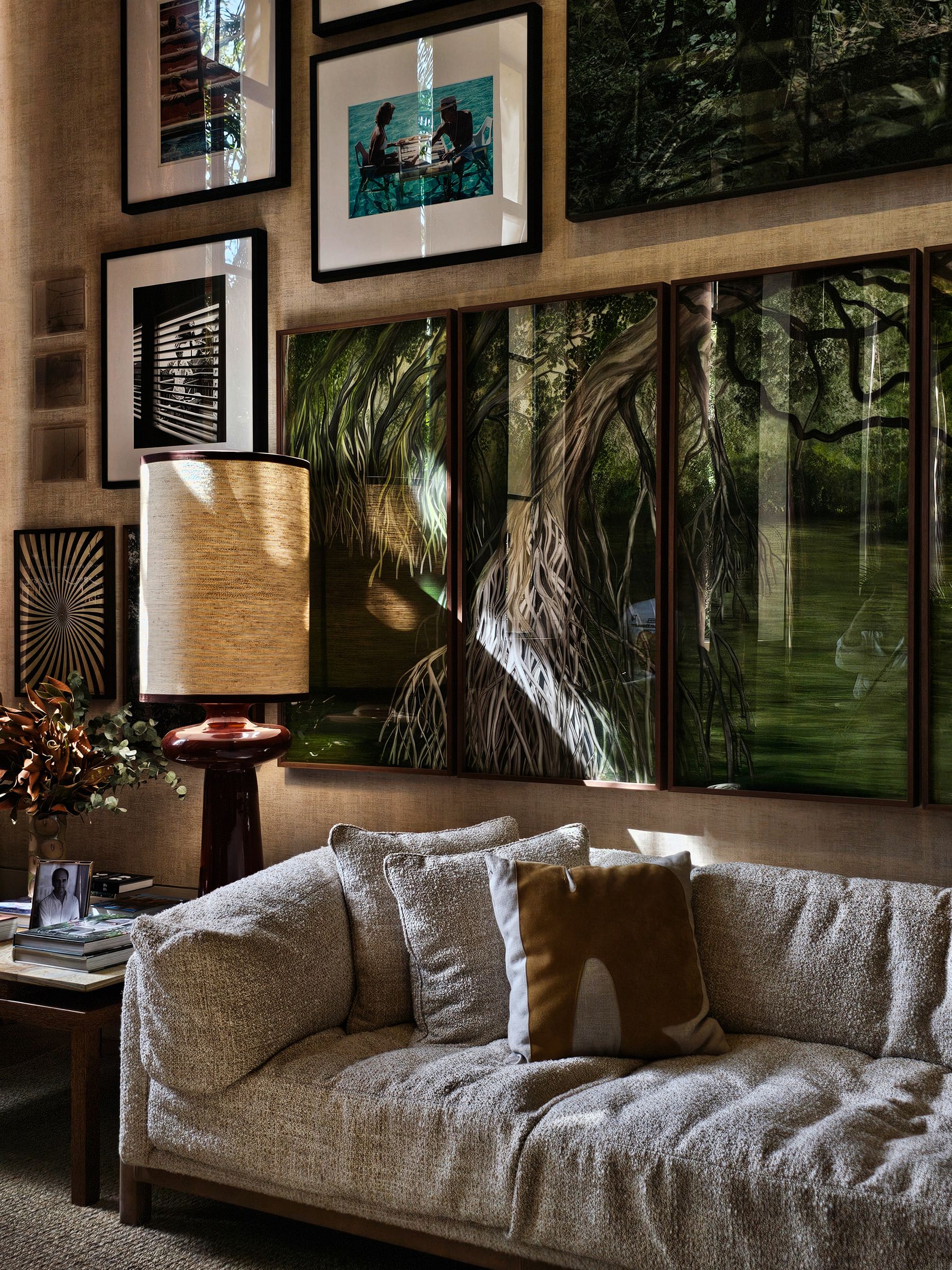
Make Monochrome Art Personal, Not Merely Coordinated
Black-and-white photography, drawings and prints are easy to coordinate, which makes them equally easy to choose without meaning. Build the art layer around subject, authorship or personal memory first, then use frame tone and spacing to create coherence. Mix one or two larger works with quieter pieces rather than buying a ready-made grid. If the room already contains strong geometric pattern, choose imagery with softer tonal movement. [Living Room Wall Ideas](/living-room/living-room-wall-ideas/) offers deeper guidance on scale, hanging and wall roles.
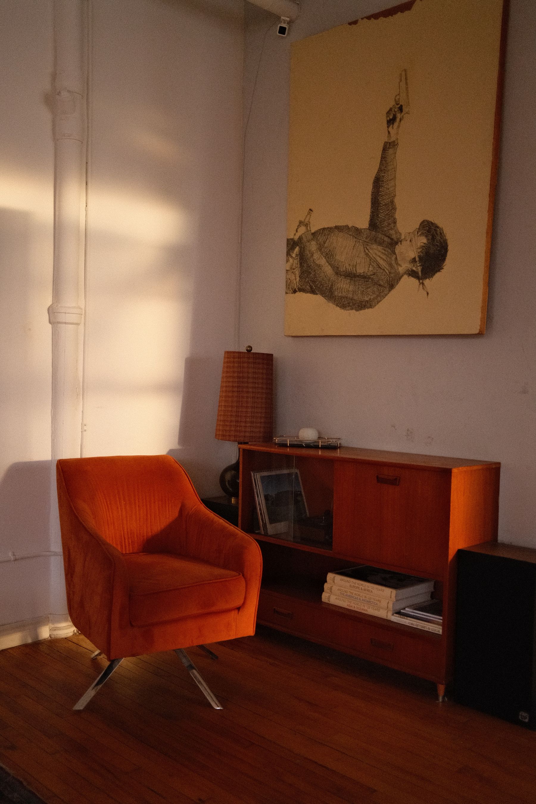
Let One Accent Interrupt the Scheme
An accent color is optional, not evidence that monochrome failed. Let it appear in one meaningful object or one connected textile group, then repeat it once at a smaller scale. Red creates a graphic interruption; olive or rust makes the room earthier; cobalt can sharpen cooler whites. Keep the accent in items that can change without rebuilding the room. This preserves black and white as the architecture of the palette while allowing art, books, flowers or seasonal textiles to evolve. Avoid equal sprinkling across cushions, vases and frames.
Reduce Contrast Events at Close Range
A small room does not need less black; it needs fewer contrast events. Concentrate the dark value in one sofa, cabinet or wall and preserve a connected pale route around it. Thin black legs and frames can help furniture feel visually precise, but too many create visual noise at close viewing distance. Use one pattern field rather than multiple small prints and keep necessary storage aligned with the strongest plane. The circulation principles in [Small Living Room Ideas](/living-room/small-living-room-ideas/) remain primary; color should make the route clearer, not narrower.
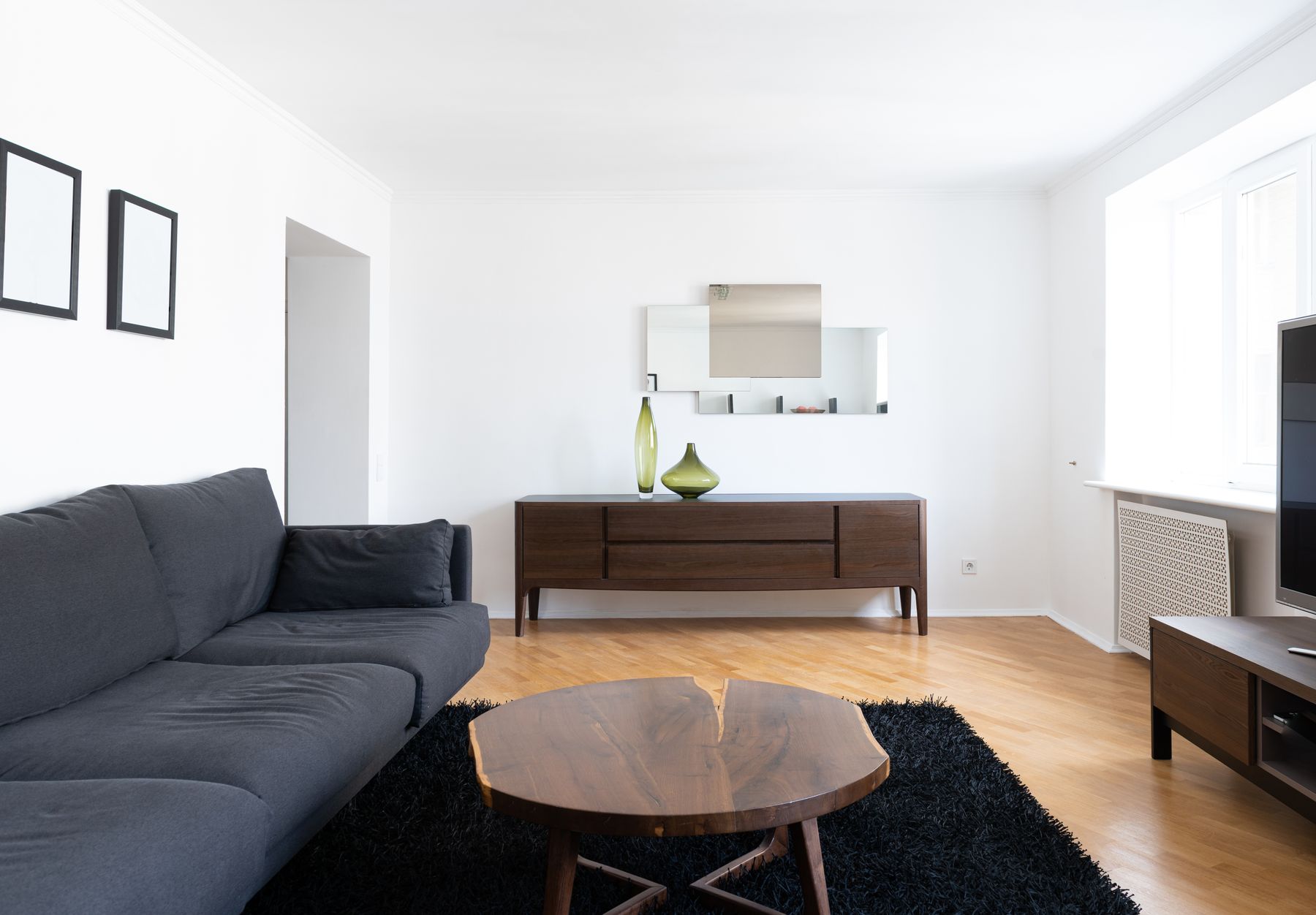
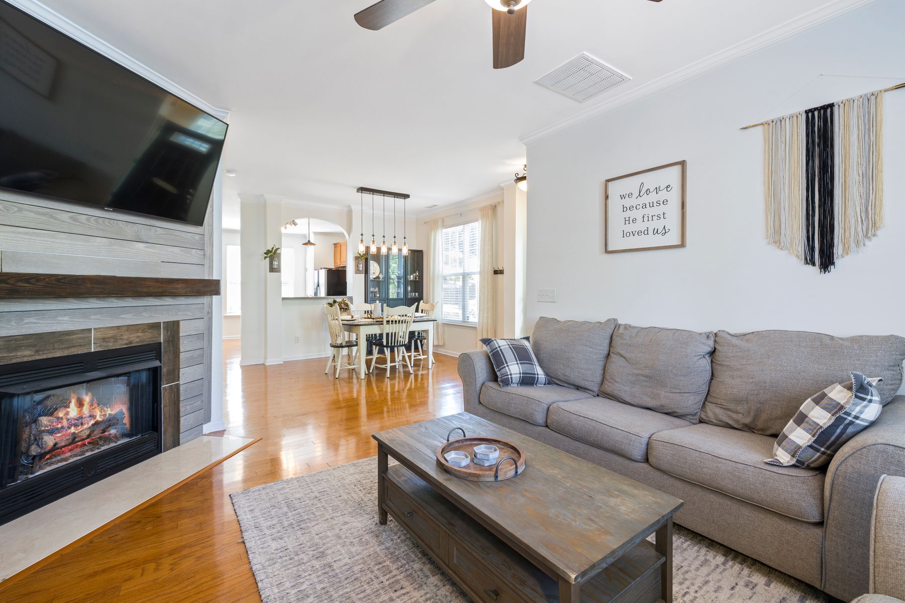
Repeat Edges Across Connected Areas
Do not furnish an open plan with matching black-and-white sets. Repeat the logic instead: perhaps dark outlines appear in living-room tables and dining-chair frames, while pale upholstery and walls form the shared field. Let one zone carry the stronger pattern and the other use quieter solids. A timber floor or stone island can act as the middle value connecting both. From the main entrance, the contrast should guide the eye through the zones rather than divide them into alternating black and white blocks.
Make the Palette Portable
In a rental, use the largest reversible elements first: rug, curtain, sofa cover where appropriate, freestanding shelving and art. A removable wall treatment only earns its place when the product, substrate and tenancy rules support it; do not assume every adhesive finish releases cleanly. Black floor lamps, tables and frames can travel, but avoid accumulating small pieces merely because they fit the palette. Build one portable dark mass and one graphic layer so the next home can use them independently.
Use Contrast to Clarify Everyday Boundaries
Contrast can help a coffee-table edge, chair arm, switch plate or change in floor level become easier to notice, but decoration is not a substitute for a safe layout or appropriate assessment. Keep routes physically clear, avoid a dark rug edge disappearing against a dark floor and make frequently used controls visually distinct from their background. For children and pets, contrast also reveals loose toys, pale fur or dark cables differently; maintenance and housekeeping routines should respond to the household rather than an idealized image.
Choose Black Finishes by Dust, Lint and Touch
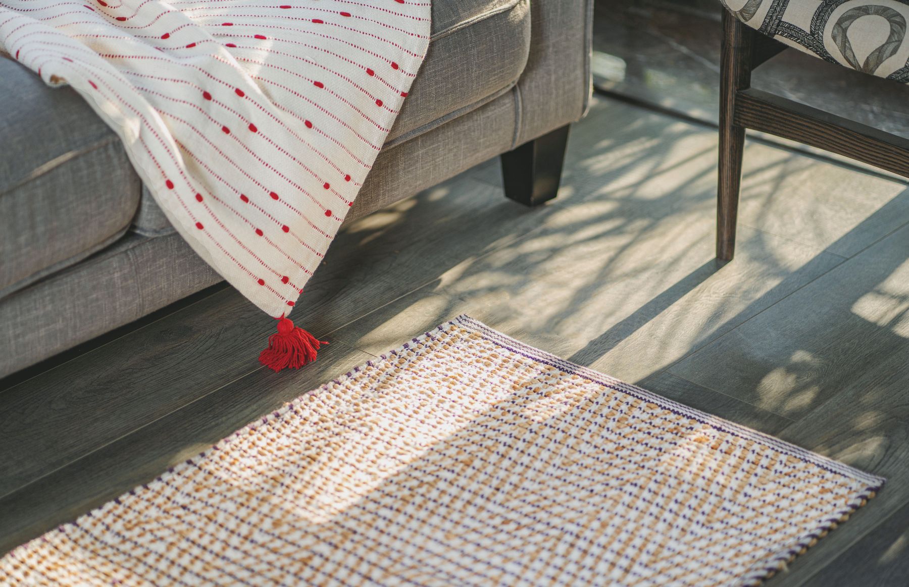
Black does not automatically hide wear. Pale dust, lint, fingerprints and edge abrasion can be conspicuous on dark glossy surfaces, while textured matte finishes may trap debris differently. White upholstery reveals spills but may show less pale pet hair; black fabric reverses that problem. Review care instructions for each exact product and place vulnerable finishes where they can be reached without moving half the room. Prefer replaceable or repairable high-contact parts over a pristine finish that normal use will quickly expose.
Translate Black and White Across Styles
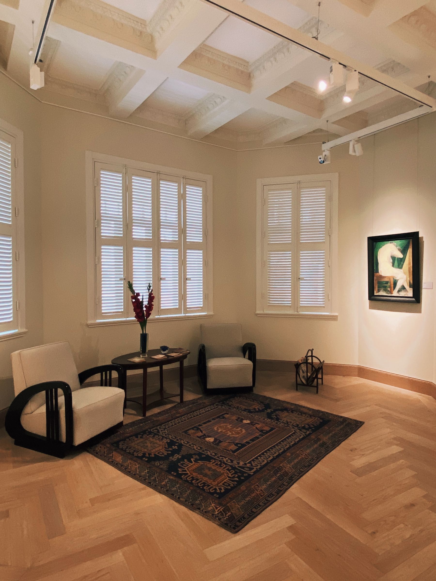
A modern route may use broad plain fields, slim frames and sculptural furniture. Art Deco can introduce geometric symmetry, polished detail and one stronger pattern. Traditional black and white benefits from softened whites, dark timber, checks, stripes and architectural trim. Gothic design needs material weight, carving and controlled shadow rather than simply more black. Compare [Art Deco Living Room Ideas](/living-room/art-deco-living-room-ideas/) and [Gothic Living Room Ideas](/living-room/gothic-living-room-ideas/) before borrowing their signals. Color should reveal a style's construction, not impersonate it.

Run the Grayscale and Subtraction Tests
Finish with two edits. First, photograph the room in grayscale. The conversation group, focal point and walking route should remain distinct; if they merge, adjust a large field rather than adding more small accents. Second, remove one repeated black object and one repeated white object. If the composition improves, the room was matching rather than organizing. A convincing black-and-white living room should still feel personal through shape, material, art and use. The palette supplies discipline, but it should never become the only story the room can tell.