Choose the Carrier Before the Shade
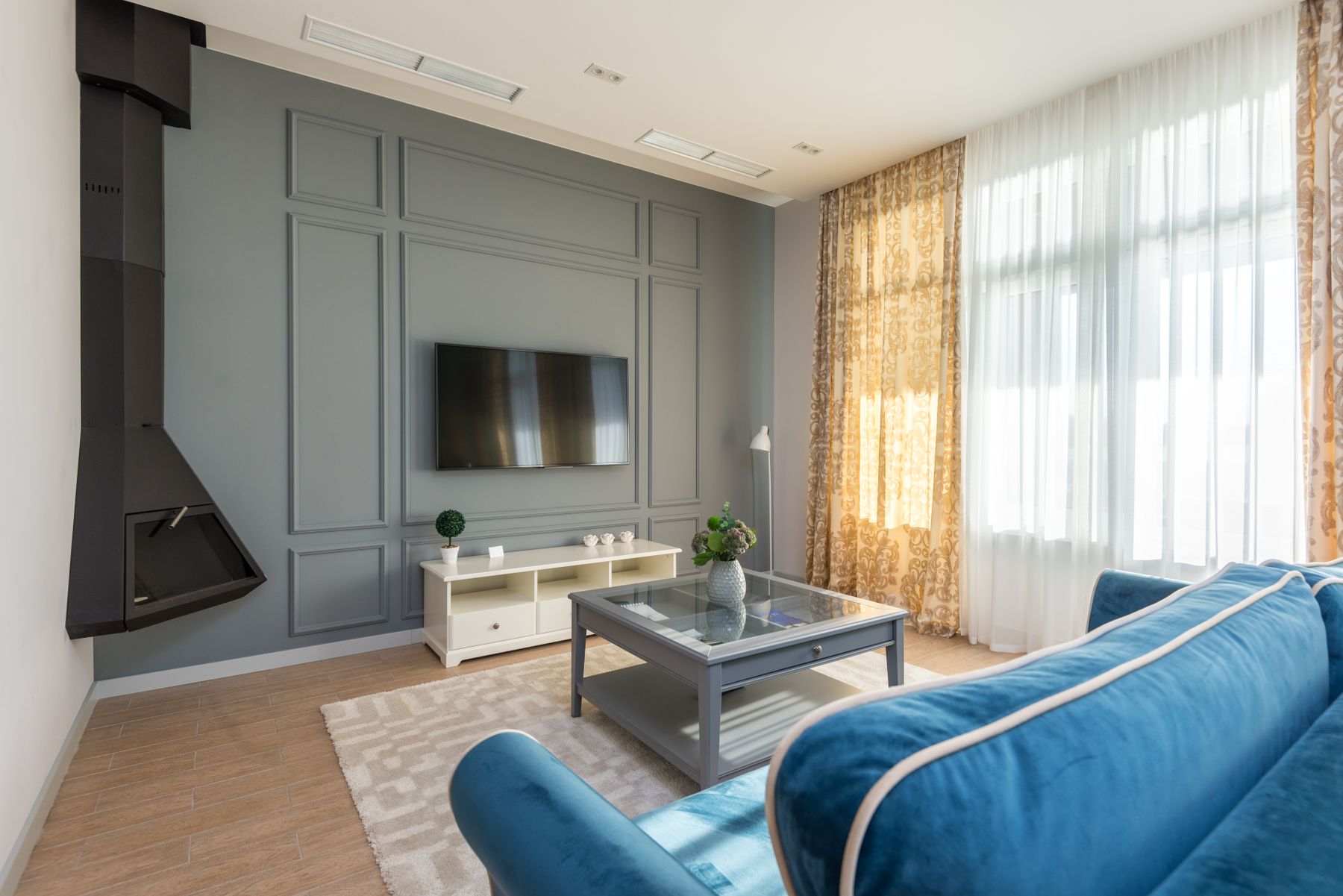
Blue needs a carrier. An **envelope** makes the walls and sometimes trim responsible for the atmosphere. An **upholstery mass** puts the color in the sofa or chair group and keeps the shell more portable. **Architectural joinery** concentrates blue in shelving, a media unit or a window seat so it reads as built form. Choose one before comparing paint names. If walls, sofa and shelves all compete at equal intensity, the room becomes a collection of blue objects rather than one spatial idea. This differs from [Blue Apartment Ideas](/apartment/blue-apartment-ideas/), where the main problem is distributing color through several rooms; here the carrier must organize one conversation setting.
Do Not Assume Blue Always Recedes
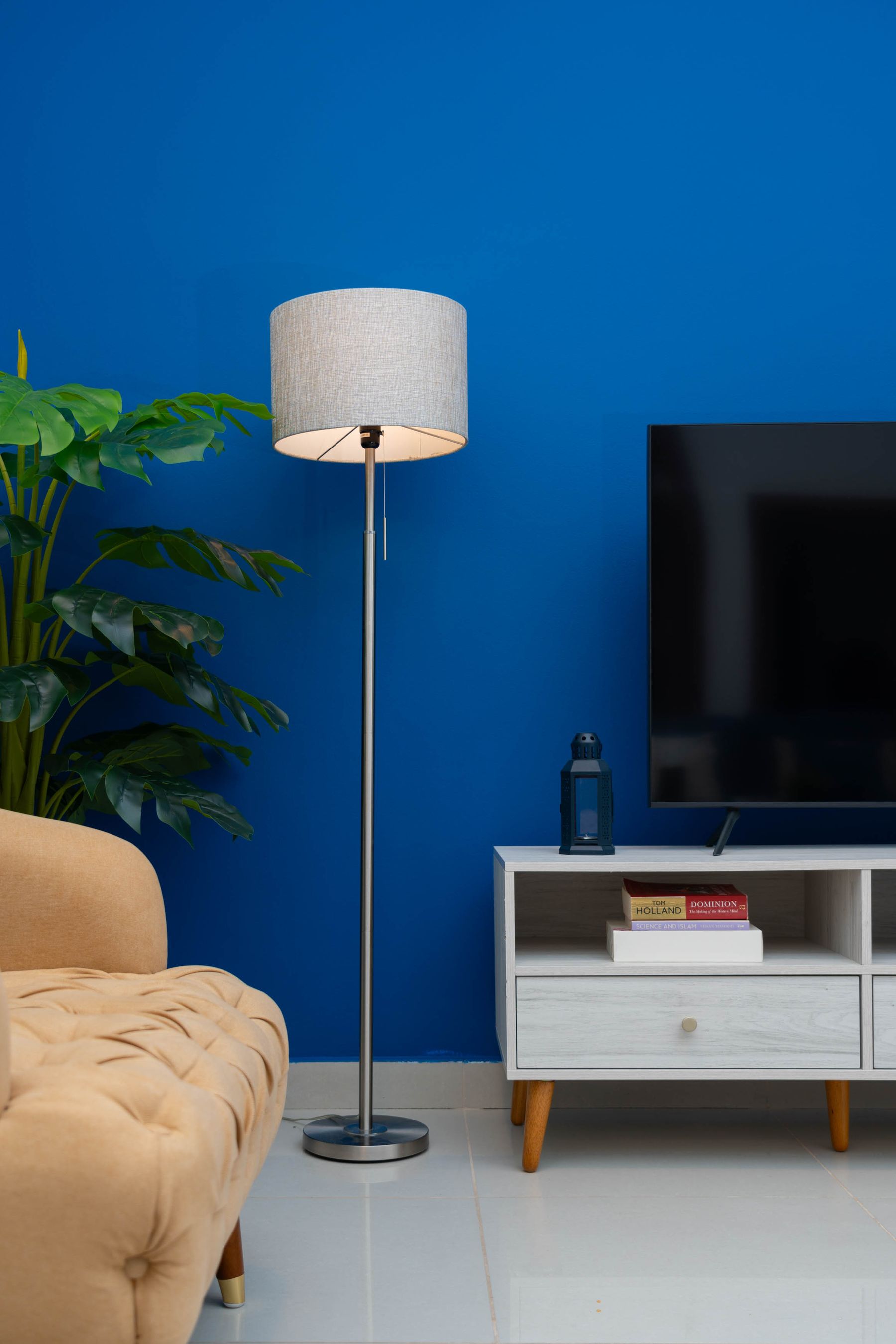
A greyed pale blue often appears to fall back, but a saturated cobalt can come forward with more force than a warm neutral. Deep navy may either dissolve a boundary or become a heavy block depending on sheen and the brightness of the floor and furniture. Judge the exact sample as a plane, not a chip. Place a large board at the far wall, then photograph it from the entrance beside the sofa and flooring. If it becomes the first shape you notice, it is advancing; decide whether that energy helps the room before calling it spacious.
Treat the Window as Another Blue Surface
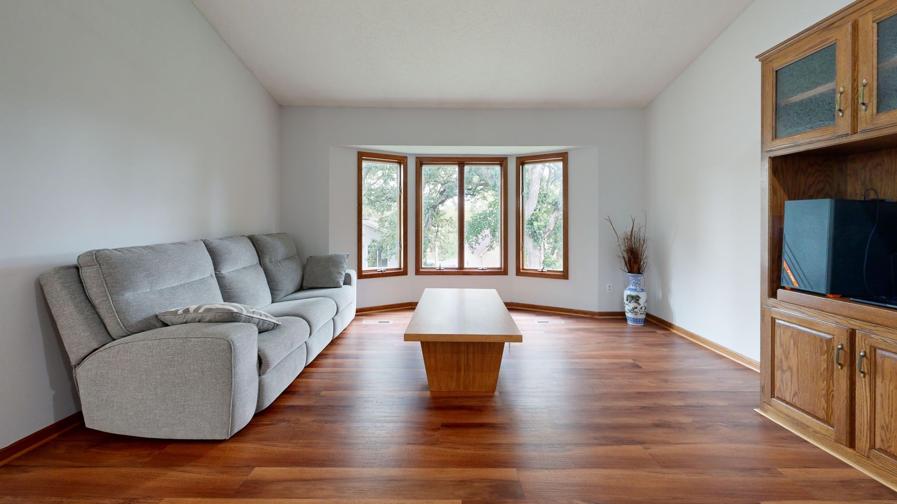
The sky can be the largest blue surface in the room even when it is technically outside. Clear light may intensify a cool wall; overcast sky can flatten powder blue into grey; a green garden or red-brick view can change the comparison again. Decide whether the interior should echo that cool field or give it resistance through timber, cream or a warmer upholstery volume. Sample beside the glass and on the wall opposite it, then compare a bright and dull day. The goal is not a blue that never changes, but changes that remain useful.
Give Powder Blue Enough Weight
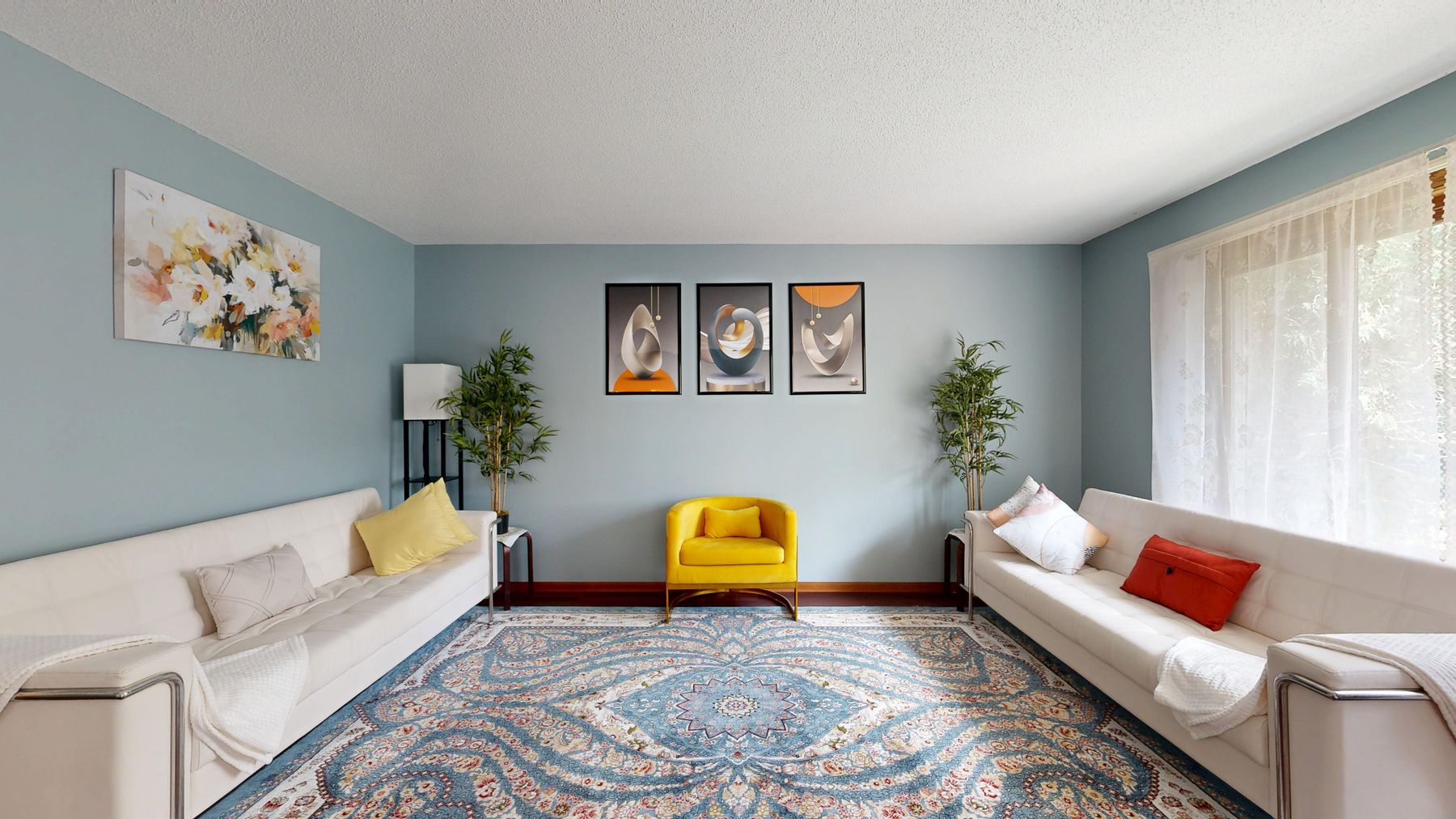
Powder blue can feel open and precise, but pale upholstery, delicate white trim and many small pastels may tip it toward sweetness. Give it one material with weight: chocolate timber, blackened metal, substantial stone, a saturated yellow chair or a broad rust textile. The counterweight should have enough area to register from the doorway. Dark outlines on every object are unnecessary; one grounded volume and a medium-value floor usually provide more composure than repeated black accessories.
Use Denim Blue as the Social Middle
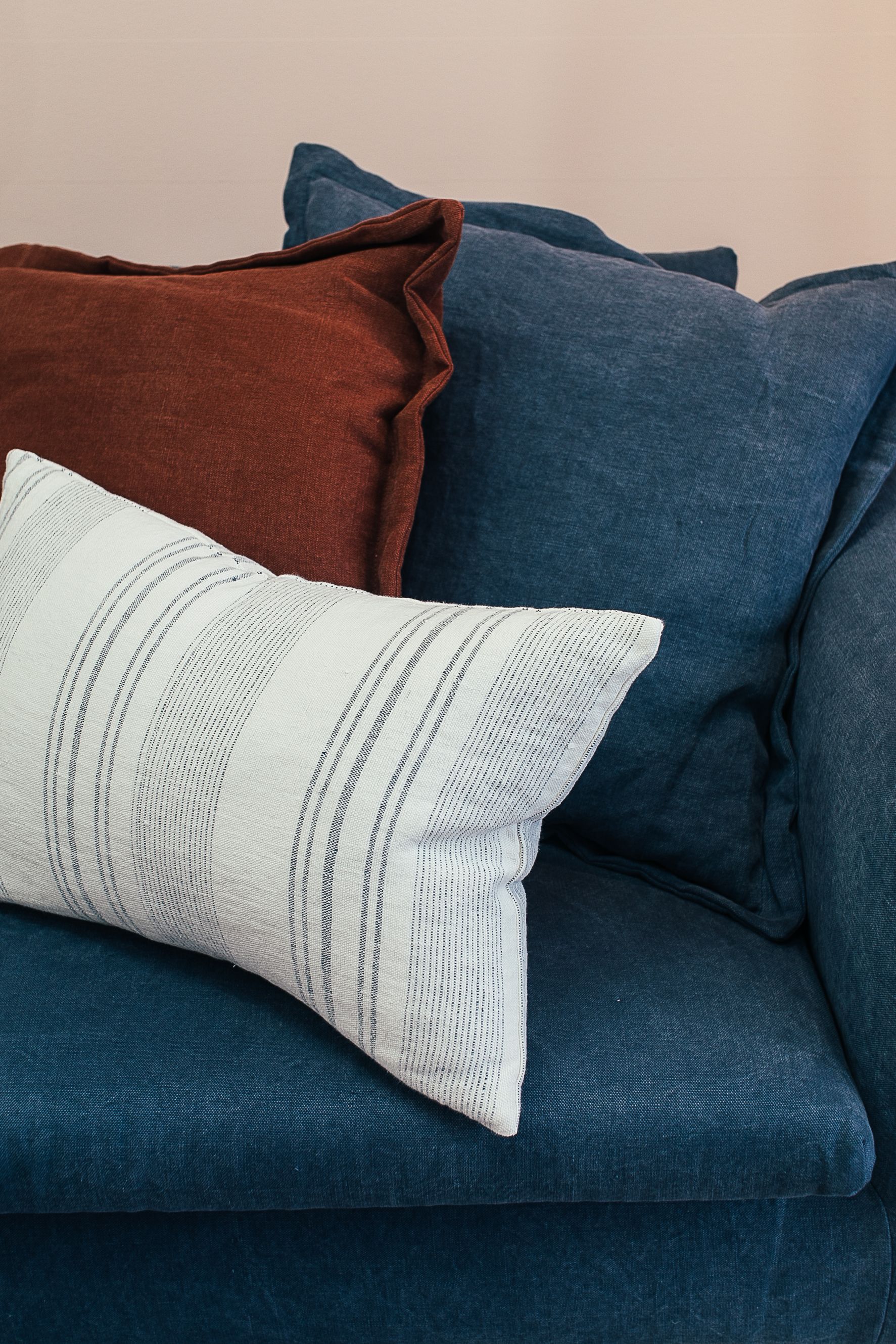
Mid-blue upholstery occupies a useful middle ground between airy powder and formal navy. It has enough value to define a large sofa without becoming the room's darkest mass, and woven texture can make fading or pile changes feel less abrupt than on a flat saturated fabric. Treat it as denim rather than a color accent: let seams, cushions and use create variation, then keep the wall quieter. Check the exact rub, care and lightfastness data for the fabric instead of assuming a medium shade will hide every mark.
Keep a Blue Sofa Legible Against Blue Walls
Tone-on-tone blue succeeds when the sofa remains an object rather than a soft bump in the wall. Separate the two through one dominant variable: light wall and deep sofa, warm blue against cooler blue, flat paint behind textured fabric, or enough visible skirting and floor to draw the lower edge. Pale cushions should not be asked to outline the furniture. Check the silhouette from the entrance and from the chair opposite, where conversation happens.
Make Cobalt One Event, Not Ten Accents
Cobalt is most convincing when it owns one intelligible form: a wall return, lacquered cabinet, chair pair, curtain span or major artwork. Scattered royal-blue cushions, ceramics and book jackets turn intensity into noise. Decide where the eye should land, give the color a clean boundary and keep neighboring surfaces less saturated. If cobalt occupies the wall behind the main seats, it may not need repetition anywhere else.
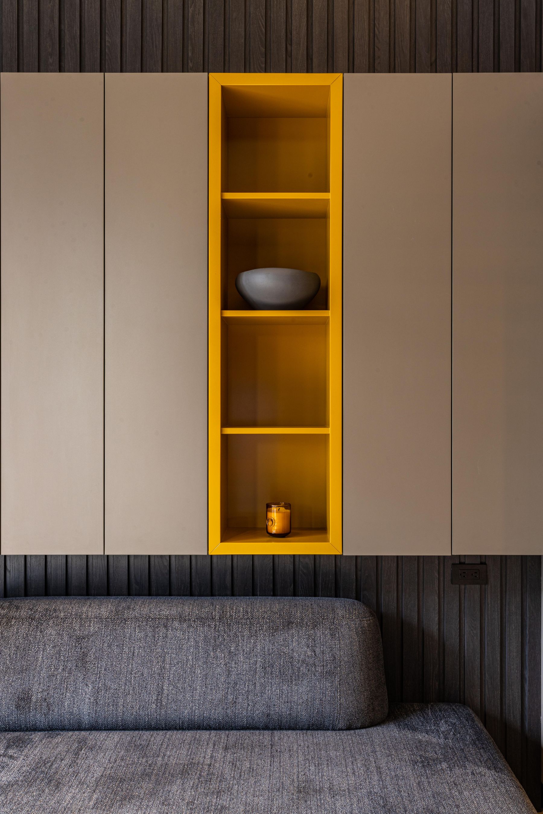
Let Navy Storage Do Architectural Work
Navy earns its depth when it helps shelves, cabinets and a media wall read as one volume. Carry the color across frames, doors and open backs only where construction and access stay clear; handles, gaps, controls and ventilation still need legibility. Closed lower storage can provide a calm base while books and objects break up the upper field. This is stronger than painting a random rectangle behind freestanding furniture because the blue coincides with a real function and boundary.
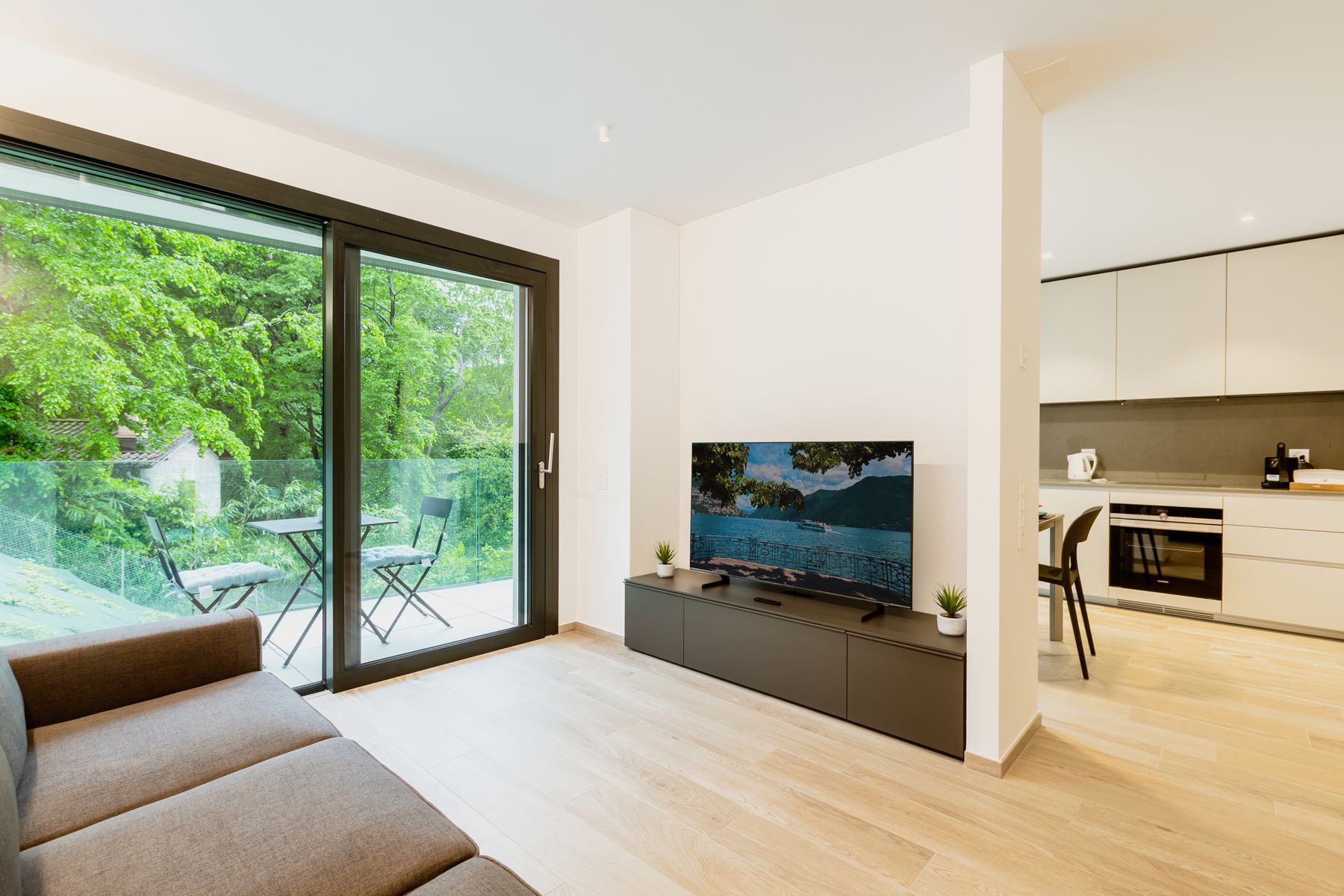
Decide Whether the Television Joins the Horizon
A dark screen can either join a navy cabinet-and-wall horizon or remain a crisp black interruption on pale blue. Choose deliberately. A deep field reduces the value jump but still needs cable access, ventilation and enough contrast at controls; a pale field makes the screen graphic and may require stronger composition elsewhere. Do not repeat black frames simply to justify the rectangle. Viewing height, glare and the social seating arrangement still come first; [Living Room Layout Ideas](/living-room/living-room-layout-ideas/) should settle those before paint does.
Pair Blue With Chocolate Before Reaching for White
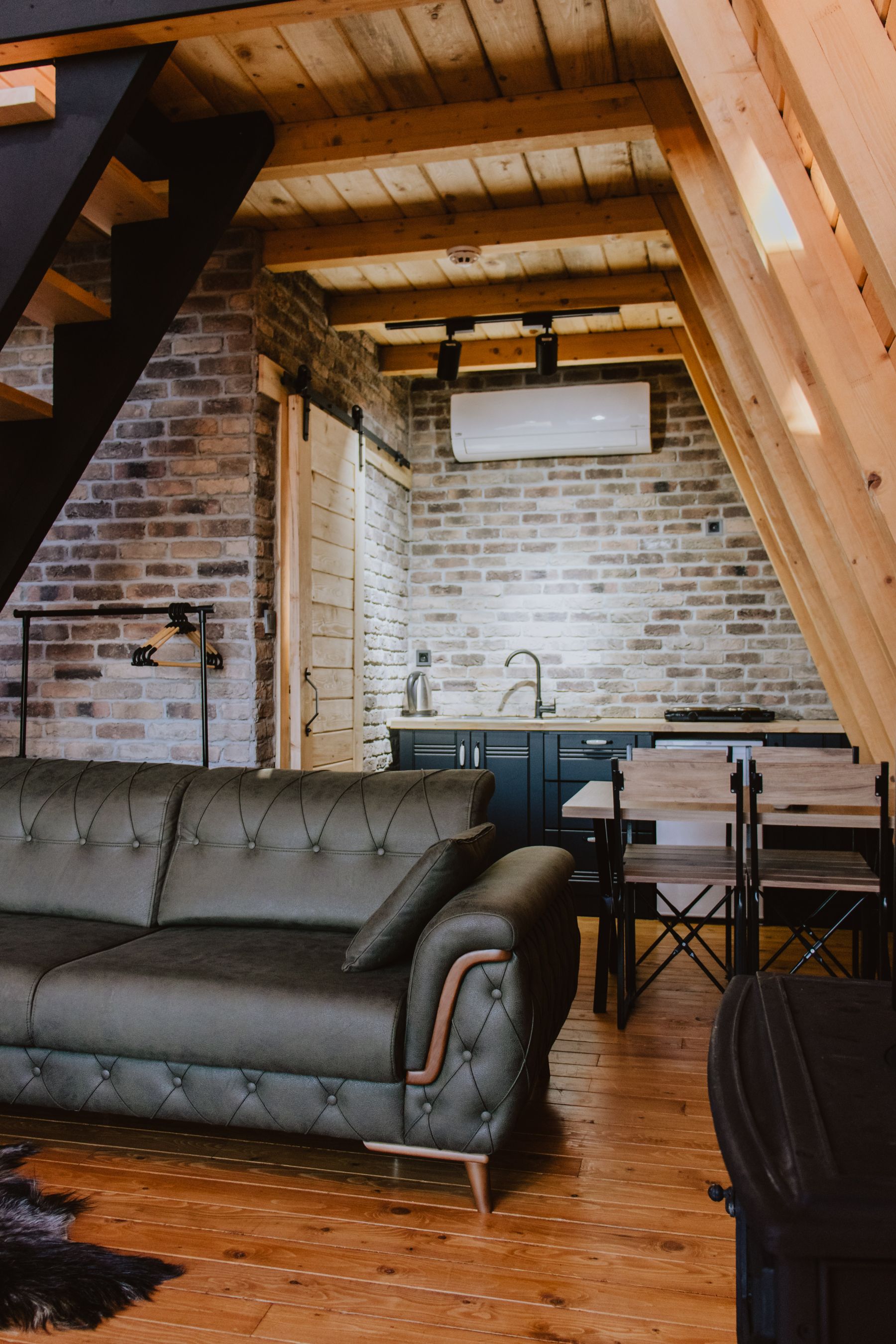
Chocolate leather, walnut, smoked oak and caramel wool give blue a warmer and less expected partner than default white. Brown supplies a middle-to-dark value that prevents pale blue becoming insubstantial and keeps navy from feeling overly formal. Start with the floor or largest timber piece, then select a blue whose undertone does not make that brown look orange or grey. Cream can still provide breathing room, but it no longer has to carry the whole contrast.
Use Rust or Ochre as One Warm Countermass
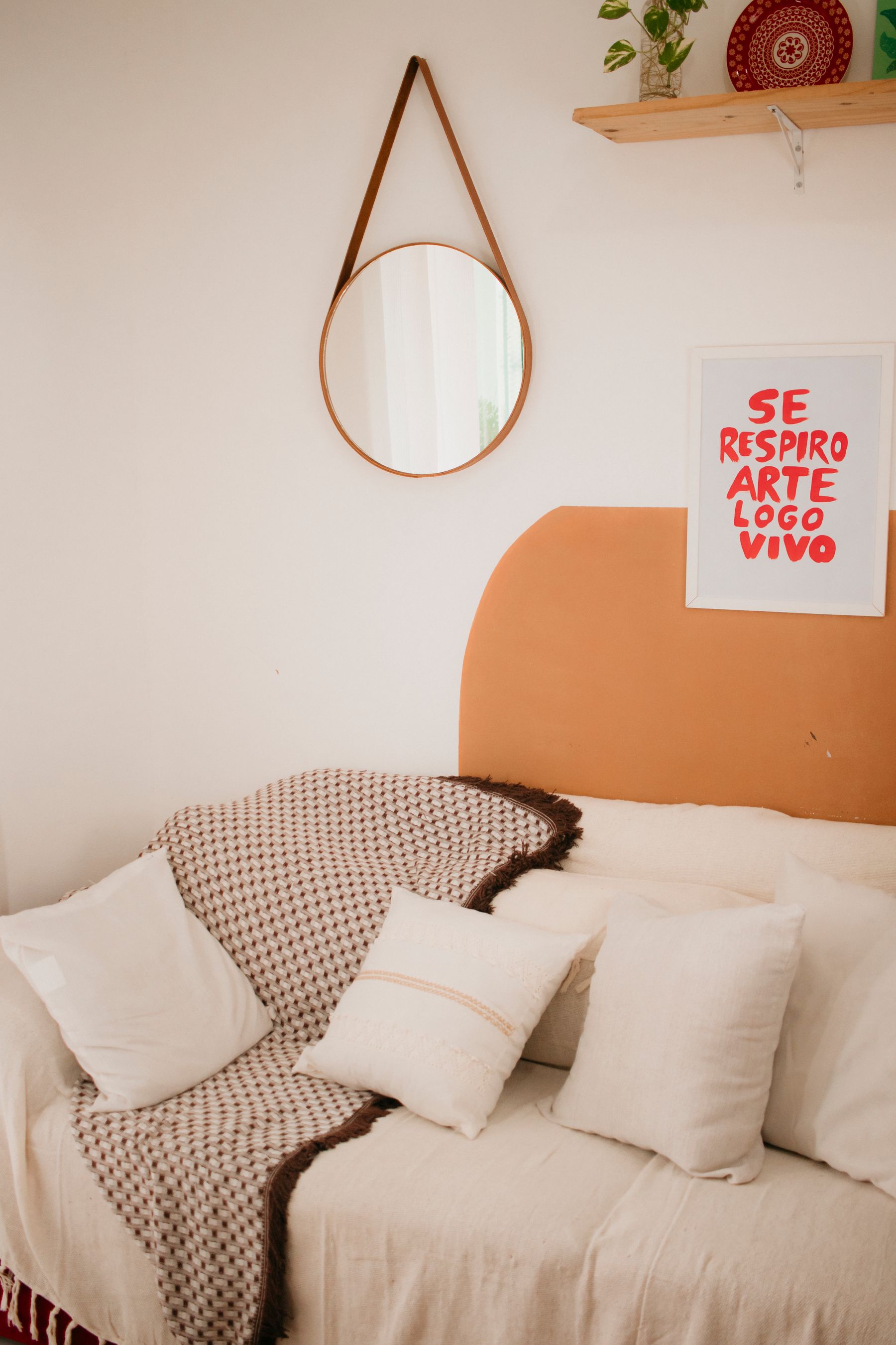
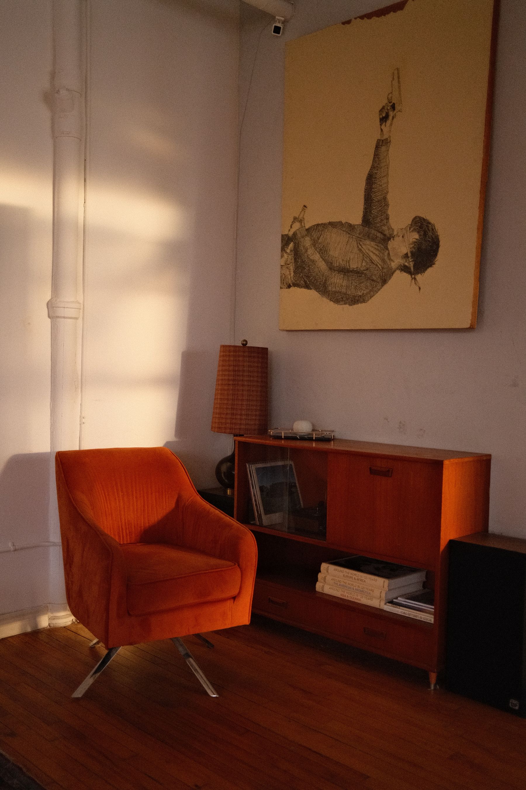
Orange sits opposite blue, so even a small amount can become loud. Give rust, ochre or burnt orange one substantial job—a chair, rug field, curtain panel or large artwork—instead of scattering it through cushions and vases. Mute at least one side if the room needs calm: ink blue with clay, denim with rust, powder blue with mustard. Timber may mediate the relationship, but it should not become a third competing orange.
Use Pink or Red to Make Blue Feel Collected
Dusty rose, oxblood, coral-red and berry can push blue toward traditional, vintage or editorial territory. The relationship works when the warm color belongs to a material with presence—velvet seating, a faded rug, painted joinery or a large textile—not when pink appears only as apologetic cushions. Repeat neither color at equal intervals. Let one dominate the field and the other interrupt it. Readers building a more architectural classic scheme can continue to [Traditional Living Room Ideas](/living-room/traditional-living-room-ideas/).

Remove the Automatic Coastal Code
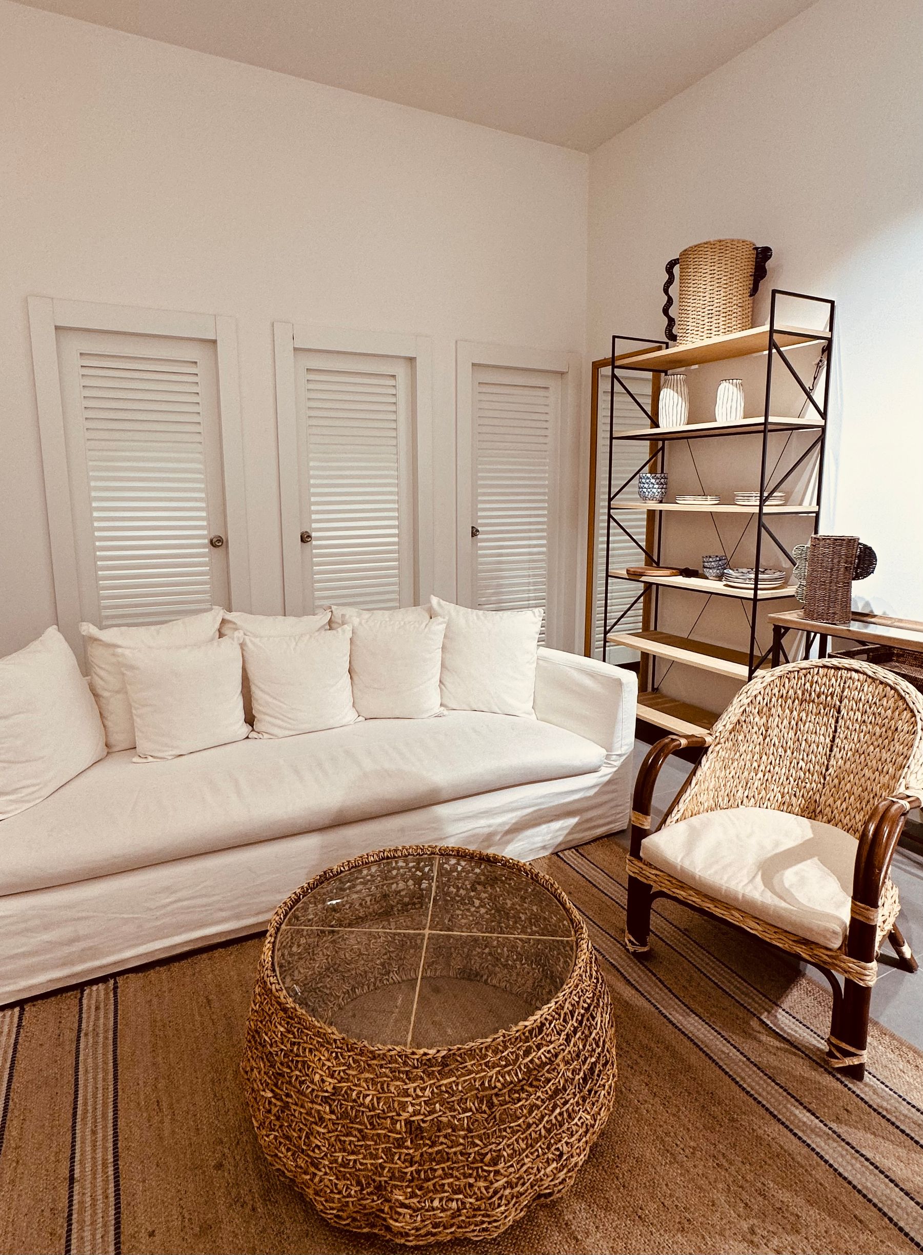
Blue does not become coastal by itself. The code usually arrives through white slipcovers, rope, rattan, stripes, bleached timber, shell objects and maritime art. Keep any of those that suit the architecture and life of the room, but do not stack them unconsciously. For a more urban or formal result, pair blue with walnut, plaster, lacquer, graphic art, smoked metal or tailored upholstery. If the coast is the actual thesis, [Coastal Living Room Ideas](/living-room/coastal-living-room-ideas/) develops view, glare, salt and material questions more fully.
Test Blue Against the Fireplace Stone
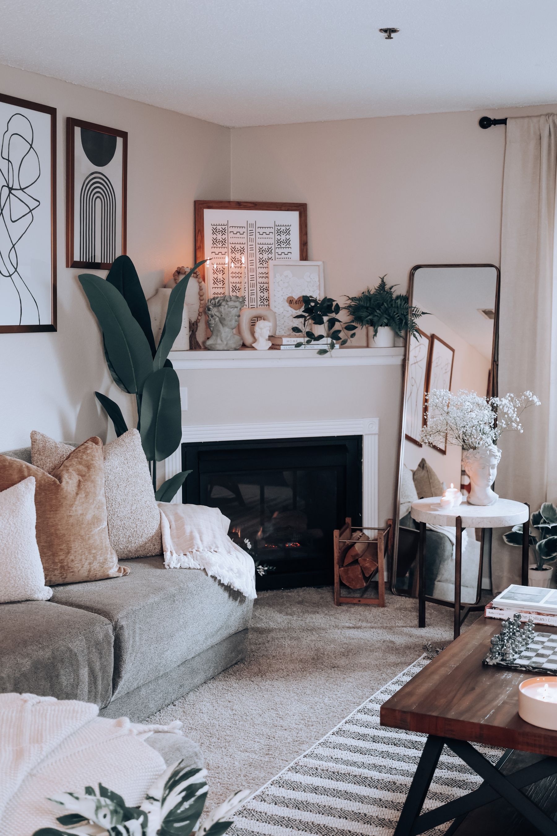
Cream limestone can make a cool blue appear sharper; grey marble may flatten a muted blue; red brick can pull it unexpectedly green. Test paint and upholstery beside the real surround, not a sample viewed elsewhere. If navy extends around the firebox, preserve mantel projection, hearth edge and required clearances so the opening does not become an unreadable black void. Appliance, heat and combustible-distance requirements must come from the exact product and qualified guidance.
Carry Blue Overhead Only With a Boundary Plan
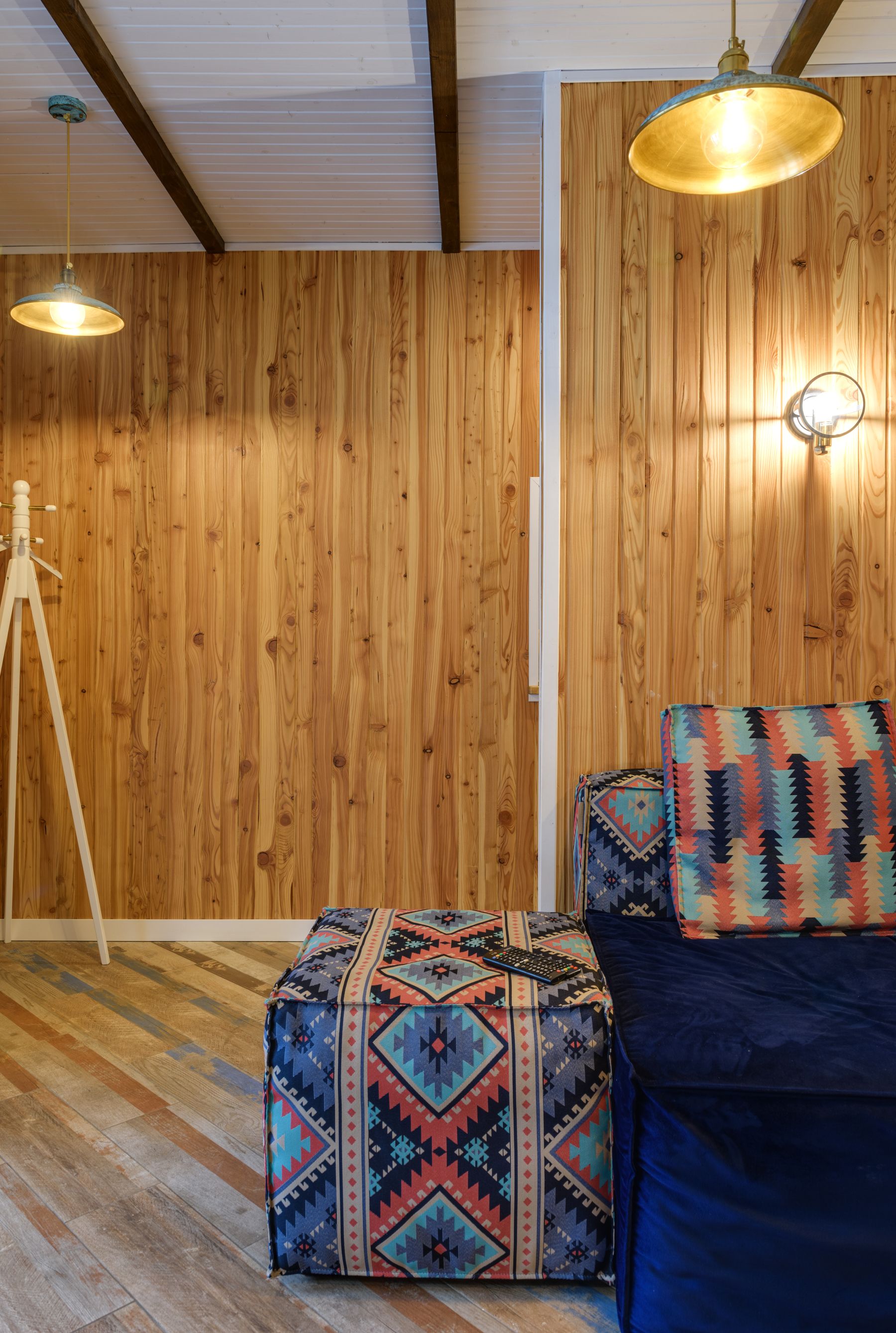
A blue ceiling can lower apparent height, make a tall room intimate or erase an awkward white lid. Decide where the field stops: at the cornice, across trim, around beams or through the full envelope. Relief and shadow lines should remain visible; doors, steps and controls still need useful contrast. In rooms with low ceilings and little daylight, a deep overhead plane may be the desired drama, but it should be tested from seated eye level rather than judged while standing beneath a sample.
Check Paper, Mats and Glazing on Blue Walls
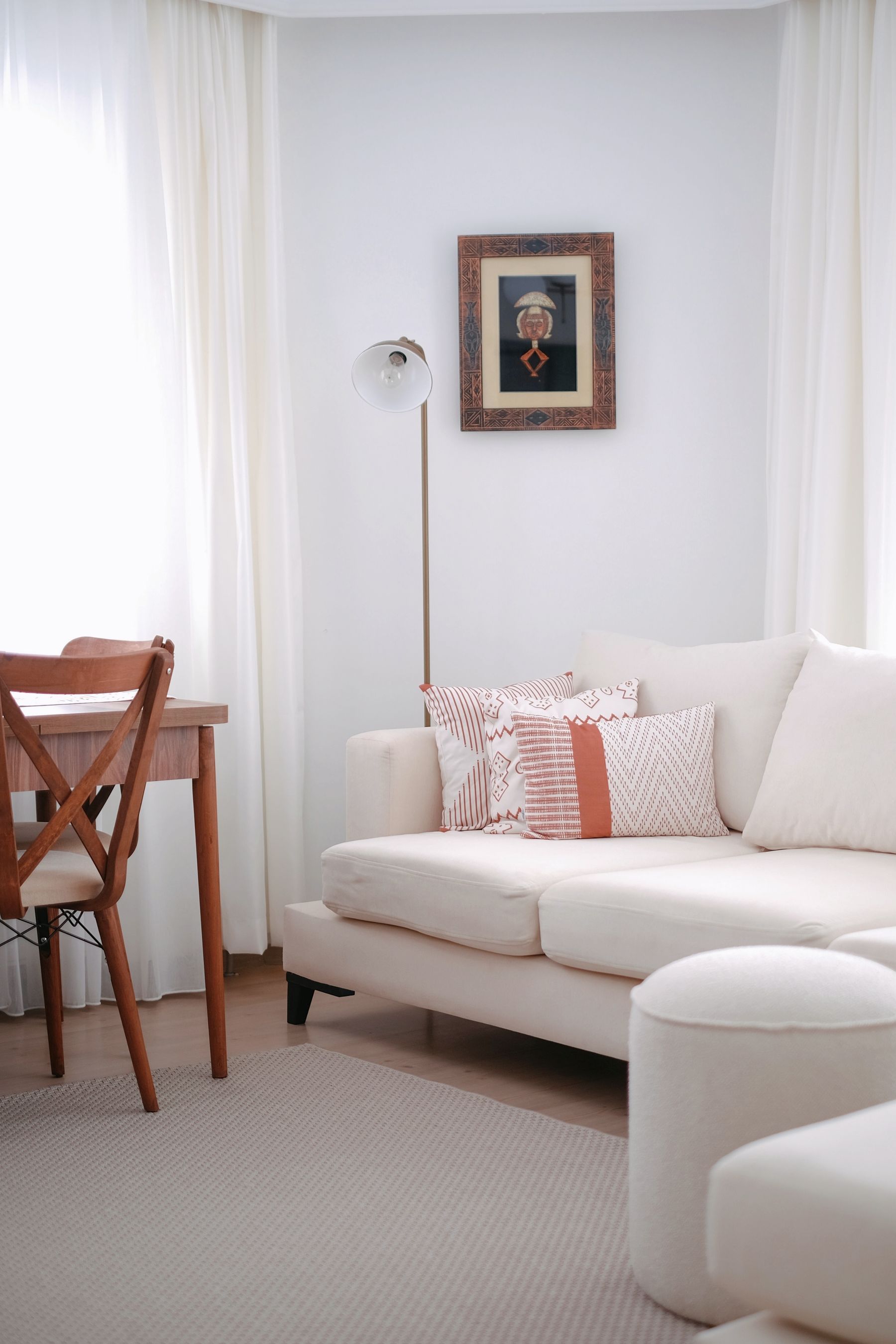
Blue changes the apparent warmth of white paper and cream mats, while glass may reflect a second patch of blue from the opposite wall or window. Test the complete framed work at the intended height. Walnut, lacquered red, warm metal, cream and pale timber can all define an edge without a repeated black-frame formula. Sit in the main seats to check glare before finalizing the arrangement; [Living Room Wall Ideas](/living-room/living-room-wall-ideas/) covers scale and alternatives to framed art.
Warm the Faces, Not Just the Wall
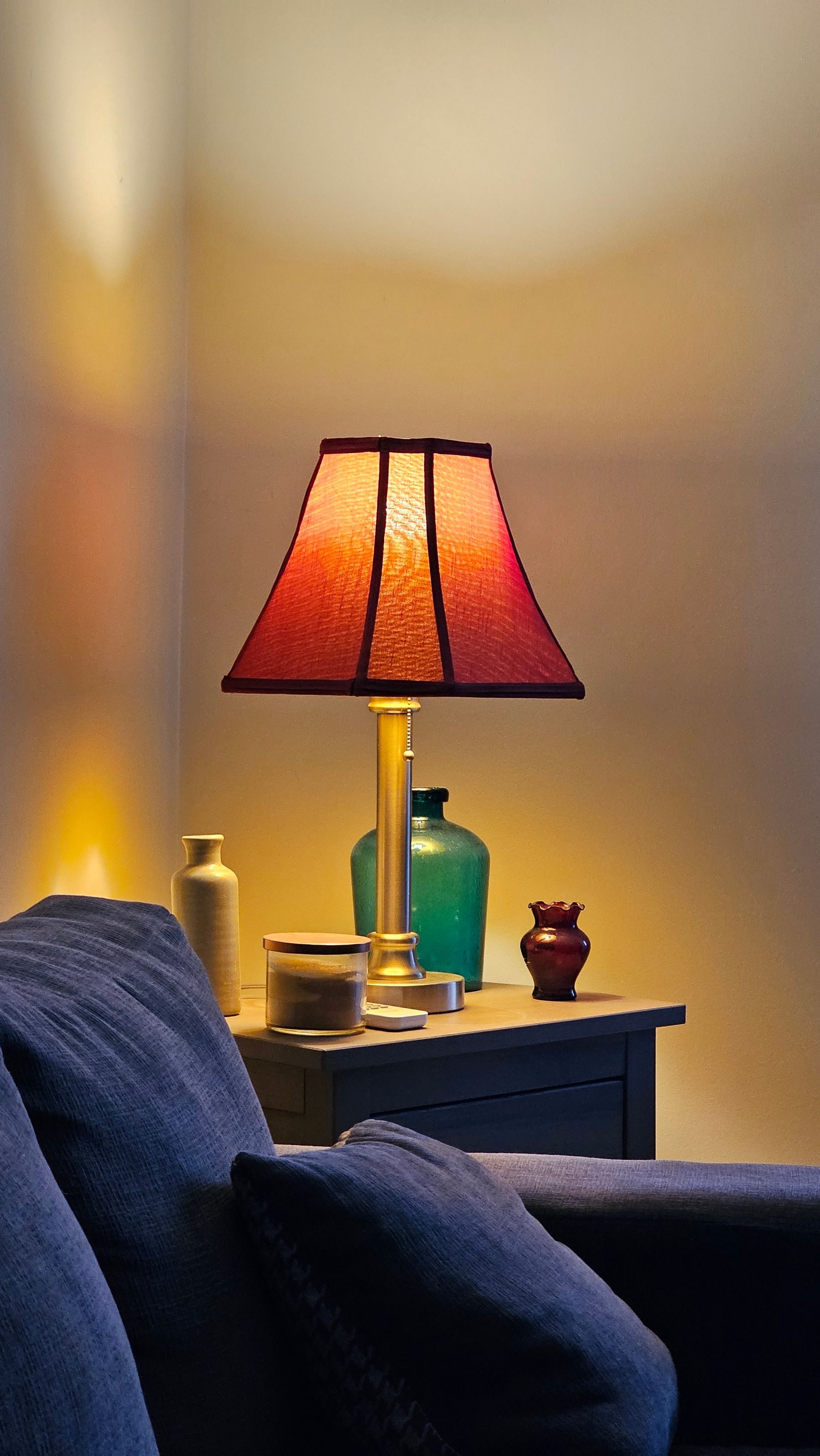
A saturated blue wall close to seating can return cool light toward faces, especially when a bright window or ceiling source is the only illumination. Build the social scene around people: shaded light near face level, enough ambient light for the whole room and task light where reading happens. Avoid overcorrecting with orange bulbs that muddy some blue-greens. [Living Room Lighting Ideas](/living-room/living-room-lighting-ideas/) provides the broader fixture and control framework; the blue-specific test is whether people still look healthy against the colored field.
Correct the Evening Shift Without Chasing Noon
After sunset the window changes from cool source to dark mirror, and the same blue may become denser, greener or more electric. Test the real evening scene with the lamps, shades and dimmer levels that will be used. Very warm light can muddy some teals and grey blues; very cool light can make cobalt dominate the room. Balance local warmth near seating with a lower ambient level rather than trying to make night reproduce the midday color exactly.
Choose a Pattern Dialect Before Mixing Patterns
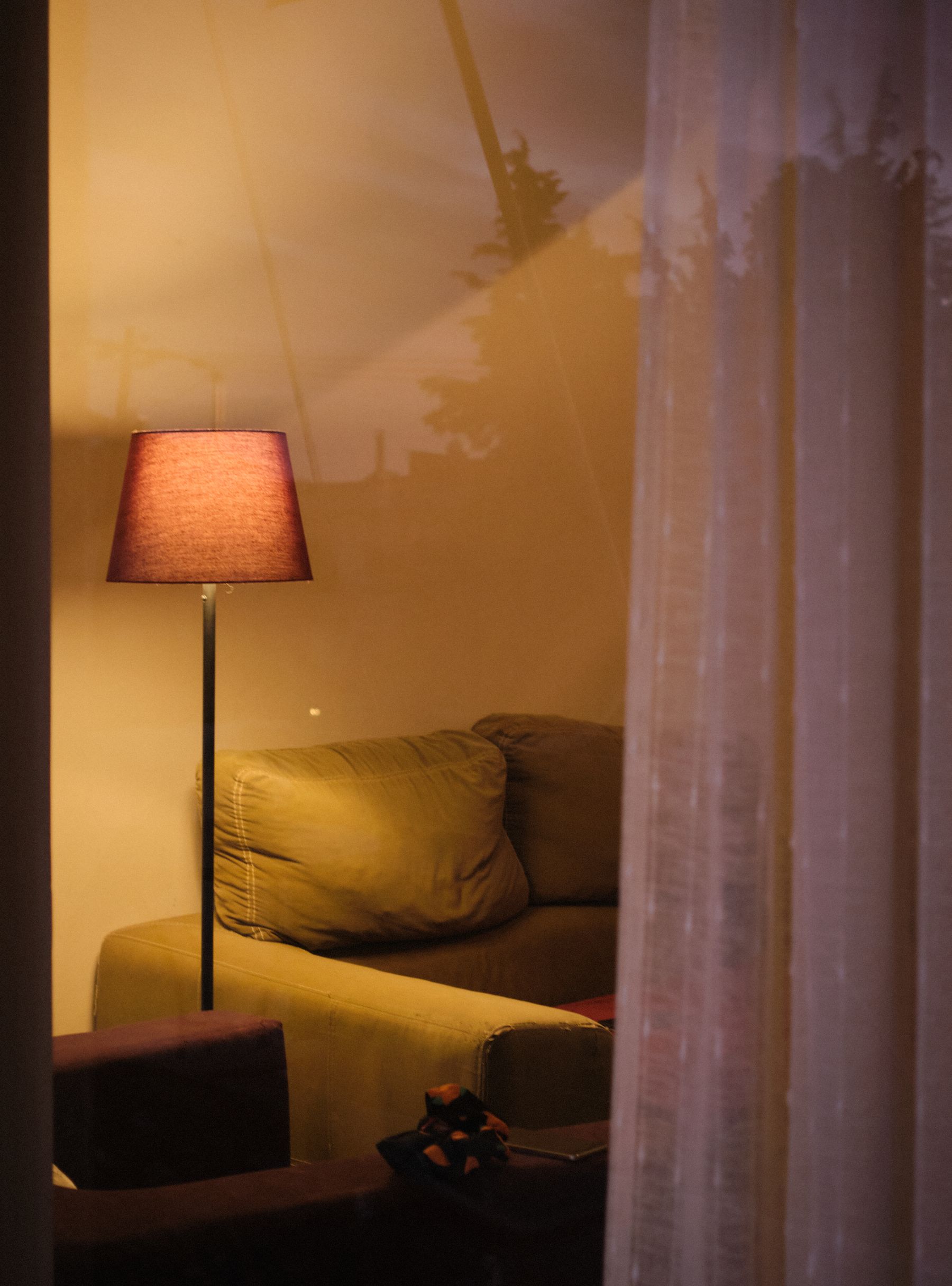
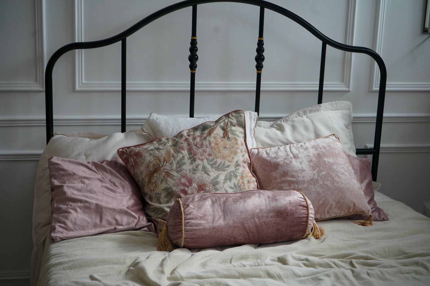
A stripe is not neutral in a blue room; paired with white and woven fiber it quickly reads nautical. Florals can make blue traditional, geometrics can sharpen it and checks can move it toward country or tailored modern depending on scale. Choose one dialect, then vary scale and density within it. A broad motif, one medium repeat and a small texture are easier to edit than several patterns making unrelated style claims.
Let the Rug Set Blue's Social Register
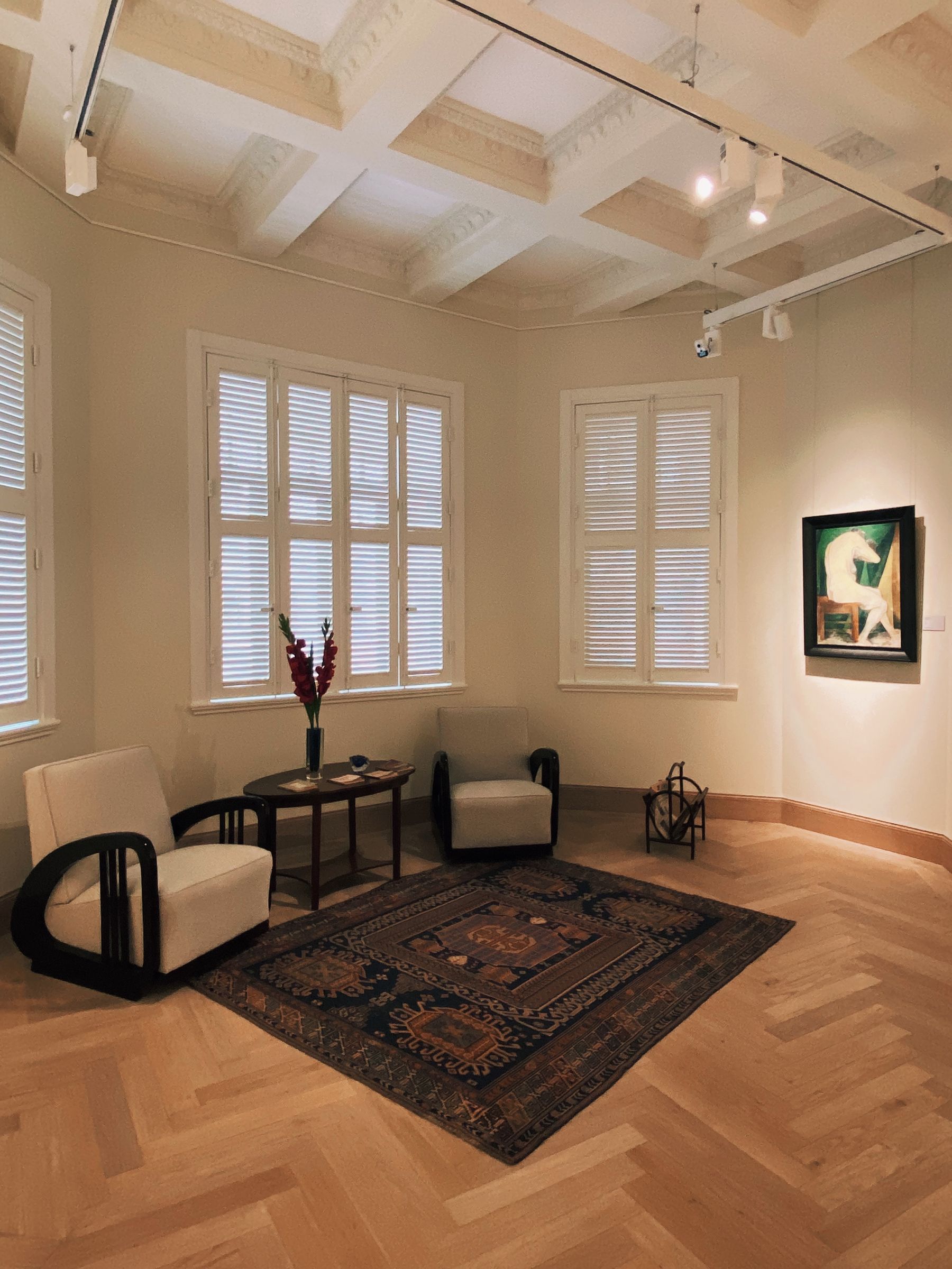
The rug can make the same blue room feel graphic, formal, relaxed or inherited. A cream-and-black geometric field sharpens denim; a faded red pattern makes navy feel collected; a quiet wool plane lets cobalt or a blue sofa remain the event. Fit and circulation come before palette—the rug should connect the conversation group and leave routes readable. [Living Room Rug Ideas](/living-room/living-room-rug-ideas/) expands the sizing and furniture-foot decisions.
Stop Blue at a Real Threshold
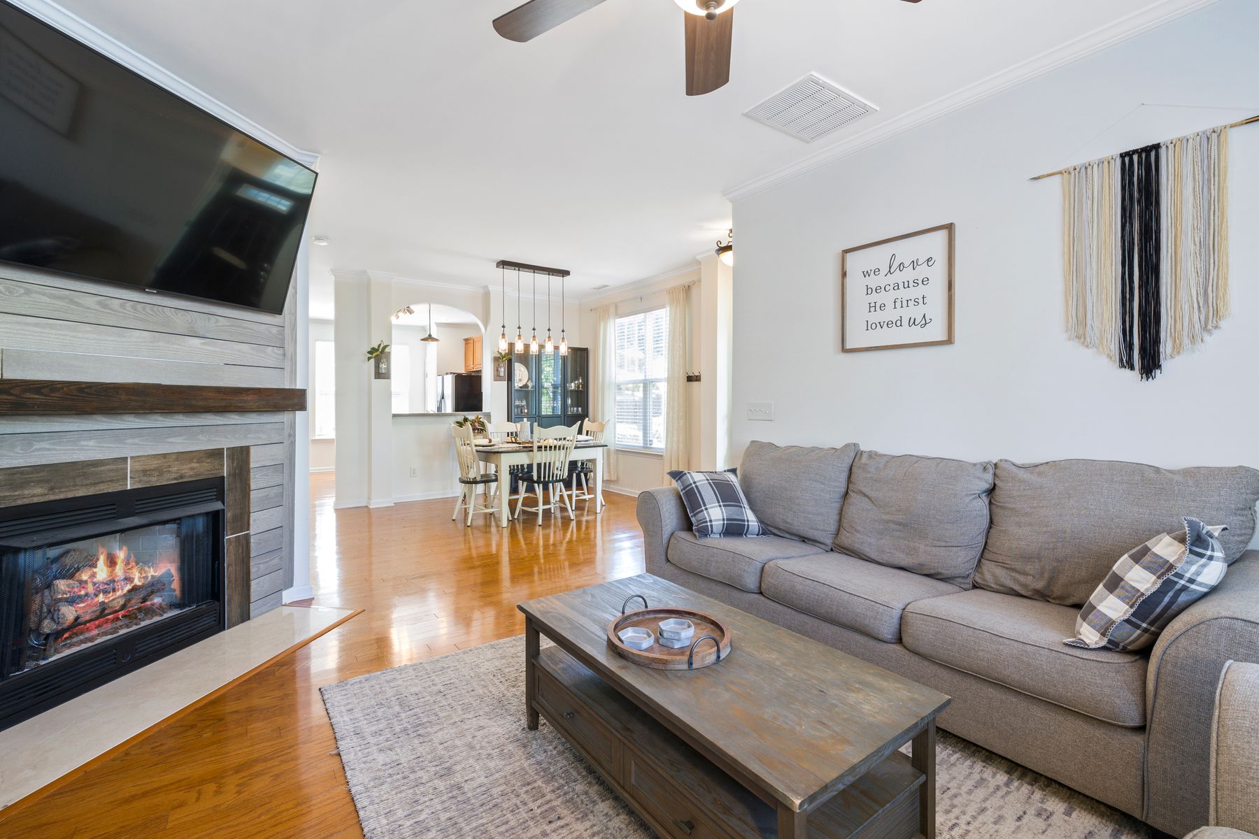
Blue becomes weaker when it leaks into adjoining zones through small matching accessories. End the main field at a return wall, ceiling change, built-in edge or clearly furnished living zone. The dining or kitchen area can answer it with timber, stone or a lower-intensity blue, but it does not need identical cushions and ceramics. Keep this decision room-specific: the threshold should protect the conversation area as a recognizable blue destination while whole-home rhythm is planned separately.
Concentrate Blue in a Small Room
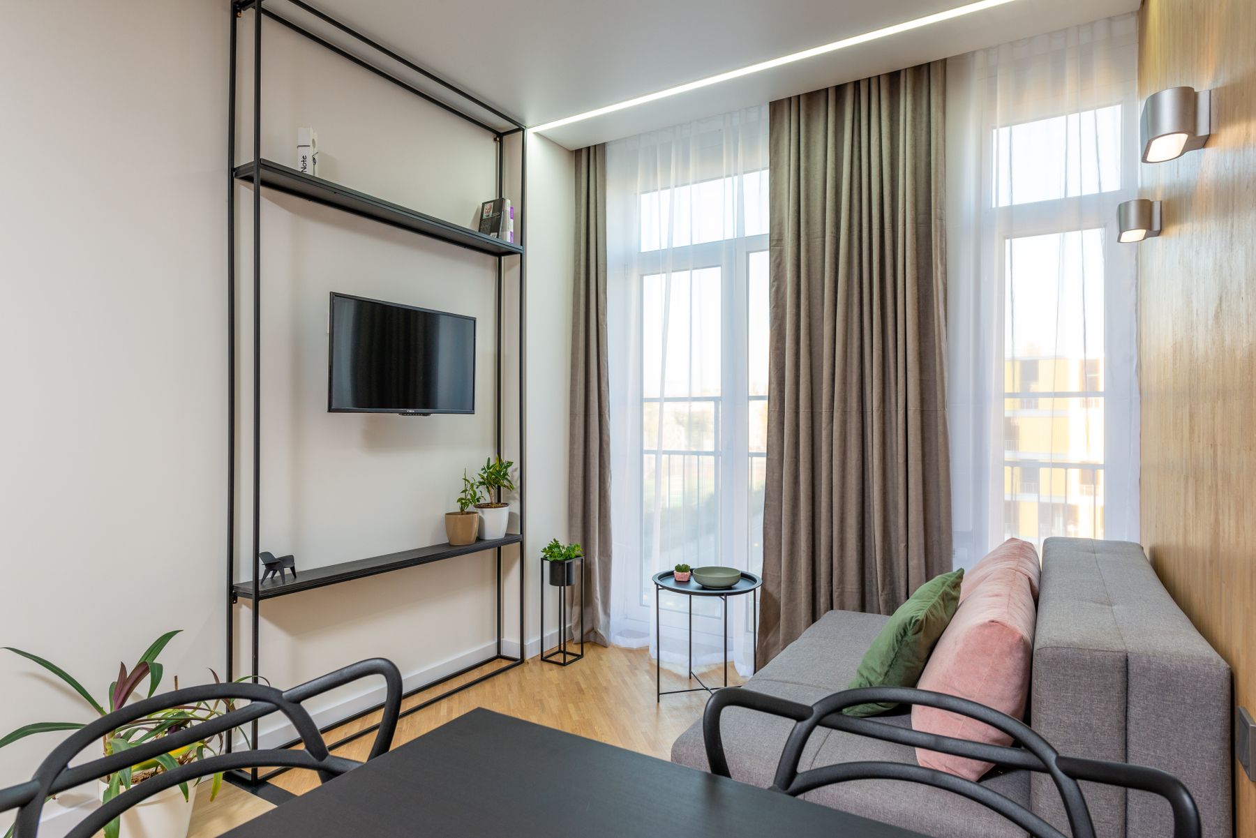
Small living rooms do not require powder blue. They require fewer competing boundaries. One deep wall, one properly scaled blue sofa or one continuous navy cabinet can feel calmer than a trail of blue accents. Count the night window, television and dark floor before adding another deep mass, then preserve the clearest route and useful side surfaces. Let [Small Living Room Ideas](/living-room/small-living-room-ideas/) lead circulation and furniture scale; blue should clarify that plan, not replace it.
Run the No-Seaside-Props Test
Finish with entrance, main-seat and evening photographs. Temporarily remove white-and-blue stripes, rope, coral, shells, maritime art and every object bought only to repeat the hue. The blue carrier should still organize the room; the sofa should remain legible; the screen and fireplace should have deliberate roles; faces and routes should work at night. Return only objects that add use, history or a material relationship. If the room loses its identity without props, strengthen the wall, upholstery or joinery rather than buying more theme.