Inventory Brown by Source, Not Shade Name
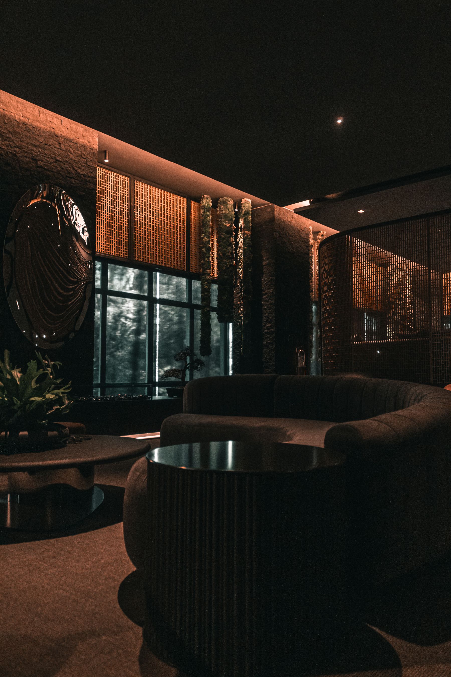
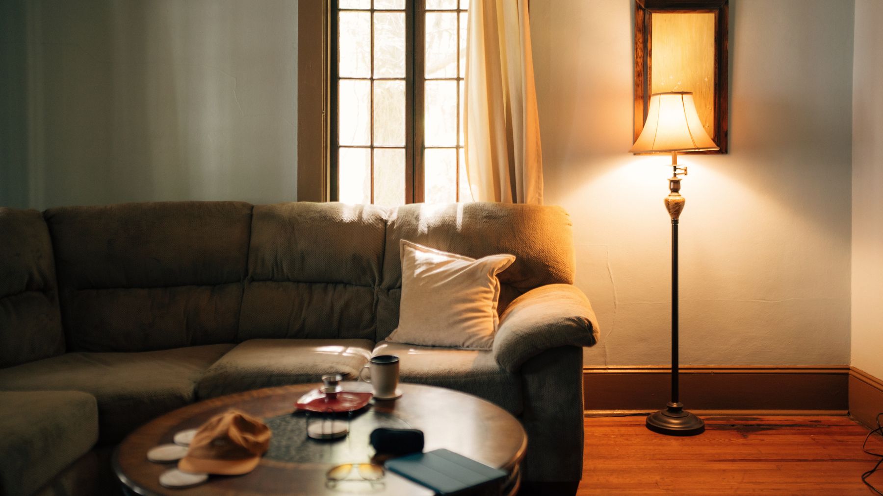
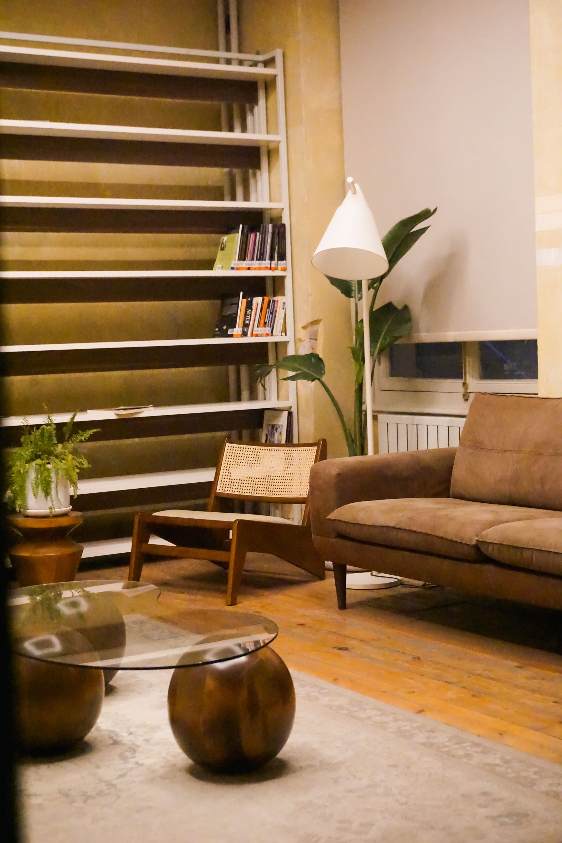
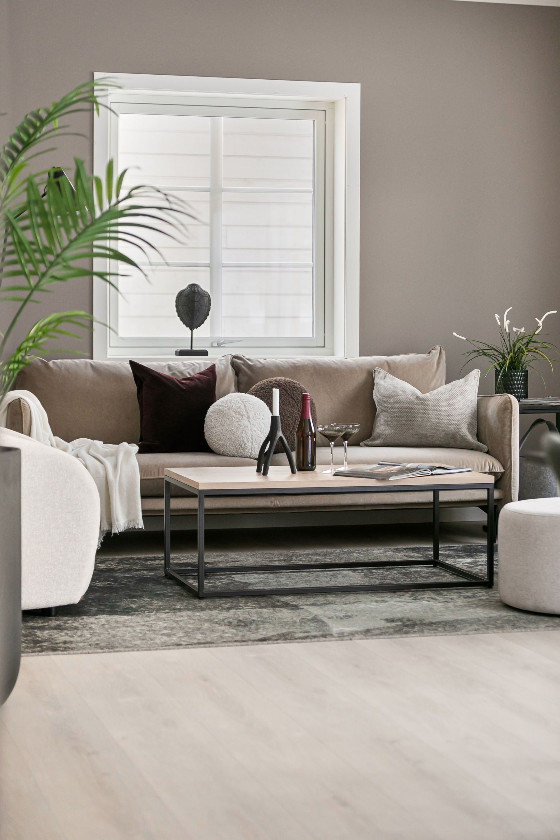
Stand at the main entrance and list every large brown source: floorboards, joinery, sofa, leather chair, brick, fireplace stone, rug, curtains and paint. Label each **wood**, **leather**, **fiber**, **mineral** or **applied color**. This matters because a paint chip presents a continuous field while timber breaks into grain, leather returns highlights and wool contains thousands of shadowed fibers. Brown becomes coherent when those behaviors form a hierarchy, not when their average colors match. If the room's main goal is simply to host many quiet hues, [Neutral Living Room Ideas](/living-room/neutral-living-room-ideas/) is the broader route; here brown must remain visibly material.
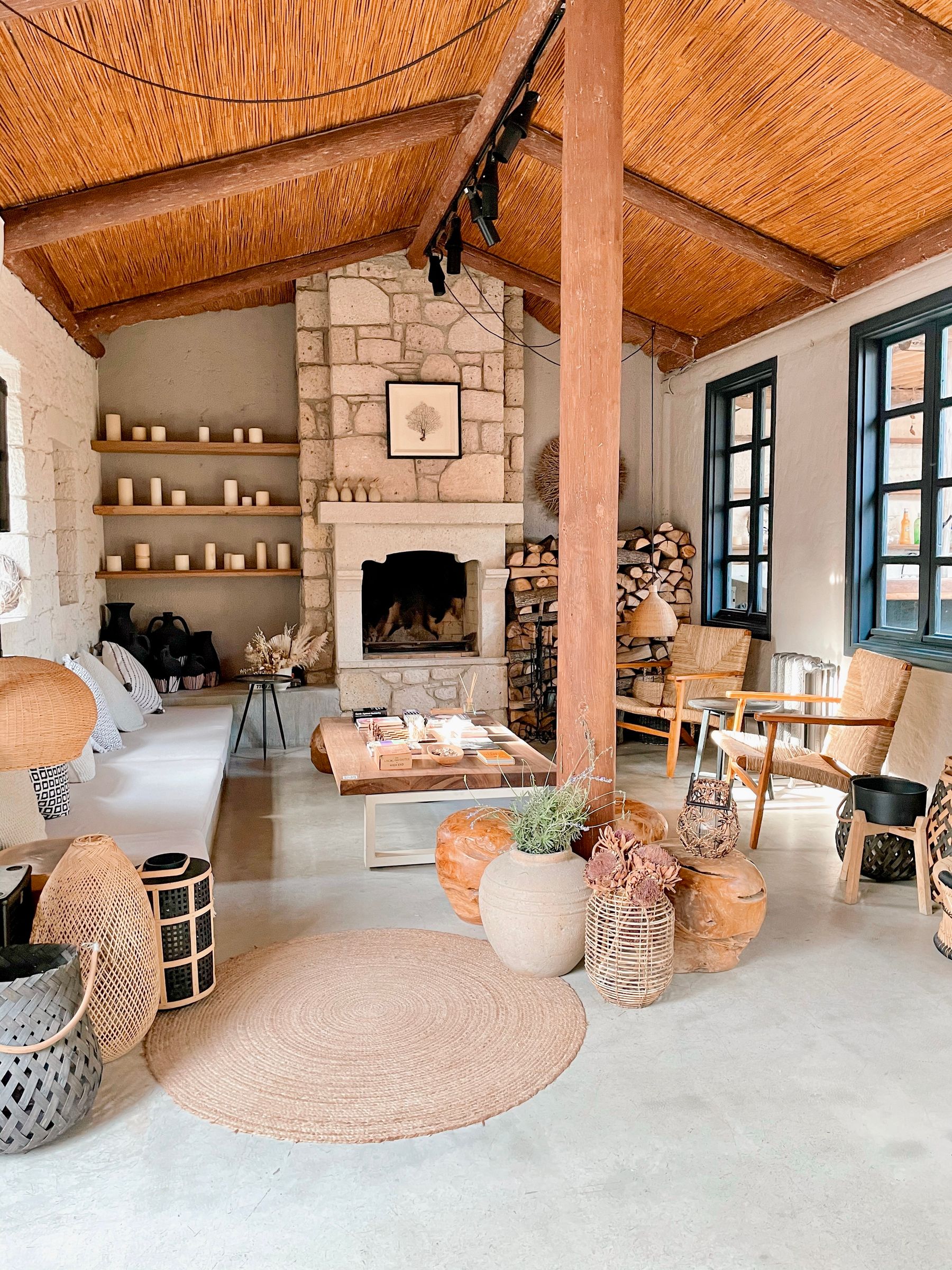
Choose the Brown That Carries the Room
Decide which source owns the largest visual role. A timber floor can carry a horizontal brown base, a chocolate sofa can become a central object, paneling can form an architectural envelope, or a brick hearth can act as a bounded mineral field. Let the other browns support, bridge or interrupt that leader. When floor, sofa, wall and table all try to be the room's signature brown, the eye reads weight rather than richness. This single decision also clarifies where cream, color and metal must create relief.
Read Red, Yellow, Grey and Violet Bias
Compare browns by bias before comparing how light or dark they are. Cherry and cognac lean red; honey oak and camel lean yellow; mushroom and smoked oak may lean grey; some cocoa paints reveal violet. A red leather sofa beside yellow oak can look deliberately lively when separated by a pale rug, yet the same pair may turn discordant when compressed into one corner. Benjamin Moore's current brown guidance likewise stresses undertone relationships rather than treating all browns as interchangeable. Use the fixed floor, stone or largest furniture piece as the reference—not a generic online swatch.
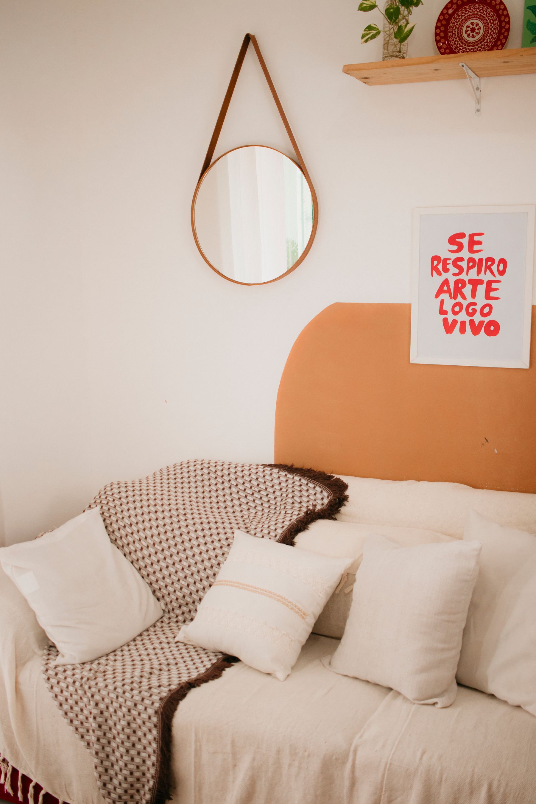
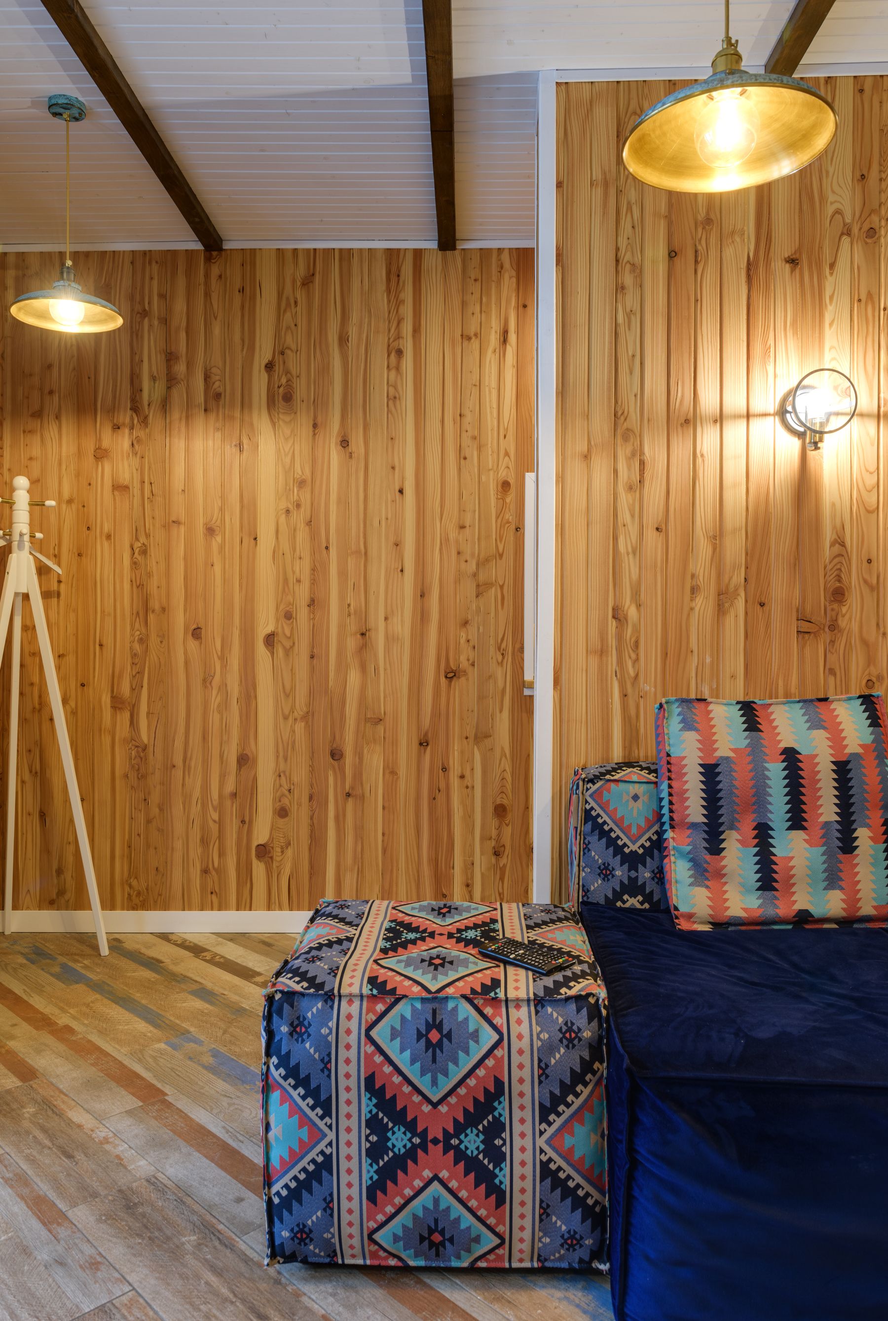
Put Brown Weight on One Plane at a Time
Brown carries visual mass, especially at middle and low values. Choose whether that mass sits primarily on the floor, rises on one wall or occupies the central seating group. A dark rug under a chocolate sectional against walnut paneling can compress all three planes into one block. Instead, release at least one edge: float the sofa against a lighter wall, let a pale rug separate it from timber flooring, or stop paneling before the ceiling. The objective is not to make brown timid; it is to make its silhouette readable.
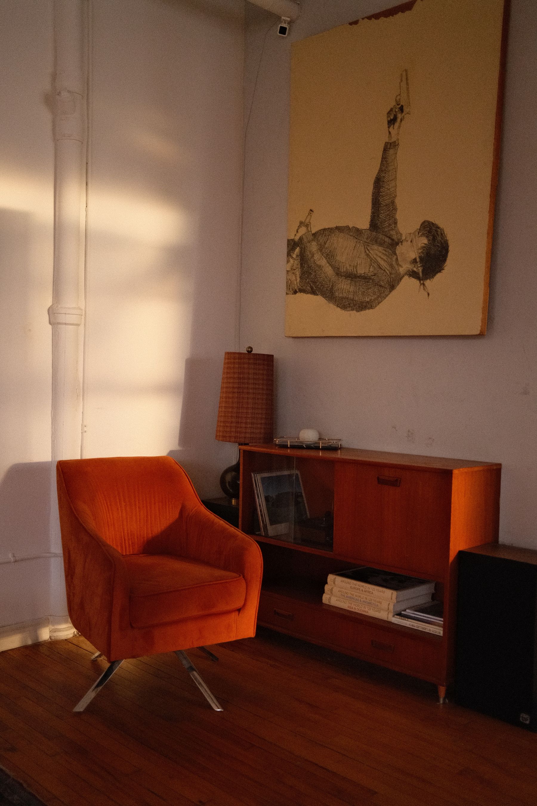
Stop Several Woods Becoming One Timber Block
A wood floor, coffee table, sideboard and chair frame can coexist without sharing one stain. Give them different roles: the floor as field, the largest case piece as mid-value anchor, and smaller frames as dark linework. Repeat an undertone twice, but vary grain scale or value so each element remains legible. Avoid five near-identical honey finishes, which usually advertise failed matching. When timber itself becomes the primary subject rather than the color system, [Wooden Bedroom Ideas](/bedroom/wooden-bedroom-ideas/) offers a deeper material framework that can be adapted to other rooms.
Use Cognac Leather as a Reflective Brown
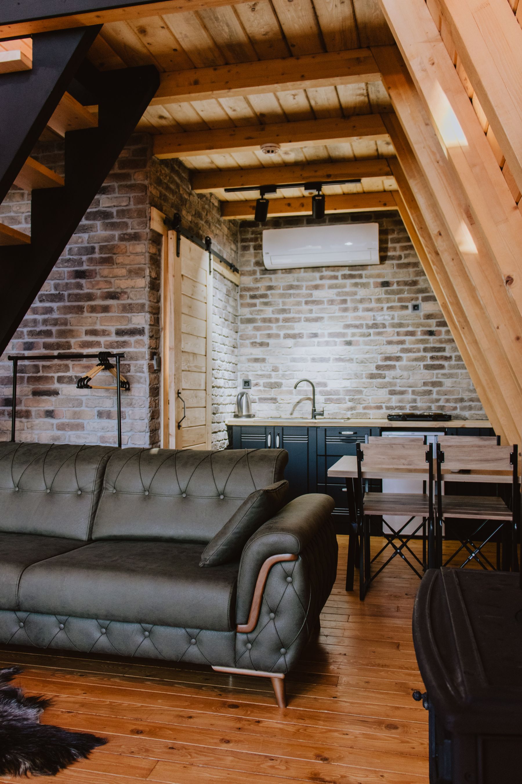
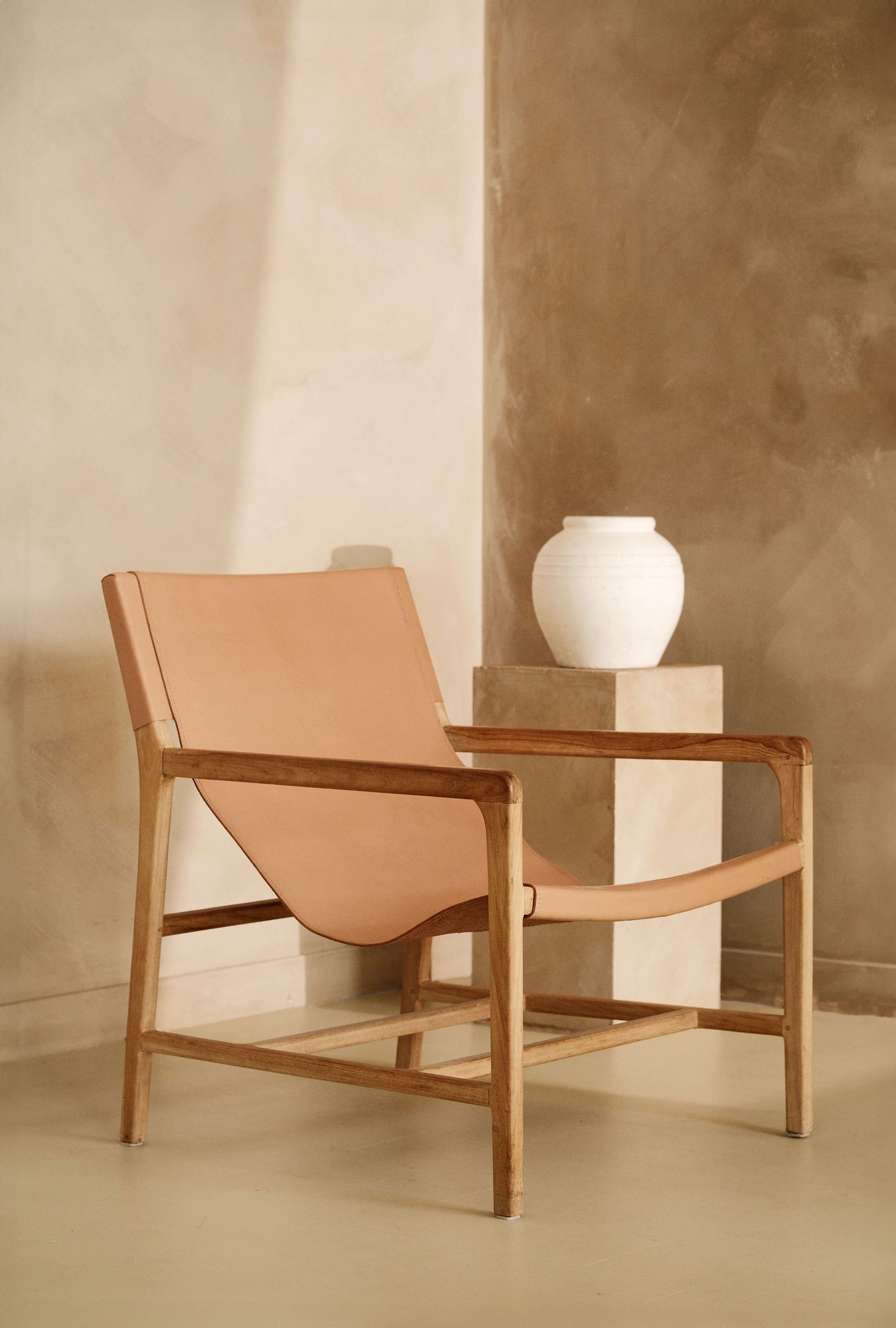
Cognac and saddle leather can be among the brightest browns in a room because curved cushions and worn areas return light. Give that sheen something quieter to work against: matte plaster, wool, a low-luster rug or dark metal. Do not match the leather with orange cushions or glossy honey wood; the reflected highlights will push the entire scene toward amber. Inspect the actual hide for protected finish, color variation and care guidance, and accept that high-contact areas may change first.
Keep Chocolate Upholstery From Losing Its Edges
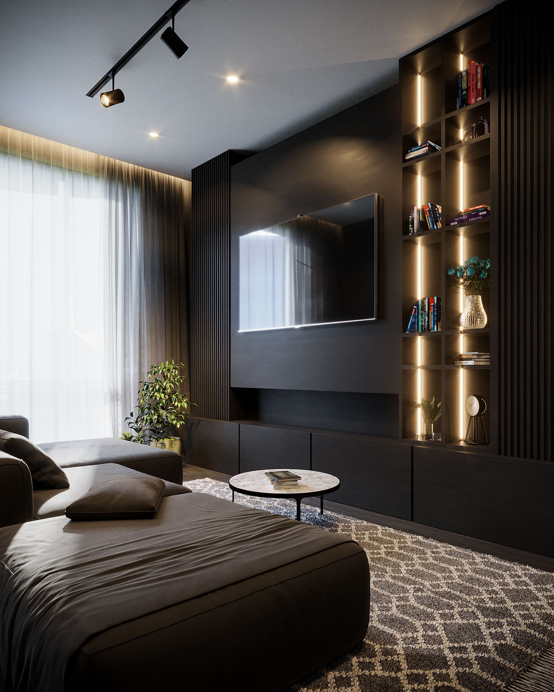
Chocolate wool, chenille and velvet absorb more light than polished leather and can become a featureless volume after sunset. Preserve the sofa's outline with a lighter wall, a rug that extends beyond its front edge, or side light that catches the arms. Velvet adds a second complication: pile direction can make adjacent panels appear like different shades. Choose cushions for posture and palette rather than using them to redraw every edge. If the whole room is intended to operate at low value, [Dark Living Room Ideas](/living-room/dark-living-room-ideas/) should lead the brightness strategy.
Choose Brown Paint Against the Fixed Brown
Start with the floor, hearth, sofa or cabinetry that will remain. A wall color may sit lighter than oak, deeper than tan leather or visibly cooler than red brick; it rarely needs to match any of them. Apply a large movable sample and view it beside the fixed brown on several walls. Manufacturer guidance emphasizes that brown contains varied undertones and that room light changes their reading. The useful question is therefore not 'Which mocha is best?' but 'Which relationship makes the fixed material look intentional?'
Separate Brick, Stone and Earth Plaster
Brick, brown stone and earth-toned plaster bring internal variation that a matching paint or timber stain cannot reproduce. Choose whether the mineral surface is the palette source or a quiet boundary. If brick has strong red variation, keep adjacent wood calmer and avoid tracing every tone through cushions. If stone is grey-brown, let it cool leather or oak instead of warming it artificially. Clean and seal according to the exact material and fireplace conditions; palette logic cannot override heat, porosity or installation guidance.
Reserve Cream as a Light-Return Surface
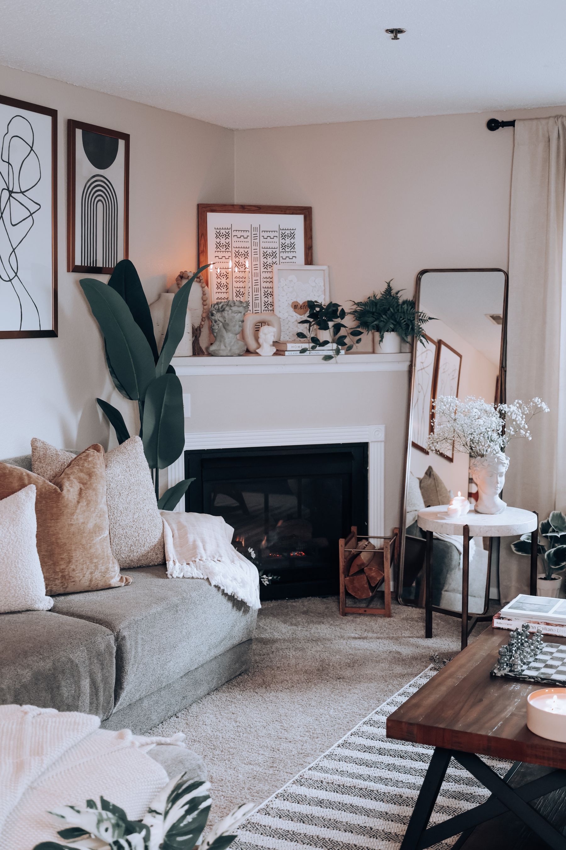
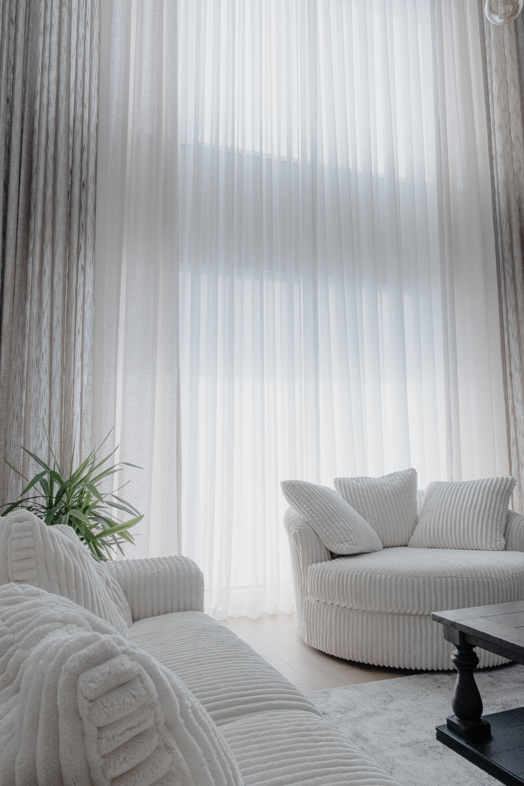
Use cream on the plane that needs to return light: a ceiling, curtain span, wall behind the sofa or broad rug. Keep it pale enough to remain distinct from camel and oak. A creamy wall with yellow curtains, honey timber and tan upholstery can form one continuous amber band; a clearer off-white or mineral cream creates breathing room. The exact white is relational, so test it beside the leading brown at midday and under lamps rather than choosing a fashionable warm white in isolation.
Pair Brown and Blue Through Value, Not Theme
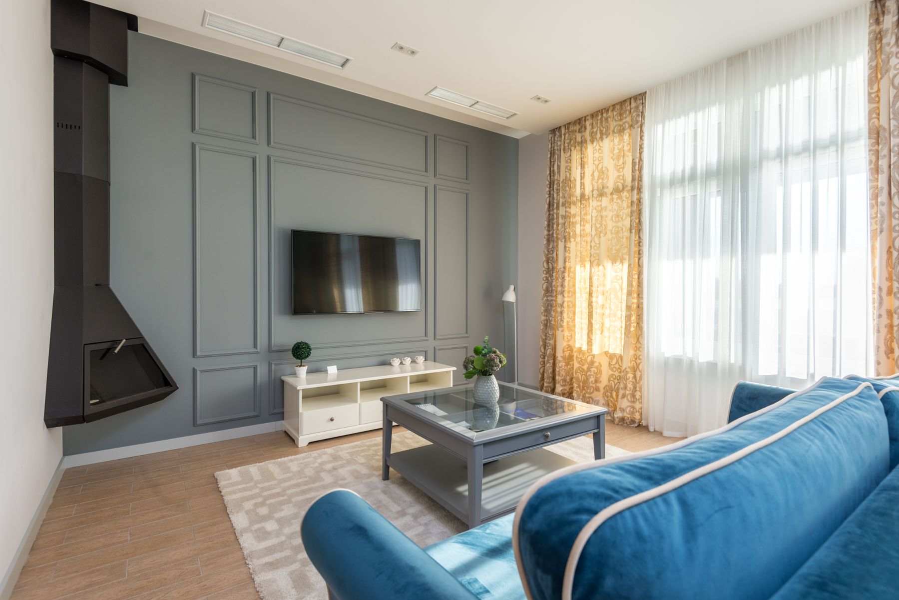
Choose blue by what the brown needs. Pale powder blue releases a dark walnut wall; inky blue gives caramel leather a cooler equal; muted blue-grey can quiet orange oak. Separate both hues by value when they occupy large neighboring masses, or let a patterned rug contain smaller repeats of each. Avoid adding stripes, rope or coastal props unless that is the actual style brief. [Blue Living Room Ideas](/living-room/blue-living-room-ideas/) can lead when blue becomes the dominant field; here it is the temperature counterweight.
Use Green to Echo Growth, Not Manufacture a Forest
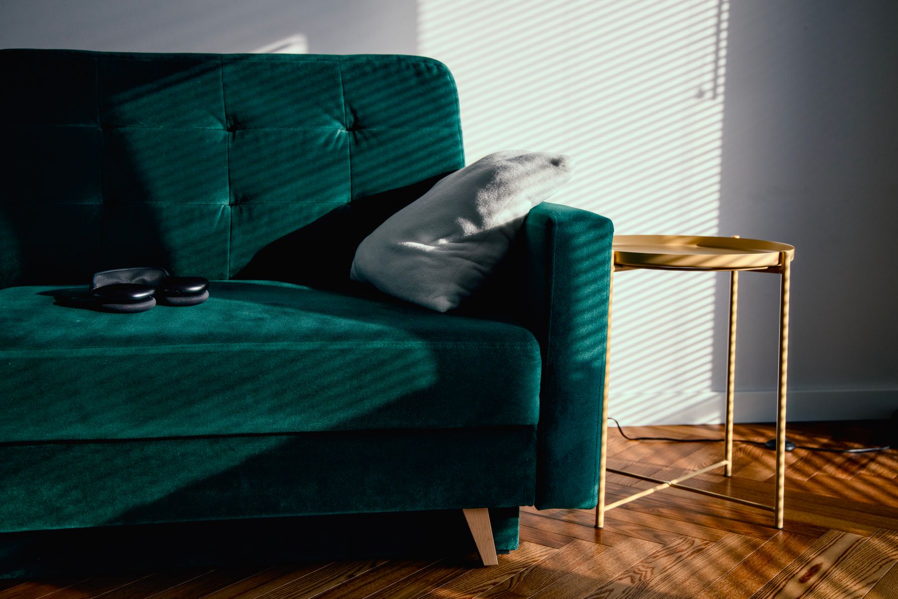
Olive, moss and bottle green can sit naturally beside brown, but the combination needs an edited structure. Let one green arrive as upholstery, a wall field or the window view, then allow real plants to remain varied rather than color-matched. Grey-green calms red timber; blue-green sharpens cognac; yellow-green can amplify honey oak. [Green Living Room Ideas](/living-room/green-living-room-ideas/) explores green as the main identity. In a brown room, green should reveal the brown's bias and provide a living interval.

Use Rose, Rust and Red Without Making Mud
Dusty rose can expose violet in cocoa paint, rust can connect leather to brick, and oxblood can give walnut a deep chromatic partner. Because these hues sit close to many browns, choose one as the visible color and make the other quieter. A rust sofa against red-brown paneling may need a pale boundary; a rose chair beside dark chocolate can work through sheen and silhouette. Do not distribute terracotta, burgundy, blush and orange in equal small doses—the result is muddier, not richer.
Let Metal Interrupt Brown Temperature
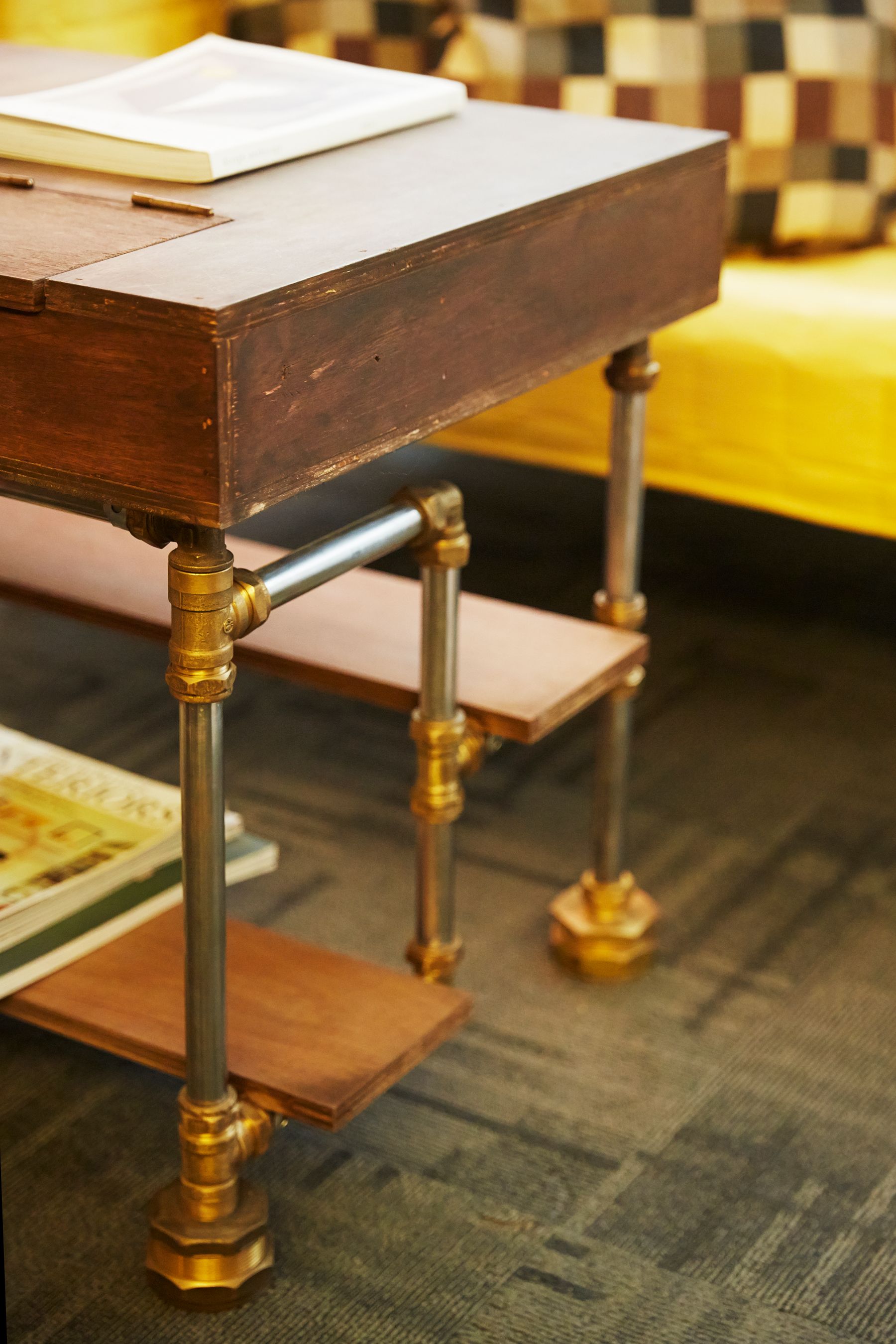
Brass and bronze reinforce red and yellow browns; chrome and stainless introduce a cooler flash; blackened steel draws a firm line through timber and leather. Choose the metal by the temperature job, then keep its total area modest. Too much brass in a honeyed room turns every highlight gold, while scattered black hardware can pepper the palette without creating structure. Repeat one metal at two useful points—such as a lamp and table base—rather than on every accessory.
Give the Screen and Fireplace Separate Dark Edges
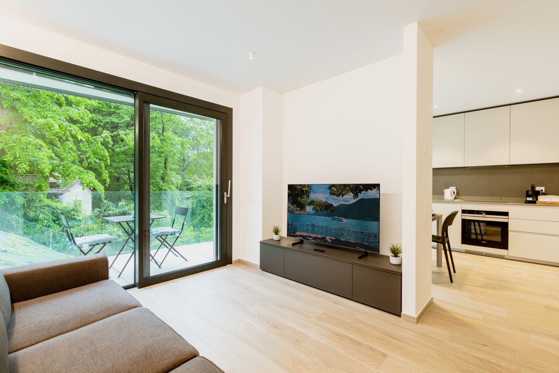
A switched-off television, firebox and dark walnut cabinet can combine into an accidental black-brown wall. Decide whether the screen or the hearth owns the darkest rectangle, and create an edge around the other with stone, plaster, joinery reveal or open space. Do not repeat black bowls and frames solely to justify the screen. In a panelled room, a slightly lighter or more matte cabinet field can keep the device integrated without pretending it disappears.
Choose Pattern That Negotiates With Grain
Read timber grain as an existing pattern. Strong cathedral grain, parquet or brick bonds may need a broader, quieter rug; plain veneer and solid upholstery can support a more articulated geometric or floral. Pattern can also bridge a difficult pair by containing both the red of leather and the grey of stone. Avoid repeating narrow stripes beside slatted walls or tiny brown motifs across every cushion. [Living Room Rug Ideas](/living-room/living-room-rug-ideas/) resolves fit; this decision resolves visual frequency.
Test Brown in North Light and Late-West Light
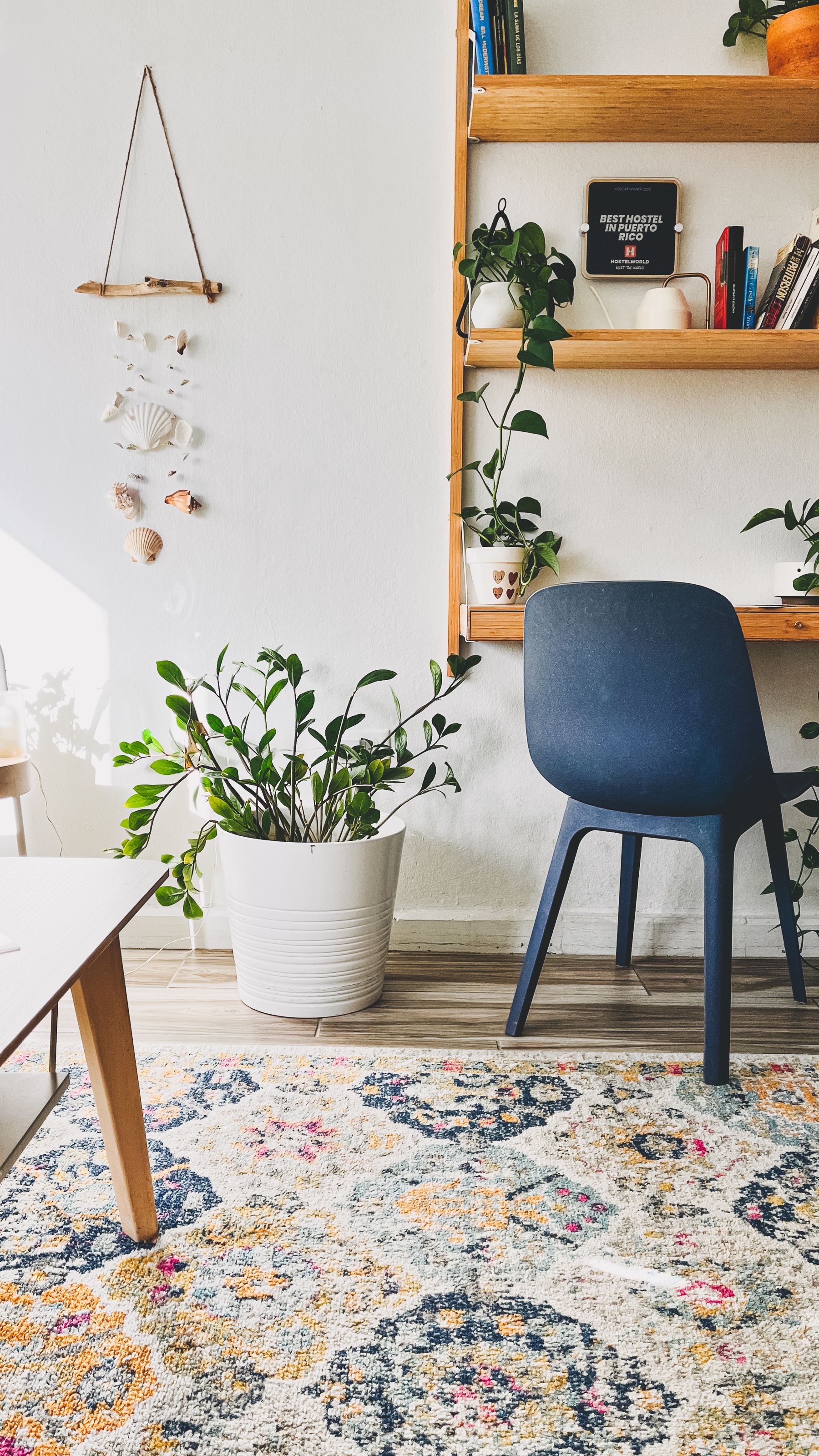
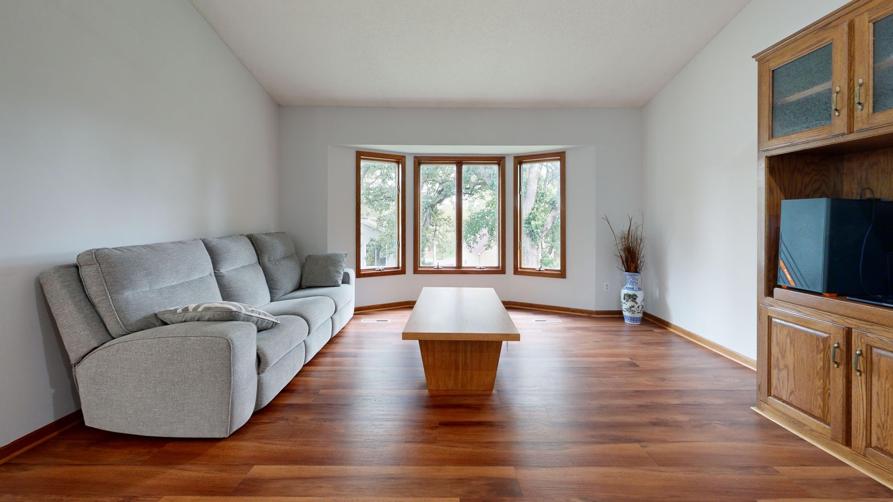
Observe the room when its natural light is coolest and when it is warmest. A grey-brown paint may look calm in north-facing light but lifeless beside a cool floor; cognac leather and cherry timber can turn intensely orange in late-west sun. Move samples through the exact zones they will occupy because the wall beside the window and the sofa across from it receive different light. Use the change to create rhythm, but reject combinations that only look coherent during one photogenic hour.
Stop Evening Light Turning Every Brown Orange
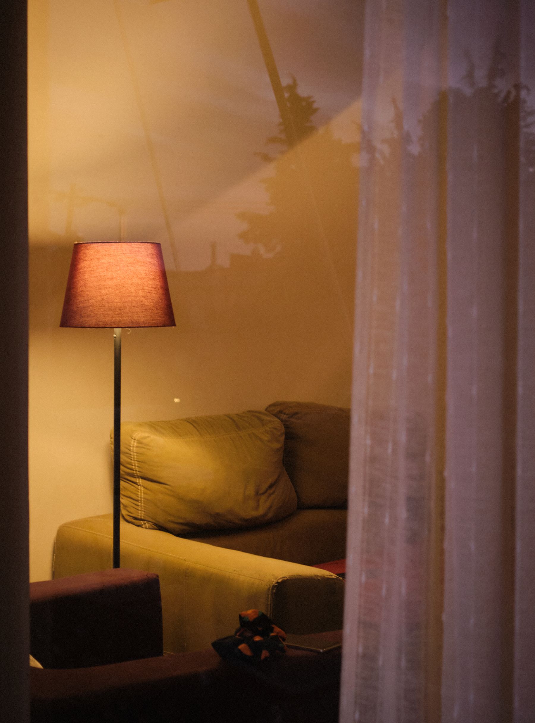
Brown does not need the warmest possible bulb. Very amber light can collapse cream, oak, leather and rust into one orange field, while a single cool ceiling source makes the same materials look dull. Build at least two layers: useful shaded light near faces and a separate source that grazes timber, brick or art. Check color rendering, glare and dimming with the actual finishes. [Living Room Lighting Ideas](/living-room/living-room-lighting-ideas/) covers the circuit plan; the brown-specific aim is to preserve material distinctions after sunset.
End Brown at a Real Open-Plan Joint
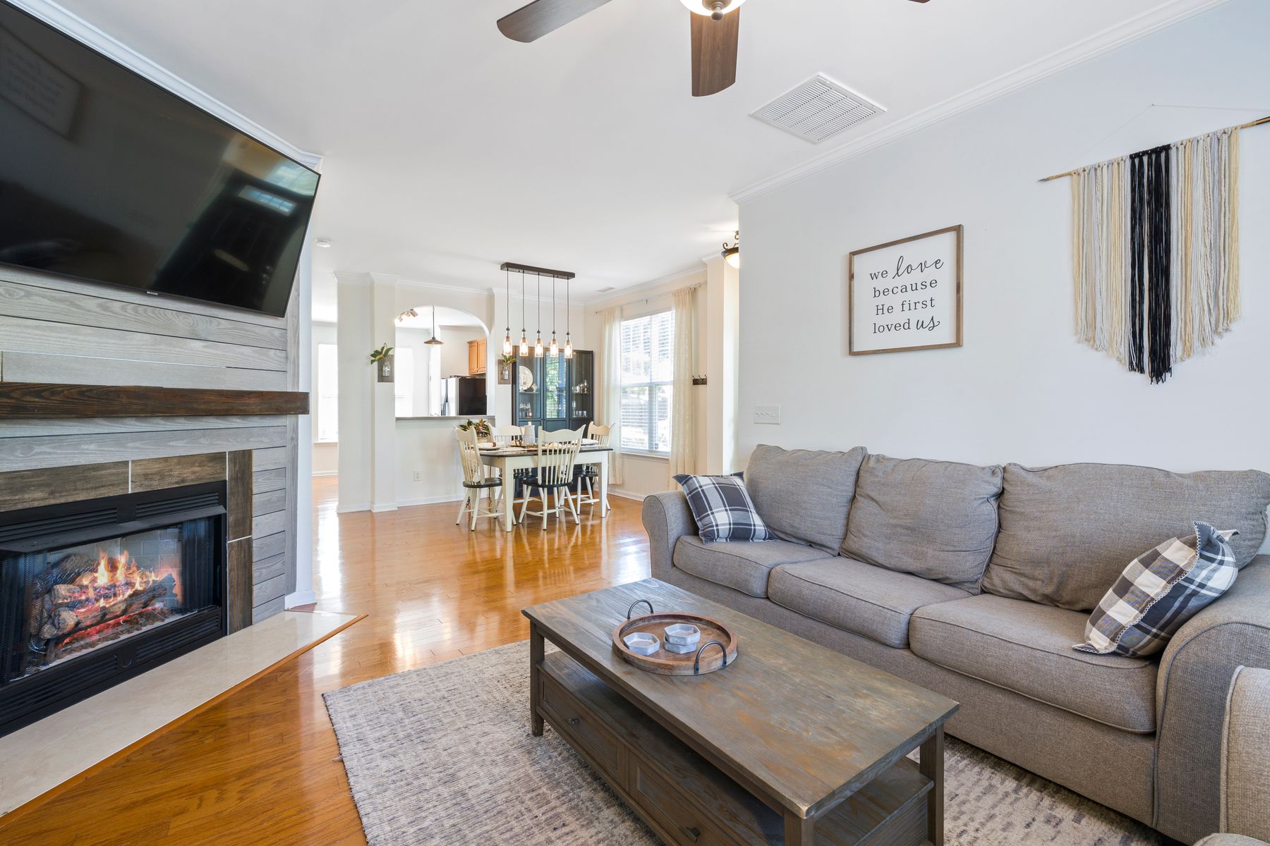
Continue one brown source across connected zones—flooring, a joinery datum or repeated chair frames—then stop a painted or paneled field at a corner, beam, cabinet end or change of plane. Avoid fading brown through a sequence of increasingly beige walls merely to make the transition gentle. The neighboring dining or kitchen zone may repeat the undertone at a smaller scale while changing material. A visible joint makes the continuity look designed and preserves identity for both rooms.
Release the Edges in a Small Brown Room
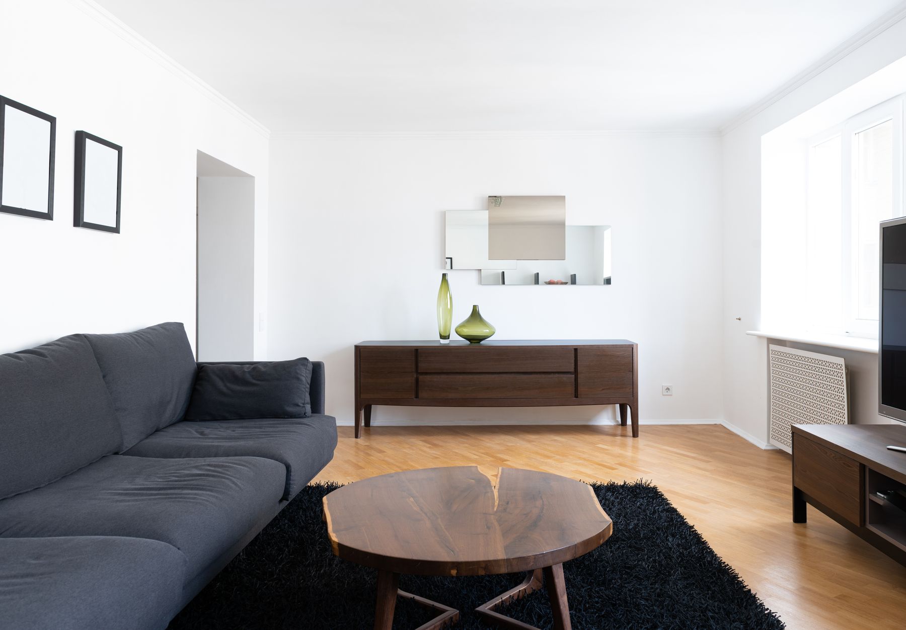
Keep brown concentrated in one or two complete shapes—a sofa and floor, or one wall and a chair—rather than scattering small dark pieces around the perimeter. Preserve a light edge at the window, a readable route and some floor around the coffee table. Legged furniture may reveal enough background to prevent a dense brown field, but choose it for stability and use rather than style shorthand. The room can remain deep and enveloping if doors, controls and walking lines stay legible.
Plan for Patina, UV Change and Pile Direction
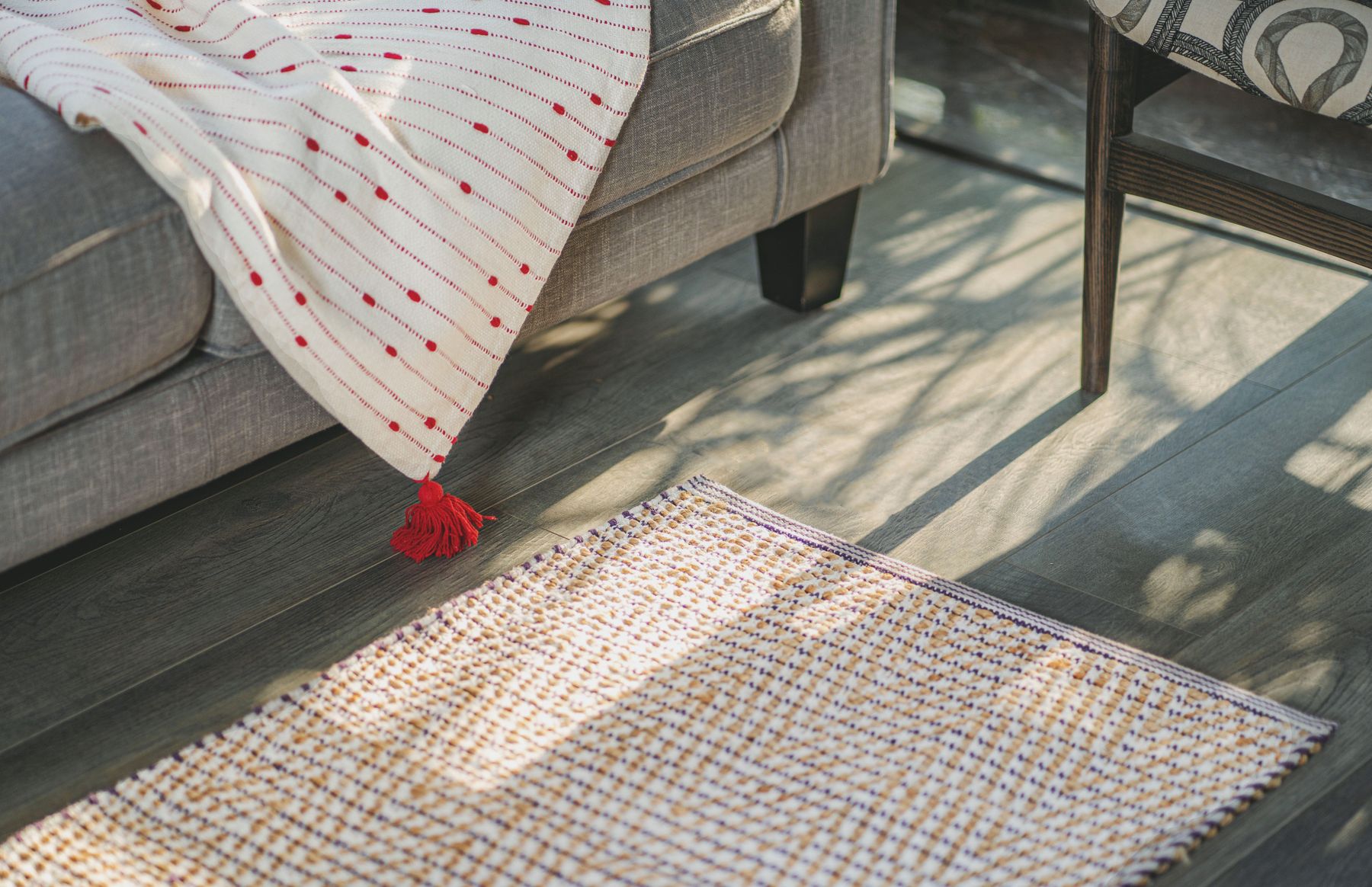
Leather may darken, lighten or crease at contact points; timber can shift with ultraviolet exposure; velvet and chenille change direction as people sit; dark brown rugs show pale lint while camel textiles show darker soil. Obtain manufacturer care instructions, keep finish and batch records, and rotate movable textiles where appropriate. Protect timber from uneven exposure without keeping the room permanently shuttered. Patina can add character, but cracking, delamination, water marks and crushed pile are maintenance issues rather than romance.
Keep Brown Distinct From Rustic, Mid-Century and Cozy
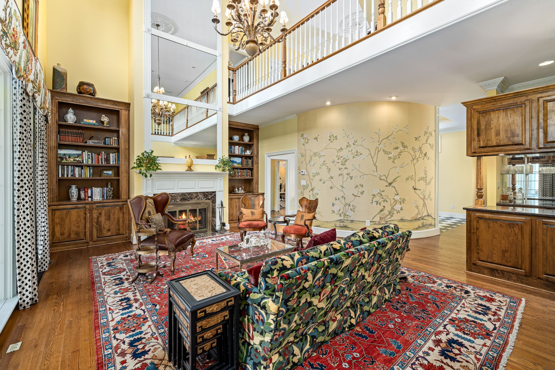
A brown room can be contemporary, traditional, minimal, maximal or eclectic. [Rustic Living Room Ideas](/living-room/rustic-living-room-ideas/) centers material age and structural honesty; [Mid-Century Living Room Ideas](/living-room/mid-century-living-room-ideas/) centers a design movement and furniture profiles; [Cozy Living Room Ideas](/living-room/cozy-living-room-ideas/) centers bodily comfort. Do not add a hide rug, tapered legs or baskets to prove brown belongs. Let the palette survive after those tokens are removed, then choose a style language that fits the architecture and household.
Run the Five-Source Brown Stress Test
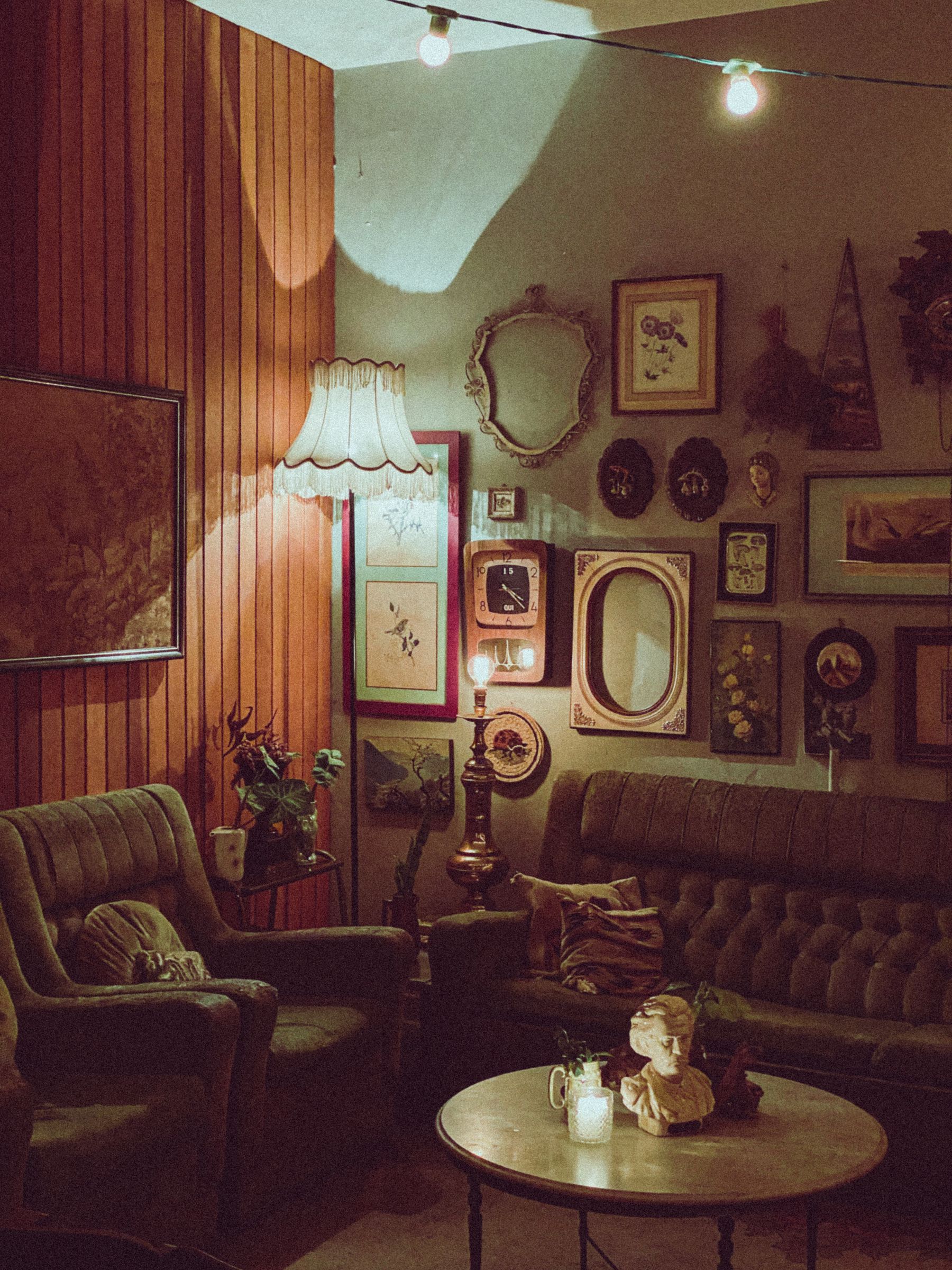
Finish by testing **wood, leather or upholstery, mineral, paint and fiber** as five possible brown sources. Not every room needs all five. For each one present, state its role, value, bias, sheen and expected aging. Then inspect the room from the entrance, main seat, screen position, window and evening route. Remove any brown that merely repeats another source without improving comfort, structure or continuity. The final palette should remain identifiable in color, understandable in grayscale and convincing without styling props.