Define Neutral as a Range With Borders
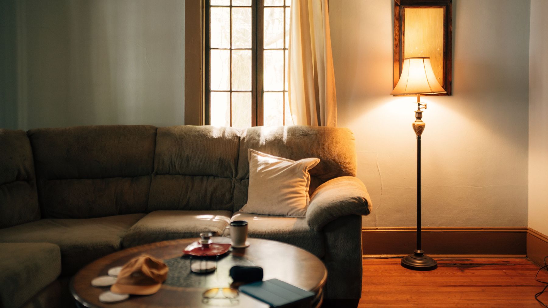
Neutral does not mean colorless. It means the room keeps chroma within a deliberate range so no unplanned hue takes command. Photograph the living room from its main entrance and circle every surface that reads clearly blue, green, red or yellow. Decide which are welcome, which are fixed and which are accidental. A muted olive chair may belong inside the range while a tiny bright-blue cushion punctures it. This border makes neutral a design decision rather than a label applied to cream paint.
Choose a Mineral, Earth or Textile Center
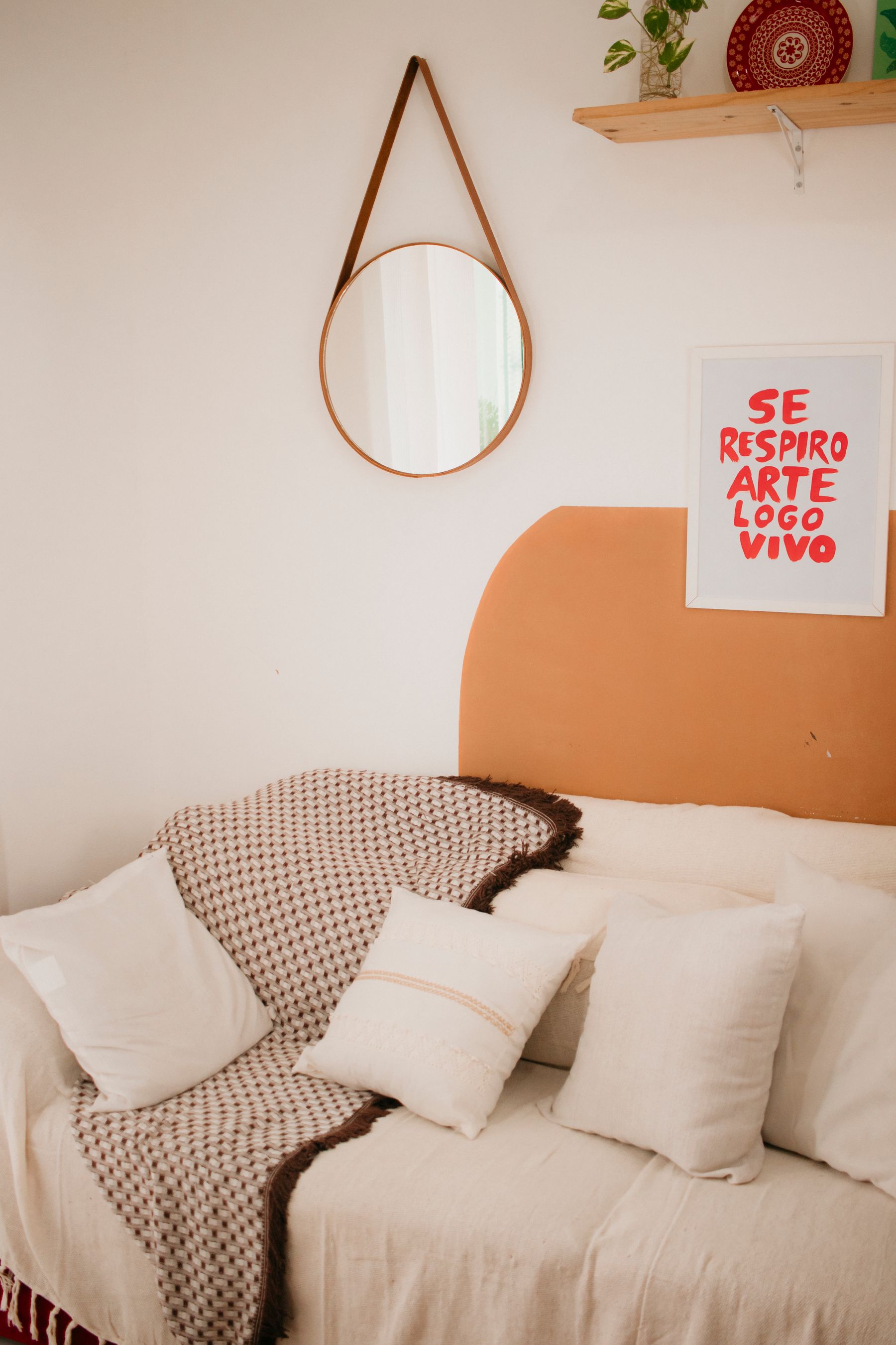
Choose the family that should make the room feel coherent. A **mineral center** grows from plaster, limestone, concrete or greyed stone. An **earth center** starts with clay, sand, bark, leather or brown. A **textile center** begins with linen, wool, canvas or undyed fiber. The categories may overlap, but naming one leader prevents every purchase drifting toward generic beige. Use its temperature and visual density to judge walls, upholstery and rugs, while allowing the other families to provide intervals rather than matches.
Set a Chroma Ceiling and One Interruption Budget
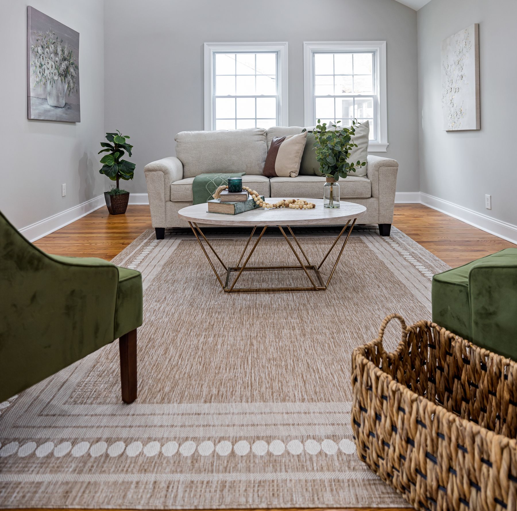
Define how much visible color the room can absorb before neutral stops being the dominant experience. The ceiling may be very low, with only greyed greens and browns, or moderately high, allowing one rust chair or cobalt artwork. Reserve the strongest chroma for one bounded event rather than scattering it through cushions, books and ornaments. [Contemporary Living Room Ideas](/living-room/contemporary-living-room-ideas/) can take over when the sculptural event, rather than the chromatic field, becomes the room's main thesis. This is not a percentage formula. It is a promise that the eye can locate the exception and then return to a stable field.

Map the Four Largest Neutral Masses
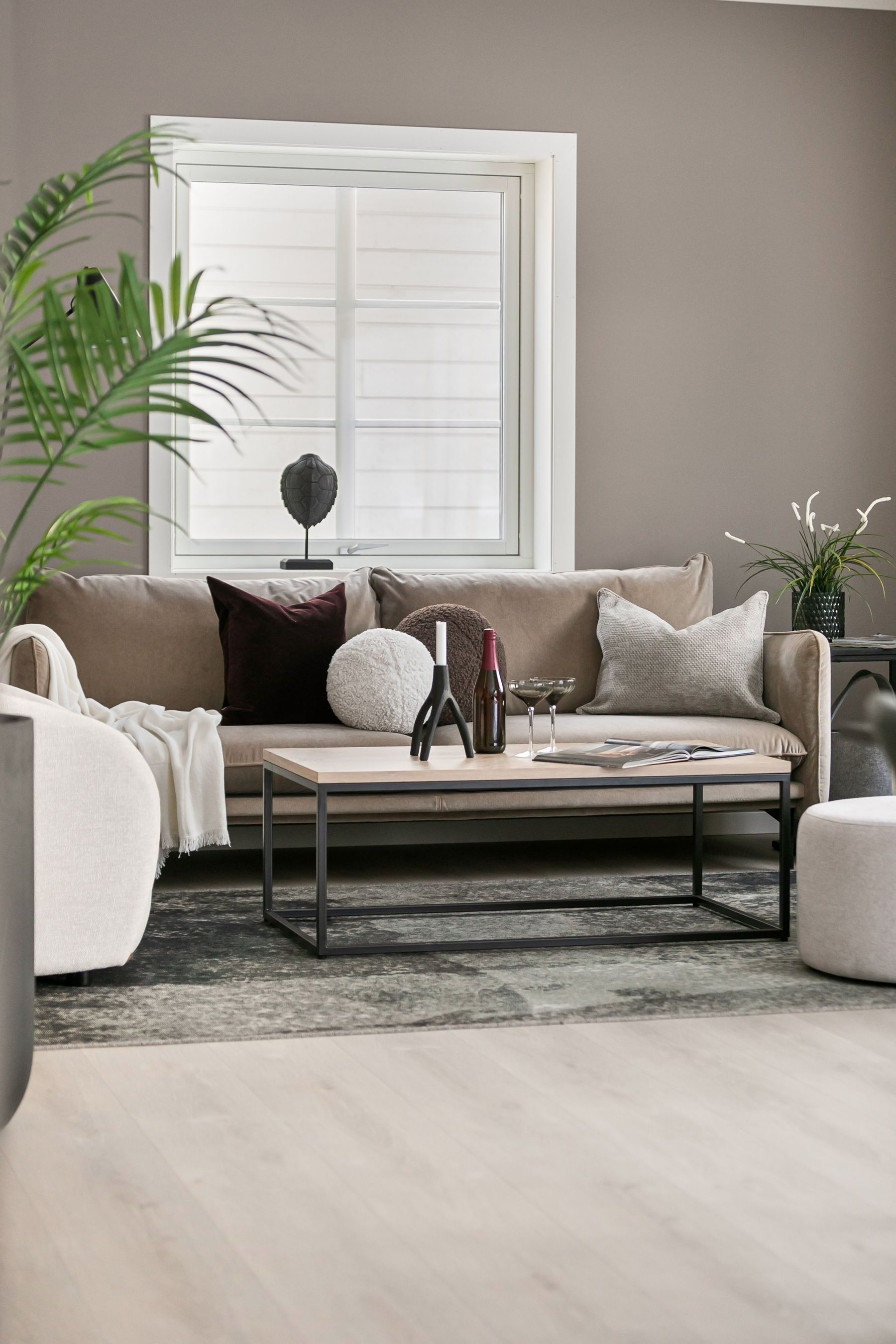
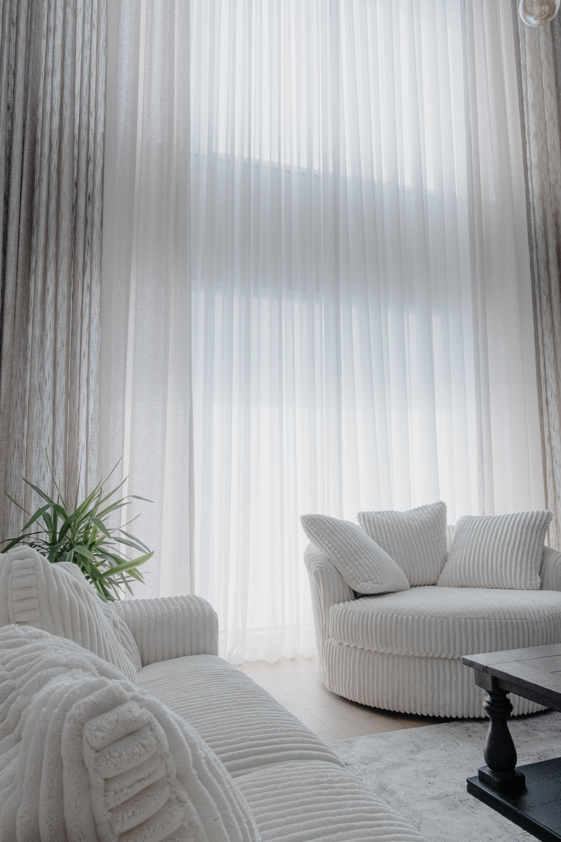
List the wall field, largest sofa, rug and curtain span in order of area. Assign each a job: center, bridge, boundary or contrast. A taupe wall may establish the center, cream curtains release the edge, a mushroom sofa bridge warm and cool notes, and a charcoal-flecked rug give the group weight. If all four share the same value and yellow bias, they merge into one honey-colored block. [Living Room Rug Ideas](/living-room/living-room-rug-ideas/) can solve fit; this map decides what the rug must do chromatically. If the entire envelope must behave as an active pale reflector, [White Living Room Ideas](/living-room/white-living-room-ideas/) is the more precise destination.
Choose Agreement, Bridge or Tension
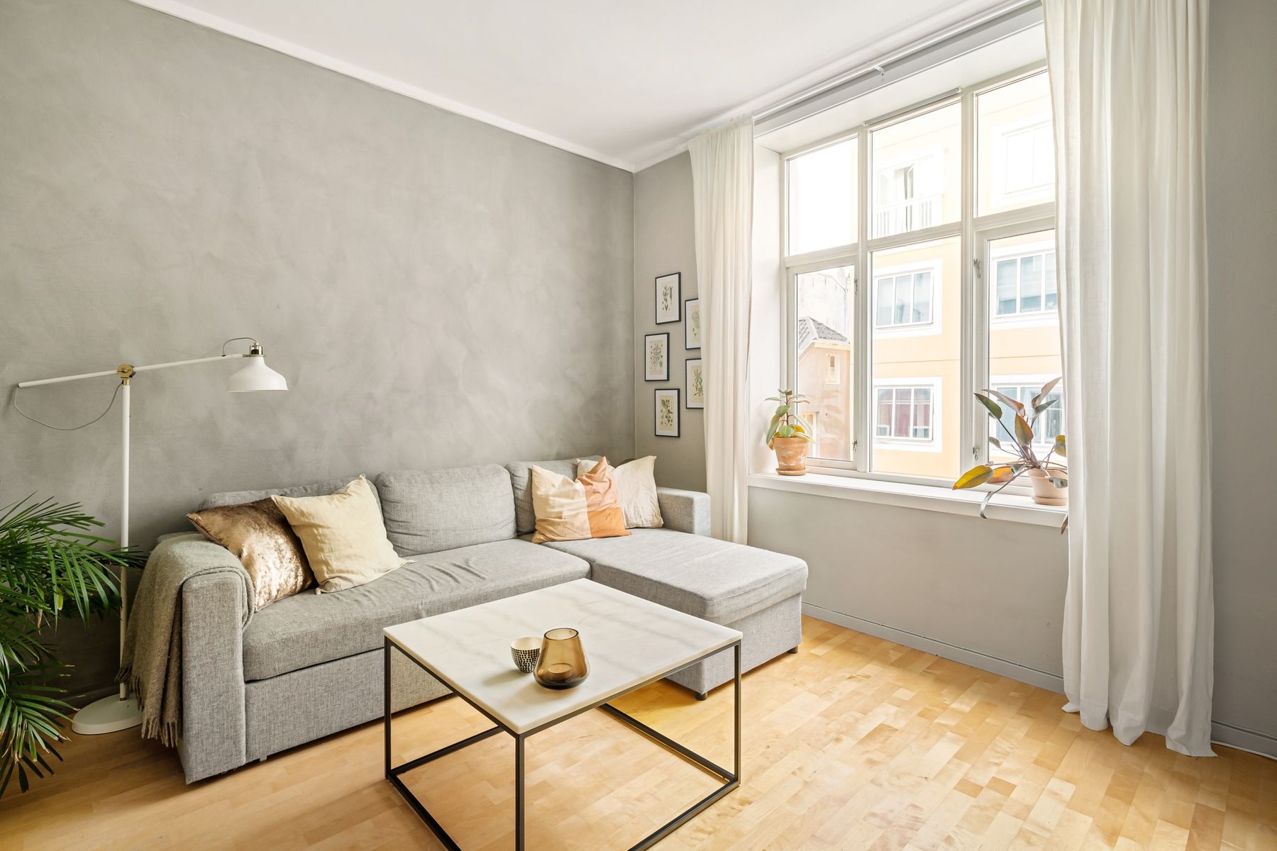
Warm and cool neutrals do not have to be blended into greige. Choose one relationship. **Agreement** keeps nearly every major surface on the same temperature side. **Bridge** uses mushroom, taupe or a complex textile to connect cool stone with warm timber. **Tension** lets a cool concrete surround stand clearly against camel leather or warm plaster. Accidental tension makes one surface look dirty; deliberate tension repeats each temperature at least once and separates them by value or material.
Use Mushroom or Taupe as a Hinge, Not Filler
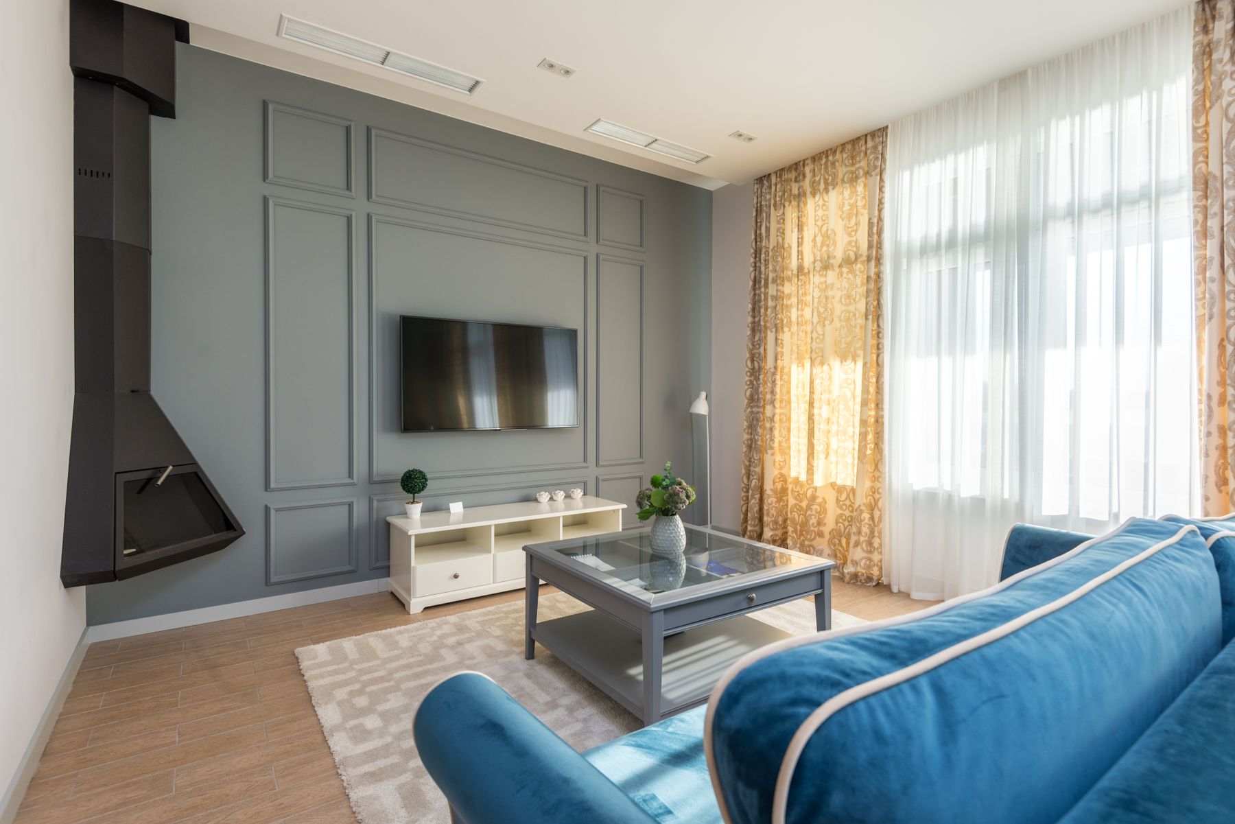
Mushroom and taupe often contain enough red, violet, grey or brown to mediate between limestone, oak, cream and charcoal. Their value is relational, not automatically sophisticated. Use the hinge on one meaningful plane—a sofa, wall or curtain—not everywhere. If it merely makes each finish less distinct, remove it and allow the contrast. For a deeper diagnosis of grey behavior, continue to [Grey Living Room Ideas](/living-room/grey-living-room-ideas/); here the hinge serves the whole neutral field.
Stop Cream, Beige and Camel Forming One Honey Band
Cream walls, beige upholstery, camel leather and honey oak can all be attractive yet collectively erase depth. Separate them through value before buying more texture. Let cream be genuinely pale, keep camel saturated enough to read as leather, and use the rug or table to establish a middle-dark center. Then check undertones: pink beige beside yellow oak can look bruised, while green-beige may make camel seem orange. The cure is not necessarily cooler color; it is clearer intervals.
Make the Sofa the Quietest Mass or the Tonal Hinge
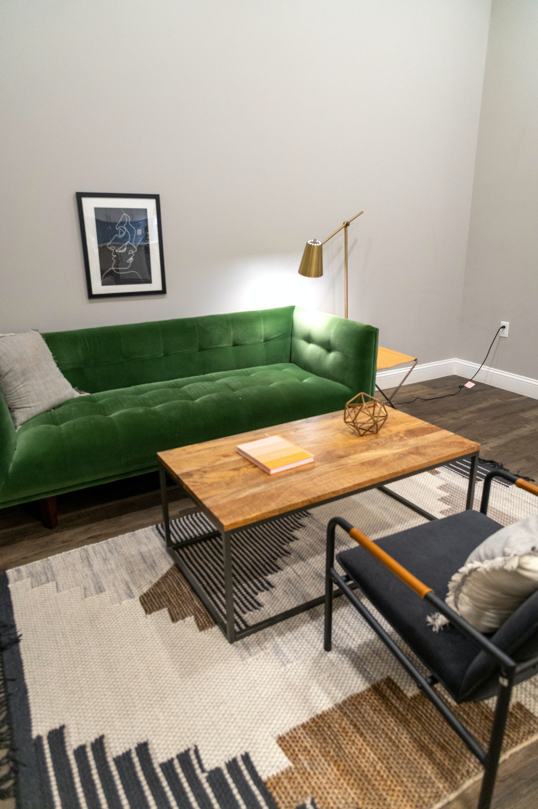
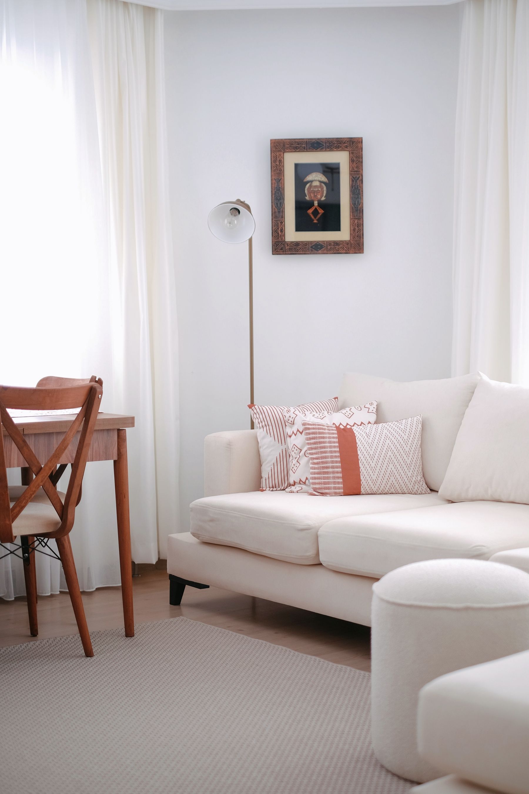
A large neutral sofa can disappear enough to give people and art priority, or it can act as the hinge connecting pale architecture to a darker ground. Choose before selecting cushions. A quiet sofa should keep a readable silhouette but avoid competing pattern; a hinge sofa should visibly contain both sides of the room's temperature or value range. Do not ask it to anchor, blend, warm and lighten simultaneously. [Living Room Layout Ideas](/living-room/living-room-layout-ideas/) should determine its physical position before color is asked to compensate for weak placement.

Test the Palette With People in It
An empty neutral room can look impeccable and fail the moment ordinary life arrives. Sit people in every regular seat wearing dark, light and colored clothing. Check whether warm walls cast yellow onto faces, whether a pale sofa erases light clothing, and whether books make the shelving look chaotic only because it was designed for empty styling. Neutrality should host variable human color without demanding a dress code. Plan quiet areas around faces and allow denser color where the room naturally stores life.
Count Art and Books as Expected Color
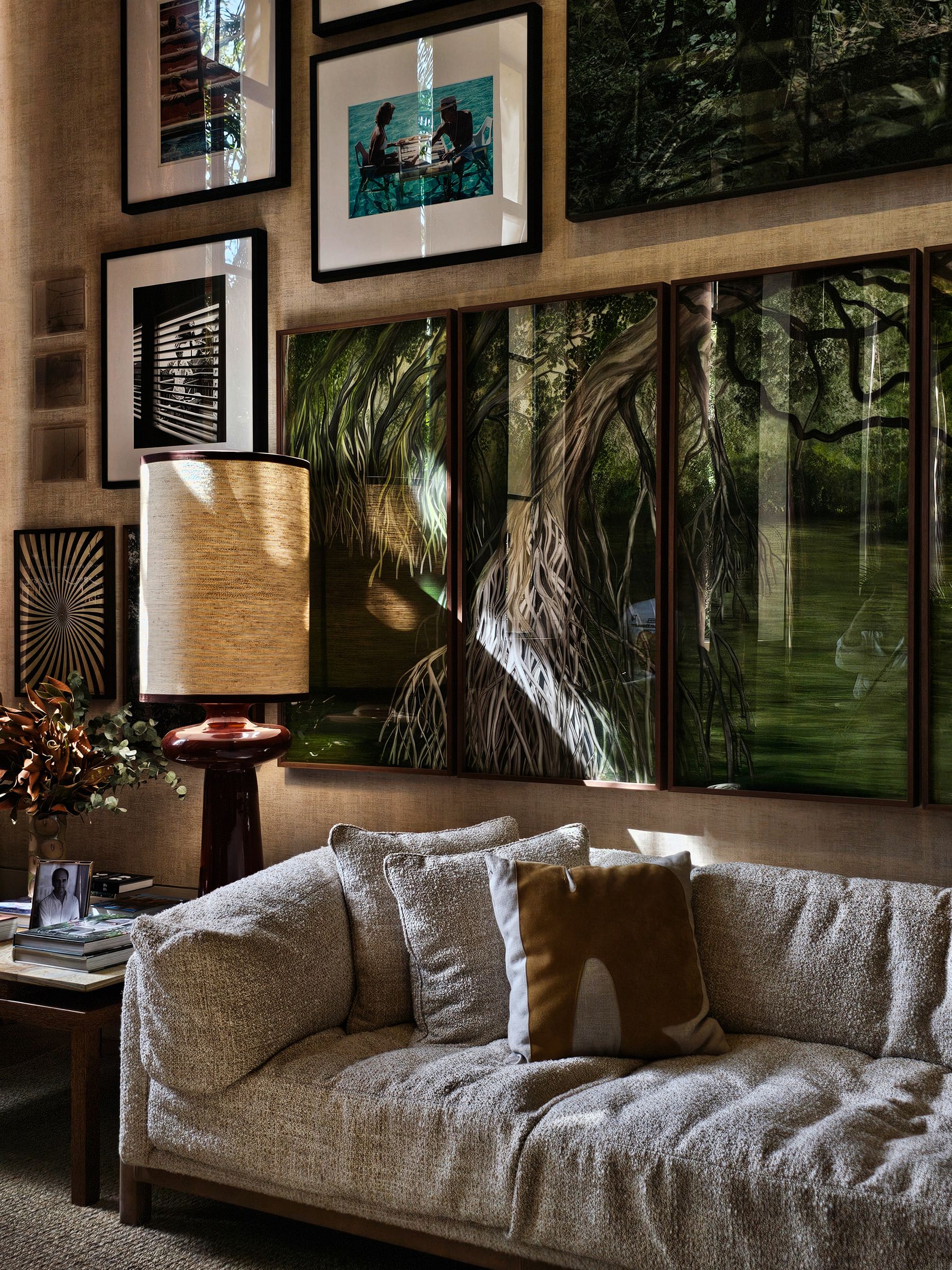
Do not buy beige art to prove the room is neutral. Decide whether art forms one chromatic island, a distributed rhythm or a quiet tonal extension. Keep saturated work on a bounded elevation and give it breathing room; let books occupy one architectural storage field instead of appearing as apologetic stacks around the room. Mats and frames should clarify the artwork rather than coordinate with the sofa. The neutral palette succeeds when personal color looks intentional, not when personality has been filtered out.
Treat the Window View as a Changing Color Source
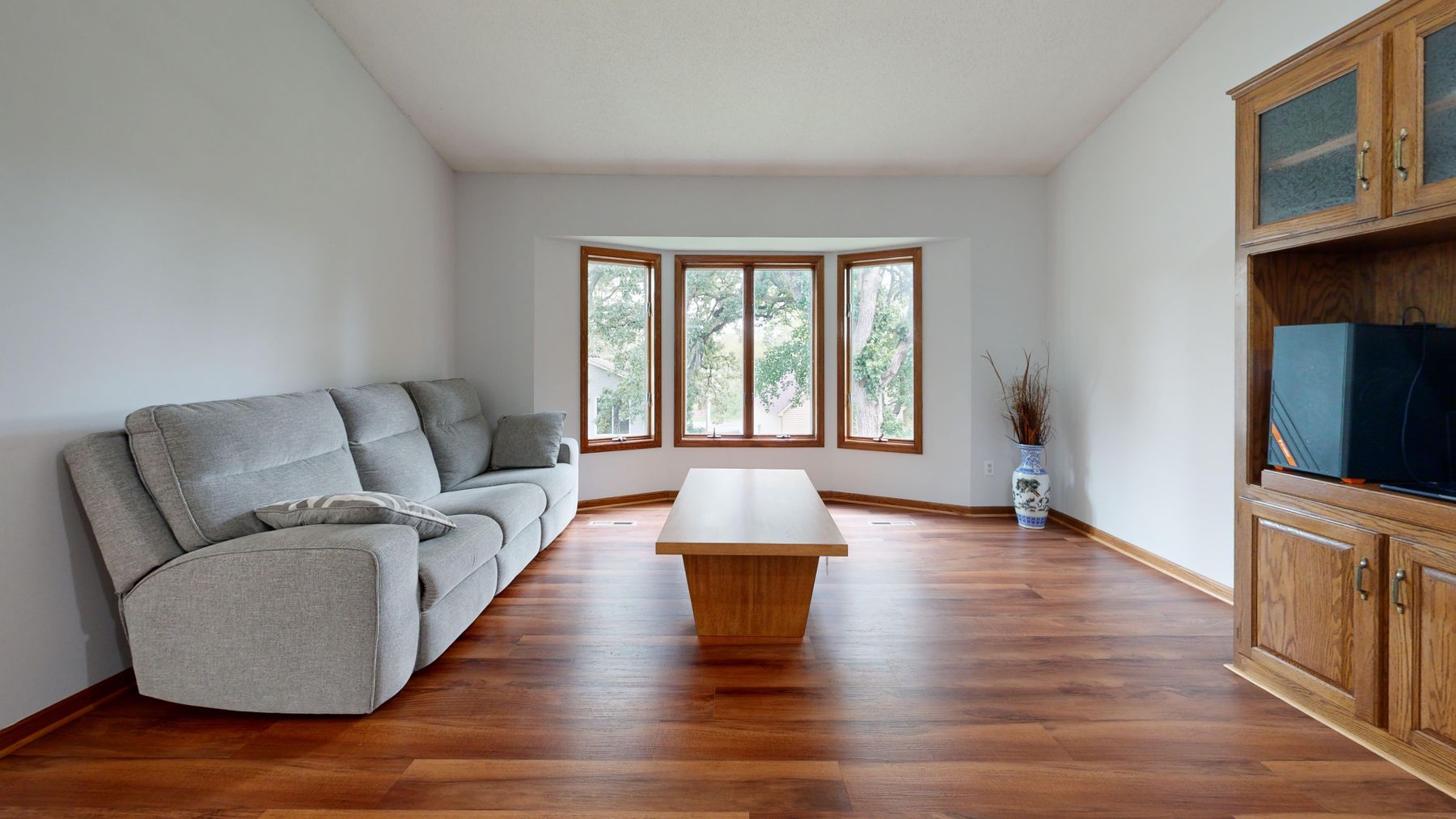
The view may contribute a large green field, blue sky, red brick or grey urban light. Decide whether the neutral room should extend that color, buffer it or oppose it. Grey-green textiles can continue foliage; warm earth tones can counter a cold city outlook; a pale mineral shell can let a dramatic view remain the one chromatic event. Test on clear, overcast and leafless days where relevant. Curtains alter both the amount and the color of this contribution, so sample them with the view visible.

Use Pattern That Becomes Texture at Conversation Distance
Neutral pattern works best when its reading changes with distance. From the entrance, a broken stripe, heathered weave or small geometric should behave like one textured mass; from the sofa, it can reveal craft and variation. If every cushion, curtain and rug announces a separate low-contrast motif, the room becomes busy without gaining color. Choose one plane for visible pattern and let the others provide grain, weave or shadow.
Separate Material Color From Applied Color
A linen described as oatmeal and a paint described as oatmeal are not equivalent. Fiber creates highlights and dark interstices; stone contains veins and pores; timber changes across grain; paint presents a continuous plane. Match their average color too closely and the applied surface can make the natural one look dirty or synthetic. Give material color a small interval and let its internal variation remain visible. This is why adding more beige materials does not automatically create depth.
Assign Timber Support or Interruption
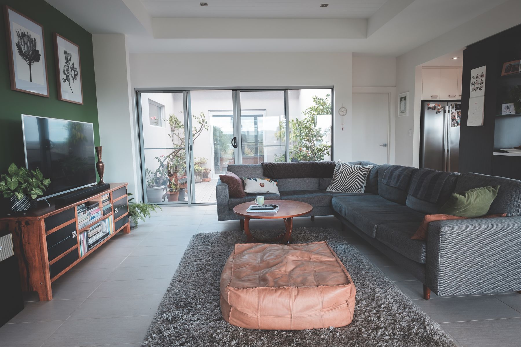
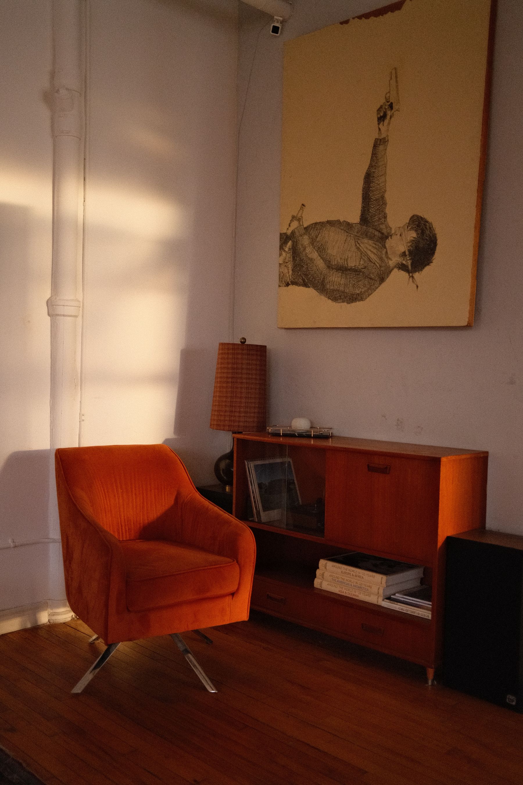
Do not add wood only to make neutral warmer. Pale oak can support a sand-and-linen center, dark walnut can create a bounded counterweight, and red timber can become the room's most chromatic surface. Decide which role the largest wood piece plays, then reduce minor woods that compete with it. Mixed species can work when value and grain weight form a hierarchy; five similar honey finishes usually read as failed matching. [Scandinavian Living Room Ideas](/living-room/scandinavian-living-room-ideas/) should lead if pale timber and daylight become the main story.
Let Stone Generate the Palette or Stay Quiet
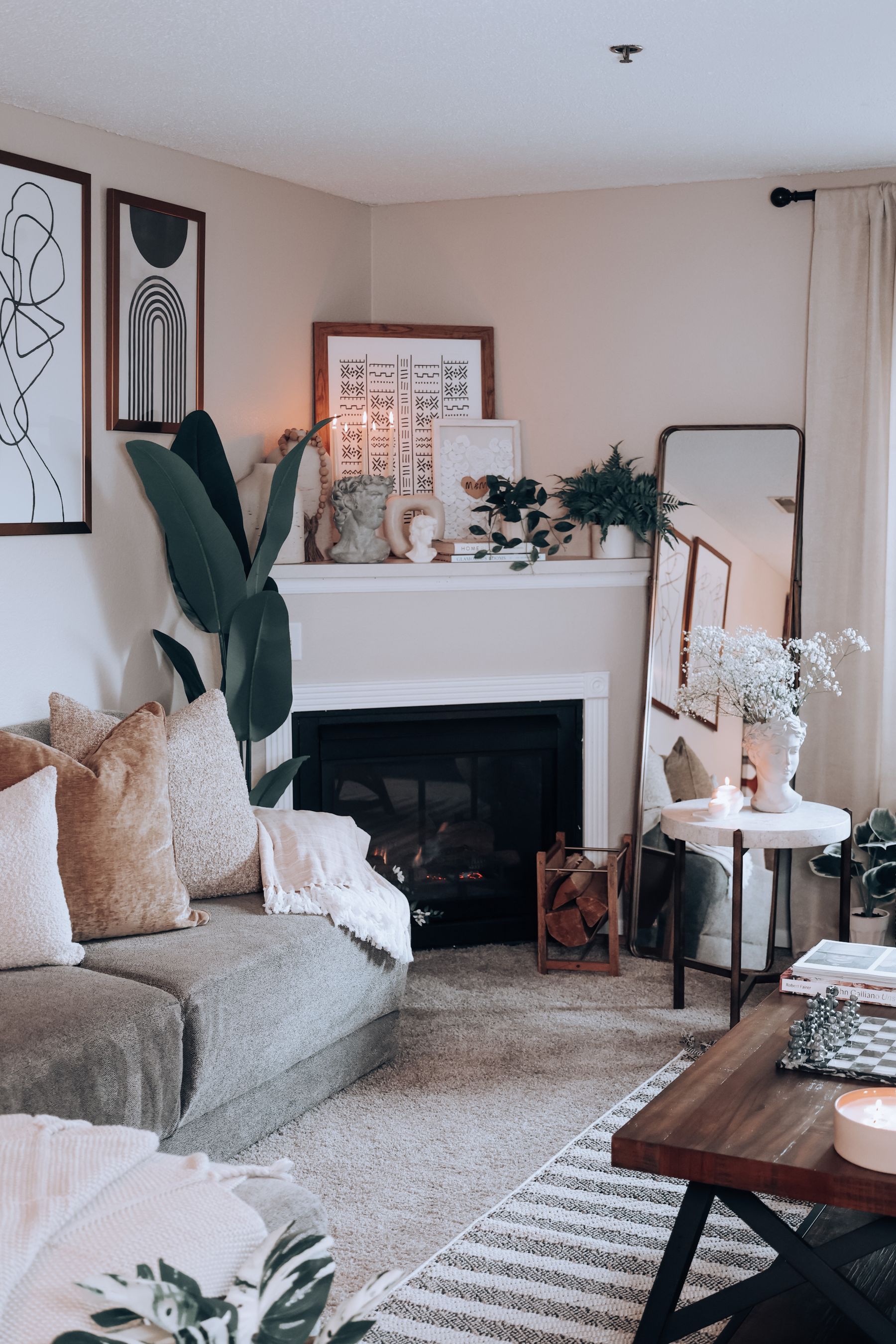
Read fireplace stone from the main seat, not inches away. If its overall field is distinctive, use two or three averaged colors to build the neutral range. If it is visually noisy, keep nearby walls and upholstery quieter instead of repeating every vein. Preserve value relief between surround, opening and mantel so the fireplace does not become a mottled rectangle. Installation, heat and clearance decisions belong to the exact appliance and qualified guidance; palette logic cannot override them.
Give the Screen One Bounded Dark Field
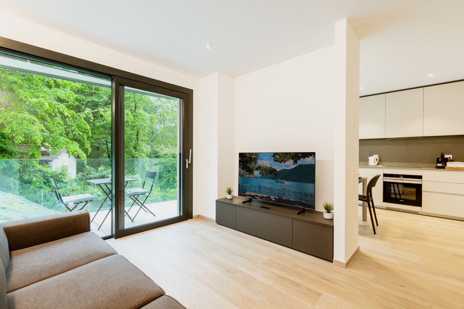
A black television can be the one necessary low-value interruption in a pale neutral room. Place it within a cabinet run, paneled field or composition of shelves whose edges make the rectangle feel expected. Do not scatter black frames, lamps and bowls around the room merely to repeat it. If the screen shares an elevation with the fireplace, decide which owns the center before styling. The neutral field should absorb the device without pretending it disappears.
Plan for Neutral Drift After Sunset
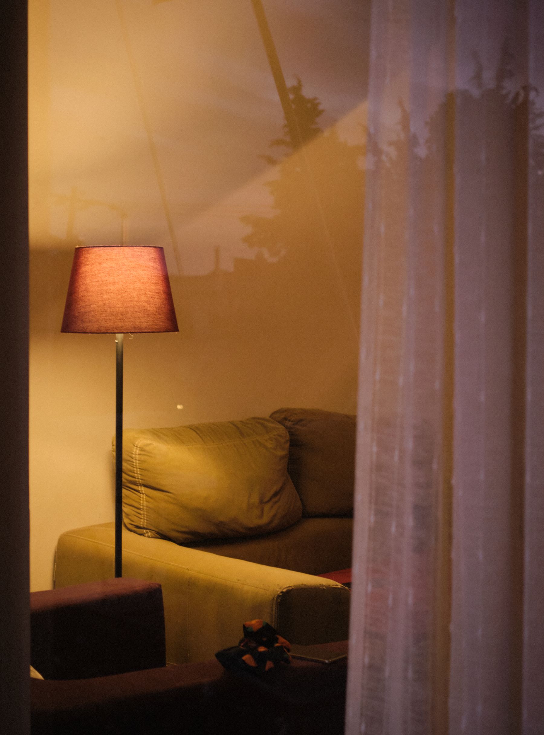
Evening light does not simply warm a neutral palette; it can change the relationship between its parts. Cream may become yellow beside a cool white ceiling, taupe can reveal violet, and green-grey stone may look stronger under warm lamps. Test the actual bulbs, dimmer positions and shades beside the largest samples. [Living Room Lighting Ideas](/living-room/living-room-lighting-ideas/) covers the layer plan; the neutral-specific goal is to keep the center recognizable while allowing a deliberate nocturnal shift.
Carry a Neutral Passport Across an Open Plan
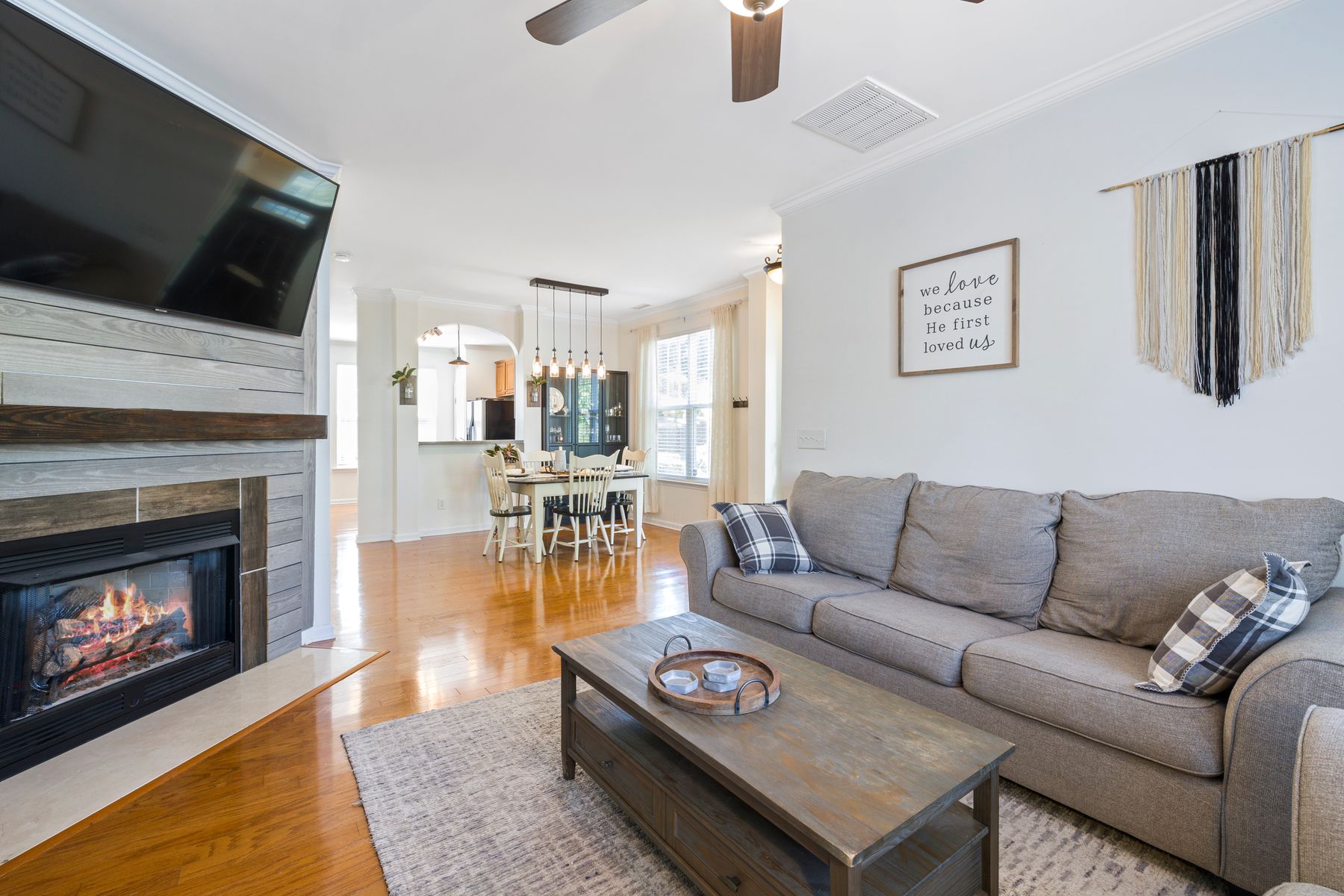
Write a three-part passport for the living zone: neutral center, darkest normal value and permitted interruption. Carry two of those traits into the adjacent space while letting the third change. A mineral-centered living room may share limestone and charcoal with the dining area but introduce muted green there; an earth-centered room may repeat walnut and cream while changing the rug value. Stop paint at a real corner, beam or joinery return. Repetition of logic creates continuity more effectively than coating every zone in one compromise color.
Keep Neutral Distinct From Minimalist and Cozy
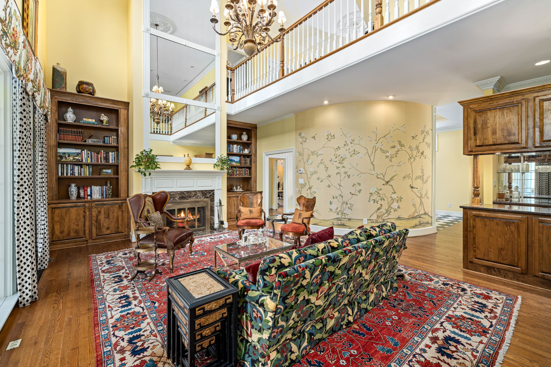
A neutral living room may be maximal, traditional, sparse or deeply comfortable. [Minimalist Living Room Ideas](/living-room/minimalist-living-room-ideas/) is organized around useful reduction; [Cozy Living Room Ideas](/living-room/cozy-living-room-ideas/) is organized around physical comfort. Neutrality governs chromatic range. Do not remove books to make beige work or pile on throws to prove warmth. Let the chosen style determine objects and forms while the neutral center, value intervals and chroma ceiling keep them in relationship.
Run the Five-Intrusion Neutral Audit
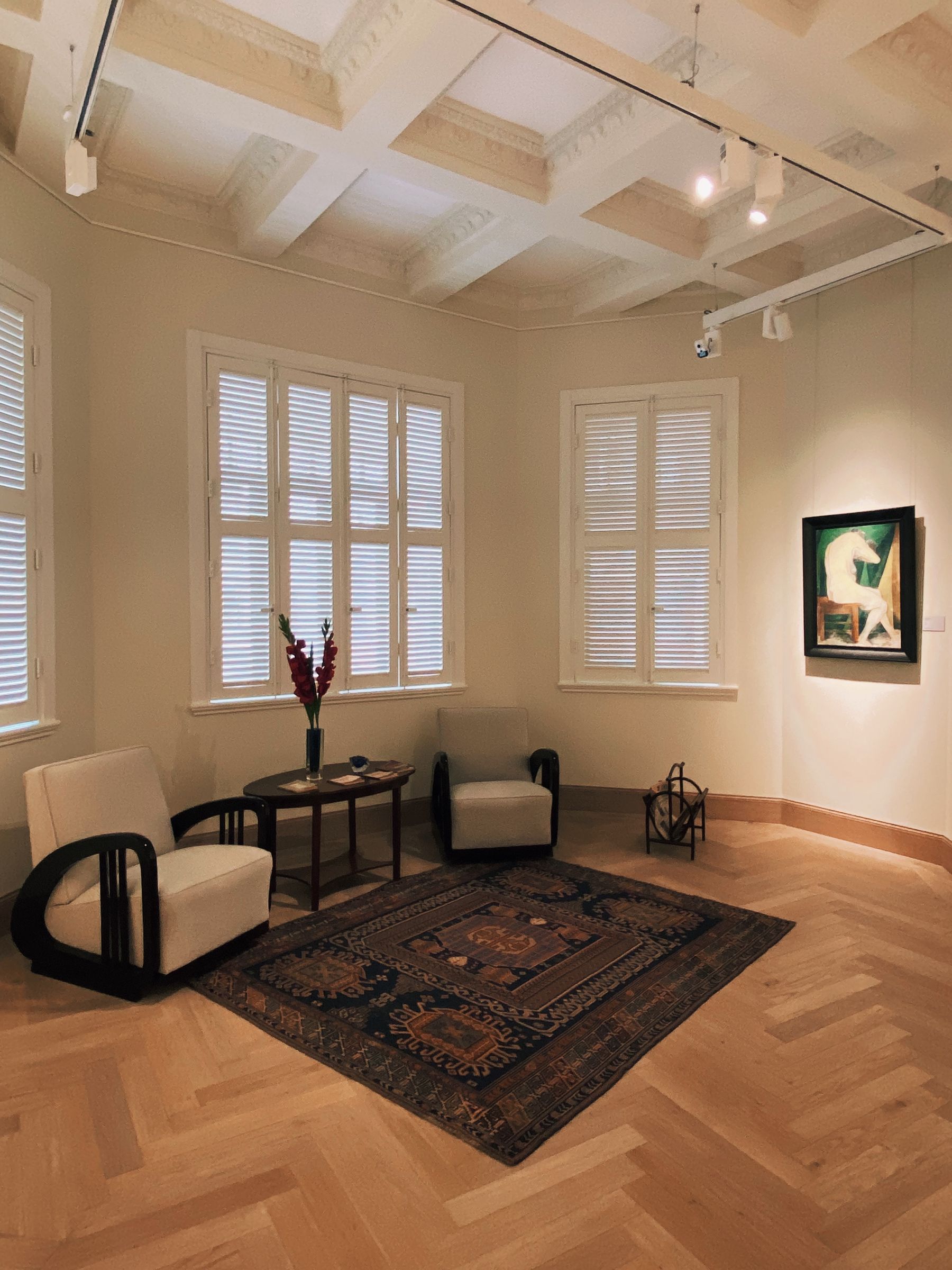
Audit the room through five normal intrusions. Add a person in colored clothing; open the view fully; reveal the real art and books; switch the television off; then turn on the lowest useful evening scene. At each step, ask whether the neutral center remains legible and whether one new color takes over accidentally. Fix the largest failing relationship, not the smallest object. A successful room is not neutral only when empty and photographed in soft daylight—it can absorb ordinary change without losing its structure.