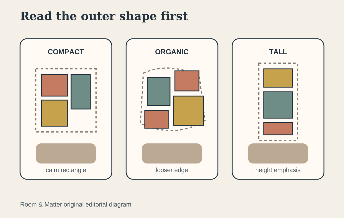
Define the Gallery's Outer Boundary First
Treat the gallery wall as one large object. Decide its approximate width and height in relation to the sofa, console, stair run or open wall before arranging individual pieces. A compact rectangle feels controlled; an organic edge feels looser; a tall composition can emphasize ceiling height. None is inherently better, but the perimeter should look deliberate. The broader [living room wall ideas](/living-room/living-room-wall-ideas/) guide helps determine whether a gallery is the right wall treatment at all.
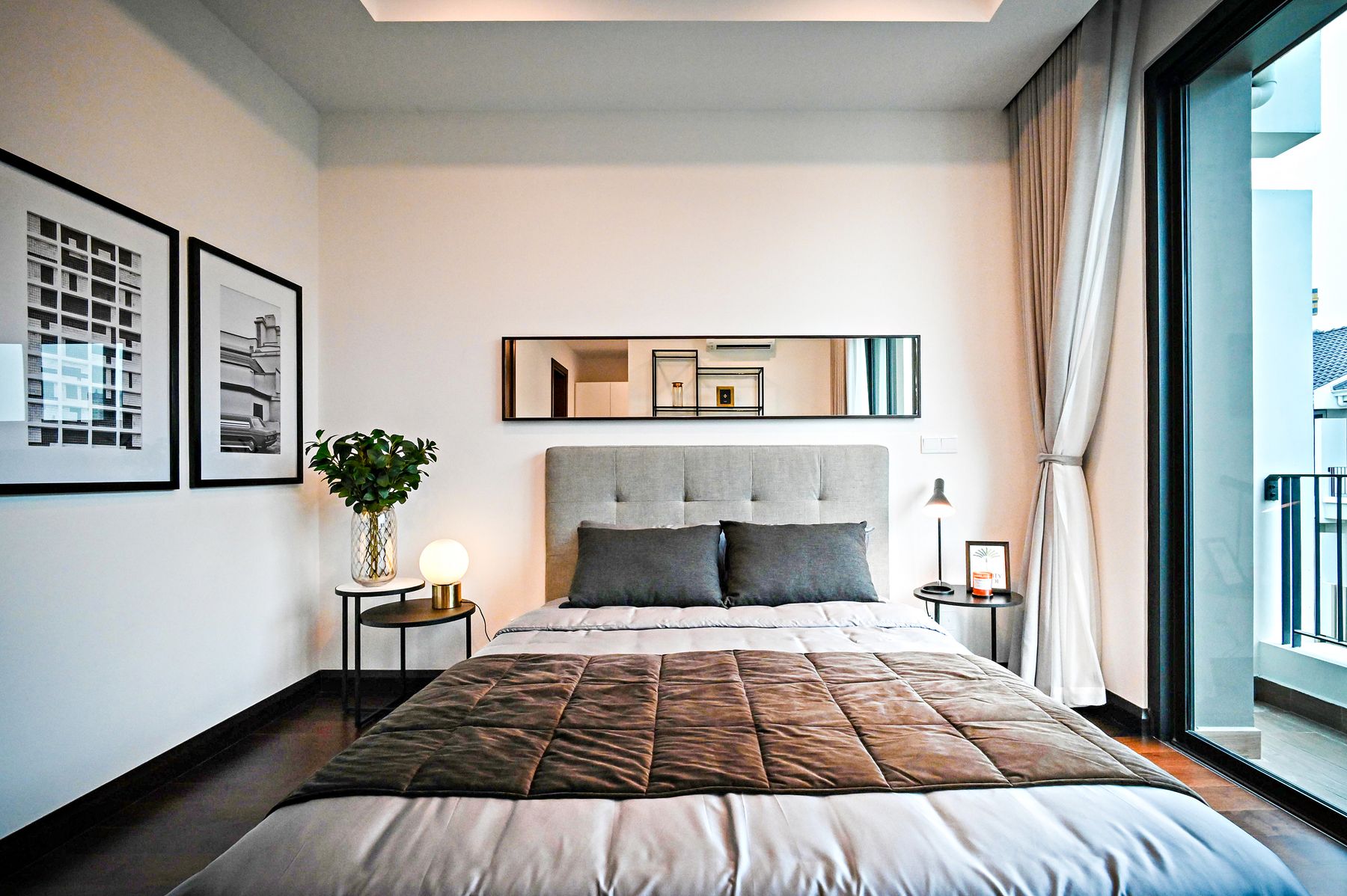
Anchor the Group to What Sits Below It
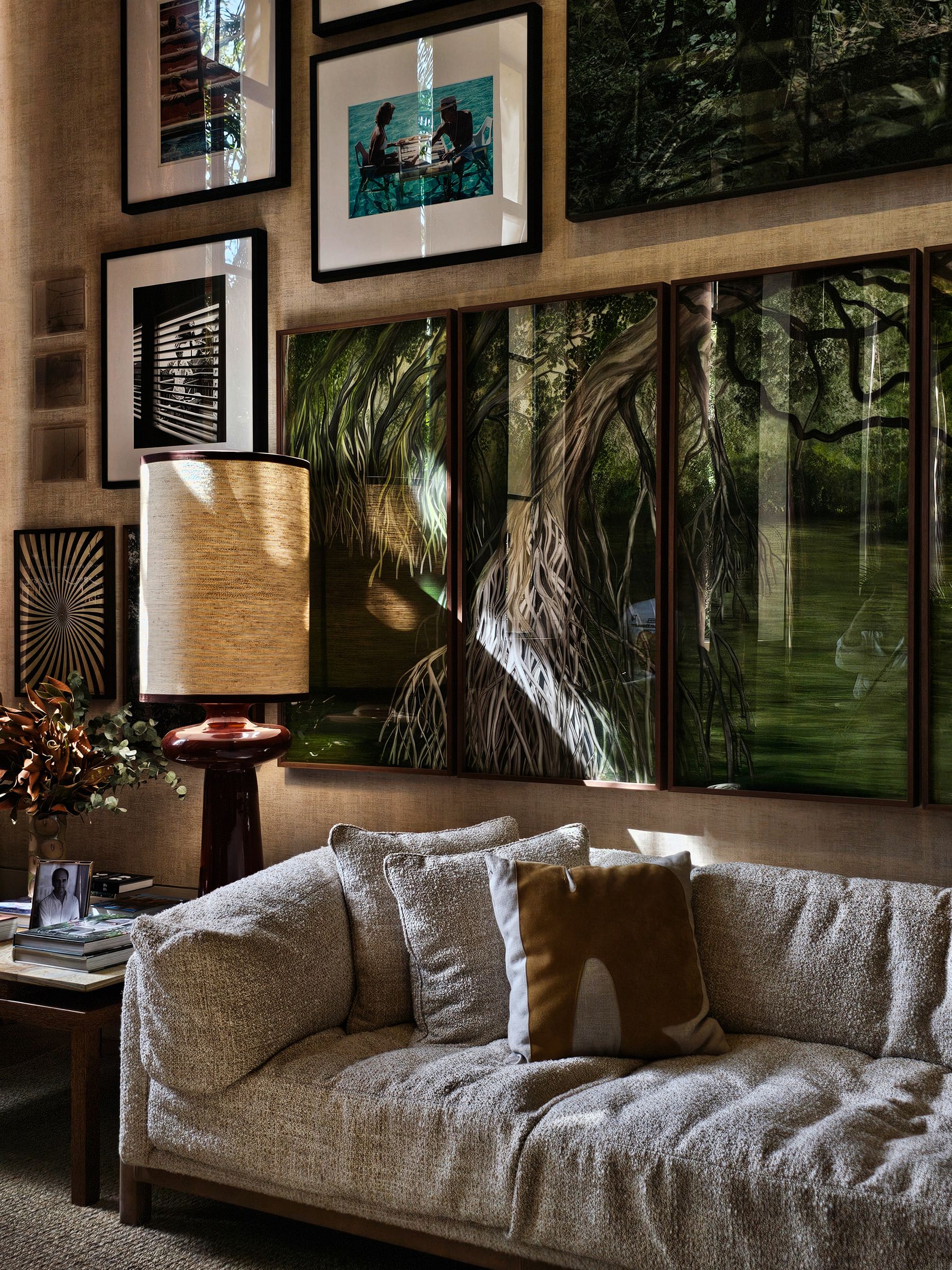
Above a sofa, sideboard or bed, align the gallery to that furniture composition rather than automatically centering it on the full wall. Include lamps, tall plants and nearby windows when judging balance. A group can be slightly asymmetrical and still feel anchored if its visual weight returns toward the furniture. On an empty passage wall, architecture such as a doorway, stair line or end view can provide the axis instead.
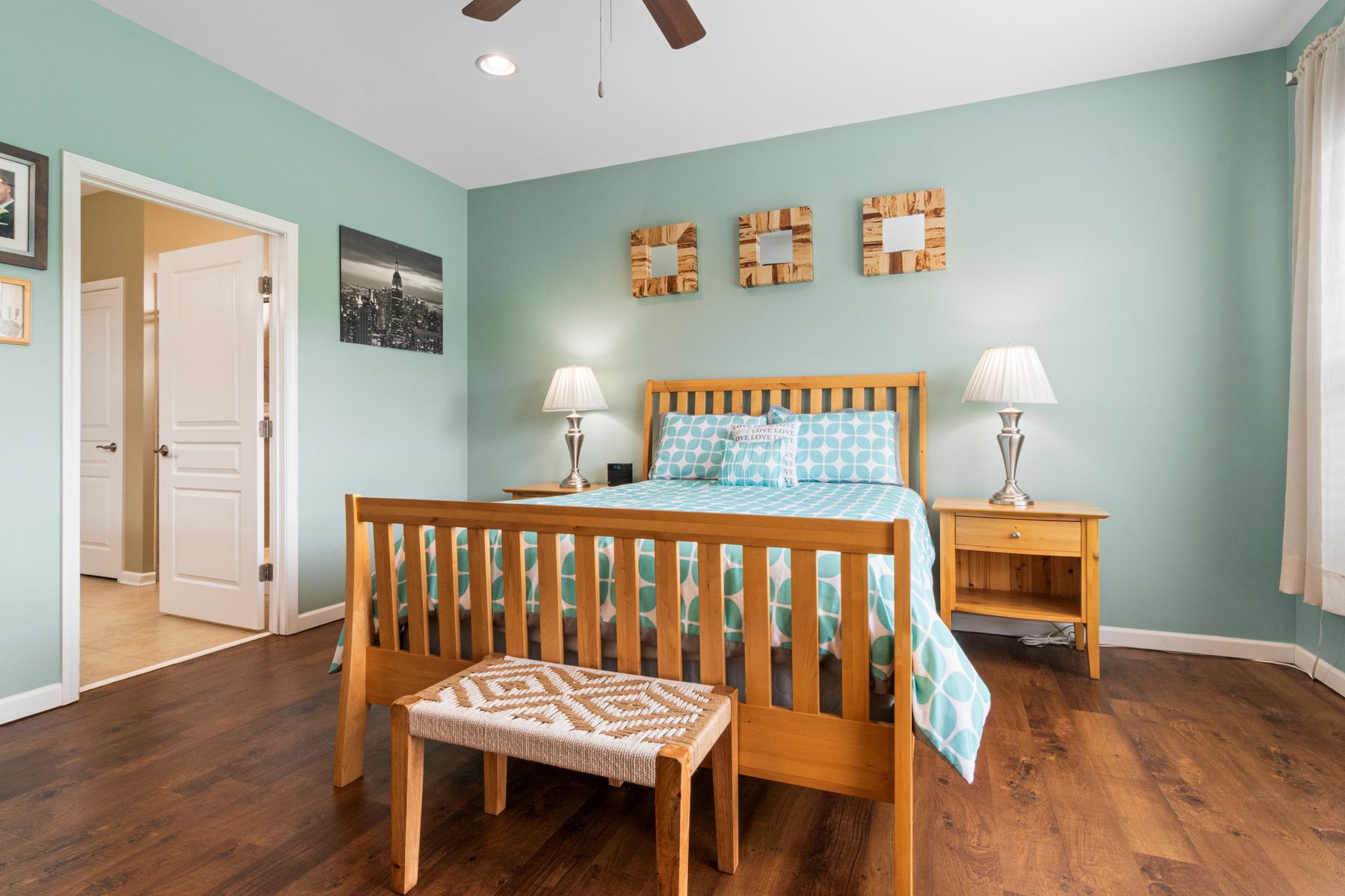
Choose a Grid for Calm and Precision
A grid works best when frames share dimensions or a strict modular relationship. Keep horizontal and vertical gaps consistent and check the total outside dimensions before ordering frames. The images can vary, but similar mats or tonal treatment help the geometry remain dominant. Grids are unforgiving of small alignment errors, so full-size templates and careful measuring matter more than improvisation.
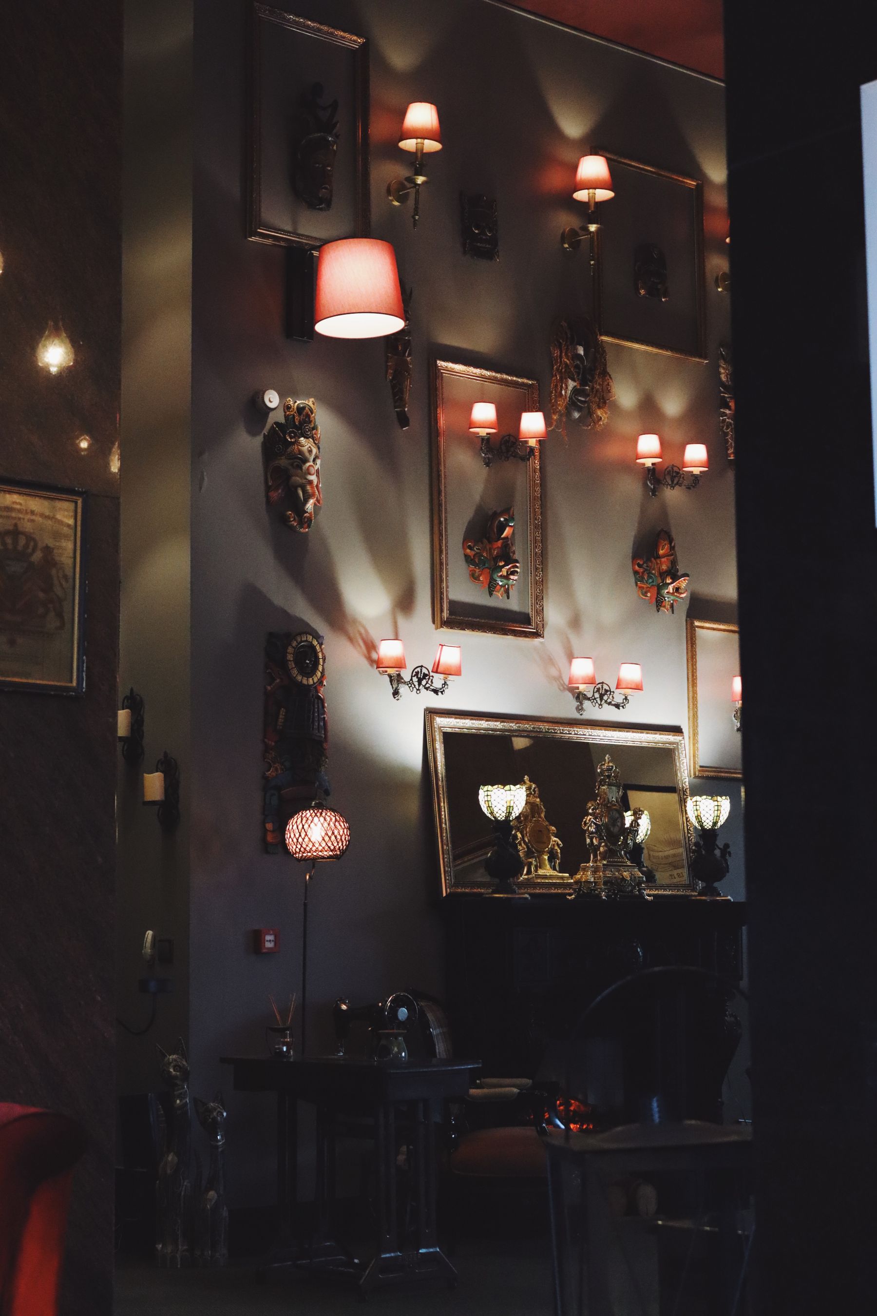
Pick One Frame Rule to Repeat
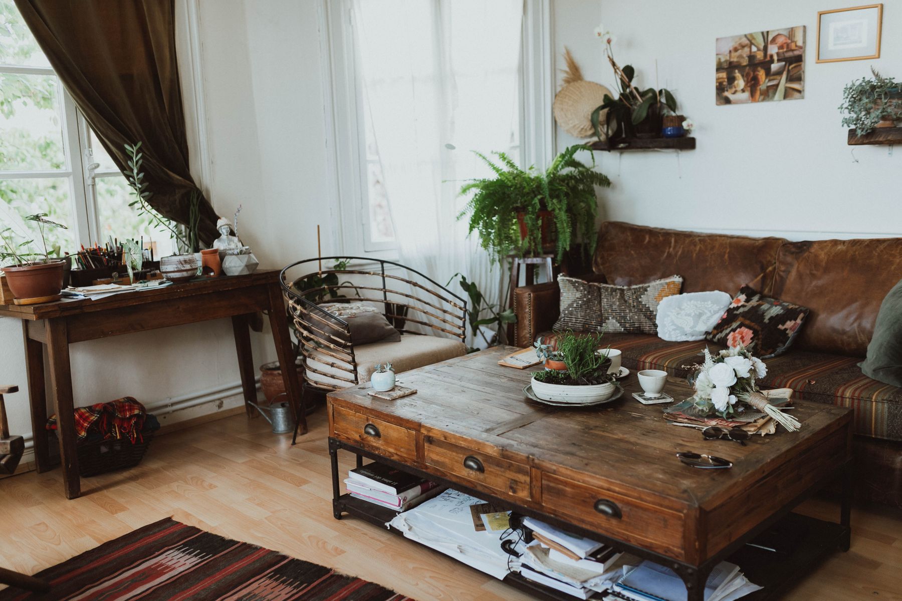
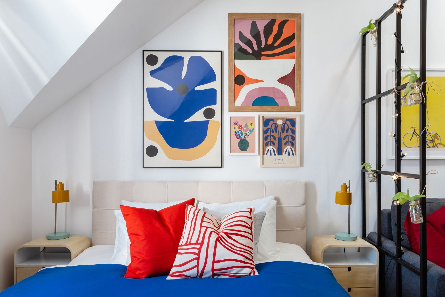
Matching every frame creates order but can make a personal collection feel newly purchased. Mixed frames create character but need connection. Repeat black, oak, brass or another material in several positions; alternatively keep mats consistent while frame profiles vary. Vintage frames can coexist with simple modern ones when their visual weight is distributed rather than clustered accidentally on one side.
Control Spacing Before You Judge Style
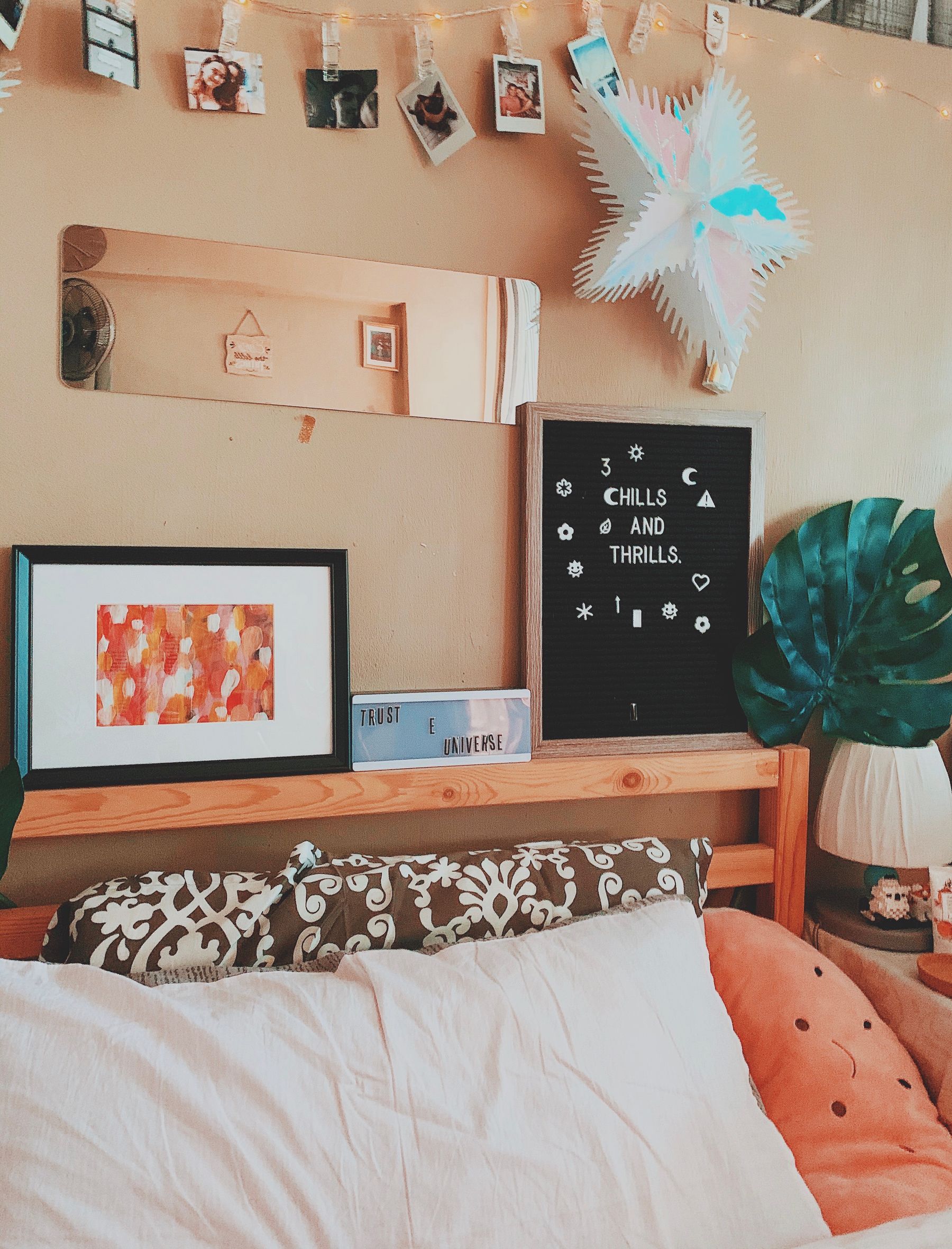
Spacing is one of the strongest unifying tools. Tight gaps make the collection read as a dense field; wider gaps give each piece more autonomy. Choose a target range based on frame scale and viewing distance, then preserve it unless a deliberate alignment needs adjustment. Large unexplained holes are more disruptive than small differences. Measure edge to edge, not hook to hook.
Mix Image Sizes According to Viewing Distance
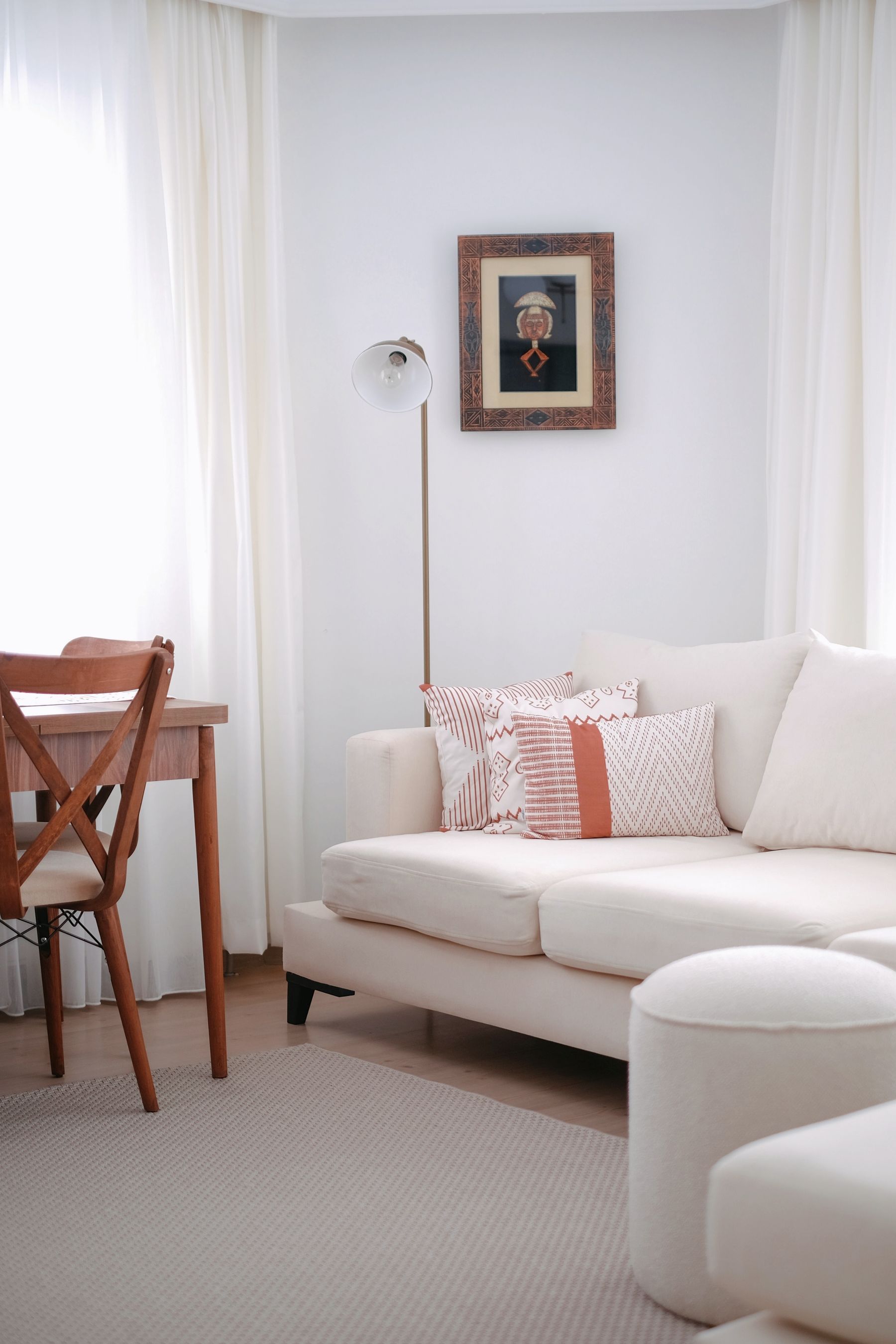
Use one or several larger works as anchors that remain legible from the main seat, then place smaller photographs and drawings where people naturally approach the wall. A gallery made entirely of tiny prints above a deep sofa may read as frame pattern rather than art. Conversely, several equally large works can leave little room for rhythm. Build a hierarchy of viewing distances instead of choosing sizes only because the frames are available.
Integrate Family Photos Without Making a Timeline
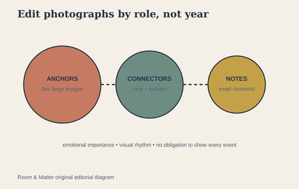
Choose photographs because they work emotionally and visually, not because every event needs representation. Convert some images to a consistent tonal treatment if wildly different colors break the composition, but do not remove all individuality. Mix photographs with art, maps or drawings when you want the wall to feel collected rather than archival. Rotate images over time instead of continually adding frames to preserve every milestone.

Mix Art Types Without Losing the Common Thread
Photography, painting, prints, textiles and shallow objects can make a gallery more tactile. Introduce dimensional pieces sparingly because projection changes shadows, dusting and safety near routes. Find a common thread—palette, era, subject, line quality or frame finish—rather than forcing every work into the same style. The thread should be visible enough to connect the group but loose enough to preserve discovery.
Unframed Is a Support Decision, Not an Unfinished Look
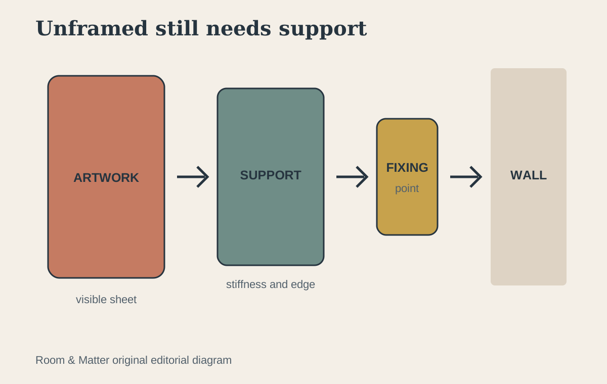
Removing the frame also removes stiffness, edge protection, glazing and a ready-made hanging point. Decide which of those jobs the work still needs before choosing clips, pins, rails or a ledge. A replaceable poster can tolerate a more direct and changeable display than an original drawing, photograph or fragile print. For valuable or irreplaceable paper, casual tape and exposed long-term display are poor shortcuts: the [Library of Congress preservation guidance](https://www.loc.gov/preservation/care/mat.html) recommends preservation framing and limiting long-term light exposure for important paper collections. Use an appropriate enclosure or consult a conservator rather than forcing a frameless look onto a work that cannot safely support it. For decorative reproductions, mount the support—not necessarily the sheet—so the page can remain flat and the visible edge stays intentional.
Paper, Textile and Canvas Need Different Edges
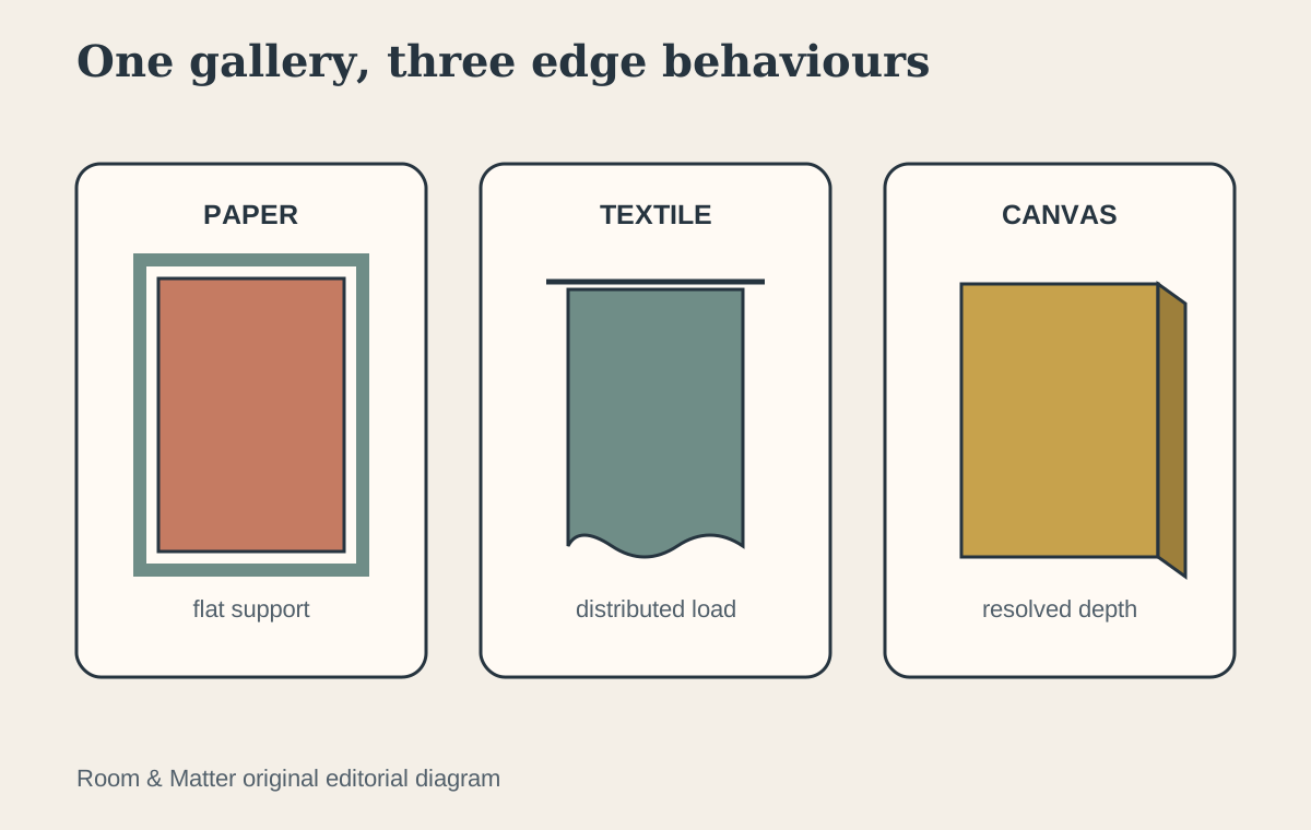
Thin paper reveals every curl and pressure point, so judge it with a backing board, sleeve, rail or other support that keeps the sheet visually calm without pretending the attachment is invisible. A textile hangs by gravity and can distort when its weight is carried by a few small points; a sleeve, rod or broad support spreads that load and makes the upper edge part of the composition. Canvas may already have structural depth through a stretcher, but its exposed edge must look deliberate beside nearby paper and frames. Do not use one clip language for all three merely to make the gallery match. Let a repeated color, spacing rule or outer boundary create unity while each material keeps the support it needs.
Clips, Pinboard or Ledge? Choose by Change Frequency
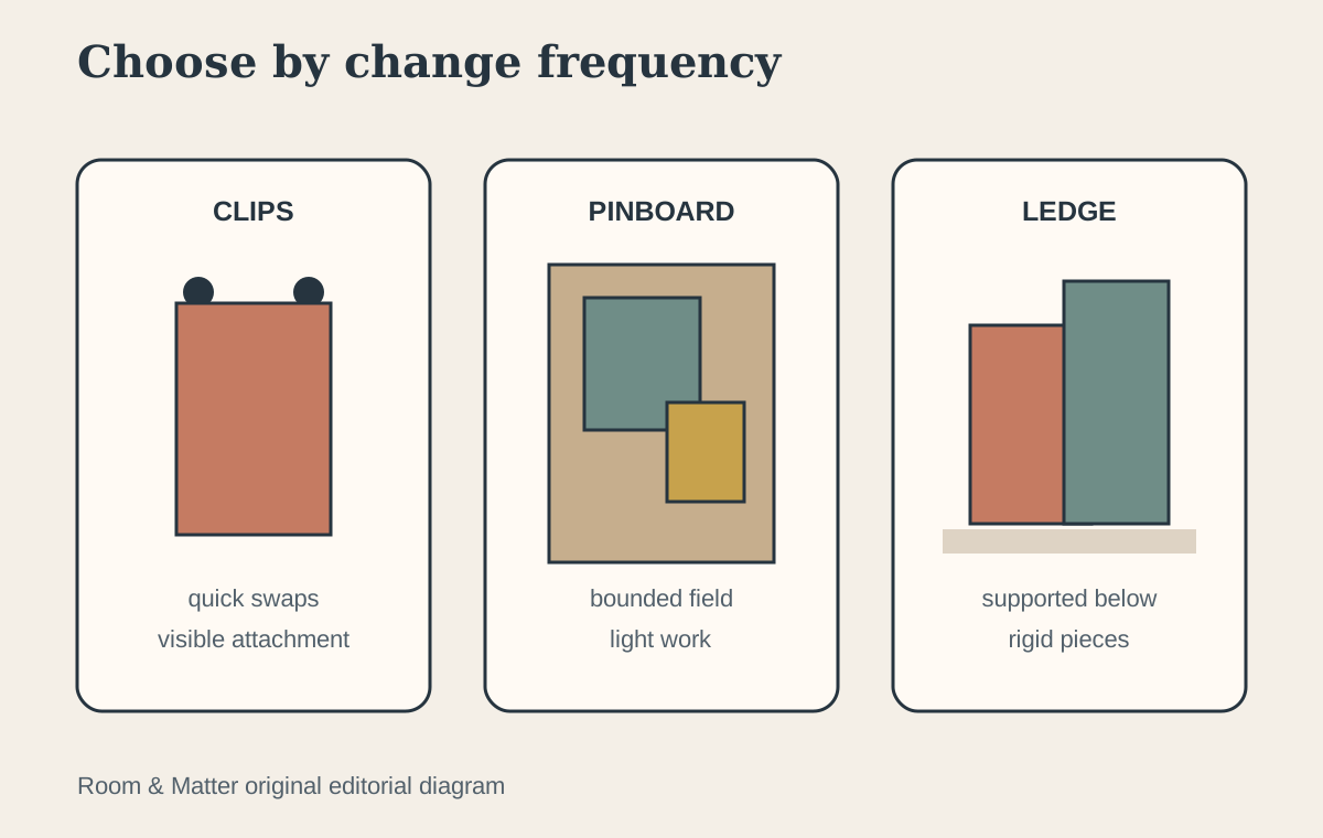
Clips suit a small, frequently changed group when the hanging point can remain visible and the sheet is replaceable. A pinboard creates a defined field for notes, sketches and light reproductions, but it should read as one bounded object rather than scattered pins across the wall. A ledge supports framed and rigid backed pieces from below, allows overlap and avoids a separate wall fixing for every item, though the ledge itself still needs secure installation and enough depth for the objects used. Choose one primary system for the rotation zone; combining clips, rails, pins and ledges in the same small area usually creates more hardware than art.
Build a Rotation Wall Without Piercing Every Sheet
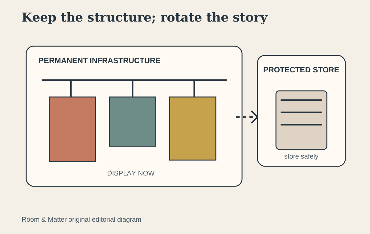
For student work, seasonal prints, postcards or a growing collection, separate the permanent infrastructure from the changing display. Install one approved rail, ledge or bounded board in a location that suits the wall and tenancy rules, then rotate supported pieces within that field. Keep the current set small enough to retain an outer boundary, and store the remainder flat or in suitable enclosures rather than stacking it behind the visible work. In a rental, written permission and the actual substrate still govern any fixing; a portable leaning panel may be stronger than multiplying supposedly removable adhesives. Rotation should reduce holes and handling, not expose every sheet to repeated tape, bending and daylight.
Use Mats to Control Visual Noise
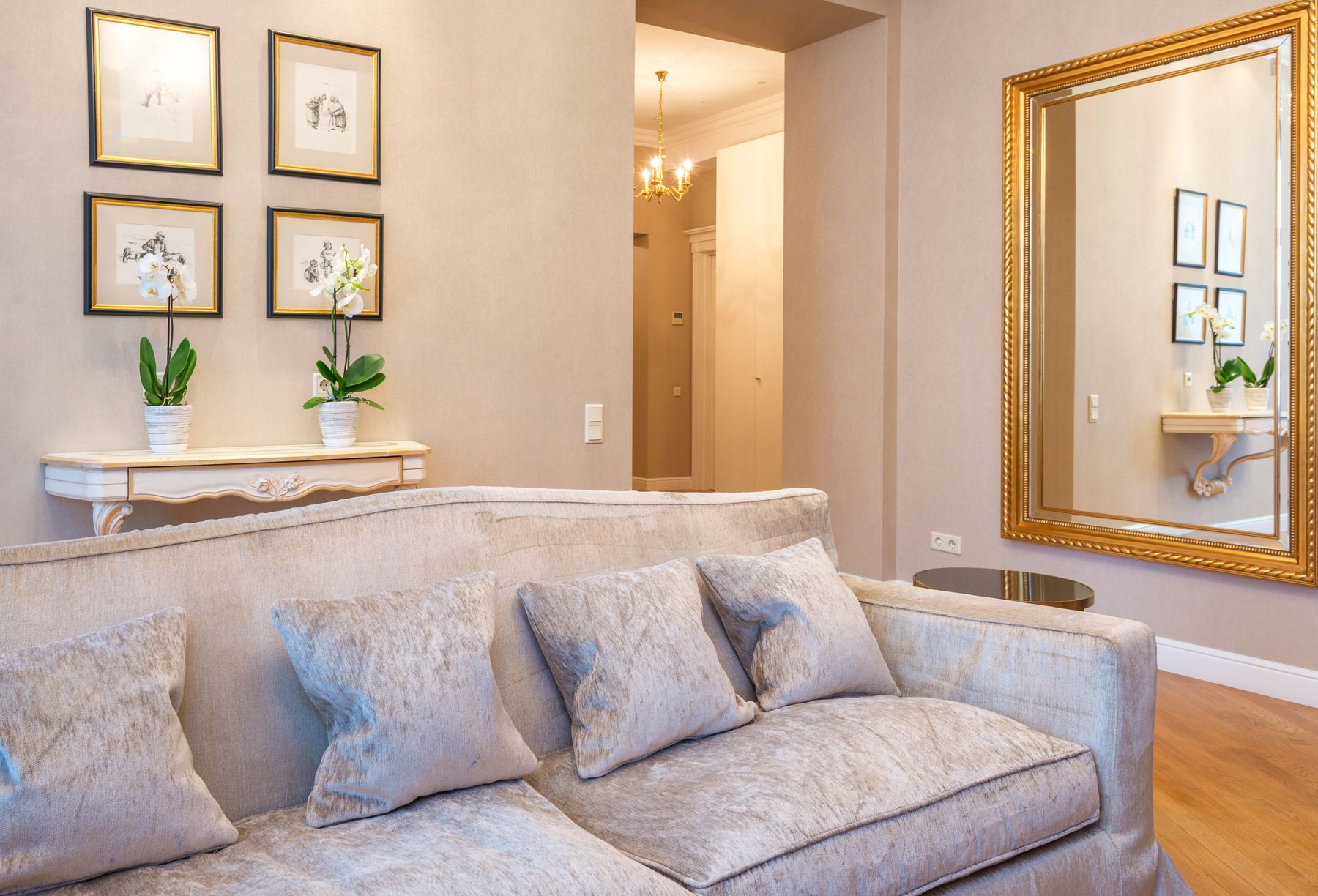
Mats create a buffer between image and frame and can help different artwork sizes feel related. A consistent mat color is one of the easiest ways to unify mixed frames, while varied mat widths can correct scale. Avoid squeezing art into narrow mats simply to fit an existing frame if the result feels cramped. For valuable works on paper or photographs, use appropriate conservation materials and framing practices.
Build the Whole Layout on the Floor
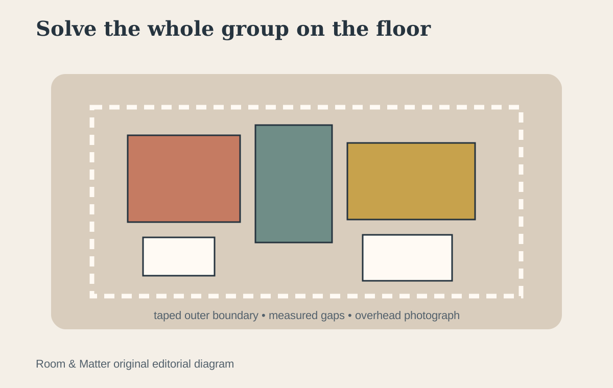
Use a floor area at least as large as the proposed wall composition and arrange every frame face up. Photograph alternatives from directly above, measure the outer dimensions and record the final gaps. This is the stage to discover that one frame is too heavy, three small pieces create a weak corner or the composition needs a stronger anchor. Solve those problems horizontally where changes are easy.
Transfer the Layout With Full-Size Templates
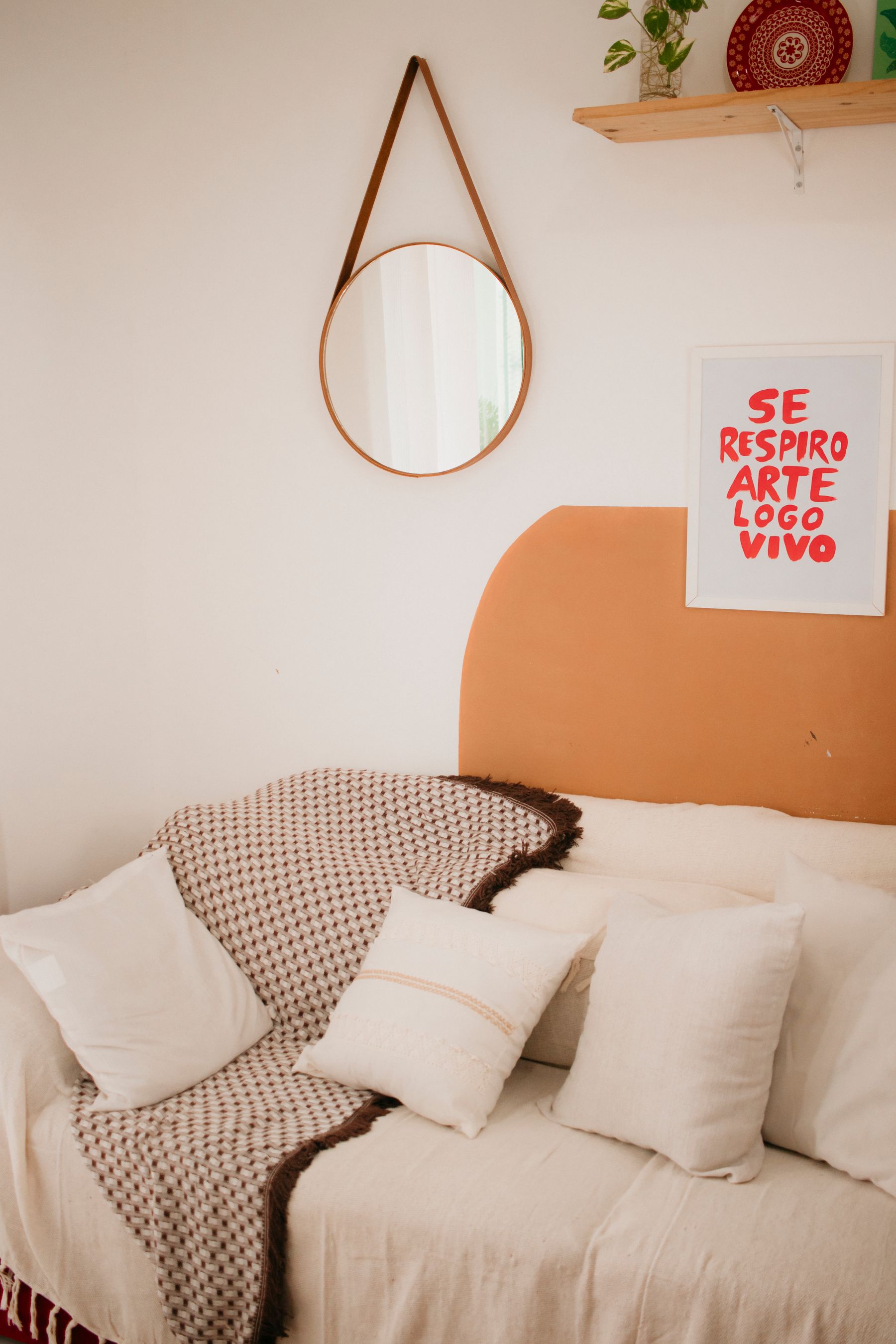
Trace each frame onto paper, mark its hanging point and label it. Tape the complete set to the wall using the measured floor layout. Then sit down, enter the room and live with the templates for at least a day. This catches the most common mistake: a group that looked balanced on the floor but sits too high or feels detached from the furniture. Adjust the whole composition before refining individual gaps.
Match Hanging Hardware to the Real Wall
Identify whether the wall is masonry, plasterboard/drywall, plaster over lath or another construction, and follow the frame and fixing manufacturer's requirements. Heavy mirrors, large frames and dimensional objects need hardware rated for the actual load and substrate. Check for concealed services before drilling and use a qualified installer when the construction or weight is uncertain. Adhesive strips can be useful only within their stated surface and weight limits.
Protect Sensitive Work From Light and Heat
Direct and excessive light can permanently fade photographs, textiles and works on paper. Track sunlight across the wall, keep sensitive pieces away from active fireplaces, radiators and damp conditions, and use suitable glazing and conservation framing where warranted. UV-filtering glazing can reduce exposure but does not make strong light harmless. Valuable or unstable works deserve advice from a qualified conservator.
Plan an Expansion Edge
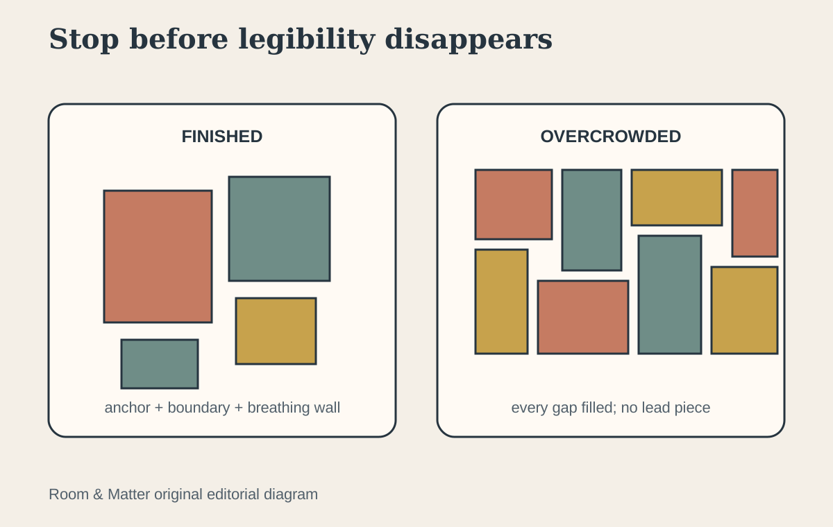
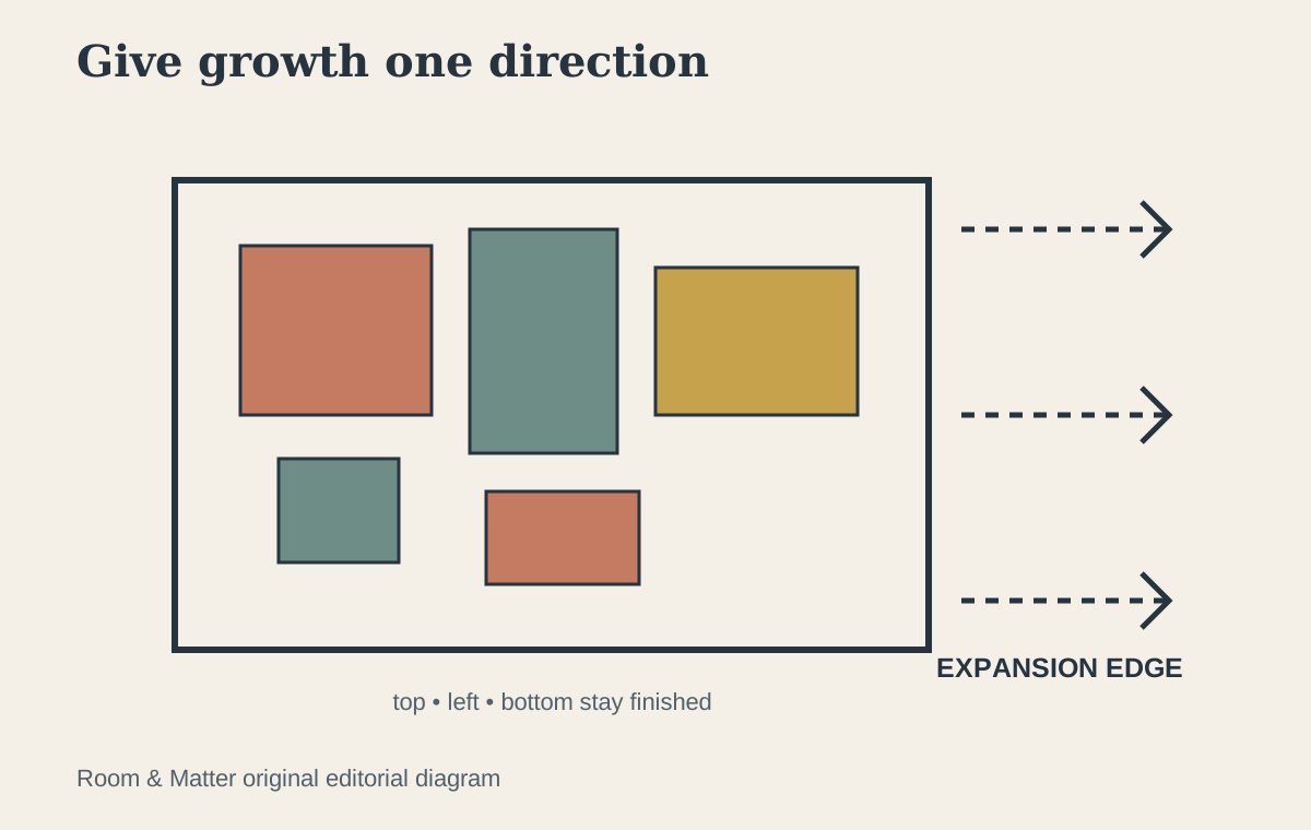
If the collection is likely to grow, decide where that growth can happen. A grid may expand by a full row or column; an organic salon wall can leave one looser edge; a stair gallery can progress with the architecture. Do not leave random holes everywhere 'for later,' because the current composition will look unfinished. Photograph and measure the finished layout so future additions can respect its spacing and visual weight.
Know When the Collection Is Full
Stop when the outer shape feels balanced, the major images remain legible and surrounding architecture has enough space to breathe. Adding another frame because a small patch of wall is visible can weaken the composition. If new meaningful work arrives later, rotate an existing piece or use the planned expansion edge. A gallery wall is an edited collection, not an obligation to display everything owned.