Give Green One Primary Job
Begin with a role, not a paint card. An **envelope** puts green across the largest wall fields and lets furniture sit within it. A **furniture anchor** concentrates the color in a sofa or chair pair against a quieter shell. A **view bridge** repeats one note from foliage outside so the glazing feels connected to the room. Choose one to lead and let the others support it. This keeps the guide distinct from [Green Apartment Ideas](/apartment/green-apartment-ideas/), where green has to travel through several rooms and thresholds. Here the test is simpler: can someone entering the living room understand where the green begins, what it organizes and where it stops?
Decide What the Window View Does to Green
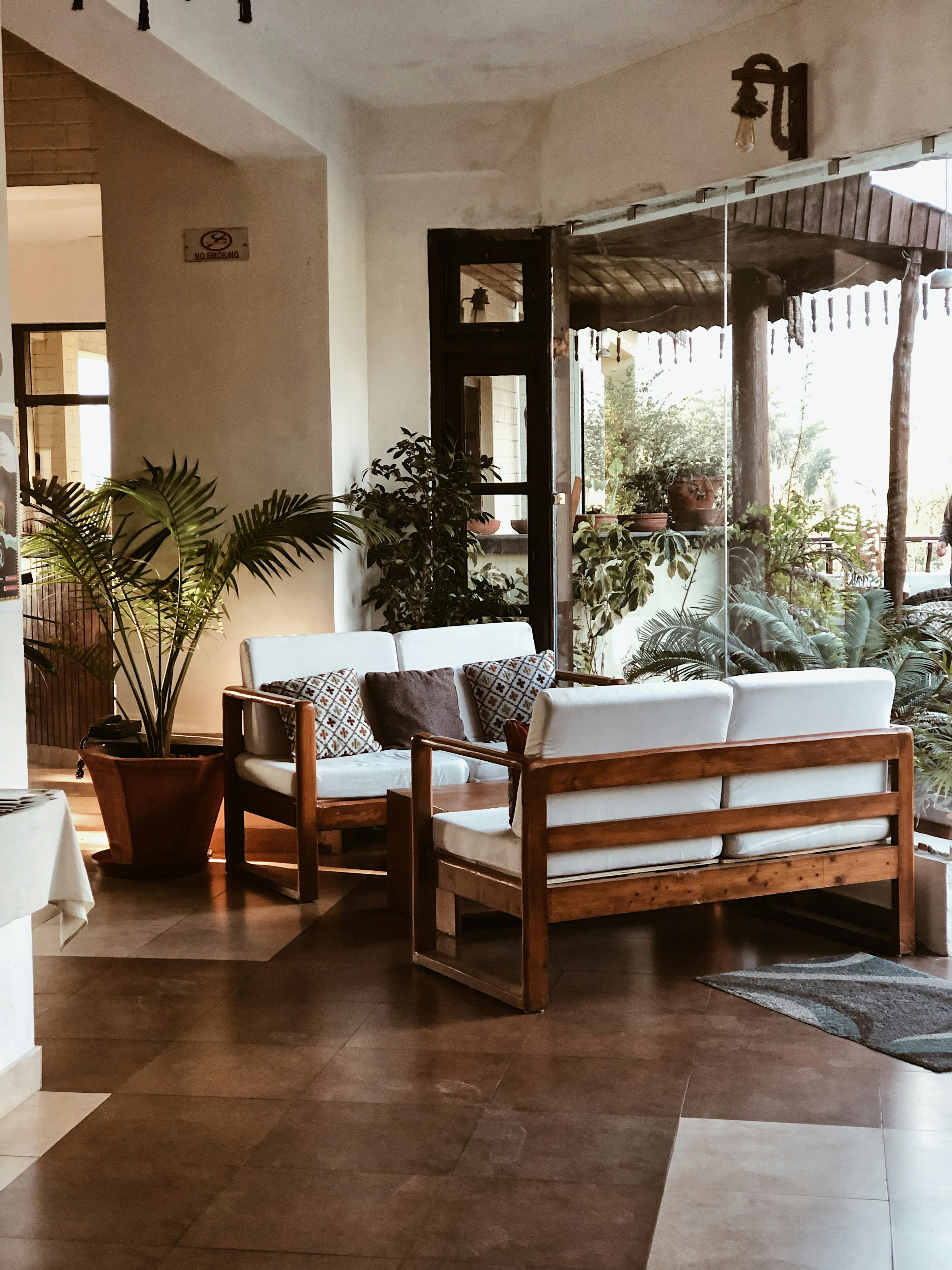
A leafy outlook can make green paint feel inevitable, but two opposite strategies work. Continue the view with a quieter, greyer green when you want the window boundary to soften. Resist it with mineral white, warm timber or a muted complementary color when the foliage deserves to remain the focal event. The wrong middle ground is to copy every outdoor green indoors: the room loses hierarchy and changes awkwardly when seasons shift. Judge the view at its fullest and barest, then decide whether the living room should merge with it or frame it.
Judge Green on Faces Before You Name the Shade
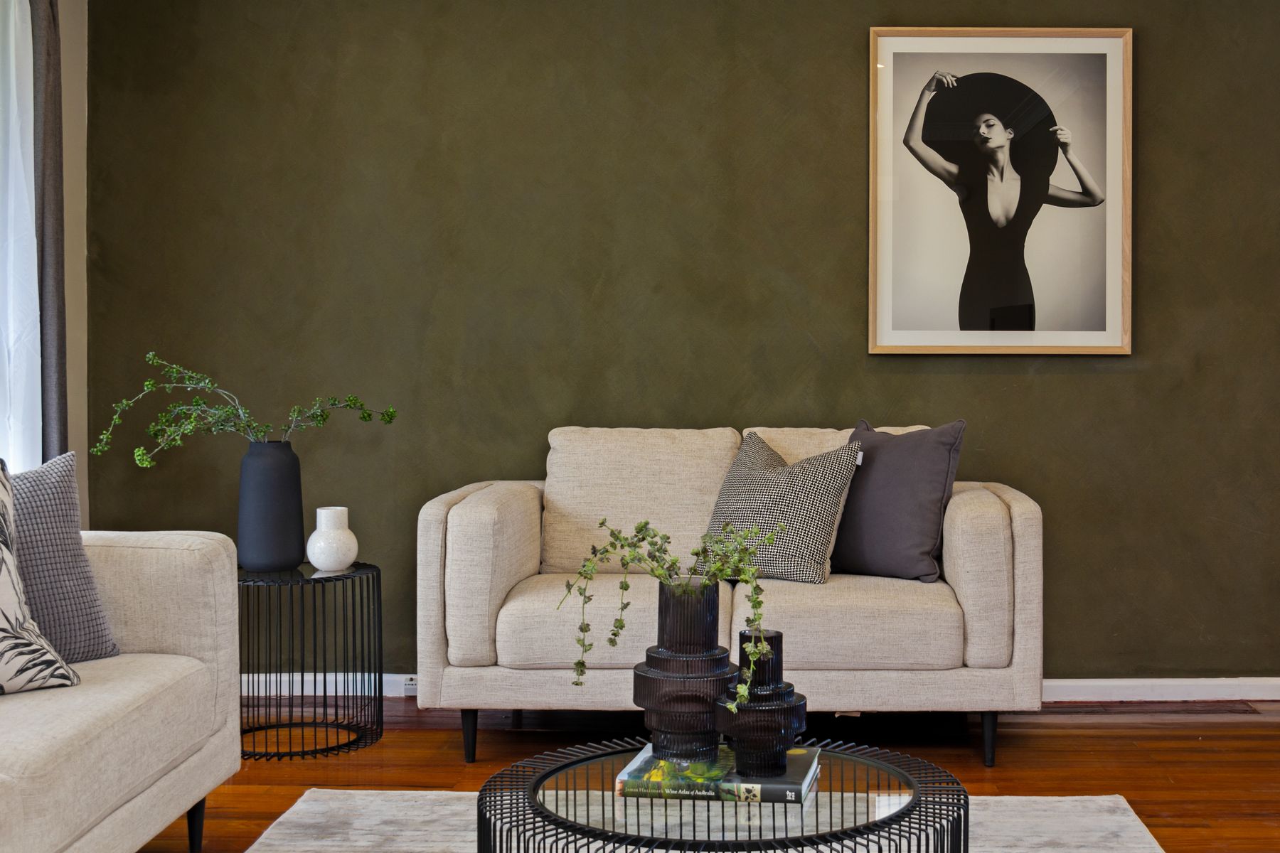
Sage, olive, forest and emerald are useful shorthand, not specifications. A yellowed olive can warm red timber yet make cool grey upholstery look tired; a blue-green can sharpen pale stone but cast an unhelpful cool reflection onto faces. Put large sample boards behind the seats where people actually talk, then view skin, upholstery and the floor together. This living-room test matters more than the generic shade ladder used in many color guides because the wall is often a reflected-light source for the social group.
Make a Green Sofa a Volume, Not an Accent
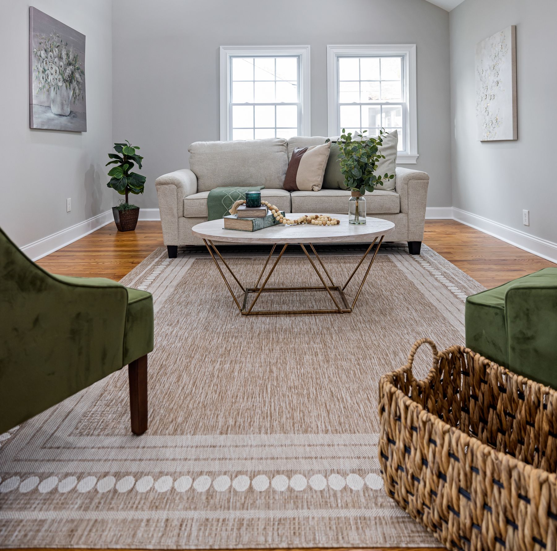
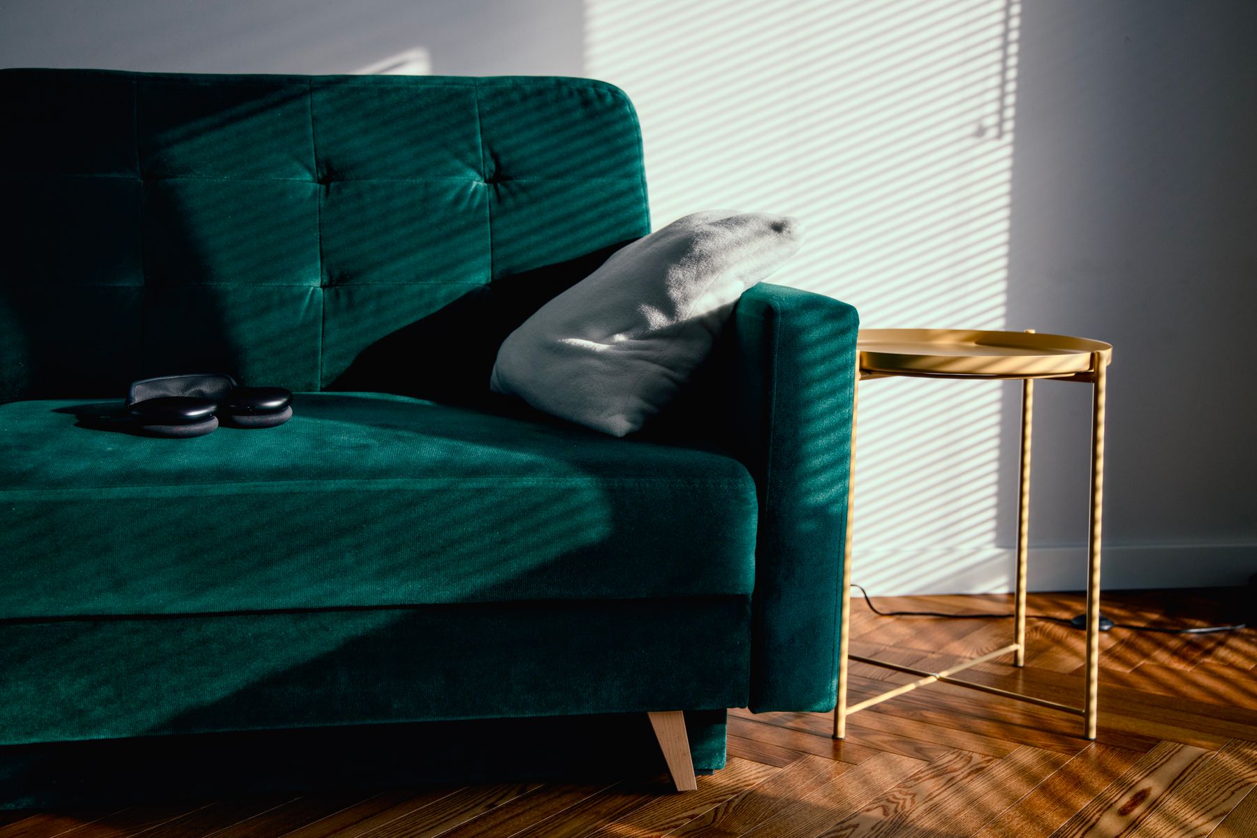
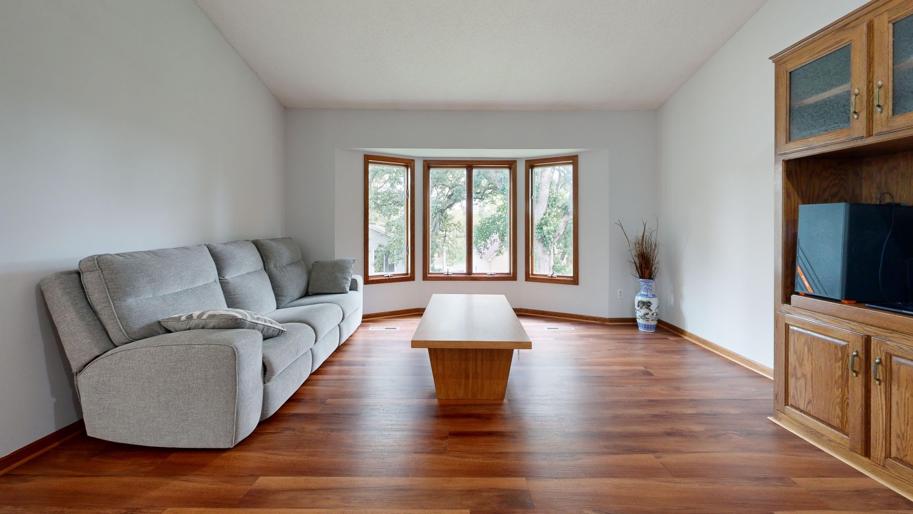
A green sofa is usually the room's largest colored object, not an oversized cushion. Its pile, seams, depth and changing light can produce several greens before any wall color is added. Give it a ground plane and enough clear wall around its silhouette; then repeat the hue only where a second element solves composition, such as one artwork or chair. If the sofa is already jewel-toned, many small botanical accessories weaken it. If it is a greyed green, contrast can come from timber, rust or cream rather than a brighter version of the same hue.
Separate a Green Sofa From a Green Wall
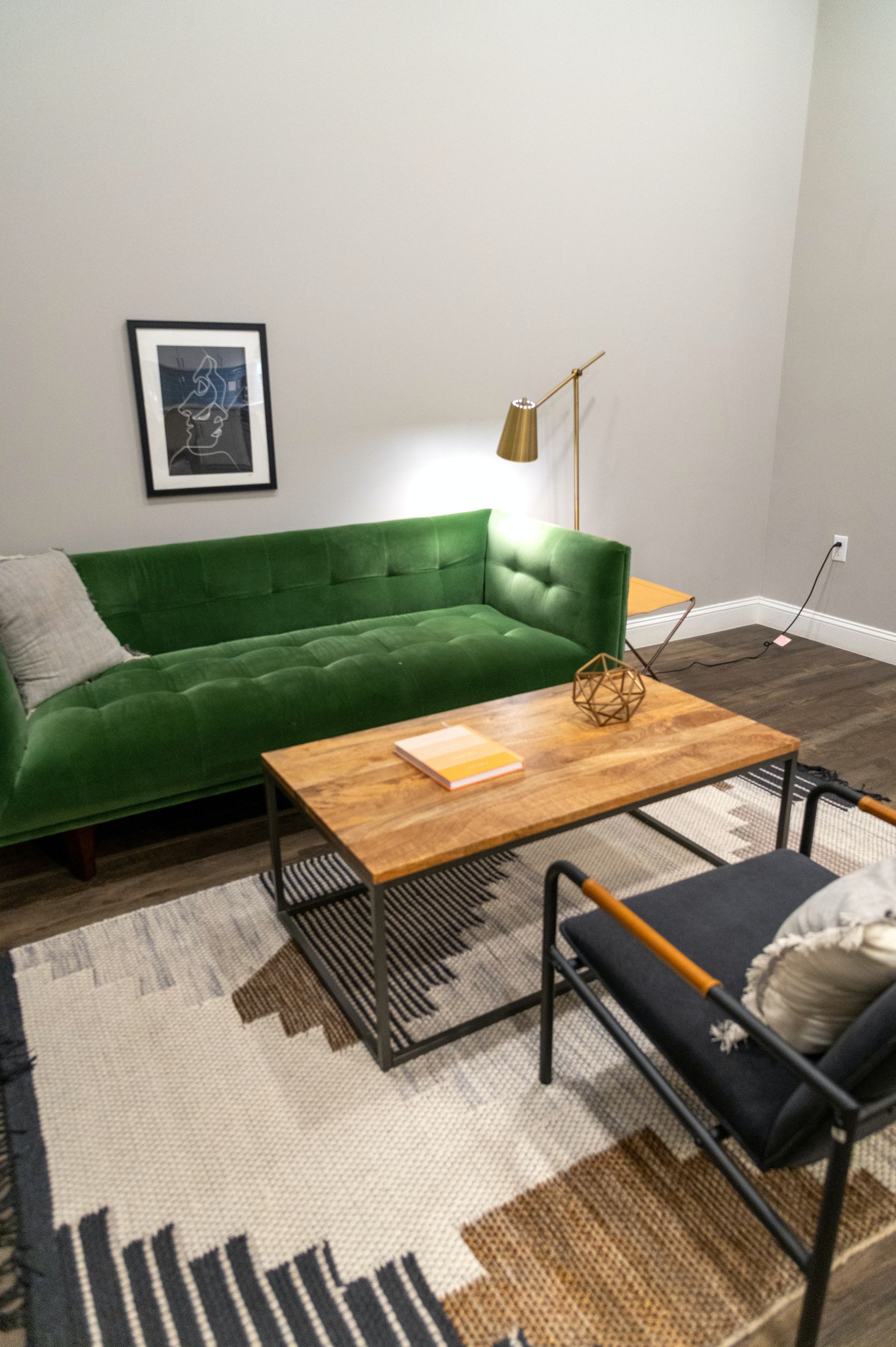
Tone-on-tone can feel enveloping, but upholstery and paint should not merge into an uncertain block. Create separation through one main variable: a lighter wall behind a deep sofa, a cooler sofa against warmer olive, matte paint behind velvet, or a visible strip of wall and floor around the furniture. Avoid solving the boundary with a row of pale cushions; they describe the sofa, not the room. The silhouette should remain readable from the entrance and from the seat opposite.
Use Color Drenching Only When the Edges Deserve to Recede
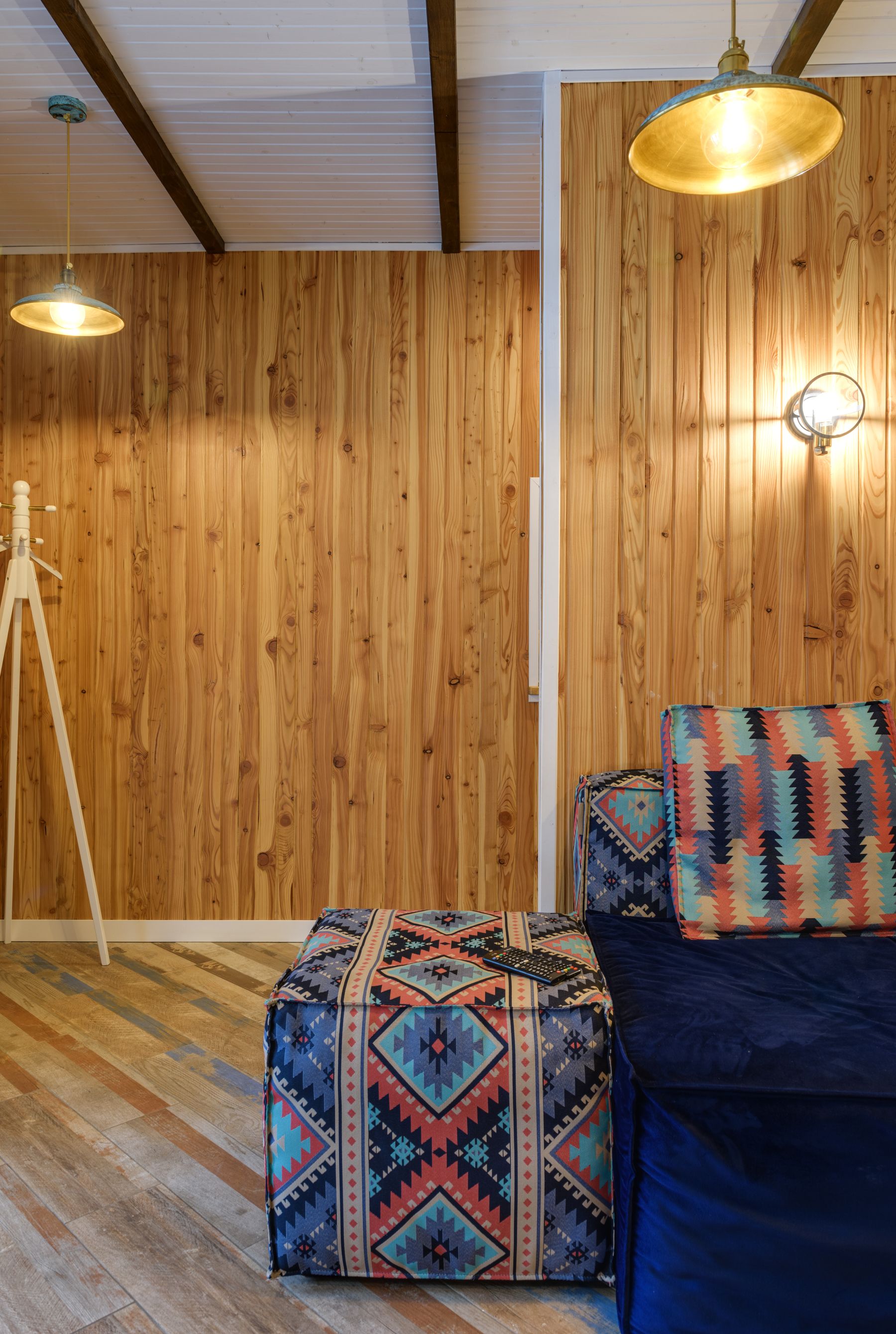
Painting walls, trim and built-ins in one green can soften interruptions and make a compact or irregular shell feel calmer. It works best when relief, window reveals and furniture still provide depth. It works poorly when doors, switches, shelving and circulation edges need contrast for practical reading. Decide which boundaries should disappear and which must remain obvious before extending color onto trim or ceiling. A drench is an architectural edit, not proof of commitment to a trend.

Pair Green With Red Without Making a Holiday Scheme
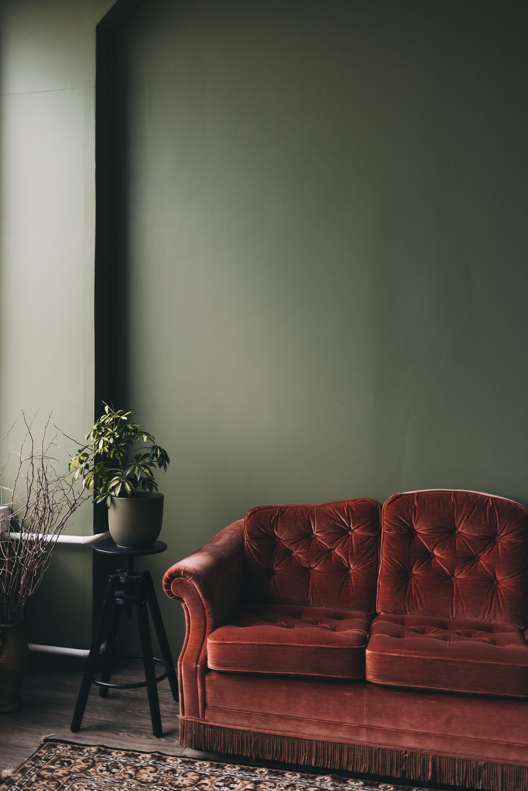
Red is green's strongest useful counterpoint, which is exactly why it needs restraint. Shift at least one side away from a bright seasonal primary: olive with rust, blue-green with dusty rose, forest with oxblood or sage with clay pink. Give the red one substantial job—sofa, chair pair, rug field or artwork—instead of repeating berries and bows around the room. Timber can mediate the pairing; cream can provide breathing room. The combination succeeds when it reads as material depth before it reads as a color trick. [Vintage Living Room Ideas](/living-room/vintage-living-room-ideas/) offers further context for making aged red upholstery feel collected rather than themed.
Use Blue-Green or Chartreuse as Deliberate Tension
Green and blue can create a low-contrast, immersive palette when their values differ enough to preserve furniture edges. Chartreuse does the opposite: it introduces a yellow charge that can wake up charcoal, walnut or deep teal. Use either relationship at meaningful scale. A blue chair beside an olive sofa or one chartreuse artwork can clarify the palette; many small aqua and lime objects make it evasive. Check the combination under warm lamps, where blue-green may dull and yellow-green can become more dominant.
Let the Television Become Part of the Green Field
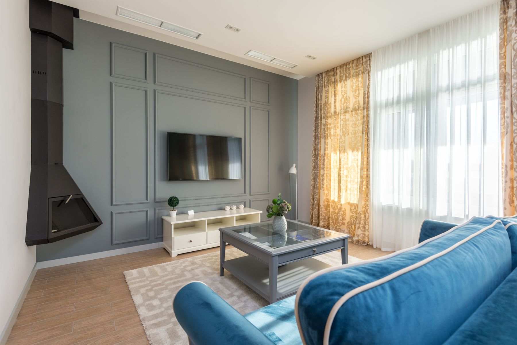
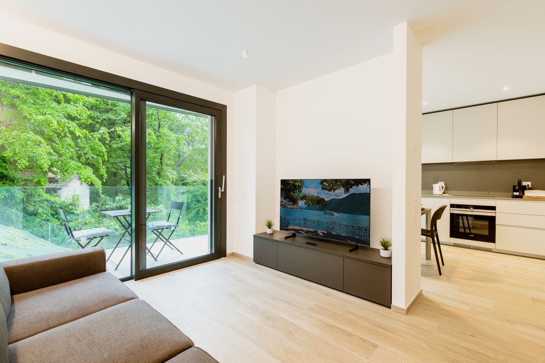
A television on green can either recede or look more abrupt than it did on white. Deep olive or forest reduces the value jump around a switched-off screen; lighter sage makes the rectangle explicit. Neither is automatically better. Decide whether the media wall should be quiet during conversation or act as a graphic plane, then solve viewing height, reflection, cable access and ventilation. Do not sprinkle black frames around the room to justify the screen. One coherent cabinet, panel or painted wall is enough. [Living Room Layout Ideas](/living-room/living-room-layout-ideas/) should still determine the viewing and social geometry.
Keep the Fireplace From Becoming a Black Hole
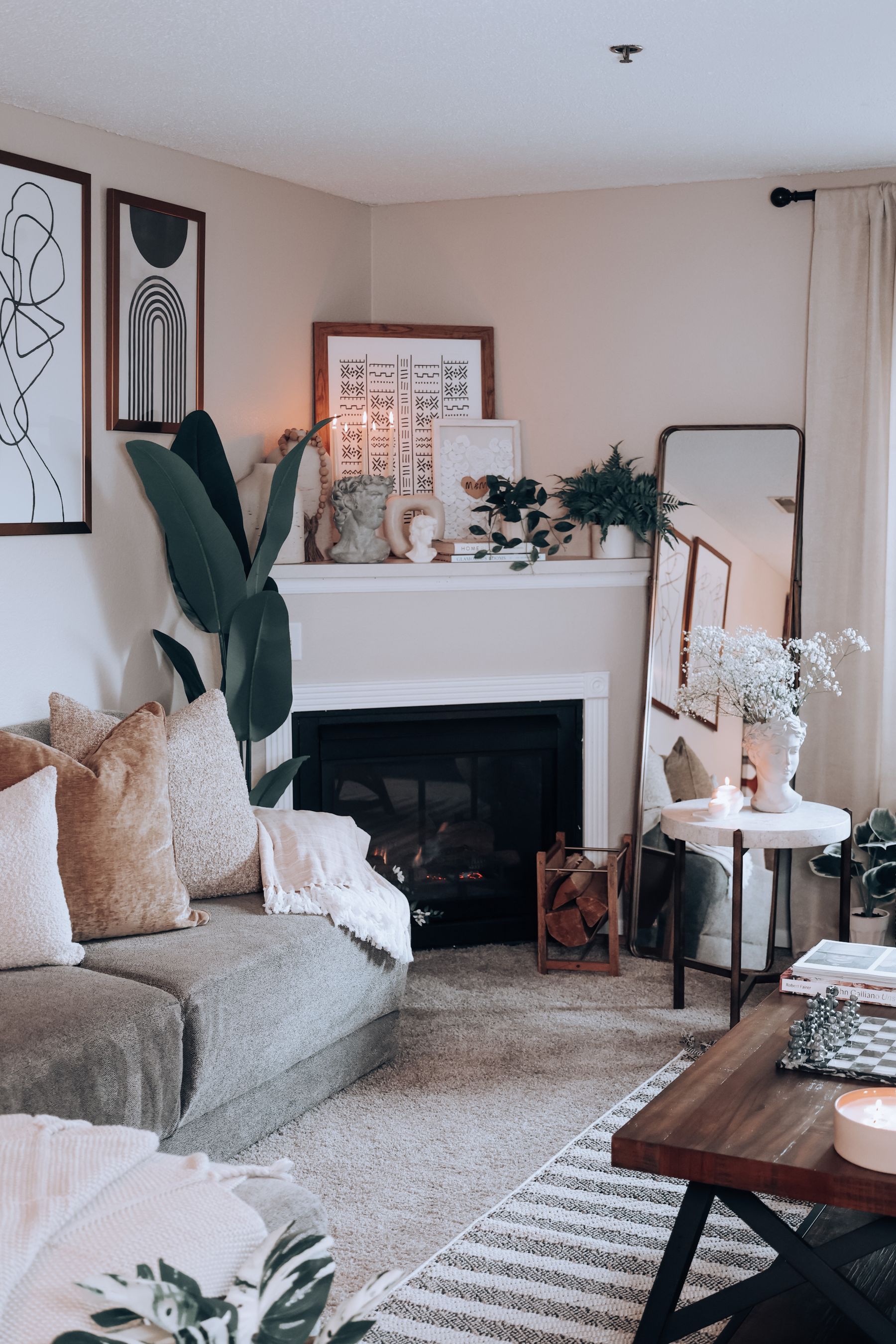
Deep green around a firebox can be handsome, but the wall, opening and nighttime window may collapse into several dark voids. Preserve the mantel projection, hearth line or surround material so the fireplace remains architectural. With a light stone surround, sample the green against its real undertone; creamy stone can make a blue-green appear sharper, while grey stone can flatten a muted sage. Keep combustible clearances, heat limits and installation requirements tied to the exact appliance and qualified guidance.
Protect Faces in the Conversation Circle
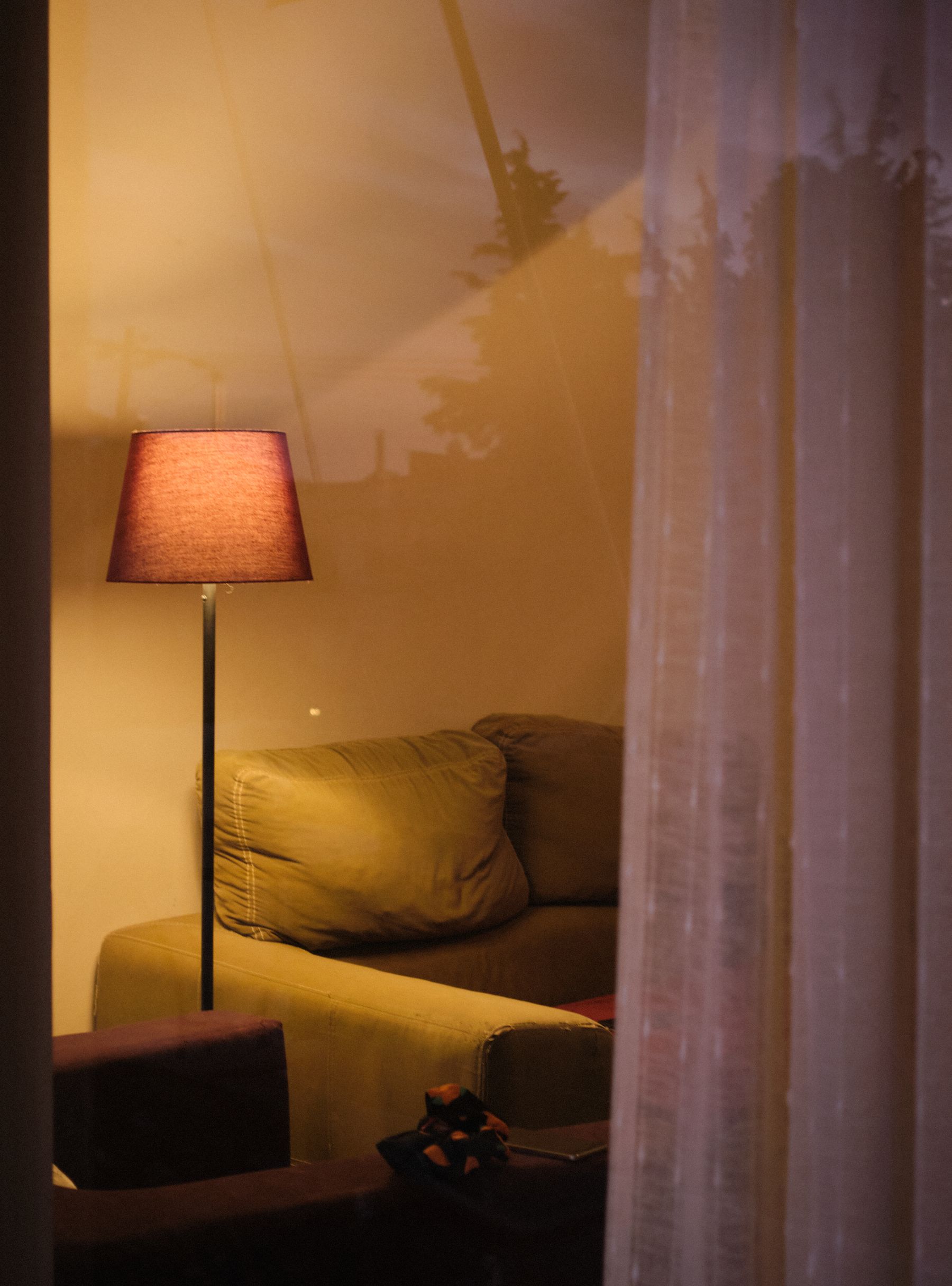
Green walls do not merely surround furniture; they return colored light toward the people in it. Deep matte green absorbs more light, while a saturated wall close to a lamp can influence skin and pale upholstery. Build the evening scene around faces: one warm, shaded source near the conversation group, enough ambient light to read the room and controlled task light for reading. Avoid a single cool ceiling source that makes the wall vivid and everyone else grey. [Living Room Lighting Ideas](/living-room/living-room-lighting-ideas/) expands fixture placement and controls.
Photograph Green in Cloud, Direct Sun and Lamplight
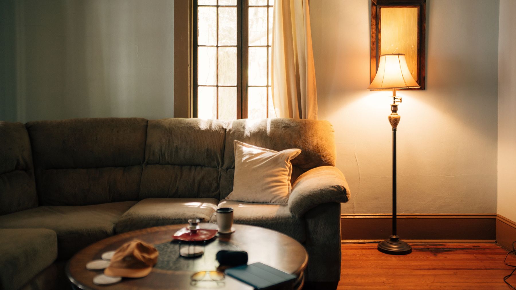
Test green in three scenes that expose different failures: the dullest daylight, the strongest reflected daylight and the actual evening lamps. A soft sage can become grey in a north-facing room; olive can turn brown under very warm light; emerald can feel theatrical after sunset even when balanced at noon. Move boards behind the sofa, beside the window and near the darkest corner. The winning sample is not the one that looks spectacular once, but the one whose changes all remain useful.
Give Art Enough Contrast Without a Black-Frame Formula
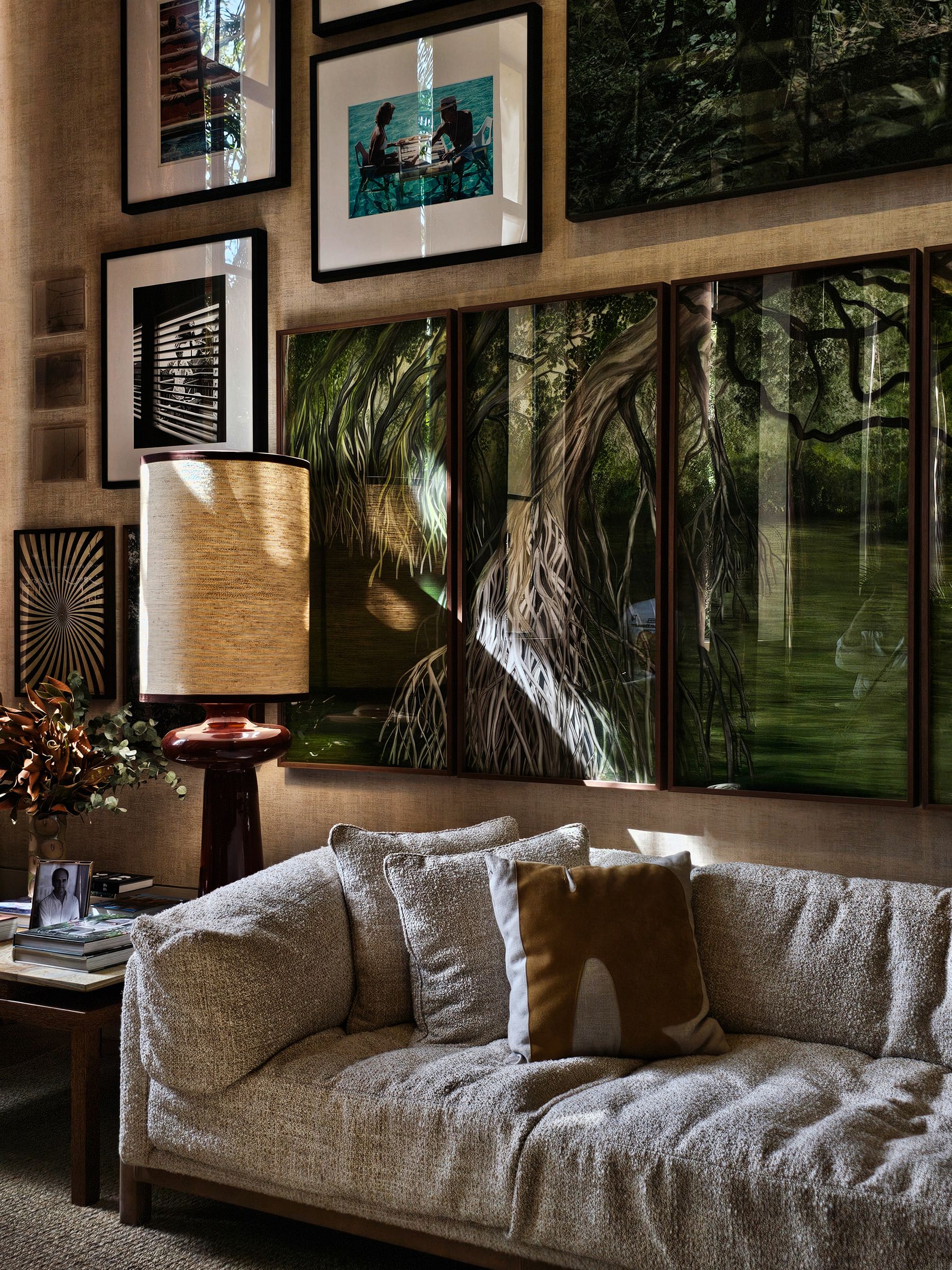
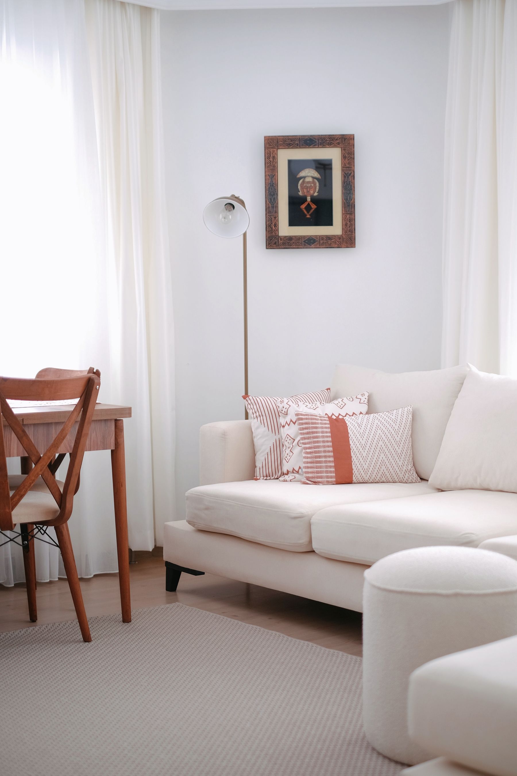
Green is generous to art, but it changes white paper, pale mats and metallic frames through contrast. Test the whole framed work against the wall rather than matching the subject alone. Timber, cream, lacquered color and aged metal can all provide edges without defaulting to repeated black rectangles. Check glazing reflection from the main seats, especially when green is used to darken a media or fireplace wall. For arrangement scale and wall alternatives, continue to [Living Room Wall Ideas](/living-room/living-room-wall-ideas/).
Let the Rug Decide How Earthy the Room Becomes
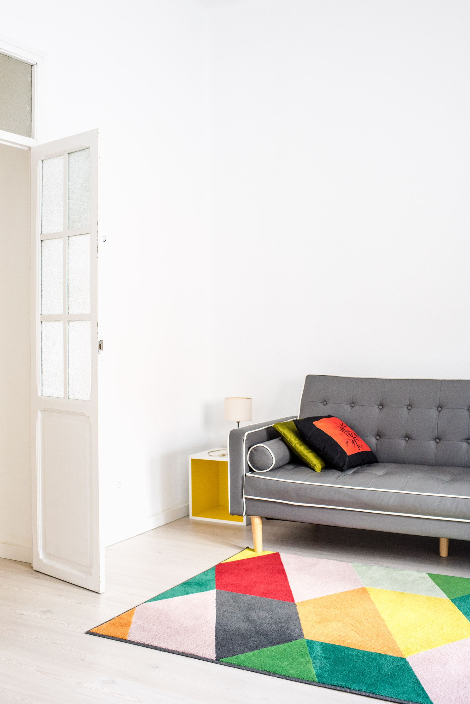
Green plus jute plus timber is an easy route to earthiness, but it is not the only one. A geometric cream-and-black rug can make olive feel architectural; a faded red rug can deepen it; a quiet wool field can let a green sofa lead. Choose the rug's visual job as well as its fit. It should connect the seating and preserve routes before it supplies another nature reference. [Living Room Rug Ideas](/living-room/living-room-rug-ideas/) covers the sizing and furniture-foot decisions.
Use Timber as a Temperature Control
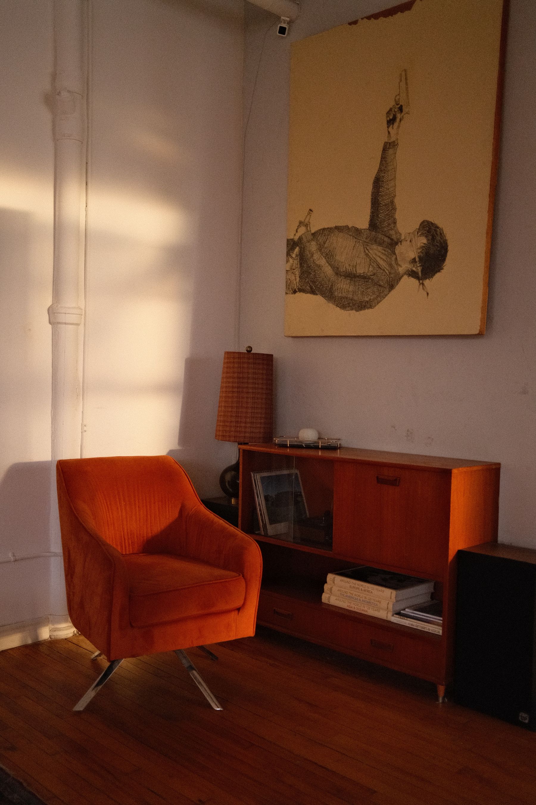
Timber does more than make green feel natural. Honeyed oak pushes blue-green toward warmth; walnut gives pale sage a deeper middle value; greyed timber can make olive more austere. Start with the floor or largest fixed joinery and let one timber temperature lead. A room with orange floorboards, red walnut, pale oak and green walls can feel unsettled even when every material is attractive alone. Use stone, metal or pale upholstery to separate two necessary wood temperatures rather than adding a third. For furniture-scale grain and warm wood volumes, compare [Mid-Century Living Room Ideas](/living-room/mid-century-living-room-ideas/).
Pass the Remove-the-Plants Test
Plants may belong in the room, but they should not be the evidence that the scheme is green. Remove them from a photograph or cover them on screen. The wall, sofa, view or one large object should still make the color logic clear. Then return only plants that fit the real light, watering routine, temperature and household safety needs. This is the dividing line between a green living room and the more canopy-led destination in [Tropical Living Room Ideas](/living-room/tropical-living-room-ideas/).
Stop Green Deliberately in an Open Plan
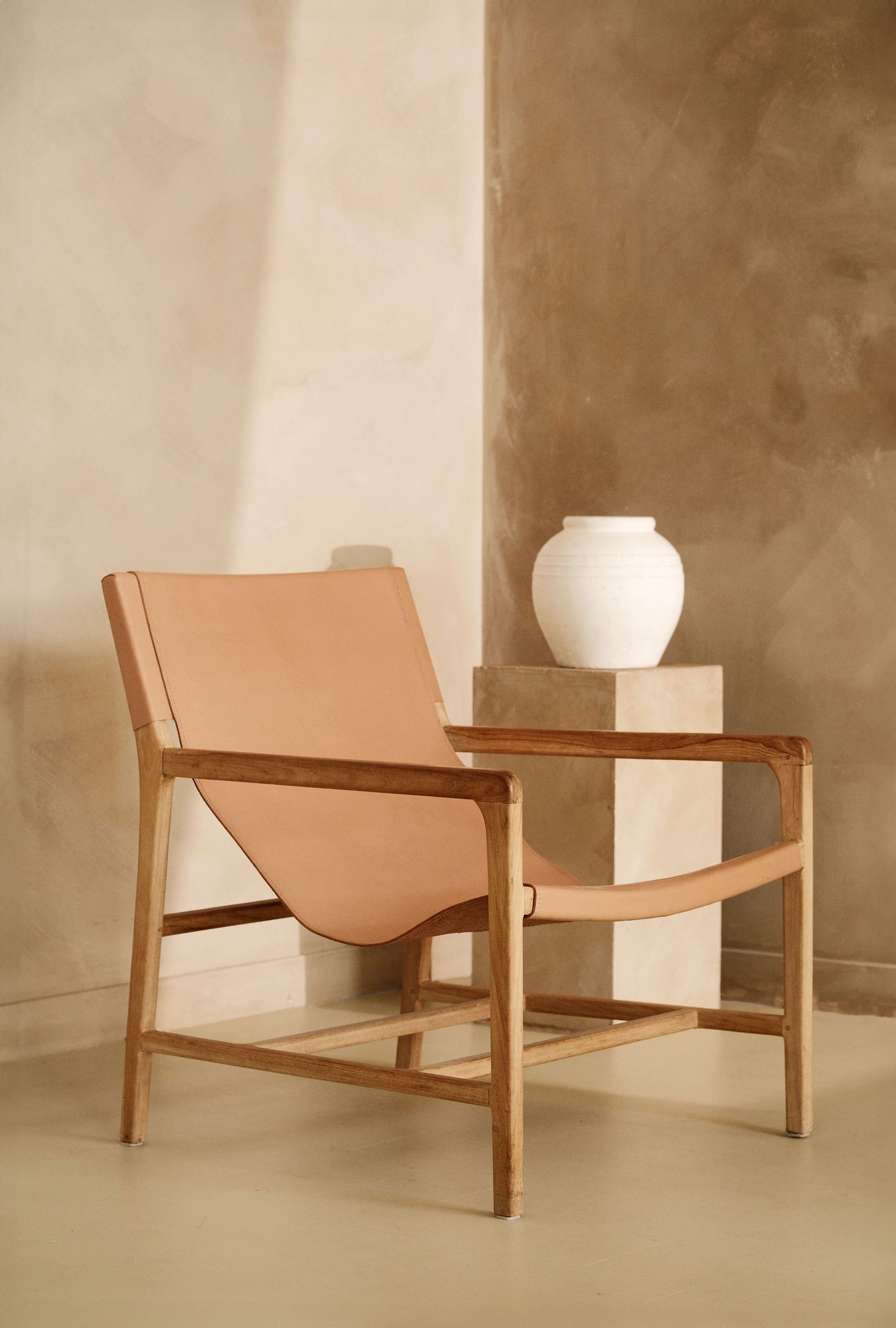
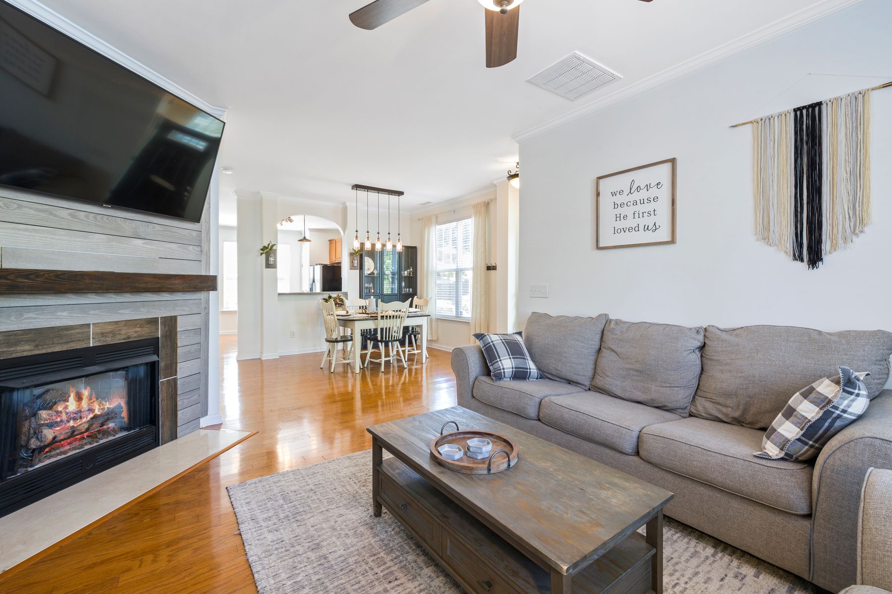
Green needs a stopping rule when living, dining and kitchen areas share sightlines. End it at a return wall, change in ceiling, built-in volume or clearly furnished zone—not arbitrarily halfway across a plane. The adjoining area can repeat the same green at lower intensity or answer it with timber, stone or a neighboring neutral. Avoid carrying small green accessories through every zone merely to prove connection. The broader threshold strategy in [Green Apartment Ideas](/apartment/green-apartment-ideas/) is useful, but this room still requires its own social boundary.
In a Small Room, Concentrate Green Instead of Miniaturizing It
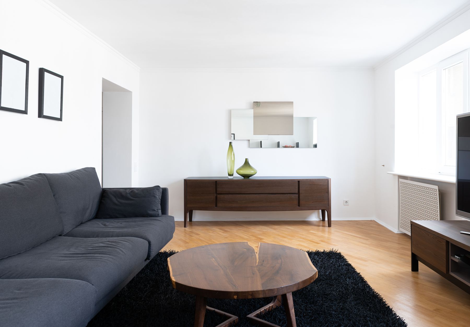
Small rooms do not require pale green or tiny furniture. They require fewer competing boundaries. One deep green wall, one properly scaled green sofa or one continuous painted storage volume can feel calmer than six small accents. Preserve the clearest route, keep the conversation group usable and let the floor or ceiling provide relief. If the room already has a dark window at night, a screen and deep flooring, count those masses before adding forest green across every wall. Let [Small Living Room Ideas](/living-room/small-living-room-ideas/) lead the furniture and route decisions; green is the color strategy, not the floor plan.
Build a Reversible Green Layer for Rentals
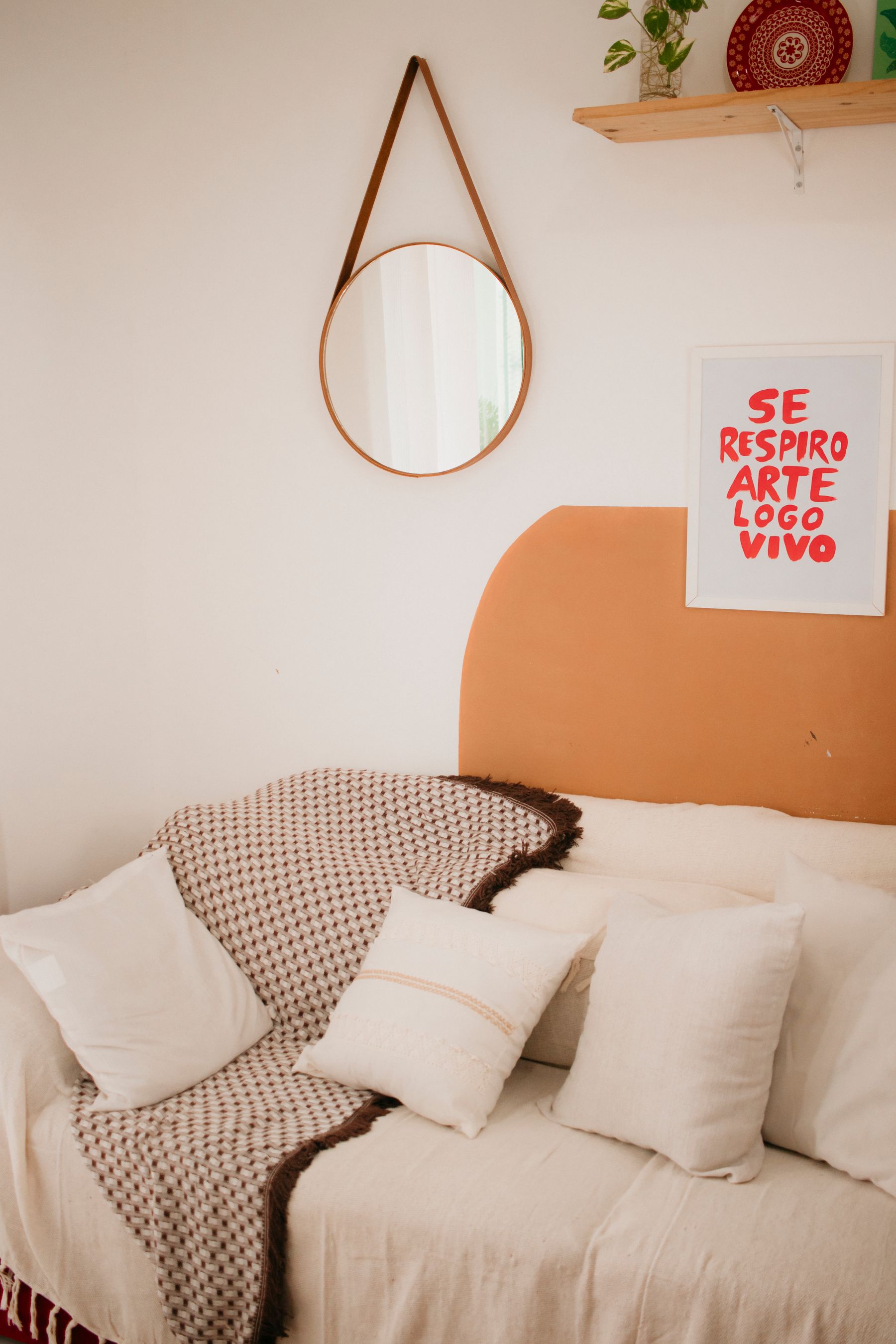
When wall changes are restricted, concentrate green in portable, large-scale elements: curtain panels, a rug field, sofa cover where construction and care allow, a painted freestanding cabinet or a fabric panel. Check tenancy terms and the exact removable-product guidance rather than assuming peel-and-stick finishes release cleanly. Choose a green that can work against a different future wall color. A reversible layer should behave like a real volume, not a collection of vases bought to imitate one.
Choose Green Upholstery by Wear Pattern
Dark green does not hide every mark, and pale green is not automatically fragile. Velvet shows pile direction and pressure; linen can soften with use; leather changes through abrasion and light; textured synthetics may catch debris. Assess the exact fabric, seams, care code, removable parts, replacement path and exposure before relying on color. Test a sample where hands, pets, food and direct sun actually meet it. The most practical green is the construction whose aging you can accept and maintain.
Use Value Contrast for Accessible Edges
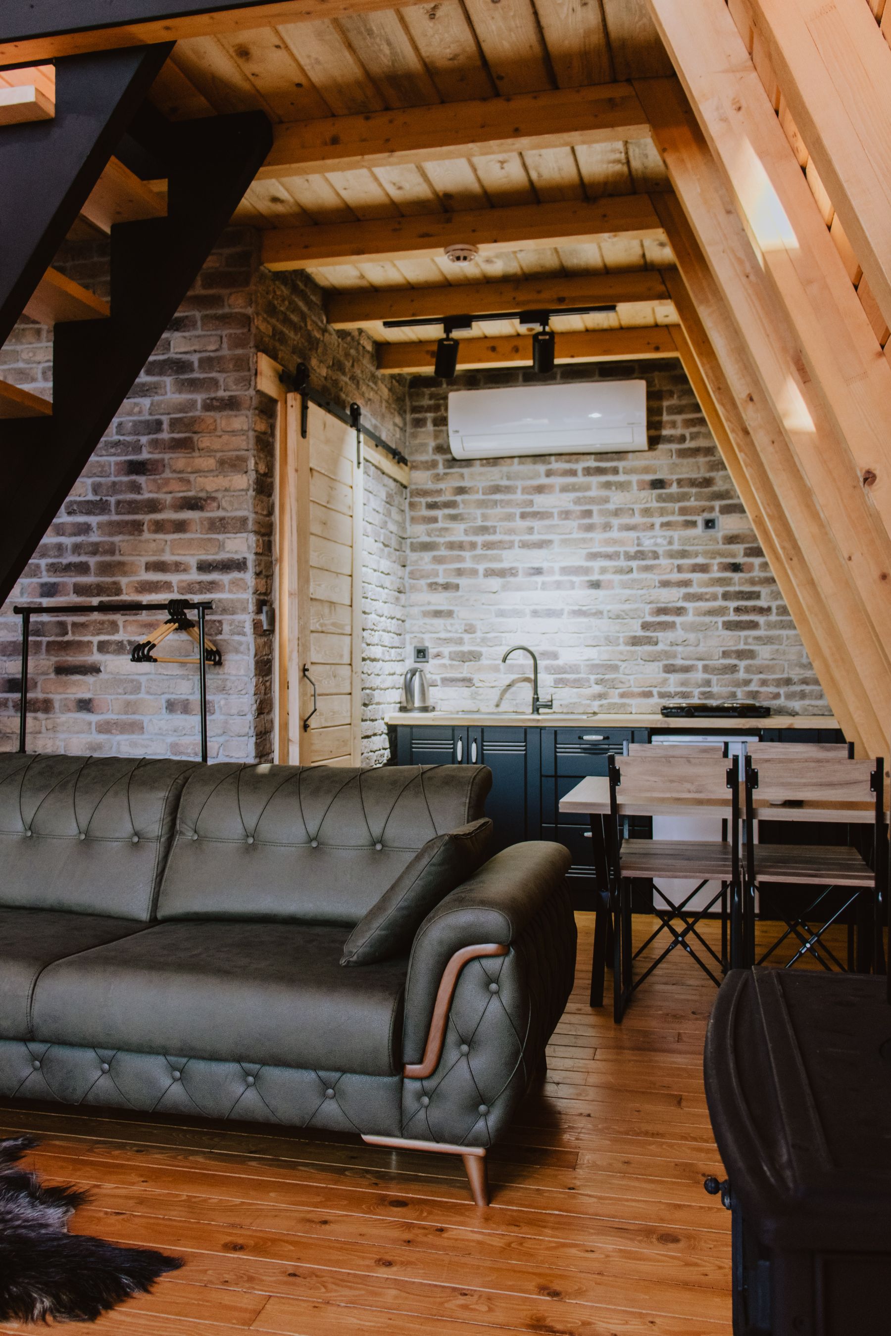
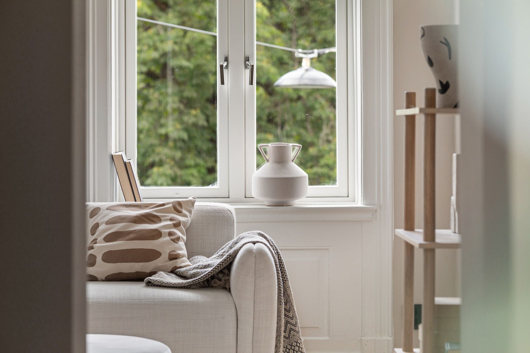
An immersive green room still needs visible door edges, switches, steps, table corners and furniture boundaries. This is especially important when deep paint extends across trim or when green upholstery sits near a similar wall. Use value contrast where movement or operation depends on it and keep the main route clear at the floor. Accessibility is not a reason to abandon saturated color; it is a reason to place contrast where it communicates rather than scattering it decoratively.
Edit the Room in Three Photographs
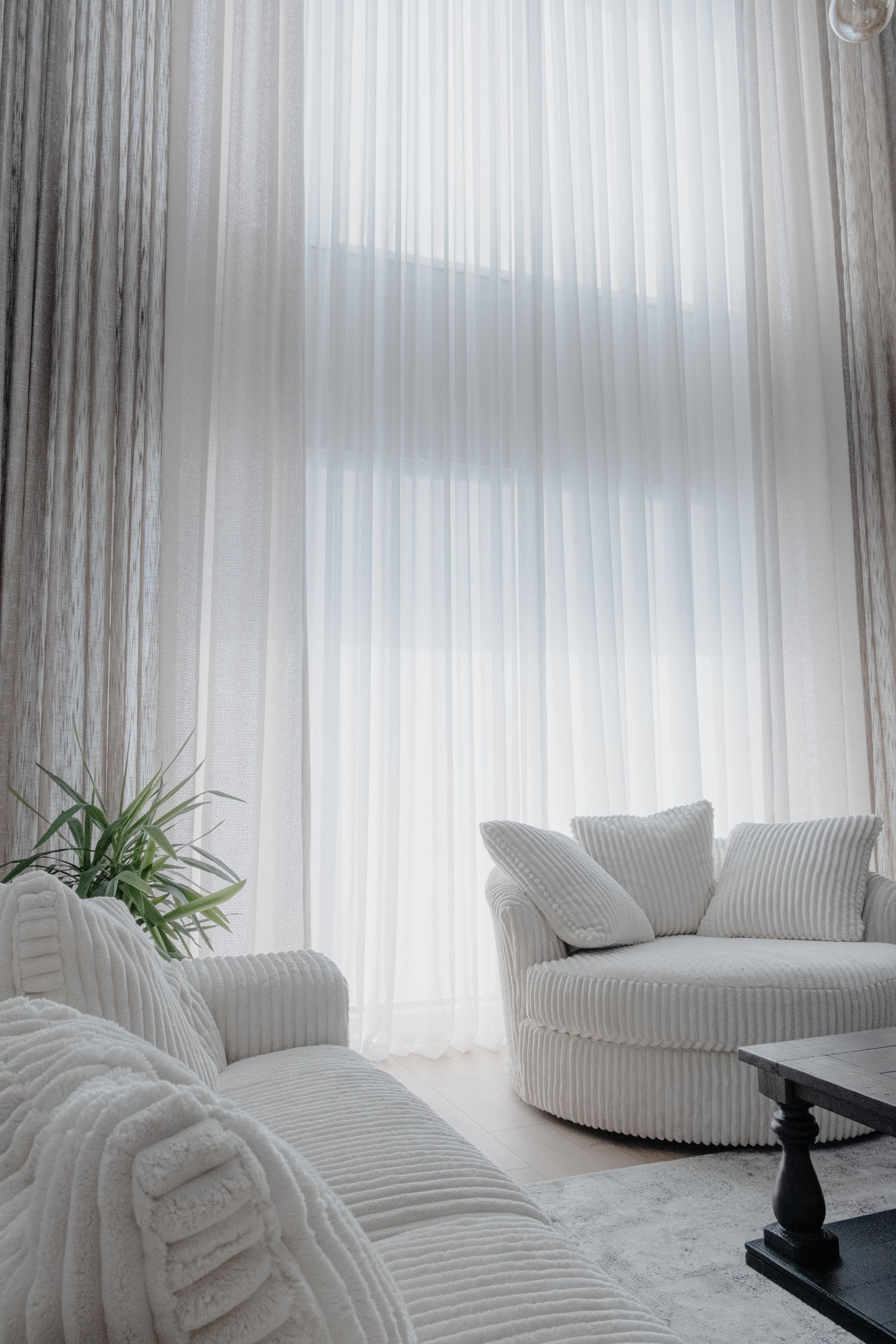
Finish with three photographs: entrance, main seat and evening conversation scene. In the entrance view, green should have one obvious primary job. From the main seat, the view, screen, fireplace and artwork should not compete as equal focal points. At night, faces and routes should remain readable while the green retains useful depth. Remove repeated accents, plants without suitable conditions and cushions whose only job is to name the palette. The final room should still make sense when one seasonal textile and half the objects are gone.