Name the Grey Source Before You Change It
Grey may be the envelope, the largest sofa, a carpeted ground, a stone fireplace or a run of cabinetry. Mark every large grey field in a doorway photograph, then choose the one that should lead. A wall-led room can tolerate a sofa with a distinct temperature; a grey-sofa room may need the shell to step away; a stone-led room should take its cue from the fixed mineral variation. If all four sources claim equal attention, changing the paint name will not create hierarchy.
Separate Undertone, Value and Surface
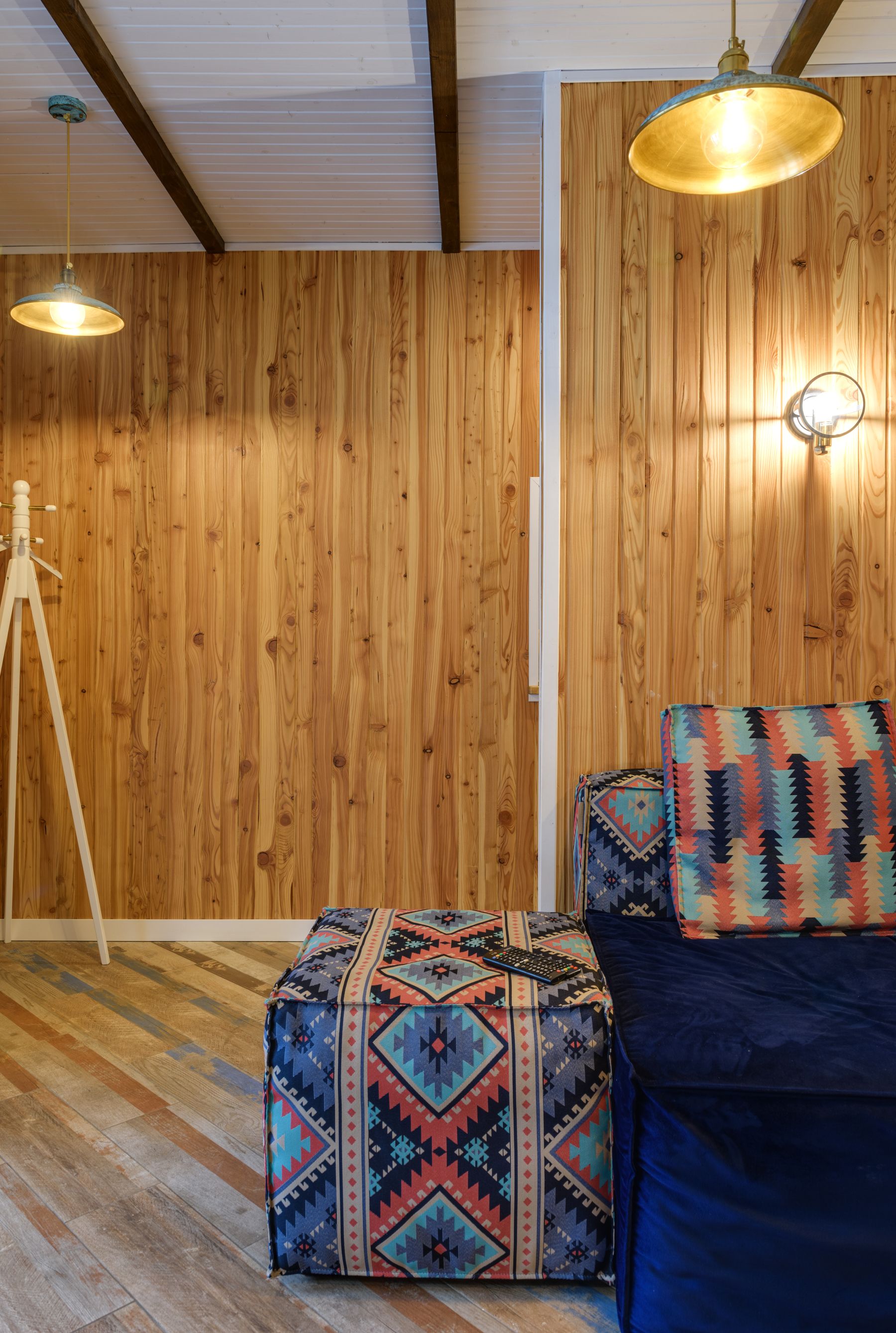
Three variables are routinely collapsed into one word. **Undertone** is the color bias—blue, green, violet, brown or red. **Value** is how light or dark the grey reads beside other surfaces. **Surface** determines how light breaks across it: flat paint, woven upholstery, limewash and honed stone cannot behave alike. Change only the variable causing the failure. A flat mid-grey wall may need shadow texture rather than a warmer hue; a blue-grey beside honey oak may need a temperature change even if its value is right.
Trace the Color Grey Borrows From the Room
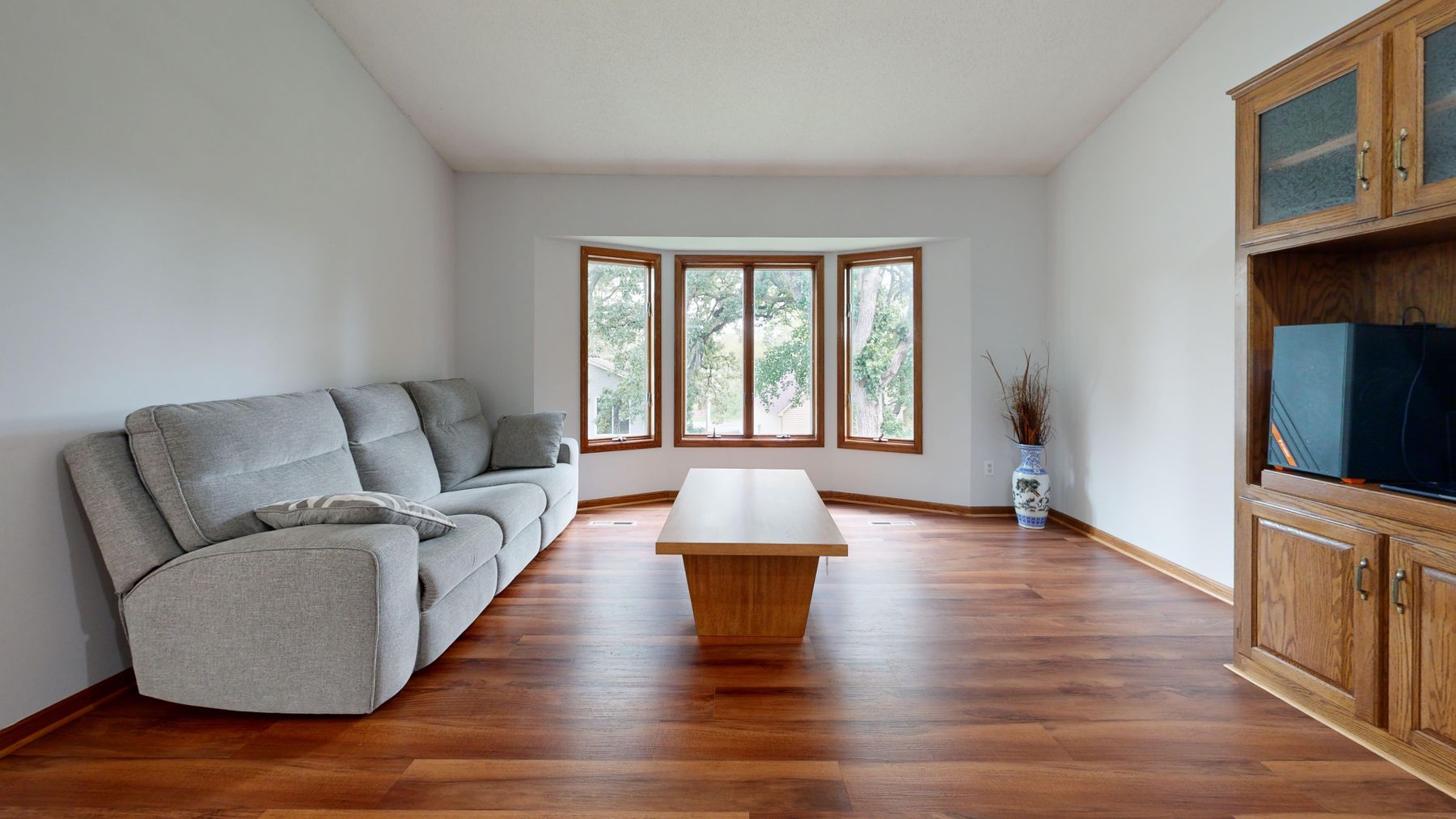
Grey is unusually dependent on comparison. A blue sky can cool the wall, green foliage can expose a violet bias, red brick can make it look greener, and an amber floor can pull a neutral grey toward lilac. Photograph the sample beside the window reveal, above the skirting and next to the largest fixed finish on a clear and overcast day. The aim is not to find a grey without undertone; it is to choose the color it is allowed to borrow.
Diagnose Cold, Flat, Dim or Hard
Use precise language before buying anything. **Cold** means the temperature fights the room or people. **Flat** means important forms share a value or finish. **Dim** means usable light is insufficient. **Hard** means too many reflective or unyielding surfaces dominate. Warm timber may help coldness but will not separate a mid-grey sofa from a mid-grey wall. Another lamp may improve dimness while leaving a glossy stone-and-glass room acoustically and visually hard. Treat the symptom you can demonstrate.

Know When Builder Grey Is the Problem
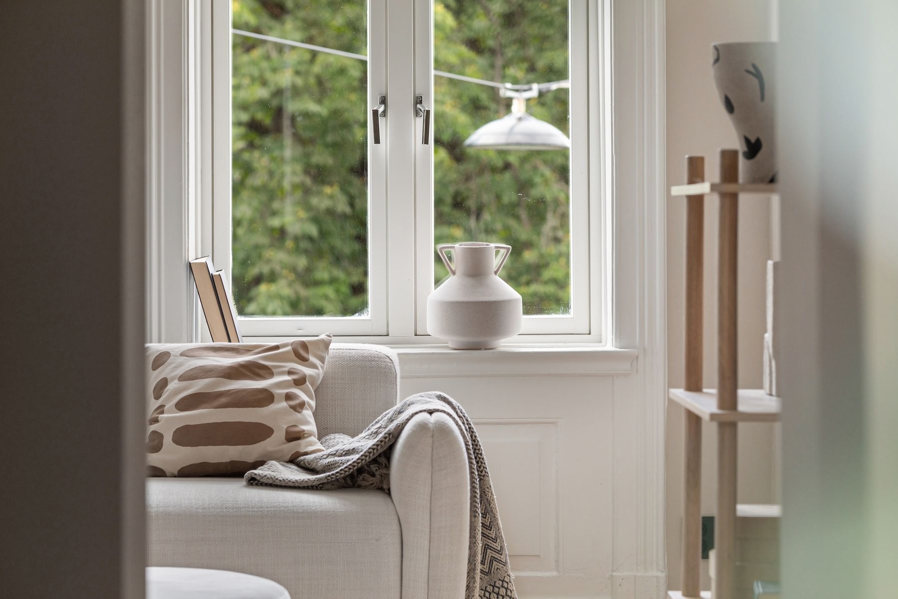
The builder-grey effect usually comes from a system: cool mid-grey walls, bright white trim, grey carpet or laminate, a cool ceiling light and furniture at nearly the same value. Replacing cushions cannot resolve that chain. Keep the paint only if it works beside the floor and daylight after the lighting and value hierarchy are corrected. If it turns every fixed finish slightly wrong, repainting is the efficient decision—not a failure to style hard enough.

Decide Whether the Sofa Is Shadow, Bridge or Anchor
A pale grey sofa can act as **shadow**, quietly modeling a light envelope. A mid-grey sofa can **bridge** a dark table and pale wall. A charcoal sofa can **anchor** the whole group. Choose one role and remove objects that contradict it. An anchor should not be outlined with dozens of pale cushions; a shadow should not become the darkest block by accident. This role is more useful than asking whether grey upholstery is timeless.
Stop a Grey Sofa From Drifting
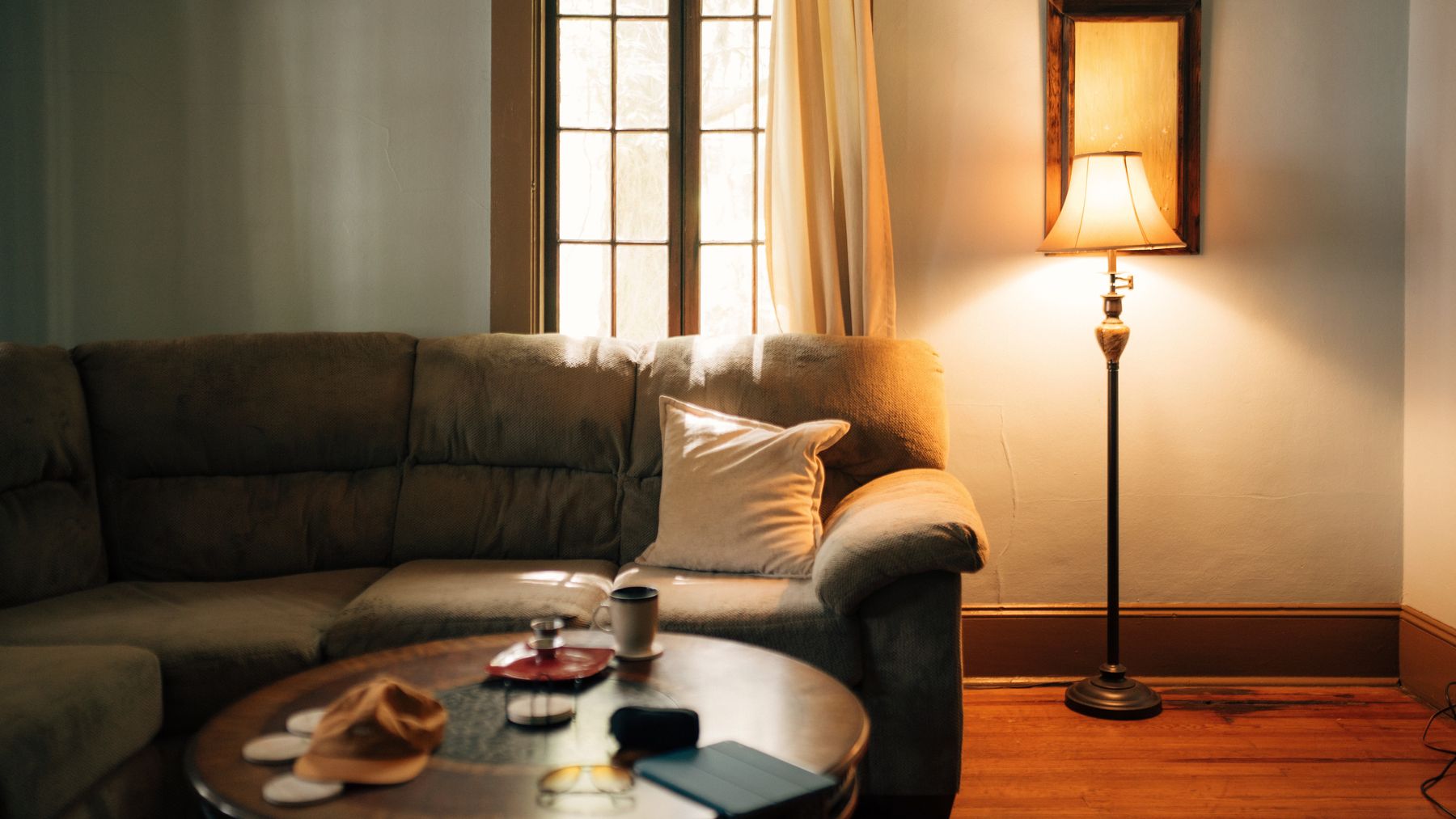
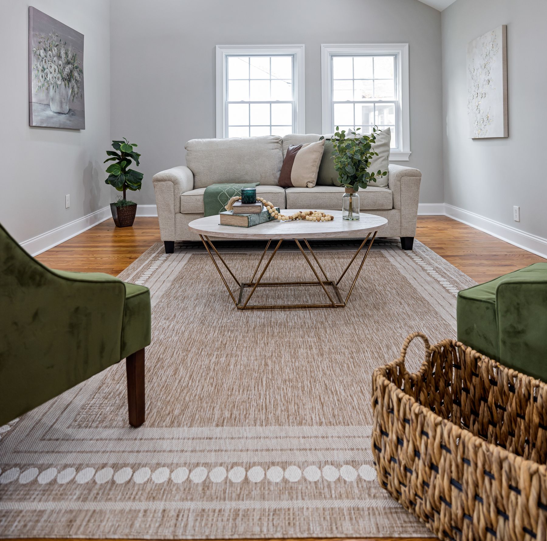
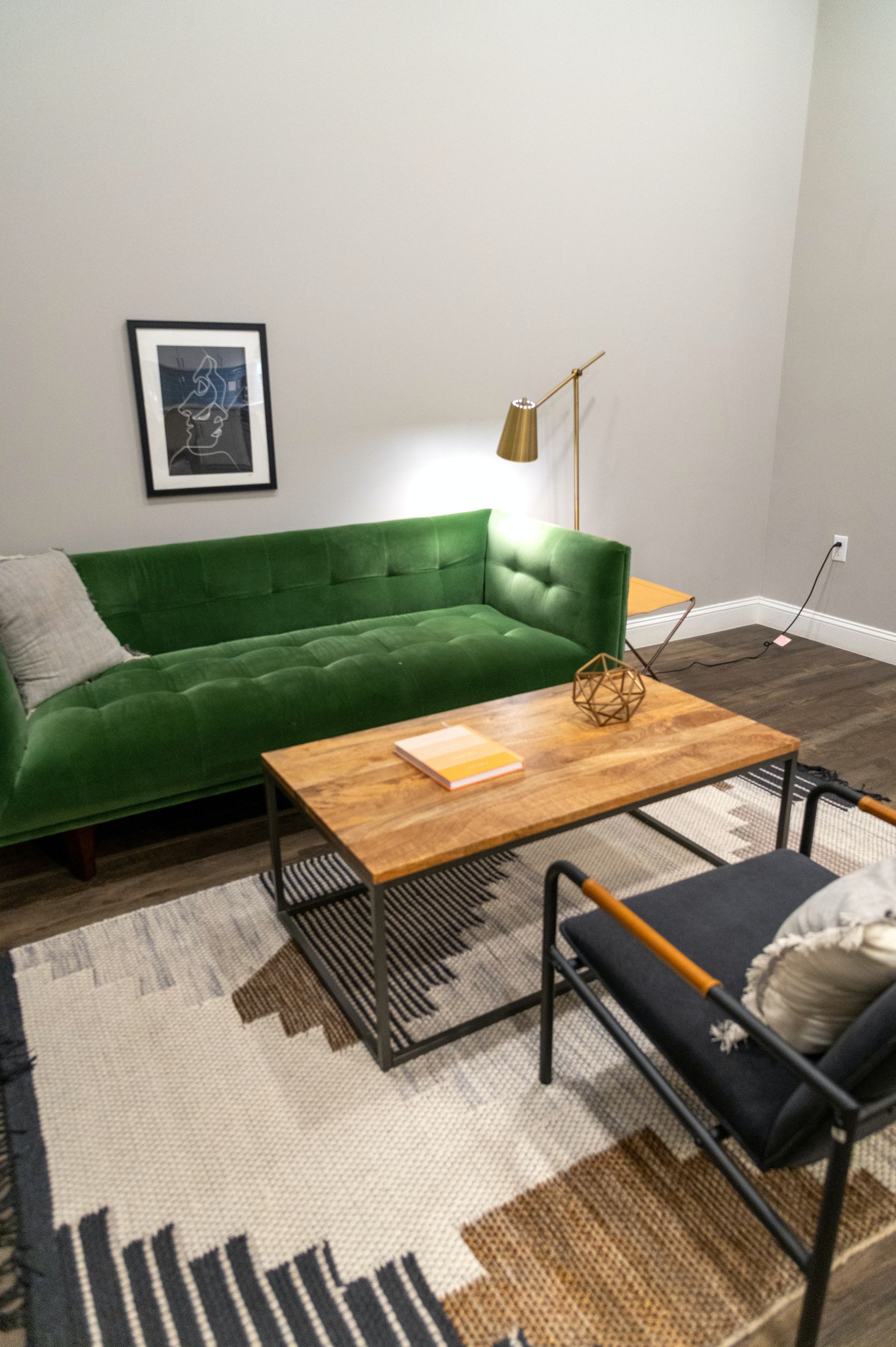
A grey sofa often looks detached when its feet meet a similarly valued floor and no central plane connects it to the other seats. Correct the ground before adding wall decor. A rug can create a readable island, a darker table can give the group a center, and a visible band of flooring can outline a pale sofa. [Living Room Rug Ideas](/living-room/living-room-rug-ideas/) covers fit; the grey-specific question is whether the sofa has a base or appears to float.
Create an Interval Between Grey Wall and Grey Sofa
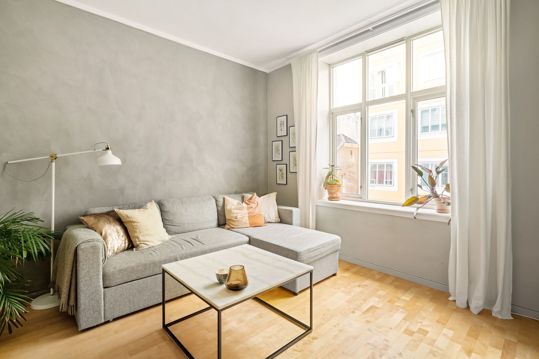
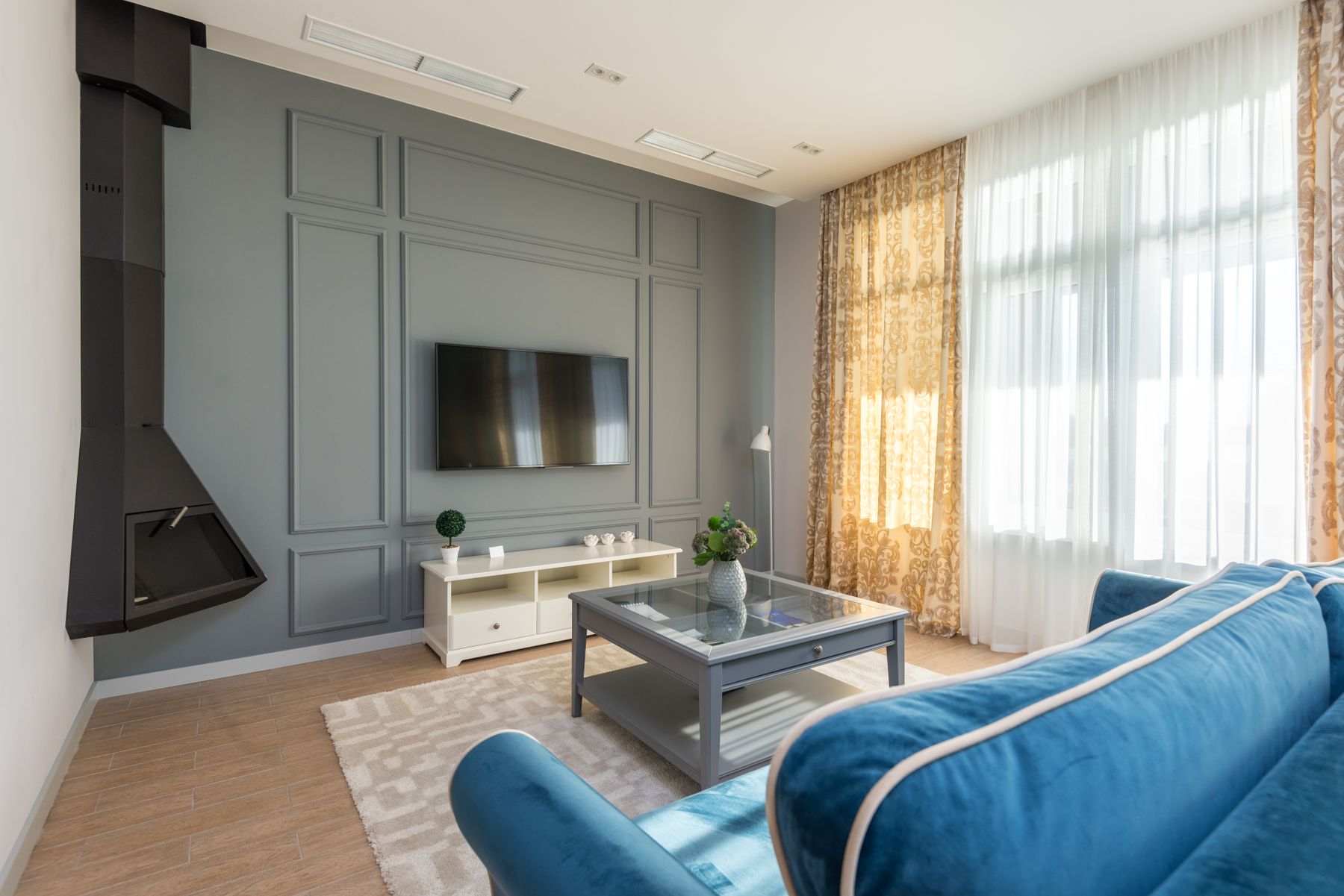
Grey-on-grey needs an interval, not a perfect match. Shift the wall and sofa by enough value to survive evening light, or keep values close and separate them decisively through temperature and texture. A woven warm grey sofa against a cooler mineral wall may remain distinct; two smooth mid-greys often collapse. Test the silhouette from the entrance and the seat opposite rather than relying on close-up fabric samples.
Use Greige as a Boundary, Not a Compromise
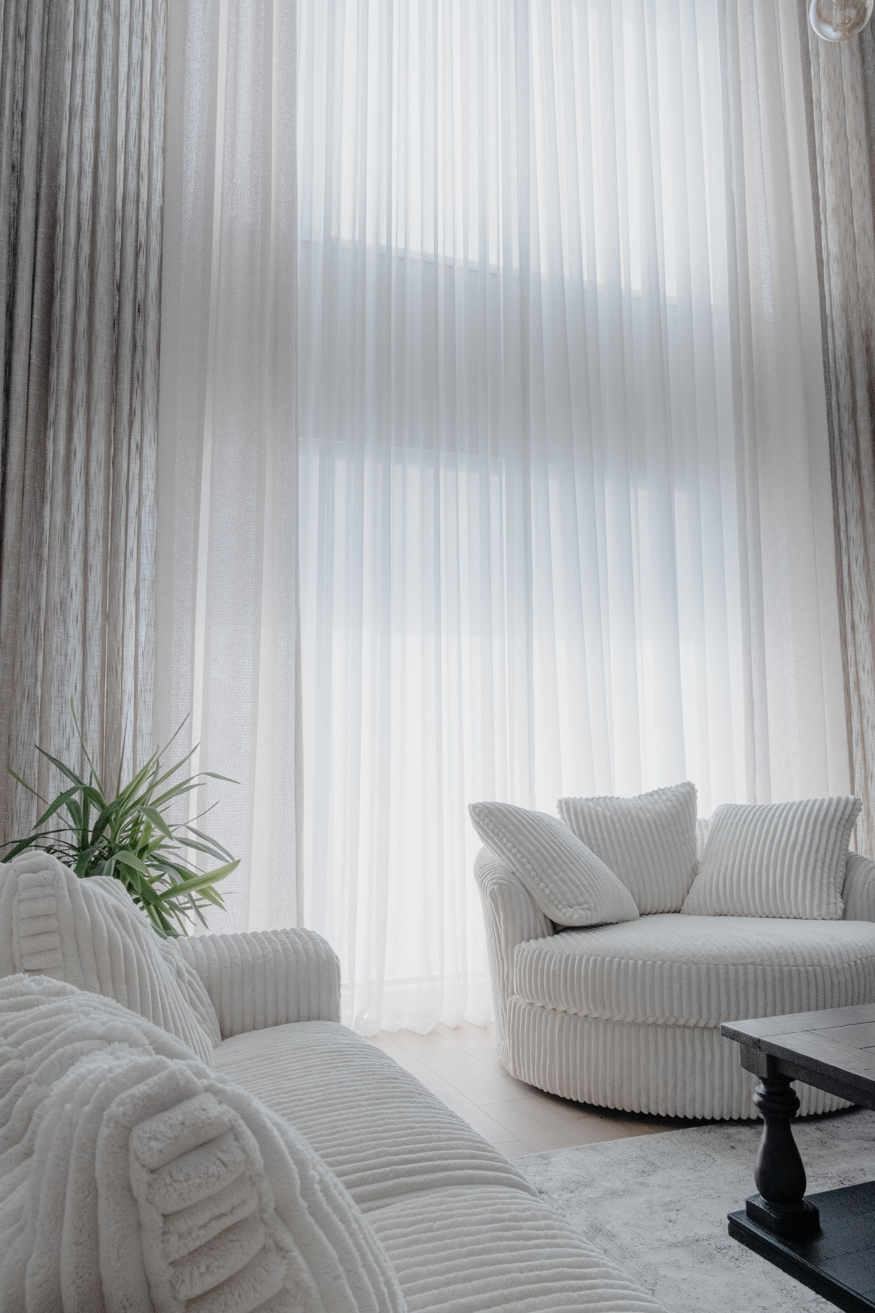
Greige is useful when the room must connect grey stone, cream textiles and warm timber. It becomes vague when every surface is adjusted toward the same safe middle. Keep one clear cool note or one dark neutral so the boundary remains visible. If the paint reads beige beside the actual sofa and floor, accept that result and design honestly around warm neutral; do not keep calling it grey to preserve a mood board label.
Put Charcoal Low Before You Put It on a Feature Wall
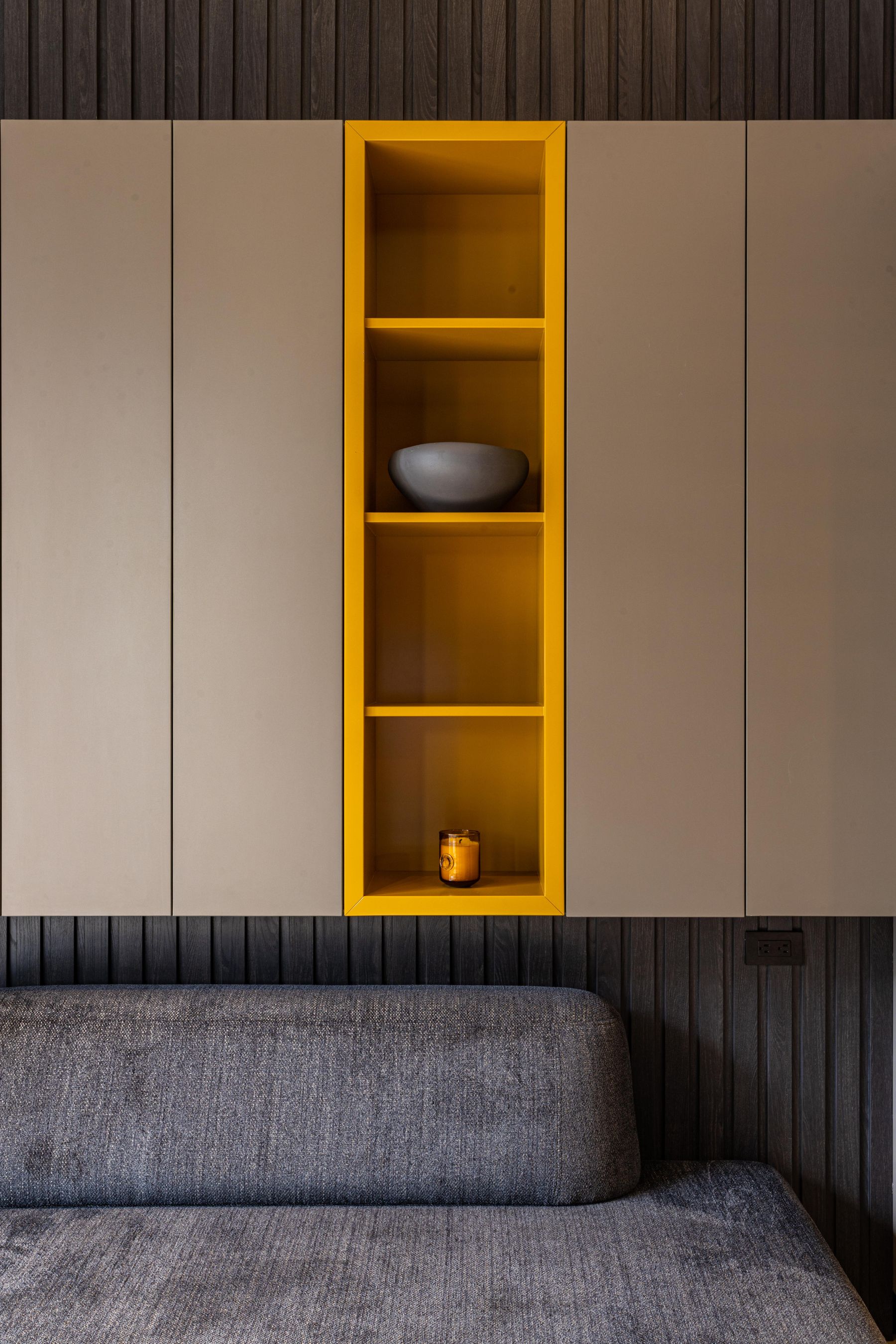
Charcoal often works harder as a low cabinet, hearth, rug field or sofa base than as an isolated feature wall. Low dark weight stabilizes a pale shell and can incorporate the switched-off television without creating a tall visual block. Use a wall only when it corresponds to architecture, joinery or the intended focal plane. [Black Living Room Ideas](/living-room/black-living-room-ideas/) goes further into dark envelopes; here charcoal is supporting grey, not replacing it.
Calibrate Grey Against Walnut, Oak or Caramel
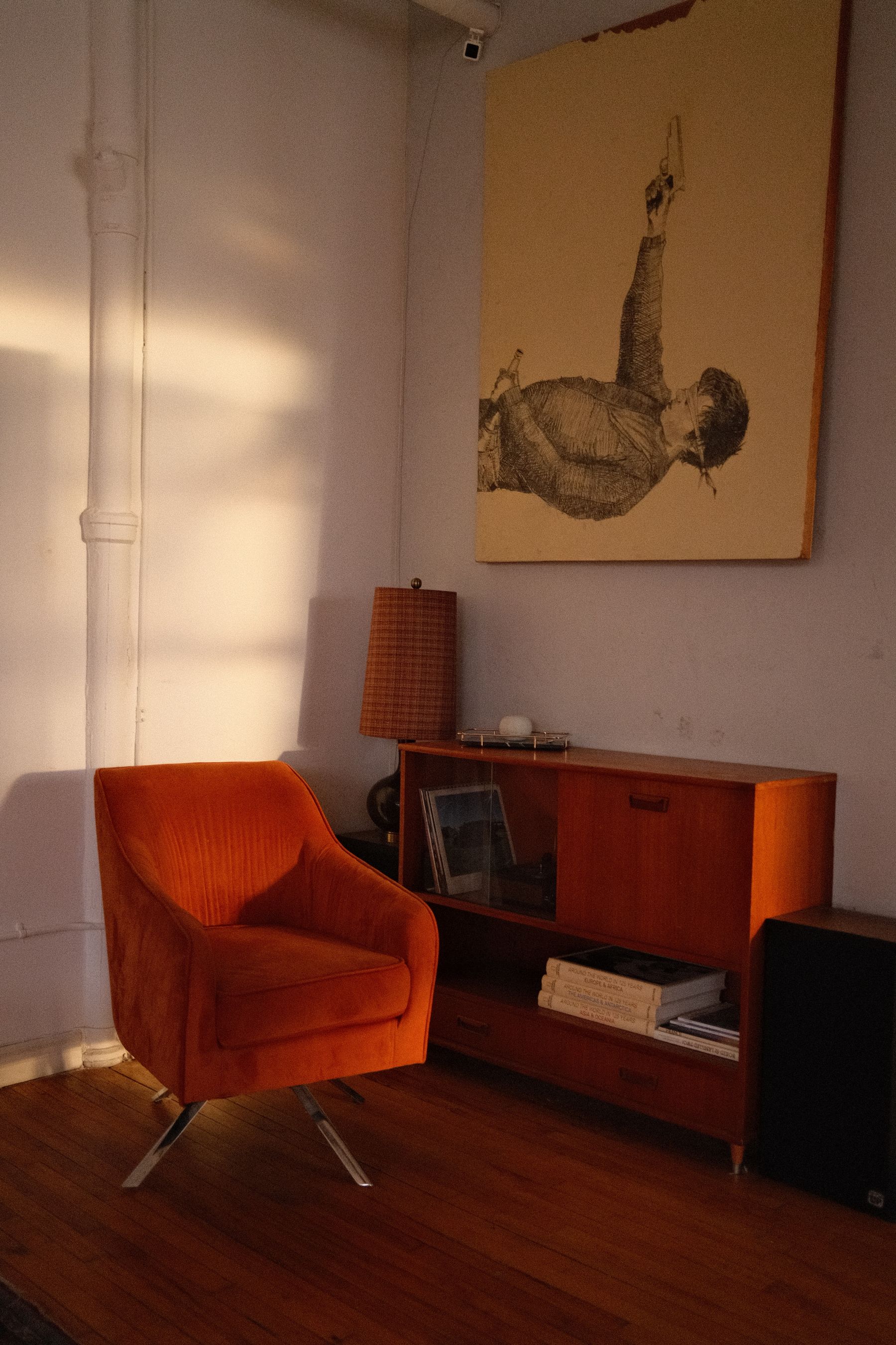
Walnut may make a blue-grey look cleaner, while yellow oak can expose violet and a red timber can push some greys green. Choose the largest existing timber family first, then test the grey against its real finish. One substantial wood volume is more informative than many small baskets. Repeat the timber only where construction or use makes sense, and let [Scandinavian Living Room Ideas](/living-room/scandinavian-living-room-ideas/) lead if pale wood and daylight are the room's central thesis.
Give Warm Color One Material Job
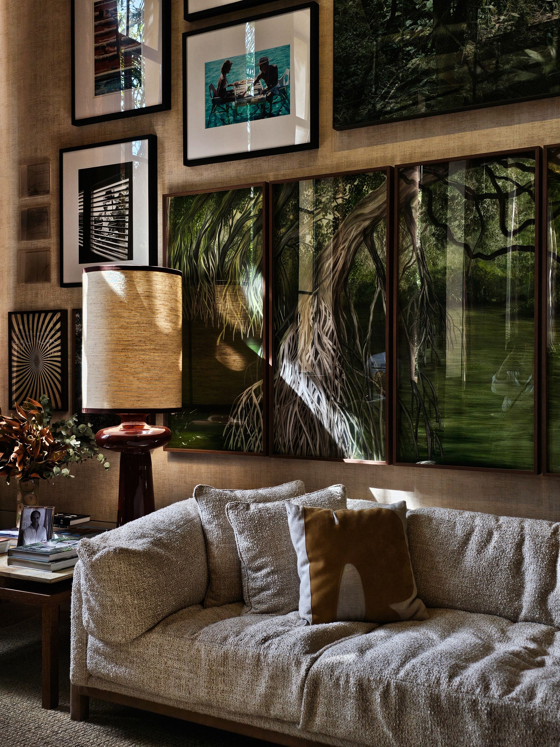
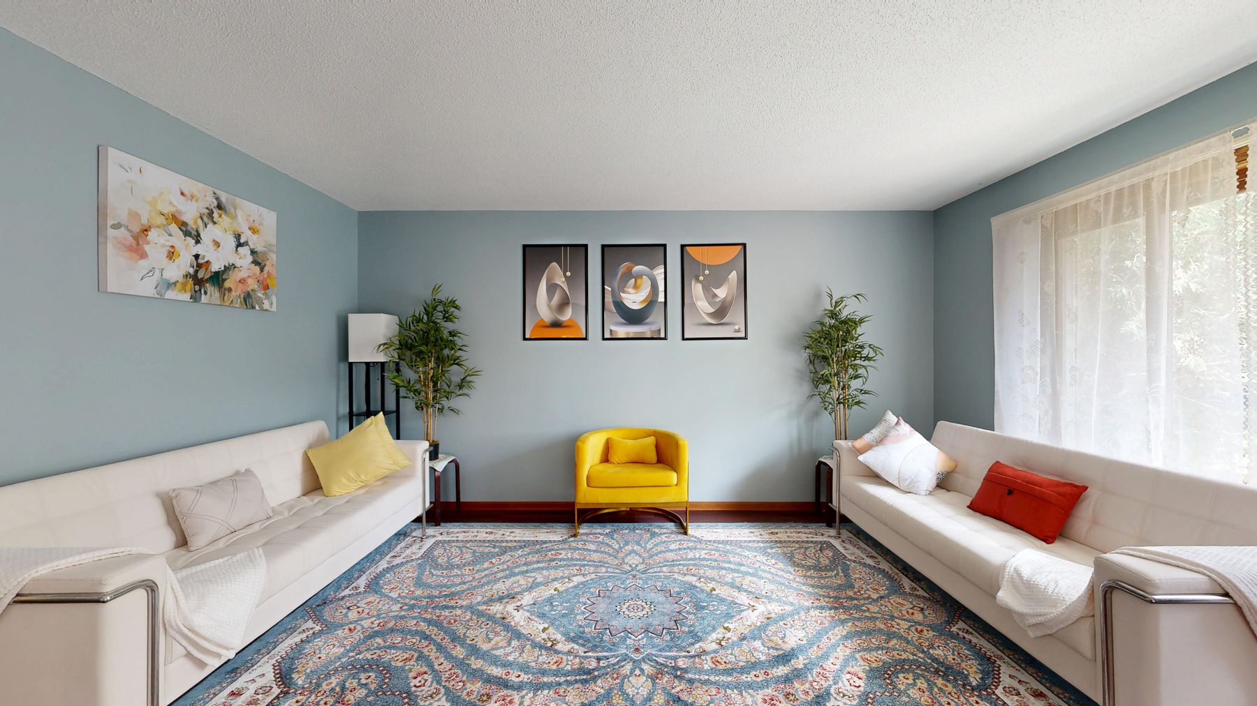
Ochre, rust, dusty pink, oxblood and clay can keep grey from becoming inert, but they should occupy a believable material: a chair, curtain span, rug field, artwork or painted cabinet. Ten small accents read as correction rather than conviction. Choose a warm color whose value also helps the room—light pink may not separate a pale sofa, while rust can provide both temperature and middle-dark weight.
Pair Grey With Blue or Green Without Double-Cooling
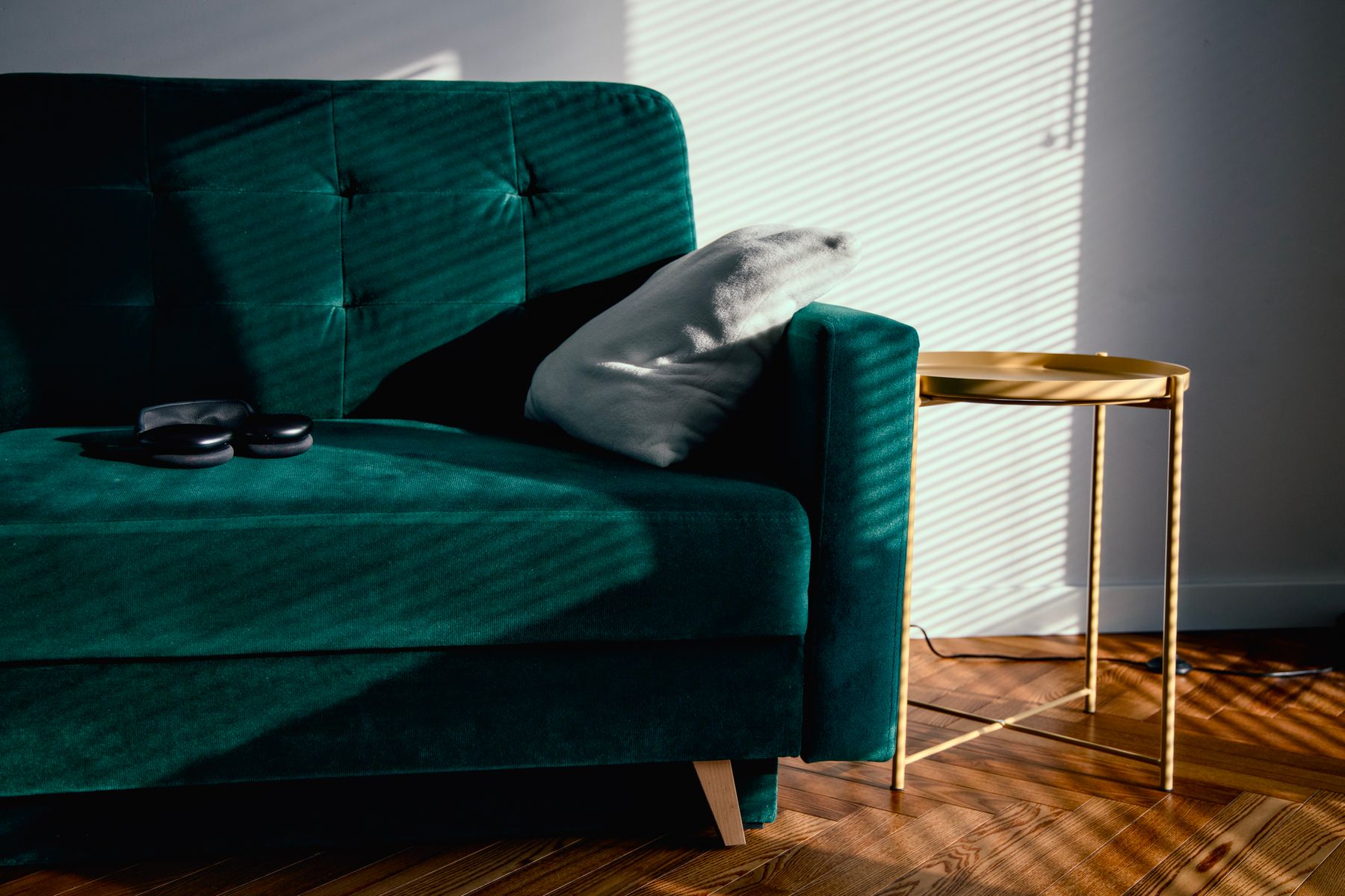
Blue and green can reveal grey's undertone rather than simply add color. A green sofa may make violet-grey obvious; navy can turn a cool grey into an undifferentiated blue field. Bridge the pair with warm floor, cream textile or natural timber, and vary value so color is not doing all the separation. Continue to [Blue Living Room Ideas](/living-room/blue-living-room-ideas/) or [Green Living Room Ideas](/living-room/green-living-room-ideas/) when that hue, rather than grey, becomes the dominant field.
Make Texture Change the Shadow, Not Just the Mood
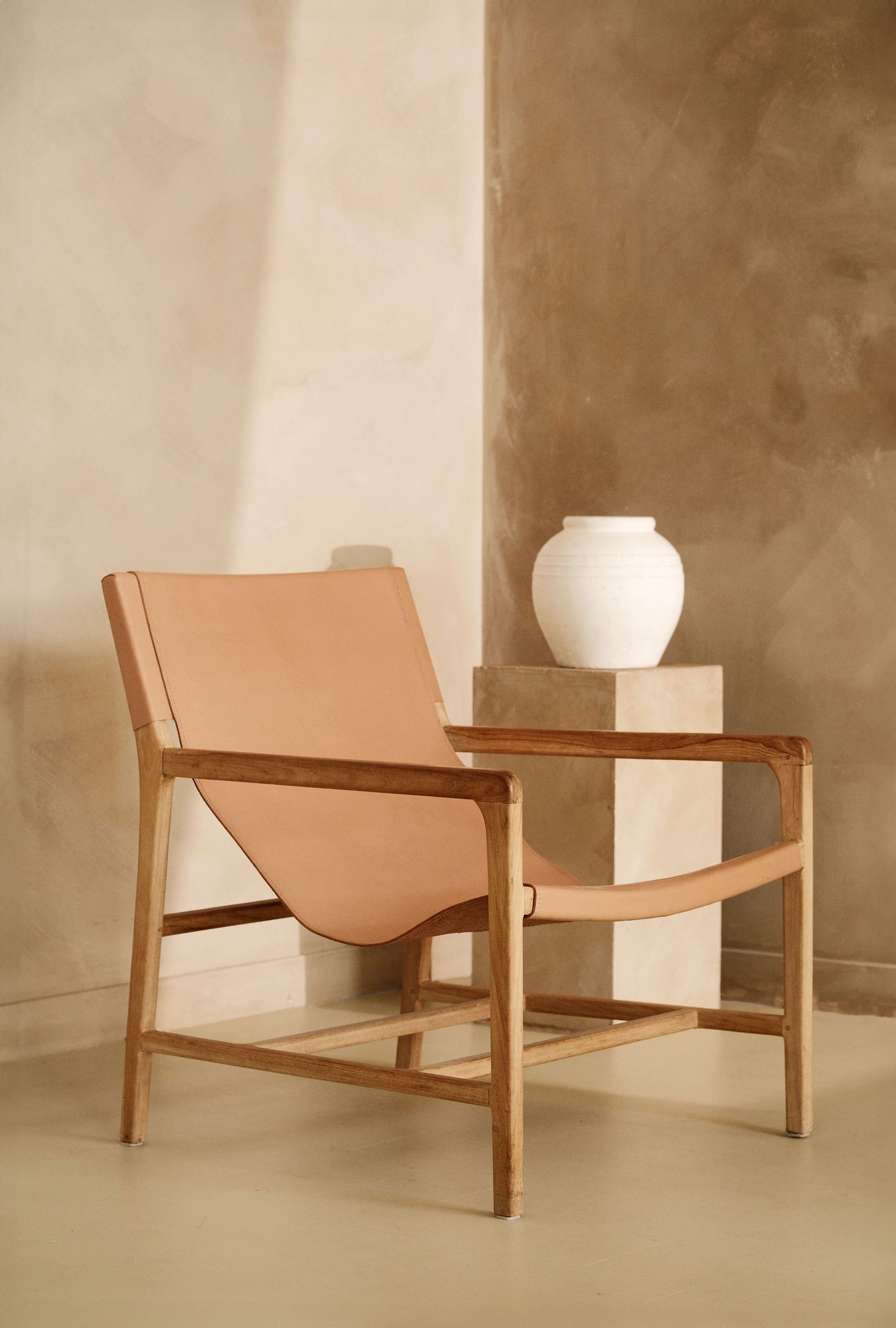
Limewash, clay paint, plaster and textured wallpaper are useful because their surface creates lighter and darker micro-fields across grey. That can rescue flatness without introducing another hue. It cannot repair the wrong undertone, and heavily mottled finishes may compete with stone or busy upholstery. Sample a large area where side light crosses it, check the manufacturer's substrate and application requirements, and decide whether variation still looks intentional at night.
Make Grey Stone and Grey Paint Agree
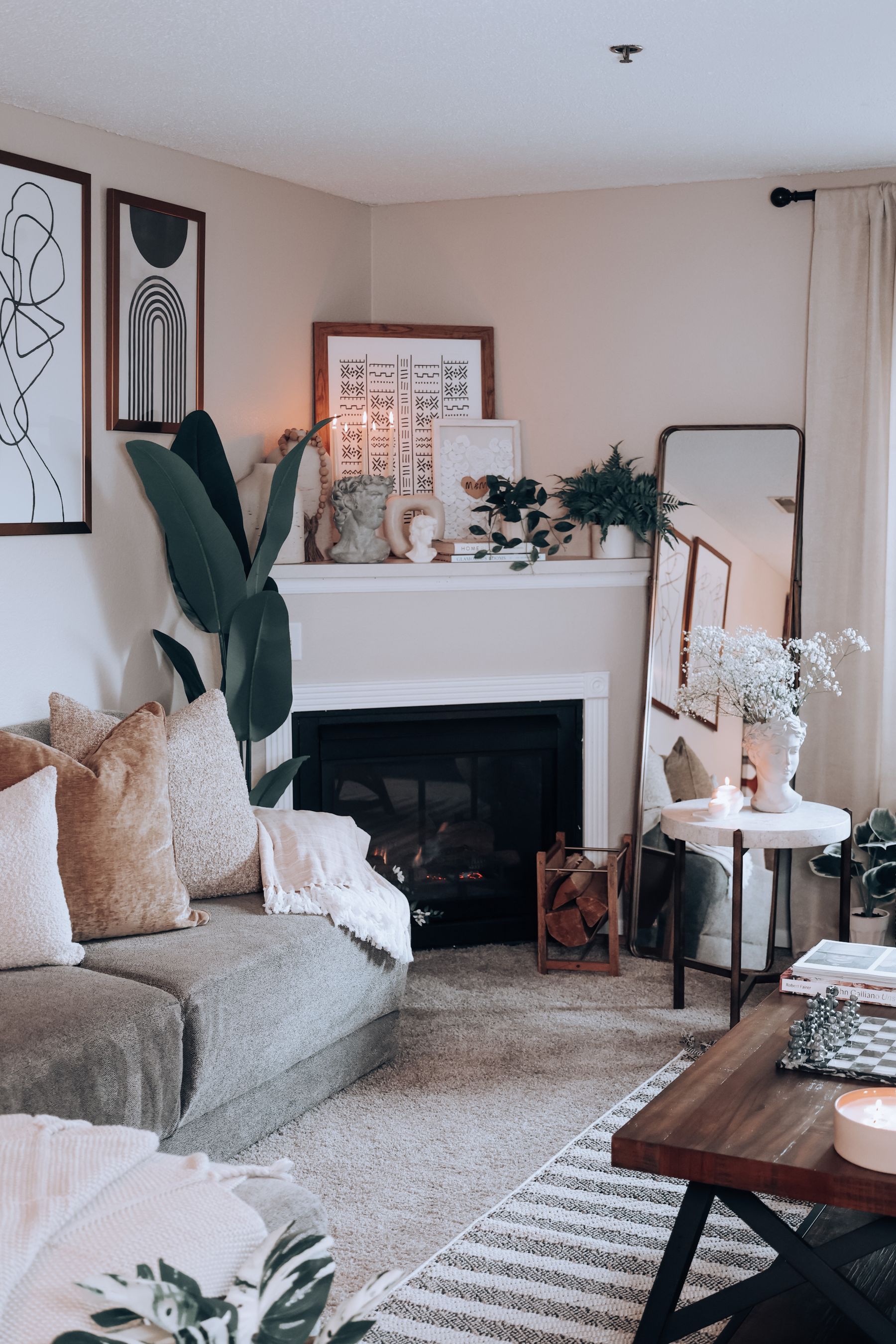
Fireplace stone contains multiple greys at once. Pulling one tiny vein for wall paint can exaggerate a color that is barely visible in the slab. Step back and identify the stone's overall temperature, then choose paint that either joins it or gives it a deliberate interval. Preserve mantel, hearth and opening relief so grey-on-grey does not flatten the fireplace. Heat, appliance and clearance requirements must come from the exact installation and qualified guidance.
Use White Trim to Expose or Quiet the Undertone
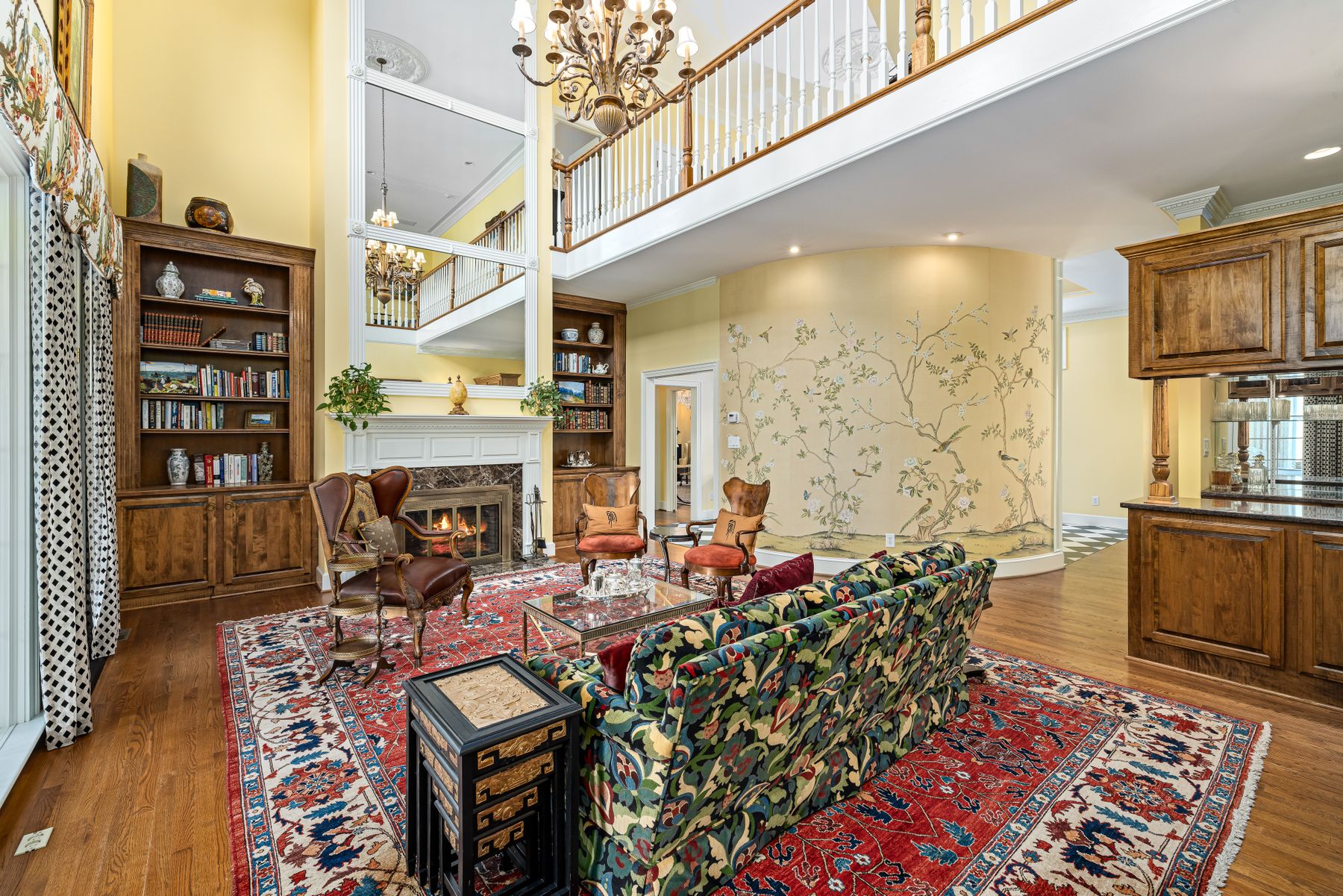
Bright cool white often makes grey look darker and more colored; creamier white can soften the contrast but may reveal a blue or violet cast. Painting wall and trim in the same grey reduces comparison and can make mouldings read through shadow instead of outline. Test wall color against the actual door, ceiling and skirting finish, not a generic white card. [White Living Room Ideas](/living-room/white-living-room-ideas/) develops the pale envelope in more depth.
Keep Silver, Chrome and Glass From Disappearing
Chrome, nickel, mirror and clear glass can make grey feel crisp, but too many reflective cool surfaces lose their edges and multiply the room's coldest light. Give each one a contrasting neighbor: timber beneath glass, dark linework around mirror, woven shade beside nickel or a matte wall behind chrome. Check reflections from seated height; a metal chosen for warmth in the showroom may simply mirror a blue window at home.
Watch Grey Shift Green, Violet or Yellow at Night
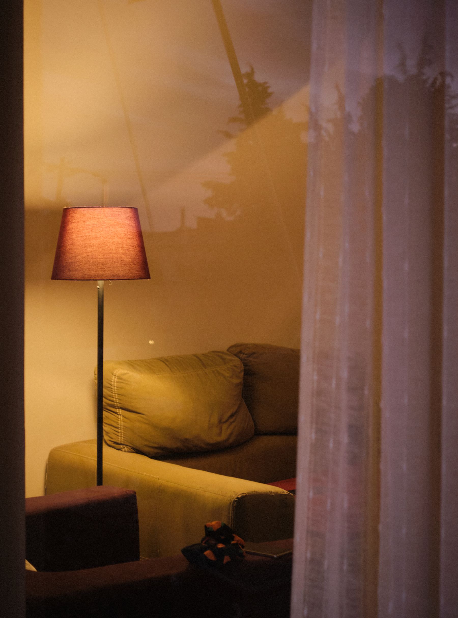
Do not ask evening light to reproduce noon. Instead, decide which shift is acceptable. Some blue-greys become green under very warm lamps; violet greys can look mauve; warm greys may turn yellow beside cream shades. Test the real bulbs, dimmer levels and shade materials beside a large sample. [Living Room Lighting Ideas](/living-room/living-room-lighting-ideas/) covers the general layer plan; here the test is whether grey remains intentional in the lowest useful social scene.
Carry the Undertone Across a Threshold, Not the Paint
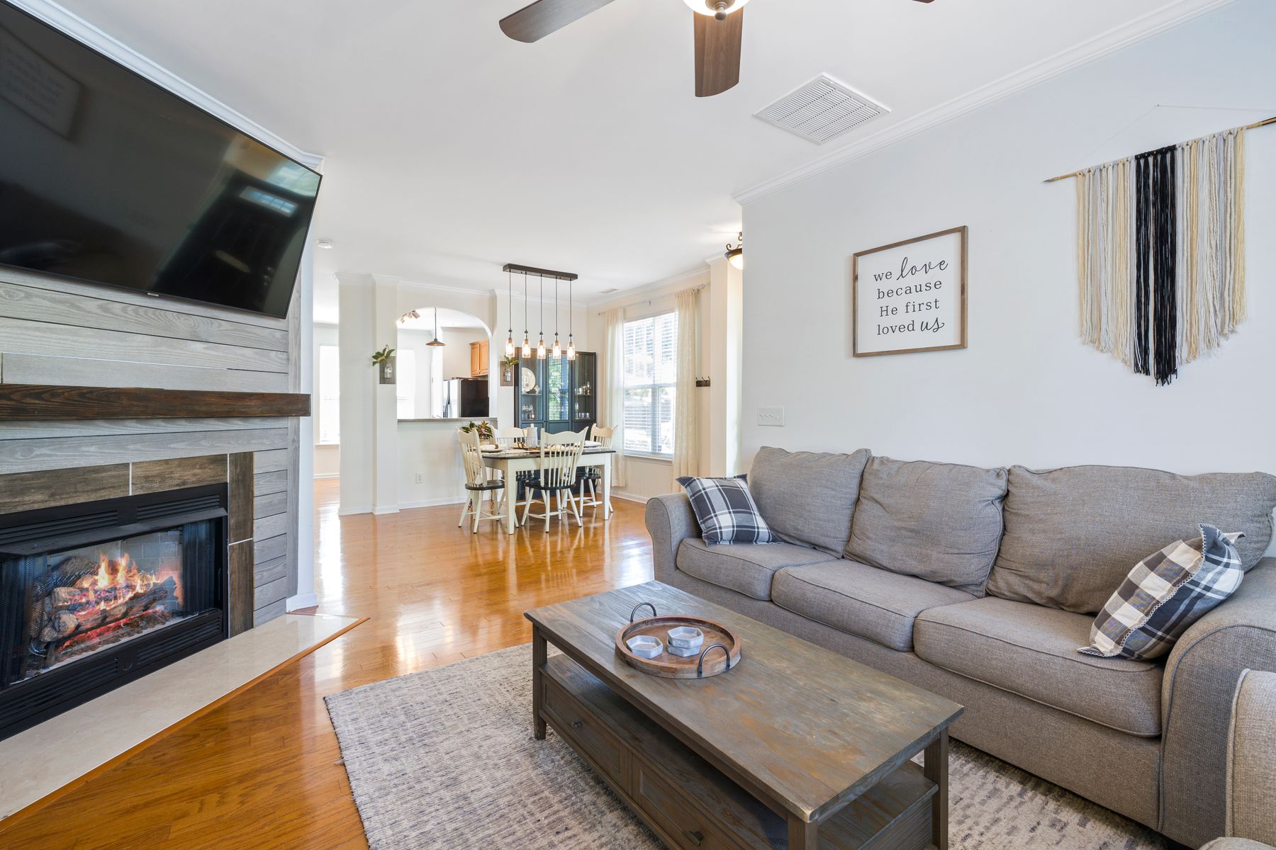
An open plan does not require identical grey paint in every zone. Repeat the undertone through a different material—warm grey upholstery answering kitchen stone, a blue-grey wall meeting cooler dining fabric—or stop the paint at a real return, beam or built-in edge. This keeps the living room distinct while avoiding a color collision at the threshold. Use [Living Room Layout Ideas](/living-room/living-room-layout-ideas/) to protect circulation before color is asked to zone the plan.
Run a Five-Move Rescue Before Repainting
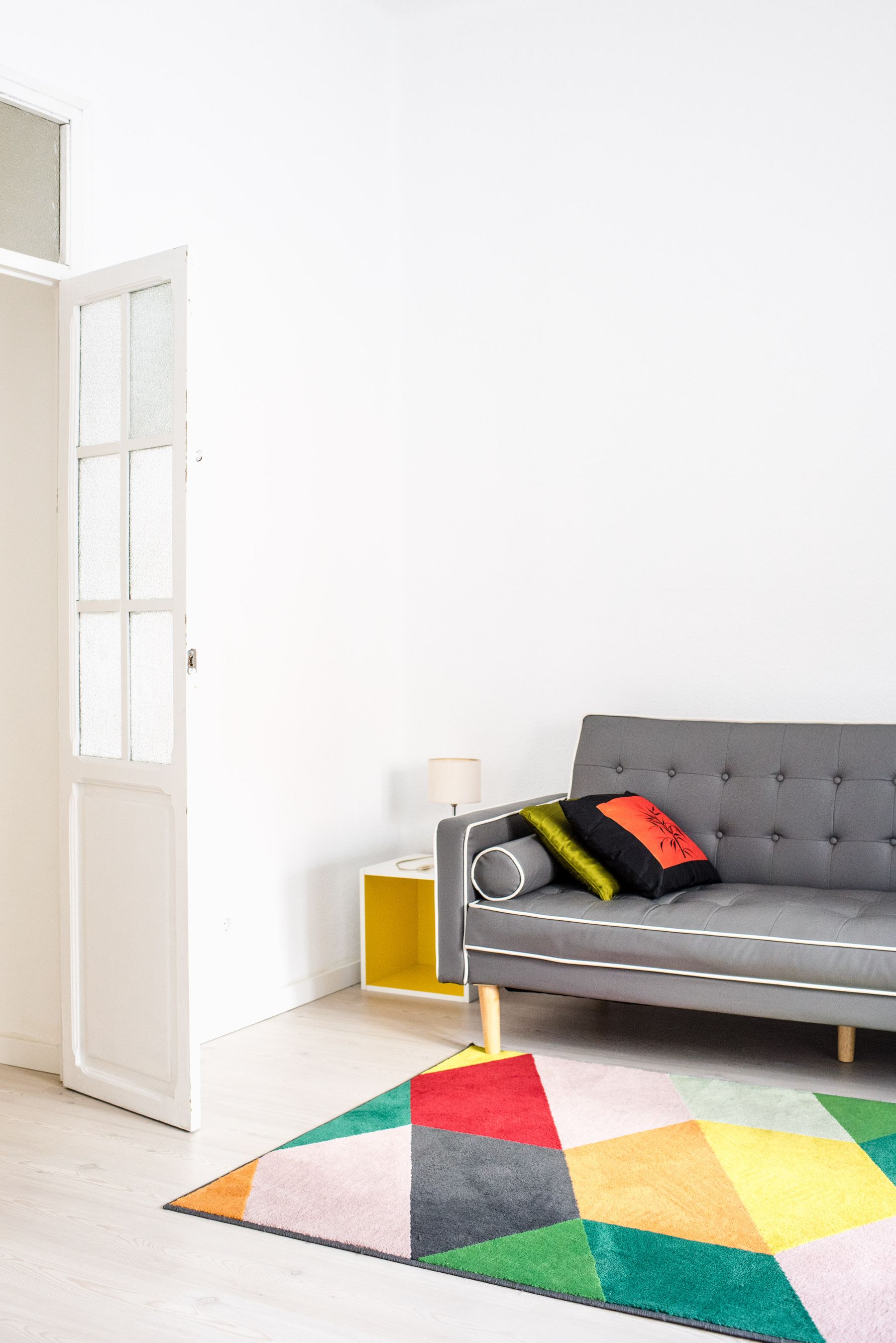
Test five reversible moves in order: define the ground with the right rug area; add or darken the central table; introduce one substantial warm material; replace one hard grey surface with texture; then set the real evening light. Photograph after each move and stop when the diagnosed problem is solved. If the wall still makes the floor, sofa and people look wrong, repaint. The exercise is not about saving paint at any cost; it prevents a color change from masking a value or material failure.
Use Color and Greyscale Photos for Different Answers
A greyscale photograph removes undertone and exposes value structure. If wall, sofa, rug and curtains become one band, the room is flat even if the color photograph feels warm. The color image reveals a different failure: a sofa and wall may have good value separation but clash green against violet. Compare both before changing anything. Grey is one of the few palettes where the monochrome image can look convincing while the real room remains chromatically unsettled.
Finish With the No-Warm-Props Test
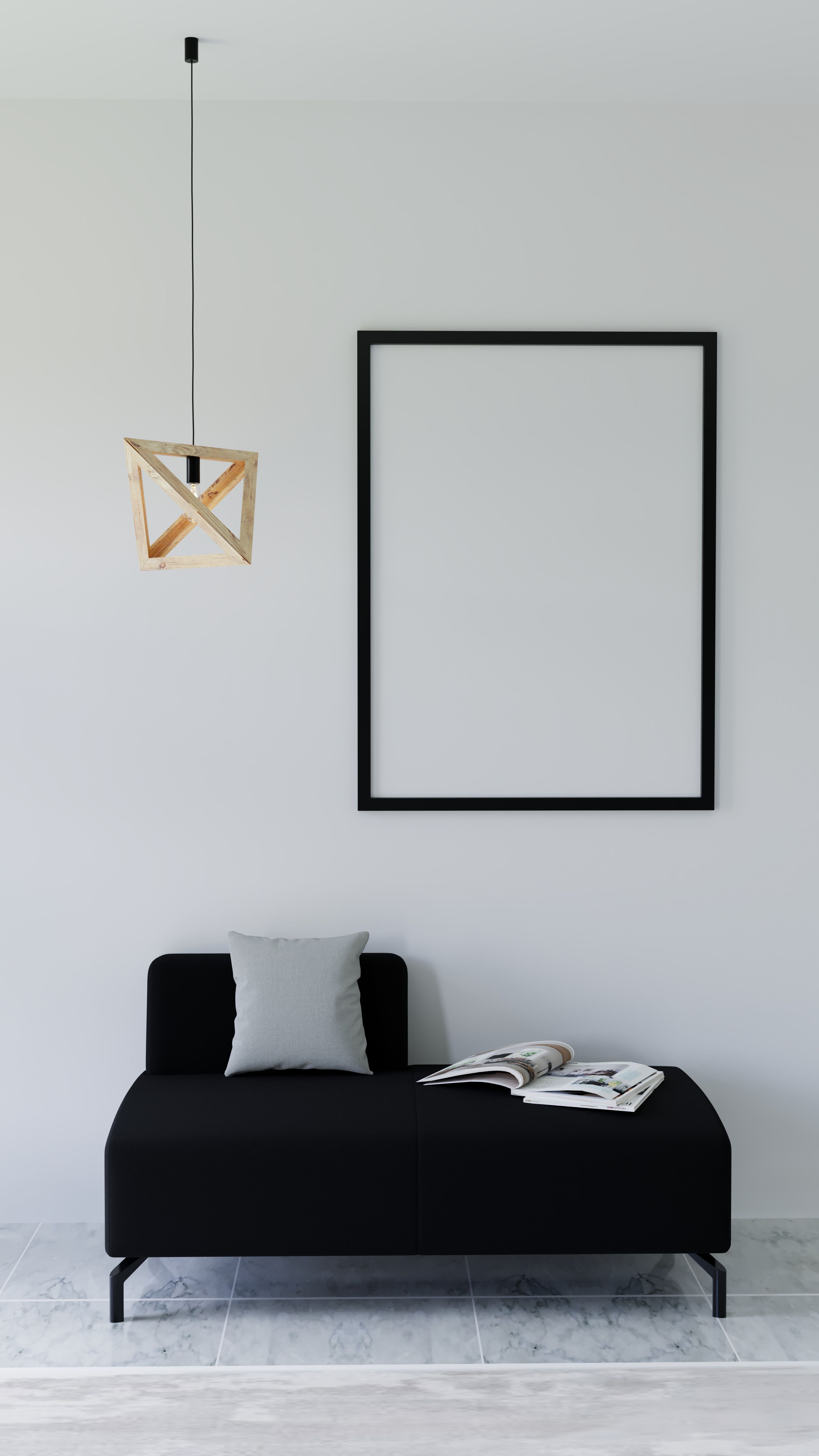
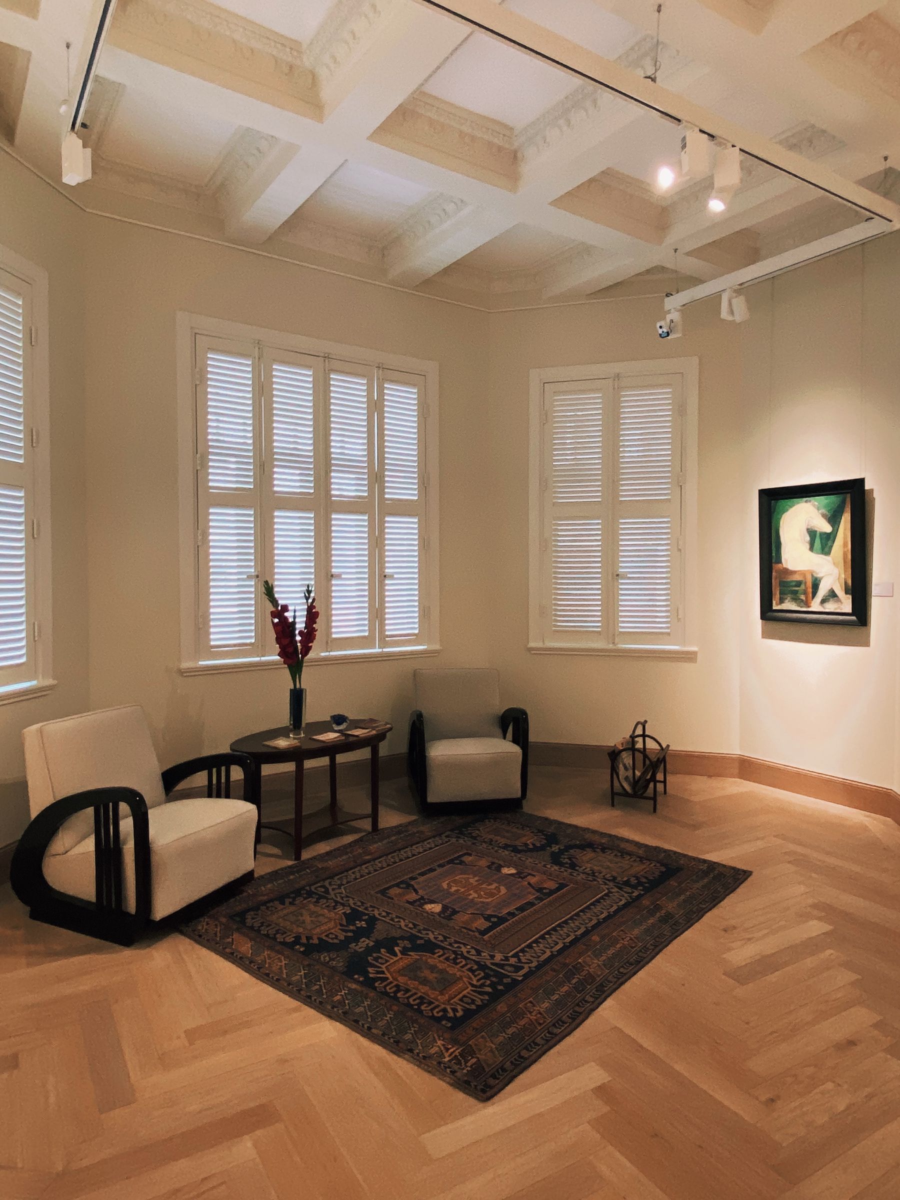
Temporarily remove the yellow cushions, terracotta vases, baskets and small timber objects bought solely to warm the scheme. Keep functional furniture and fixed materials. The grey envelope should still have value steps, the sofa should remain grounded, the fireplace and screen should be deliberate, and routes should stay legible. Return only warm elements with scale, use or history. If the room collapses without props, correct the wall, ground, center or light rather than rebuilding the accessory pile.