Decide Whether Orange Is Field, Mass, Material or Flash
Begin with the physical carrier. A painted wall creates a continuous **field**; a sofa or pair of chairs forms a bounded **mass**; brick, leather and fired clay make orange a **material**; lamps, art or a single textile provide a **flash**. Choose one primary role because each demands a different balance. A field changes every edge placed against it, while a sofa can be separated with floor and wall contrast. Material orange contains variation and wear that flat paint cannot imitate. Small flashes work only when they point to something useful rather than orbiting the room as matching accessories.

Set the Exposure Before Picking the Shade
Map orange as **dominant**, **shared** or **punctual**. Dominant orange might occupy a wall or sectional; shared exposure could divide between a chair and a rug motif; punctual orange may appear once at the far end of a sightline. Do not compensate for an undersized orange gesture by repeating it in cushions, vases and books. That creates frequency without authority. Conversely, a full orange wall beside an orange sofa usually needs a clear reason—such as a monochrome envelope—not a desire to make the palette obvious.
Choose the Red–Yellow Direction
Compare at least four directions beside the room's fixed materials: yellow-orange, red-orange, pink-coral and greyed rust. Yellow-orange can intensify honey timber; red-orange can energize blue and dark brown; coral may reveal pink in stone or upholstery; greyed rust can sit closer to brick and earth plaster. Official Benjamin Moore guidance recommends identifying existing undertones before pairing orange, while Sherwin-Williams separates bright, muted, warm and cool orange families. Use those categories as a testing prompt, not as a guarantee that a named swatch will behave the same in your room.
Test Orange at Seated Face Height
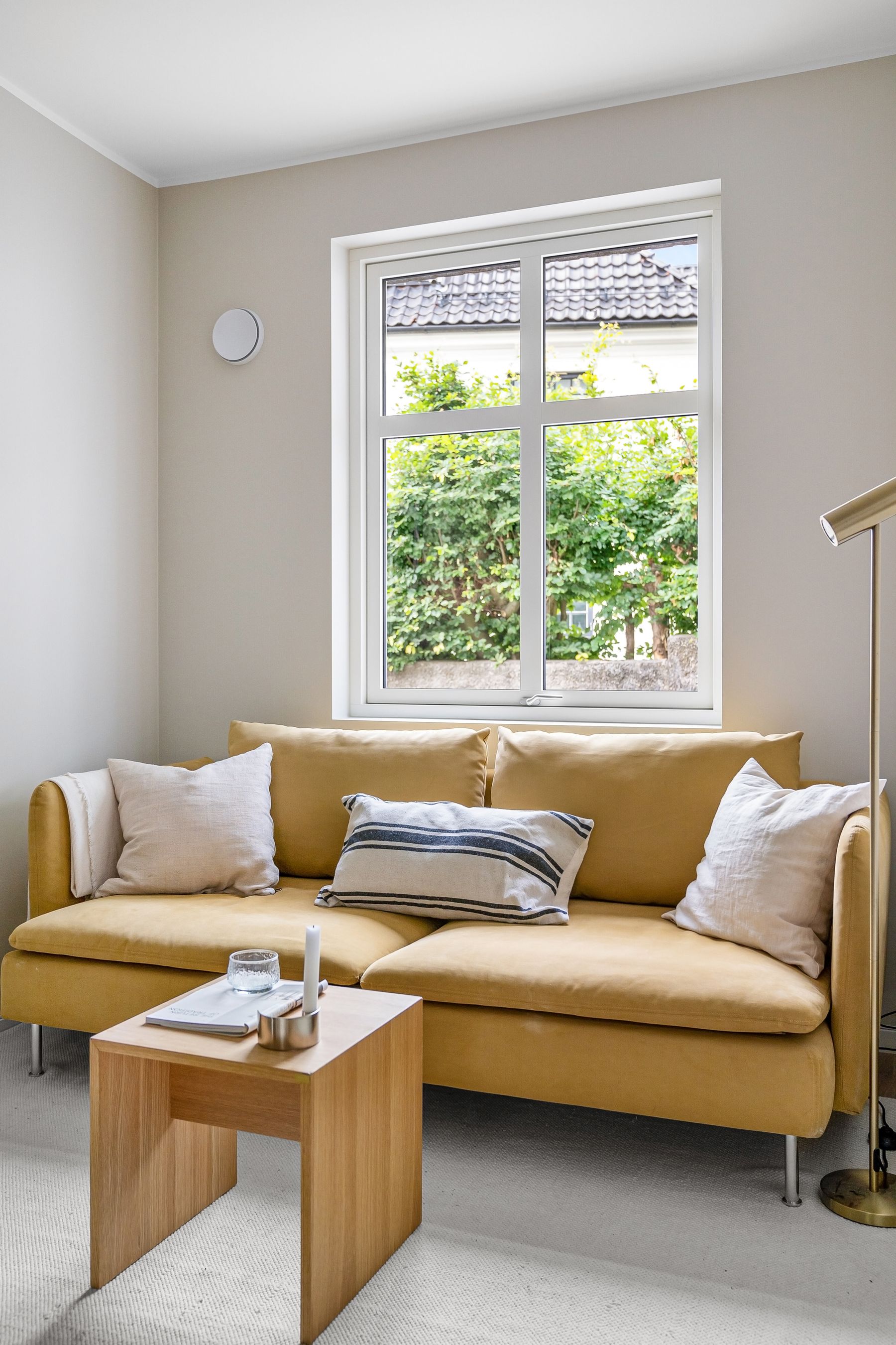
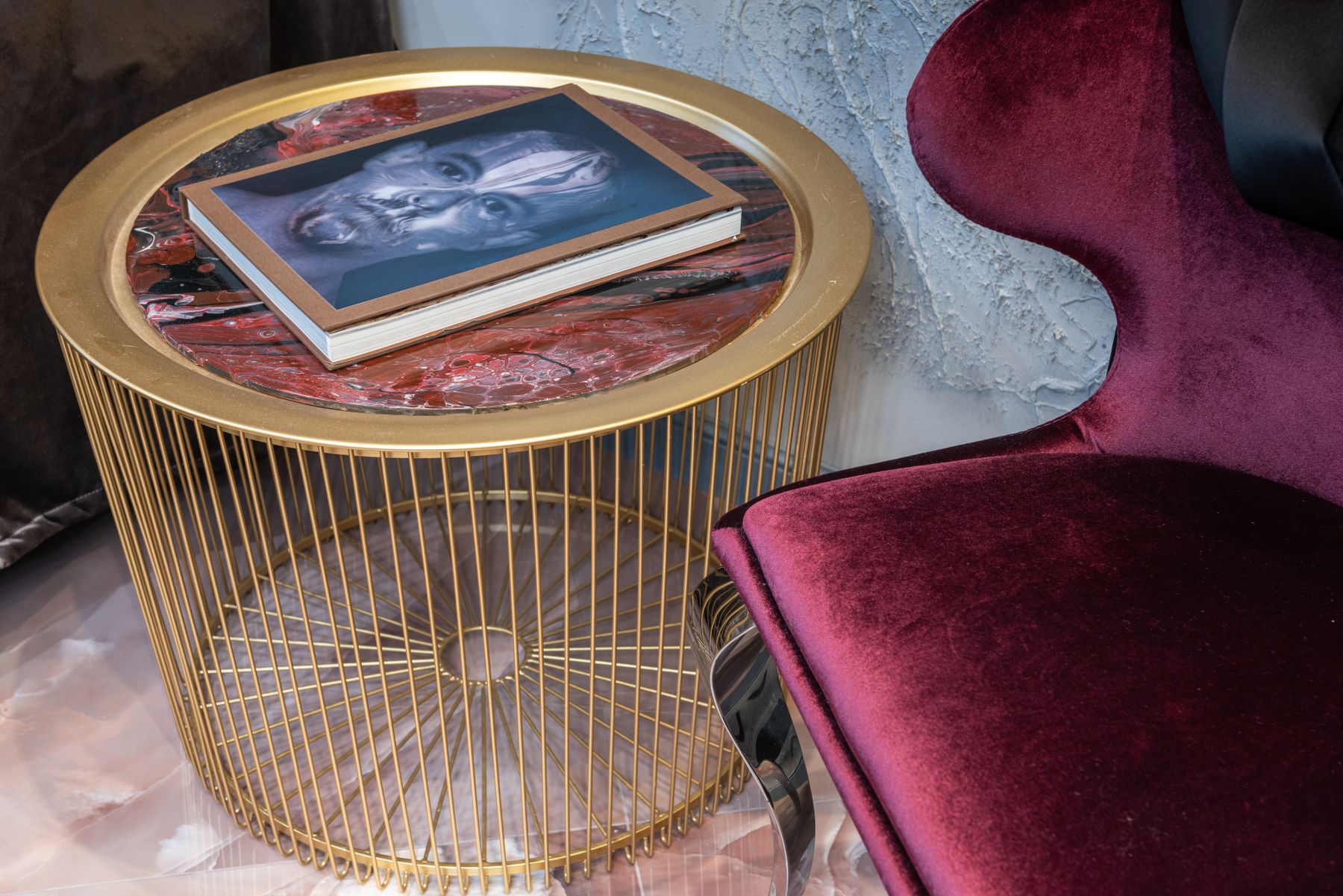
Orange beside a main seat can return warm color onto skin, pale upholstery and white paper. This is most noticeable when a bright wall, curtain or sofa sits close to a face and receives direct light. Tape a large sample where the orange will actually be, then sit in every principal chair during daylight and the evening lamp scene. The question is not whether faces look warmer in theory; it is whether skin, food, books and screens remain natural enough for the room's real uses.
Keep Terracotta Material From Becoming a Theme
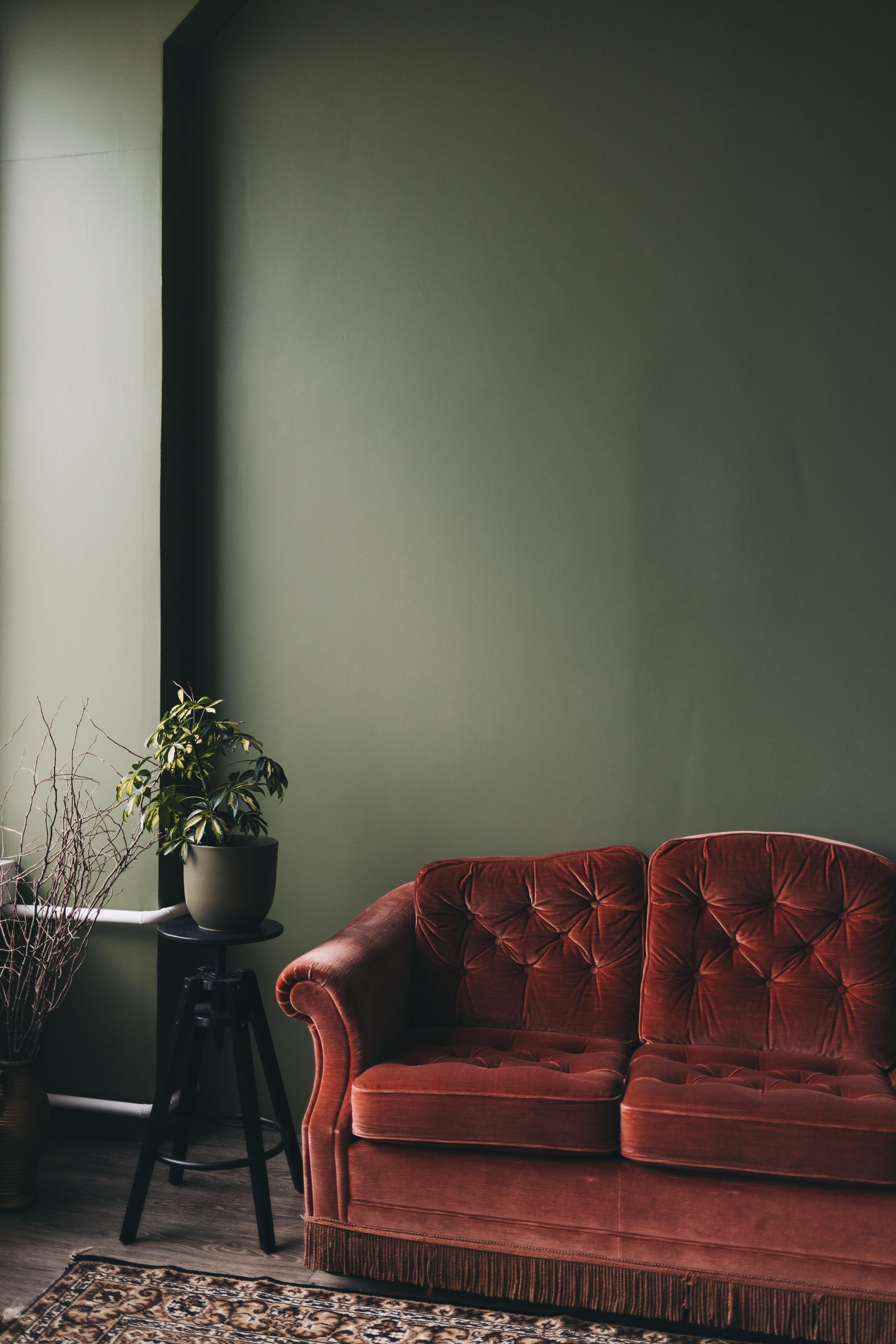
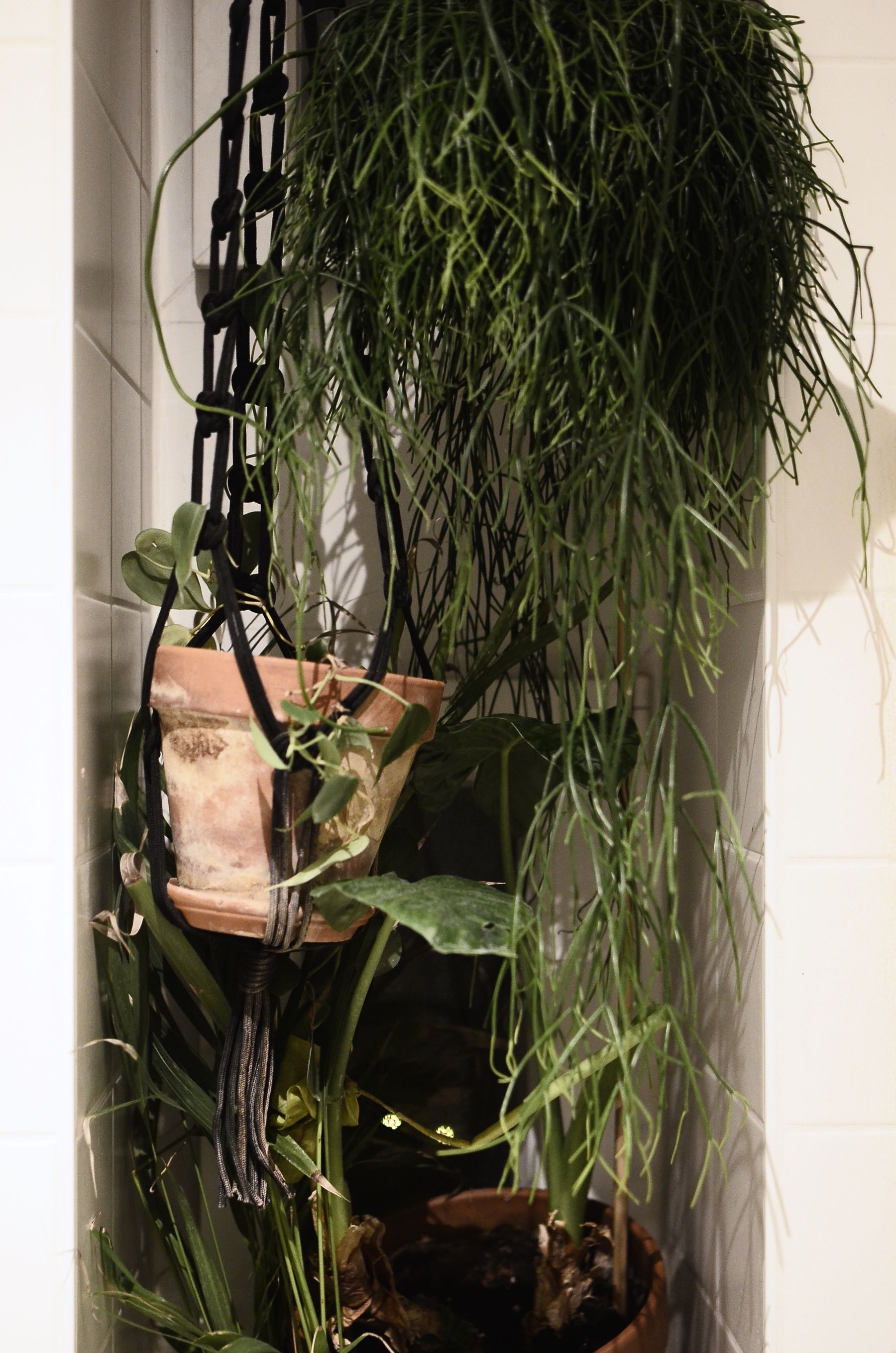
Decide whether terracotta means actual fired clay, lime-compatible earth color, brick, a paint approximation or upholstery. A real tiled floor has joints, temperature, porosity and maintenance requirements; a terracotta-painted wall is a continuous optical field. Let one form lead. Repeating pots, cushions, lampshades and prints in the same clay color turns material logic into a theme. If architecture, solar contrast and regional craft are the main story, [Mediterranean Living Room Ideas](/living-room/mediterranean-living-room-ideas/) offers the fuller route; an orange room can use clay without borrowing an entire regional vocabulary.

Let Burnt-Orange Upholstery Hold a Complete Silhouette
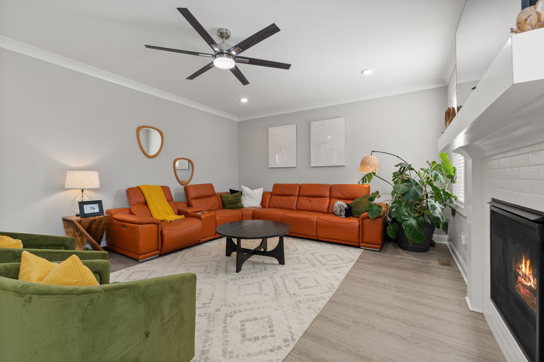
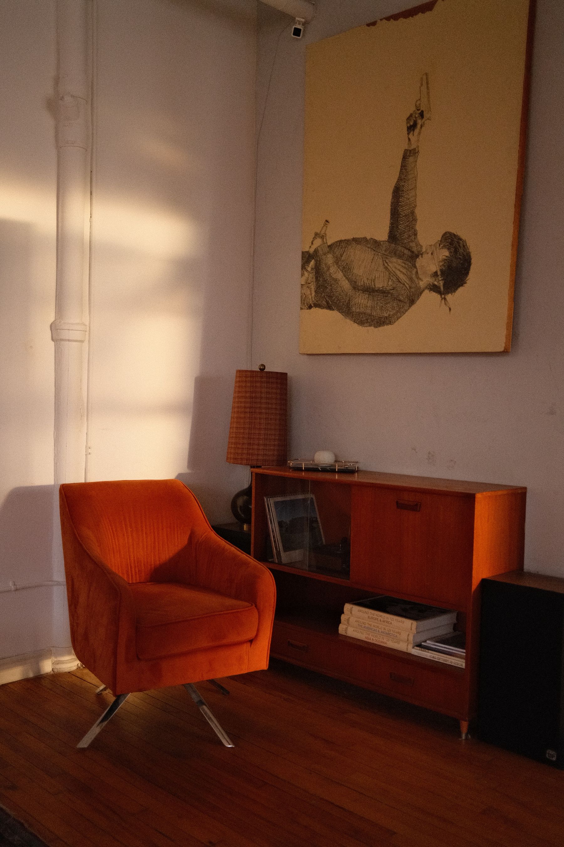
Treat a burnt-orange sofa as a large chromatic object. Preserve its outline with a wall, rug or floor that differs in value, and keep at least one end free from another orange mass. Velvet will shift with nap; leather will return highlights; wool may absorb them. These behaviors affect how large the sofa appears. Avoid using pale cushions to redraw every seat and orange cushions to prove the color is intentional. Choose cushions for posture, then let the sofa's full shape carry the palette.
Separate Orange From Honey and Amber Timber
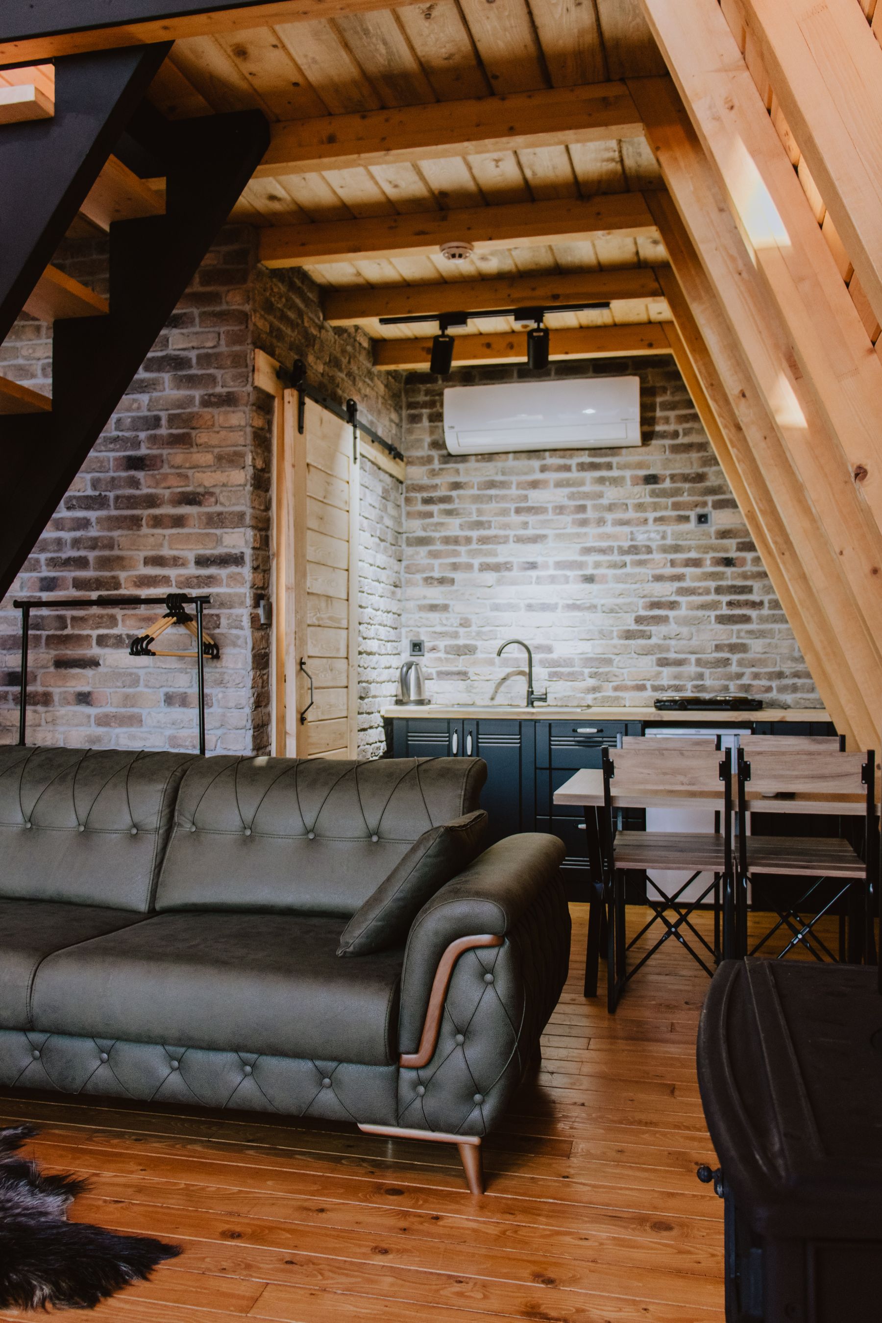
Honey oak, teak and amber-finished pine already contain orange-yellow energy. An orange sofa placed directly on an orange-toned floor, in front of a teak wall or beneath very warm lamps can lose its edges. Create an interval with a pale mineral rug, a dark base, cooler wall color or visible gap. Do not stain all timber darker automatically; first determine whether the collision is caused by value, hue or sheen. [Brown Living Room Ideas](/living-room/brown-living-room-ideas/) provides a broader material hierarchy when several woods and leathers compete.
Audit the Late-West Surge
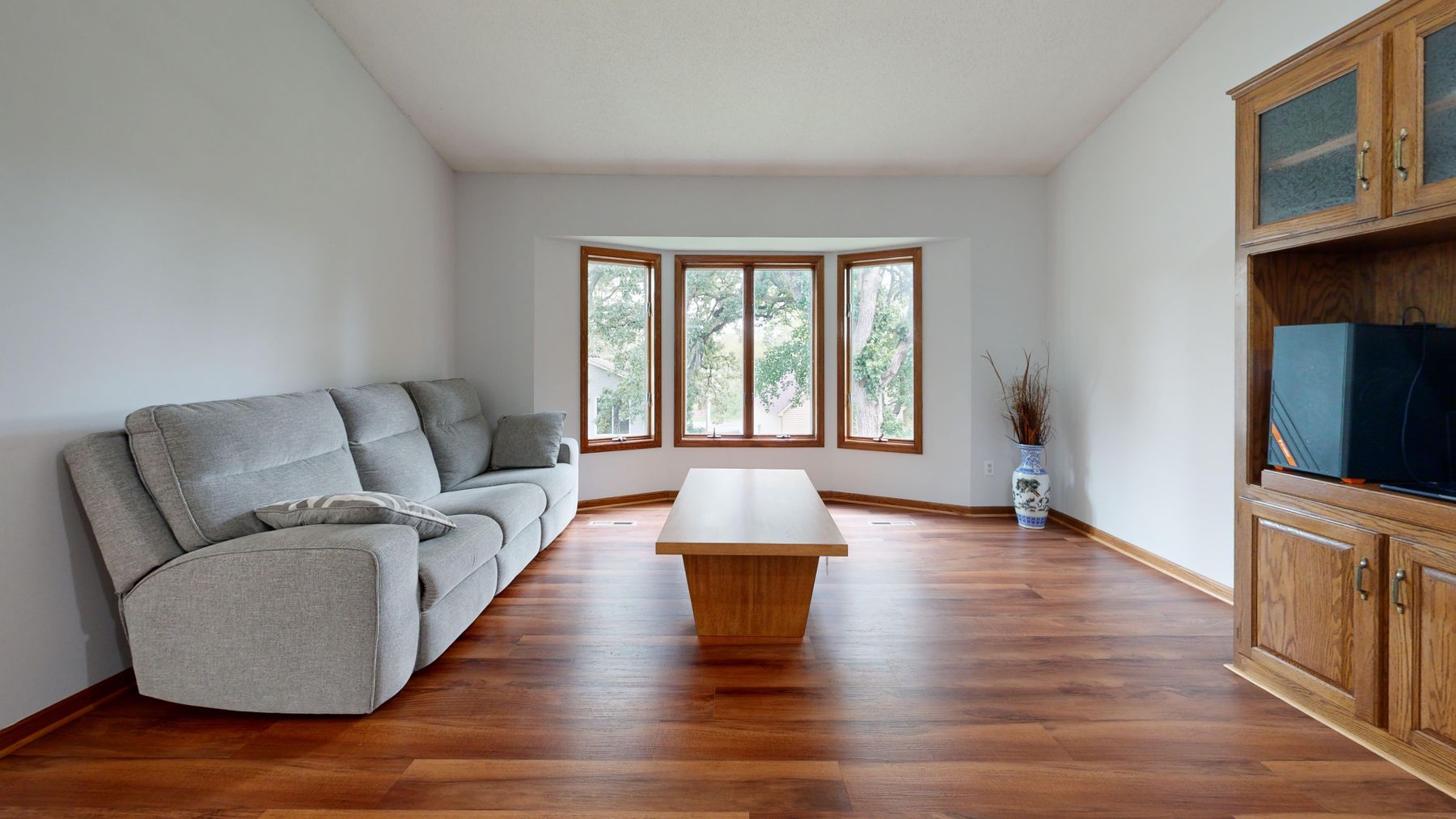
If the room receives late-west sun, inspect orange during the strongest low-angle light rather than judging only at midday. A controlled rust may become vivid red-orange; glossy paint or leather may add a second layer of glare. This does not make orange unsuitable. It may mean placing the brightest carrier away from the sun patch, choosing a greyer direction or using adjustable solar control where comfort requires it. Keep this test distinct from the goal of making a yellow room appear sunnier: orange already carries enough chromatic heat to need restraint at peak exposure.
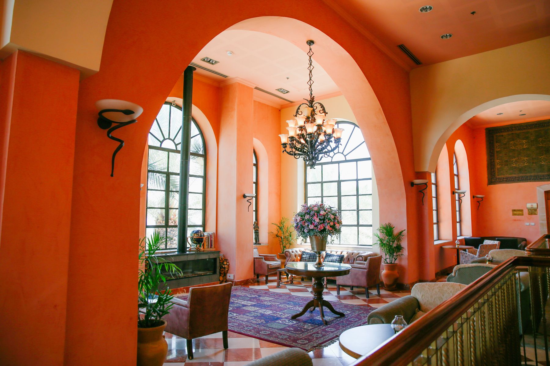
Use Cool Daylight to Reveal Clay
In a room with diffuse or cool daylight, do not automatically choose the loudest orange to compensate. A muted clay, coral-brown or soft rust may become clearer because cool light separates it from timber and cream. Test the wall and largest textile together: an icy white can make rust look dirty, while a mineral off-white or grey plaster can reveal its red and earth components. The useful contrast is not simply warm versus cool; it is whether the orange retains depth without looking fluorescent or lifeless.
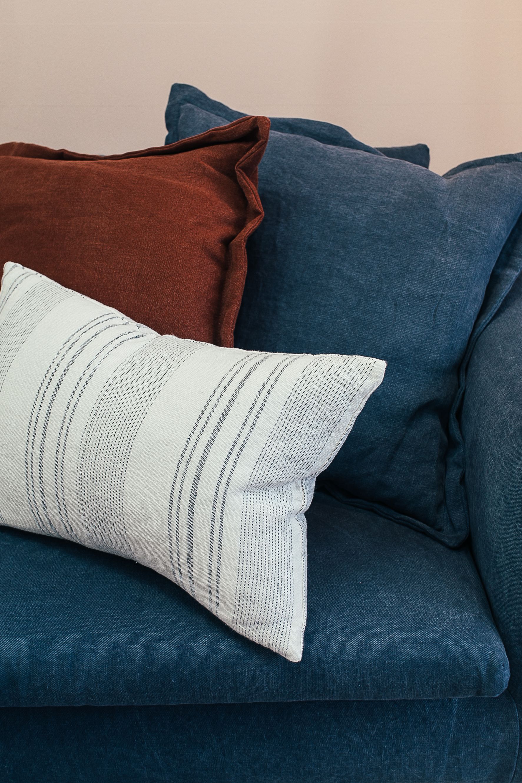
Let Blue Frame Orange, Not Mirror It
Orange and blue can sharpen each other so strongly that equal areas resemble a graphic exercise. Give one hue the larger territory. An orange sofa may need a blue-grey wall, one deep-blue chair or a rug containing a limited blue note; an inky blue room may use a single rust seat as the counter-mass. Adjust value as well as area: dark navy and mid-value orange create a firmer relationship than pale blue and coral. [Blue Living Room Ideas](/living-room/blue-living-room-ideas/) should lead if blue becomes the envelope rather than the supporting field.
Choose Olive or Emerald for Different Reasons
Use olive when orange needs an earth-connected bridge to timber, leather or clay. Use blue-green or emerald when orange needs a cleaner temperature break. The first route can become muddy if every surface is muted; the second can become theatrical if both colors are saturated and equal. Keep the room's plant life separate from the palette decision: leaves vary naturally and should not be treated as a matched set of green accessories. [Green Living Room Ideas](/living-room/green-living-room-ideas/) explores green as the dominant system.
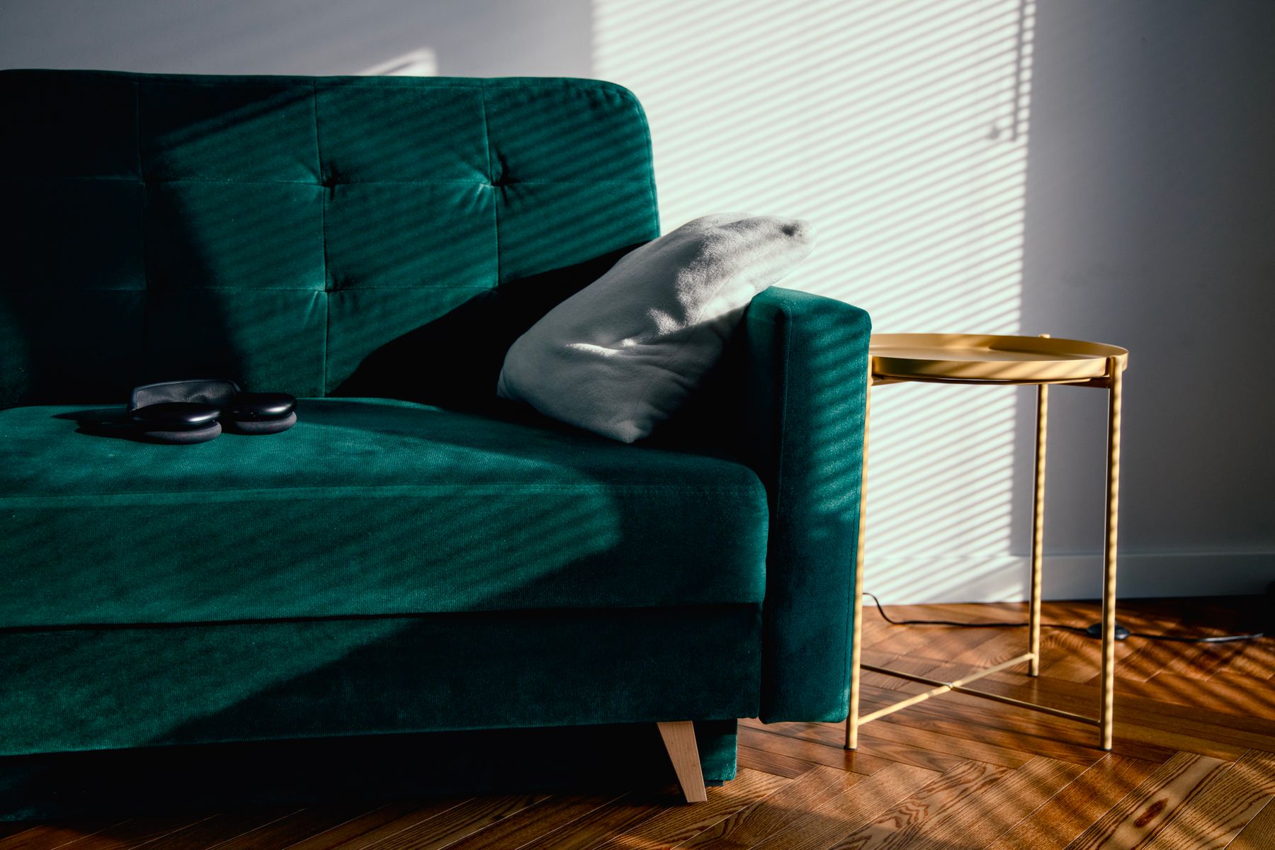
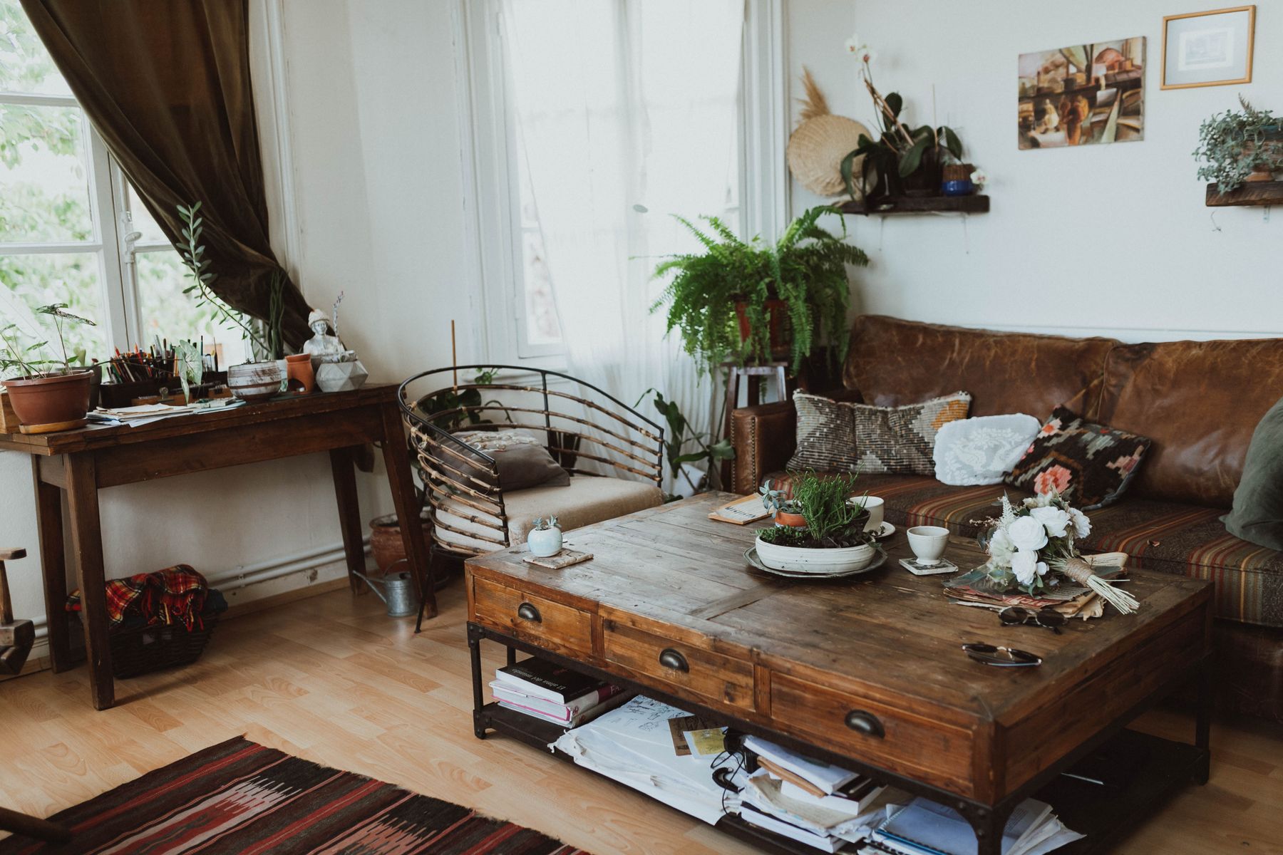
Use Plum to Lower the Visual Temperature
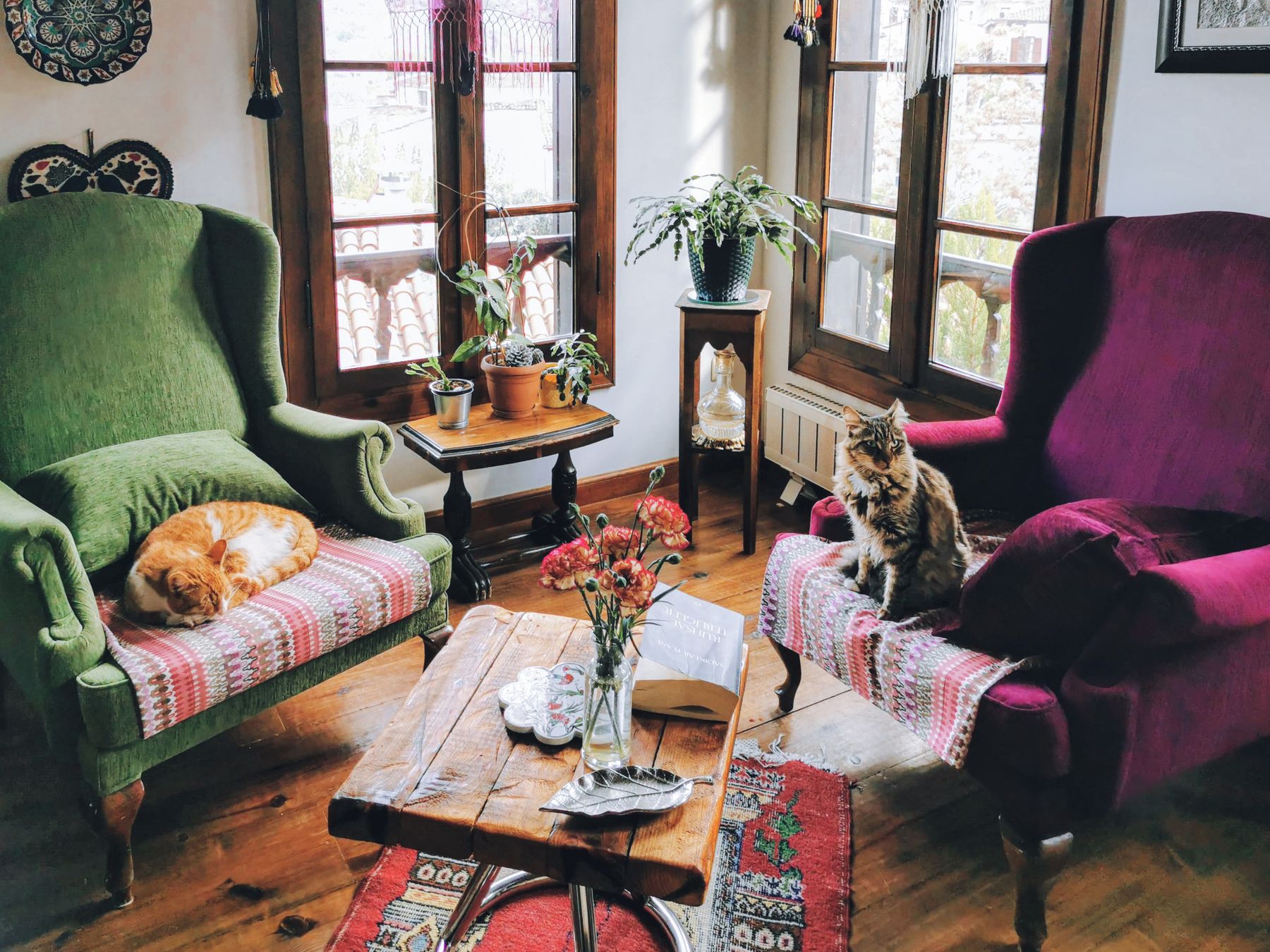
A small plum, aubergine or wine-colored element can pull orange away from citrus and toward a deeper evening palette. This pairing works through shared red content, so separate the colors by value or material: matte plum wool beside orange leather, or a deep purple-brown wall behind a lighter coral chair. Avoid adding burgundy, blush and red in equal doses; too many adjacent hues erase the decision. Plum is most useful when the room needs chromatic depth without another large cool field.
Build an Analogous Route Without Blur
An analogous palette can move from ochre through orange to coral, pink and red, but it needs hierarchy. Choose one leading hue, one bridge and one minor endpoint. Separate neighboring colors with value, pattern scale or material behavior rather than outlining everything in white. A coral wall, rust chair and oxblood detail can work; five equally small warm accents usually read as indecision. This is one place where a patterned textile may be genuinely useful because it shows the transitions in one controlled object.
Give Orange a Mineral Relief Plane
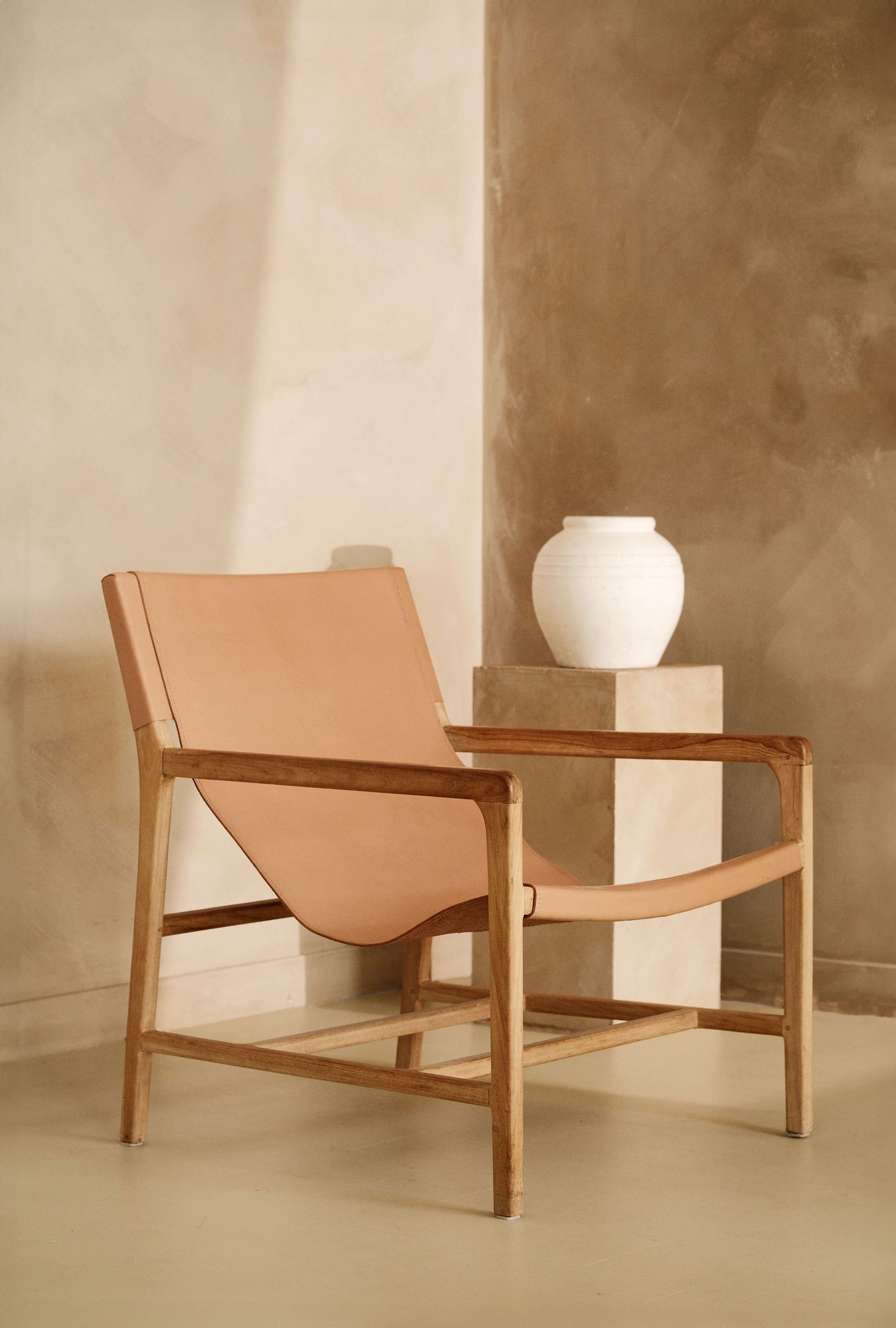
Use one broad mineral-looking plane to give orange somewhere to stop: limestone, limewash, chalky grey, pale travertine or a restrained off-white. The plane should be quiet enough to reveal orange's edge but not so creamy that it joins the amber family. Let its texture remain subtle; aggressive mottling beside strong orange can look distressed or themed. Unlike the 'white witness' needed to judge yellow's apparent brightness, this relief surface is primarily about lowering visual temperature and separating material masses.
Choose the 1970s Reference—or Remove It
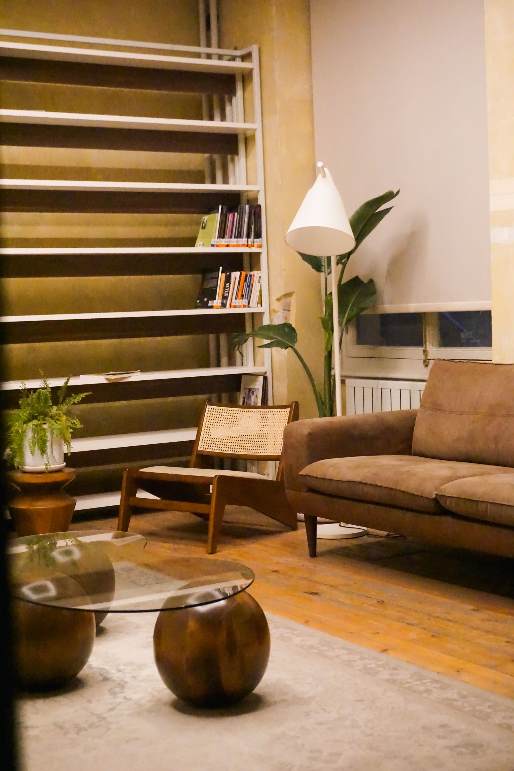
Burnt orange can evoke the 1970s when it appears with smoked glass, chrome, shag texture, dark timber, modular low seating or period pattern. Decide whether that reading supports the room. If yes, choose two or three accurate cues and let the rest of the architecture remain calm. If no, pair orange with a contemporary silhouette, mineral relief and fewer nostalgic materials. [Retro Living Room Ideas](/living-room/retro-living-room-ideas/) begins with a decade route; this guide begins with orange behavior, so the period reference remains optional.
Use Chrome, Smoked Glass or Black as a Temporal Counterpoint
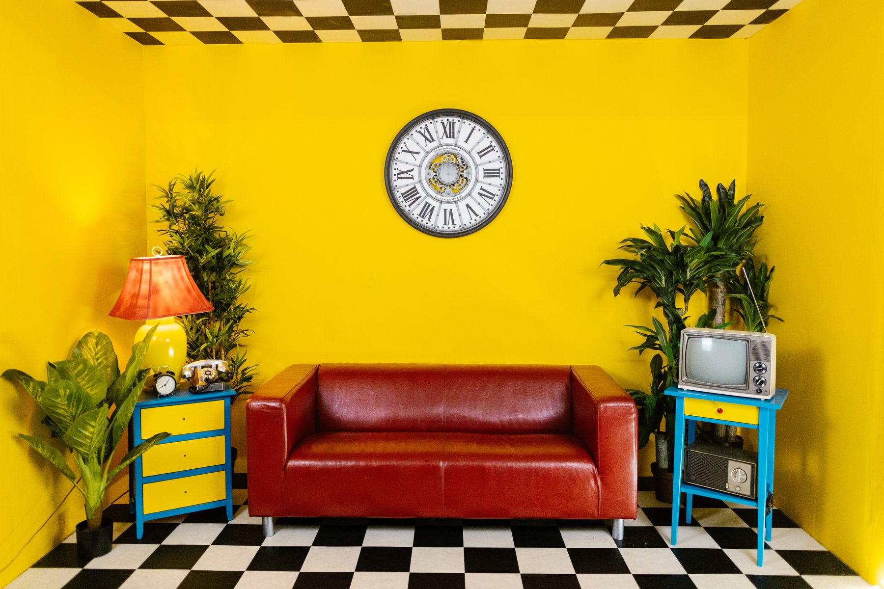
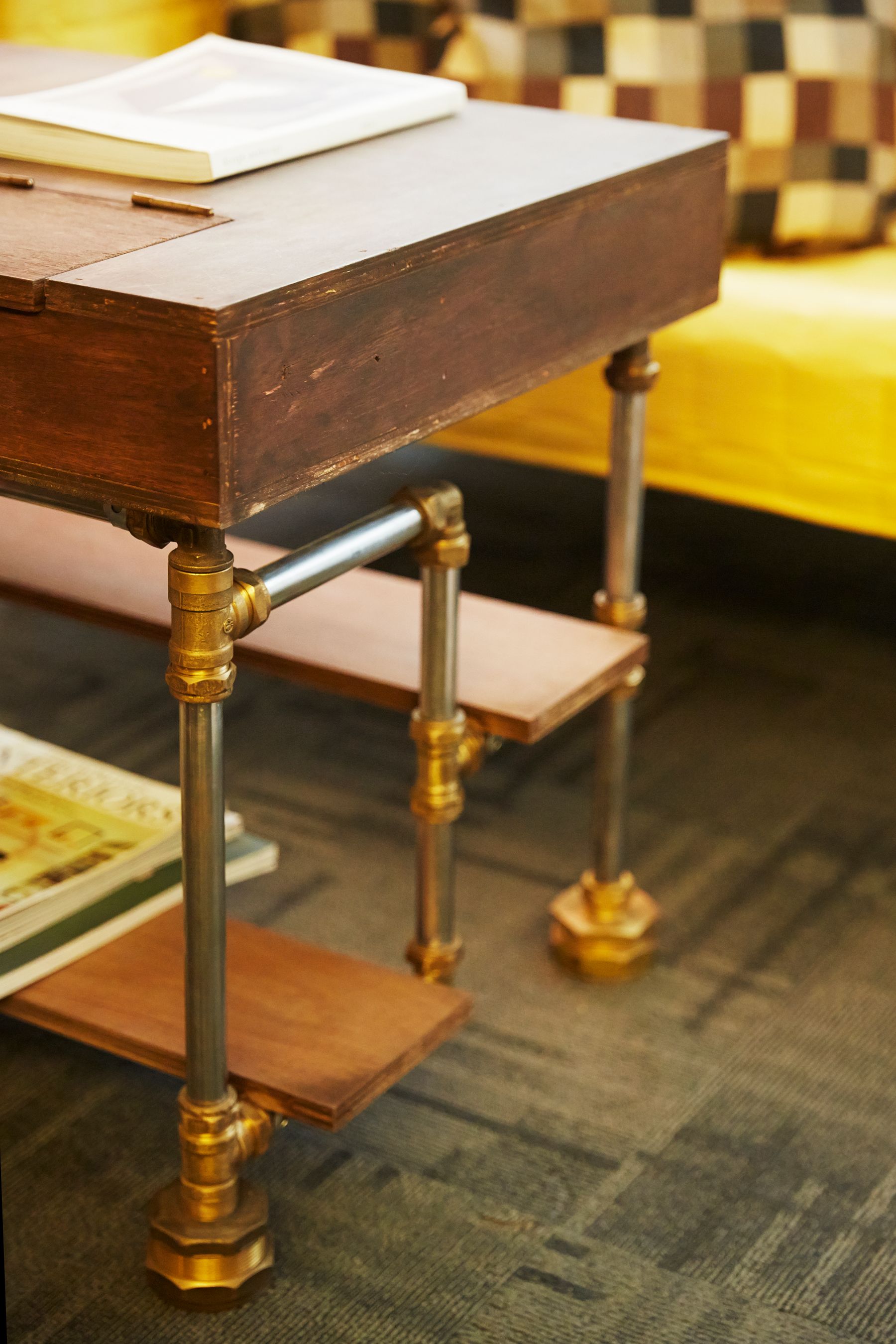
Chrome can pull orange toward a sharper contemporary or space-age direction; smoked glass can reinforce a deliberate 1970s route; blackened metal can contain orange without cooling it much. Brass often increases the room's yellow warmth, so use it only when that amplification is wanted. Choose the counterpoint by historical and temperature effect, then repeat it at two structurally useful points such as a table base and lamp—not across every handle, frame and ornament.
Scale Pattern to Orange's Attention Strength
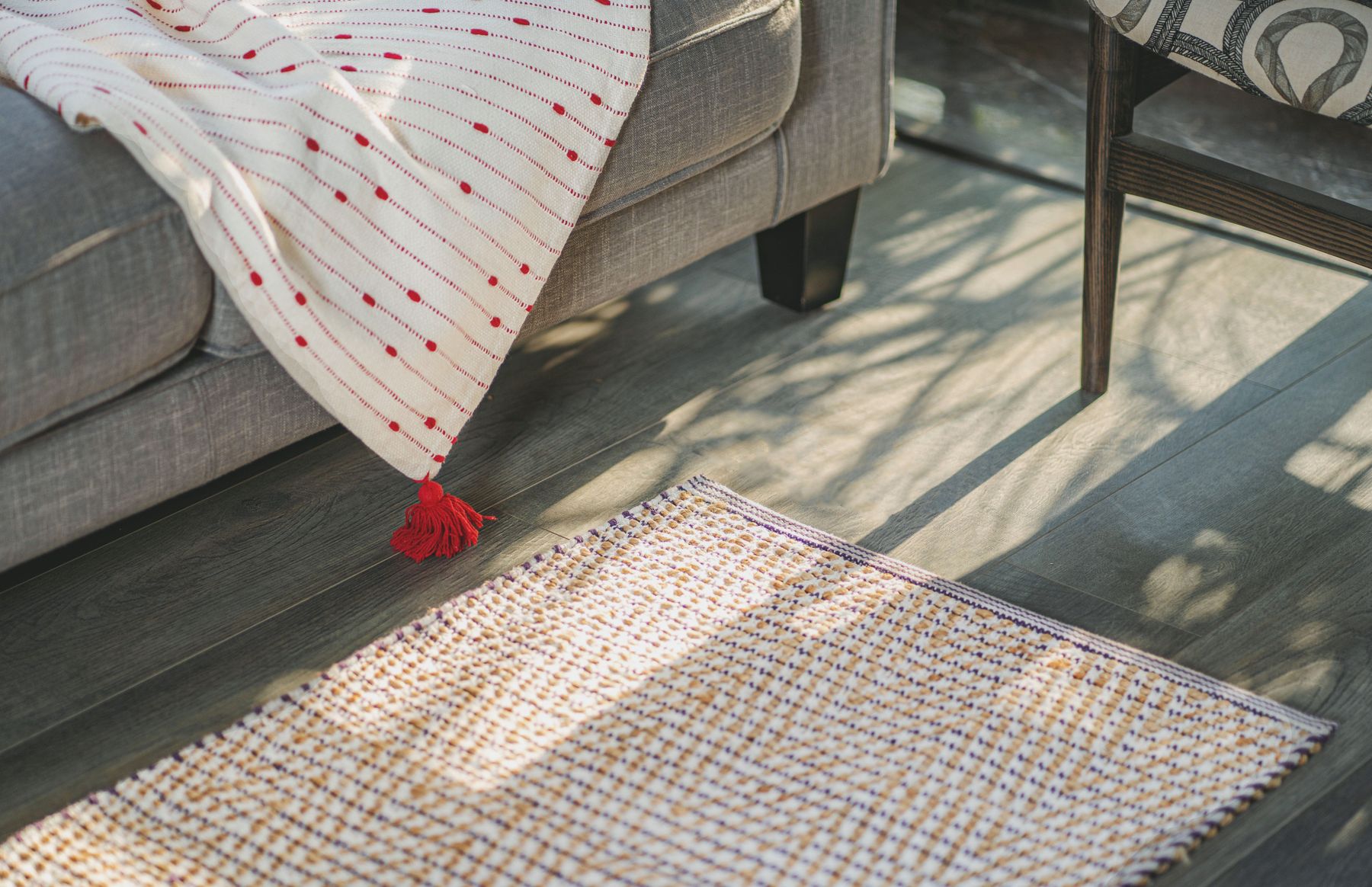
Orange attracts attention quickly, so a small motif may read larger than its actual area. In a patterned rug or curtain, count how often orange repeats and where those repeats land relative to the sofa and sightline. A broad low-contrast rust stripe may be quieter than dozens of tiny bright-orange marks. If the sofa already carries orange, let pattern bridge to blue, plum or mineral tones rather than duplicating its exact hue. [Living Room Rug Ideas](/living-room/living-room-rug-ideas/) resolves placement and size; this decision resolves chromatic frequency.
Stop Orange at the Daylight Change
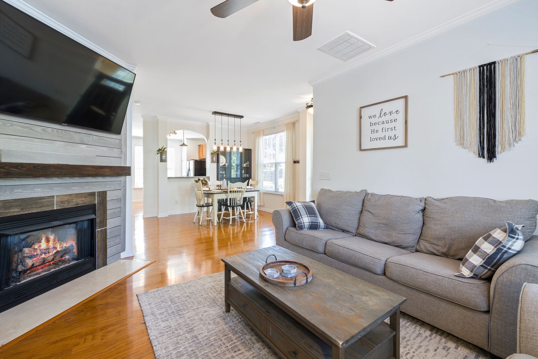
In an open living-dining-kitchen plan, map where daylight direction and intensity change. An orange wall that works in the living zone may become brighter beside kitchen glazing or muddier down a corridor. Stop the field at a return, beam, cabinet end or material joint, then repeat only a smaller note beyond it. Do not graduate orange through peach and beige solely to connect zones; that often creates a sequence of unrelated warm paints. A shared timber or dark line can carry continuity instead.
Plan for Nap, Fade and Porous Marks
Ask how the chosen carrier records light and contact. Velvet nap can create darker and brighter panels; leather can develop contact variation; strongly colored textiles may change with exposure; unsealed clay and porous stone can mark; painted walls show repairs differently according to sheen and batch. Follow the manufacturer or material supplier's cleaning, sealing and light-exposure guidance, retain finish records and test care products discreetly. The objective is not to freeze orange at showroom perfection but to know which changes are acceptable and which indicate damage.
Keep Orange Distinct From Yellow, Brown and Style Themes
[Yellow Living Room Ideas](/living-room/yellow-living-room-ideas/) asks how yellow changes apparent light; [Brown Living Room Ideas](/living-room/brown-living-room-ideas/) begins with material sources and weight. Retro and Mediterranean guides begin with historical or climatic design languages. An orange room instead asks how much orange the eye receives, what direction it leans, what it reflects and which associations the surrounding forms create. If the room only works after adding sun motifs, clay pots or vintage props, return to the carrier and exposure decisions.
Run the No-Props Orange Exposure Audit
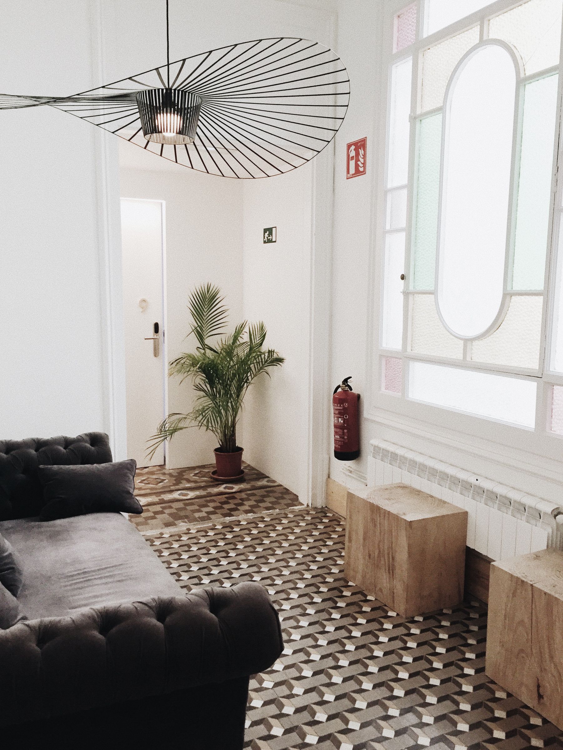
Remove orange cushions, books, flowers, ceramics and seasonal objects from the mental picture. Inspect the entrance, main seat, conversation view, window view and evening route. At each position, identify the orange carrier, its exposure, the relief plane and the nearest color counterpoint. Then check faces, timber collision, west-light amplification and after-dark edges. Reintroduce only objects that improve use, proportion or continuity. A mature orange room does not need a trail of matching evidence; one clear chromatic decision can be enough.