Choose Yellow's Scale: Field, Glow or Flare
Start with a noun, not a paint chip. A **field** is a wall or connected envelope that changes the room's ambient reading. A **glow** is a sofa, curtain span or broad rug large enough to affect the group. A **flare** is one chair, cabinet or artwork-sized event. Pick one. A butter field can hold darker ochre furniture only if one clearly supports the other; three unrelated yellows at three equal scales feel accidental. This decision also determines which surfaces must remain quiet and which photographs or future Pins can show genuinely different ideas.
Treat Yellow as Apparent Light, Not Illumination
Yellow can make a surface look as though light is landing on it, but it does not increase the light available for reading, faces or safe circulation. A dark room painted yellow may become a dark yellow room. Separate the visual effect from the lighting plan: keep measured daylight, useful lamp positions and glare control as functional decisions, then use yellow to shape the mood those sources reveal. [Living Room Lighting Ideas](/living-room/living-room-lighting-ideas/) covers the general layers; here the test is whether the yellow surface still has readable edges when the room is at its lowest normal light level.
Map Where Sun Actually Lands
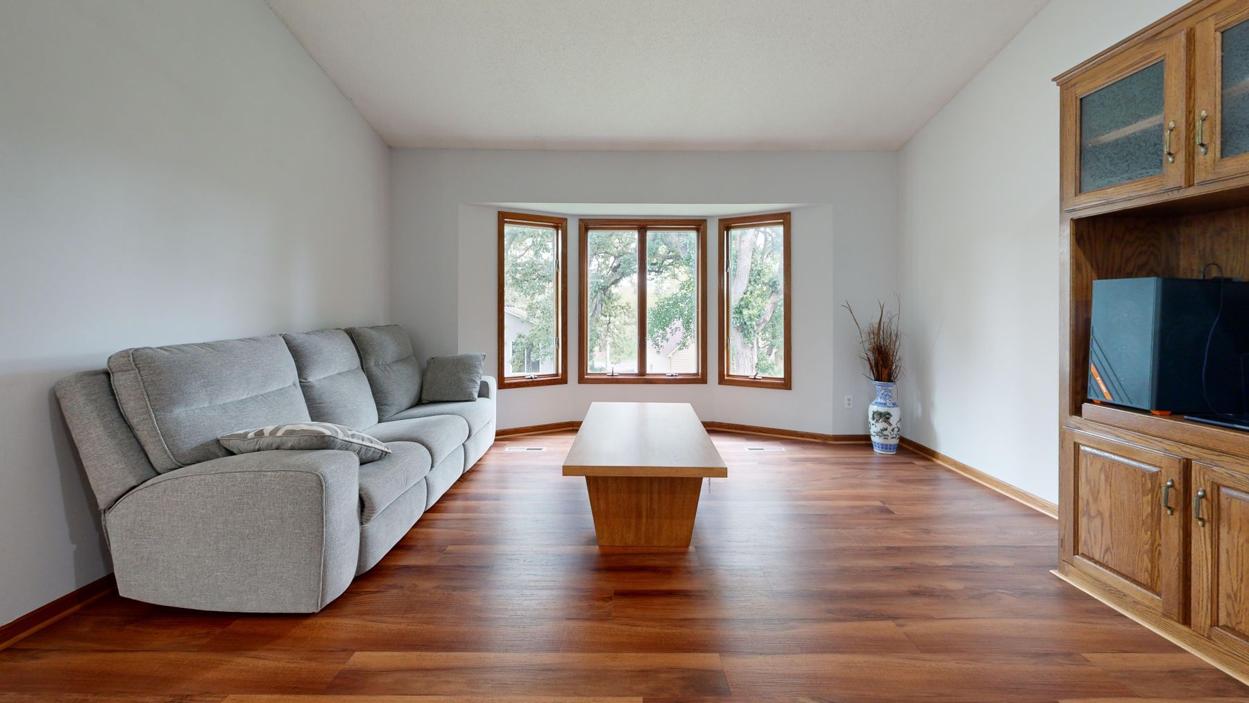
Mark the direct-sun patch at morning, midday and late afternoon on an ordinary bright day. A wall that receives sun may make butter almost disappear at noon and flare gold later; a sofa placed in that patch can bleach visually while the same fabric looks olive in shade. The most stable place for a yellow field is not automatically the brightest wall—it is the surface whose changing light produces a range you actually like. Photograph the sample from the principal seat, not only square-on beside the window.
Warm North-Facing Light Without Forcing Sunshine
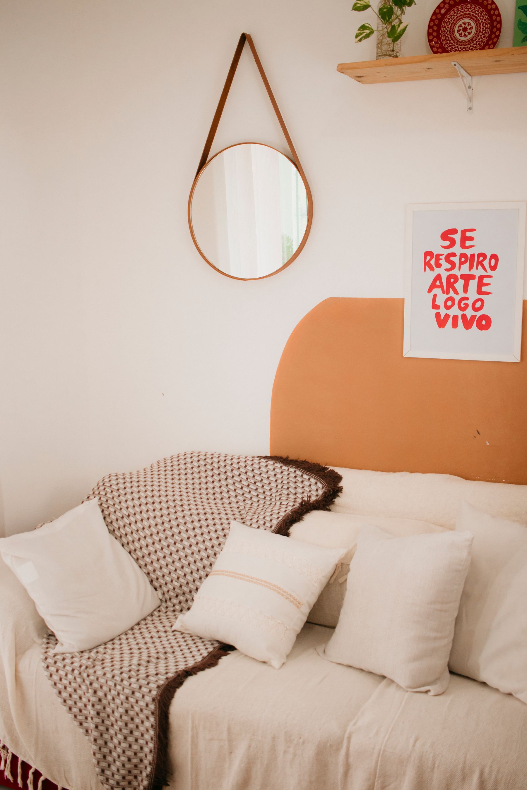
North-facing rooms receive cooler, more consistent light. A softened yellow can counter that cast, but very pale green-biased yellows may turn chalky or slightly sour, while a brown ochre can become heavy. Test cream-yellow, muted butter and a warmer straw at floor level, beside the window reveal and in the deepest corner. The goal is not to imitate southern sun; it is to find a yellow whose quietest version still looks deliberate.
Control the Amber Surge in South and West Light
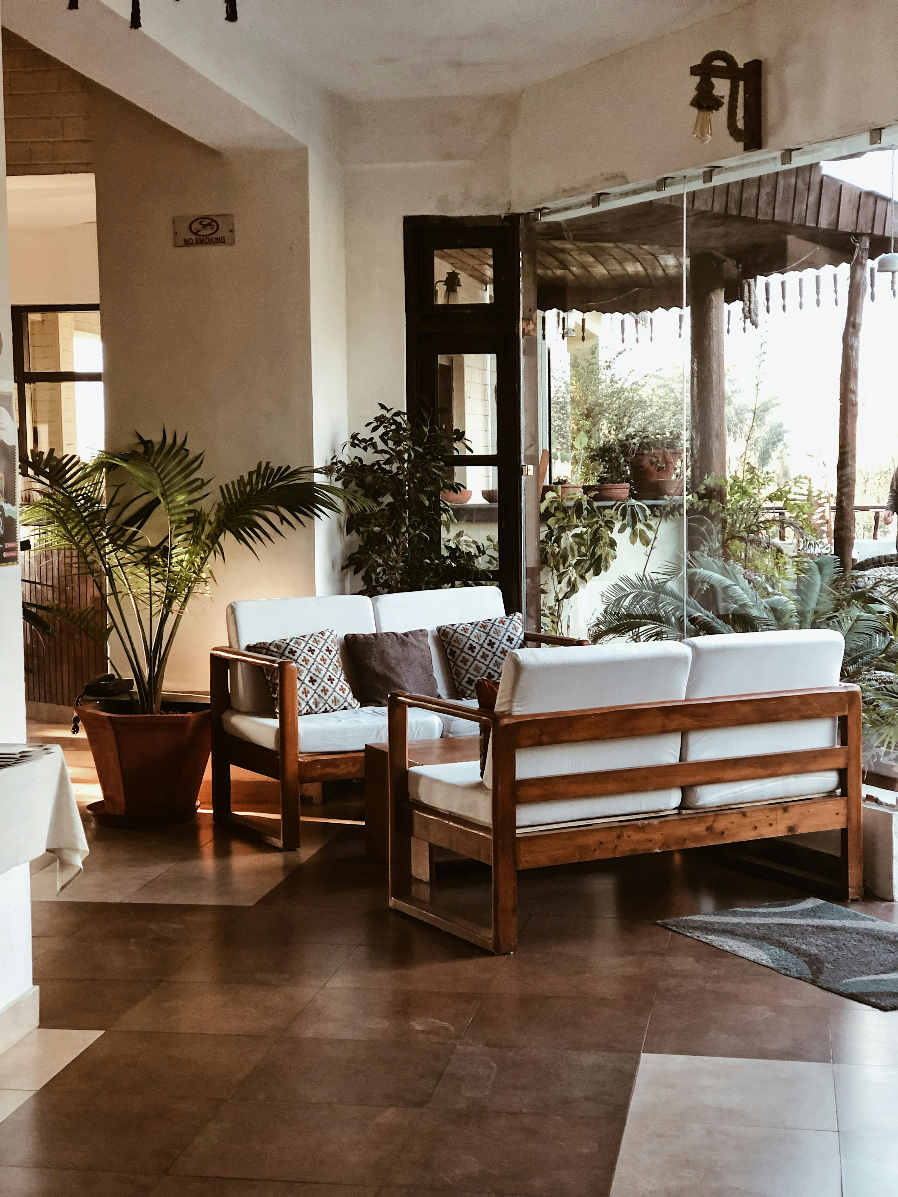
In strong southern or late western sun, yellow can become much warmer and more saturated than the sample looked in the morning. Butter may bleach near-white at peak light, while ochre can surge orange as the sun lowers. Use slightly muted color, keep a cool or dark comparison visible, and test at the hottest hour rather than choosing under soft morning light. Curtains affect this too: cream sheers can add another warm filter before the wall color is even considered.
Reserve Enough Dark Structure for Yellow
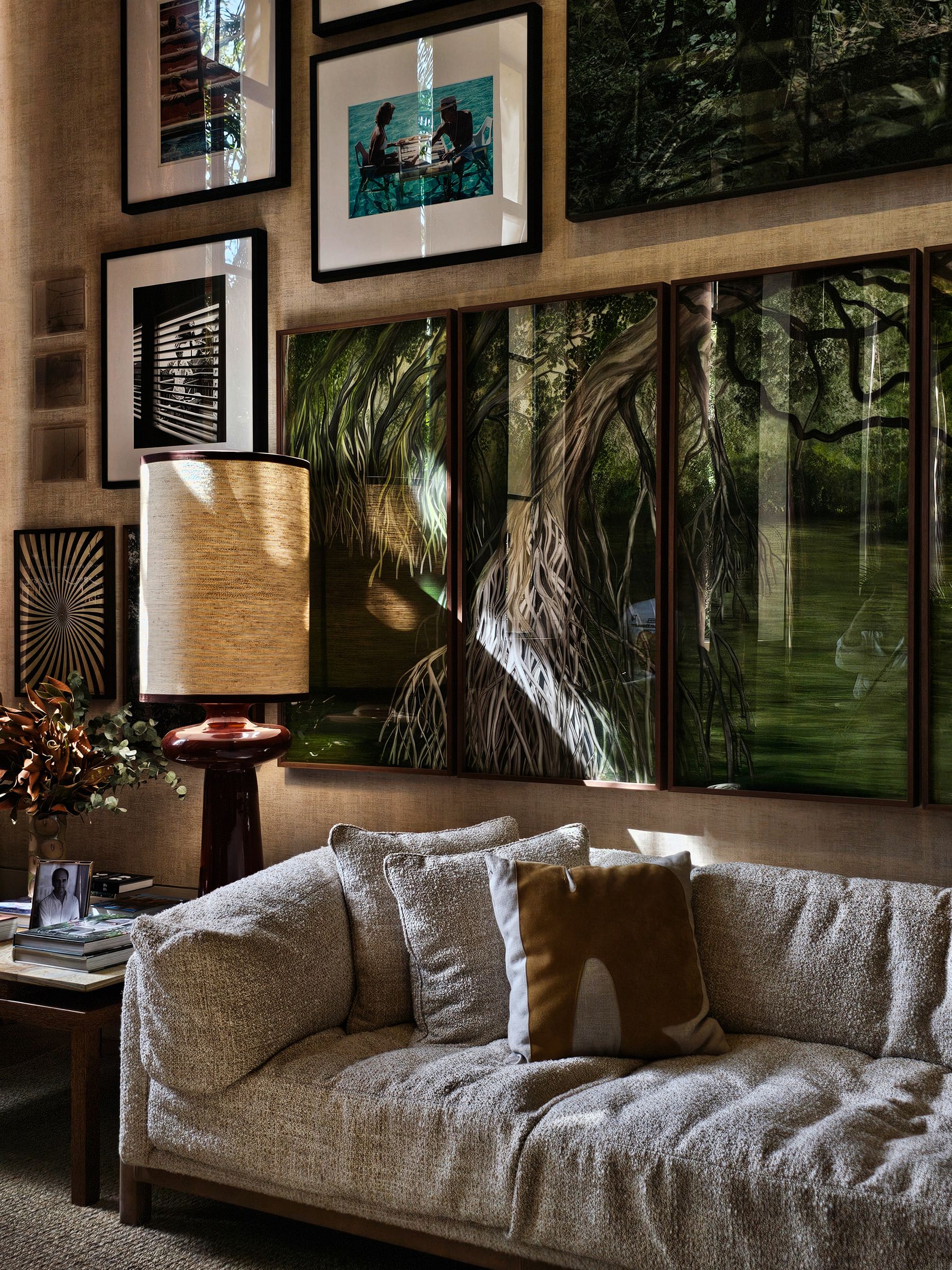
A successful yellow room still contains greyed corners, object shadows and dark joints. If wall, curtains, rug, timber and lamp light are all similarly warm and light, the eye loses depth even though the palette feels cheerful. Preserve at least one continuous shadow structure: a dark skirting line, walnut table, charcoal hearth, deep sofa base or pronounced architectural reveal. Yellow should make shadow legible, not erase it.

Give Butter Yellow a Medium or Dark Counterweight
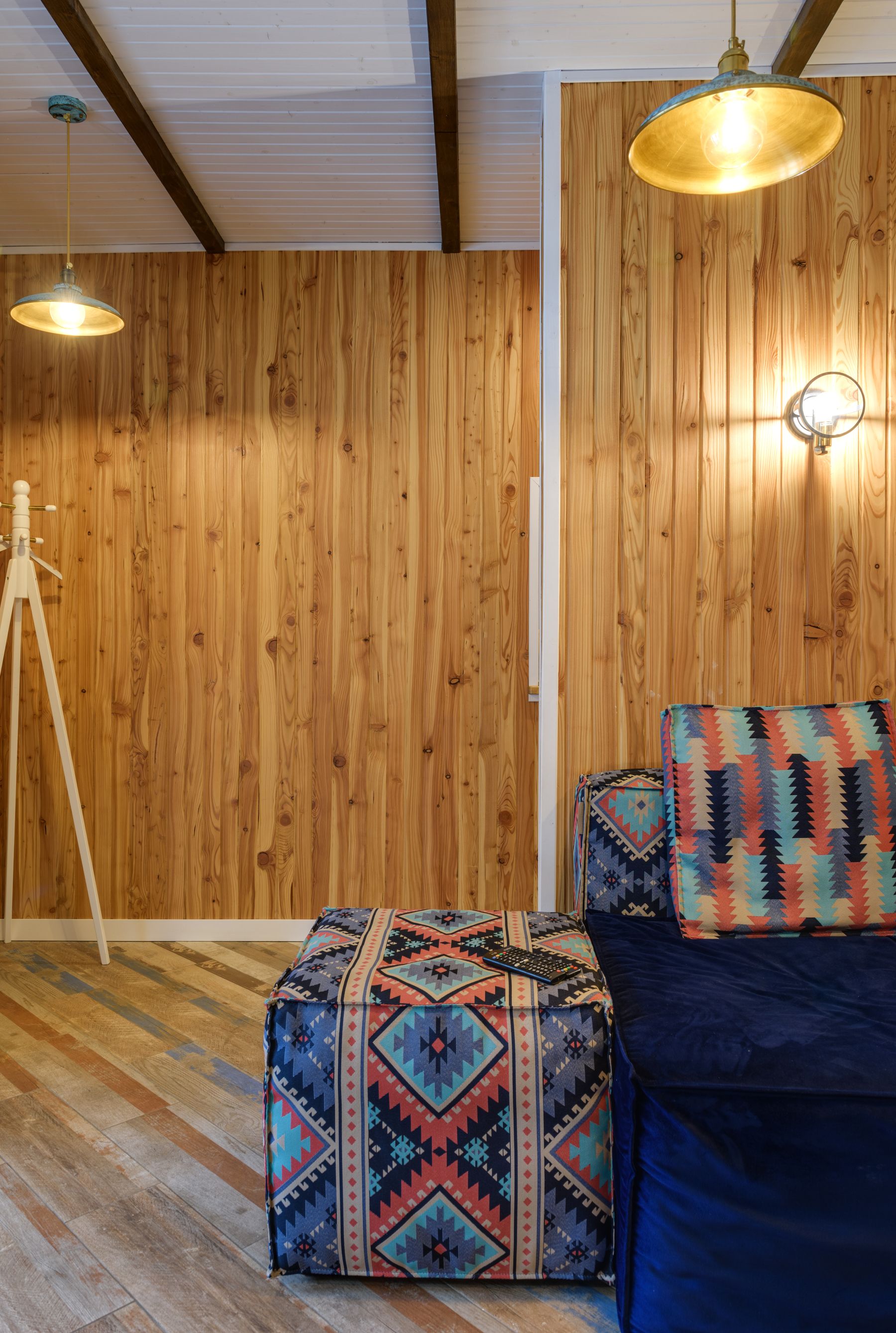
Butter yellow works like painted light, which is why an all-pale room can become vague. Counter it with one medium or dark volume rather than peppering the scheme with black lines: a walnut table, blue sofa, charcoal rug edge or deep plum chair. Keep the counterweight connected to use and scale. The point is not contrast for its own sake; it is to let the pale yellow register as a chosen field rather than an off-white mistake.
Let Ochre Belong to Material Mass
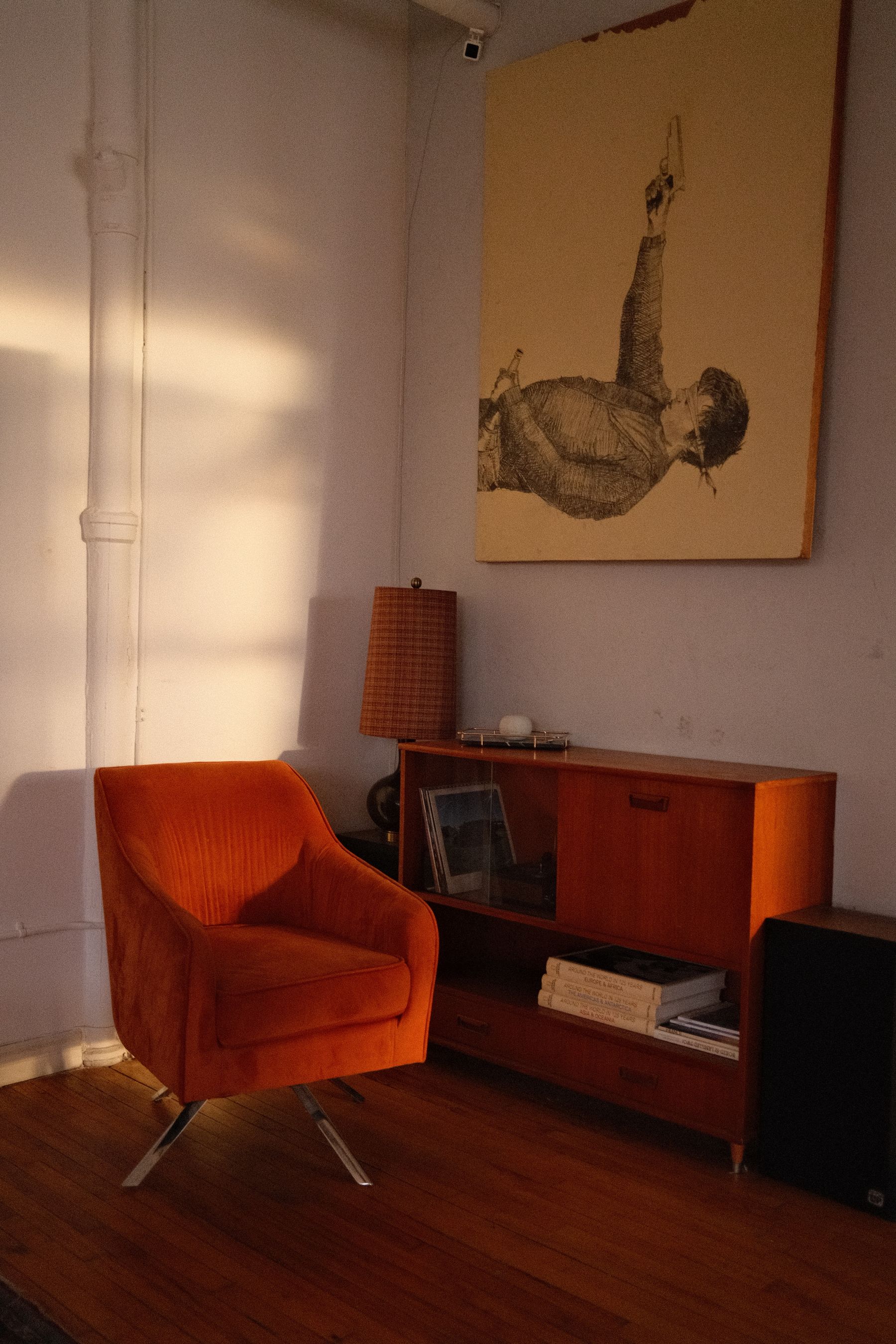
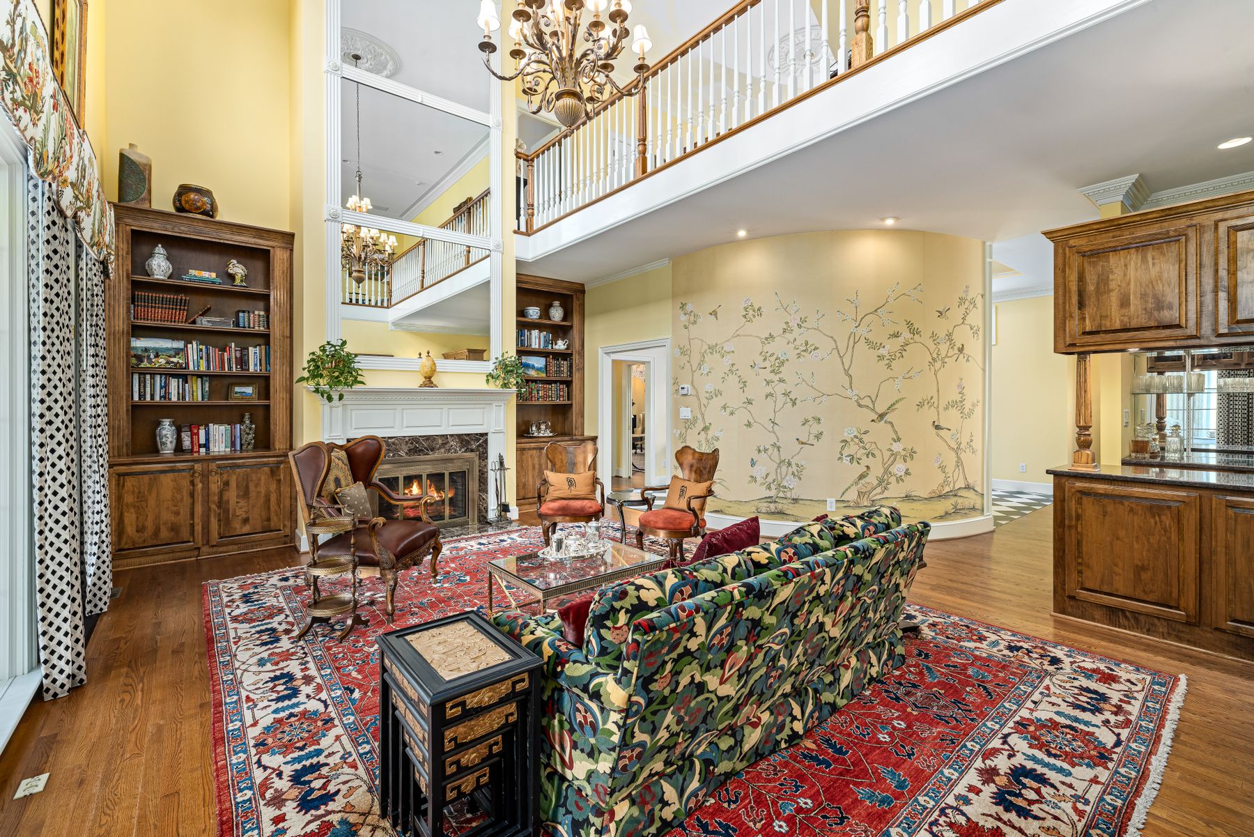
Ochre and mustard contain enough brown to read as material color rather than pure signal. They are especially convincing in velvet, wool, leather-like upholstery, a dense rug or a full curtain span where pile and folds create darker internal shades. A tiny ochre vase rarely has that authority. If walls are already yellow, use ochre only when its value is decisively deeper; otherwise the room can look stained rather than layered.
Use Clear Yellow as One Graphic Event
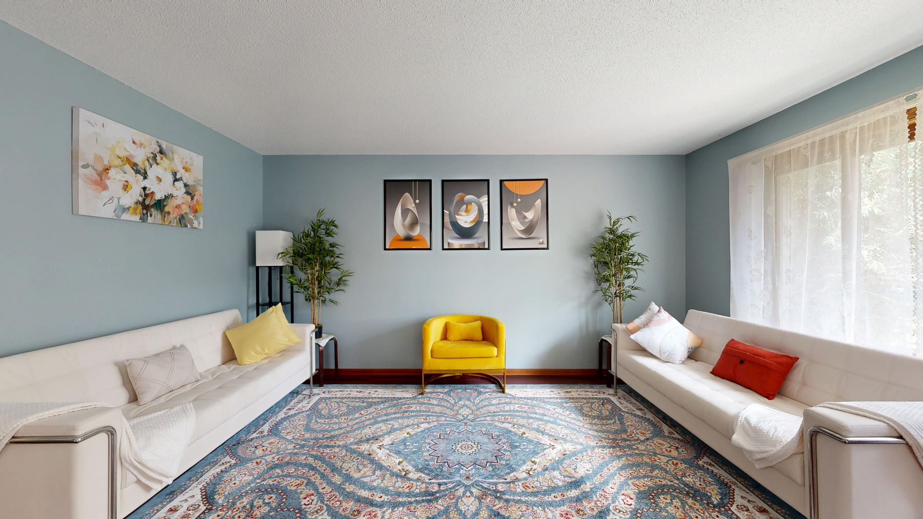
Canary, sunflower and acid yellow announce themselves faster than butter or ochre. Use that speed: one lacquered cabinet, chair, lamp body or bounded artwork-sized plane can organize the view from the entrance. Repeating it in cushions, books, flowers and candles weakens the first event and creates a trail of visual instructions. Let the clear yellow occur once, then support it with quieter values rather than exact color matches.
Make a Yellow Sofa Glow or Anchor—Not Both
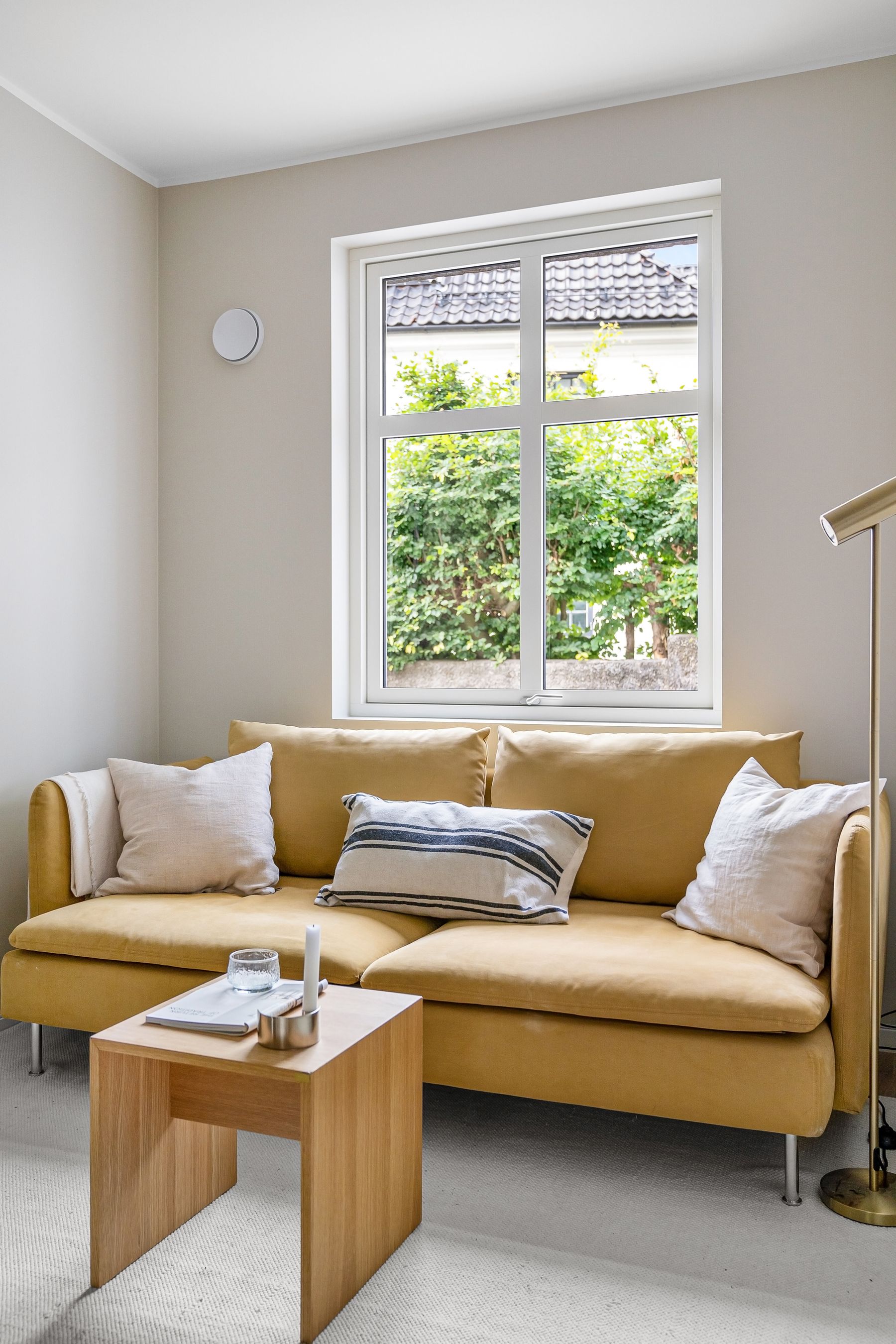
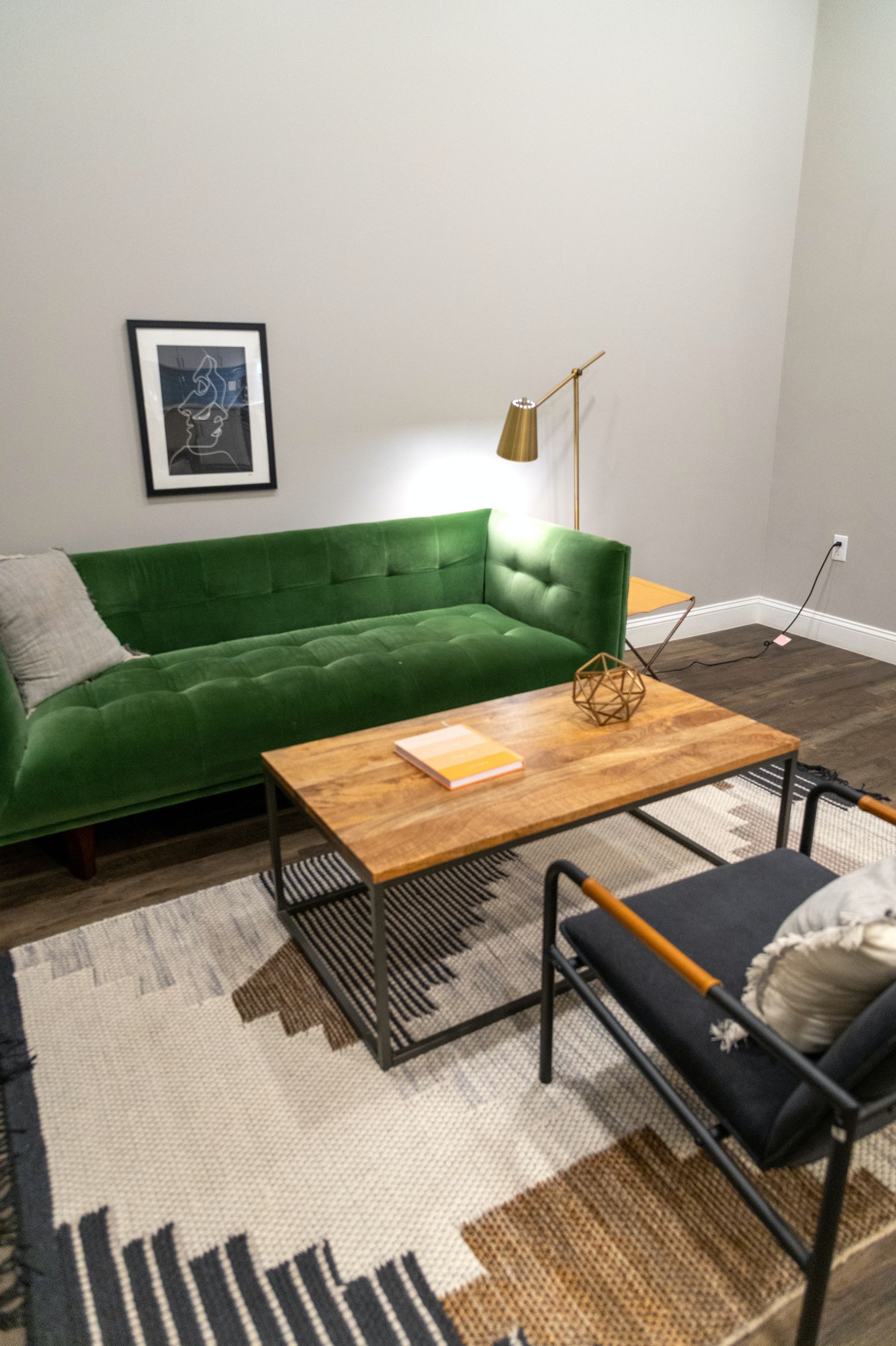
A yellow sofa is often the room's largest luminous object. A pale or clear yellow sofa can **glow** against a darker wall and floor; a mustard or ochre sofa can **anchor** a pale envelope. Do not ask it to do both by surrounding it with equally light walls and then loading it with dark cushions. Give its feet a readable relationship to the rug, keep the central table from repeating the same yellow-brown value, and judge the silhouette from the opposite seat.
Check Yellow Beside Faces
A large yellow wall, curtain or sofa can bounce warm color onto skin, especially when the surface sits directly opposite the window or main lamp. This may feel flattering at low intensity and strangely jaundiced when saturated. Sit two people in the normal conversation positions and compare the effect at noon and evening. If every face is strongly tinted, move the yellow behind the observers, reduce its saturation or interrupt the reflective field with a quieter surface.
Avoid the Accidental Playroom Effect
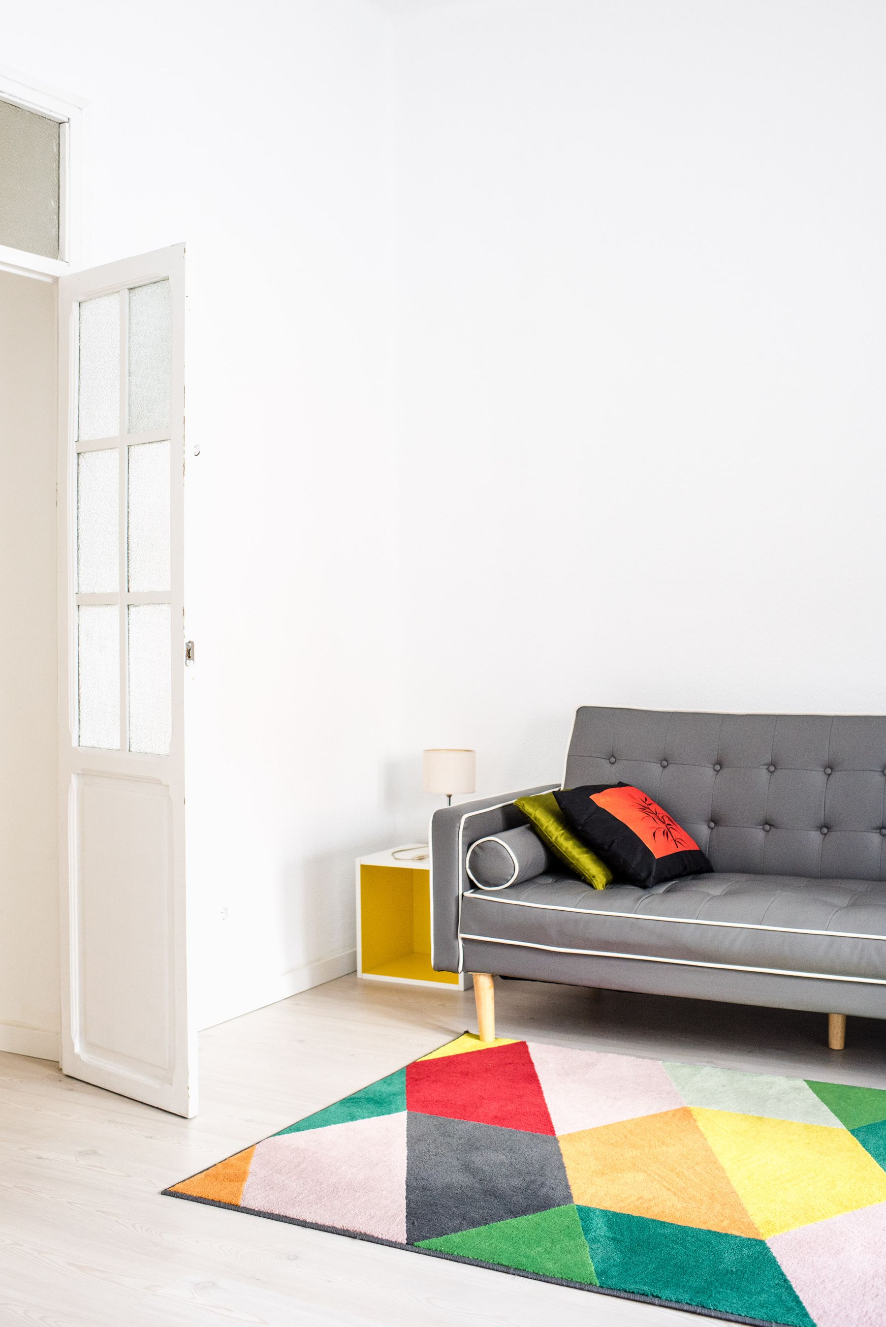
Yellow does not become childish because it is bright. The playroom effect usually appears when clean yellow, red and blue occupy equal areas, motifs are small and repeated, and every object has a rounded novelty shape. Keep one primary color dominant, mute or deepen the others, and put pattern into a substantial rug or textile rather than a scatter of themed accessories. A room can be energetic and still have hierarchy.
Pair Yellow and Blue With Unequal Power
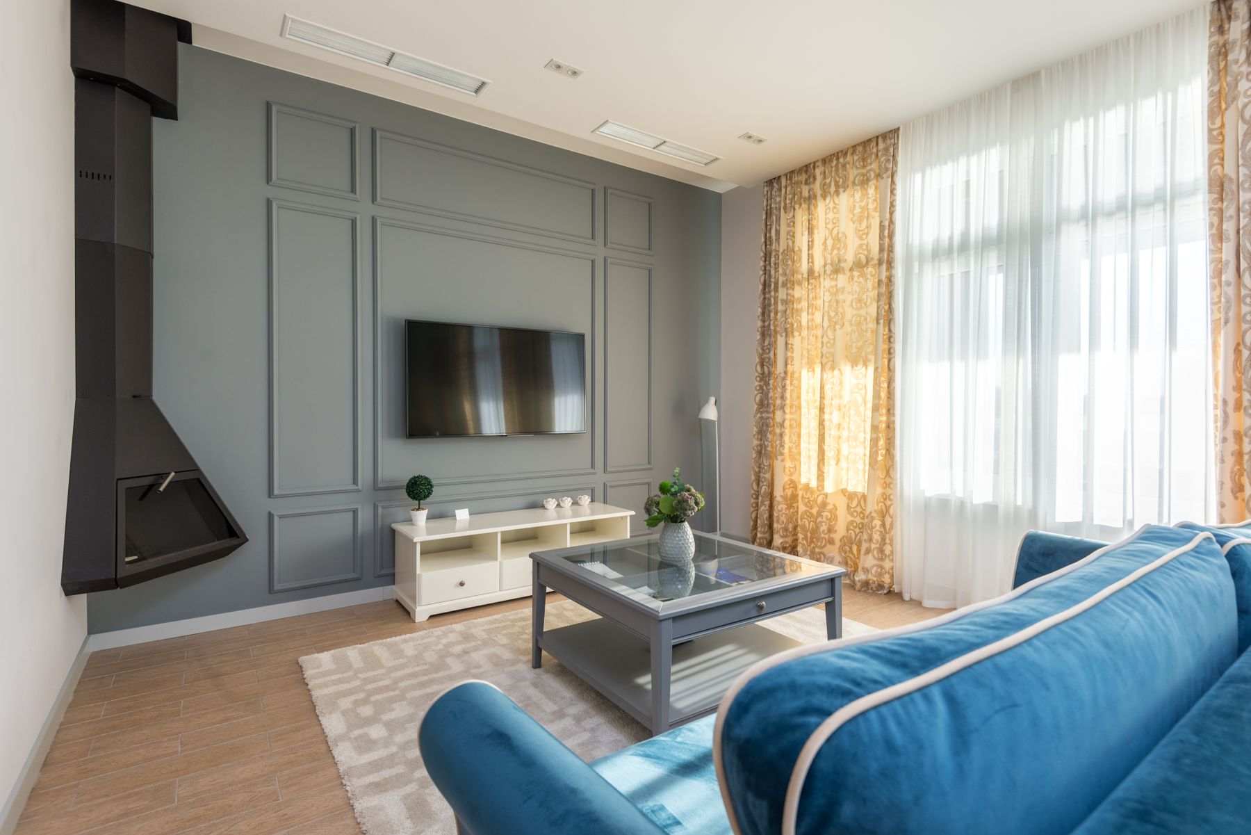
Blue and yellow intensify one another, so equal areas at equal saturation can become visually argumentative. Choose a hierarchy: butter walls with one deep blue sofa; navy walls with an ochre chair; or a pale blue envelope with one clear yellow event. Let value do part of the work. [Blue Living Room Ideas](/living-room/blue-living-room-ideas/) develops blue's spatial behavior; in a yellow-led room, blue is the cool counterweight rather than a second headline.
Use Plum or Violet to Slow Yellow Down
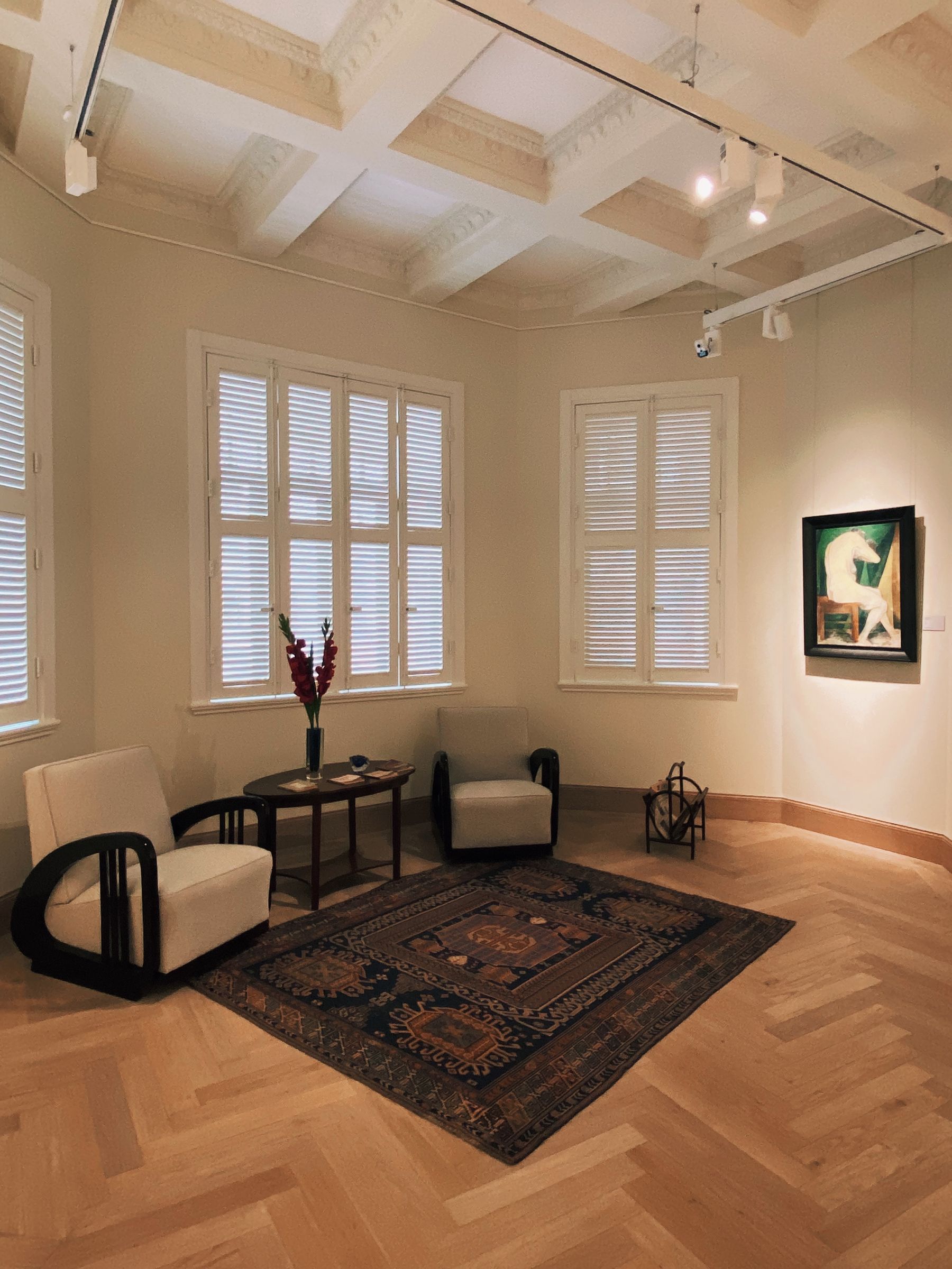
Violet is yellow's direct complementary family, which makes the pair vivid even in modest amounts. Plum, aubergine and dusty lilac slow the contrast by adding darkness, grey or red. Use the quieter color over the larger area and the stronger one as a bounded material. A pale lilac sofa against bright yellow walls can vibrate; an aubergine chair on muted straw walls usually has enough value separation to settle.
Keep Yellow and Green From Drifting Into Chartreuse
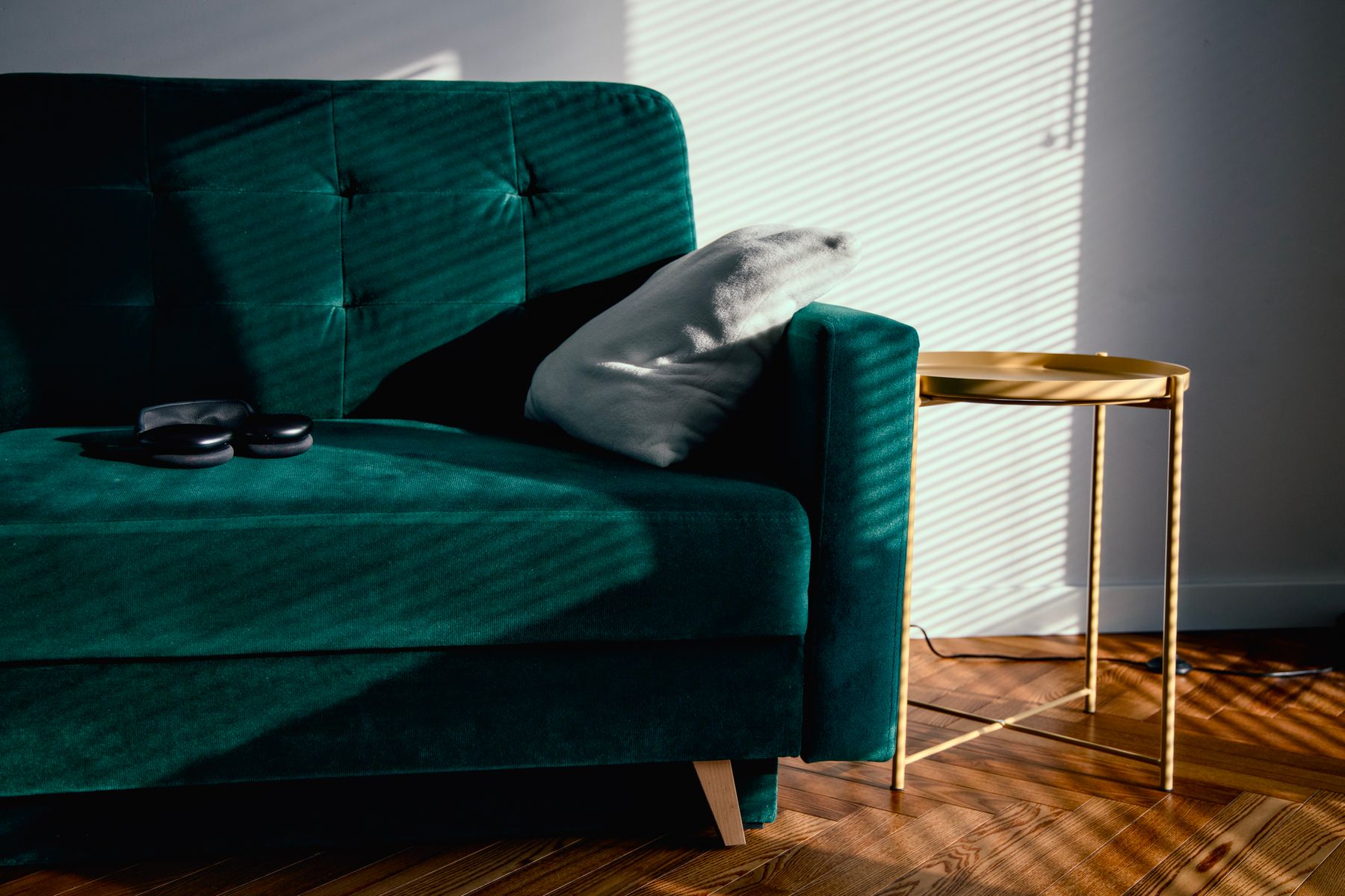
Yellow beside green can feel garden-fresh, but similar light values may blend into a chartreuse haze. Separate them through value and temperature: butter with forest, ochre with blue-green, or a clear yellow flare against muted sage. Plants are not a substitute for this decision; their highlights can add yet another yellow-green note. Continue to [Green Living Room Ideas](/living-room/green-living-room-ideas/) if the garden relationship becomes the main story.
Stop Yellow and Timber From Becoming One Golden Block
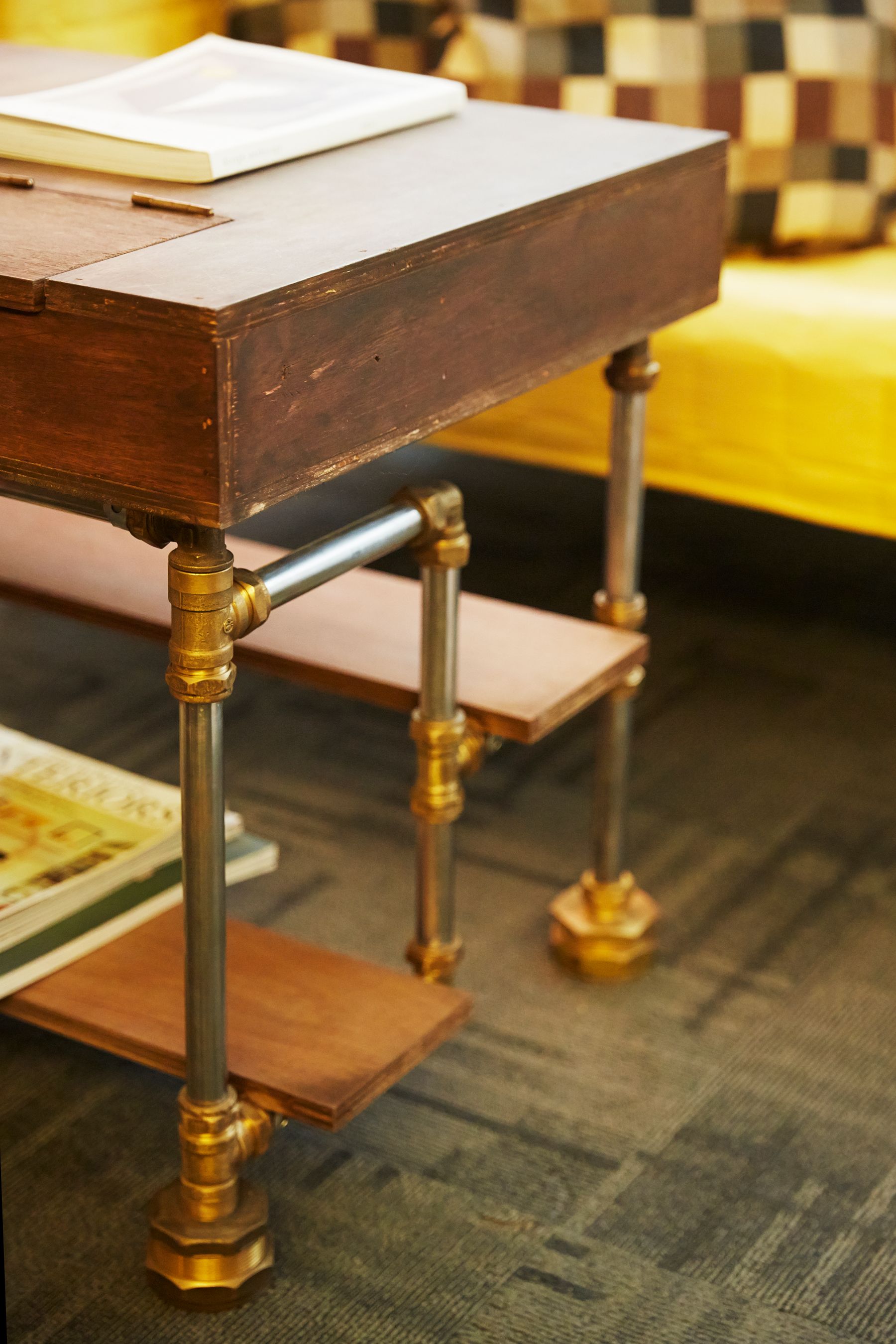
Honey oak, pine, teak and some walnut finishes already carry yellow, orange or red. Place a yellow sample beside the largest timber—not a generic wood swatch. Pale butter may merge with blonde oak; ochre may make teak look orange; a slightly cooler straw can clarify red-brown walnut. Keep at least one difference in value, grain or finish. One dark metal or stone boundary is often more effective than adding a cooler accessory collection.
Let Brass Either Blend or Outline
Brass can disappear beautifully into a yellow field or vanish unintentionally. Decide which. Unlacquered or brushed brass can blend into ochre as a low-contrast detail; polished brass needs a dark or pale neighbor to show its edge. Avoid selecting metal under showroom spotlights, then placing it against a wall of similar warmth. Chrome or blackened steel is not automatically better; it simply creates a different boundary and may be the clearer choice around screens or hearths.

Read Brick and Stone Before Choosing Yellow
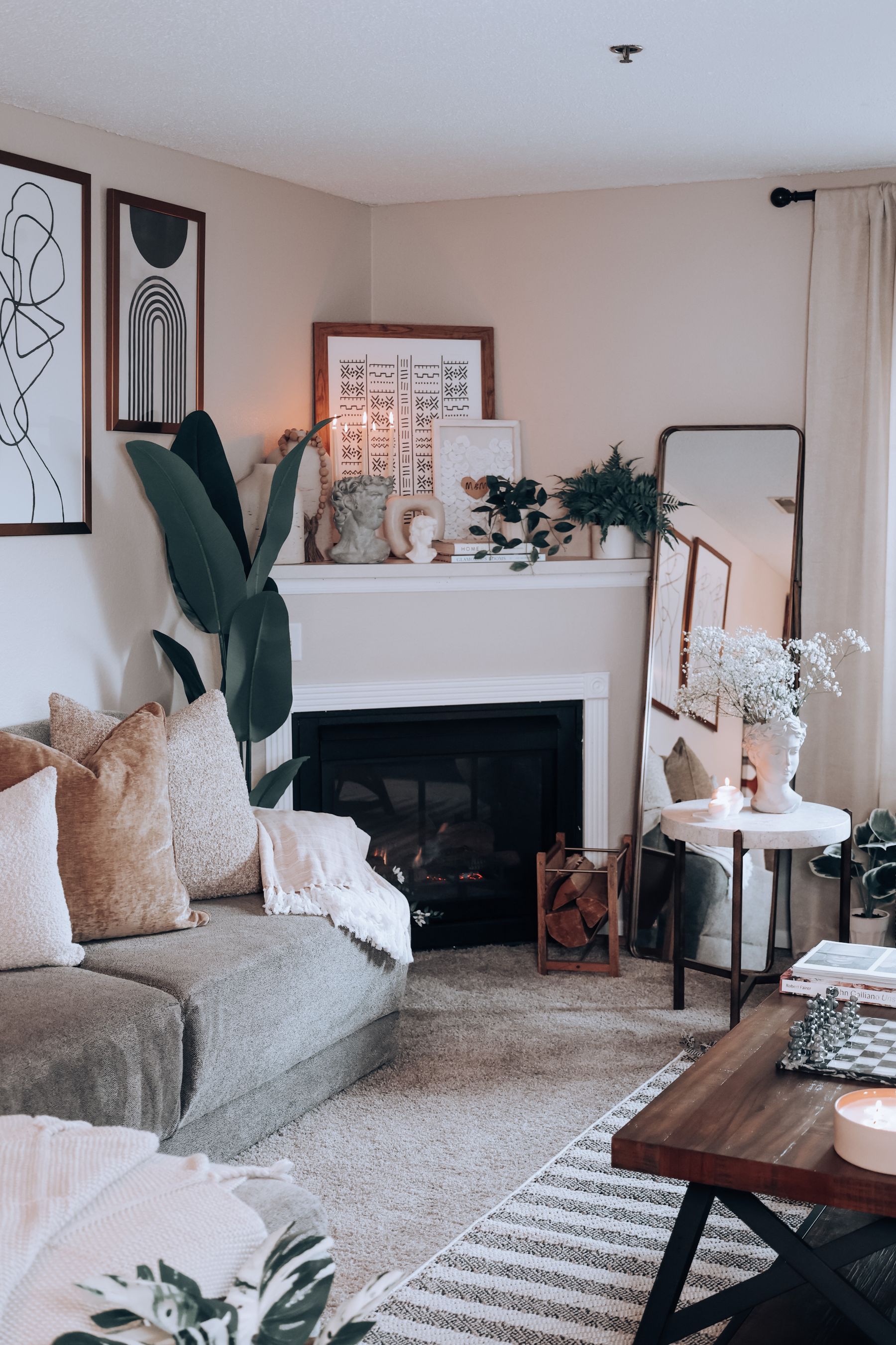
Red brick can push some yellows greener; buff brick can make butter disappear; cream limestone may turn a saturated yellow louder than expected. Read the fireplace as an average field from the main seat instead of matching one attractive fleck. If stone already supplies warm variation, yellow may work better as a sofa or curtain than on the adjacent wall. Preserve relief around mantel, hearth and opening, and follow the installation's exact heat and clearance requirements.
Build a Dark Horizon for the Television
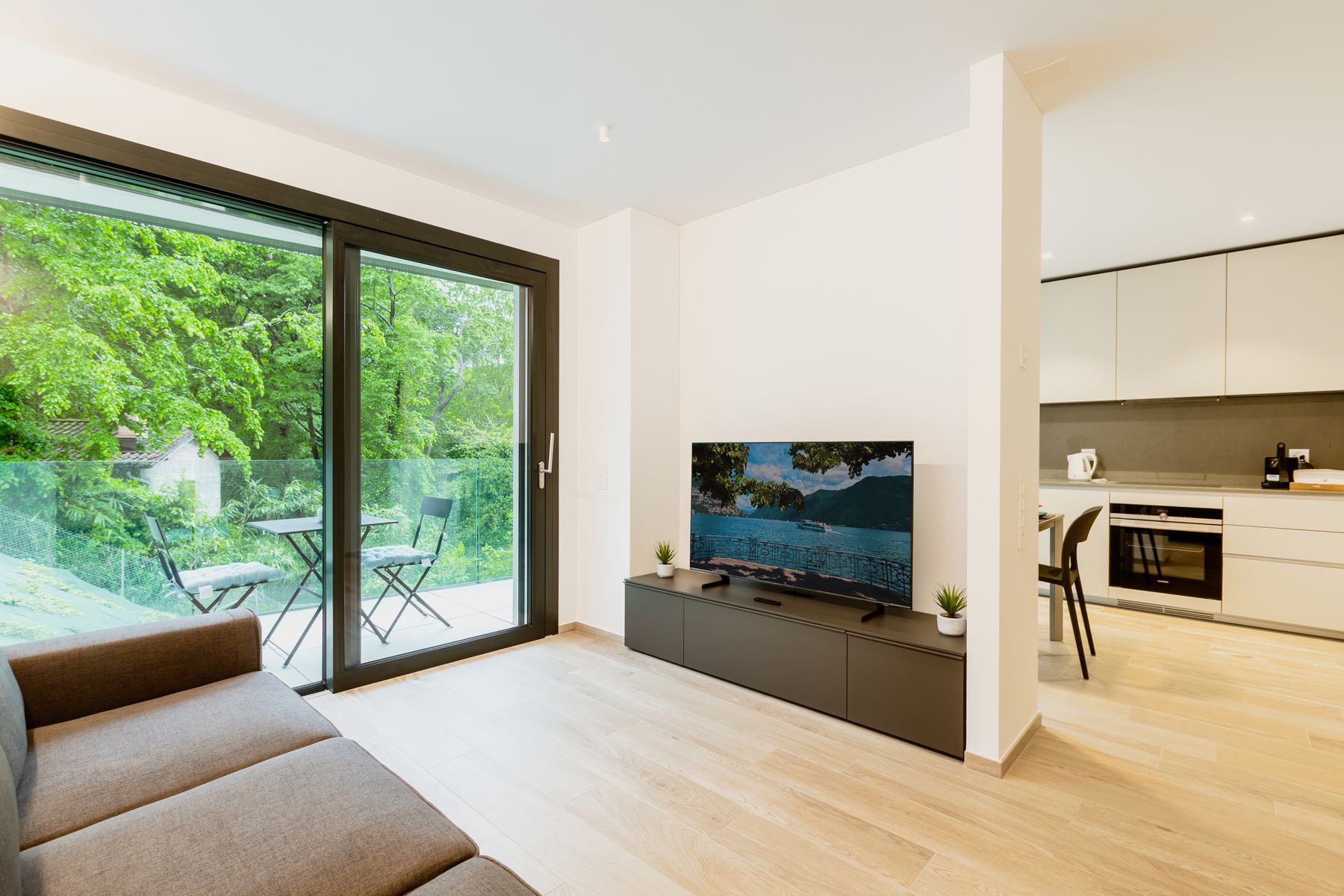
A switched-off television can look unusually severe on pale yellow because the screen is both very dark and visually cool. Give it a dark horizon: walnut or charcoal joinery, a low shelf line, a deeper hearth extension or a bounded wall panel. Do not spread black accents around the room merely to justify the screen. The yellow field should remain continuous enough to feel intentional while the media area has its own low-weight logic.
Use White as a Color-Cast Witness
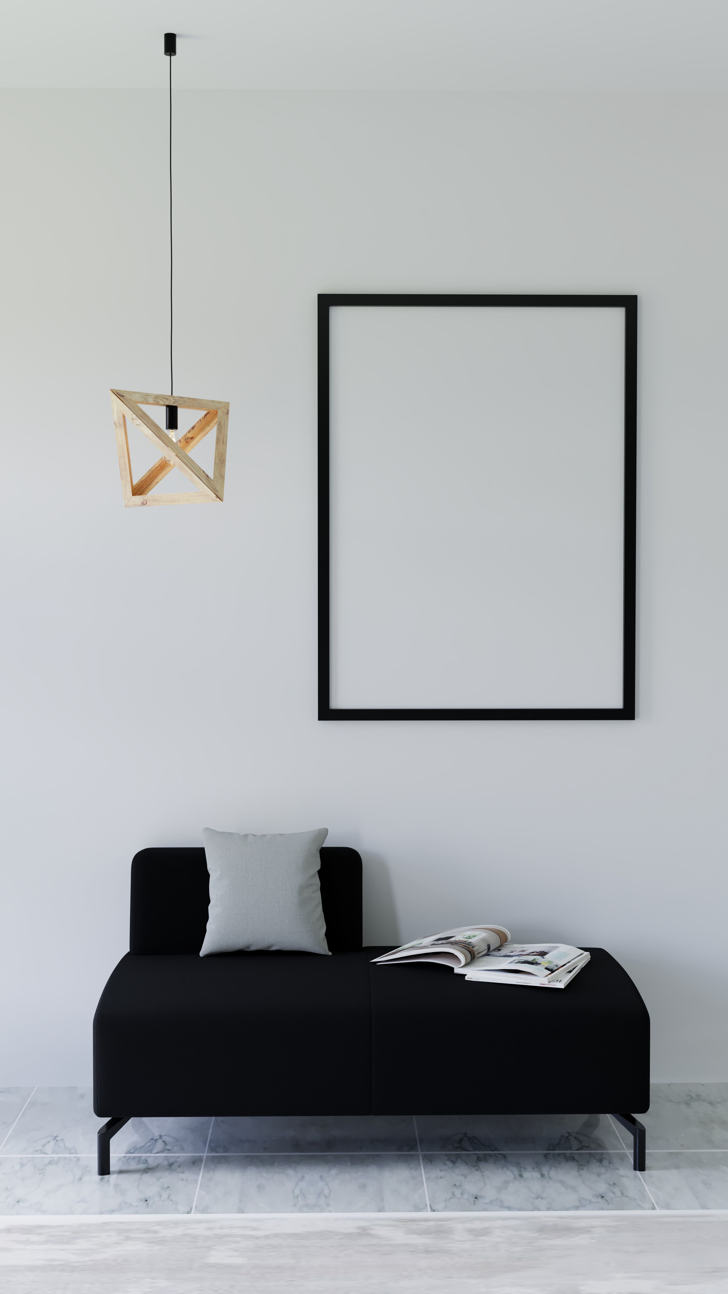
White trim, paper, a lampshade or an unglazed ceramic object reveals how much yellow the room is reflecting. That reference can be useful: warm white may join butter quietly, while a clean white line makes the yellow field explicit. If every white object turns visibly cream in daylight and amber at night, the yellow is affecting more of the room than the paint chip suggested. [White Living Room Ideas](/living-room/white-living-room-ideas/) explores the envelope; here white is a measuring instrument.
Test the Lowest Evening Scene
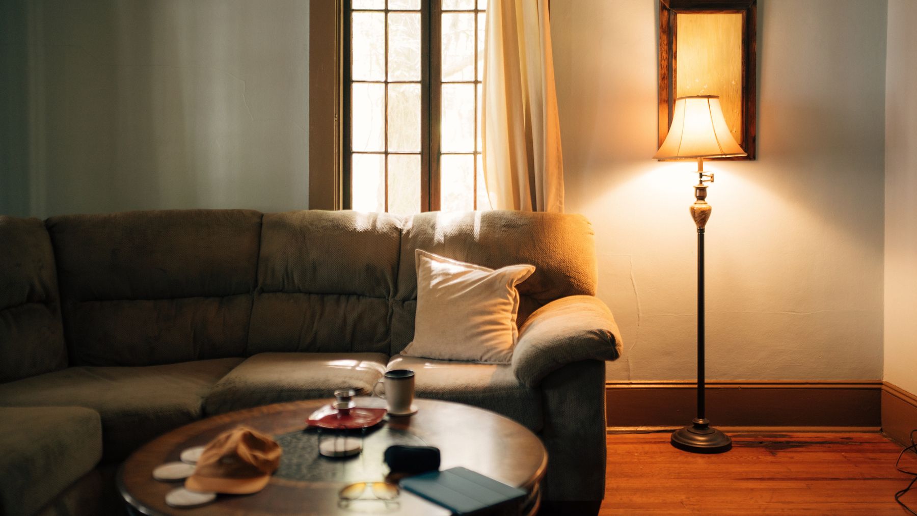
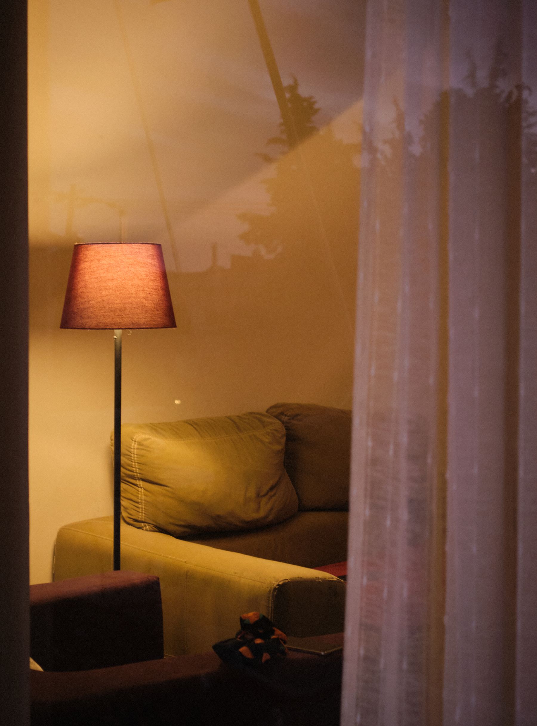
Yellow usually changes most after sunset. Very warm bulbs, amber glass and cream shades can stack warmth until butter reads orange and ochre becomes brown. Test the actual dimmer setting used for conversation—not just every lamp at full output. A neutral-white task light may be useful near reading seats, while the general scene can remain warmer. The target is not daylight imitation; it is a night version in which yellow still has its intended family and the room's shadows remain readable.
Treat Yellow Curtains as Transmitted Light
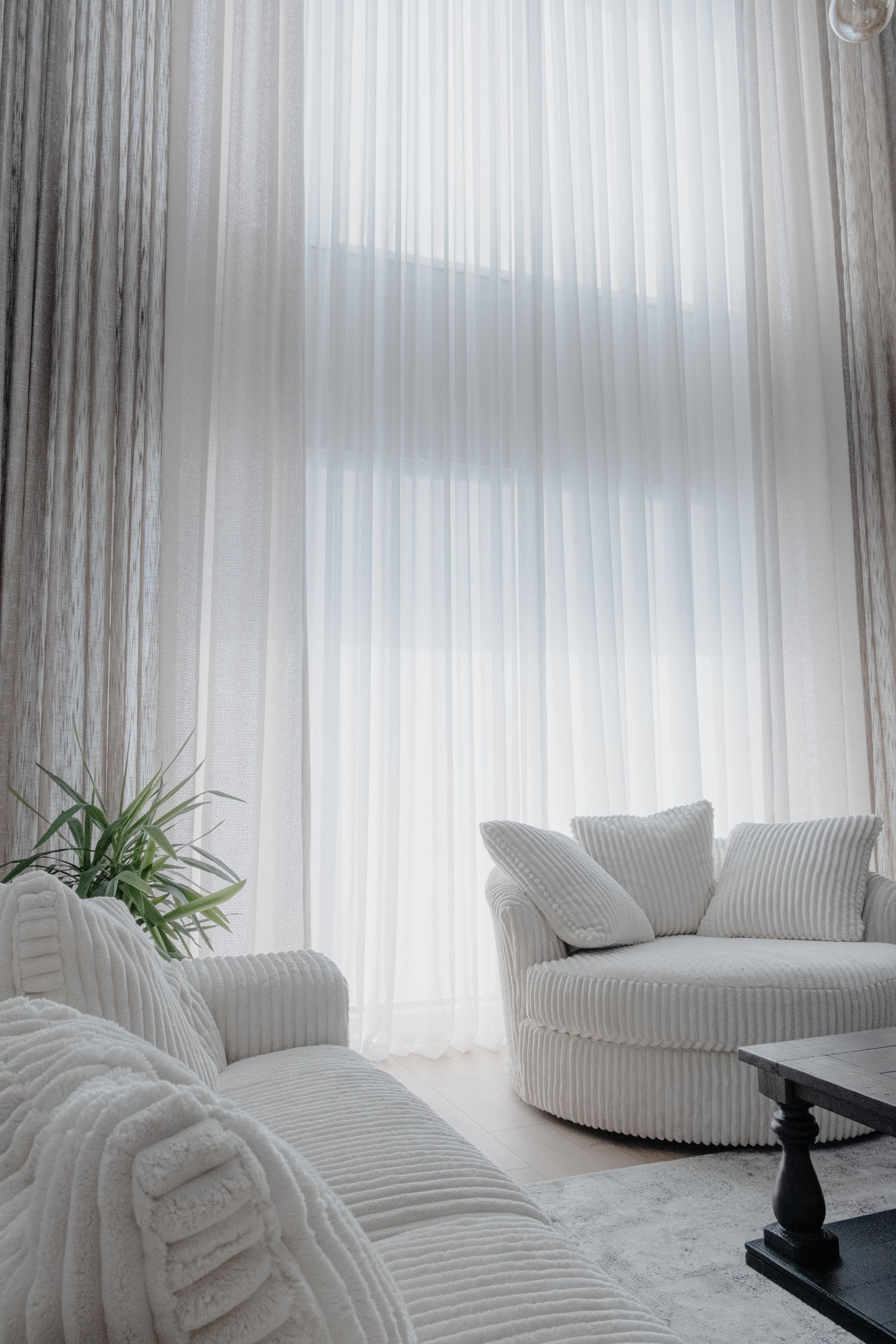
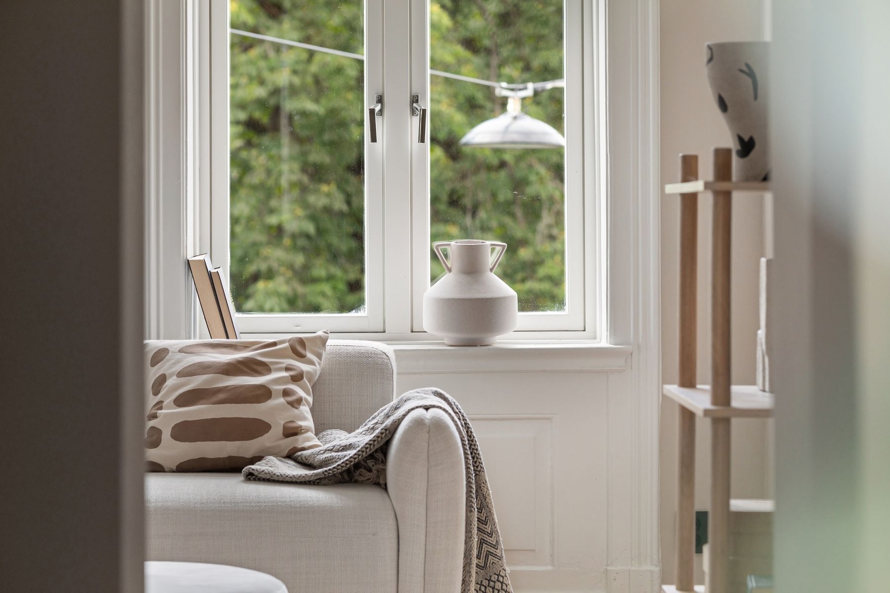
Yellow curtains do more than repeat a wall color. Sheer fabric can tint incoming light and nearby surfaces; lined ochre curtains become tall dark masses when closed; butter drapery may almost disappear in strong sun. Test the fabric hanging vertically at the real window, both open and closed, and look at the opposite wall and seated faces. If the cast is too strong, keep yellow in the leading edge or outer panel and use a neutral filtering layer behind it.
Let a Yellow Rug Pool Light on the Floor
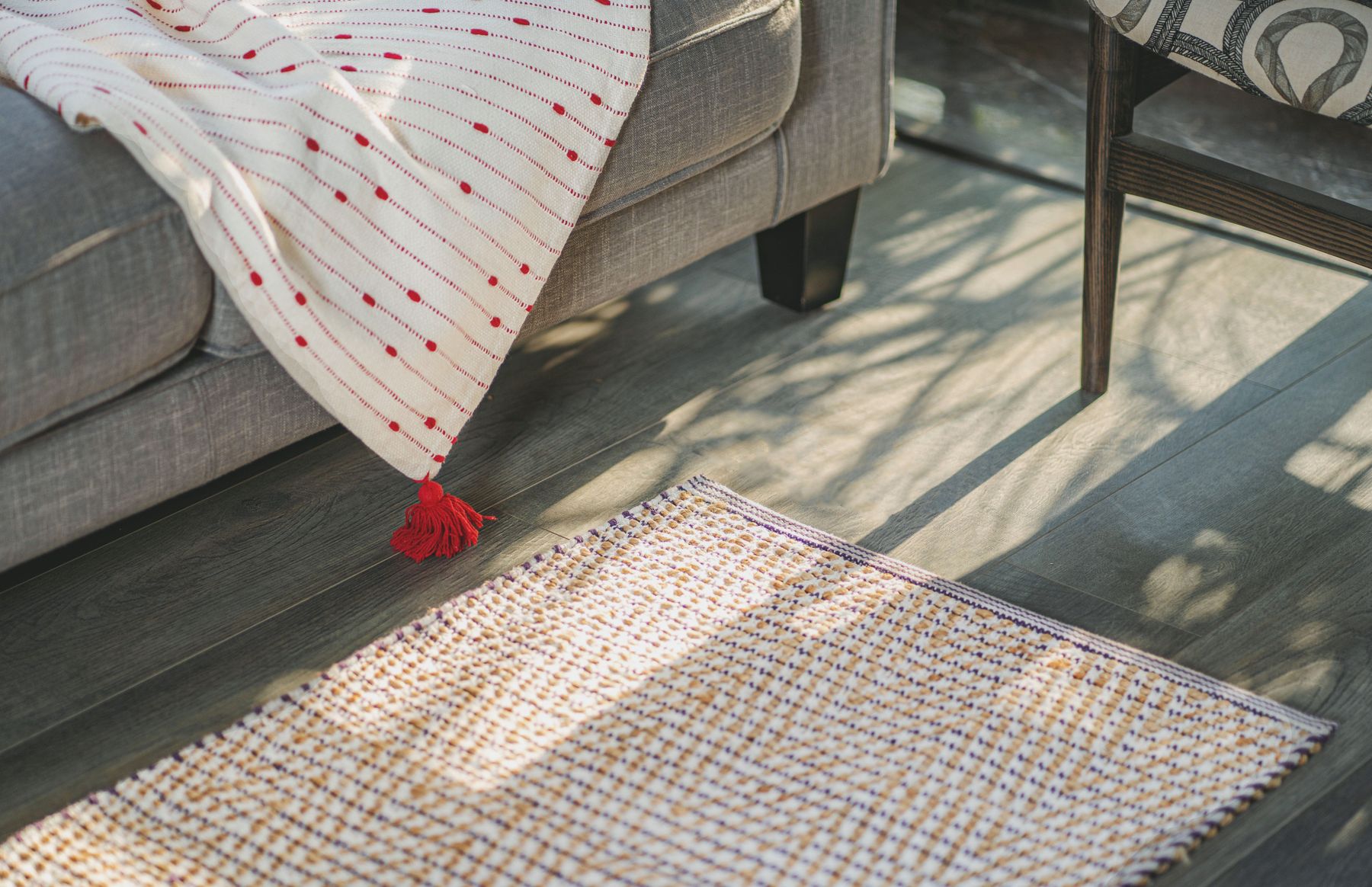
A yellow rug places apparent light low in the room. It can lift dark seating and make a north-facing group feel warmer, but it also reflects into pale sofa bases and can merge with honey flooring. Use pattern when you need yellow to mix with darker values; use a more continuous field when the rug is meant to be the single glow. Size and secure the rug for the whole seating group, then use [Living Room Rug Ideas](/living-room/living-room-rug-ideas/) for construction, edge and pad decisions.
Aim Yellow Away From a Route Unless It Should Pull You
Clear yellow attracts the eye quickly. Put it at the end of a route when you want to draw people toward a window seat, reading chair or social center. Keep it off a competing side wall when the path should continue to another room; otherwise the eye stops while the body moves on. This is not color-coded wayfinding, but a compositional pull. Confirm that the yellow focal surface remains visible without placing furniture, lamps or planters in the circulation line.
End the Yellow Field Where Architecture Takes Over
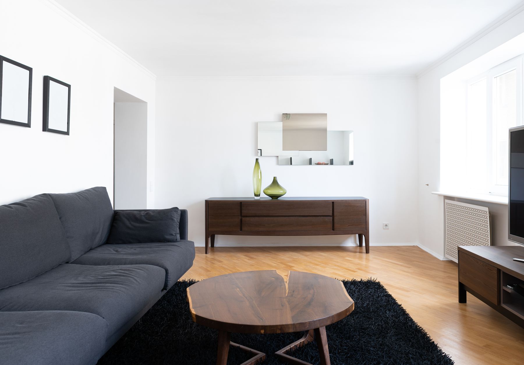
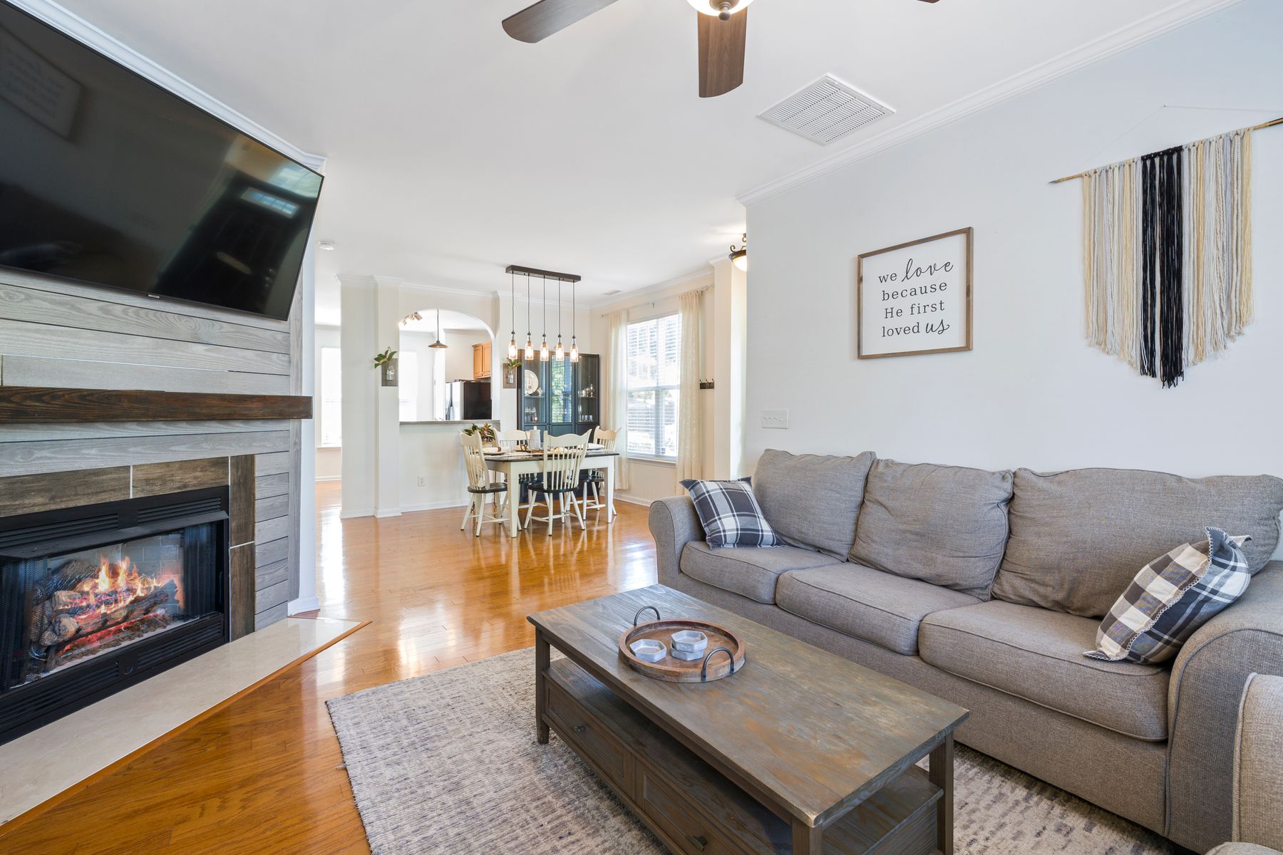
Yellow is visually fast, so an arbitrary stopping line is easy to notice. End the field at a wall return, beam, full-height joinery element or change in ceiling plane. Across the threshold, carry an undertone or material rather than scattering matching yellow accessories through the dining or kitchen zone. A butter living room might meet cream stone; an ochre sofa might answer warm timber without repeating ochre chairs. Protect circulation first with [Living Room Layout Ideas](/living-room/living-room-layout-ideas/), then use color to clarify the zone.
Use the Four-View Yellow Audit
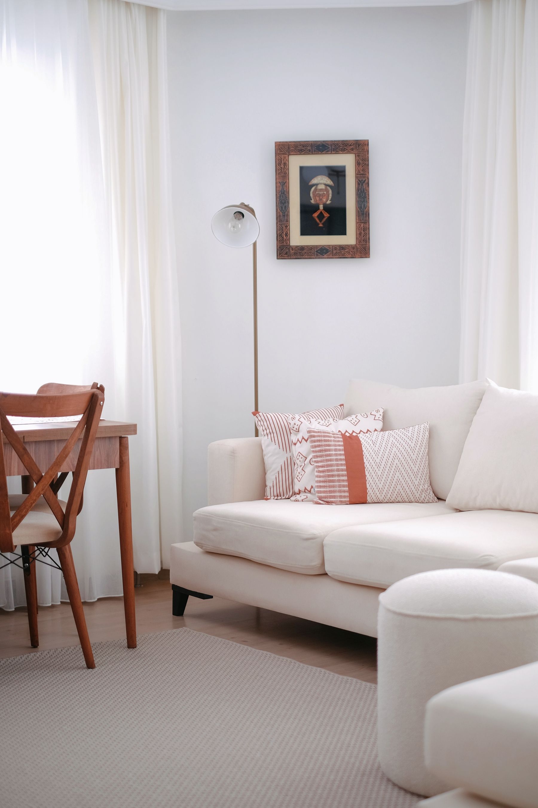
Finish with four photographs. From the **entrance**, yellow should lead at the intended scale. From the **main seat**, it should support rather than tint every face and view. With the **television off**, the black rectangle should belong to a grounded composition. In the **lowest evening scene**, yellow should remain butter, ochre, mustard or clear yellow—not collapse into generic amber. Name one failure per view and change only the surface responsible. This final audit replaces the vague instruction to keep adding warmth until the room feels cheerful.