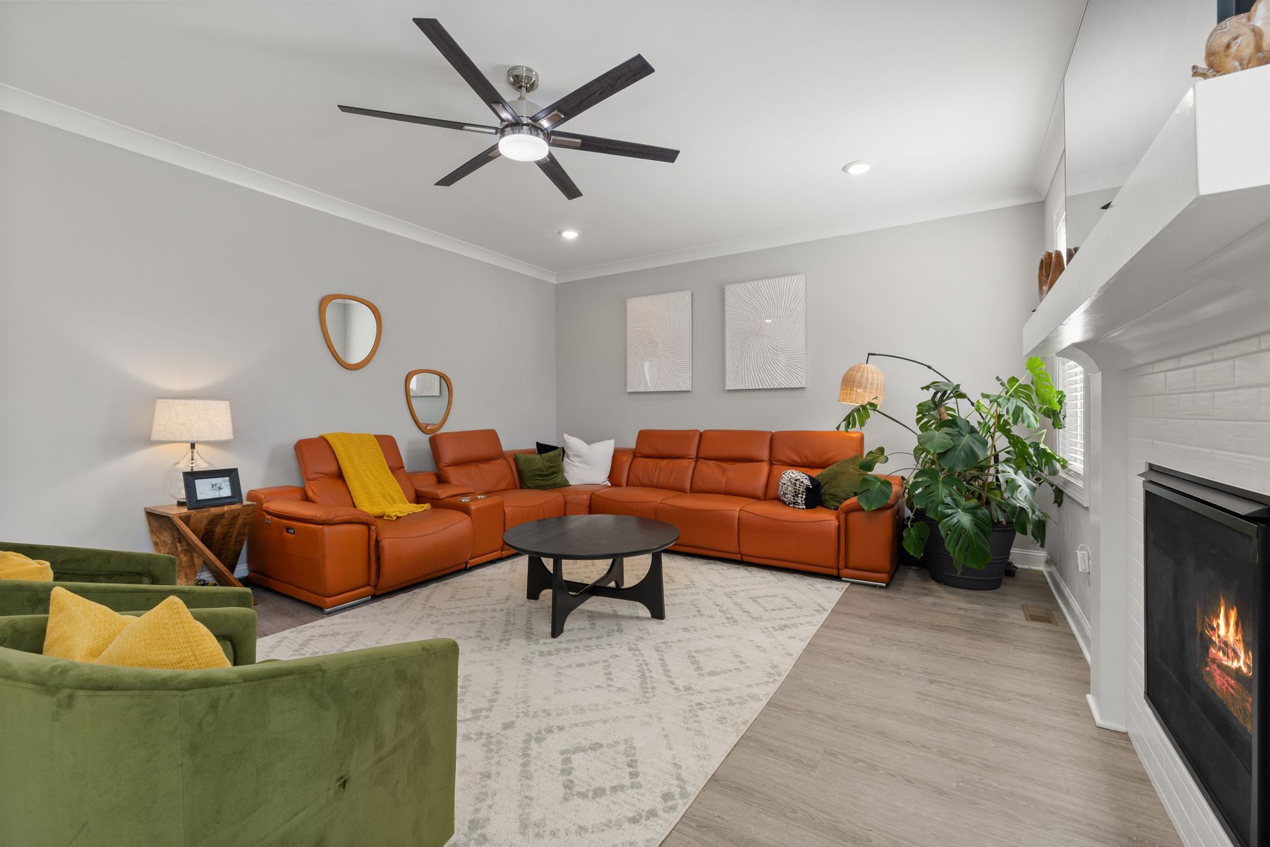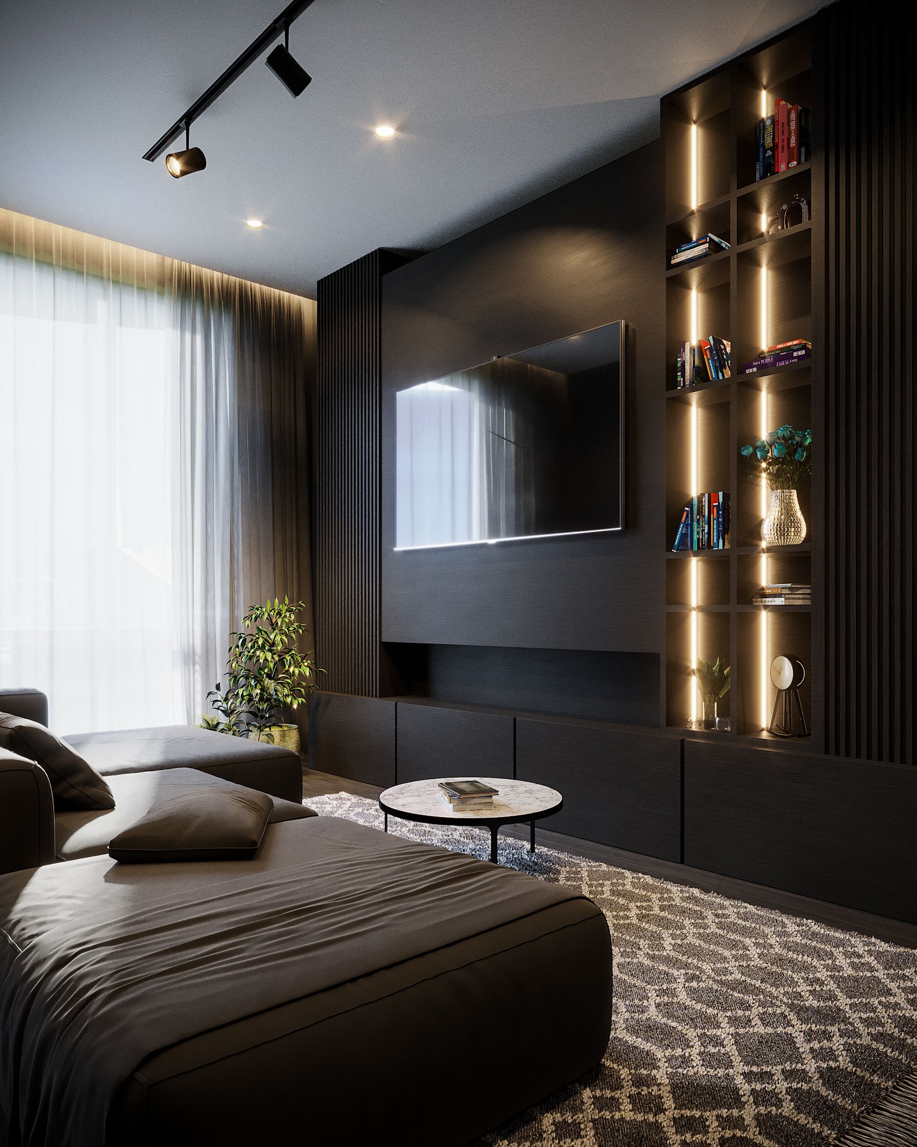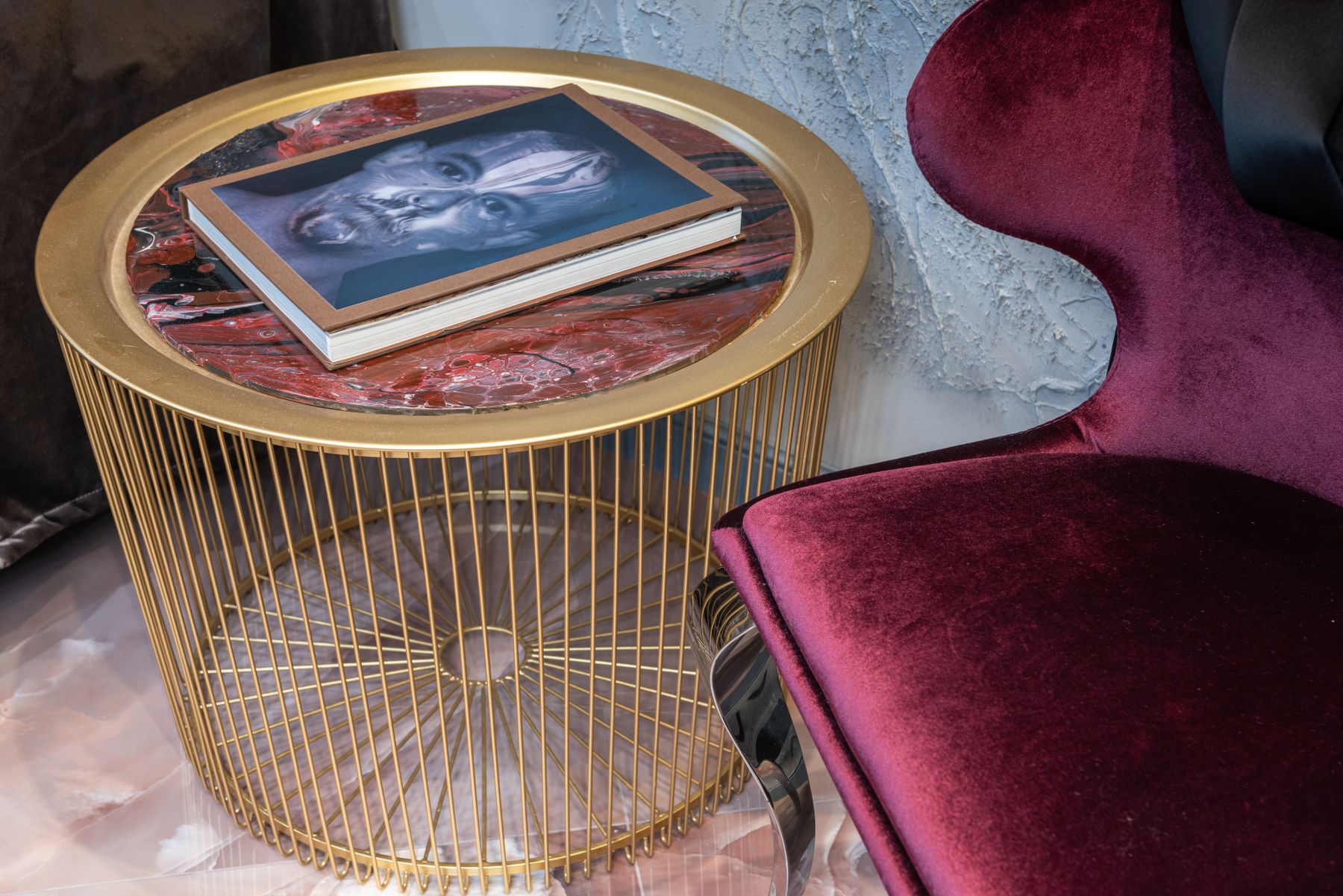
Decide What Red Is Allowed to Interrupt
Start with an attention contract: red may announce the sofa, mark the conversation center, frame a view, intensify one wall or reveal an existing material such as brick. State that job before naming a shade. A red chair that interrupts a neutral seating group needs no matching vase; a burgundy wall behind art should not also compete through a scarlet rug. If several red elements have equal authority, the room loses sequence and becomes a collection of signals. This decision separates a red-led room from one that merely contains red accessories.

Map First Look, Second Look and Visual Rest
Stand at the doorway and identify three moments: **first look**, **second look** and **rest**. Red usually wins the first look even when it occupies less area than the wall or floor. Give the second look to architecture, a view or a contrasting chair, then preserve a genuinely quiet rest surface. Repeating red at every corner forces the eye into a loop. This gaze map is more useful than calculating a fixed percentage because saturation, value, scale and sightline all change red's apparent area.
Choose Clear, Blue, Orange or Brown Red
Compare four useful directions against the actual floor, hearth and largest upholstery: clear balanced red, blue-red, orange-red and brown-red. A blue-red may expose yellow in oak; an orange-red can merge with brick or cognac; brown-red can sit quietly at low value; a clear red remains the most graphic. Benjamin Moore's current red family includes colors described through pink, orange, purple and brown relationships, while Sherwin-Williams presents red as a broad high-impact family. Use those ranges to test relationships, not to assume every named red behaves alike.
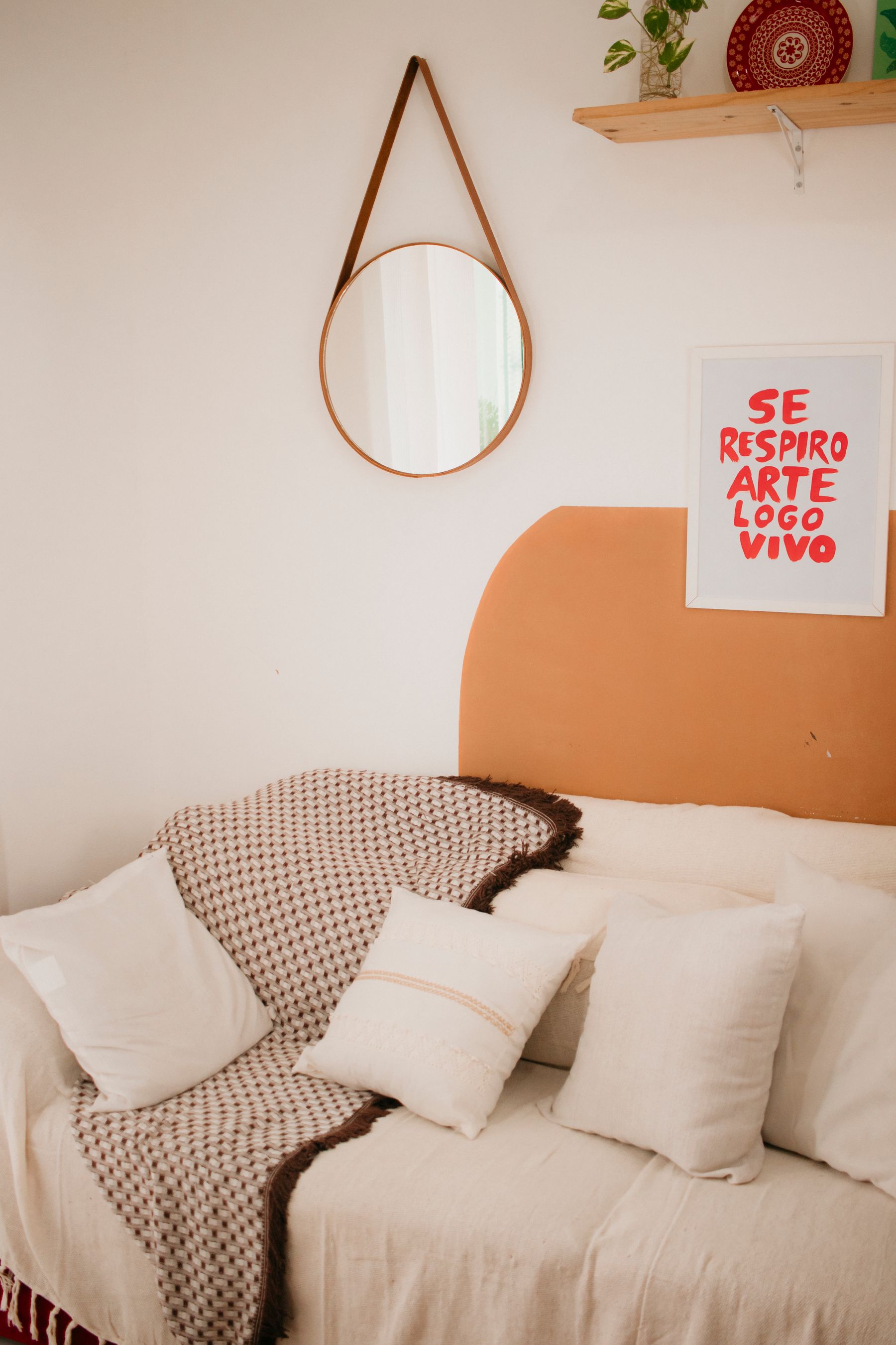
Test Red at Conversation Distance
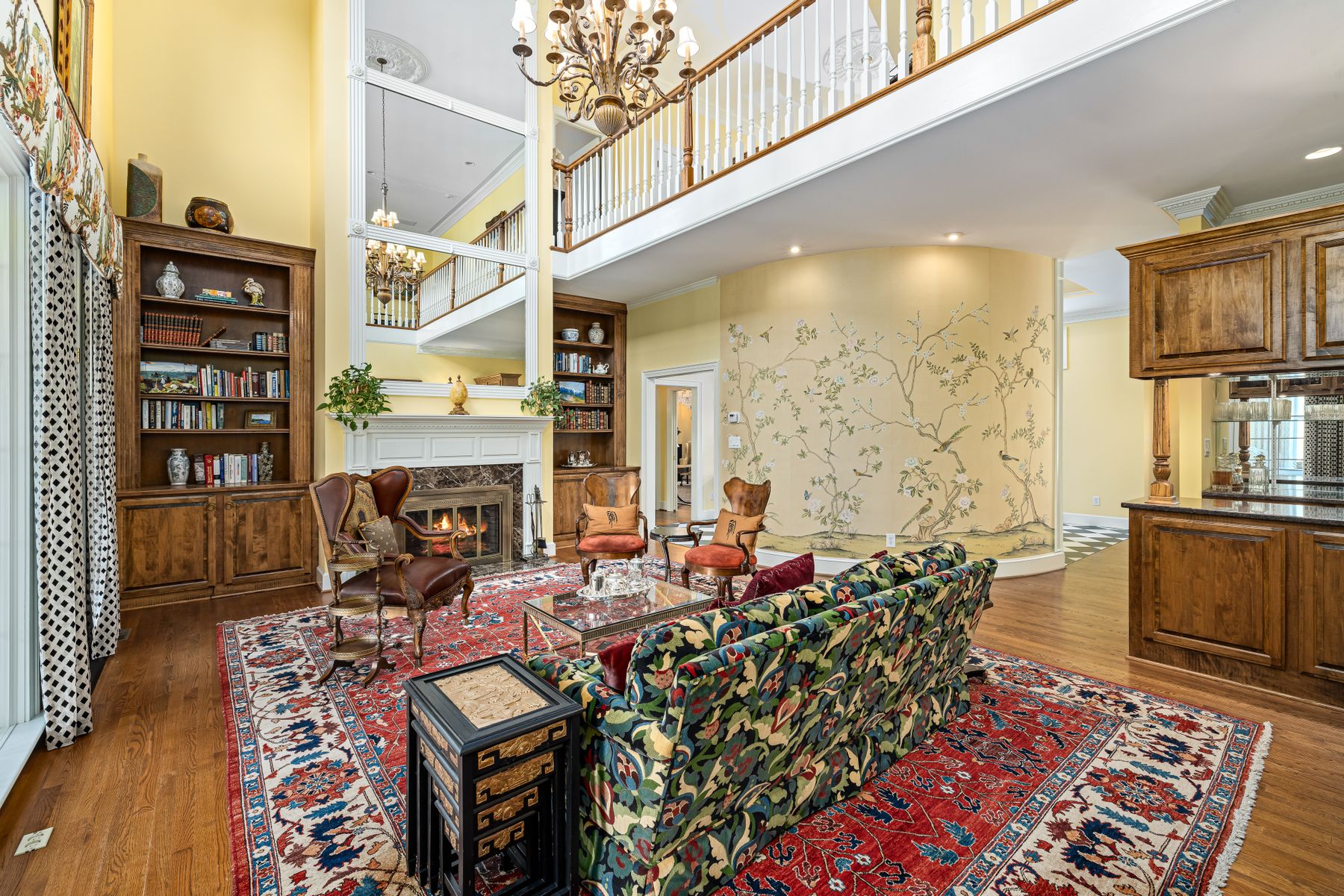
A saturated sofa, wall or curtain can reflect color onto skin, books, food and pale upholstery. Test from the actual seats, not only from the entrance. Place a large sample at the future red surface, sit in every main chair and observe it under daylight and the normal evening lamps. Pay particular attention when a bright red plane sits close to faces or receives direct sun. The aim is not sterile color neutrality; it is keeping people visually present inside the palette rather than tinting the entire social zone.
Give a Red Sofa One Landing Zone
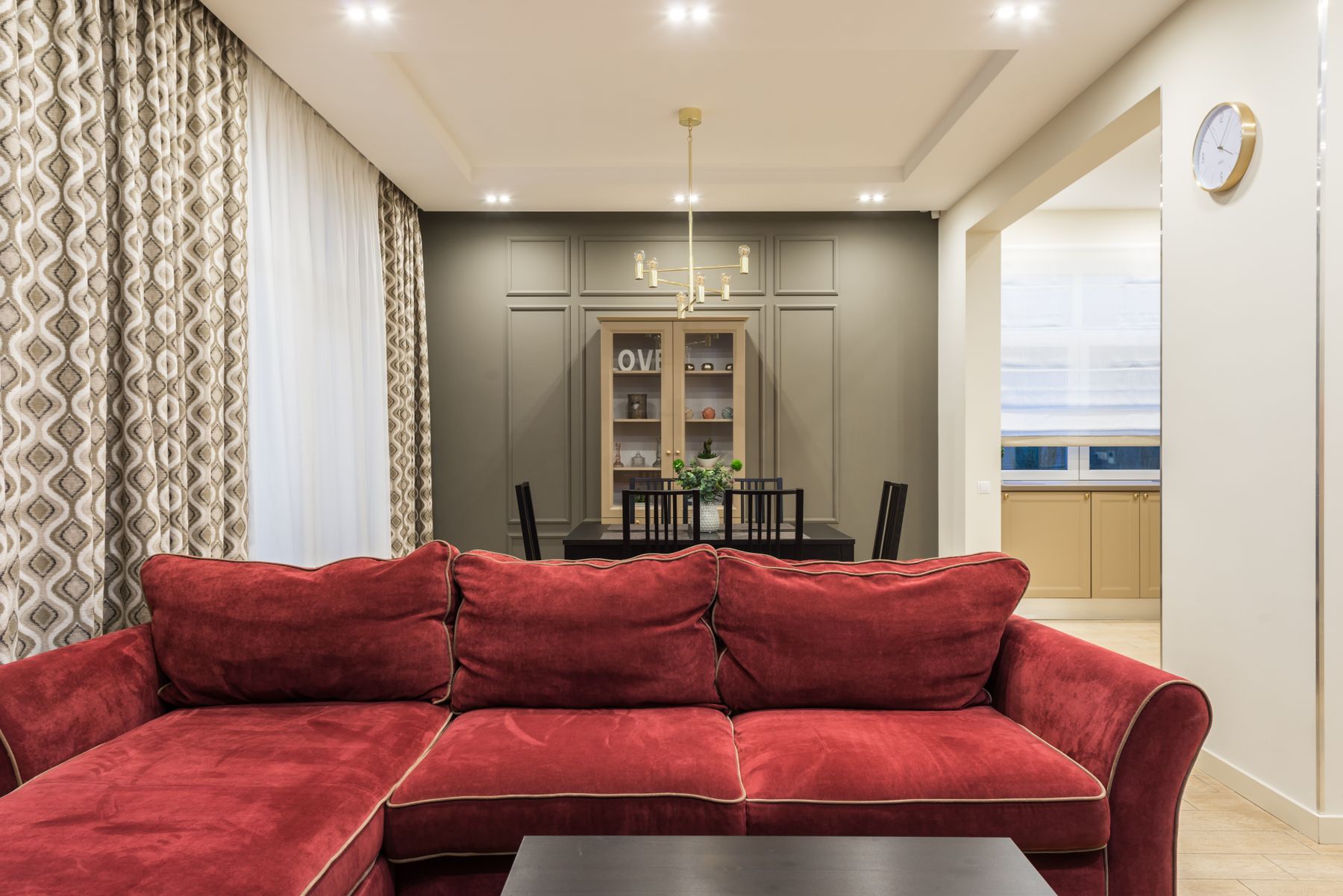
Let the red sofa land against one controlled backdrop: pale plaster, a deep quiet wall, timber with sufficient value contrast or a bounded rug field. Keep its full silhouette visible and allow the other seats to support conversation without matching. Red cushions on every chair weaken the hierarchy rather than connect the group. If the sofa is velvet, its nap will create several reds across the cushions; if leather, highlights will sharpen the form. Choose the surrounding quietness according to that material behavior.
Choose Burgundy Envelope or True-Red Interruption
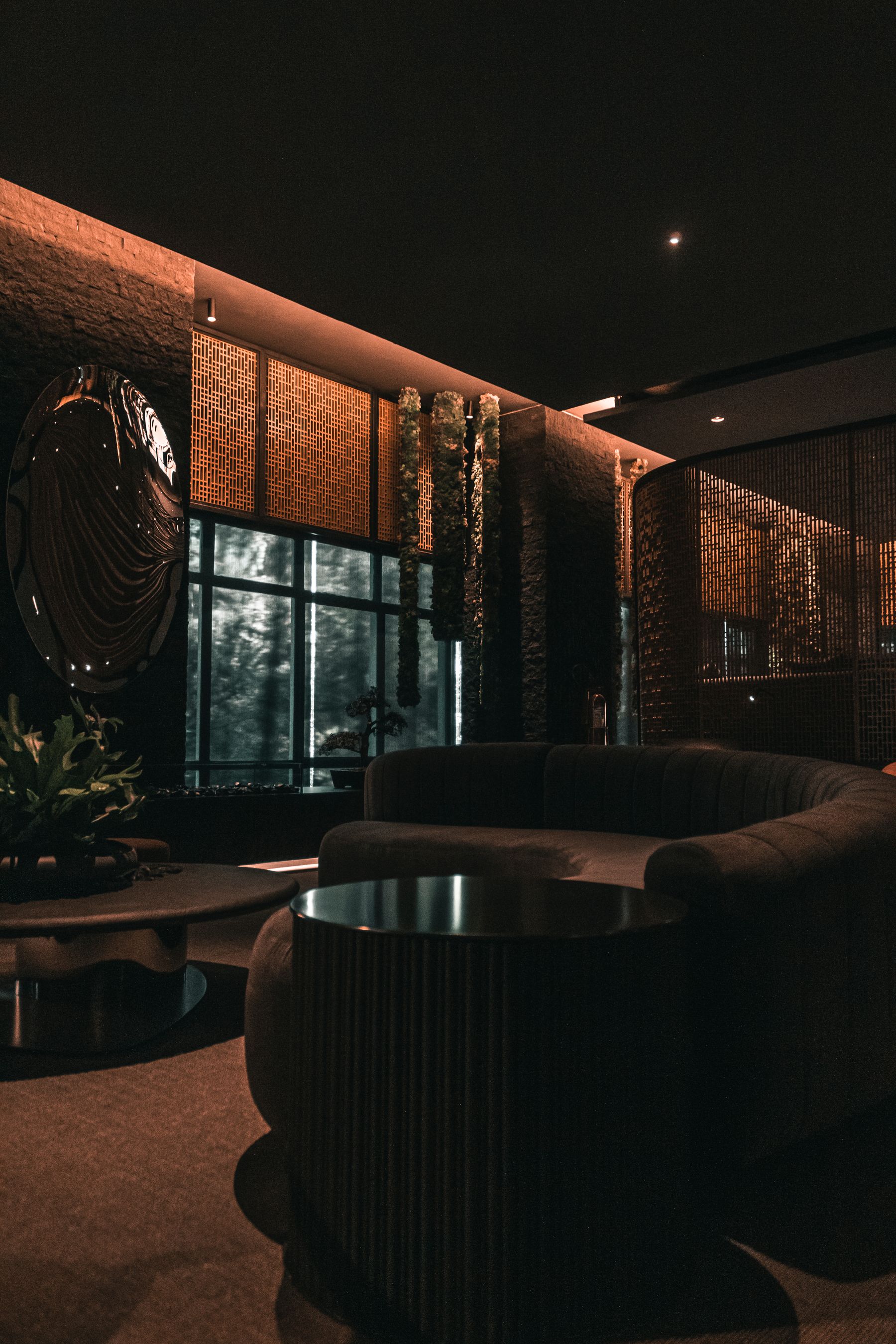
Deep burgundy, oxblood and red-brown can form an envelope when their value is close to dark timber and shadow. A clearer red rarely disappears this way; it reads as an interruption even at smaller scale. Decide which experience the room needs. For enclosure, compare wall, trim and ceiling boundaries as one low-value composition. For interruption, keep the red bounded and give it a quiet field. [Dark Living Room Ideas](/living-room/dark-living-room-ideas/) should lead when the primary problem is navigating low brightness across the whole room.
Let Velvet, Lacquer and Polished Metal Multiply Red
Red intensity is not controlled by pigment alone. High-gloss lacquer creates moving white highlights; velvet shifts between dark and bright as the pile changes; leather concentrates light on curves; matte wool spreads color more evenly. Polished chrome and mirror can also pick up a nearby red field and carry small reflected flashes to another part of the room. Choose sheen according to the red's job. A small glossy cabinet may command more attention than a broad matte wall, while a velvet sofa can appear several values at once. Test material samples upright and curved where possible, because a flat chip cannot predict their changing surface.

Pair Red and Green Without a Holiday Signal
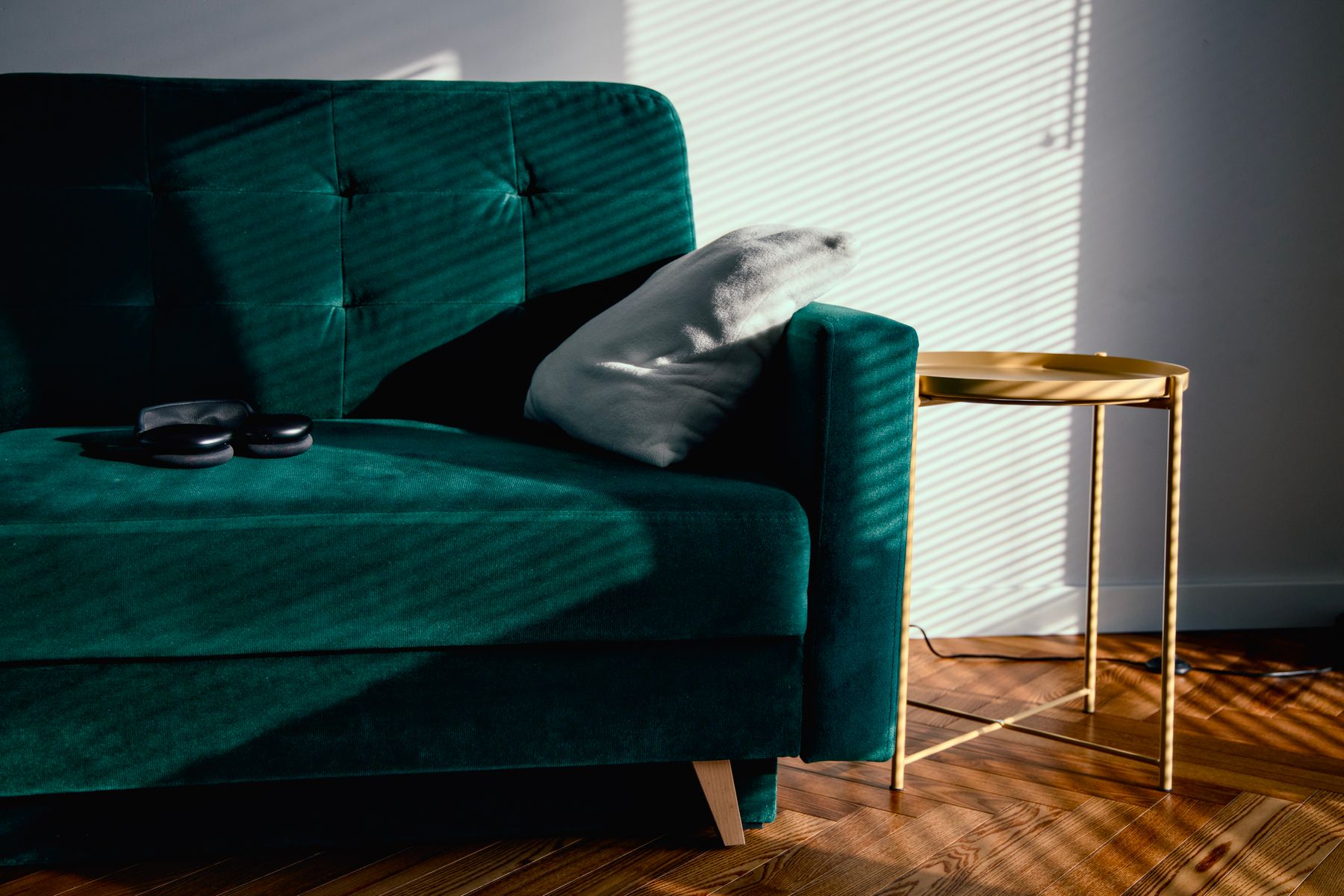
The holiday association strengthens when clear red and clear green appear in similar amounts, similar saturation and repeated decorative objects. Break at least three of those conditions. Pair oxblood leather with greyed olive wool, a small scarlet chair with a broad forest wall, or brick red with blue-green glass. Let timber, mineral neutrals and ordinary household objects remain visible so the palette belongs to the room rather than a season. [Green Living Room Ideas](/living-room/green-living-room-ideas/) offers the deeper route when green carries the envelope.
Use Blue to Change Red's Register
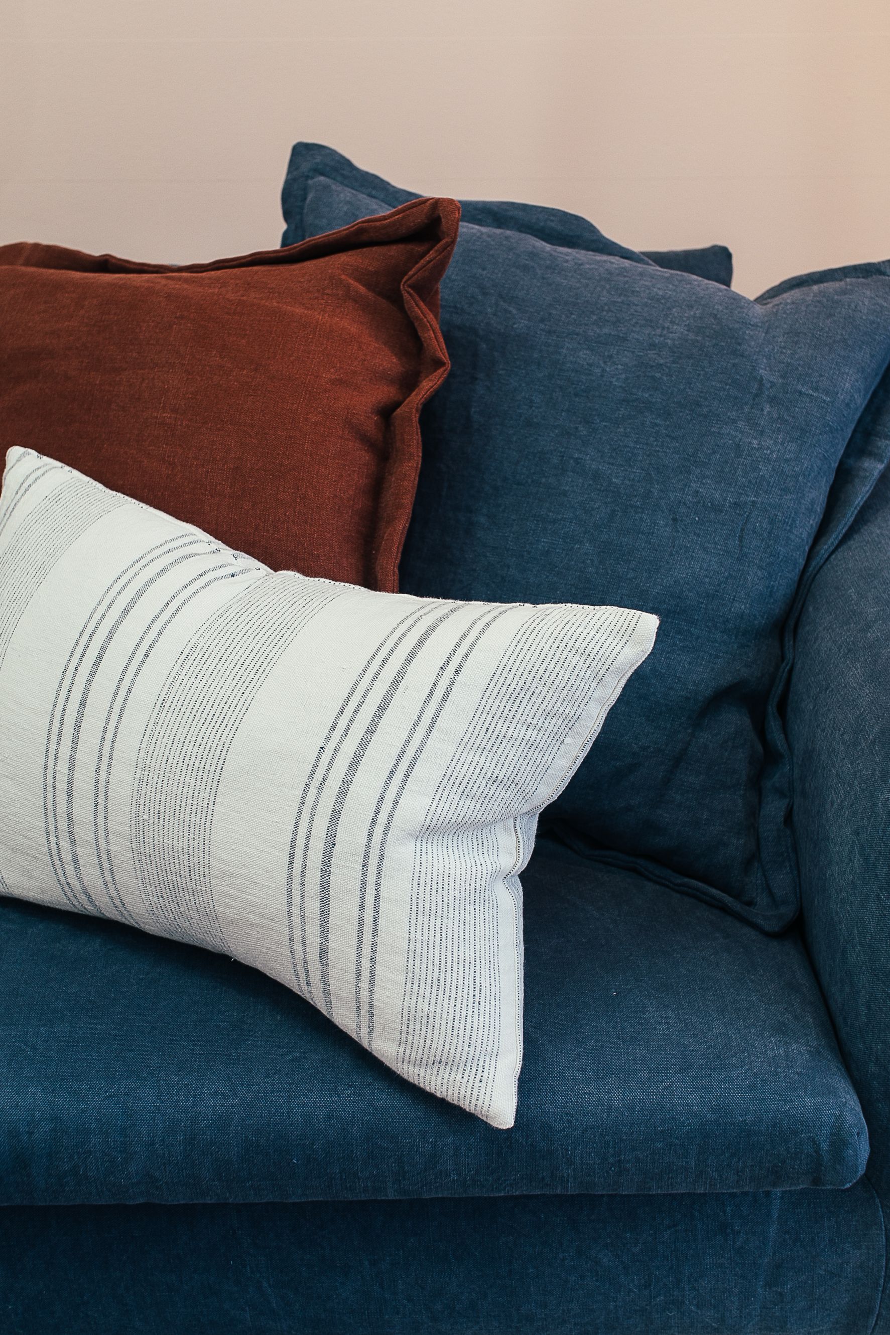
Navy beside scarlet creates a firm graphic pair; powder blue can make red feel clearer and lighter; blue-grey can quiet brick or burgundy; a violet-blue bridge can connect red to plum. Avoid equal blocks of pure red, white and blue unless that emblematic effect is intentional. Let one hue own the large field and give the other a bounded role. [Blue Living Room Ideas](/living-room/blue-living-room-ideas/) should lead if blue controls apparent distance, joinery or the room envelope.
Build Pink, Coral and Red as a Directed Gradient
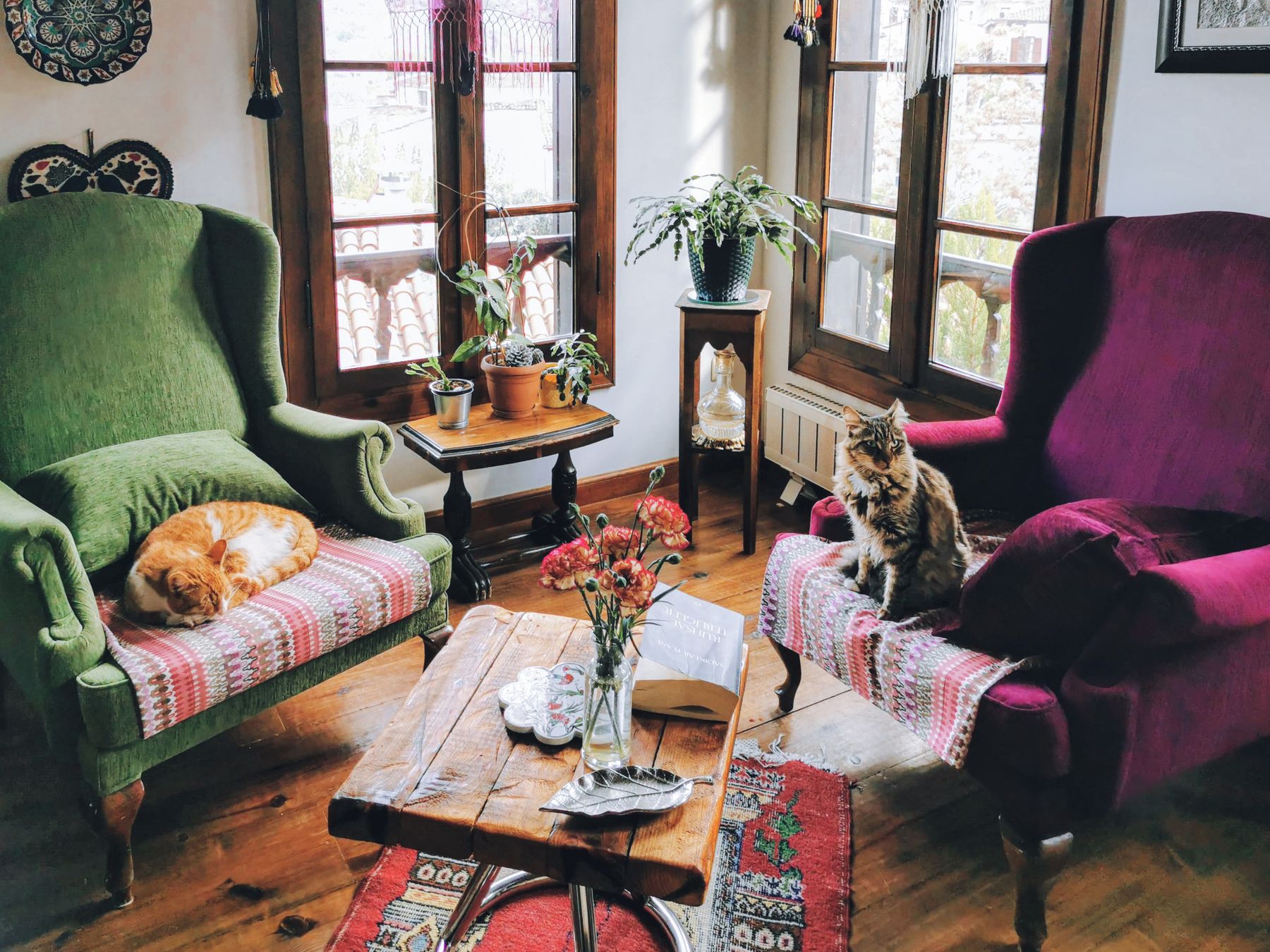
An analogous route can move from blush through coral to true red or from rust through red to plum. Choose the direction and assign each hue a scale: perhaps a blush wall, one red sofa and a small plum endpoint. Do not distribute five neighboring warm colors across equal cushions and objects. A patterned textile can mediate the gradient if it contains the transitions in one place. This route is especially useful when fixed stone or upholstery already reveals pink, but it needs a visible leader rather than a promise that every warm hue belongs.
Use Cream, Black and Pale Stone Without Building a Stage Set
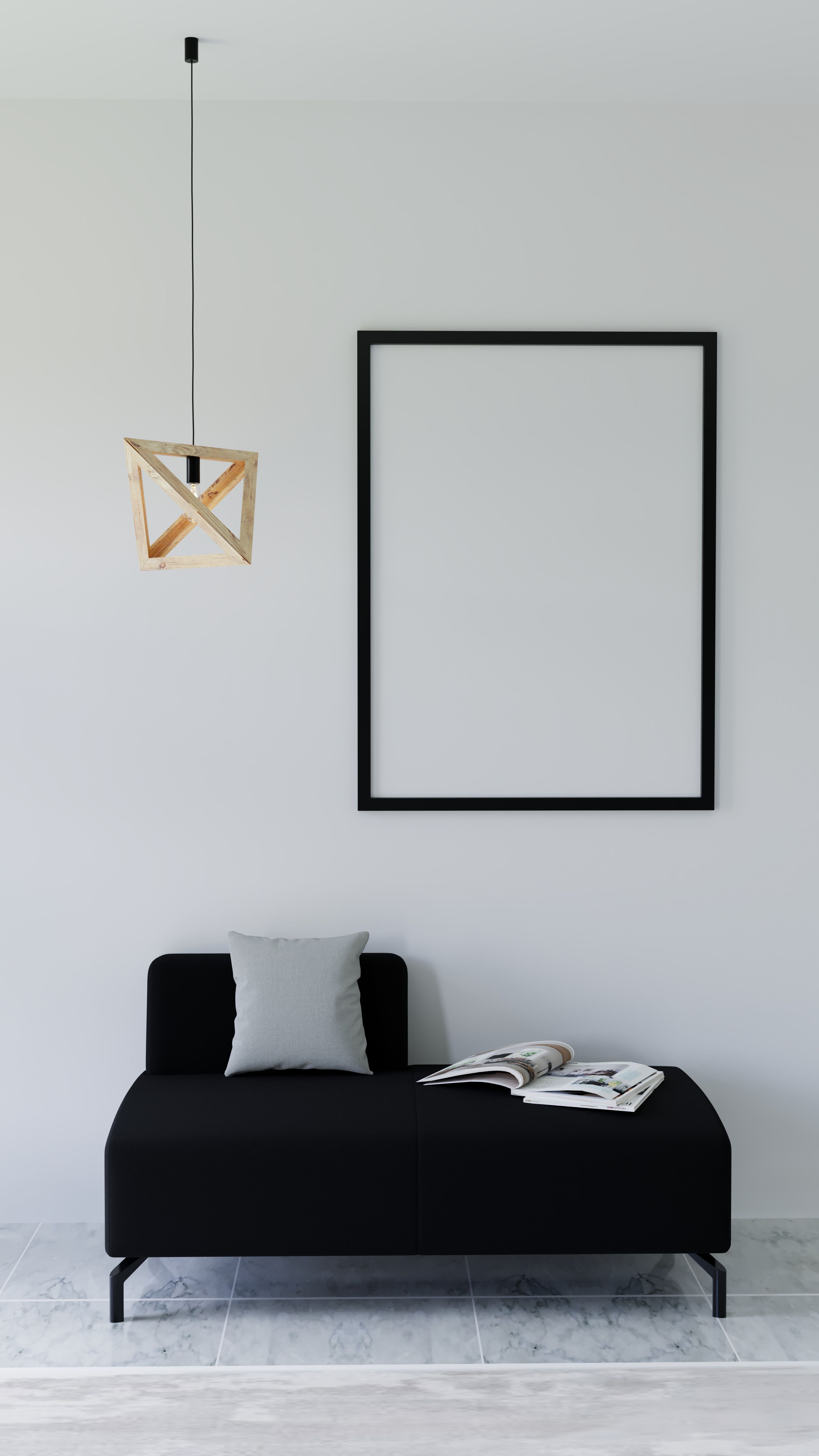
Cream gives red a softer light-return plane than stark white; pale limestone or quiet grey stone can lower its temperature; black supplies an edge strong enough to contain it. The combination becomes theatrical when black outlines every object, cream fills every background and red repeats as isolated punctuation. Choose one structural black role—table base, firebox, shelving line or window frame—and one broad cream or mineral plane. Then let red own the focal event. If geometry, symmetry and period glamour are the primary argument, [Art Deco Living Room Ideas](/living-room/art-deco-living-room-ideas/) is the more accurate destination.
Separate Red From Cherry, Mahogany and Cognac
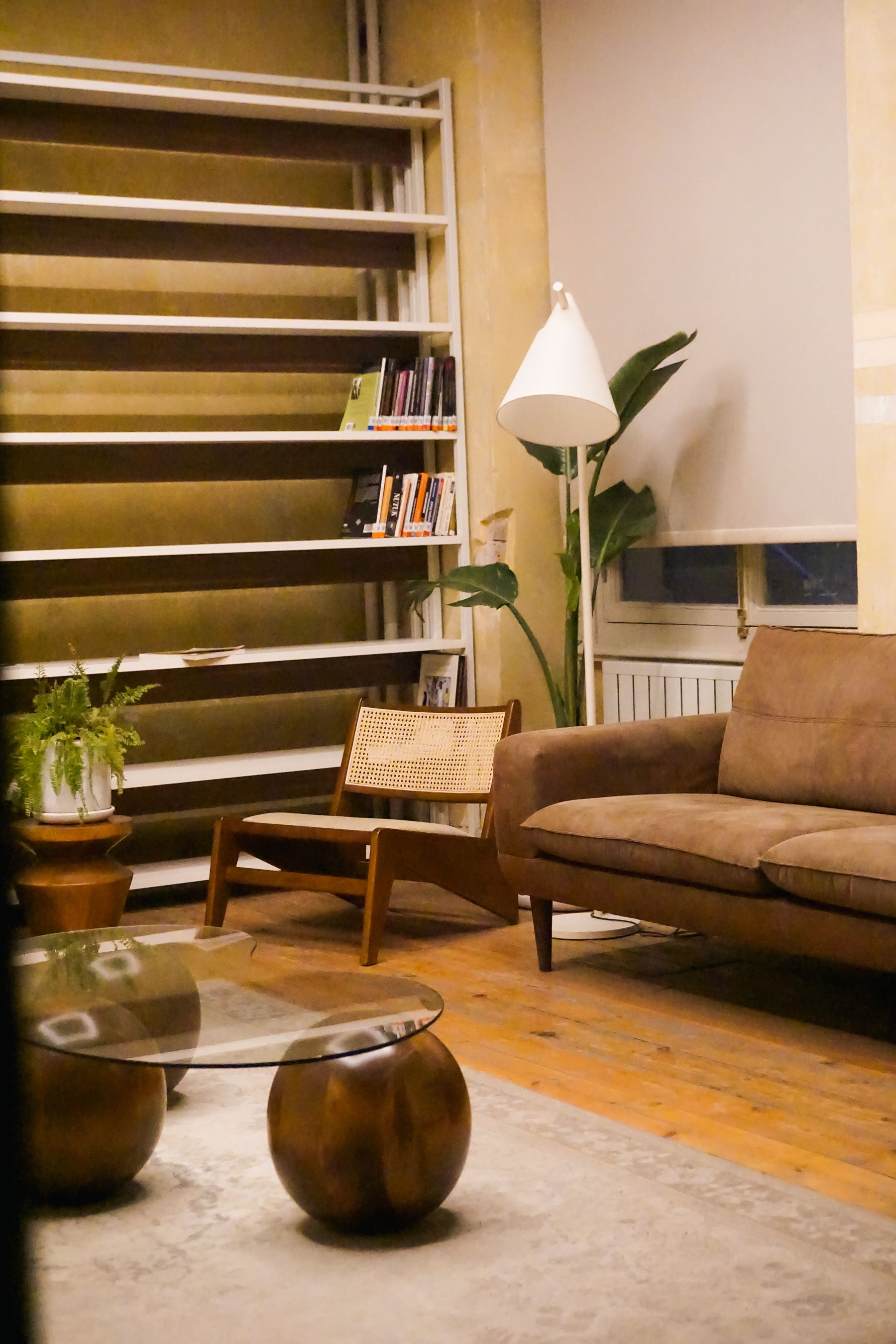
Cherry, mahogany, red oak and cognac leather can act as low-chroma red sources. Place the proposed paint or textile directly beside them. A true red may make cognac look orange; burgundy may merge into mahogany; coral can expose pink in a red-oak floor. Separate the masses with value, sheen or a mineral interval rather than trying to match their average color. [Brown Living Room Ideas](/living-room/brown-living-room-ideas/) offers the fuller material-source method when timber and leather carry most of the room.
Let Brick Count Before Adding Painted Red
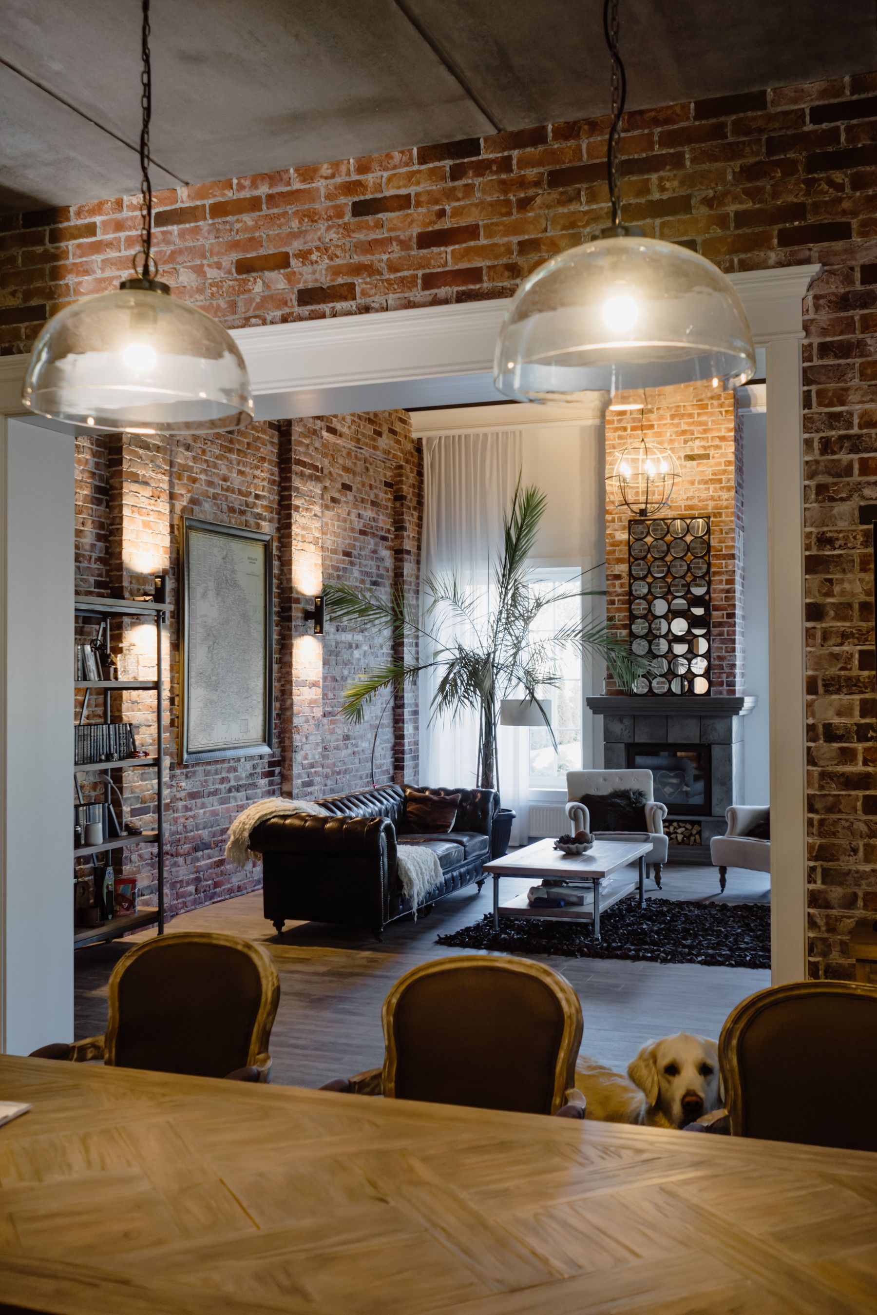
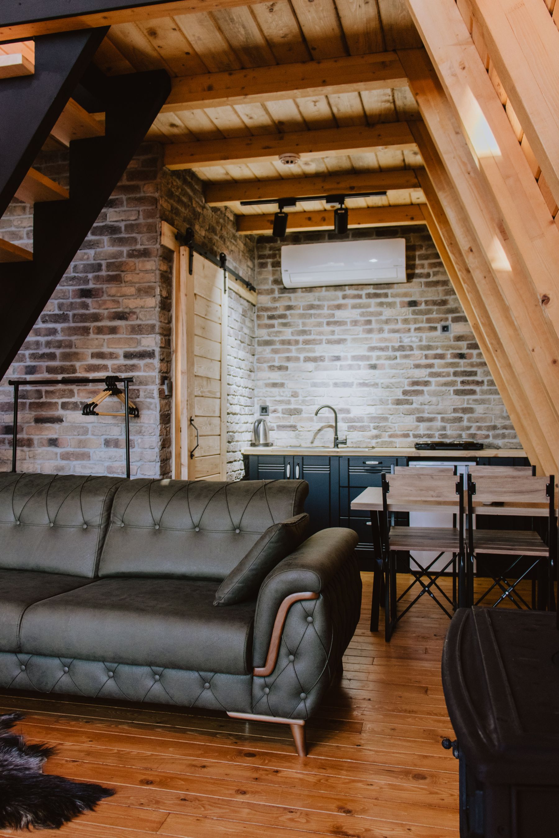
Treat exposed brick as a large red-family field even when it looks brown at first glance. Its mortar, fired variation and shadows create far more frequency than flat paint. Decide whether brick is the focal surface, a background envelope or a bounded architectural feature before adding red upholstery. A red sofa against red brick may need a pale or dark interval; a blue-grey chair may be the only additional color required. [Industrial Living Room Ideas](/living-room/industrial-living-room-ideas/) develops the structural relationship between exposed masonry, metal and services. Clean, repair and seal according to the exact masonry and building conditions rather than using palette logic as technical guidance.
Keep Red From Fighting the Artwork
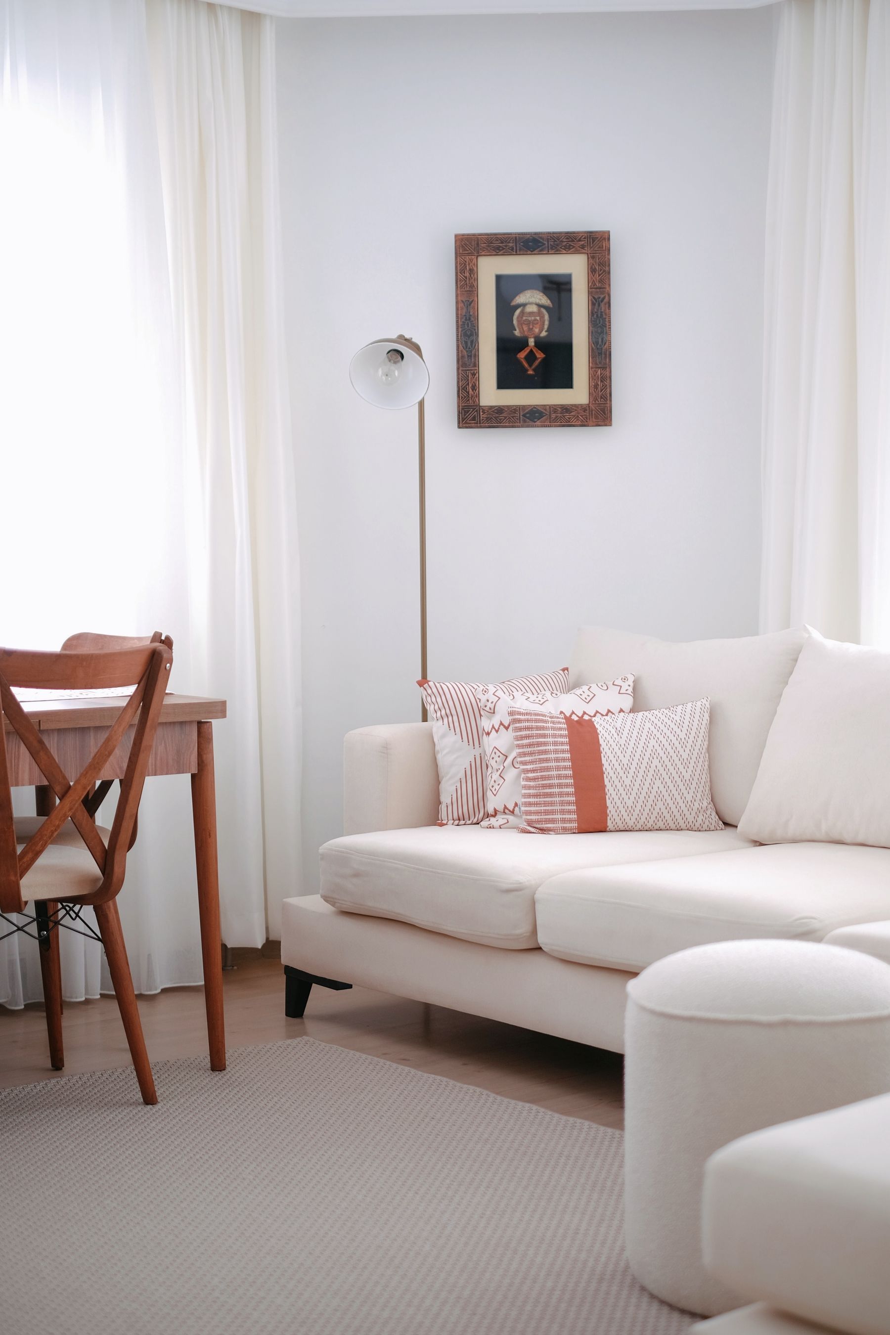
Inventory red inside the artwork as part of the room, not as content behind glass. A large red painting above a red sofa may collapse into one field; pale art on a red wall may punch a bright hole; many small works can turn red into a restless gallery background. Choose whether art or the architectural color owns the first look. Give the other scale, spacing and value that support a second reading. [Living Room Wall Ideas](/living-room/living-room-wall-ideas/) is the useful continuation when the full elevation still lacks structure. Avoid selecting artwork merely because it repeats the sofa color; subject, authorship and meaning matter more than palette matching.
Give the Television a Different Kind of Attention
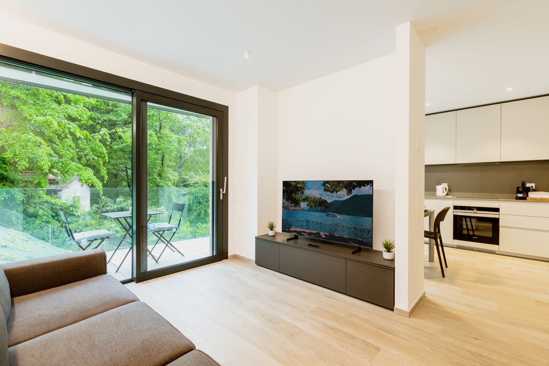
A switched-off television is a dark reflective rectangle; red is a chromatic attention magnet. If both occupy the same elevation, decide which should recede during the day and which should lead during viewing. A burgundy media wall can reduce the screen's value jump, while a true-red cabinet beneath a black screen may create two stacked signals. Keep controls, ventilation and viewing geometry practical. The goal is not to disguise equipment theatrically but to prevent the red composition from competing with every program.
Turn Repetition Into Rhythm, Not Confetti
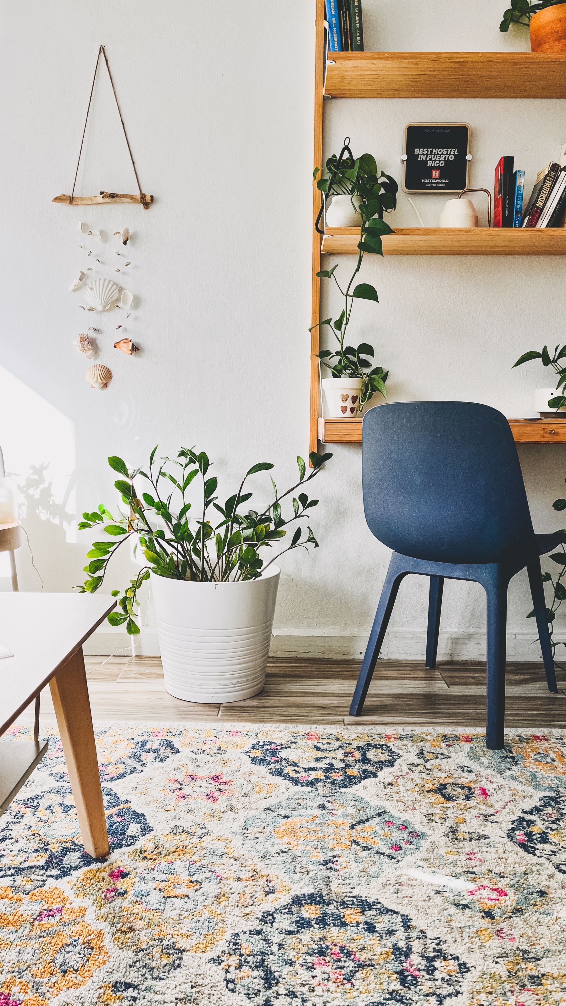
When red appears in a rug, textile or gallery, count repetitions and intervals. Three red notes aligned with the seating group can create rhythm; fifteen equally bright marks across the perimeter behave like confetti. Vary scale deliberately—a broad low-chroma stripe can support one clear-red chair, while many tiny scarlet motifs may compete with it. [Living Room Rug Ideas](/living-room/living-room-rug-ideas/) resolves construction and furniture placement; here the decision is chromatic frequency. Do not repeat red automatically to 'tie the room together.' Geometry, material and sightline can create connection without another chromatic echo.
Measure the Red Cast at the Window
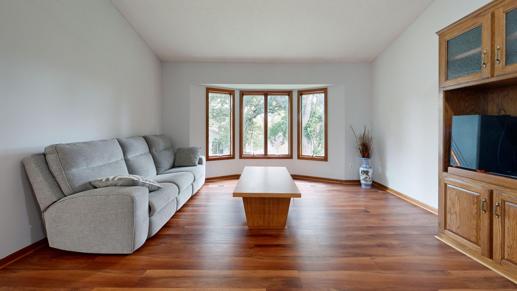
Curtain color changes with opacity. A translucent red or coral fabric can cast colored light onto walls, flooring and faces; a lined burgundy curtain reads more like a deep vertical panel. Sample the fabric against the actual window at the brightest hour and after dark from outside where relevant. If colored transmission is unwanted, keep red in the face fabric with a suitable lining rather than choosing by swatch alone. Window treatment decisions must also respect privacy, heat, fire-safety and installation requirements for the specific product and building.
Stop Warm Lamps Turning Red Brown
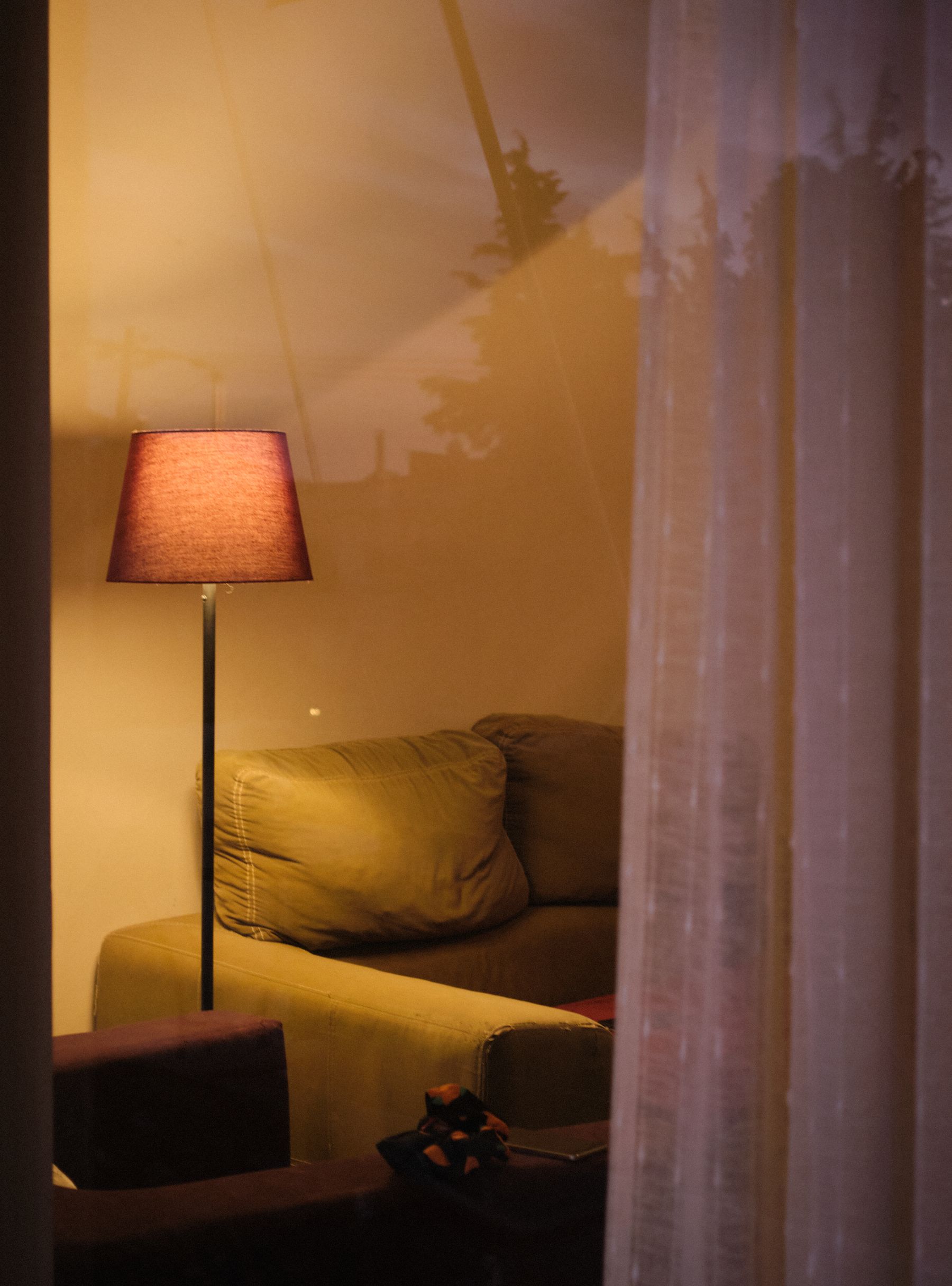
After sunset, very warm lamps can push clear red toward orange and make burgundy nearly brown, especially beside timber and cream. A single cool ceiling source can make the same room harsh. Test the actual red material under every normal lamp and dimming level, keeping enough face light and directional variation to preserve the sofa, wall and floor as separate shapes. [Living Room Lighting Ideas](/living-room/living-room-lighting-ideas/) covers the circuit plan; the red-specific task is maintaining its intended direction without tinting the social zone.
End Red Before the Next Zone Inherits It
Use red as a destination visible from the hall, dining area or kitchen, then stop it at a return, doorway, cabinet end or change of plane. The next zone may repeat the undertone in timber, art or one small textile, but it does not need another equal red focal point. Check views in both directions: a red sofa may be a useful endpoint from the kitchen yet overwhelm the living room when backed by red dining chairs. One shared sightline should have one chromatic leader.
Choose Style Evidence Beyond the Color
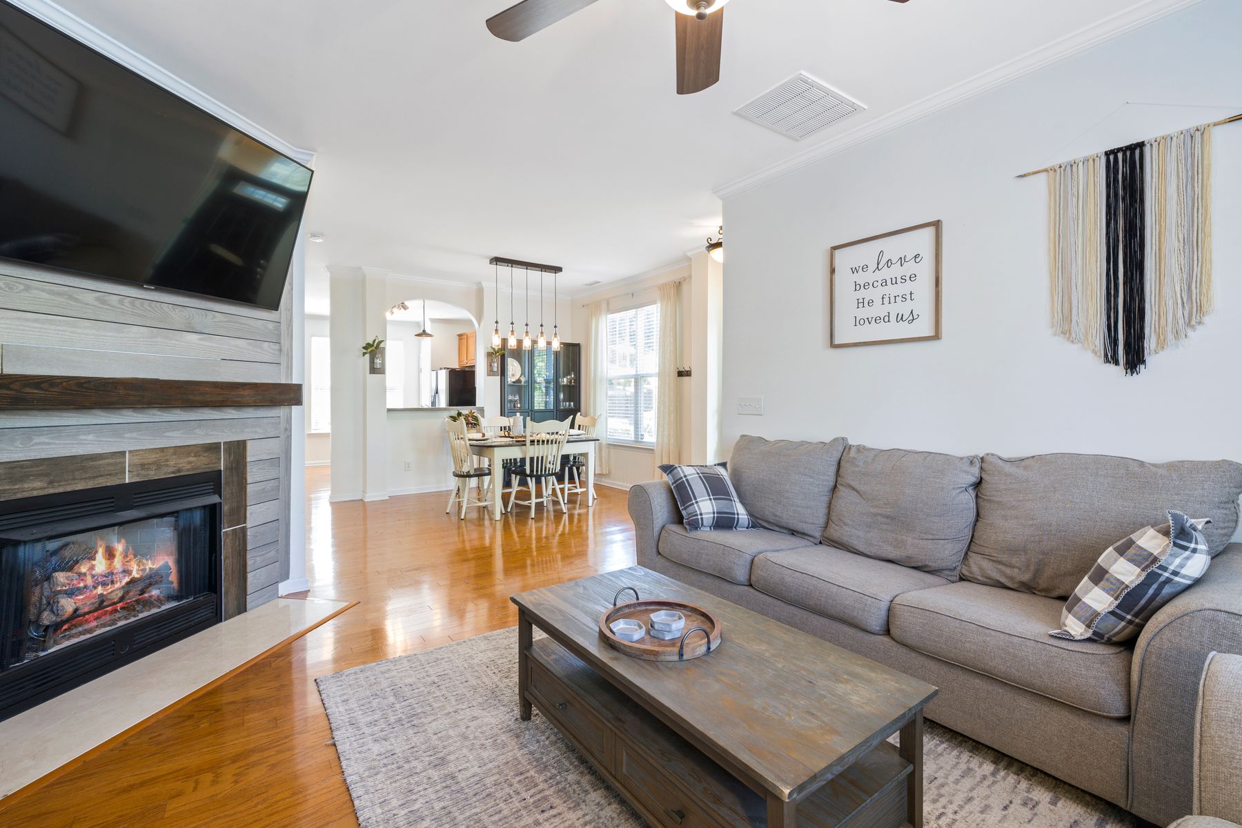
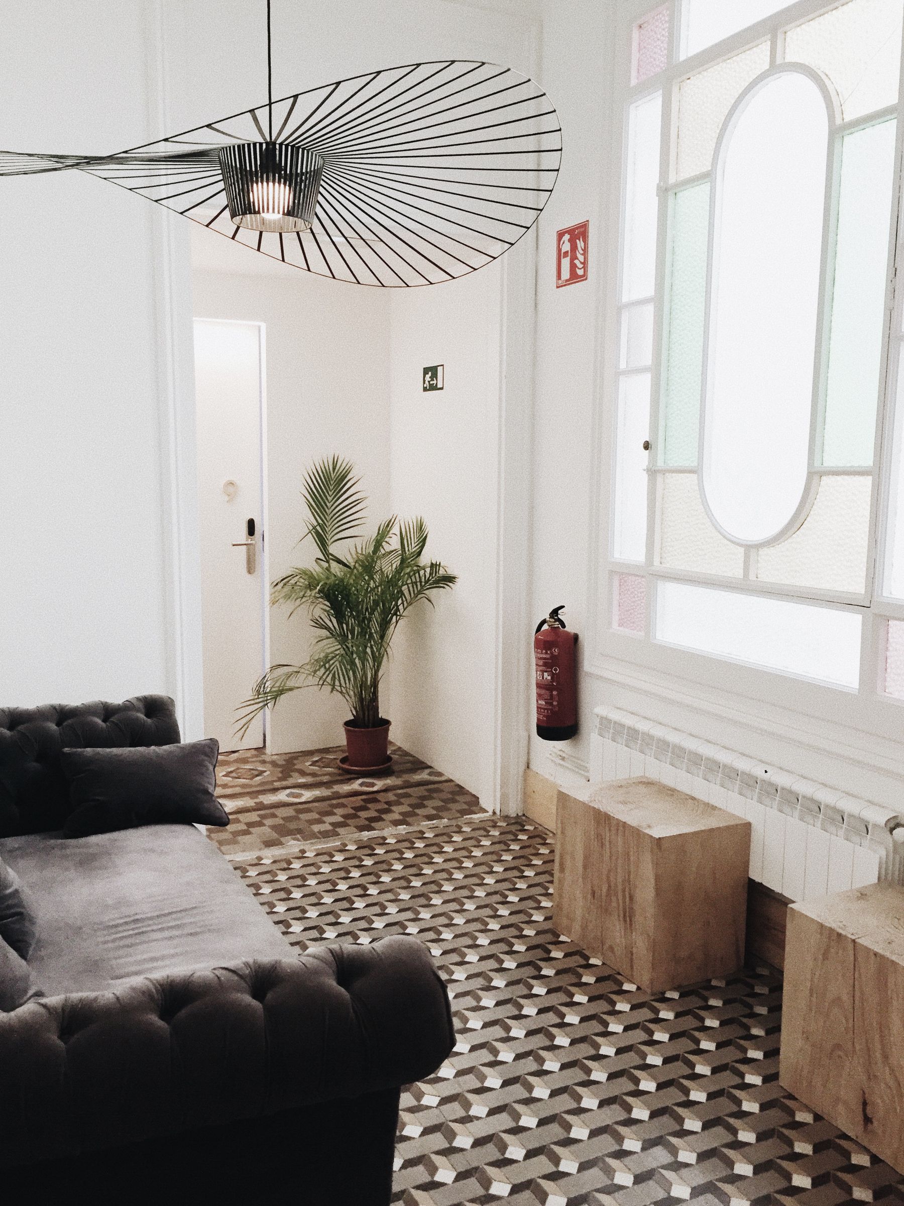
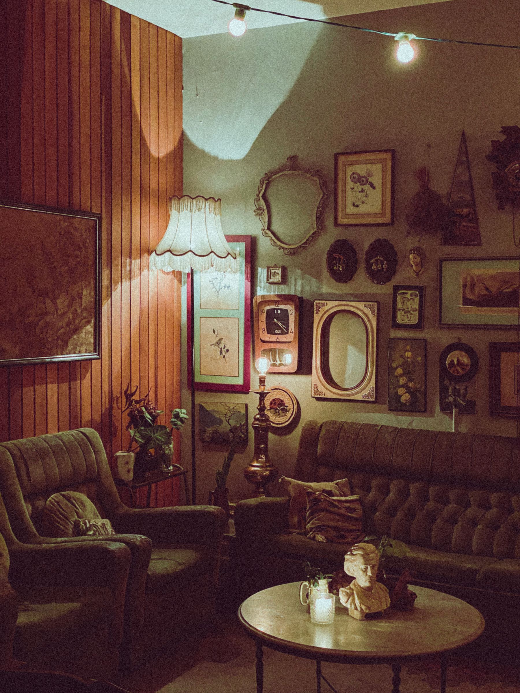
Red can appear in Art Deco, Victorian, Gothic, retro, contemporary, rustic or minimalist rooms. Do not add black lacquer to prove Art Deco, dark arches to prove Gothic or a shag rug to prove the 1970s. [Vintage Living Room Ideas](/living-room/vintage-living-room-ideas/) begins with architecture, era mixing and useful old pieces; Art Deco begins with geometry and formal organization. A red room should remain coherent after those tokens are removed. Choose style evidence because it suits the building and use, not because red needs a costume.
Plan for Pile, Touch, Sun and Repair
Red makes variation easy to notice. Velvet pile can produce dark and bright panels; leather may change at high-contact areas; painted repairs can flash if sheen or batch differs; textiles exposed unevenly to sunlight may not age uniformly. Follow the exact manufacturer or material supplier's care and exposure guidance, keep paint and finish records, and test cleaners discreetly. Patina can be welcome, but cracking, delamination, stains and failed repairs are material problems rather than proof of character.
Run the Cover-the-Red Attention Audit
Create five views: entrance, main seat, opposite conversation seat, screen position and longest open-plan sightline. In each image, digitally cover the red. If the room loses its intended focal order, red is doing useful work. If circulation, furniture balance or art improves, red may be hiding a structural problem. Restore red and check the first-second-rest sequence, face reflection, timber and brick boundaries, repetition count and night behavior. Remove any red object whose only job is proving that the palette is red.