
Define White-Led Before You Remove Every Other Color
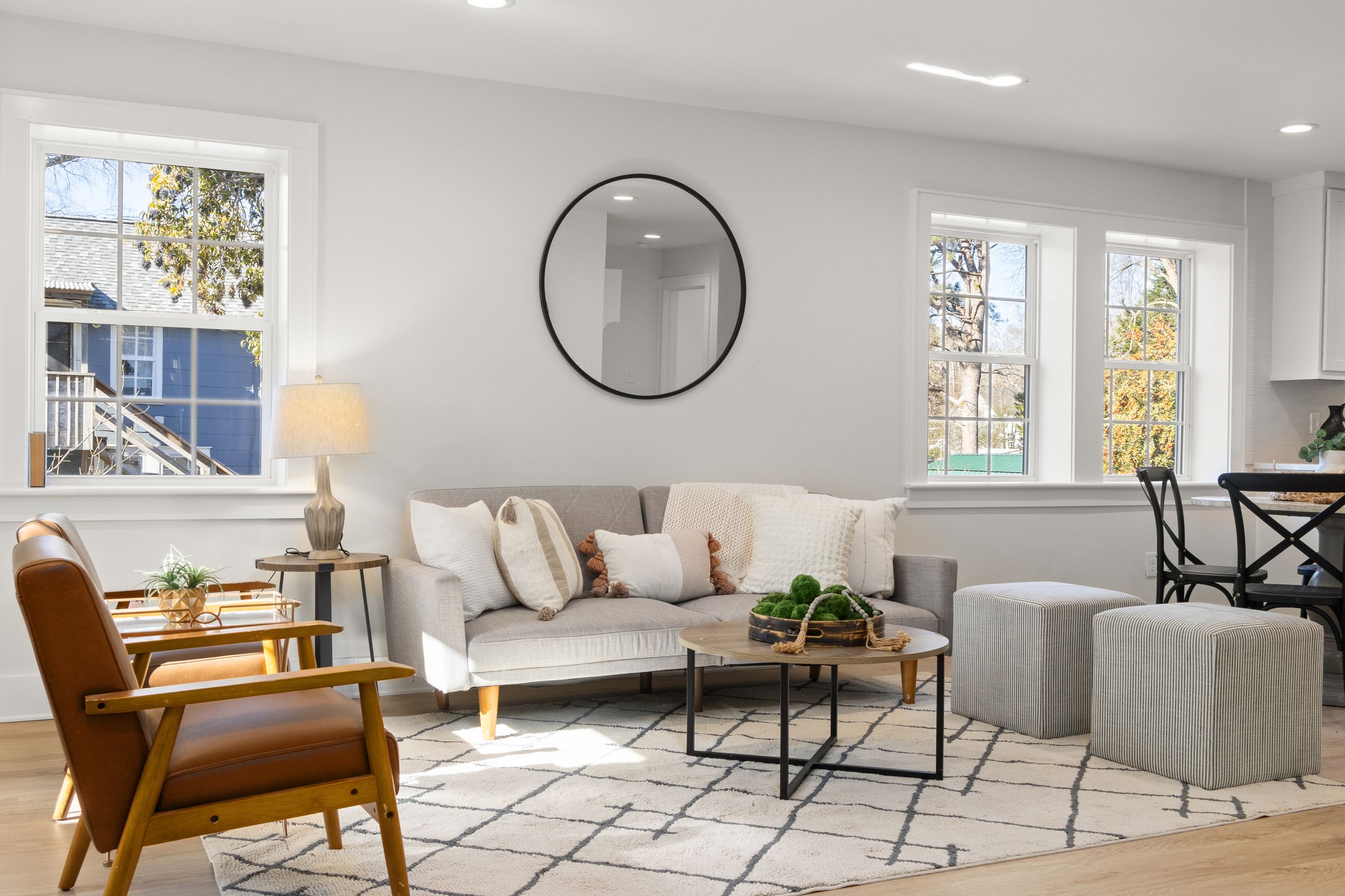
A white living room is one in which the largest reflected fields—usually walls, ceiling, major upholstery or curtains—create the dominant experience. It does not require white timber, white art, white books and a ban on color. Decide which pale planes should connect and which objects deserve to interrupt them. This separates the destination from [Minimalist Living Room Ideas](/living-room/minimalist-living-room-ideas/), where reduction and possession are the central questions. A white room may be collected, historic, contemporary or colorful at the edges; its identity comes from how light travels across a pale field.
Choose White by What the Room Reflects
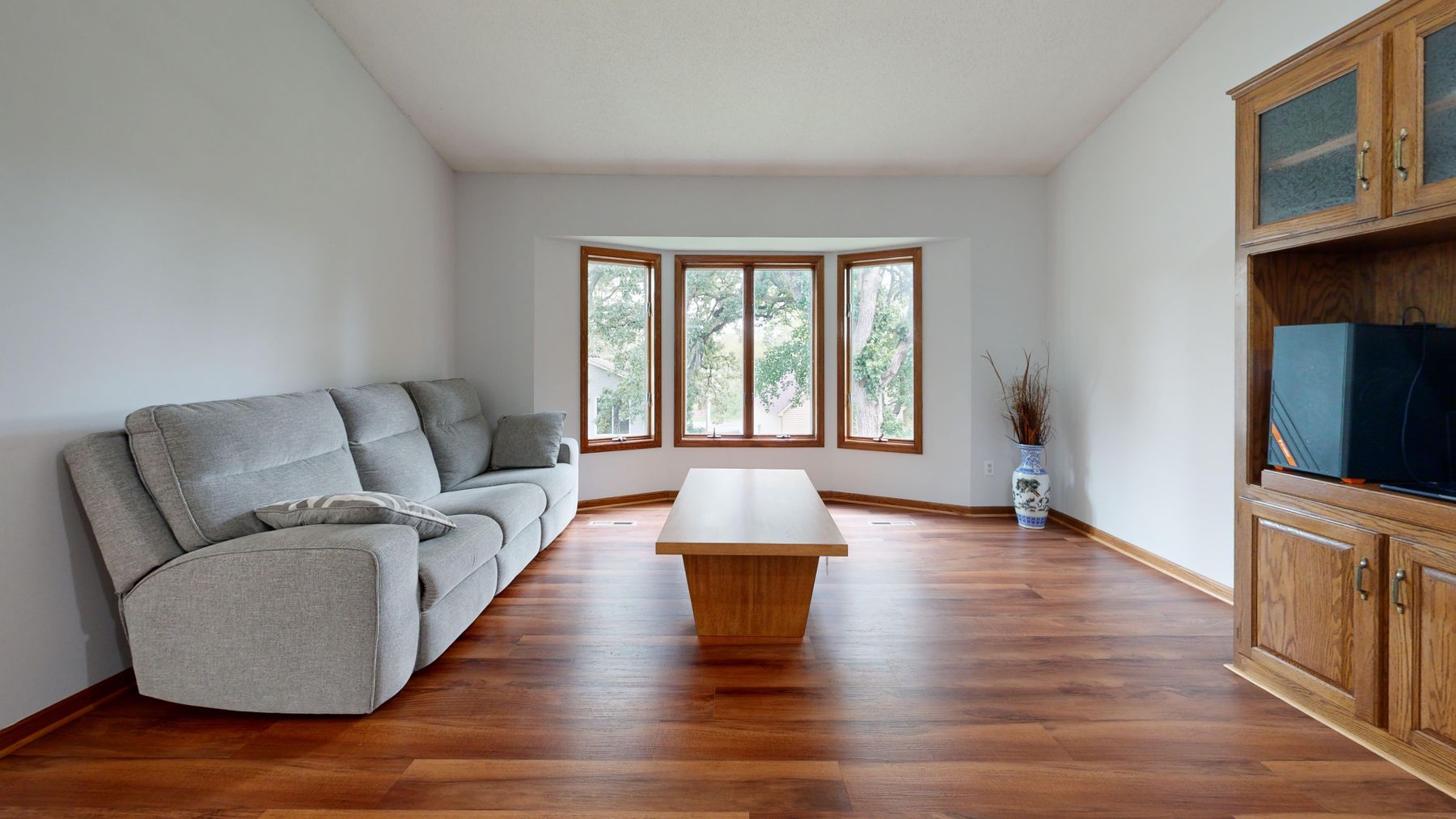
White is unusually responsive to borrowed color. Cool sky, foliage, red brick, warm timber flooring and neighboring painted walls can all shift its appearance. Start with the largest fixed reflector: floor, window view or stone surround. Test movable boards beside it at morning, midday and evening, then repeat behind the sofa and near the darkest corner. A warmer white may steady cool exposure; a cleaner one may prevent orange floorboards from making the walls look creamy. The test matters more than the label, light-reflectance number or online photograph.
Build a Shadow Budget
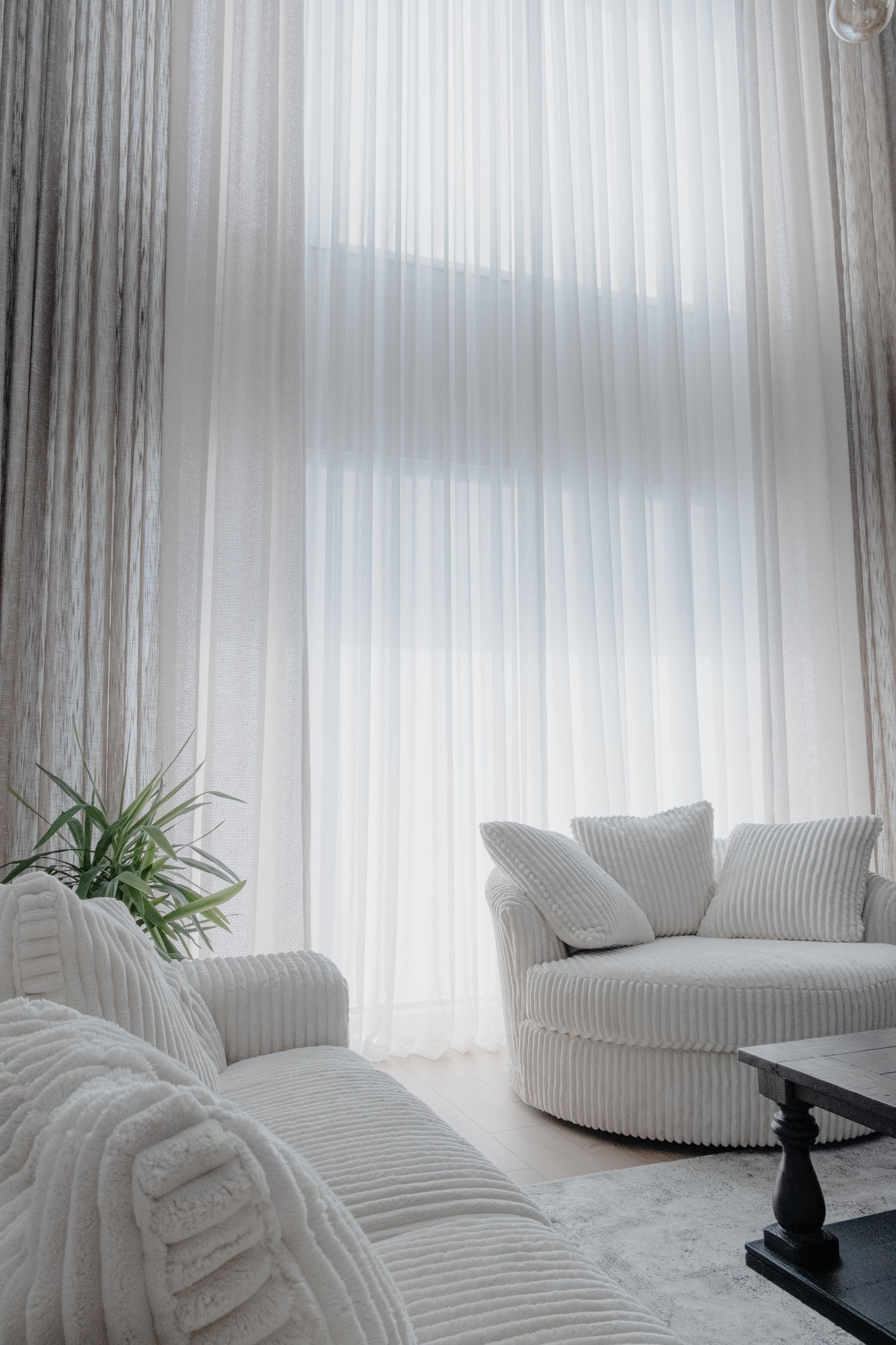
An all-pale room needs shadow as much as it needs light. Allocate it through curtain folds, upholstery channels, shelving reveals, moulding, limewash movement, deep rug pile and the gap beneath furniture. These are not decorative textures to scatter indiscriminately; each should make a large plane easier to read. If every surface is smooth, front-lit and the same value, the room becomes a bright photograph with little spatial memory. If every surface is heavily textured, white loses its quietness. Aim for one architectural source of shadow and two tactile sources at body level.
Do Not Match the Largest Pale Masses
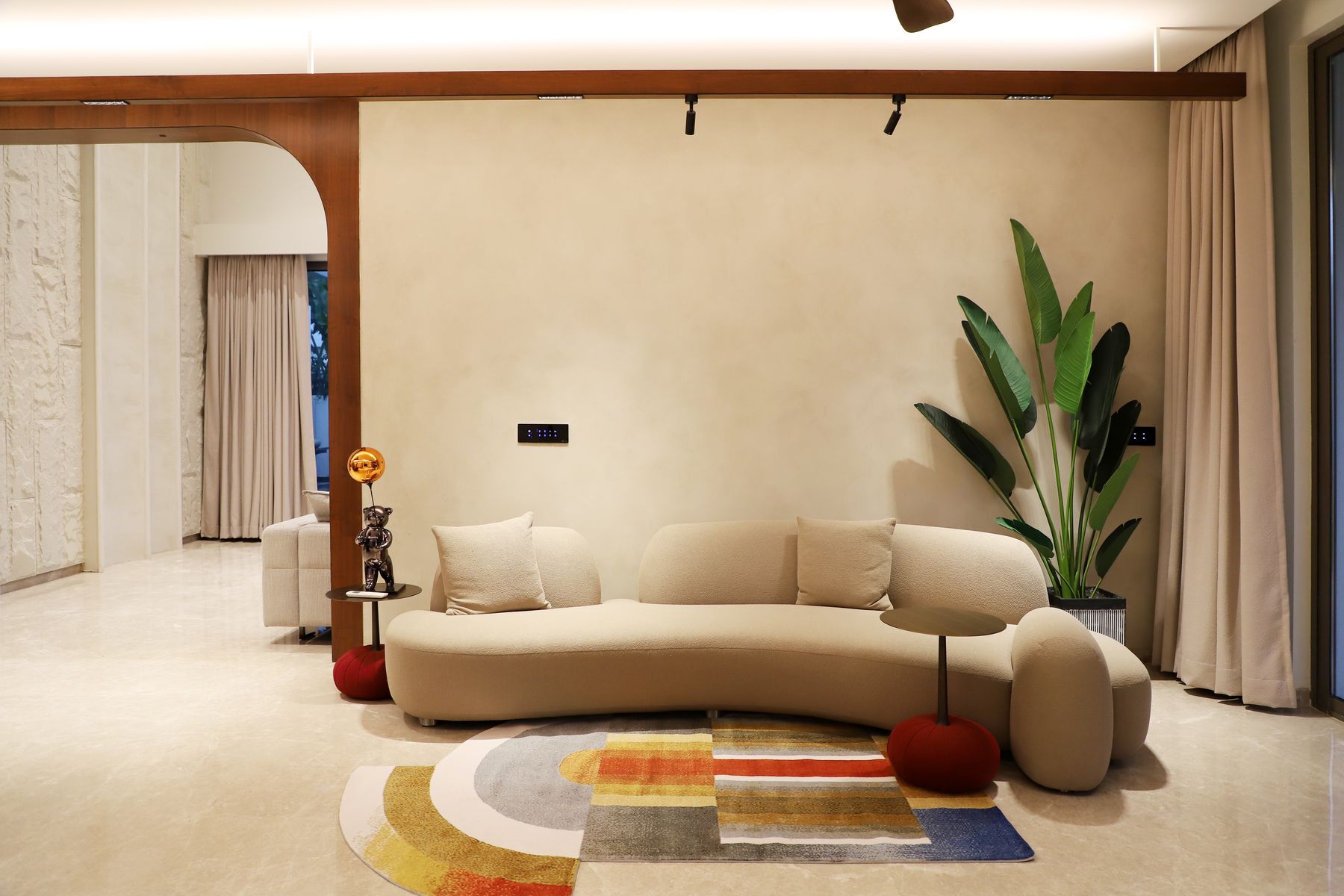
Wall white and sofa white perform different jobs. Paint is read as a broad reflecting plane; upholstery has pile, seams, wear and a large three-dimensional silhouette. Let them belong to the same temperature family, then separate them by value or surface. A chalky wall may suit an oatmeal sofa; a cleaner wall can support warmer boucle or linen. An exact-looking match often fails as soon as daylight changes or the fabric ages. Ground the seating with a rug, visible legs or a low table rather than outlining every pale object in black.
Choose Between a White Envelope and One Colored Volume
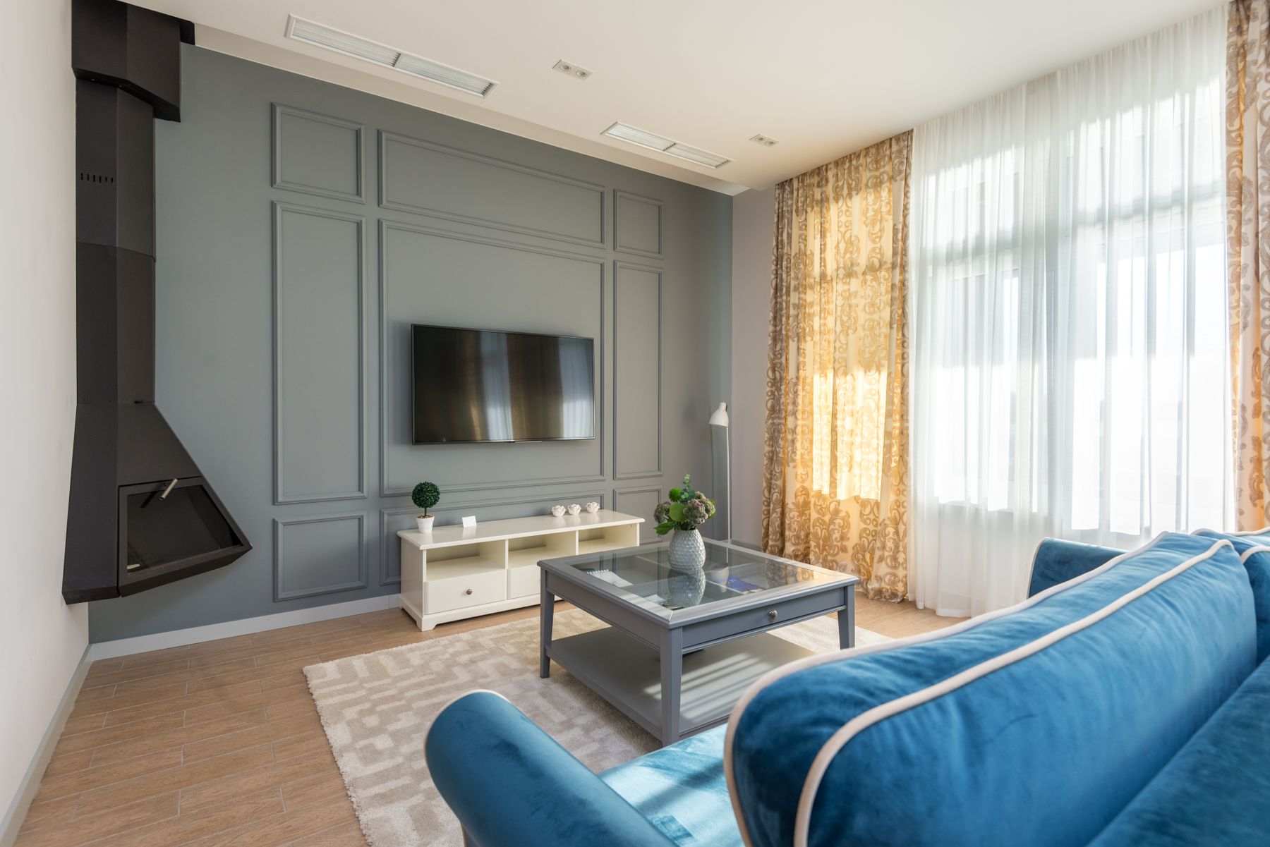
A white envelope lets shape and shadow lead. One colored volume makes the pale shell a deliberate background. Both are stronger than a room filled with small cushions, vases and prints chosen merely to ‘break up the white.’ If color matters, give it a useful scale: sofa, pair of chairs, curtain wall, cabinet or one artwork with enough presence to affect the whole seating group. Repeat the hue once, quietly, if needed. The room should still read as white-led because the color occupies a defined volume rather than competing on every plane.
Let Relief Give White Architecture a Memory
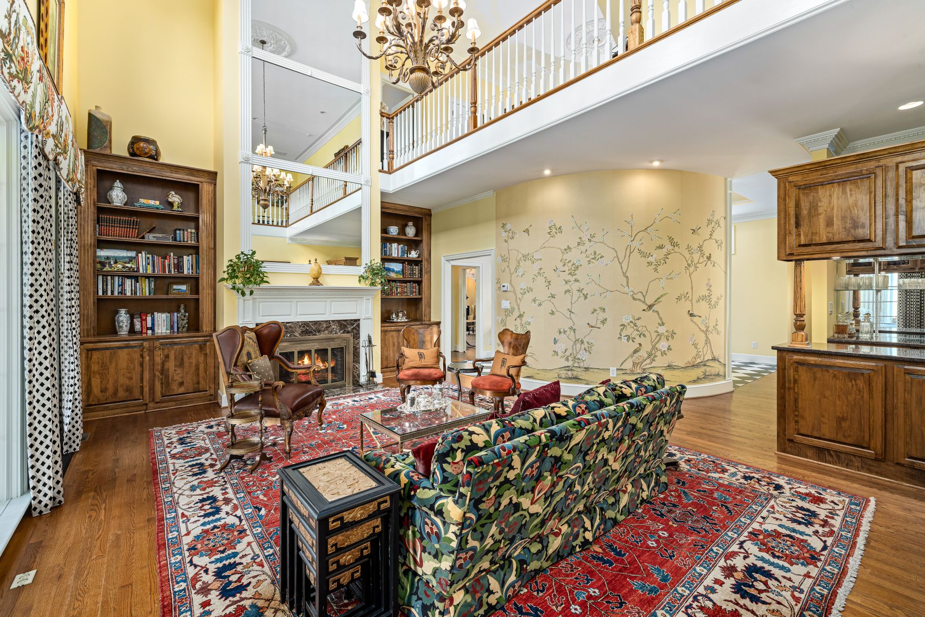
In a period or traditional shell, white becomes richer when it reveals rather than erases construction. Keep moulding profiles, mantel depth, window reveals and panel joints visible through restrained paint build-up and appropriate preparation. In a plain room, a shallow shelf, framed opening or textile panel can create relief without imitating history. This is where [Cottage Living Room Ideas](/living-room/cottage-living-room-ideas/) offers useful lessons about irregular shells and inherited features, but white should clarify the architecture actually present rather than manufacture character through applied trim alone.
Keep a White Fireplace Dimensional
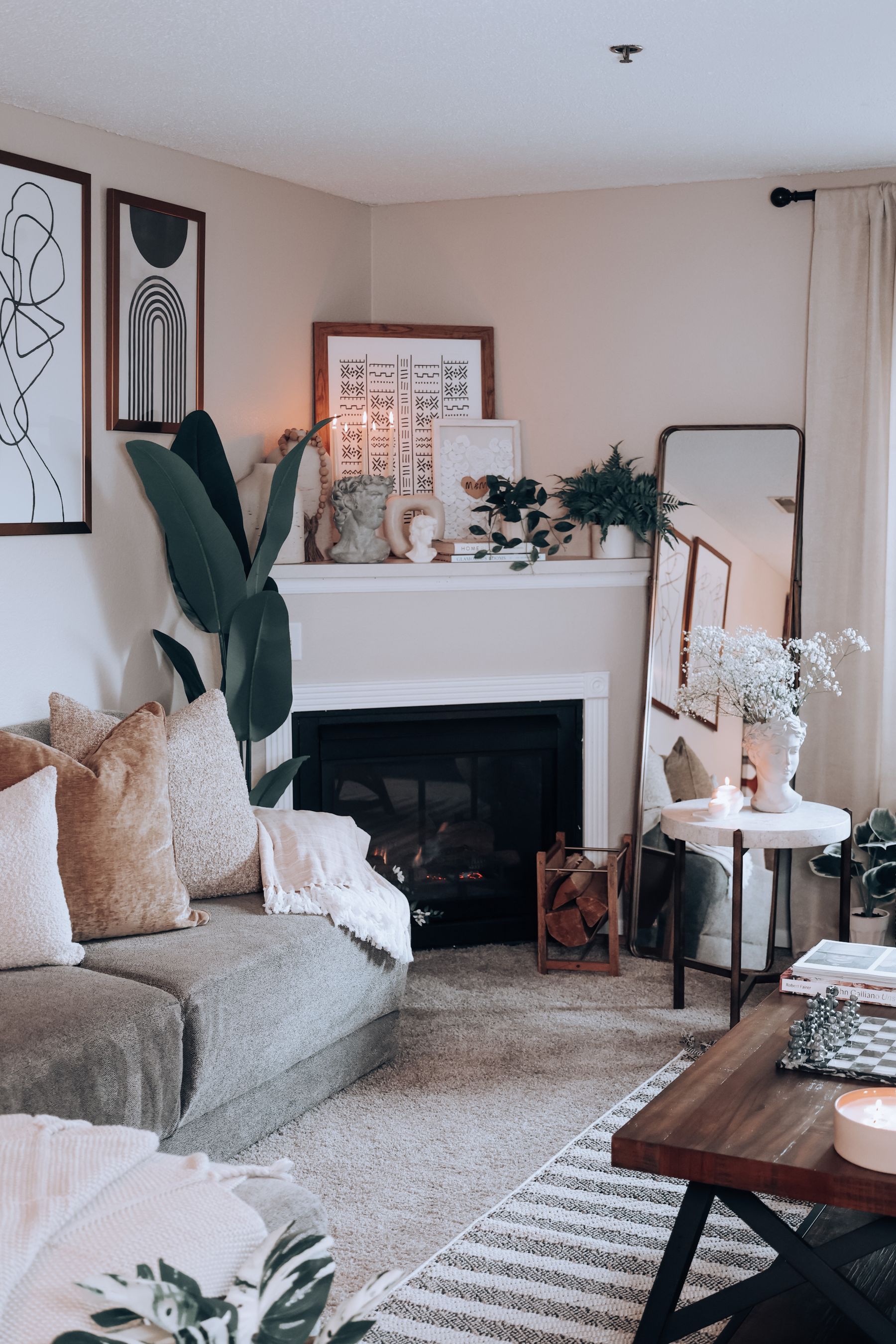
A fireplace painted to match the wall can either feel architectural or disappear except for a floating dark opening. Preserve at least two depth cues: mantel projection, hearth line, surround joint, side light or a controlled material change. Avoid placing many tiny dark objects along the mantel to ‘balance’ the firebox. One mirror, artwork or substantial object can relate the opening to the wall without turning it into a dotted outline. Seating should still face people comfortably; the fireplace is a focal participant, not a reason to stretch the conversation group beyond use.
Treat the Television as One Intentional Dark Void
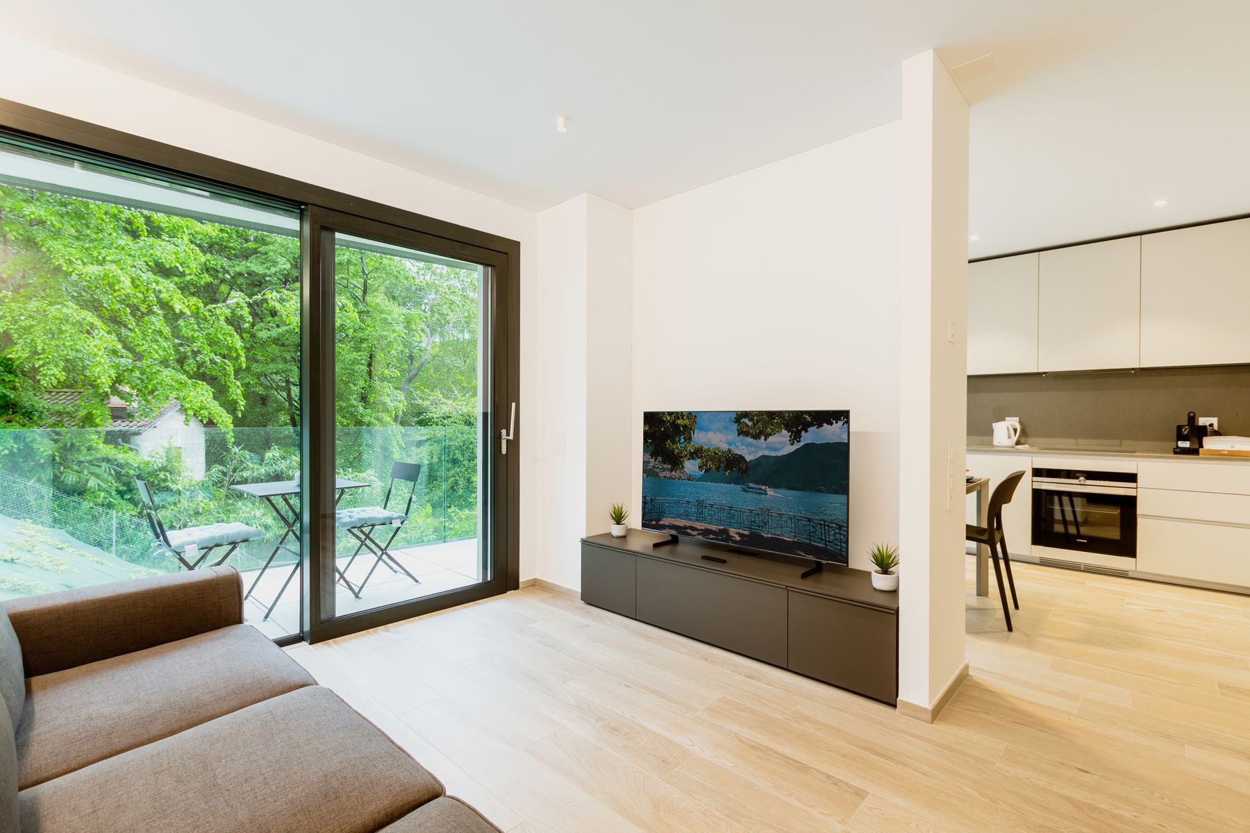
On a white wall, a switched-off television becomes the room's most explicit dark shape. Decide whether to accept that graphic rectangle, soften its contrast with a mid-value panel or integrate it into shelving with enough breathing room. Do not repeat black picture frames and accessories simply to make the screen look intentional; that usually multiplies the problem. Resolve viewing height, glare, cable access and ventilation first. [Living Room Layout Ideas](/living-room/living-room-layout-ideas/) can help position the screen without sacrificing the social center.
Make the Social Center Read as One Group
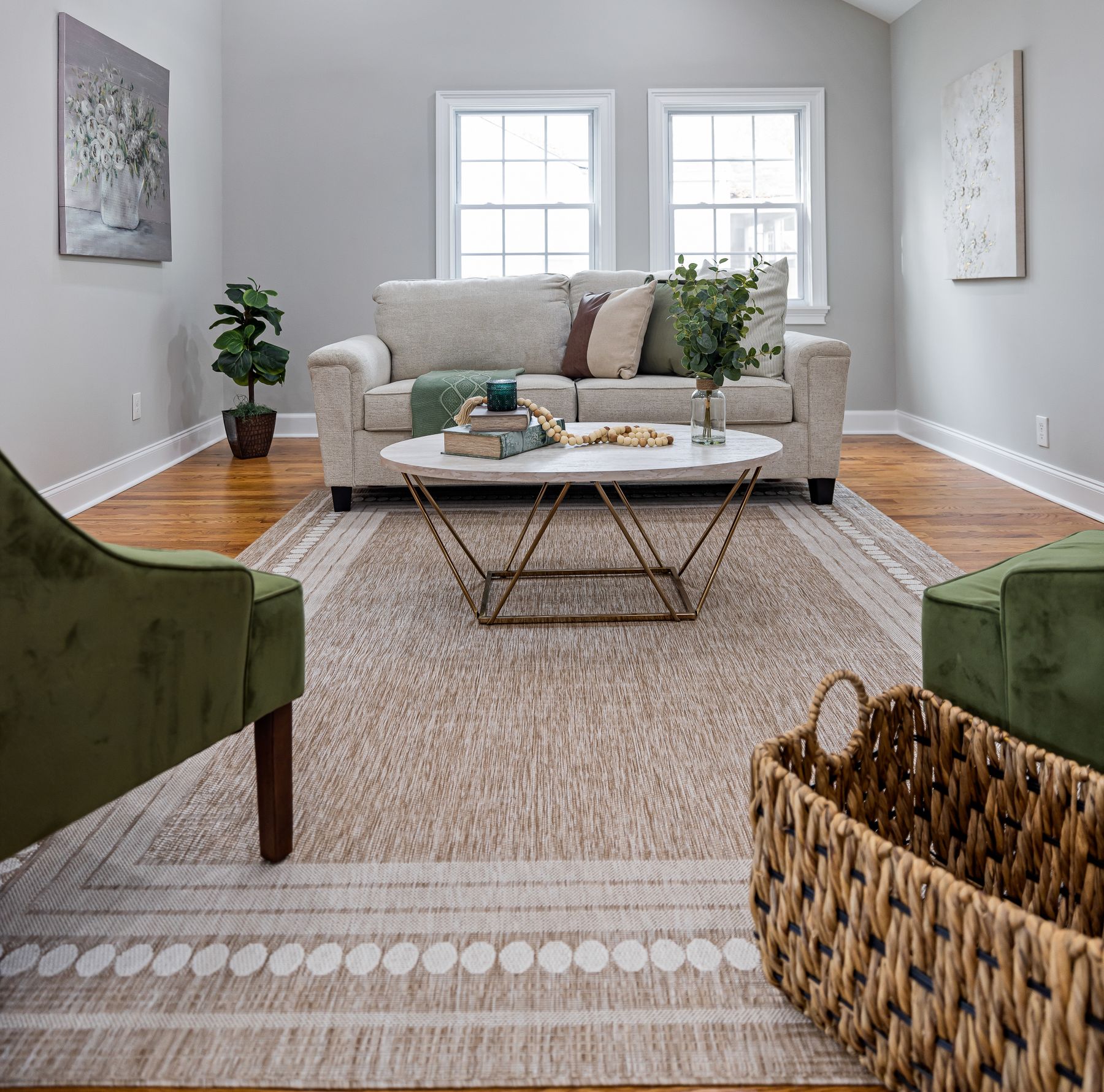
White sofas and pale chairs can lose their relationship when they sit against a pale shell with no shared center. Use a rug boundary, substantial coffee table, consistent seat orientation and reachable side surfaces to make the conversation group legible. Contrast does not need to outline every chair; one timber table, pair of deeper-toned chairs or visible floor band may be enough. Keep normal speaking distance and preserve the primary route around, not through, the group. The white palette should reveal the social plan rather than make a furniture showroom of isolated pieces.
Let the Ground Plane Define the Pale Island
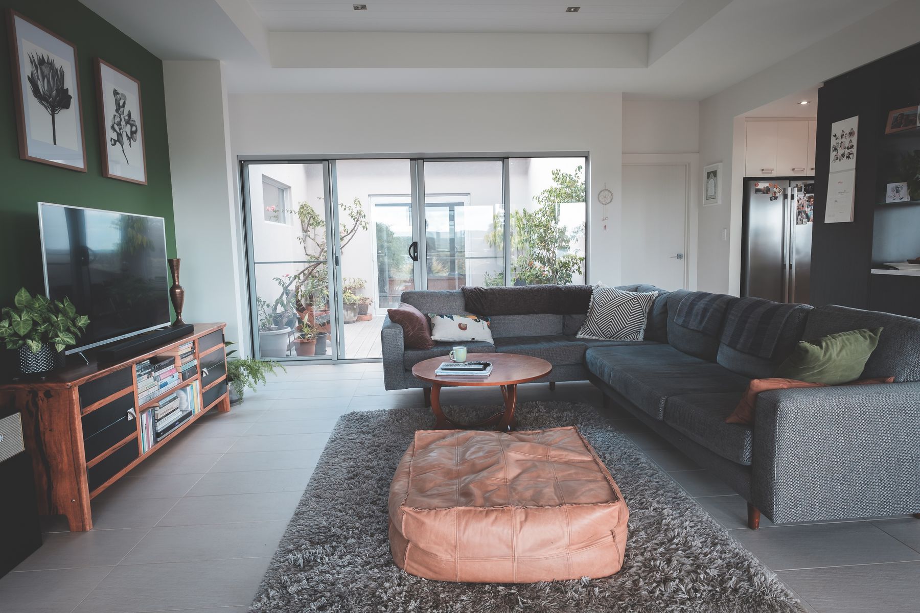
In a white room, the rug often supplies the missing middle value between upholstery and floor. Choose its job before its pattern: connect the seating, protect a high-use zone, soften acoustics or reveal pale furniture edges. A mid-value weave is usually easier to integrate than a tiny high-contrast motif. Size still matters more than color; the rug should relate to the front legs and circulation rather than float beneath the table. [Living Room Rug Ideas](/living-room/living-room-rug-ideas/) covers the fit decisions in more depth.
Specify the Most-Touched Pale Surface First
White upholstery is not automatically impractical, and fabric described as high-performance is not automatically invulnerable. Assess the exact weave, seam construction, care code, removable components, replacement options and household use. A loose cover may suit frequent washing only when the maker permits it and refitting is realistic. A tighter textured neutral may disguise minor variation but trap debris differently. If children, pets, food or direct sun shape the room, let those routines select the construction before a pristine photograph selects the shade.
Hold to One Grain Temperature
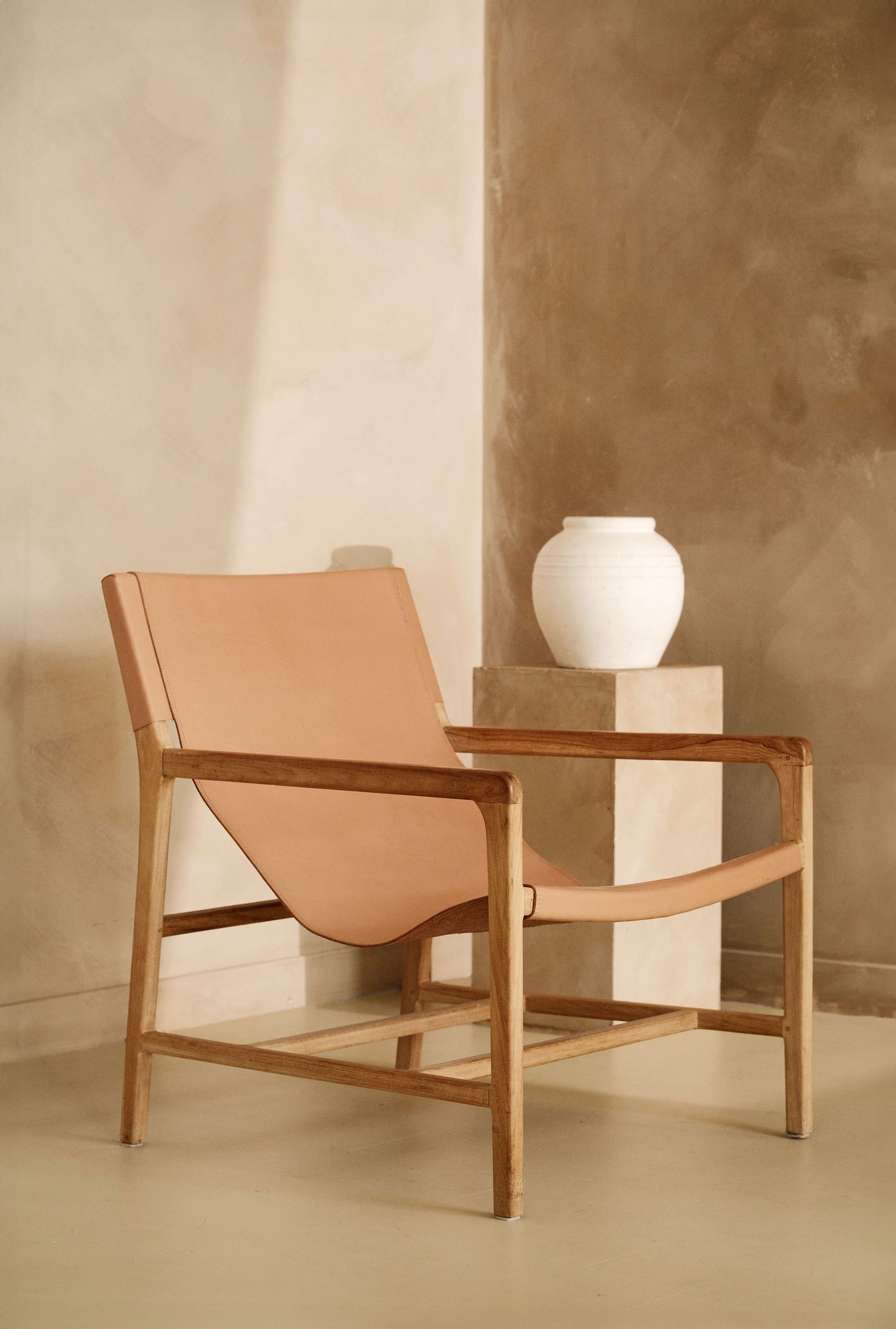
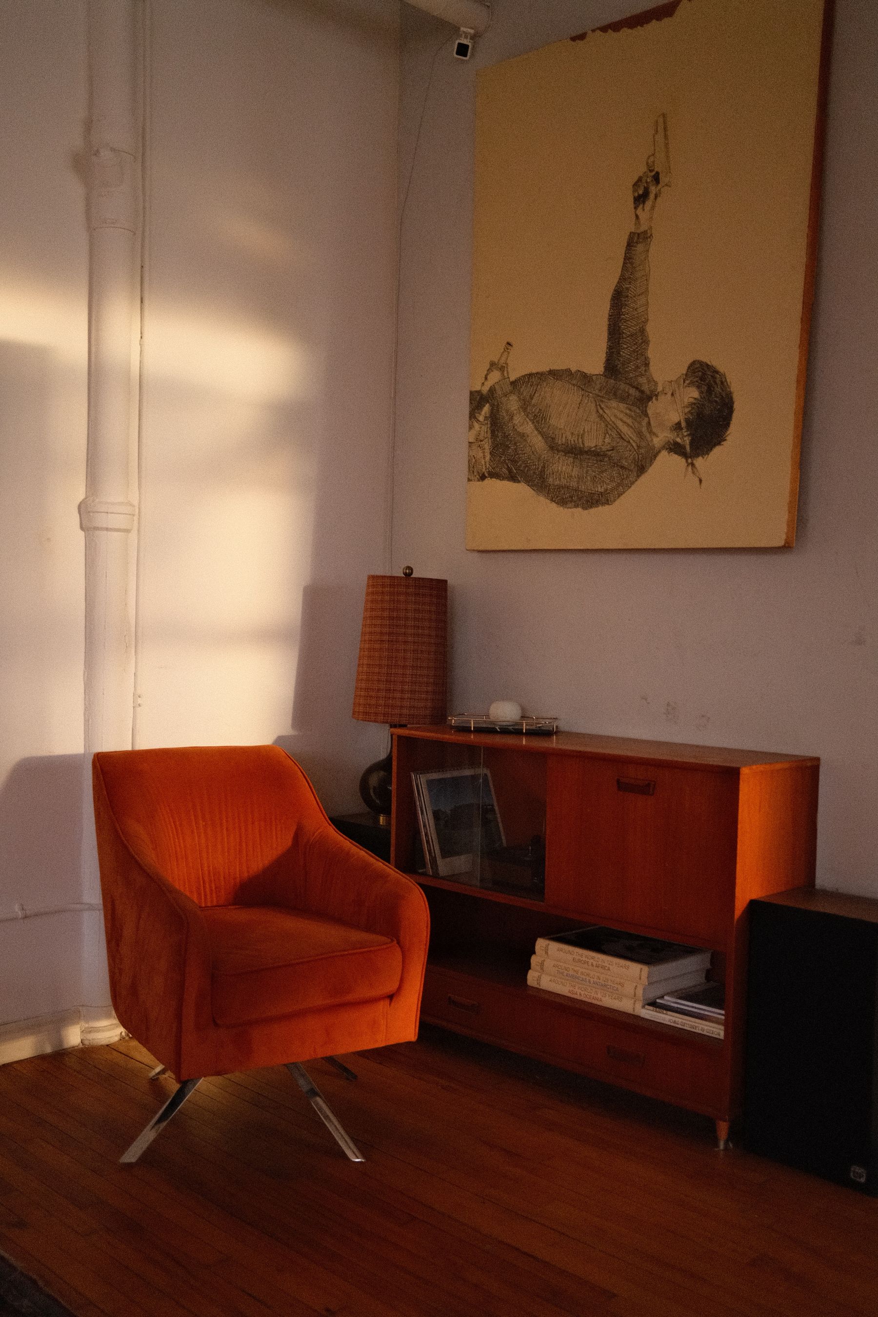
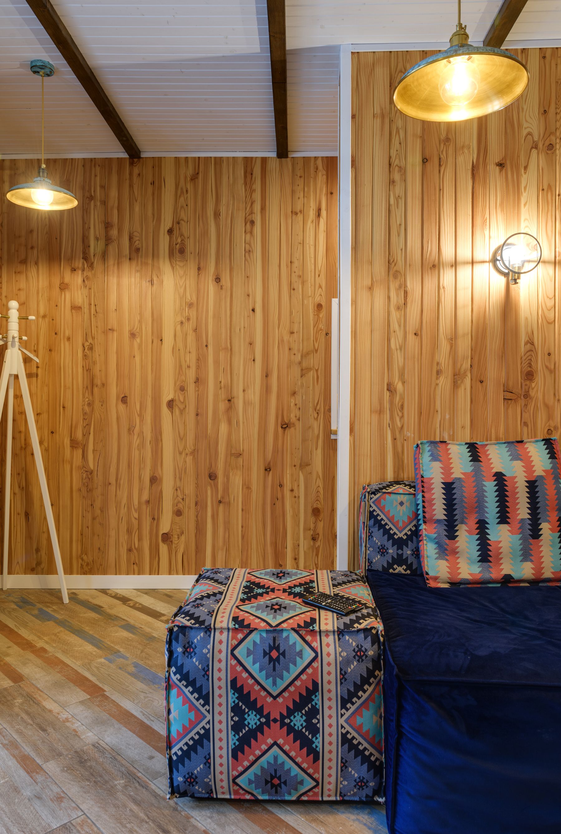
Wood can connect a pale shell to human-scale furniture, but several unrelated orange, grey and red timbers make white look unstable. Begin with the floor or largest fixed joinery and choose one temperature to lead. Repeat it in two structurally useful places such as a table and sideboard; smaller variation from age and grain is welcome. Pale oak keeps contrast gentle, while walnut or stained timber can provide a deliberate anchor. The aim is not to ‘warm up white’ generically but to give the eye one consistent material interval.
Use Material Joints Instead of Beige Filler
When a white room feels thin, the answer is often a material relationship rather than more neutral objects. Let timber meet plaster cleanly, wool sit against stone, linen filter glass or ceramic interrupt a smooth shelf. These joints create scale and tactile contrast while keeping the palette quiet. Beige cushions, pampas grass and small baskets become filler when they do not clarify a plane, task or transition. Use fewer material families, but allow each to appear in a place where its edge, grain or softness can actually be seen.
Give One Chromatic Volume a Real Job
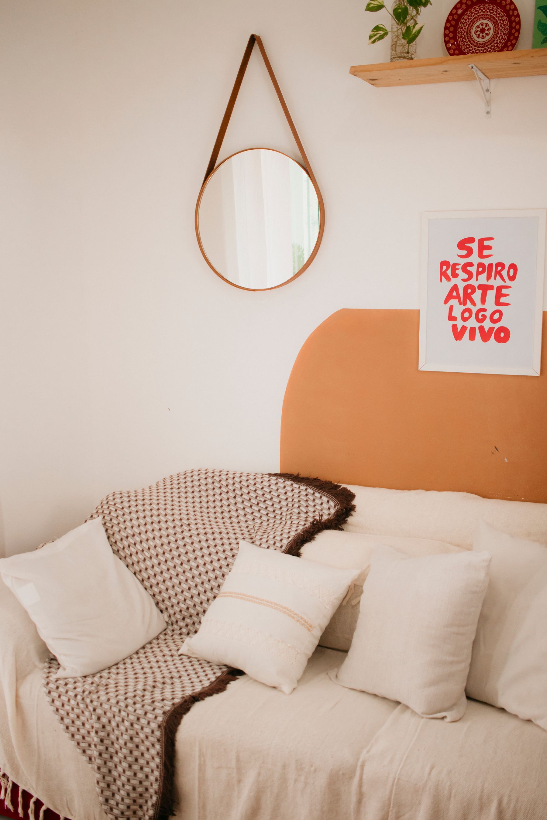
Color earns its place when it solves composition: framing the sofa, identifying a reading zone, balancing a view or giving one cabinet visual authority. A bounded painted field, substantial textile, chair pair or large artwork can do this. Random accent-color repetition turns the white room into a theme assembled object by object. Keep the pale field dominant and let the colored element remain large enough to be understood from the doorway. For a fully value-led alternative, compare [Black and White Living Room Ideas](/living-room/black-and-white-living-room-ideas/).
Use Plants Only Where the Light Supports Them
Green leaves can be striking against white, but plants are living occupants rather than automatic styling. Match the species and placement to the actual light, temperature, watering routine and household safety needs; relocate or choose another object when conditions are unsuitable. One healthy floor plant or connected group usually contributes more than many small pots spread around the room. Its pot should join the material plan instead of starting another accent-color sequence. White makes decline and dust visible, so care is part of the composition.
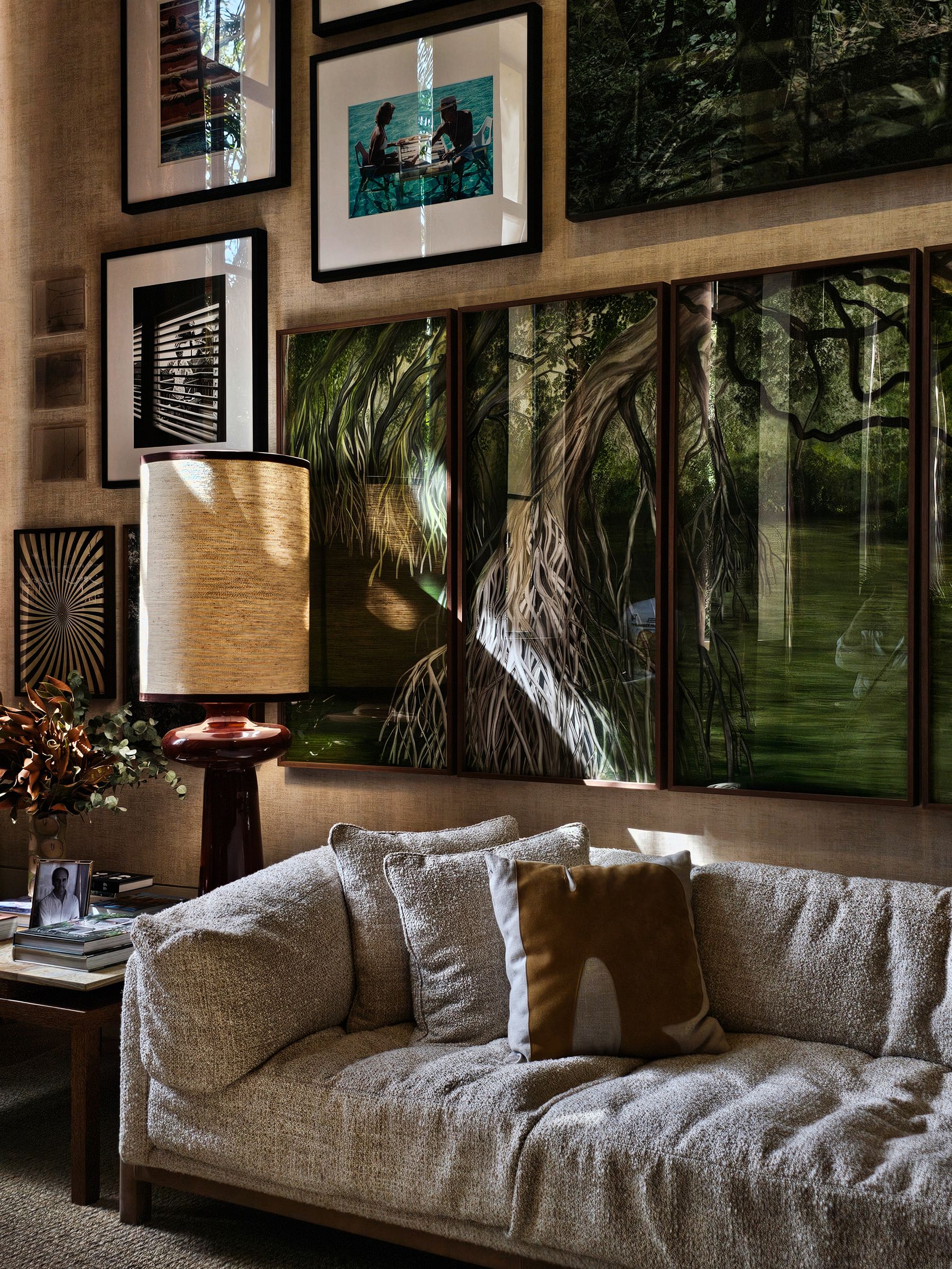
Hang Art as a Bounded Interruption
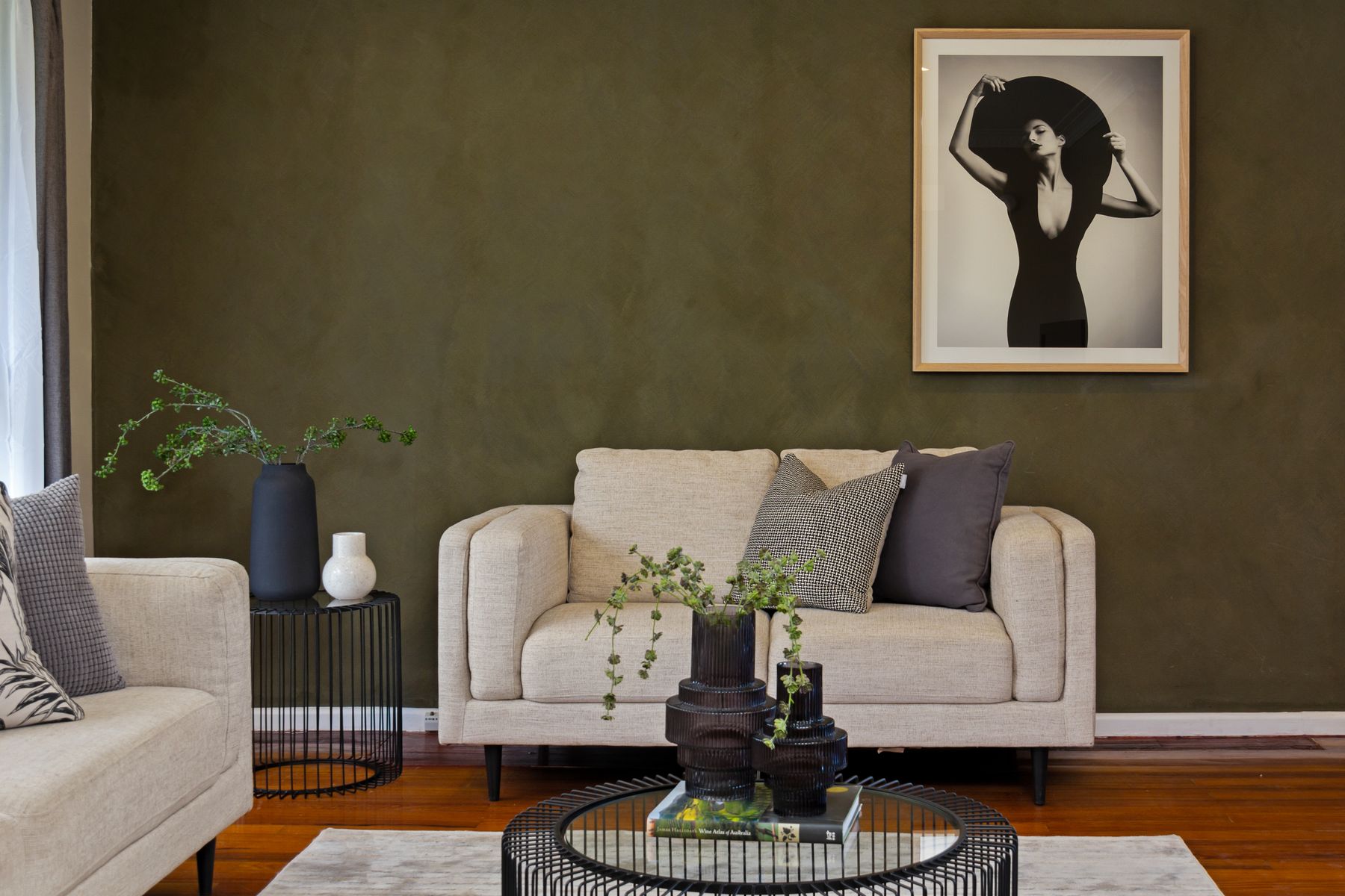
White is a gallery background only when the art, frame and glazing suit the wall and light. Choose one large work or a grouping with a clear outer boundary; tiny pieces dispersed across a broad wall make the empty intervals feel accidental. Check reflections from the main seat before fixing height, especially opposite large windows. Dark frames are not obligatory—timber, painted, metal or frameless presentations can work when their edges remain visible. [Living Room Wall Ideas](/living-room/living-room-wall-ideas/) offers more ways to balance art with paneling, shelves and television walls.
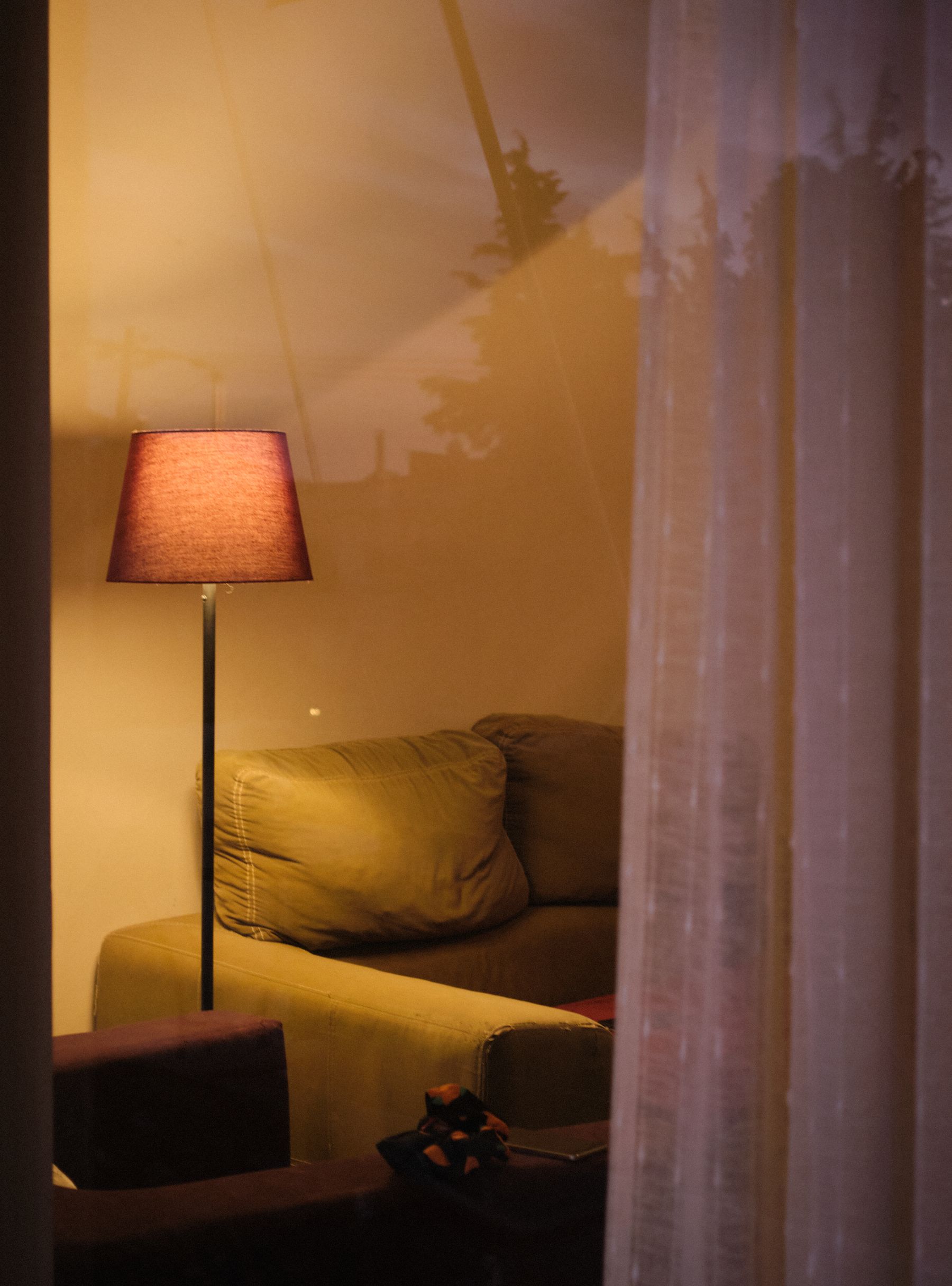
Rebuild the Room After Sunset
A white room designed only for daylight can become flat grey or over-bright after sunset. Build the evening scene from useful pools: a reading lamp at the chair, softer ambient light for conversation and controlled illumination at art or shelving where needed. Several dimmable sources can offer flexibility, but compatibility and electrical work must follow the exact fittings and qualified guidance where required. Avoid one bright ceiling source that erases relief and makes pale upholstery glare. [Living Room Lighting Ideas](/living-room/living-room-lighting-ideas/) expands the task and control plan.
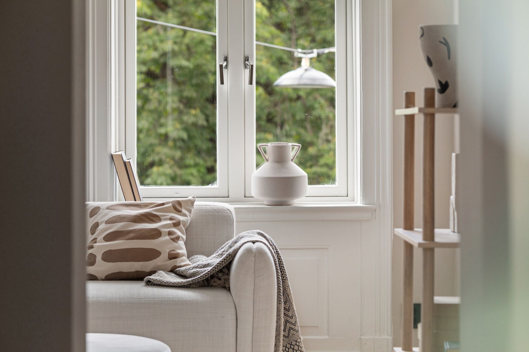
Make Daytime Softness Earn Its Place
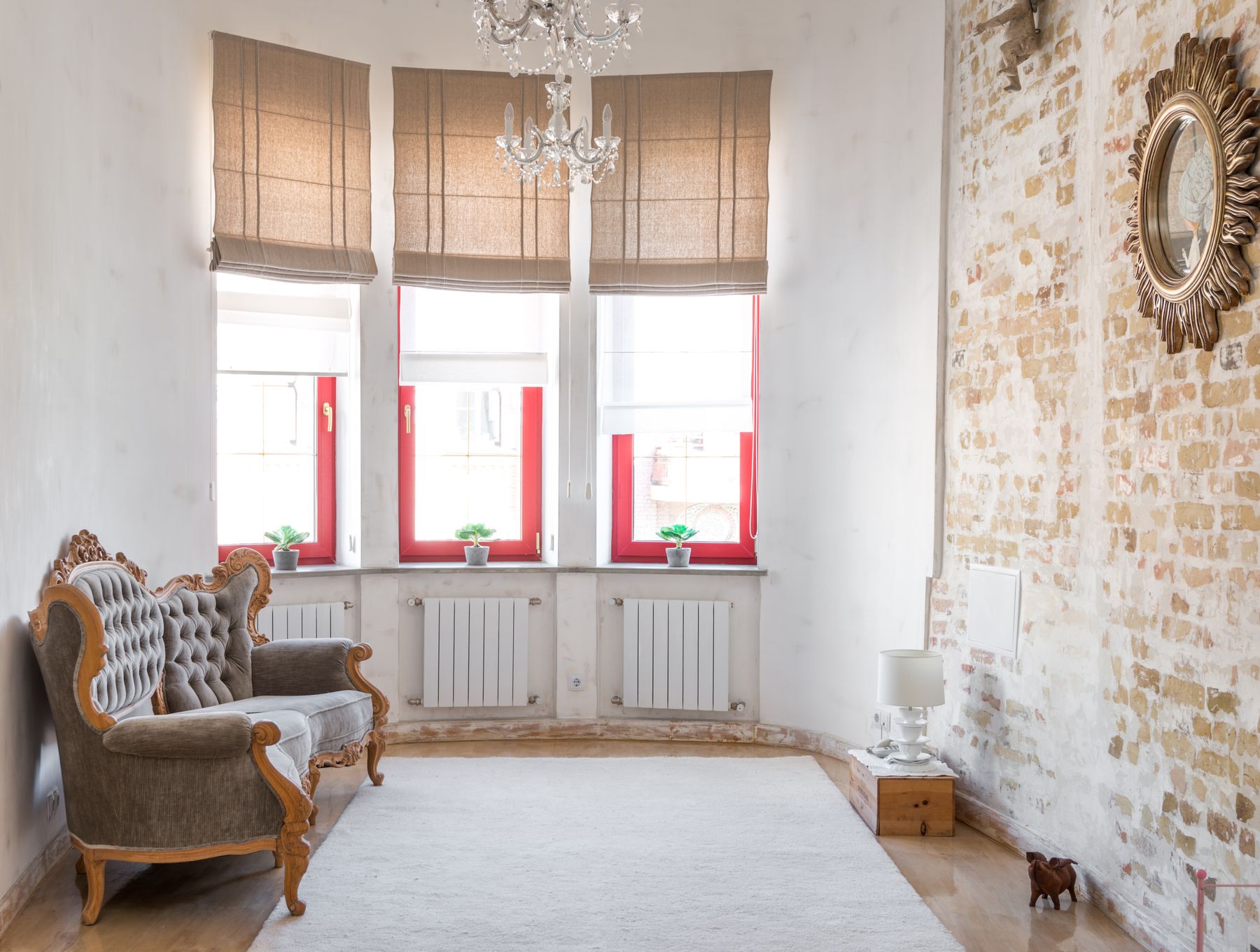
Sheers diffuse view and daylight, but they do not solve every orientation, privacy need or screen reflection. Layer only when each treatment has a job: glare control, blackout, insulation, privacy or softness. Full-height curtains can extend the pale field and add vertical shadow; a deeper outer curtain may provide useful night-time mass. Check stack-back so fabric does not permanently cover scarce glass. The hero image demonstrates why curtain folds matter: they turn a bright opening into a graduated surface rather than a blank white rectangle.
Keep Connected Areas Distinct Without Breaking the Field
In an open plan, repeating the same white on every wall, cabinet and upholstered piece can erase useful zoning. Keep the architectural field continuous where it genuinely connects the space, then give each activity a different boundary: rug, pendant, furniture orientation, ceiling change or one material volume. Living and dining areas do not need matching pale furniture. The whole-home threshold thinking in [White Apartment Ideas](/apartment/white-apartment-ideas/) can help, but the living room still needs its own social center and evening light scene.
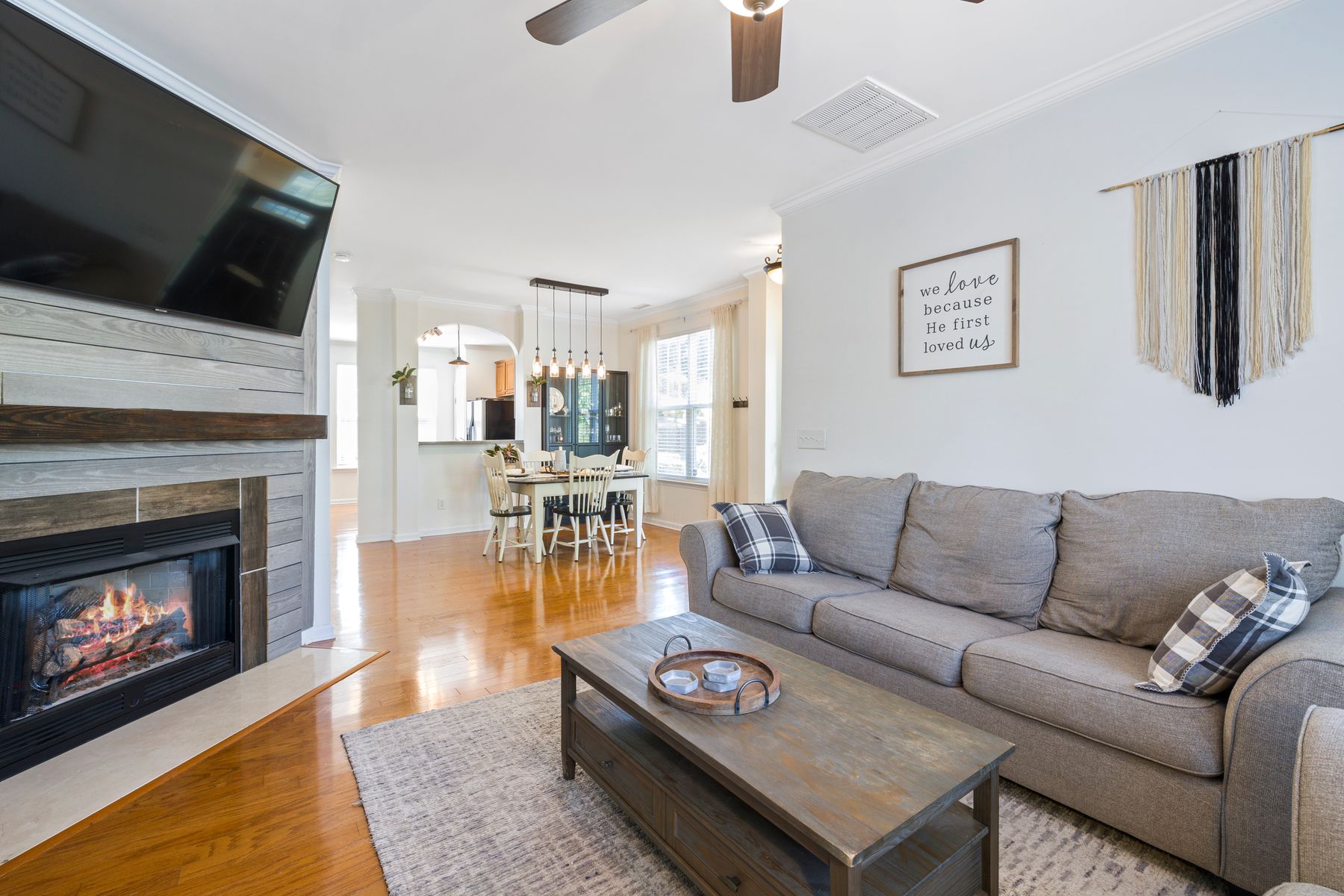
In Tight Quarters, Reduce Boundary Count
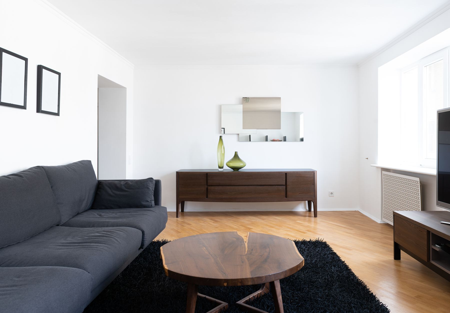
White does not automatically make a small living room feel bigger. Strong glare, undersized furniture and many pale objects with separate outlines can make it feel busy or washed out. Reduce the number of boundaries: one properly scaled sofa, one connected rug, storage aligned to a wall and a clear route to the window or adjoining room. Preserve tonal separation at furniture edges so circulation remains obvious. [Small Living Room Ideas](/living-room/small-living-room-ideas/) should lead the floor plan; white is the supporting light strategy.
Make the Pale Field Move With You
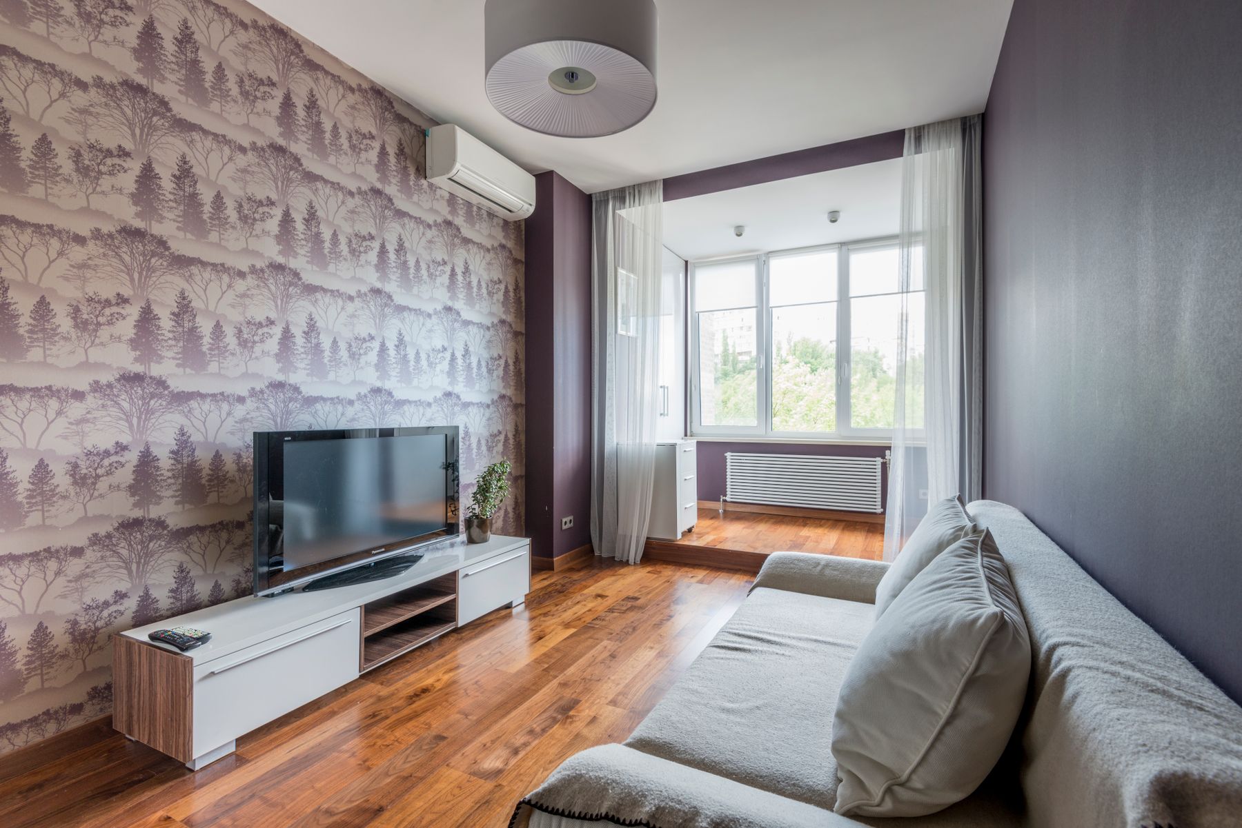
A rental white living room can be built from large reversible elements: curtain panels, rug, sofa cover where the construction permits, pale freestanding shelves and lamps that wash the wall. Do not assume removable wall products release cleanly from every paint or substrate; check the product and tenancy rules. Choose portable pieces that can work against a different future wall color. One broad pale mass is more effective than collecting small white accessories that travel badly and add no function.
Keep Everyday Edges Visible
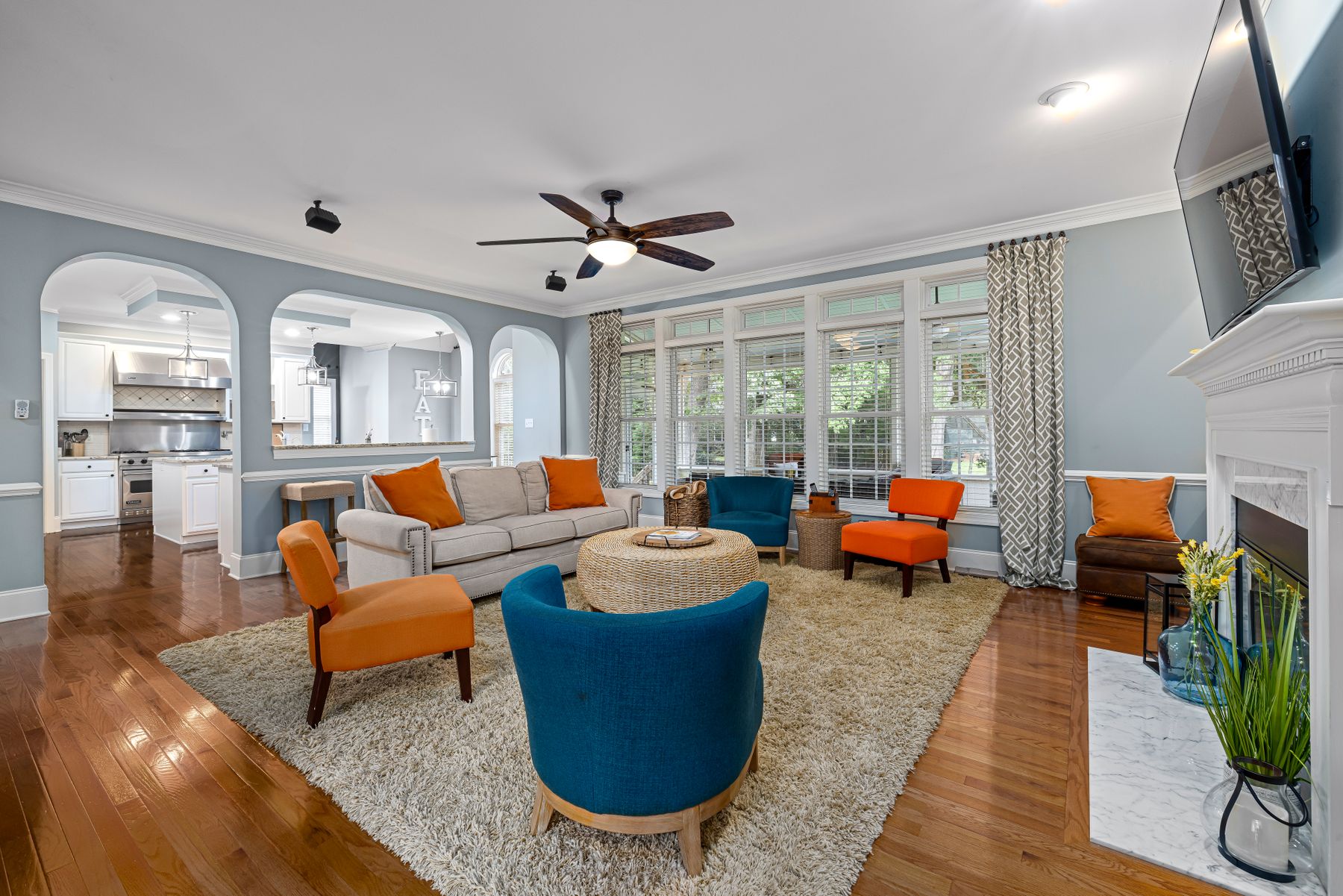
Pale rooms can conceal pale controls, rug edges, furniture corners and changes in level. Useful tonal difference may support orientation, but decoration is not a substitute for a safe layout, stable furniture, clear routes or appropriate assessment. Keep frequently used controls visible against their background, avoid a pale rug edge disappearing into a similar floor and make low tables easy to perceive in both day and evening light. Contrast should be placed where people interact, not scattered decoratively around the room.
Design High-Contact Surfaces to Recover
Different whites reveal different evidence of life: dark scuffs at corners, hand marks near switches, yellowing from incompatible touch-up paint, spills on upholstery or grey traffic paths in rugs. Choose washable or repairable finishes only from the maker's exact guidance, keep a record of paint product and batch, and provide cleaning access around furniture. Slight variation in linen, wool, timber and handmade surfaces can make aging feel normal; a flawless synthetic field may expose every interruption. The goal is not invisibility but a room that can recover without panic.
Run the Cloud, Sun and Evening Test
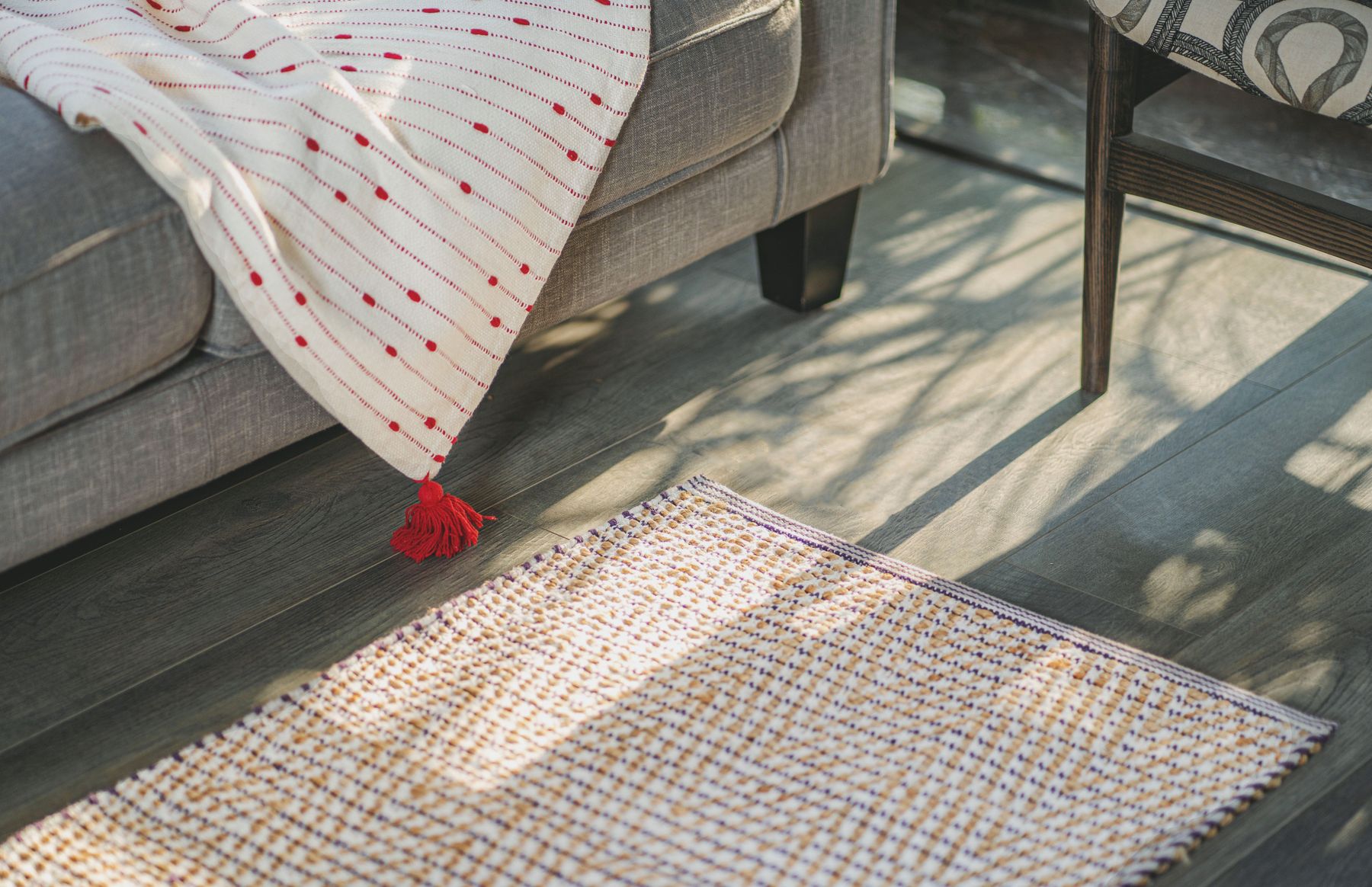
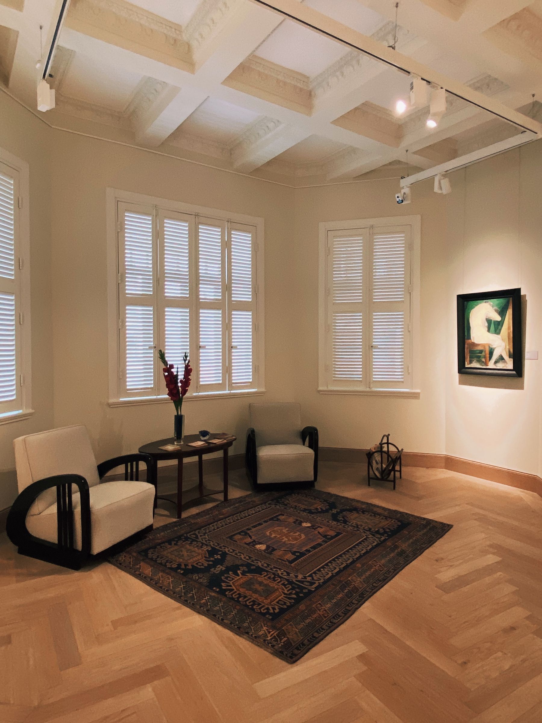
Finish in three scenes: a cloudy morning, the strongest direct daylight and the normal evening setting. In each, check whether wall and sofa separate, the main seat remains inviting, art avoids destructive glare, the screen or fireplace does not become an isolated hole and the route stays visible. Then remove one beige filler object and one repeated dark accent. If the composition improves, the room needed stronger hierarchy rather than more styling. White should make the living room more responsive to life, not more dependent on one perfect photograph.