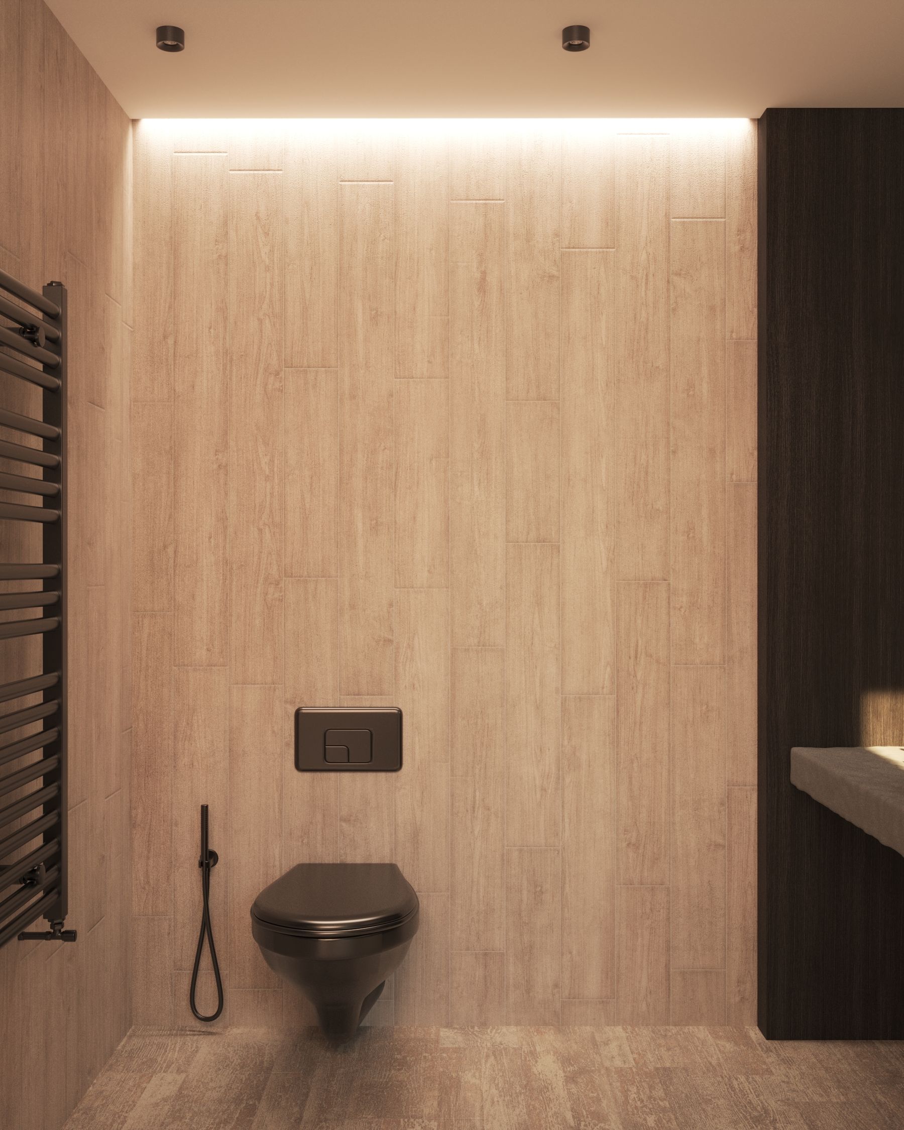
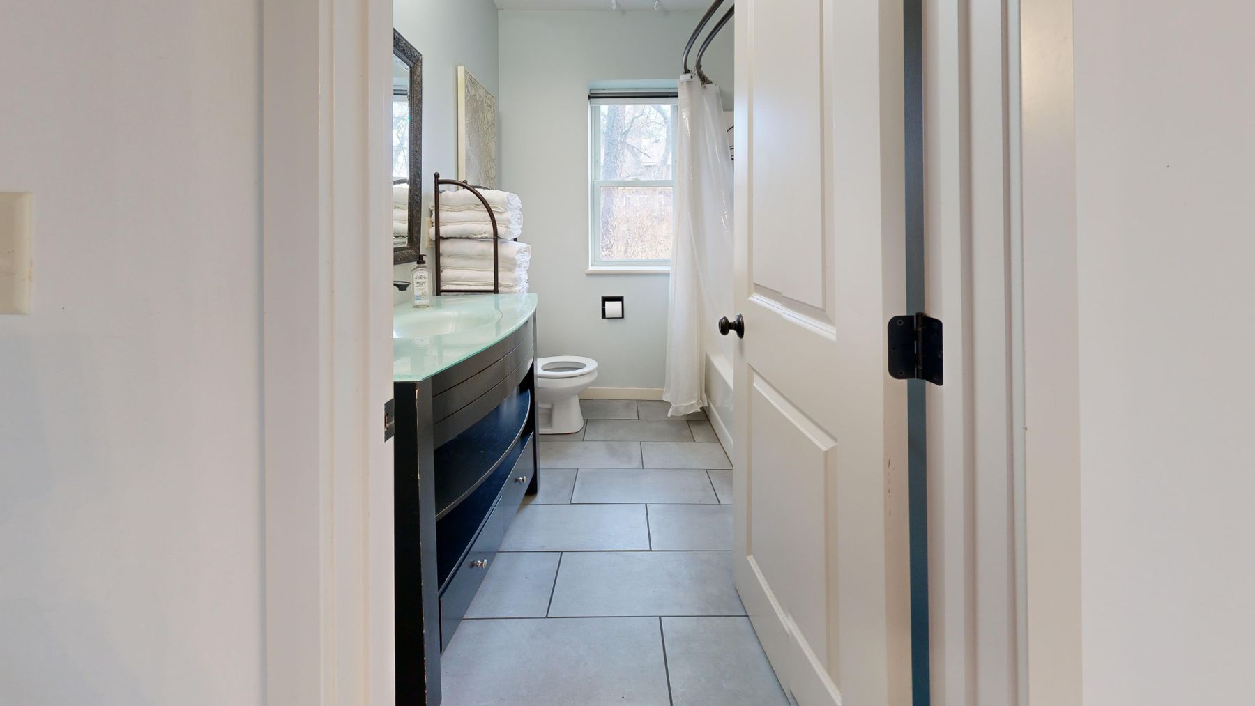
Start With the Light, Not a Beige Paint Name
Observe the room in the morning, afternoon and after dark before fixing the palette. North-facing light can cool cream and beige; strong warm light can exaggerate yellow or pink undertones. Reflections from brick, foliage or a neighboring wall may also affect a small bathroom. Tape candidate samples vertically beside the mirror, shower and floor, then move them through the room for several days. This is more reliable than choosing a color because its name includes sand, linen or stone.
Build a Palette Ladder Instead of One Flat Beige
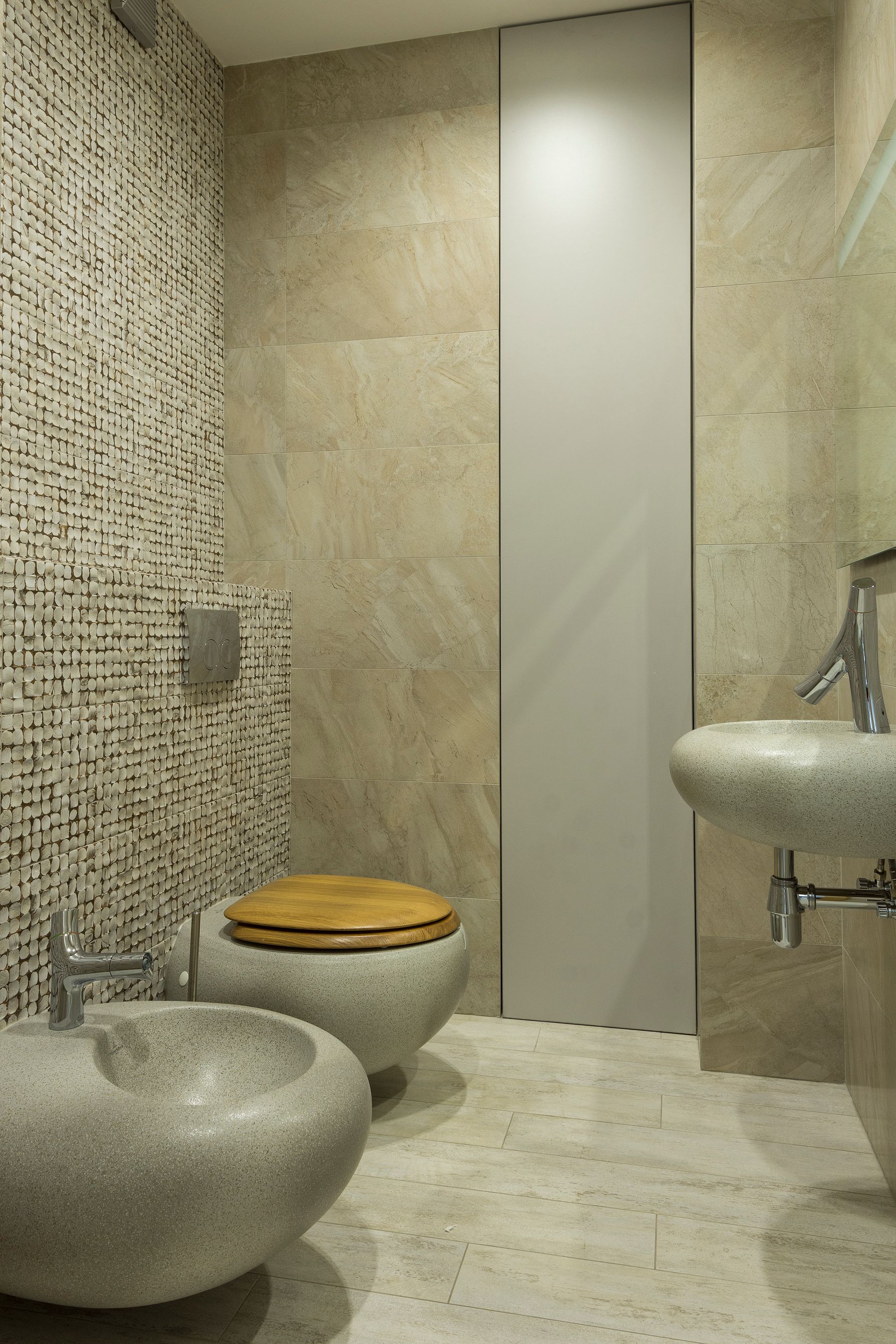
Give each major plane a position on a simple light-to-dark ladder. Warm white might lead on the upper walls, cream or pale stone can carry the shower, sand can ground the floor, and taupe or timber can define the vanity. The shifts need not be dramatic, but they should be visible from the doorway. A palette ladder prevents the common result in which walls, floor and cabinetry are almost—but not quite—the same beige.
Choose Warm, Cool or Balanced Neutral Deliberately
Warm neutrals lean toward cream, camel or clay; cooler neutrals lean toward mushroom, putty or grey. A balanced greige can connect chrome fixtures, white ceramic and warm cabinetry, but it still has an undertone. Start with fixed elements that will remain—window frames, existing floor, stone or sanitaryware—and make the new palette answer them. If grey is the true lead color, the dedicated Grey Bathroom guide offers a more focused route.
Use Paint Where Easy Revision Matters
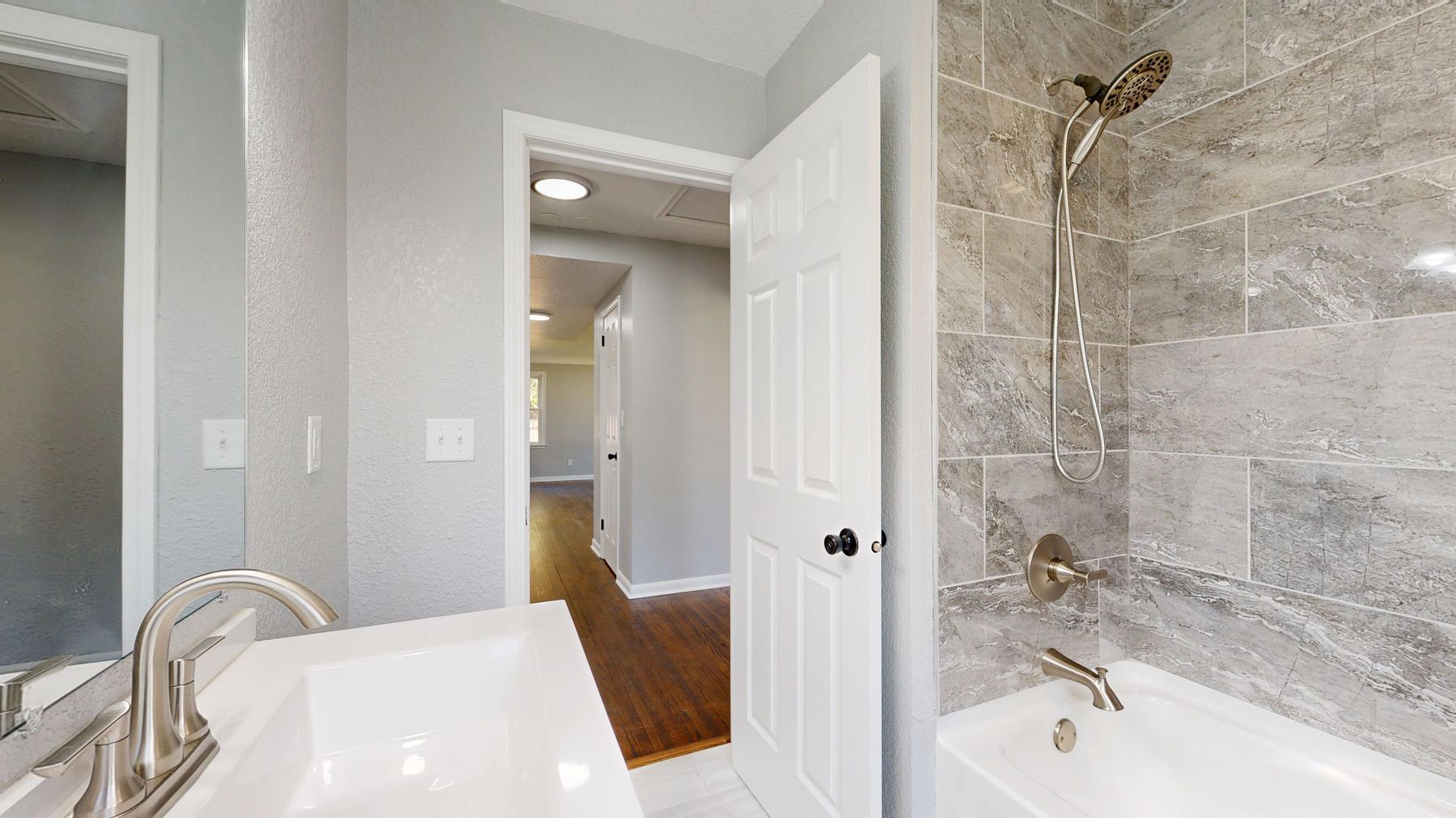
Paint is useful above tile, around storage and in a powder room because it can be sampled broadly and changed later. Select a bathroom-suitable finish for the expected moisture and follow the maker's preparation guidance; higher sheen is not a substitute for ventilation. Keep waterproofed wet zones in materials specified for that exposure. A painted upper wall also offers a controlled place to adjust the scheme if installed tile reads warmer or cooler than expected.
Let Tile Scale Set the Visual Rhythm
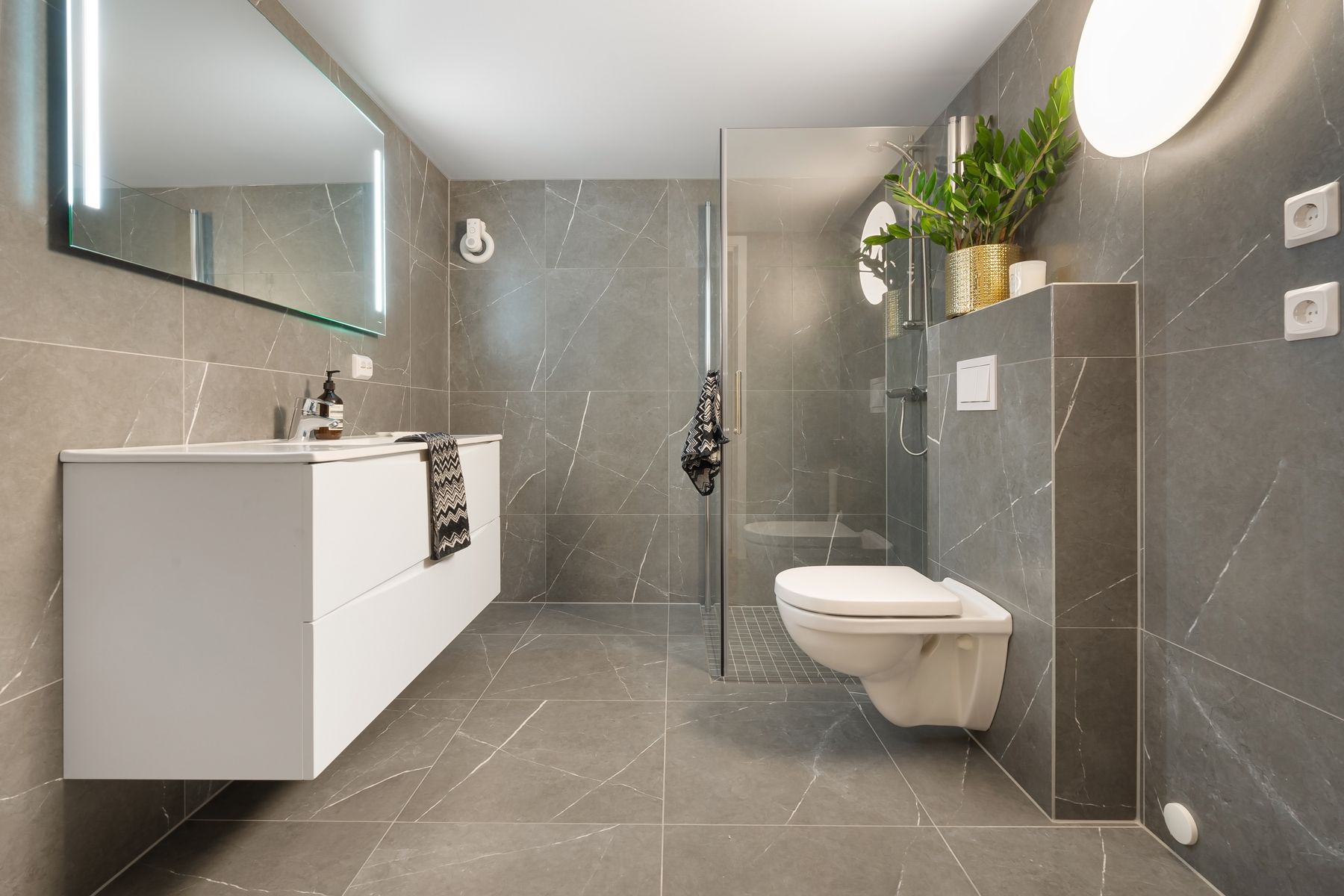
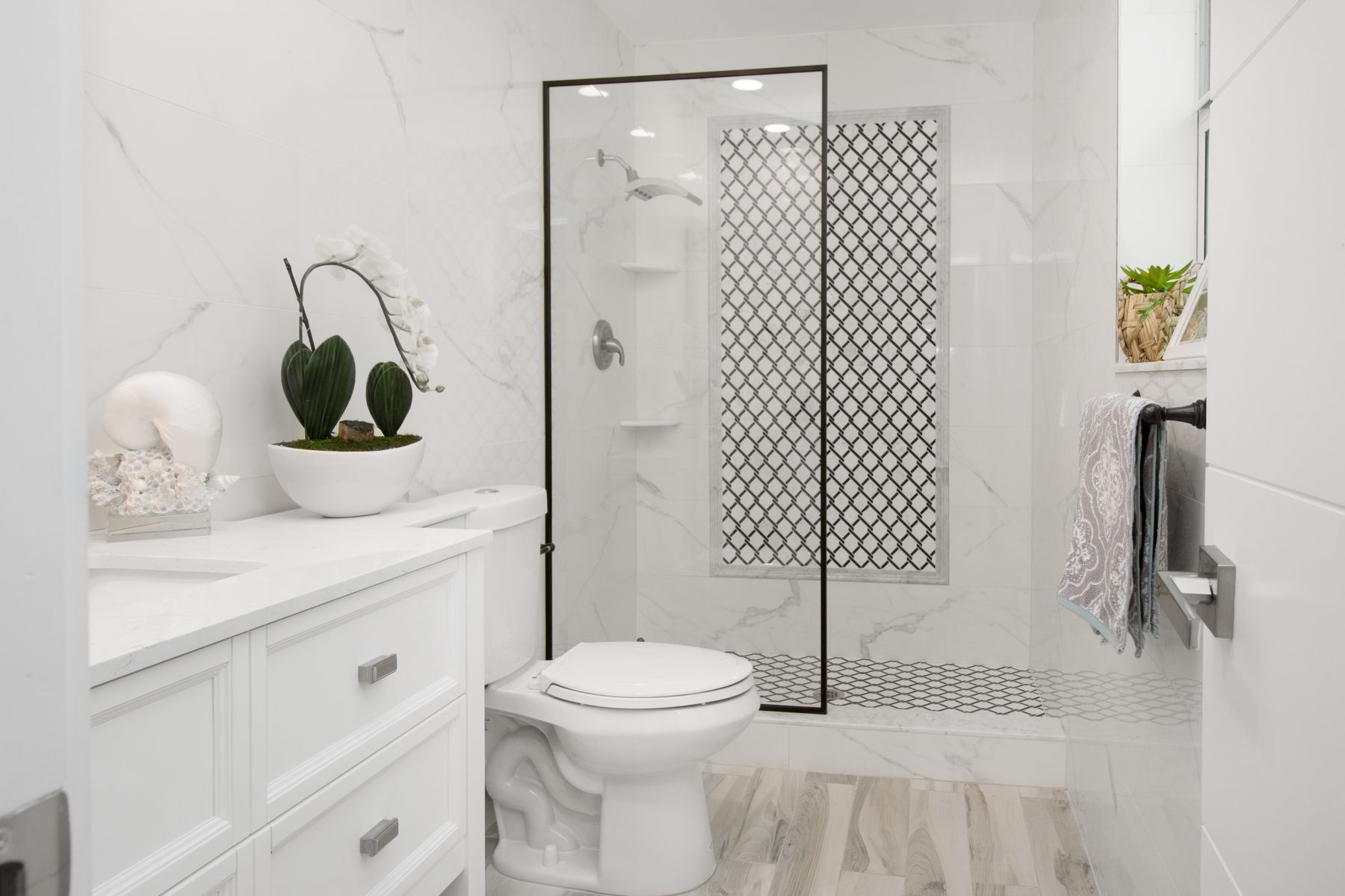
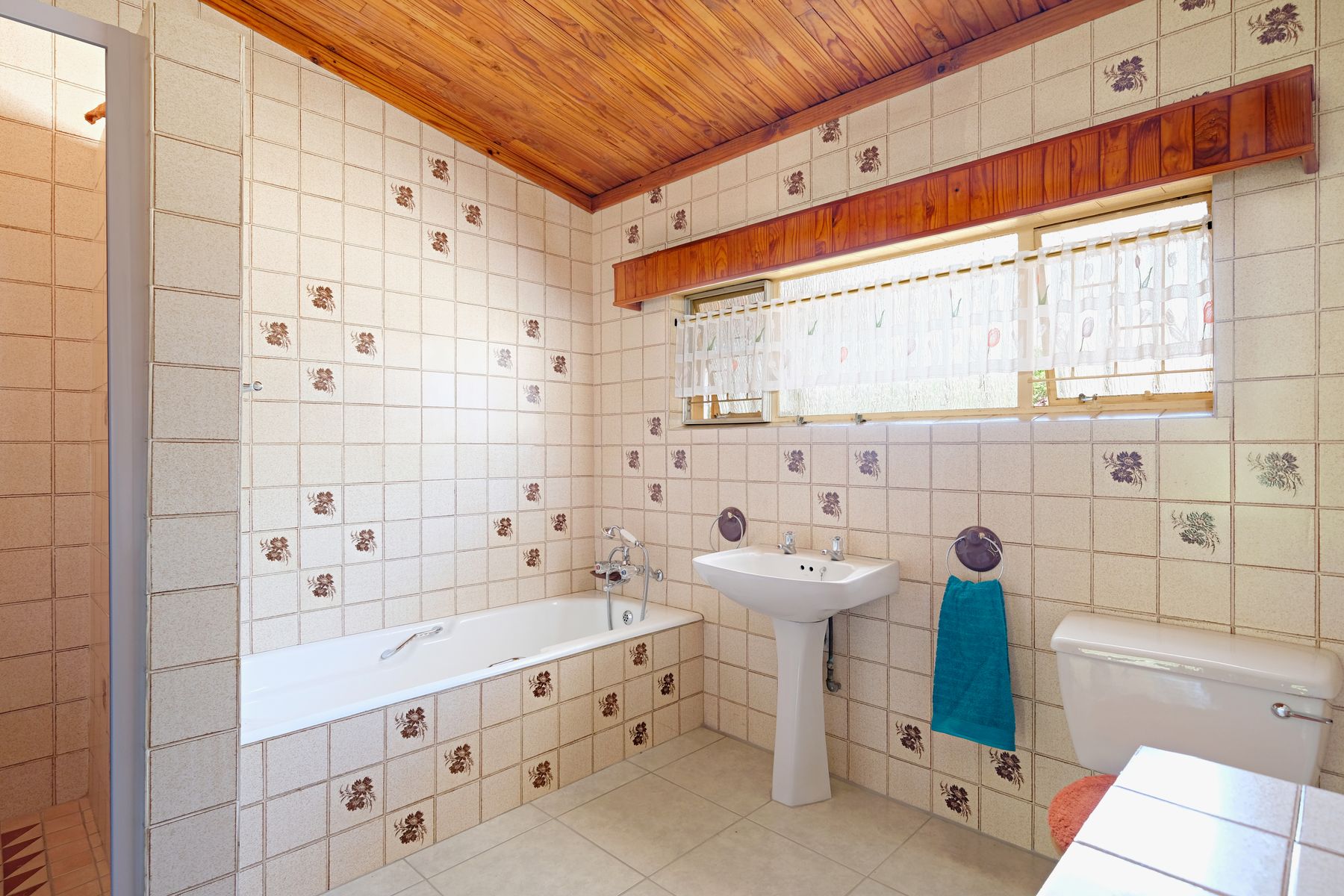
Large-format tile can make a mineral surface feel continuous, while smaller rectangles or mosaics add a finer cadence and more grout. Choose scale for the architecture and installation conditions, not because neutral color is assumed to be invisible. Small rooms can handle either approach: a large tile reduces joints, while a well-proportioned smaller tile can make a deliberate feature of the wall. Plan cuts around niches, taps and edges before approving the layout.
Treat Grout as a Permanent Color Decision
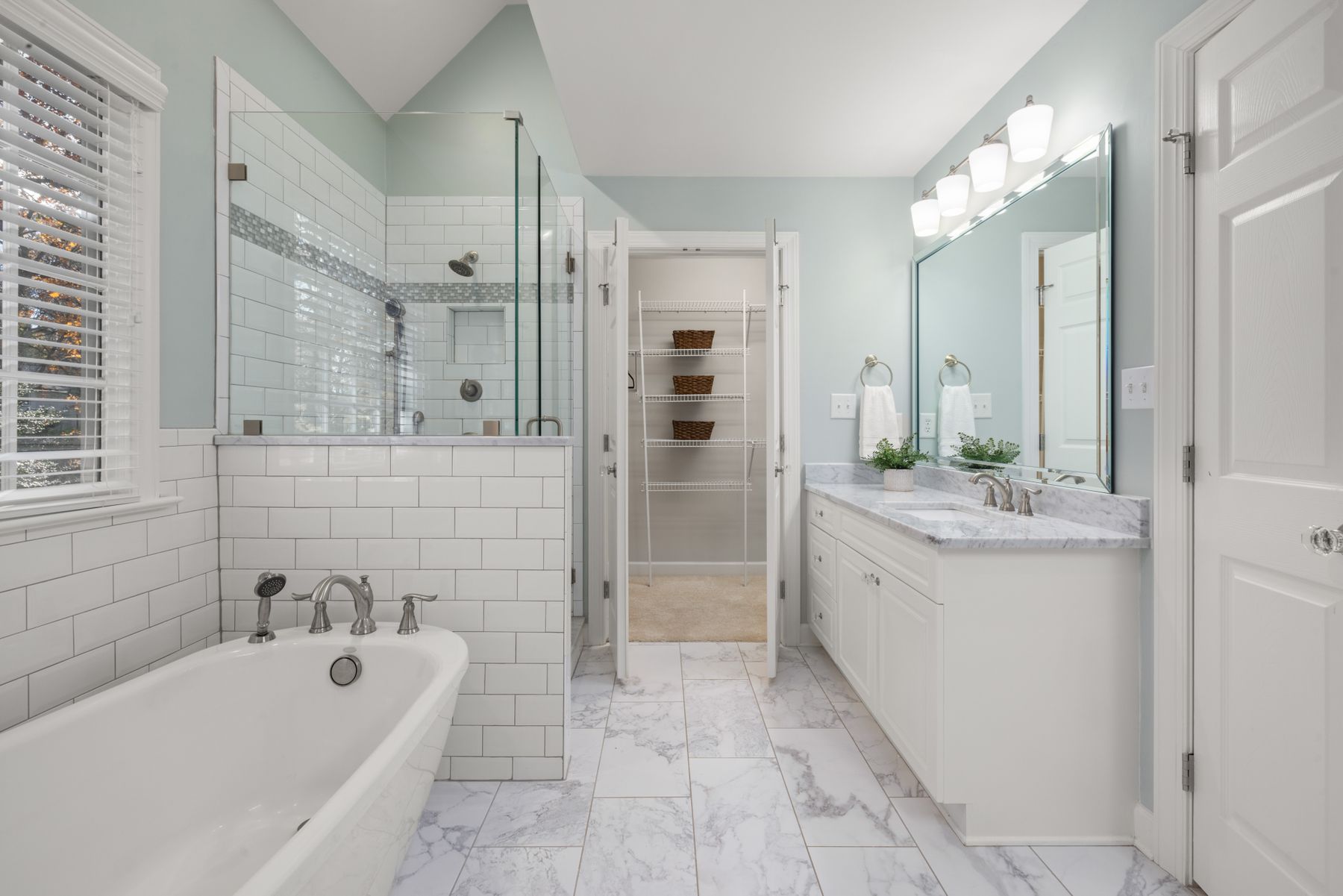
A close grout match calms the field; a modest contrast reveals the grid. In a neutral bathroom, a poorly chosen grout can turn a cream tile pink or make greige look dirty. Make a sample board using the real tile, grout and sealant rather than relying on a printed stick. Ask how the grout performs in a shower, whether it requires sealing and which cleaners are compatible.
Add Tactile Glaze Without Creating Visual Noise
Handmade-look or irregular glazed tile can make a restrained palette feel alive because light catches each face differently. Use it where that variation can be appreciated—at a vanity wall, bath surround or contained shower—rather than covering every plane automatically. Inspect several pieces together and expect shade variation if the product is sold that way. The uneven surface also changes cleaning and detailing at corners, so confirm the installer is comfortable with the material.
Ground the Room With a Slightly Deeper Floor
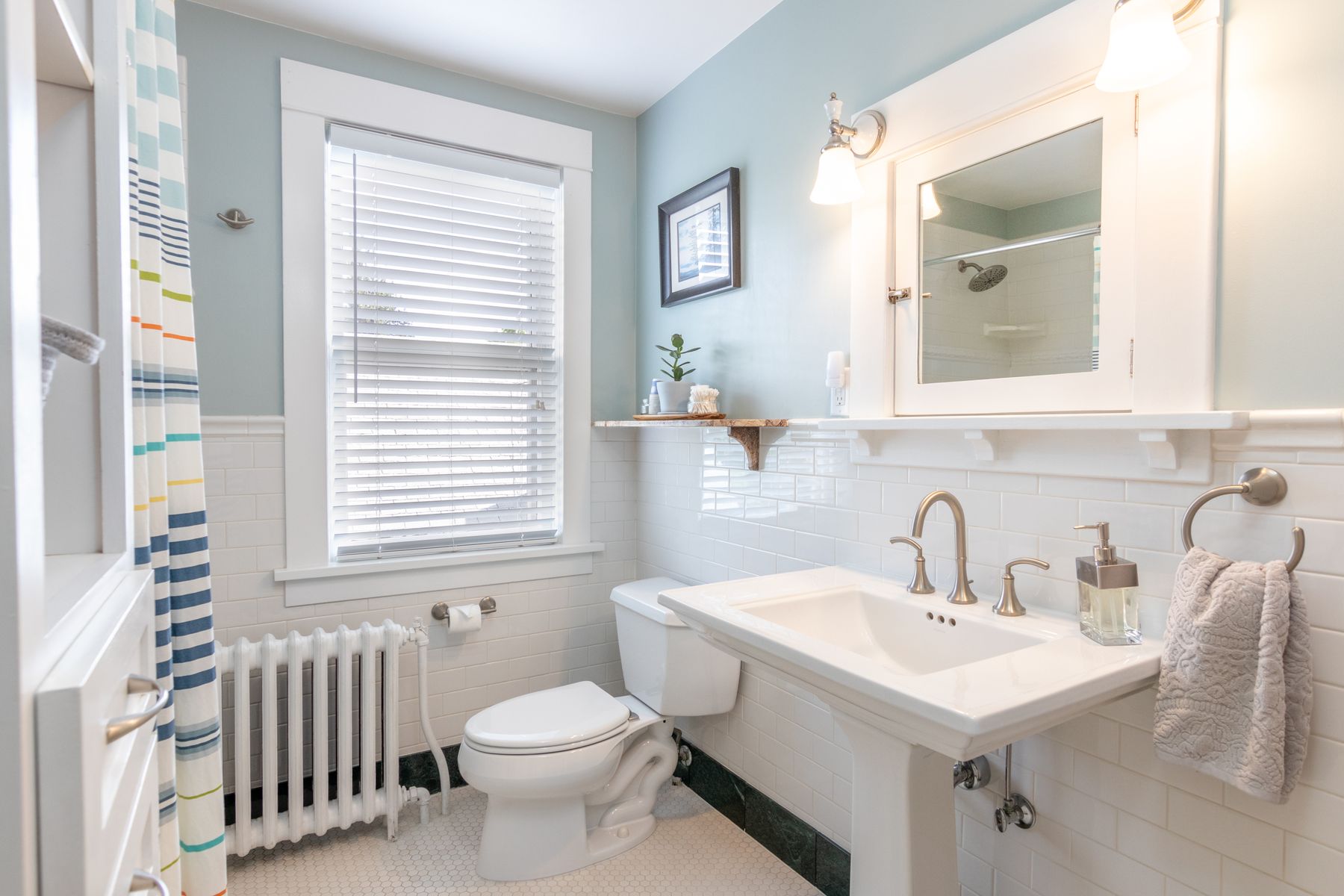
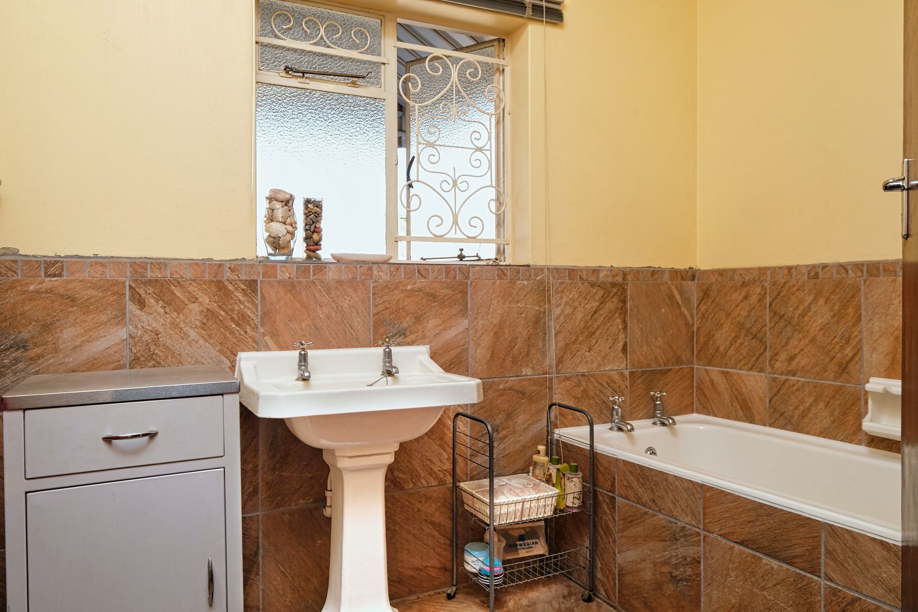
The floor often works best one or two values deeper than the walls. Sand, putty or soft taupe hides minor dust better than brilliant white and gives white fixtures a clear base. Color is only part of the decision: confirm slip resistance, drainage falls, edge profiles and cleaning guidance for the exact product. Patterned or heavily variegated tile may disguise marks, but it can also make a compact floor busy.
Use Stone Movement as the Main Pattern
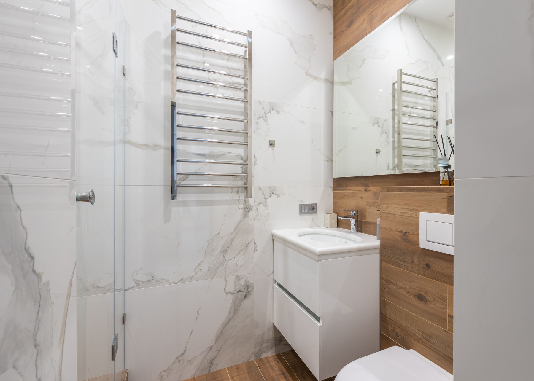
Veining, fossils or cloudy mineral variation can provide enough pattern for the whole room. Select one surface to carry it and keep adjoining finishes quieter. For natural stone, inspect the actual slabs or batches and understand sealing, staining and acid sensitivity. For porcelain, lay out multiple pieces to check print repetition and vein direction before installation. A dramatic slab can still be neutral in color, but it will not be quiet in character.
Decide Whether Limestone or Travertine Fits Real Life
Limestone and travertine bring authentic variation that printed surfaces imitate, yet they need informed specification. Ask about porosity, fill, finish, sealing, compatible cleaners and whether the proposed use includes a shower floor. Honed surfaces often suit a calm palette better than a high polish, but performance depends on the exact stone and treatment. A stone-look porcelain may be the more sensible choice when low maintenance or predictable replacement matters.

Warm the Scheme With One Controlled Wood Tone
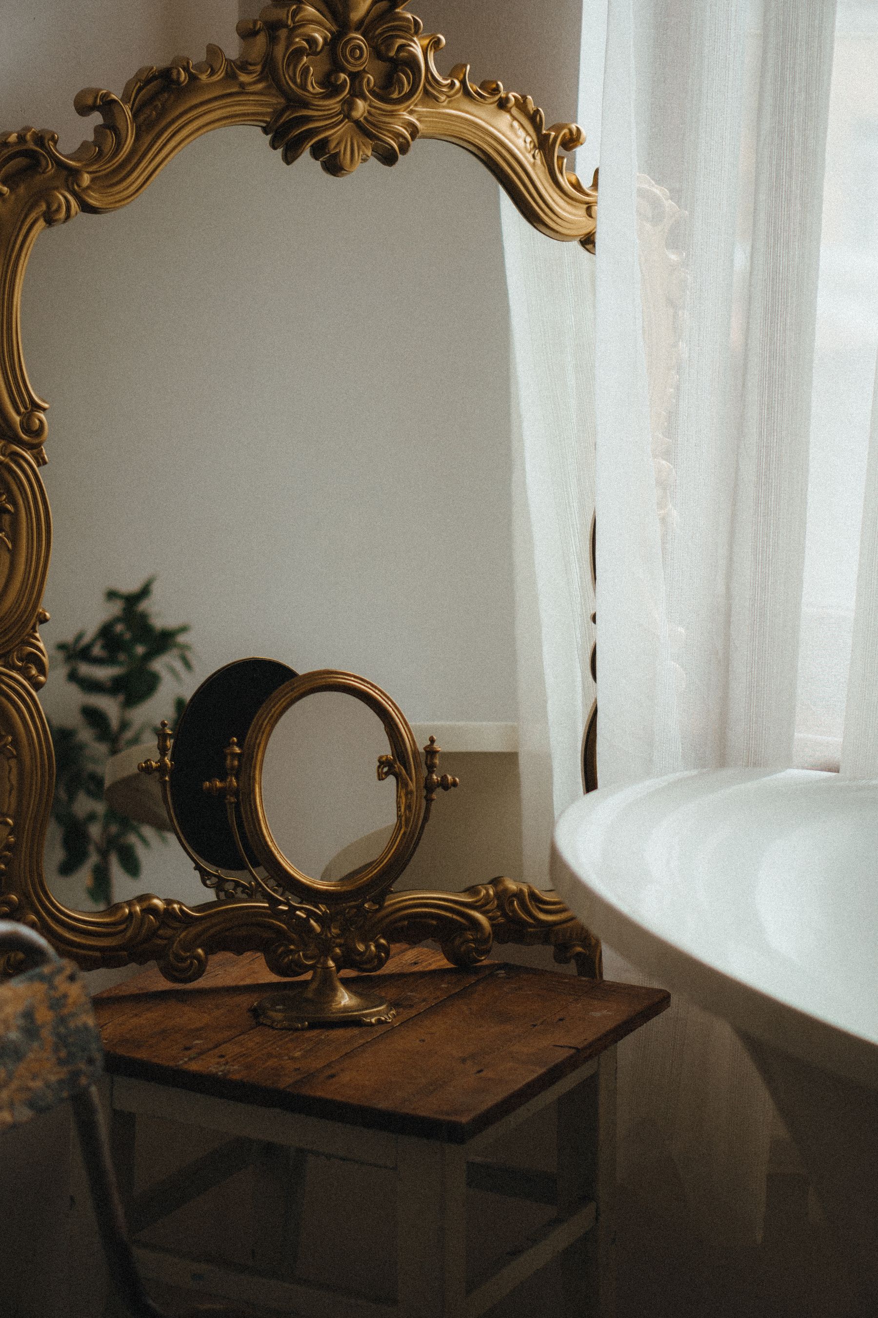
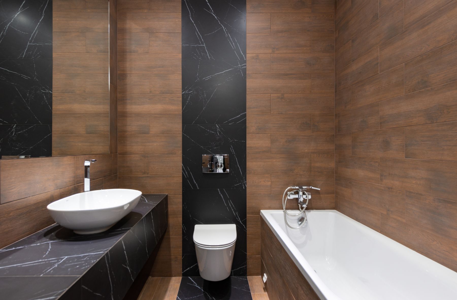
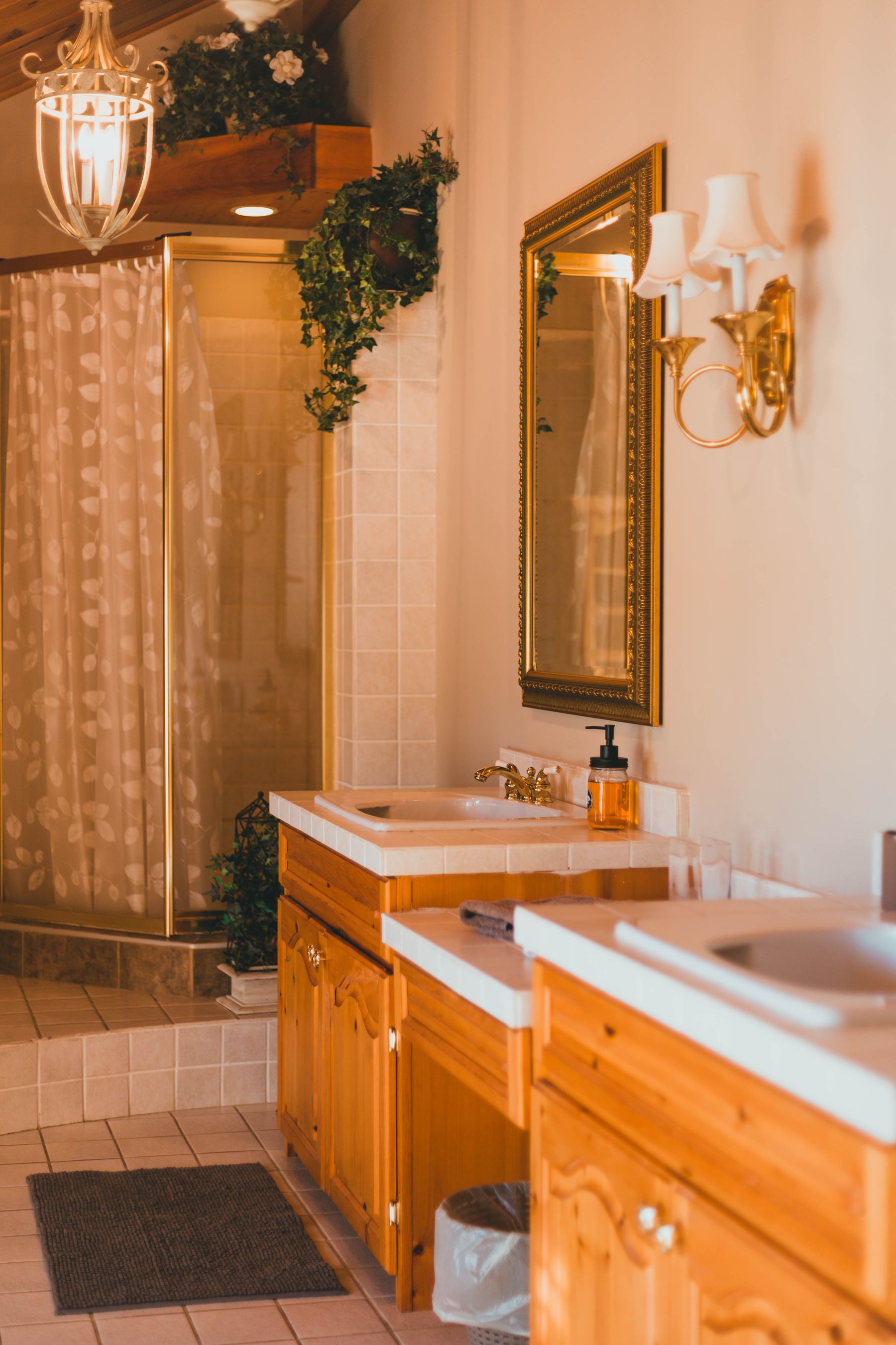
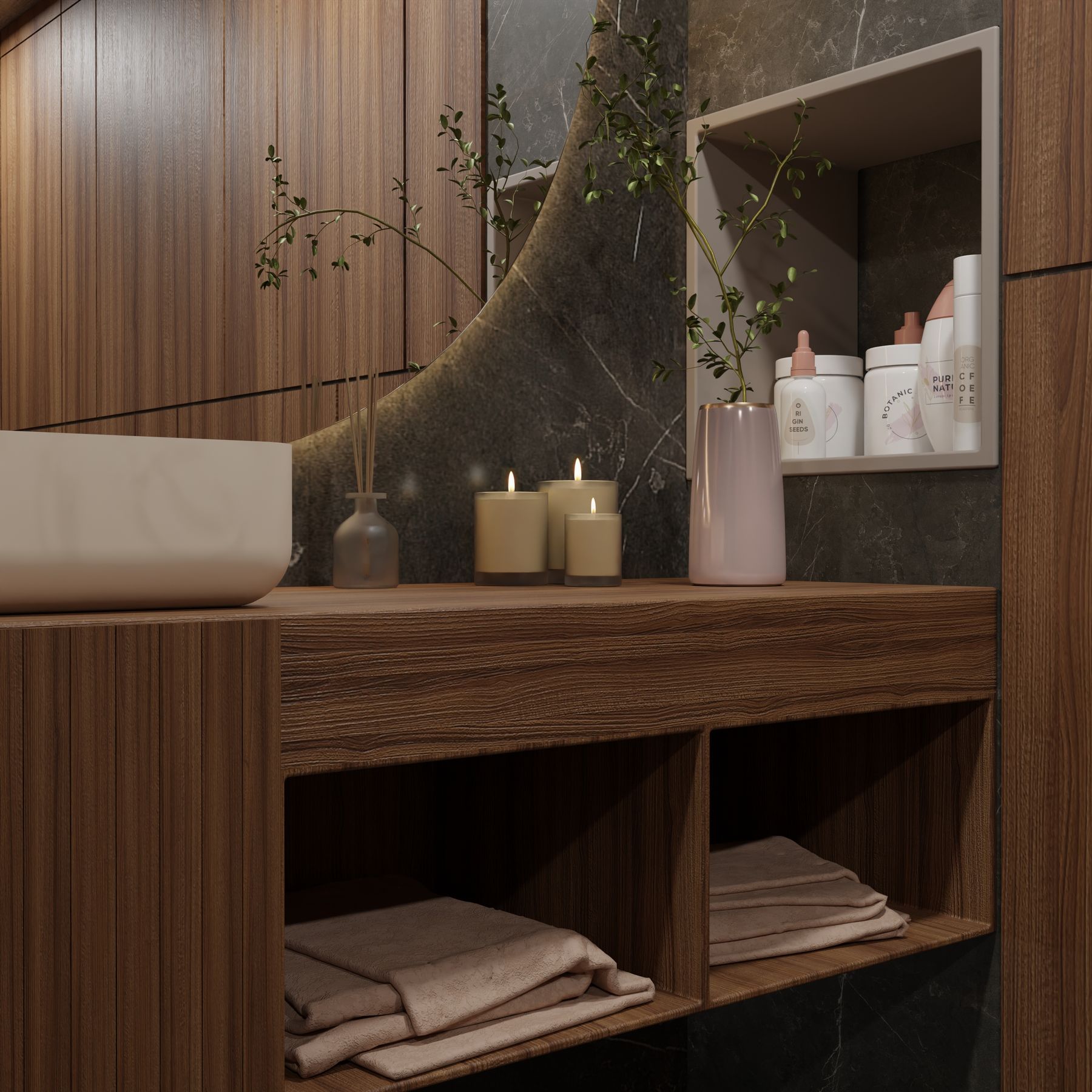
Wood is most effective here as a measured anchor: a vanity, tall cabinet, stool or framed mirror. Repeat the same general tone once or twice rather than assembling unrelated orange, grey and red woods. Check the cabinet construction, edge sealing and ventilation for bathroom use, especially beside a bath or shower. If visible grain becomes the dominant story, the room has moved toward a warm wood concept rather than a neutral palette with timber support.
Keep White Ceramic as a Clean Reference Point
Trying to match every neutral to the basin or bath usually creates a near miss. Let standard white ceramic be crisp, then place warmer tile and cabinetry around it deliberately. Repeat a small amount of white in a towel, countertop or trim if the fixture feels isolated. An all-white bathroom is a different design route: here white is one value in a broader family rather than the entire field.
Make the Vanity Earn Its Visual Weight
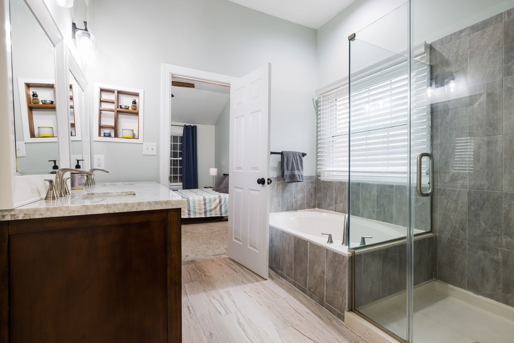
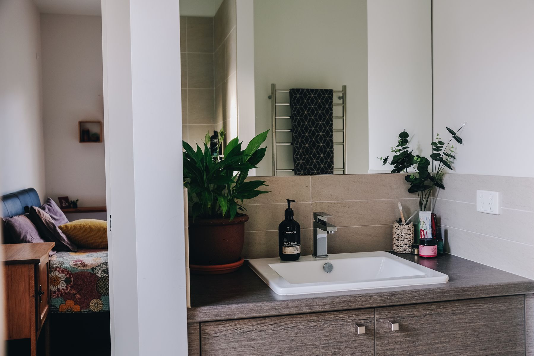
A vanity is often the largest furniture-like element, so use it to solve both contrast and storage. A taupe, mushroom or timber front can separate pale wall and floor finishes; a floating form may reveal more floor in a compact room. Prioritize drawer clearance, plumbing access, basin height and the items that actually need storing. Decorative open shelves are not a substitute for concealed space for toiletries, cleaning supplies and spare paper.
Connect the Shower Without Losing Construction Logic
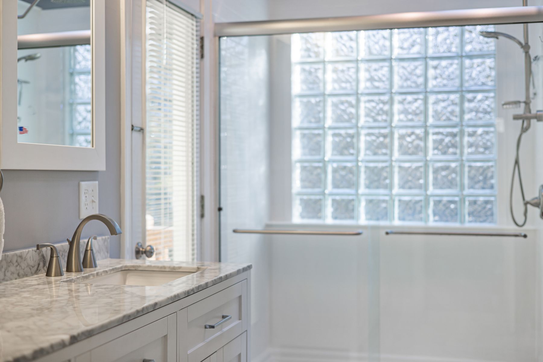
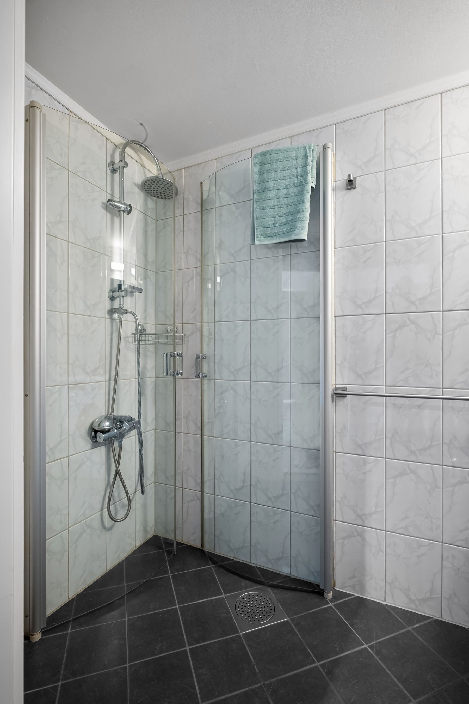
Repeating the main wall tone inside the shower can make a small bathroom feel continuous, while a slightly deeper shower tile can define the wet zone. Either approach is valid if waterproofing, drainage, substrate and enclosure support come first. Keep niches aligned with the tile module where possible and avoid a decorative insert that introduces an unrelated beige. Clear glass preserves continuity but adds a regular cleaning task.
Give a Freestanding Bath Enough Breathing Room
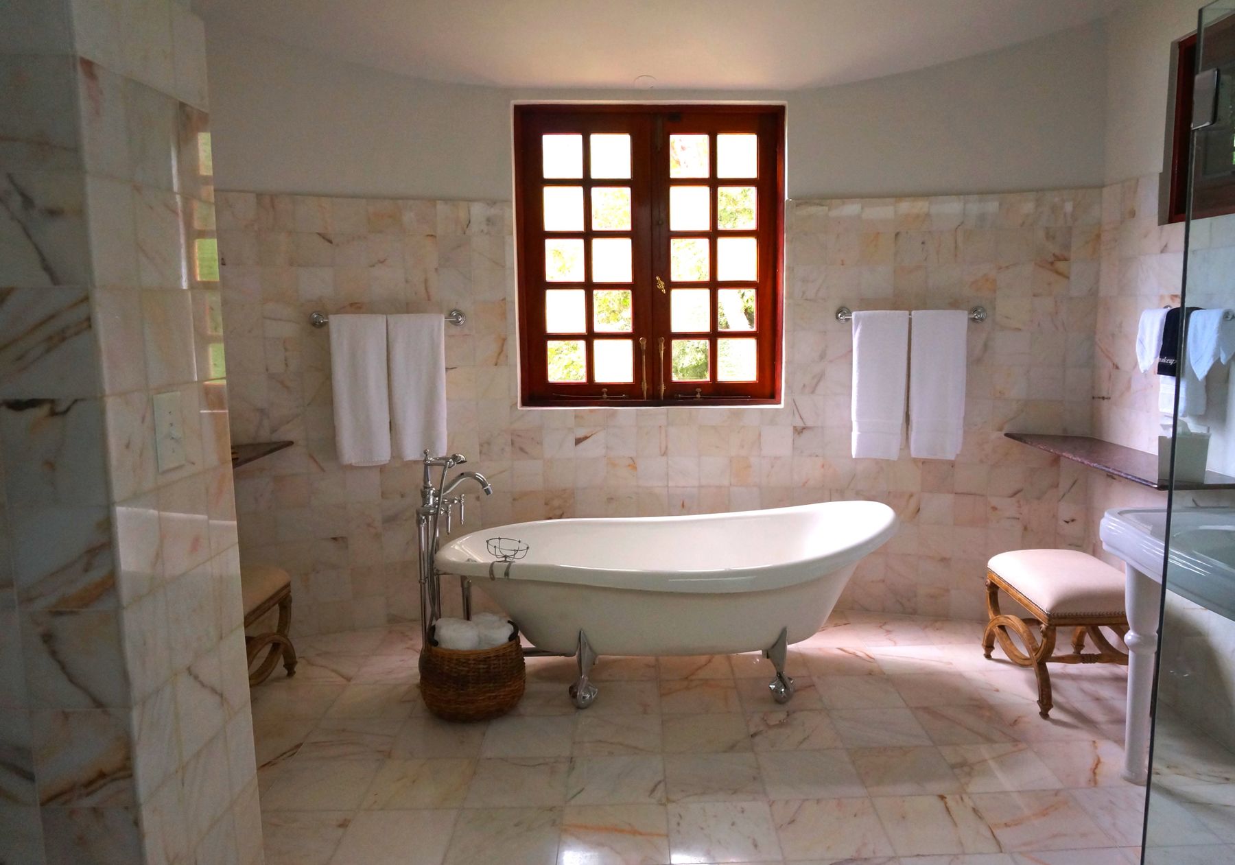
A freestanding bath suits a soft neutral palette because its silhouette creates contrast without color. It only works when there is usable access around it, a sensible filler location and a plan for cleaning behind it. In a tighter room, a built-in bath with a tiled apron may look more integrated and use space better. Let the choice follow bathing habits and dimensions, not the assumption that every spa-like room needs a sculptural tub.
Choose Metal by Undertone and Maintenance
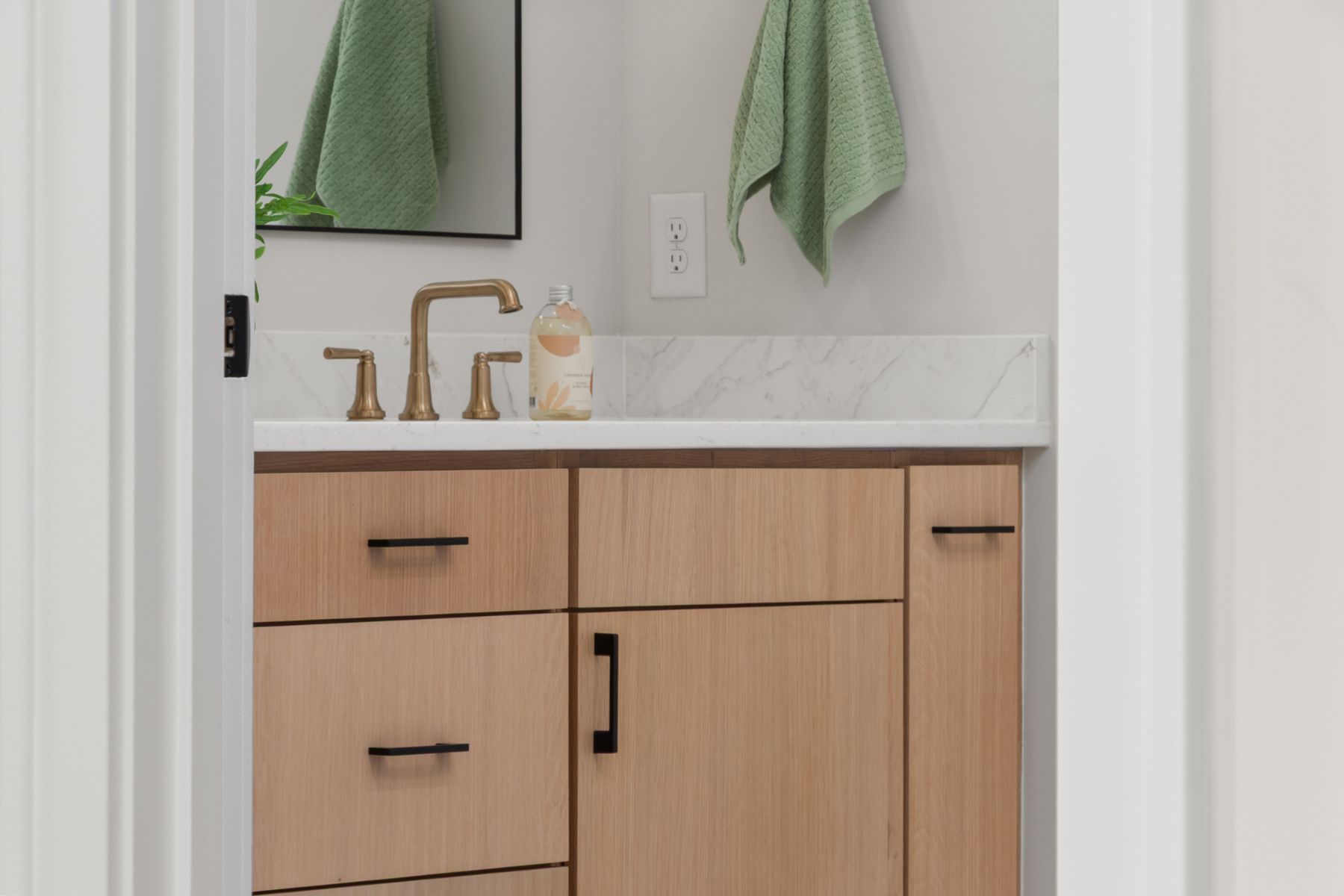
Brushed nickel is a quiet bridge between warm and cool finishes; brass adds warmth; bronze creates a deeper line; chrome brings a sharper reflective note. Compare finish samples against tile and vanity rather than selecting from a catalog image. Ask whether the finish is living, coated or plated and what cleaners are permitted. One primary metal plus a limited secondary finish is usually easier to coordinate than making every fitting identical.
Use Dark Accents as Wayfinding, Not Decoration
A slim black frame, dark bronze tap or charcoal handle can make a neutral room easier to read. Concentrate dark notes at useful touchpoints rather than scattering small black objects around the room. If walls, ceiling and major fixtures become deep charcoal, navy, brown or green, the scheme belongs with a dark bathroom instead. Here the purpose is definition: enough contrast to find a control, see an edge or anchor a mirror.
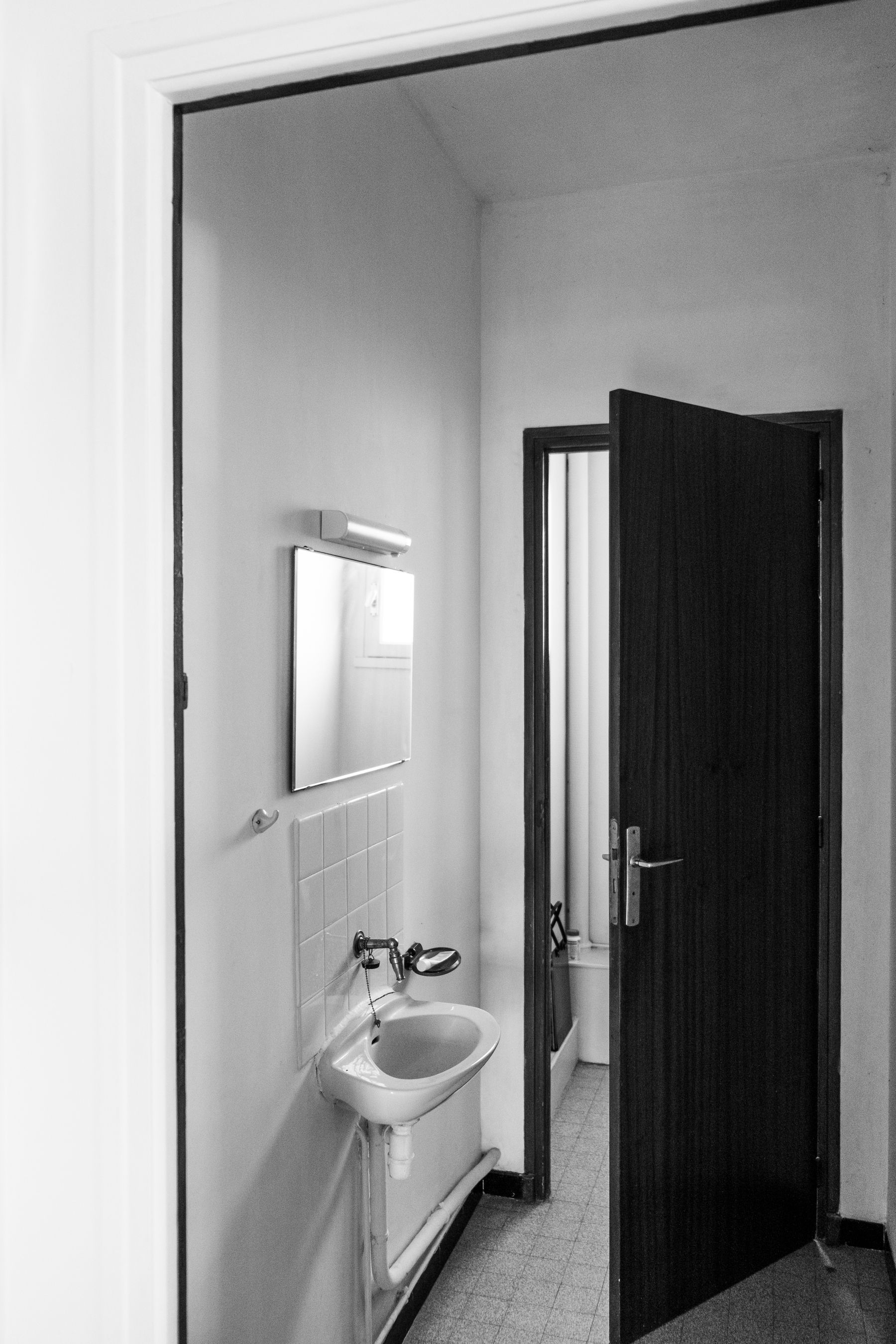
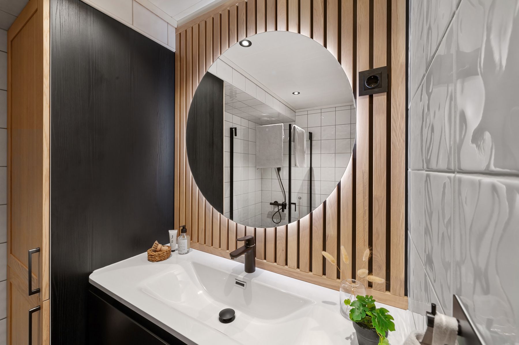
Make the Mirror and Task Light Work Together
Choose mirror size after the vanity and lighting positions are known. Side lights can reduce facial shadows; a carefully selected illuminated mirror may help in a narrow wall. A warm backlight alone is atmospheric, not sufficient grooming light. The reflection is also part of the composition, so aim it toward daylight or a calm wall rather than open shelving full of products.

Layer Evening Light Without Turning Cream Yellow
Separate functional light from the softer evening layer. The vanity needs clear, even illumination with good color rendering; the bath or night circuit can be warmer and dimmer. Very warm lamps may push cream toward yellow and flatten taupe, while cool lamps can make beige look grey. Test the chosen lamp or integrated fitting with the actual samples, and confirm dimmer compatibility before installation.
Make a Small Neutral Bathroom Legible, Not Blank
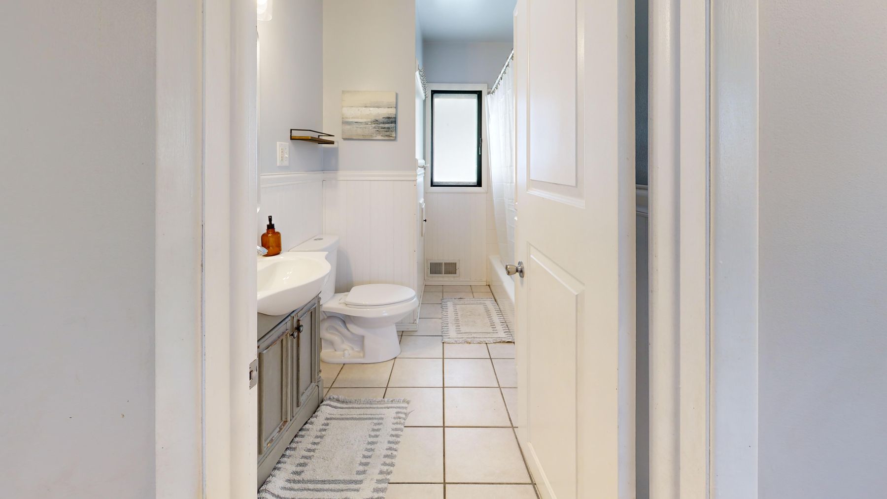
Continuity helps a compact room, but covering everything in one pale value can make fixtures and storage harder to read. Keep the wall field related across zones, then define the floor, vanity and controls with modest shifts. Choose a vanity depth that protects circulation and use the wall above the toilet or beside the mirror for purposeful storage. Large mirrors and clear glass can extend sightlines, but they do not compensate for a blocked doorway or oversized basin.
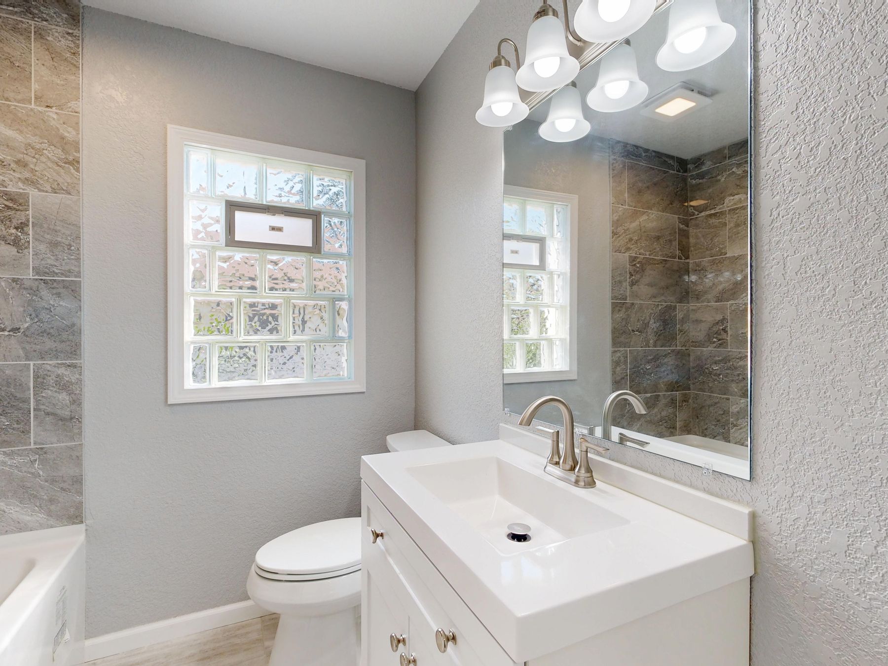
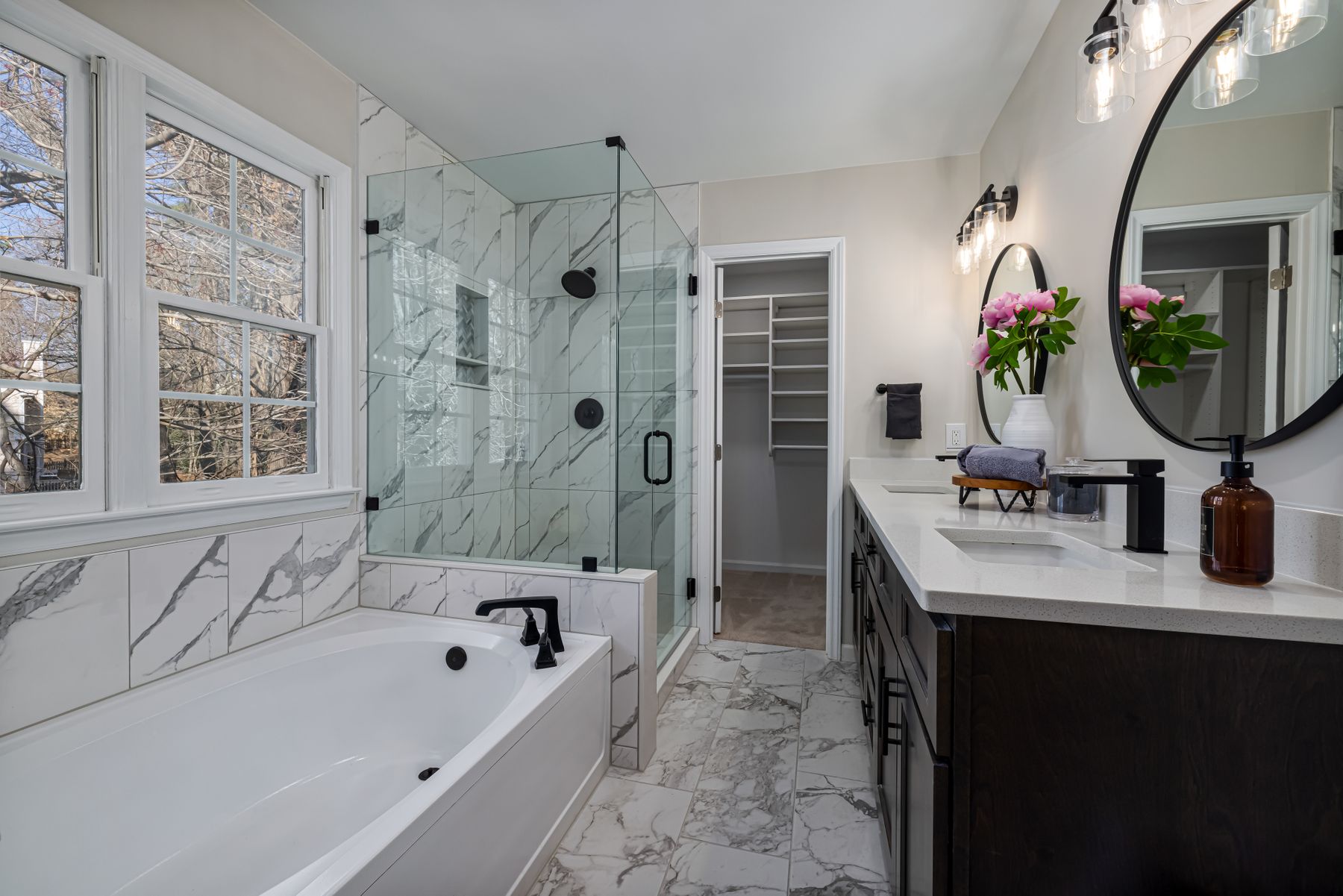
Warm a Windowless Bathroom Through Surfaces, Not Gloom
Without daylight, undertone is controlled almost entirely by the installed lighting. Use a pale field with enough reflectance, a deeper floor or vanity for definition, and more than one light source to avoid a flat ceiling wash. Glossy tile is not automatically brighter if it reflects glare; a soft satin or honed surface may distribute light more comfortably. Ventilation also matters more because there is no window to release humidity.
Integrate Laundry Without Letting It Dominate
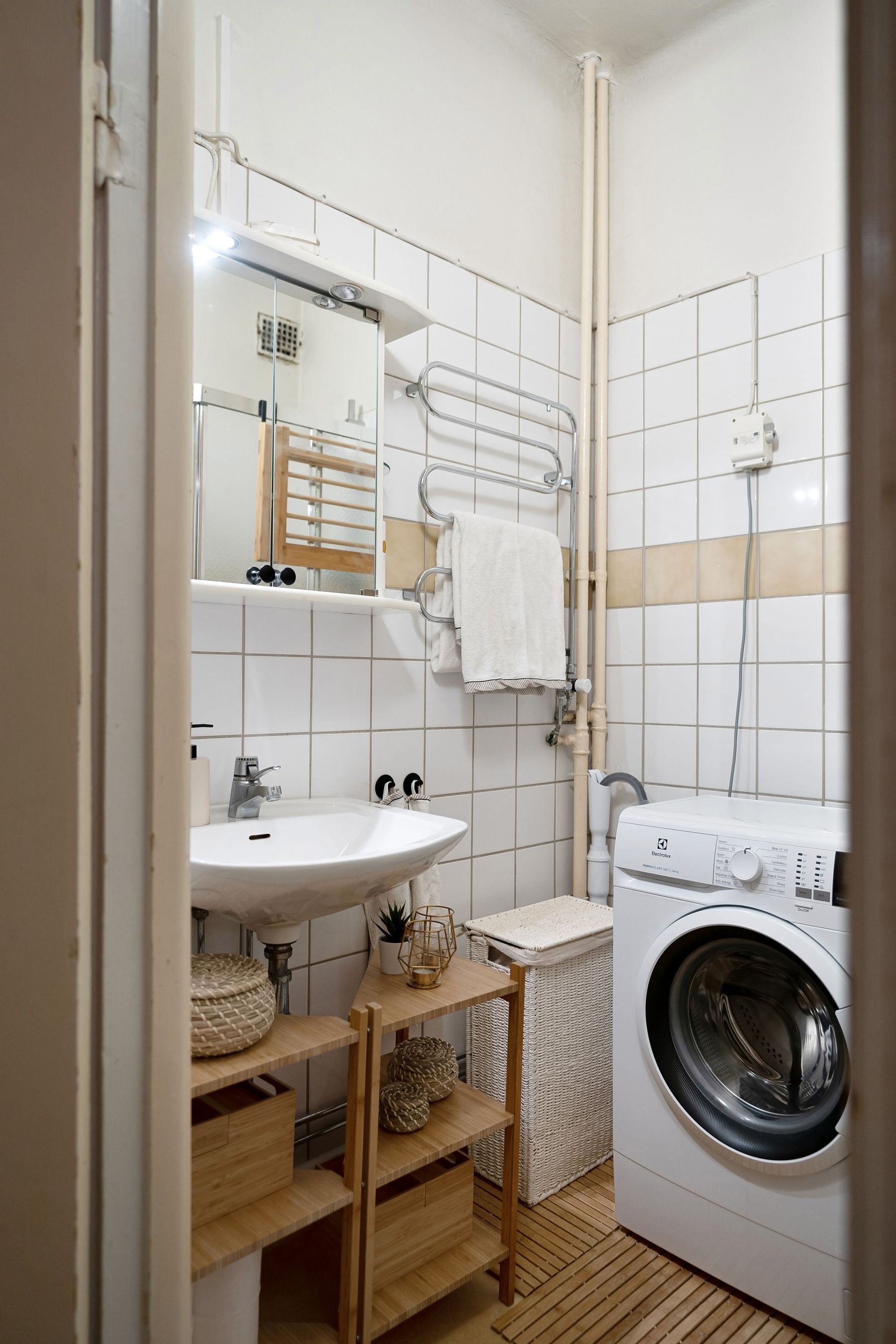
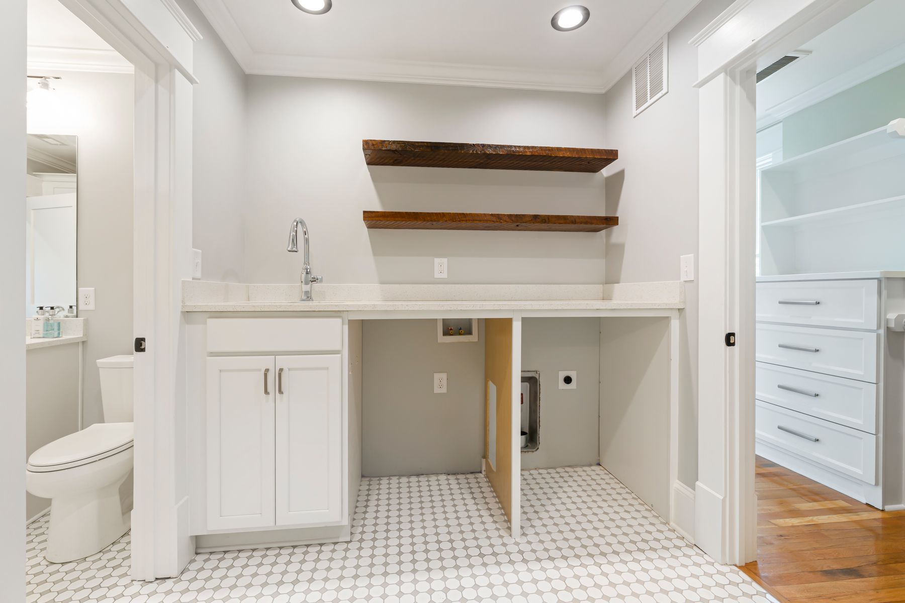
Where the bathroom also handles laundry, align the machine, counter and storage into one elevation. Neutral cabinetry can reduce visual interruption, but appliances still need ventilation, service access, door clearance and safe connections. Plan a place for detergents, a hamper and drying rather than leaving them to occupy the vanity. A continuous counter can be useful, provided its depth does not narrow the route through the room.
Separate Display Storage From Daily Storage
Neutral rooms look restful when their large planes remain visible, not when every item is beige. Put backups, medicines, cleaning supplies and colorful packaging behind doors; reserve open shelves for objects used often or displayed intentionally. Recessed niches can help in the shower, but their size should follow bottle dimensions and tile layout. Storage that is difficult to reach or clean will not stay visually quiet for long.
Protect Accessibility With Purposeful Contrast
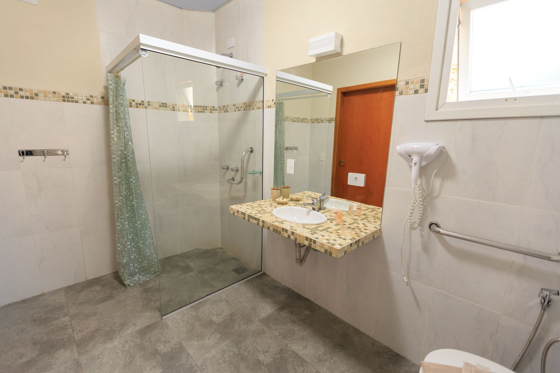
Low contrast is not a virtue when it hides a grab rail, tap, toilet, step or shower edge. Use tonal difference at functional touchpoints and keep circulation free of movable decor. Plan reinforcement for future rails, comfortable control reach, non-slip flooring and a night-light route early, when they can be integrated cleanly. Accessibility requirements vary by project and jurisdiction, so use qualified guidance rather than treating an image as a technical specification.
Plan Privacy Without Cooling the Palette
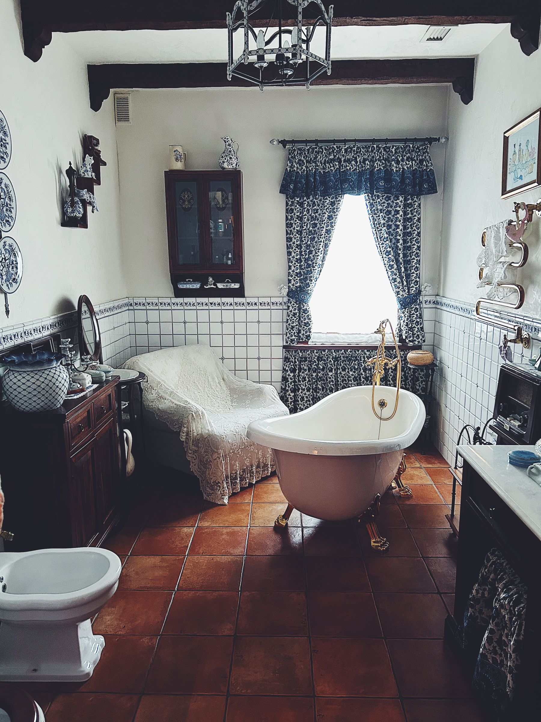
Frosted or reeded glass, a well-positioned blind, shutters or a high-level window can protect privacy while retaining useful daylight. Choose a treatment that tolerates humidity and can be cleaned, and make sure it does not obstruct ventilation or the bath filler. Warm linen-colored fabric may suit a dry zone, while glass treatment is often simpler near direct splashes. Consider the night view from outside as well as daytime privacy from within.
Use Ventilation to Preserve the Finish
Cream grout, pale paint and timber edges show mildew, swelling and staining quickly when moisture lingers. Size and duct the extraction system for the room and local requirements, provide make-up air, and use timer or humidity controls where appropriate. Leave towels room to dry and avoid packing cabinets tightly against damp walls. Ventilation is not visible on a mood board, but it is what allows a quiet finish palette to age evenly.
Design for Water Spots, Soap and Cleaning
Neutral does not mean maintenance-free. Dark taps can show mineral spots, pale grout can discolor, textured tile can hold residue and natural stone may react to acidic cleaners. Match materials to local water, cleaning habits and the household's tolerance for patina. Provide a squeegee location, reachable ledges and enough closed storage to clear the counter. A finish that looks perfect only immediately after cleaning is not automatically the calmest choice.
Finish With a Full-Scale Decision Test
Before ordering, assemble the real tile, grout, paint, countertop, vanity finish, metal and a white ceramic reference. View them in the room under planned light, photograph the combination, and remove anything that introduces an unexplained undertone. Then test the layout at body scale: reach the controls, open storage, clean behind the bath and walk the route at night. If the scheme still needs personality, add one durable note—a veined surface, tactile glaze, warm metal or textile—rather than a collection of beige accessories.