


Begin With Routines, Not Decluttering Rules
List what happens at home during a normal week and identify the furniture, surfaces, outlets and storage each activity needs. This separates useful possessions from duplication without forcing an arbitrary object count. A dining table that also supports work may be essential, while three occasional side tables may not be. The result should make routines easier rather than requiring daily performance to preserve a styled image. Start at the moment something enters the apartment: the keys, wet coat, grocery bag or parcel. Give each a first landing place and a realistic next destination. The photographed hall is a study in keeping a route legible while containing a few useful objects; its leaning mirror still needs the appropriate secure support for the actual household.
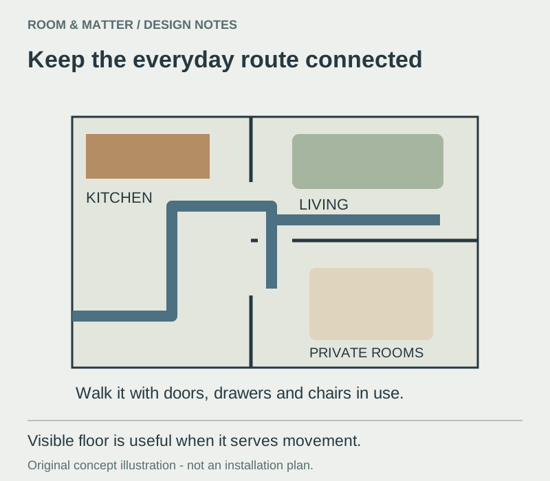
One Clear Route Through the Apartment
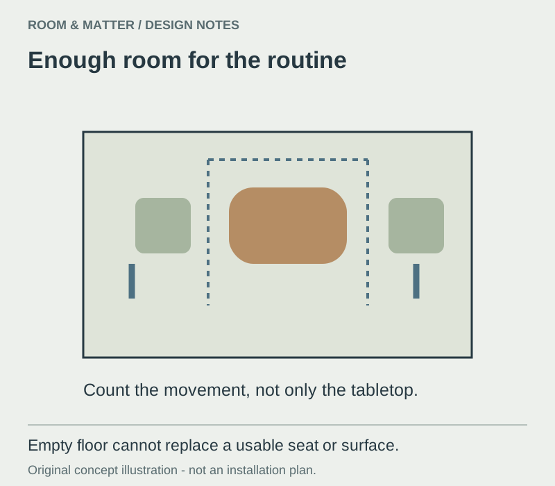
Map the route from entry to kitchen, bathroom, windows and private rooms, then keep large furniture outside that path. Aligning furniture edges can create more order than pushing every piece against a wall. Test the plan with doors, drawers and chairs open because minimalist appearance cannot compensate for collisions. Visible floor is useful when it represents movement, not when it comes from removing necessary seating. Walk the route with a shopping bag, then try the bathroom door, a pulled-out dining chair and the storage used most often. Those tests may reveal that a smaller piece is needed, or simply that one large piece should move. Small Apartment Ideas develops the relationship between circulation and multi-use furniture.

Open Space With the Fewest Effective Cues
Use a sofa orientation, rug edge, pendant or material transition to establish each activity. Two clear cues usually work better than a screen, shelf and color change all competing at once. Keep important sightlines open and choose stronger separation only where sleep, privacy, sound or cooking genuinely requires it. In a studio, zones should make the room easier to understand rather than divide it into narrow fragments. In the photographed room, the sofa, compact dining position and kitchen fronts provide different cues without a full-height divider. Use that relationship as a planning example; a sleeping area or a shared work call may need stronger visual or sound separation than this image demonstrates.
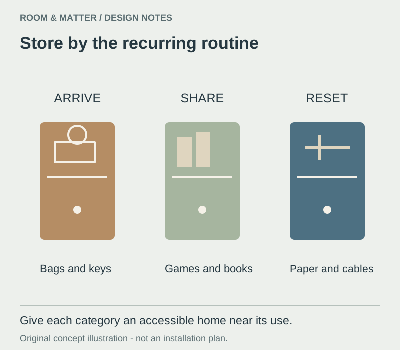
Design Storage Around the Objects That Recur
Minimalism depends less on owning almost nothing than on giving repeated objects a practical home. Plan entry storage for shoes, bags and keys; kitchen storage for food and equipment; and living-area storage for media, paperwork and shared items. Flat fronts can reduce visual noise, but inaccessible interiors simply move disorder behind doors. Reserve some capacity for change rather than filling every compartment on installation day. Choose the interior arrangement from the objects first: hanging lengths for coats, shelf depth for paperwork, a drawer for small chargers and a place for recycling. A door that conceals an inaccessible pile does not improve the routine. The category-led approach in Living Room Storage Ideas can help distinguish display from everyday capacity.
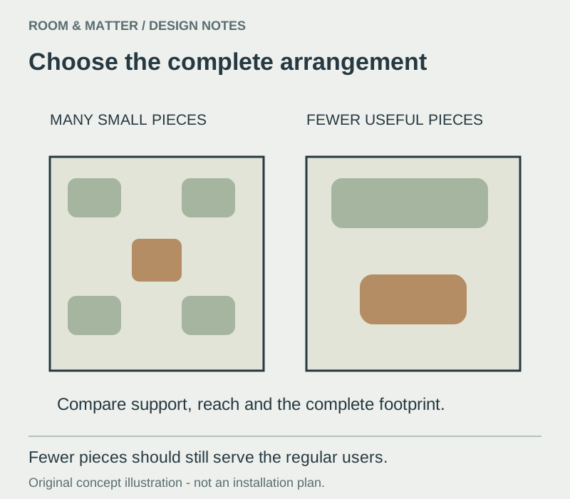
Fewer Pieces at the Right Scale
A correctly sized sofa, dining table or storage wall often serves better than several tiny pieces chosen only to look light. Compare complete arrangements and account for depth, chair movement and reach. Furniture with visible floor beneath it can help a compact room breathe, but comfort and stability still matter. Remove duplicates only after the remaining pieces support every regular user. Compare a complete seating group on paper, including the path past it and the surfaces people reach. Replacing three poorly placed small pieces with one useful piece may simplify the room; removing an essential seat merely makes it less welcoming. Test the actual chair or sofa for support before treating a low silhouette as an improvement.

Warm Materials Carry the Character
Wood, linen, wool, stone and softly textured plaster can give a restrained apartment depth. Limit the material family so each surface remains legible, but avoid forcing every timber to match exactly. Grain and tactile variation become more important when there are fewer objects in view. Select finishes for wear, cleaning and the apartment's light rather than for an abstract neutral palette. The broad kitchen view pairs wood-toned surfaces with quieter white fronts. The visual relationship is useful even when the exact species or finish is unknown. Put samples beside the existing floor and at hand-contact points; a material that only looks warm may still feel too hard, show marks or be difficult to repair.
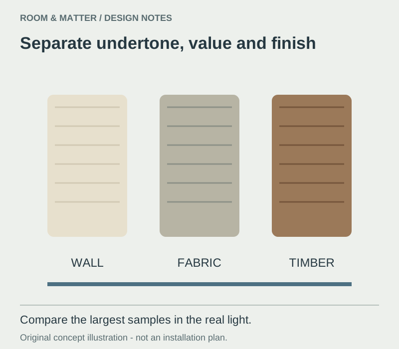
A Neutral Palette With Depth
Warm white, oatmeal, greige, pale wood and soft grey can create continuity when their undertones relate. Use texture and value contrast so walls, furniture and textiles do not dissolve into one blank field. Darker elements can clarify edges or anchor a zone without becoming a full black accent scheme. Always view samples beside fixed flooring and in both daylight and lamp light. Separate color, value and finish in the sample test. A warm wall and cool grey sofa can look harmonious until strong side light reveals the difference in sheen. Keep enough contrast at a table edge, door or handle to make it easy to read, and compare the largest surfaces rather than building the palette from small decorative objects.
One Deliberate Color Can Matter
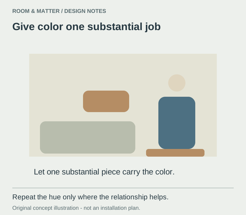
A minimalist apartment does not have to be monochrome. A colored sofa, artwork, cabinet or rug can carry more visual weight than many matching accessories. Keep neighboring surfaces quieter and repeat the hue only where the relationship feels natural. This approach preserves clarity while allowing the home to reflect taste rather than a generic style template. Give the color one substantial job, such as identifying the main seat or drawing attention to an artwork. Then live with that choice before repeating it on cushions, vases and storage boxes. Repetition is useful when it connects activities; it becomes unnecessary when every small object needs to match.

A Working Window Edge
Keep tall storage out of the strongest daylight path where possible and position activities according to glare as well as brightness. Window treatments should solve privacy, heat and light control without remaining closed by default. A low bench or chair can use the edge without blocking it. Observe conditions at several times of day before fixing a desk, sofa or screen position. The studio photograph places a narrow table and stools at a glazed door, with a sleeping surface in the foreground. It demonstrates how several activities can compete for one bright edge. Check whether sitting there blocks the door or creates screen glare before treating the window position as the automatic desk location.
Layered Light Without a Crowded Ceiling
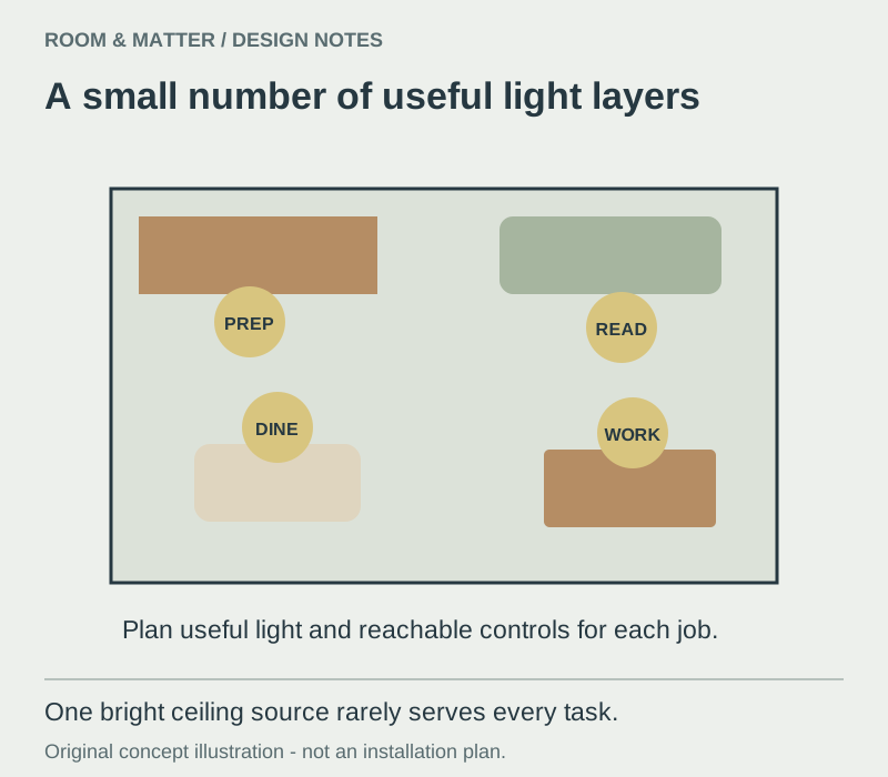
Combine general light for movement with focused sources for cooking, reading, dining and work. Minimal fixture count does not mean asking one bright ceiling light to perform every task. Choose simple forms with useful beam control and plan switches, outlets and cable routes early. Connected rooms feel calmer when color temperature and dimming behavior are reasonably consistent. Make a simple night-time task list: preparing food, finding clothes, reading and reaching the bathroom. A light can serve more than one job when its aim and controls allow it, but an exposed source in the line of sight may be uncomfortable. Use Living Room Lighting Ideas to coordinate the shared area with the rest of the apartment.

Comfortable Living, Not Sparse Living
Provide enough seats, reachable surfaces and light for the people who regularly use the room. A rug can gather the group and add softness without becoming decorative clutter. Choose one focal point and keep secondary walls quieter rather than removing everything. Negative space is valuable only when the remaining arrangement supports conversation, reading and relaxation. The source image includes a sofa, several secondary seats and tables, so the room is furnished for use rather than emptied for a style label. In a smaller footprint, keep the same test: can the regular users sit, set down a drink and move past one another?

One Clear Working Surface in the Kitchen
Reserve a durable stretch of counter for preparation and assign appliances according to actual frequency. Concealed storage reduces visual noise only when equipment remains accessible enough to use. Keep handles, joints and materials consistent where this improves legibility, but do not sacrifice grip or maintenance for seamless appearance. The kitchen should reset easily after cooking rather than look unused. In the photographed kitchen, the sink, food items and the remaining counter show why preparation needs an assigned place. Keep the frequently used tools within reach of that surface and move occasional equipment to a more suitable compartment. Kitchen Storage Ideas helps plan the supporting inventory without turning every counter into a display.

Dining Without a Matching Set
Position the table for serving and circulation, then choose a shape that responds to the available route. Repeat one material or tone from the kitchen instead of purchasing every item from one collection. If dining also supports work, include comfortable chairs and focused light. Empty floor around an unusably small table is not a worthwhile minimalist trade. A round table can soften the route through a compact kitchen, but the chair still needs room to pull back. A slim rectangular table may be a better fit where the passage runs alongside it. The photograph shows one round-table arrangement; verify your own serving route, number of regular users and chair position before copying its shape.

A Quiet Bathroom With Complete Function
Use a limited material palette, clear floor area and storage close to the basin while prioritizing waterproofing, ventilation and safe lighting. Wall-mounted furniture can expose more floor and simplify cleaning when the wall and installation support it. Keep daily toiletries reachable behind doors or in a contained tray rather than pretending they do not exist. Texture can provide depth without many decorative objects. The photographed bathroom combines a basin, toilet and screened shower within a restrained palette. It does not reveal waterproofing, ventilation performance or electrical protection. Keep those requirements separate from the visual decision, and use Bathroom Storage Ideas to plan a reachable place for supplies and cleaning items.

A Workspace That Resets Quickly
Choose a desk depth that supports the actual equipment and position it to control glare. Provide task light, power and nearby closed storage so clearing the surface does not mean moving work into another room. In a shared space, a console or dining table may serve if the setup can be restored without friction. Cable management should remain accessible rather than permanently hiding components that need maintenance. The small timber desk shows personal art and a closed laptop rather than an empty surface. Decide what must stay out between work sessions and what needs a nearby home. A reset should mean a short, repeatable sequence—save work, contain cables, store loose papers—not packing the entire office into an unrelated room every evening.
Art as a Focal Point, Not Surface Coverage
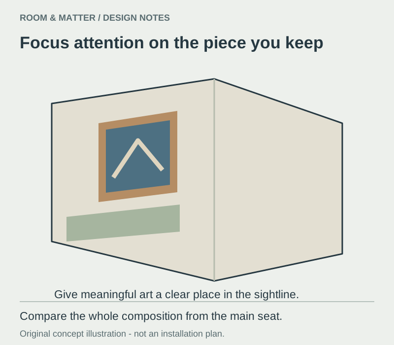
Select the wall most visible from the entrance or main seat and give it one confident composition. A large work may relate to furniture better than several undersized frames, but a small piece can succeed when its placement is intentional. Leave other functional walls quiet and verify installation requirements. Minimalism should focus attention on meaningful art rather than remove it. For a frame group, compare the outside shape against the furniture rather than adding prints one at a time. Gallery Wall Ideas offers a separate composition method when several personal pieces matter. Leave enough visual space that the things you keep can be noticed individually.
Adapt Minimalism to a Rental
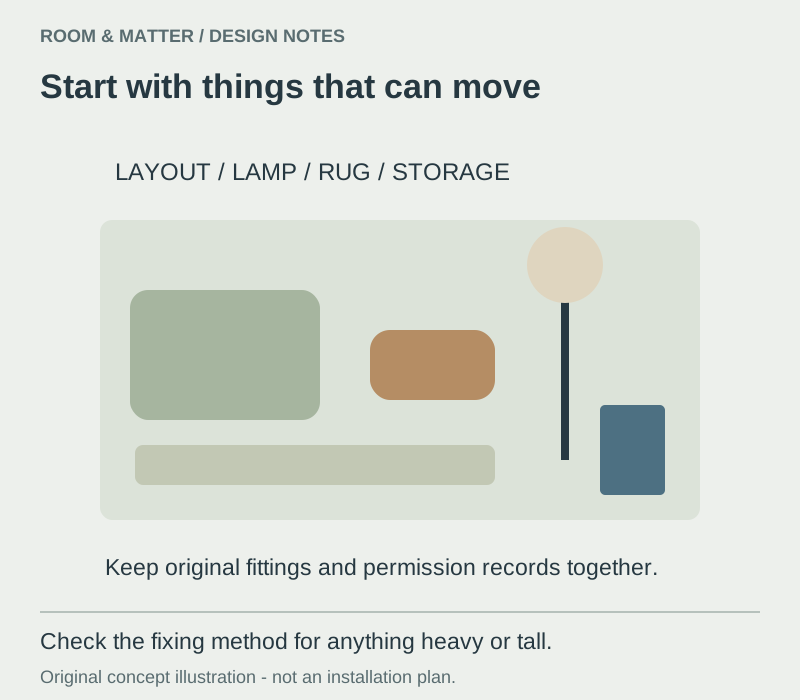
Use furniture layout, lamps, curtains, rugs and freestanding storage before considering permanent changes. Open shelving is flexible but requires editing, so pair it with boxes or closed furniture for visually mixed items. Work with existing wall and floor colors instead of adding several temporary coverings. Confirm permission for drilling, painting or hardware changes and retain original parts. Separate portable improvements from anything attached to the building. Curtains, a lamp, a rug and suitable freestanding storage can travel with you; fixing a heavy mirror or tall cabinet still needs an appropriate method and any required permission. Keep original hardware and finish information together so reinstatement is realistic.
Do Not Confuse Minimalism With Smallness
Minimalist design can help a compact apartment, but empty floor does not replace enough seating, storage or work surface. Scale pieces accurately, use vertical space where reach remains practical and protect the main route. A small home often needs more careful storage than a large one, not less. Evaluate success through routines and comfort rather than how few objects appear in a photograph. A larger apartment can feel just as visually confused when every zone has a different material and an extra occasional table. A very small apartment may legitimately need more visible storage. Compare the real household routines rather than borrowing the object count from a spacious photograph.
Edit for Maintenance, Comfort and Longevity
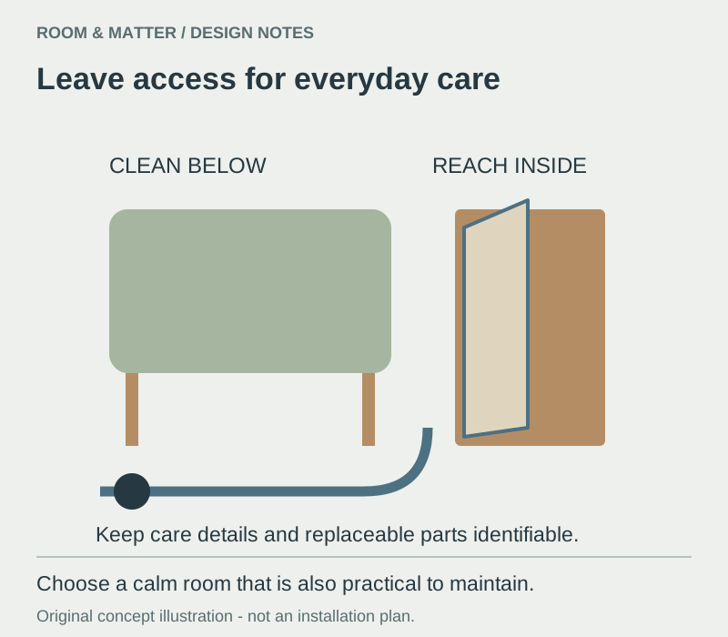
Choose finishes that tolerate the household's wear and leave access for cleaning, repairs and future change. Remove objects that repeat a function, block a route or create maintenance without adding meaning. Keep personal pieces that contribute memory, color or comfort and give them enough space to be seen. The apartment is complete when further subtraction would make daily life poorer rather than clearer. Check the spaces beneath the sofa, behind the freestanding unit and around removable equipment before deciding that a smooth front is low-maintenance. Keep care instructions and replaceable parts identifiable. The next round of editing should remove a friction point or repair a weak choice, not begin a new cycle of buying matching storage.


