Choose the Ratio Before the Objects
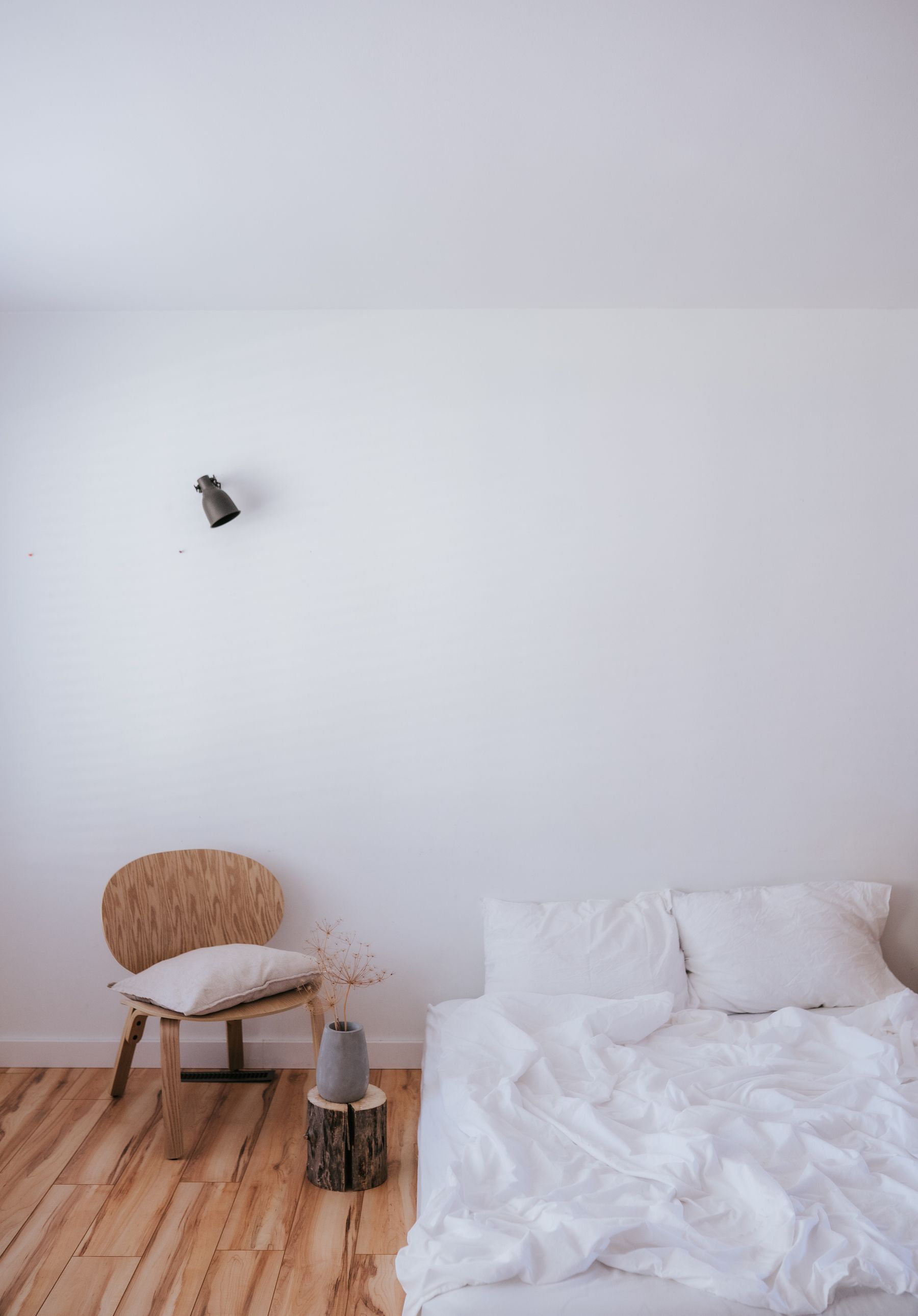
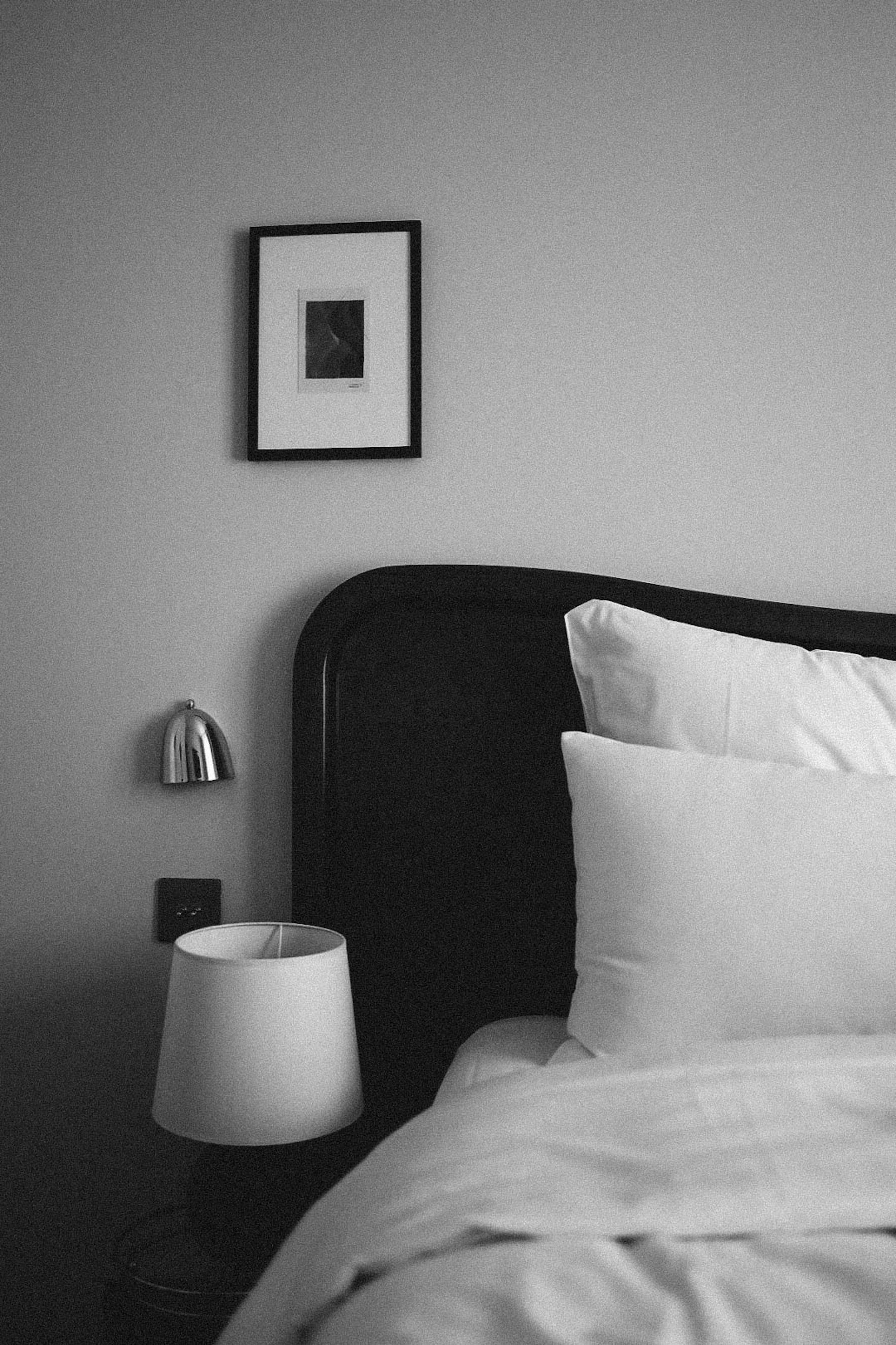
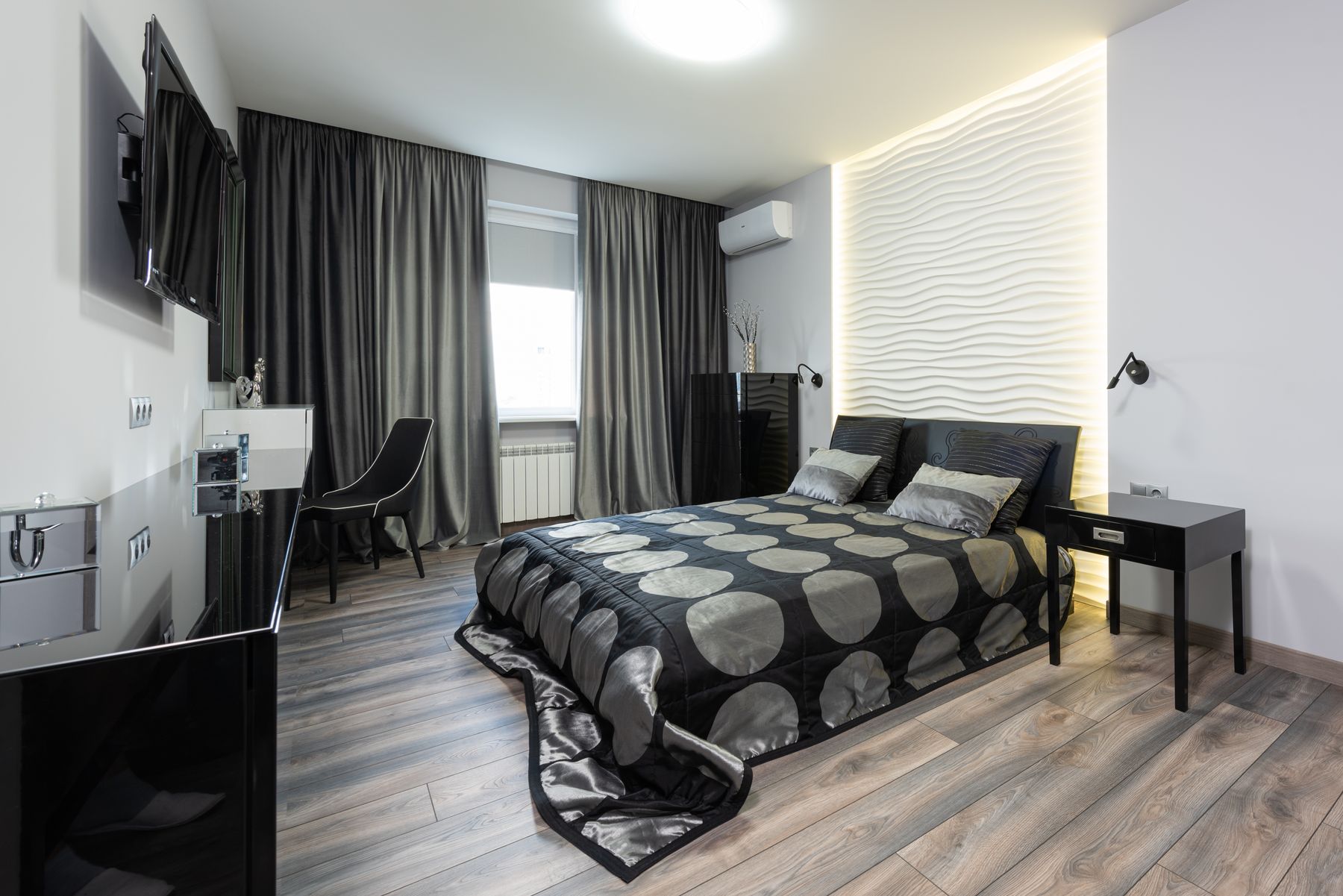
Decide whether the room should feel light-led, balanced or dark-led, then assign the largest planes accordingly. A bright room might use white walls and bedding with a black bed or wardrobe; a cocooning room may reverse that relationship. Count floor, ceiling, curtains and windows as part of the ratio. There is no universal 60–30–10 formula: orientation, ceiling height and the amount of visible furniture change the result. Photograph the empty room in grayscale before buying accents.
Go Black-Dominant Without Losing the Bed
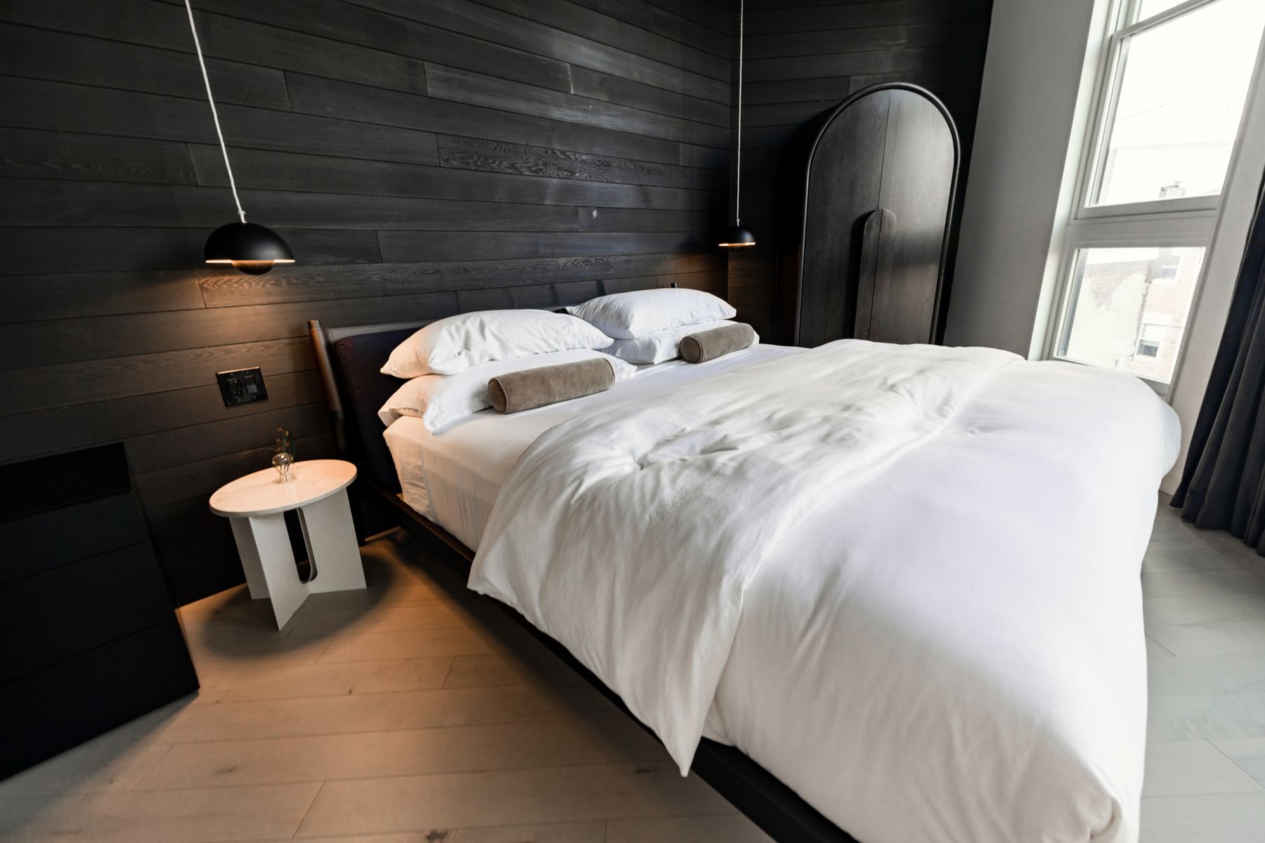
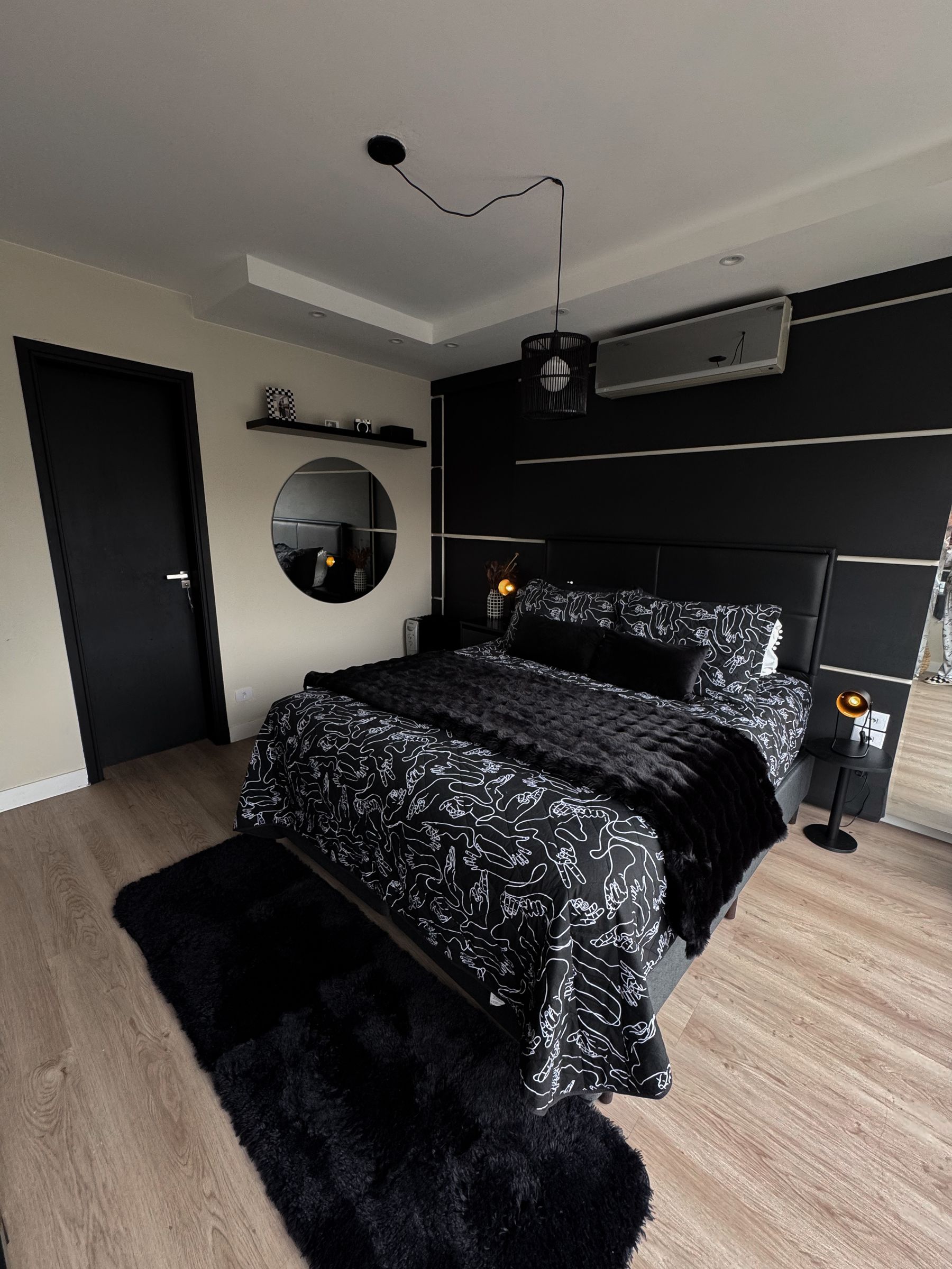
Black walls, ceiling or cabinetry can create depth, but the bed edge, route, switches and storage handles must remain readable. Use white or pale bedding as the largest countershape and add warm low light that reveals texture instead of flattening the wall. Matte finishes hide less glare but show rubbing; eggshell may be easier to clean. [Black Bedroom Ideas](/bedroom/black-bedroom-ideas/) explores fully black-led schemes, while this approach preserves a visibly two-color composition.
Keep a White-Dominant Room Graphic
In a white-led bedroom, use black where it can define architecture or furniture: a bed frame, window outline, curtain rod, lamp or single cabinet. Avoid scattering many tiny black objects around the room, because the eye will hop between them and the pale field will feel spotted. Warm white walls and cream bedding can still read white beside a true black. A future White Bedroom guide will cover tonal white in greater depth; here contrast remains essential.
Soften Pure Black and Optical White
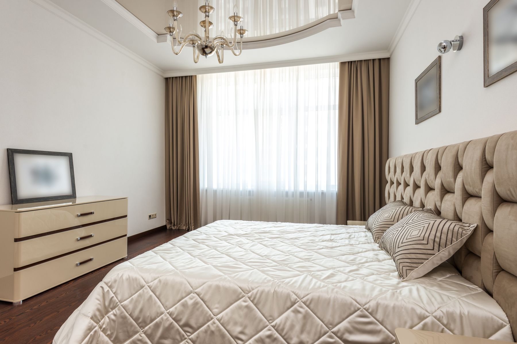
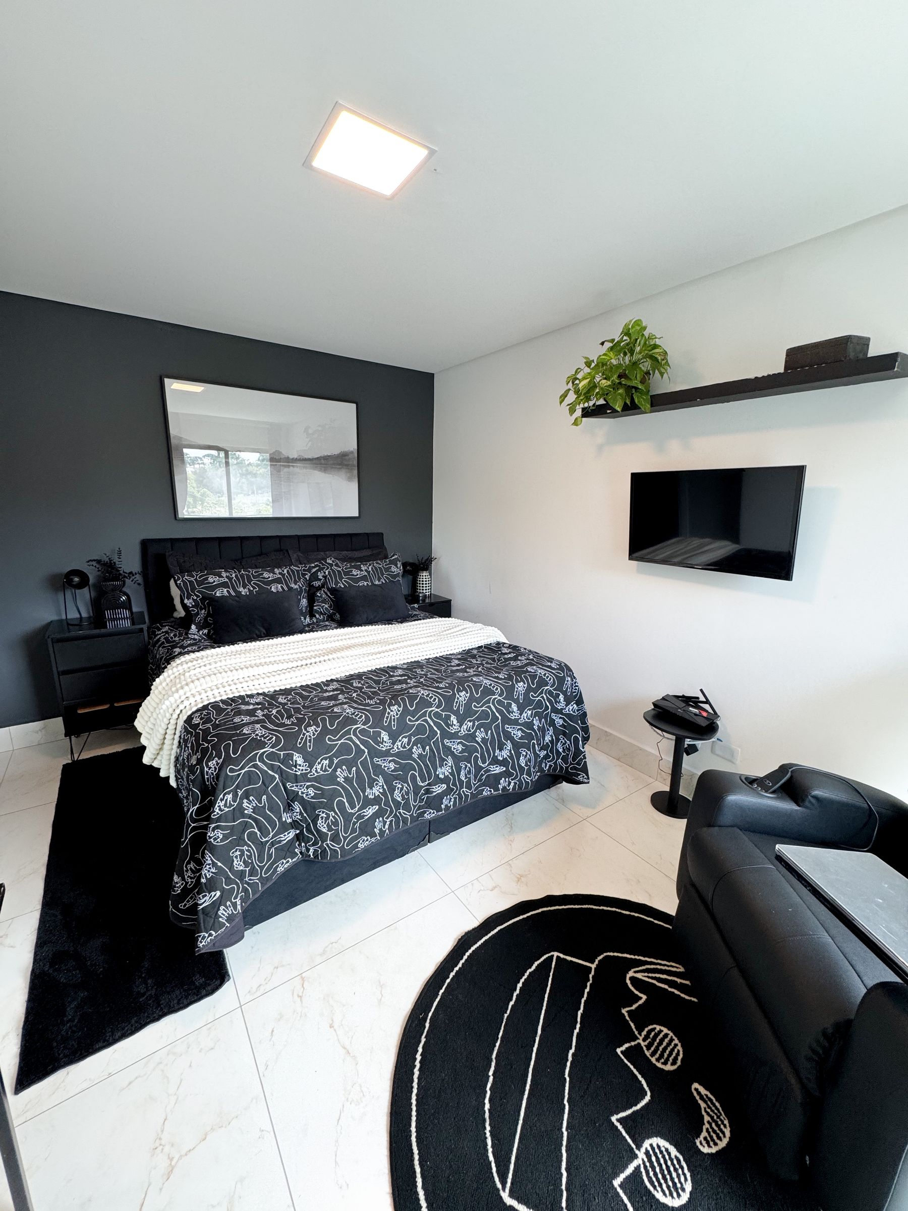
Pure black beside cool optical white can feel harder under artificial light than it did on a sample card. Use soot, ink or charcoal against chalk, ivory or warm white, then let natural timber, green or gray form a narrow transition. This is not abandoning the palette; it makes both endpoints more livable. Test large samples behind the bed and beside existing floors at dawn, midday and evening. Undertone conflict is more visible across a broad wall than on a small chip.
Build Contrast With Shape, Not Clutter
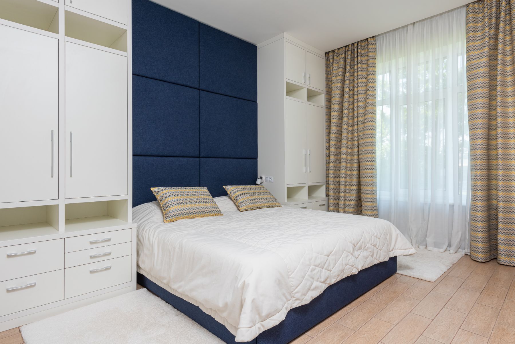
Use the bed rectangle, headboard curve, wardrobe plane or window grid as the main black shape. Repeat its line once or twice at a smaller scale, then allow softer material to interrupt the geometry. Strong contrast makes every edge visible, so an ordinary collection of frames, cords and accessories can quickly feel busy. [Contemporary Bedroom Ideas](/bedroom/contemporary-bedroom-ideas/) offers a broader framework for sculptural current forms; the monochrome version needs even stricter hierarchy.
Warm the Palette With Honest Material
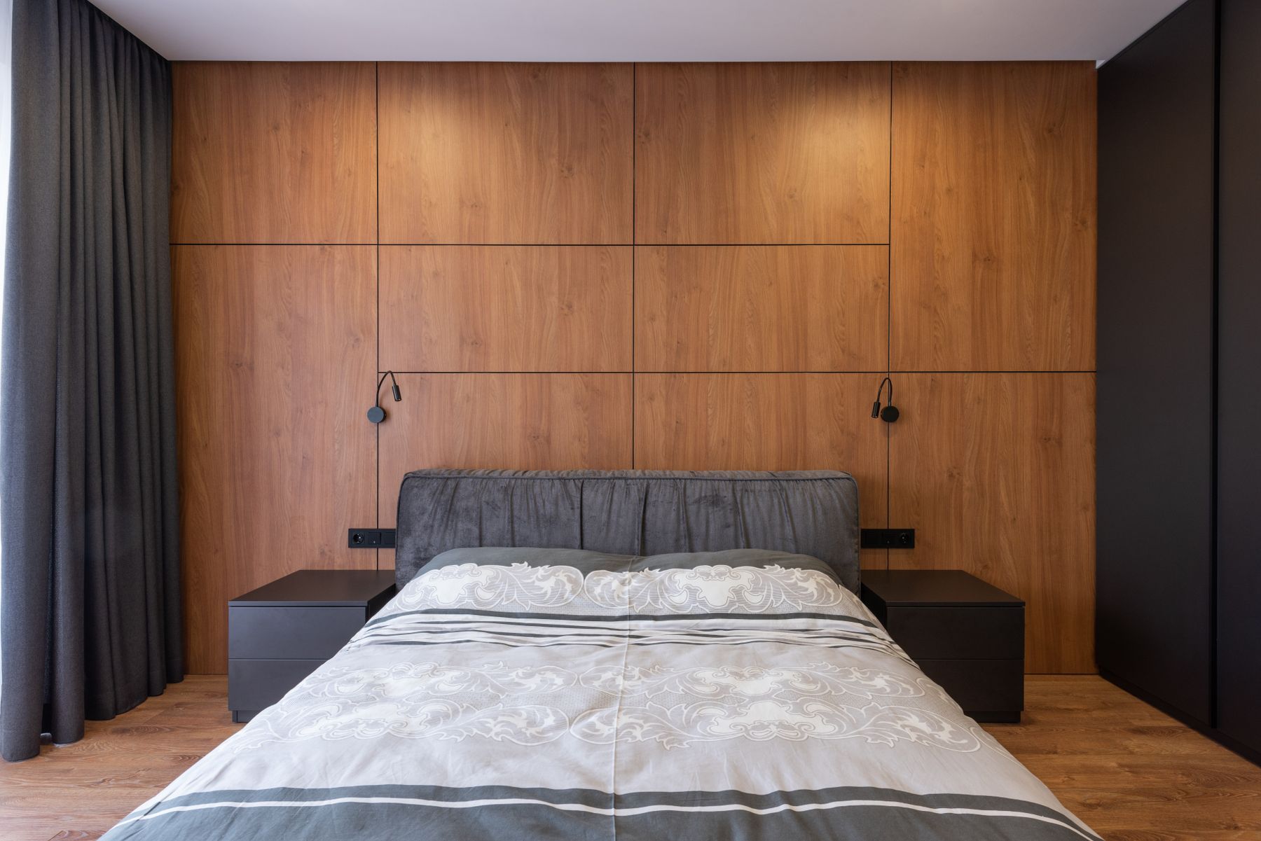
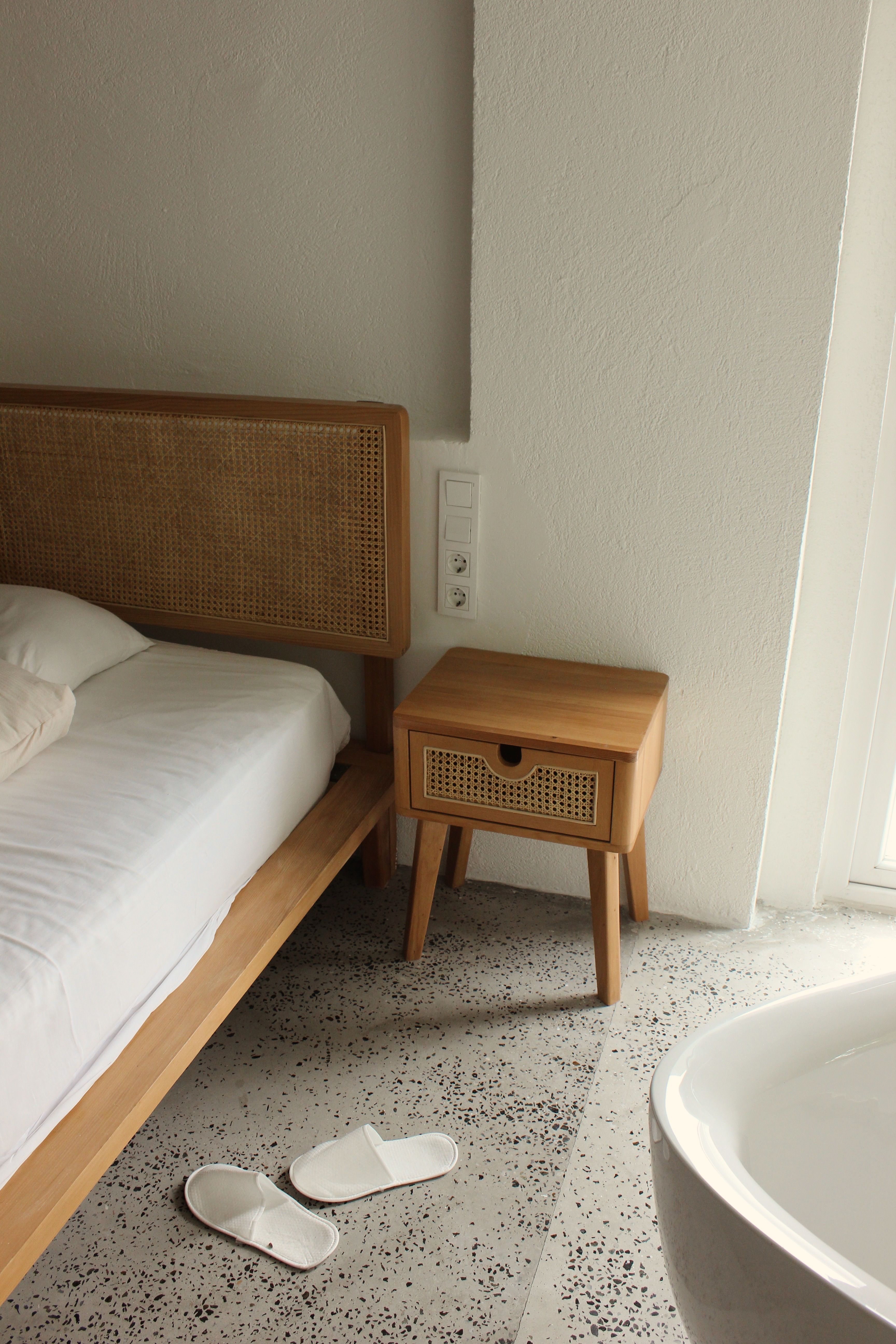
Oak, walnut, cork, wool, linen, leather or woven grass can prevent black and white from reading as a showroom. Use one warm material family in a meaningful area—a floor, bed, bench or broad rug—rather than adding many tan accessories. Keep its finish honest enough for grain and wear to remain visible. The material is a bridge, not a third competing color scheme. Confirm cleaning, allergies and sunlight performance before relying on a delicate natural surface beside the bed.
White Bedding Through Texture
White bedding needs variation in weave and loft more than a large cushion count. Combine breathable sheets, an appropriate duvet or blanket and one tactile top layer chosen for climate, allergies and laundry. Cream and chalk can coexist when their undertones agree. Keep a dark throw only if it has a real thermal use and a nighttime home. A pale bed should remain inviting and washable, not become a fragile display that residents avoid touching.
Control Pattern Scale on the Bed
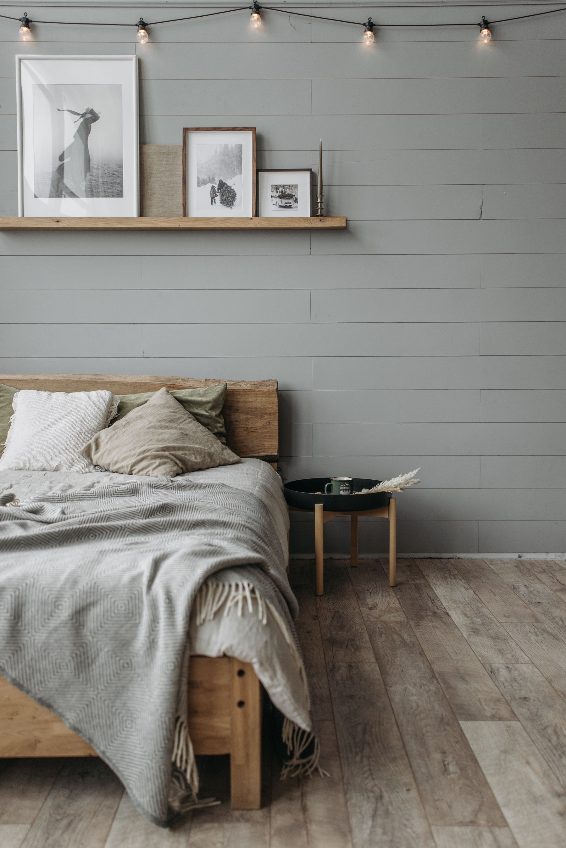
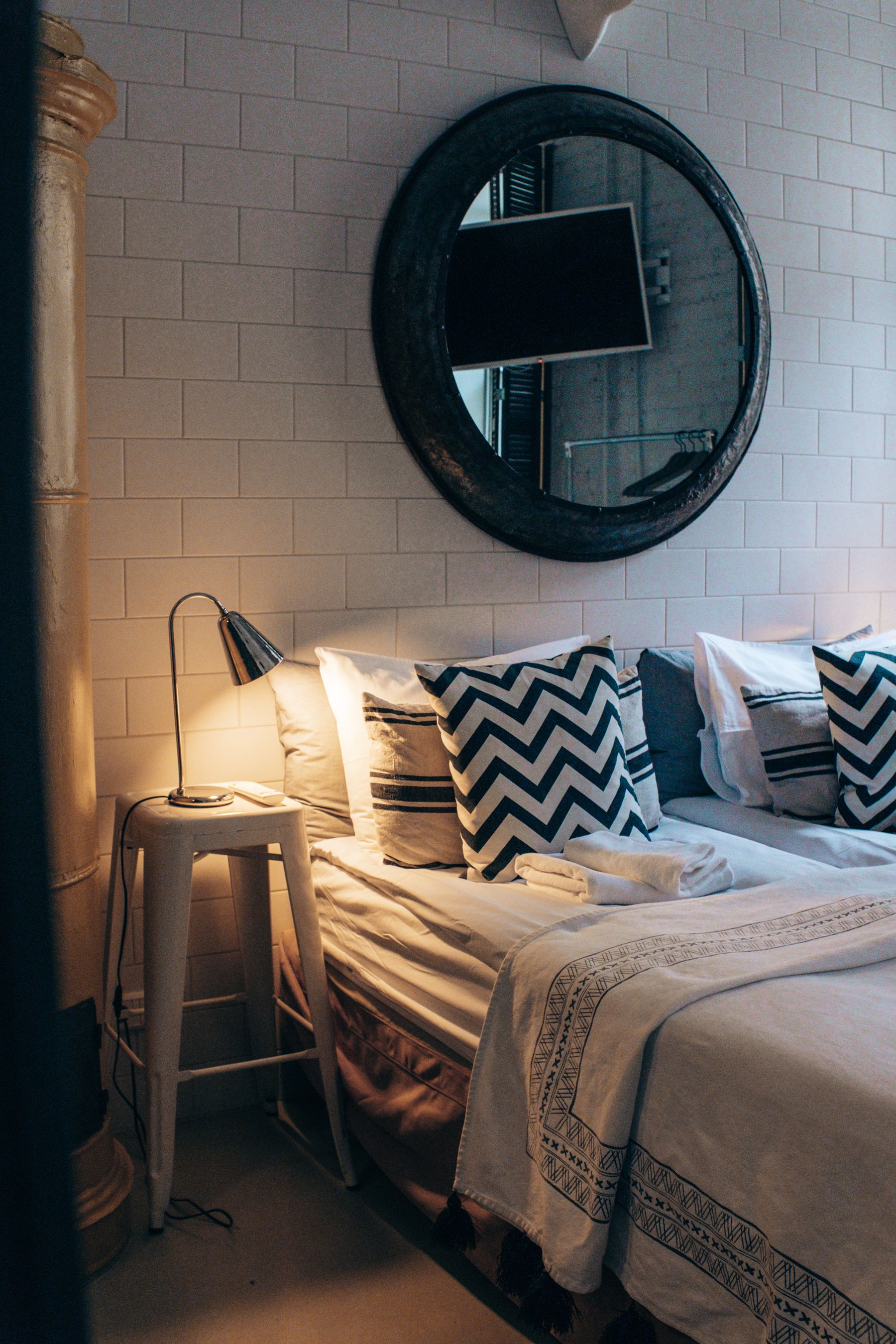
A stripe, check, toile or abstract black-and-white print can animate the room, but high contrast amplifies pattern more than color does. Use one dominant repeat, one subtle texture and broad solids; avoid equal-strength geometry on rug, curtains and bedding. Check the full repeat at room distance before cutting fabric. If the pattern causes visual vibration or hides the bed edge in low light, move it to a smaller, replaceable layer rather than a permanent wall.
Ground the Bed With the Right Rug
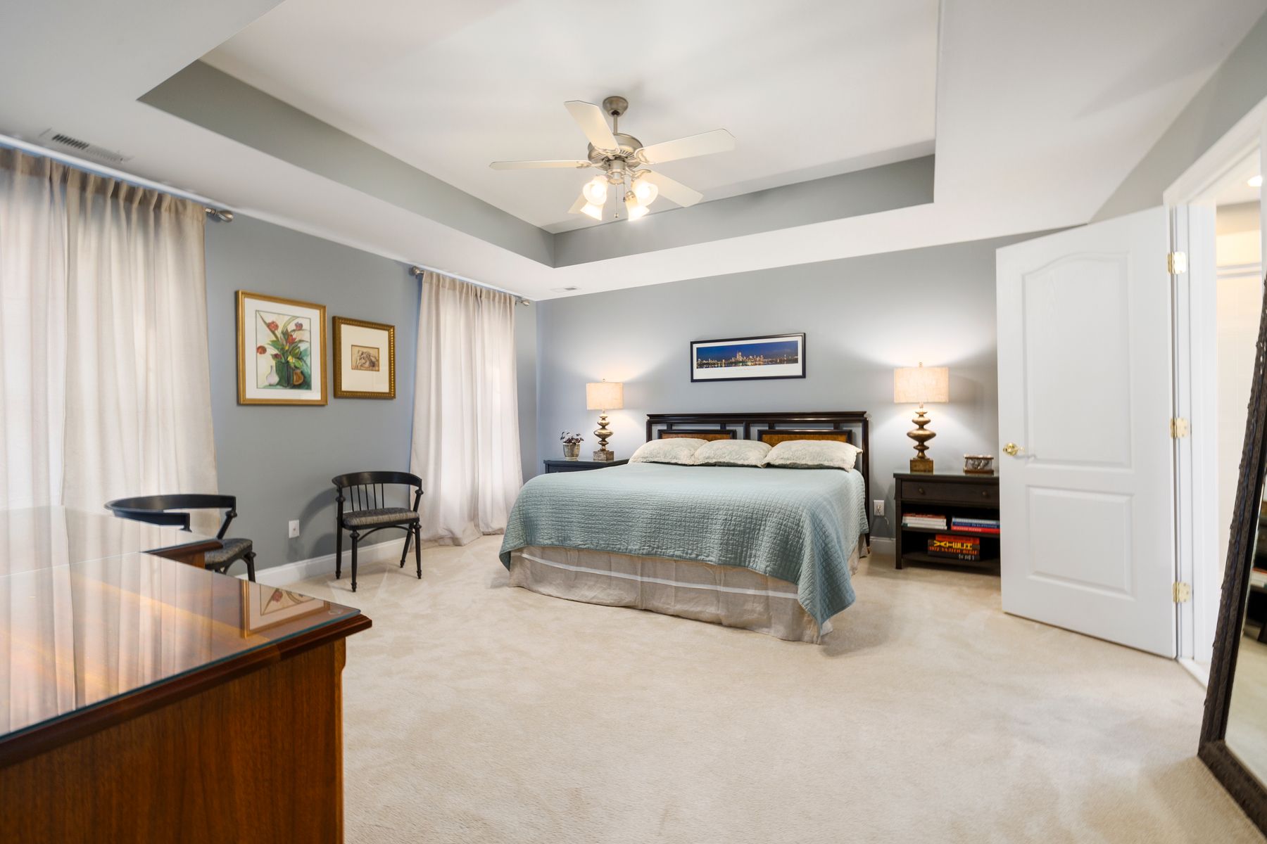
Choose rug size and fiber before pattern. It should support the first step on both sides, remain clear of doors and vents, and sit securely under the bed. A black field hides some stains but reveals pale lint; a white field brightens but may demand frequent cleaning. Medium-scale geometry can bridge both values if bedding remains quieter. Review underlay, pile and maintenance in [Living Room Rug Ideas](/living-room/living-room-rug-ideas/) before buying on appearance alone.
Use the Window Frame as Contrast
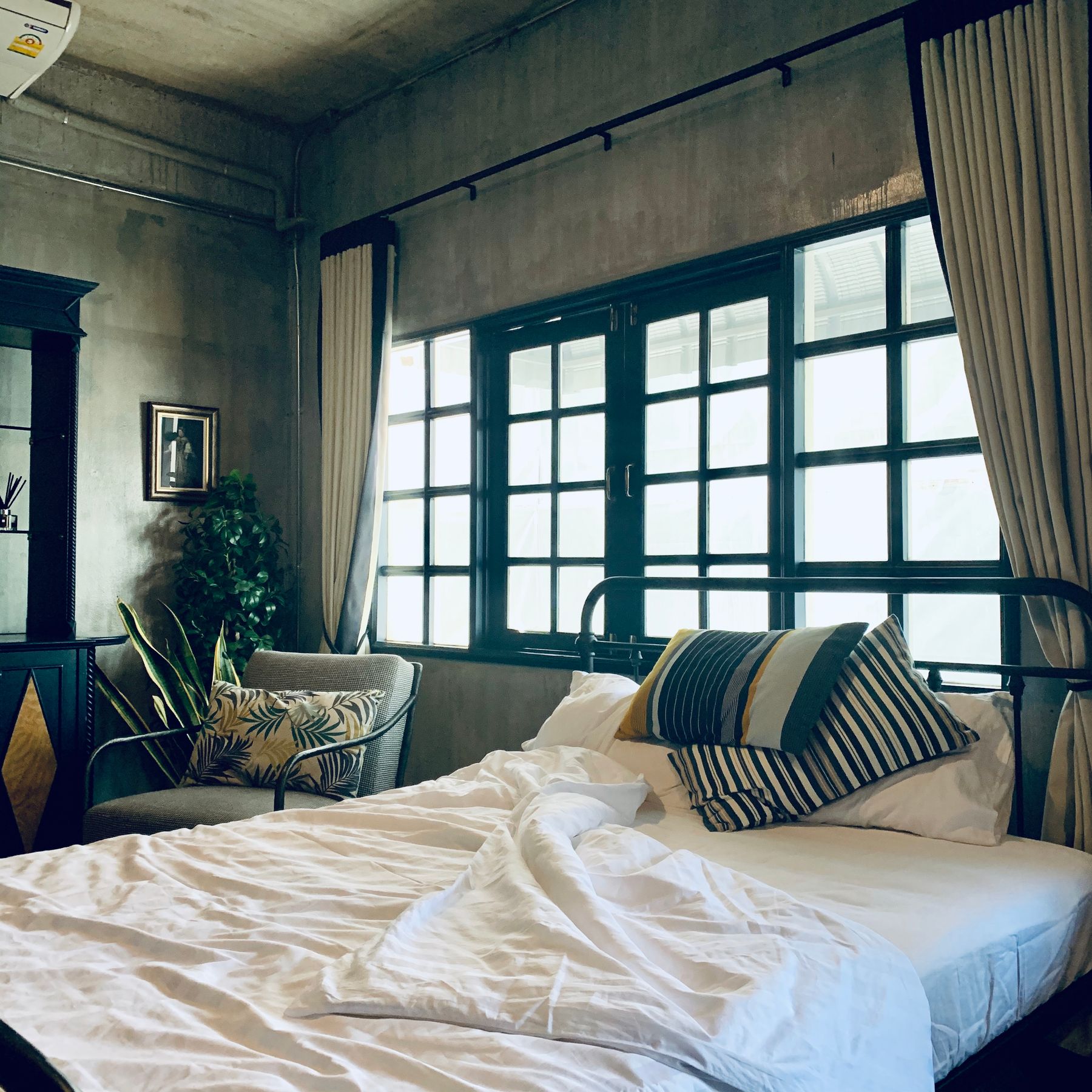
Existing black frames can carry enough contrast that curtains and nearby furniture remain quiet. If frames are white, a dark rod or lined curtain can create the outline without painting hardware unsafely or voiding warranties. Separate daytime privacy, glare, thermal control and true blackout rather than expecting one monochrome fabric to solve everything. The frame should make the view clearer, not create a heavy grid that competes with the bed or reduces useful daylight.
Light Across Both Values
Black absorbs light while white reflects it, so one ceiling source exaggerates the difference. Combine ambient light, independent reading lights and a low route, then dim them separately. Aim light across textured dark surfaces and keep bright sources out of the pillow view. Warm-neutral lamps often make the palette more comfortable than cool high-output light. [Living Room Lighting Ideas](/living-room/living-room-lighting-ideas/) expands beam and control choices; bedroom lighting should end in genuine darkness.
Bedside Furniture Judged by Reach
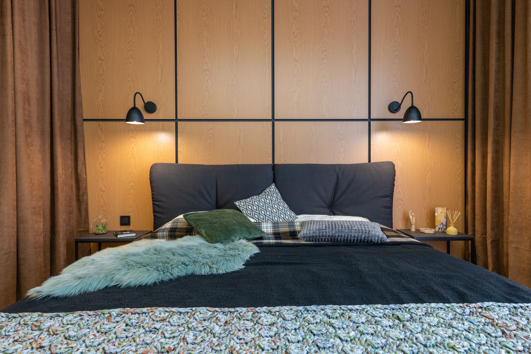
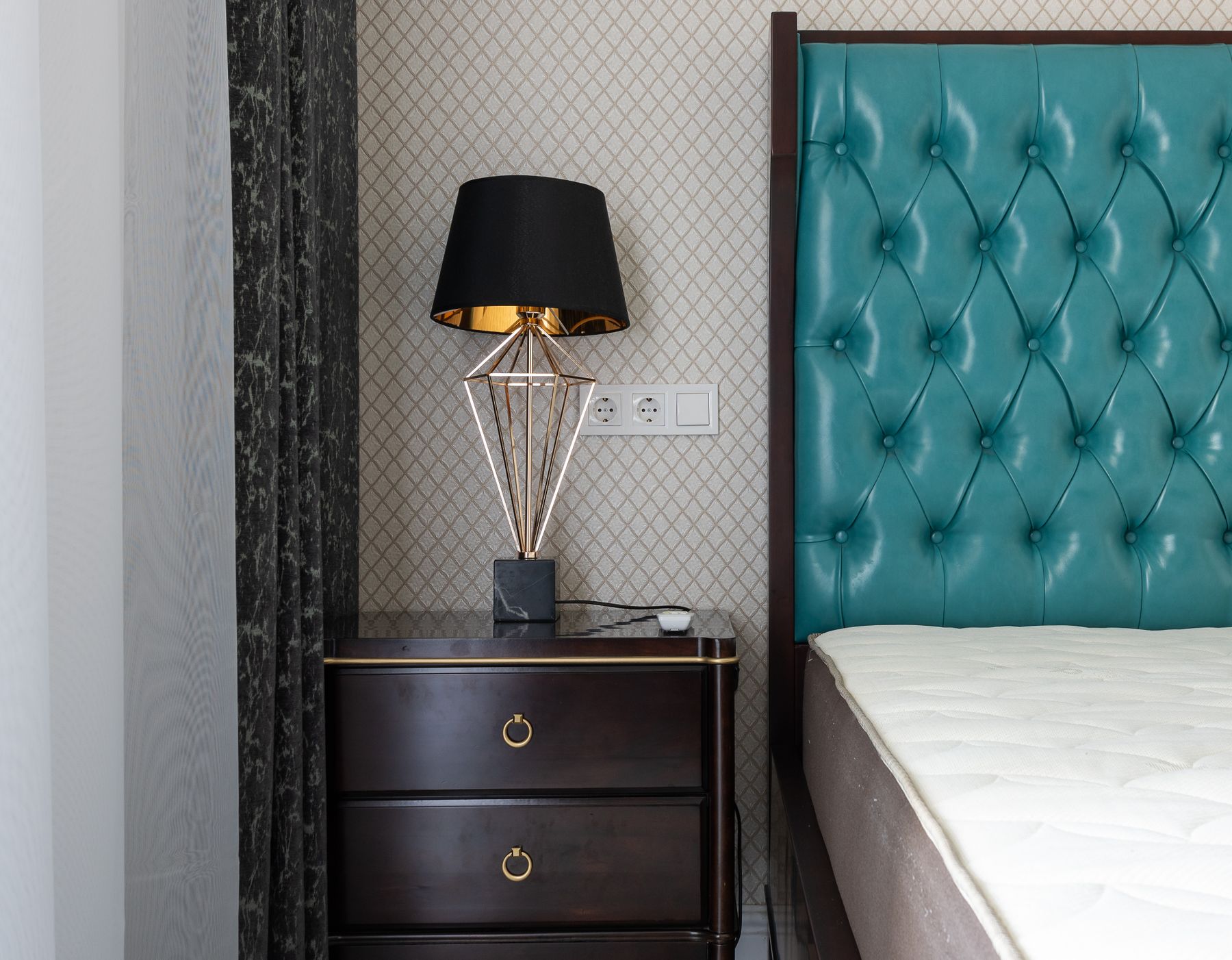
Select black, white or timber bedside furniture after measuring mattress height and natural hand reach. The surface needs water, glasses, medication or a book; one drawer can contain charging and small visual noise. Two sleepers do not require identical pieces if their routines differ. Avoid white lacquer that throws lamp glare or black glass that shows every fingerprint. Contrast should clarify the bedside function, not turn a practical surface into a high-maintenance object.
Make the Headboard the Main Silhouette
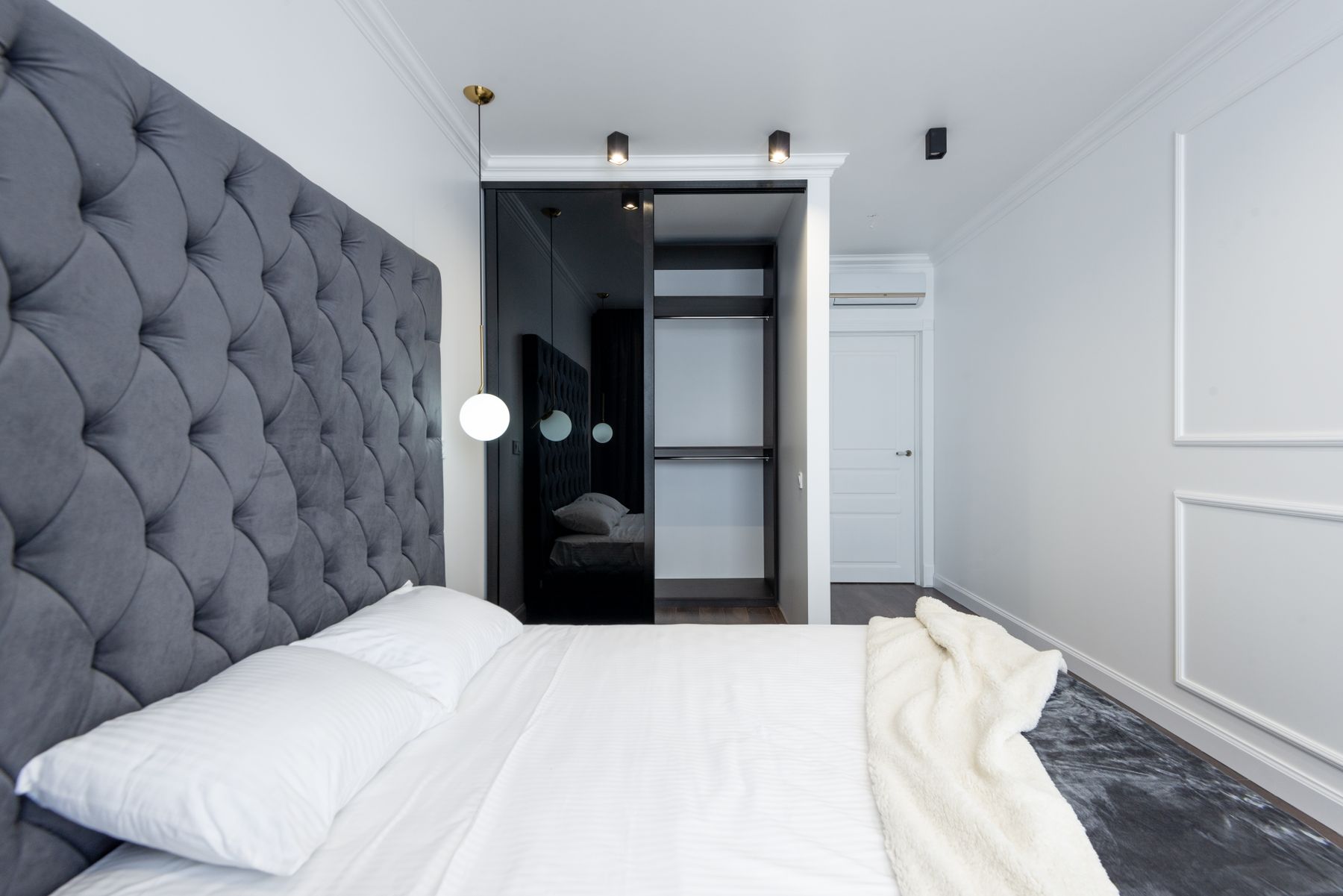
A black upholstered headboard against pale wall, a white headboard on charcoal, or a simple dark timber frame can establish the entire palette. Size it around mattress width, sitting height, bedside light and nearby switches. Channeling and curves soften a strict scheme, but deep seams collect dust and full wall upholstery needs safe, repairable construction. If the headboard already commands the room, avoid stacking high-contrast art directly above it.
Art With Personal Meaning
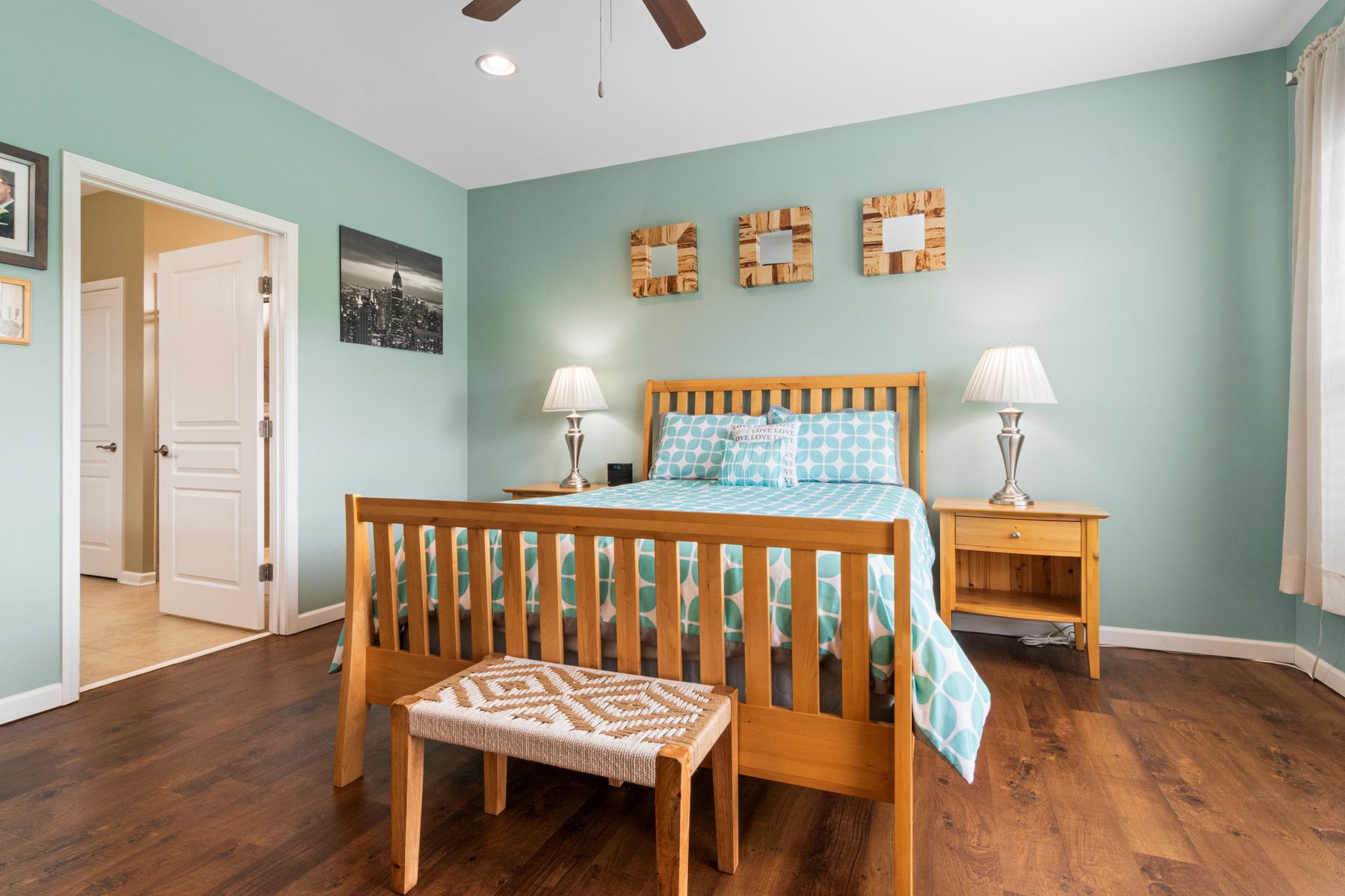
Black frames and white mats are useful, but they do not make generic prints personal. Choose work for meaning, scale and safe placement, then let the frame support it. Photography, drawing, textile and restrained color can all belong; the art does not have to obey the palette completely. Avoid heavy glass above the sleeper and protect light-sensitive pieces. Fewer larger works usually create more restful hierarchy than many small high-contrast rectangles.
Material Depth for a Dark Wall
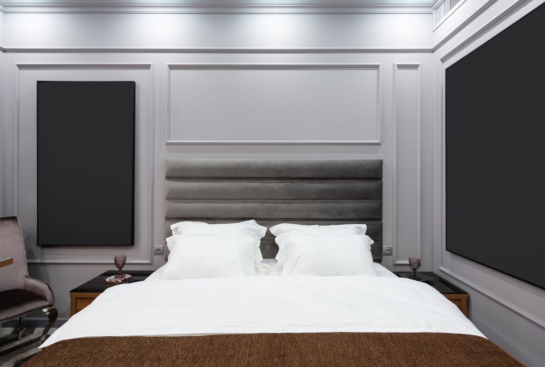
A black wall gains depth through plaster movement, timber grain, panel rhythm or varied sheen—not automatic slats applied everywhere. Draw the full elevation around outlets, headboard, doors and corners, and provide access to any concealed services. Matte surfaces may mark; grooved surfaces collect dust. If the room has damp or a cold external wall, diagnose that before cladding it. The strongest material wall earns attention while adjacent planes remain simpler.
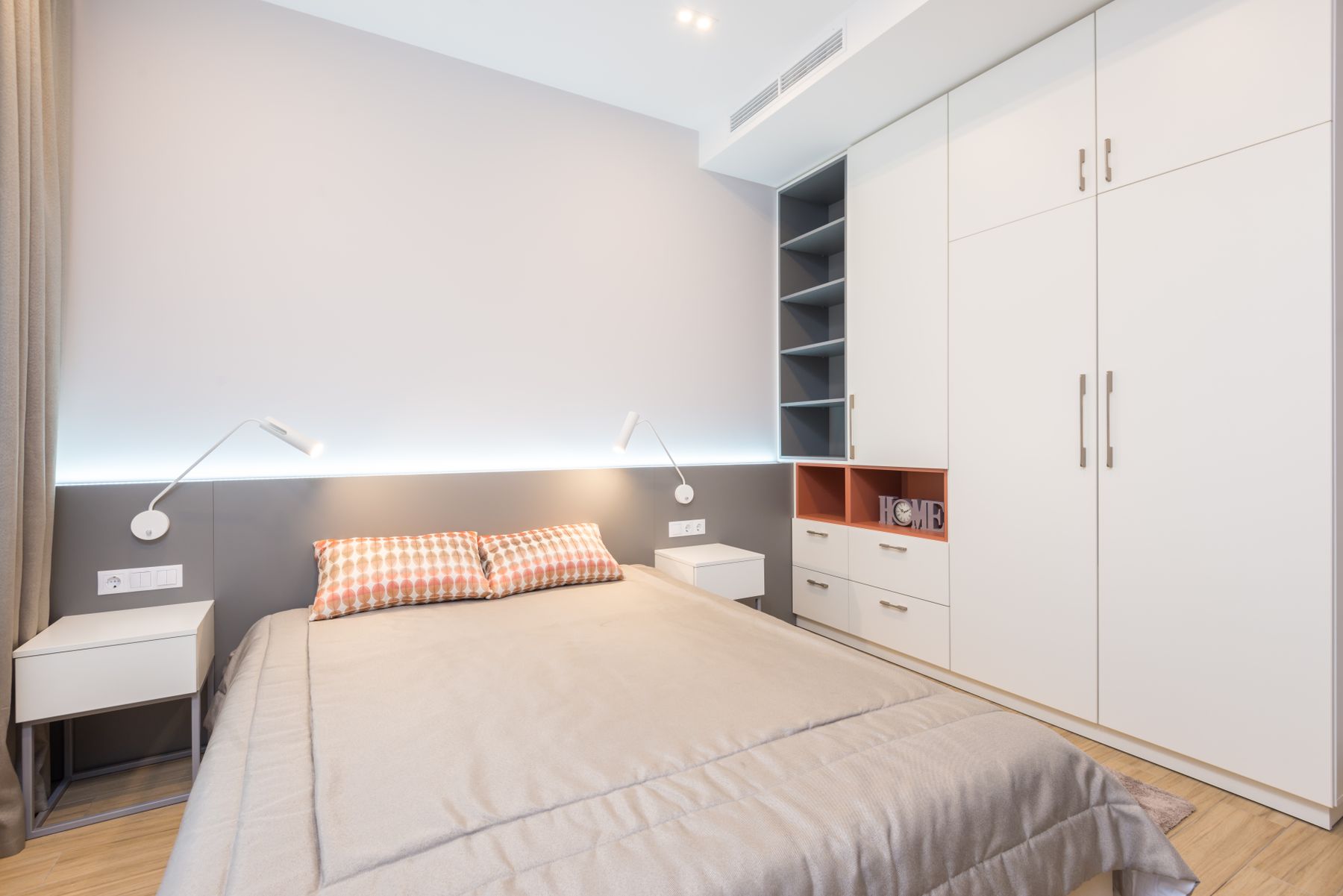
Storage Quiet Outside, Useful Inside
Inventory hanging lengths, folded items, shoes, laundry and luggage before dividing the wardrobe. Full-height white fronts can merge with a pale wall; charcoal fronts can add architectural weight. In both cases, graspable contrasting handles and a lighter interior improve use. Avoid touch-latch systems where fingerprints or accessibility make them frustrating. The calm exterior only succeeds if the inside supports a quick reset and doors, drawers and ventilation remain practical.
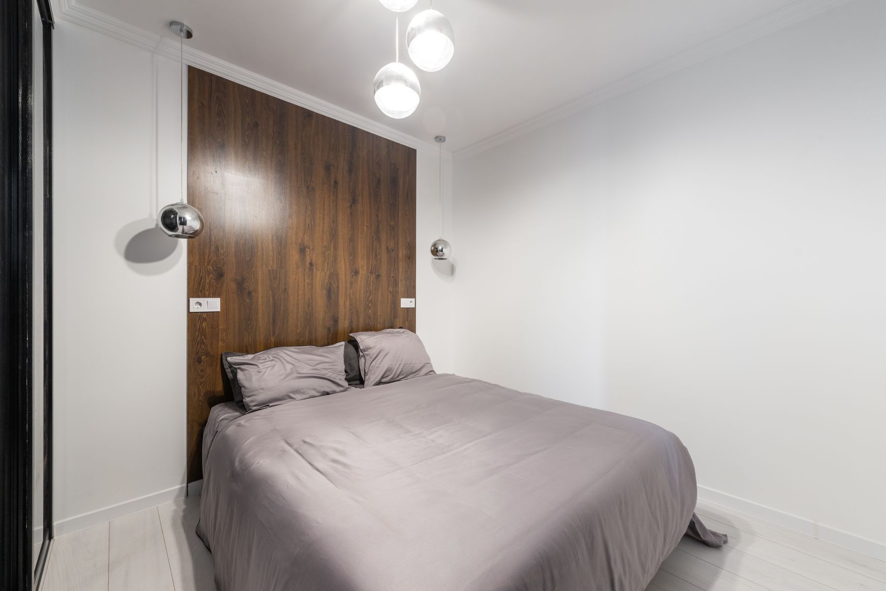
Scale Contrast for a Small Bedroom
Small rooms do not need to avoid black, but they benefit from fewer, larger dark fields. Choose the mattress first, preserve one complete route and use wall-mounted light or shallow bedside shelves where width is tight. A black headboard or curtain wall can create depth while pale bedding and ceiling preserve clarity. Borrow storage and circulation tests from [Small Apartment Ideas](/apartment/small-apartment-ideas/); do not use color to disguise furniture that is simply too large.
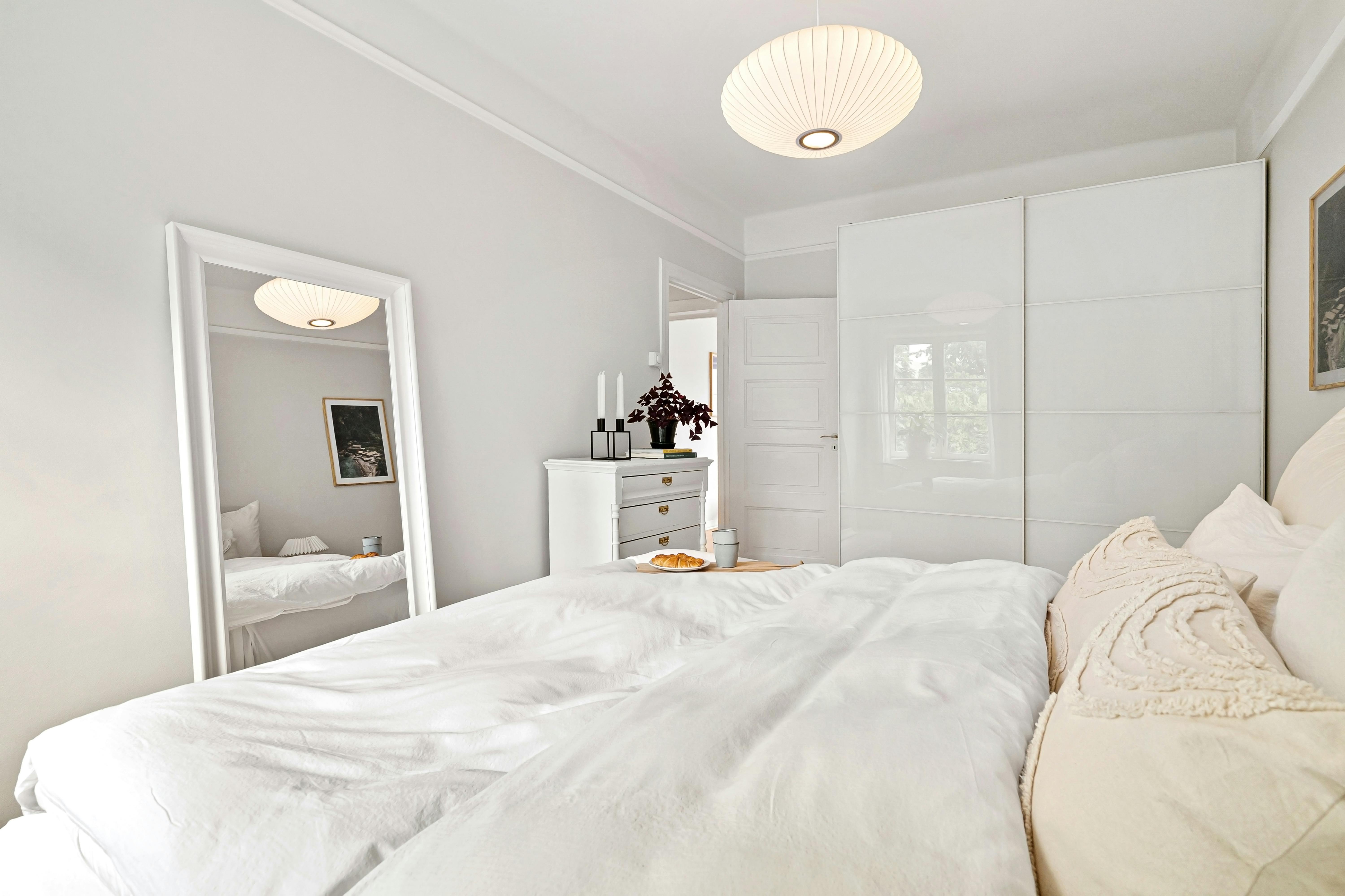
Portable Contrast Layers for a Rental
Use a dark bed or headboard, black-lined curtains where permitted, white bedding, a broad rug and portable lamps before altering the shell. Verify the lease and substrate before paint, adhesive panels or removable wallpaper; removable does not mean damage-free. Photograph starting conditions and keep landlord fixtures accessible. A portable scheme should fit a future room rather than becoming disposable decor. Strong contrast can come from useful objects, so renters do not need false architecture.
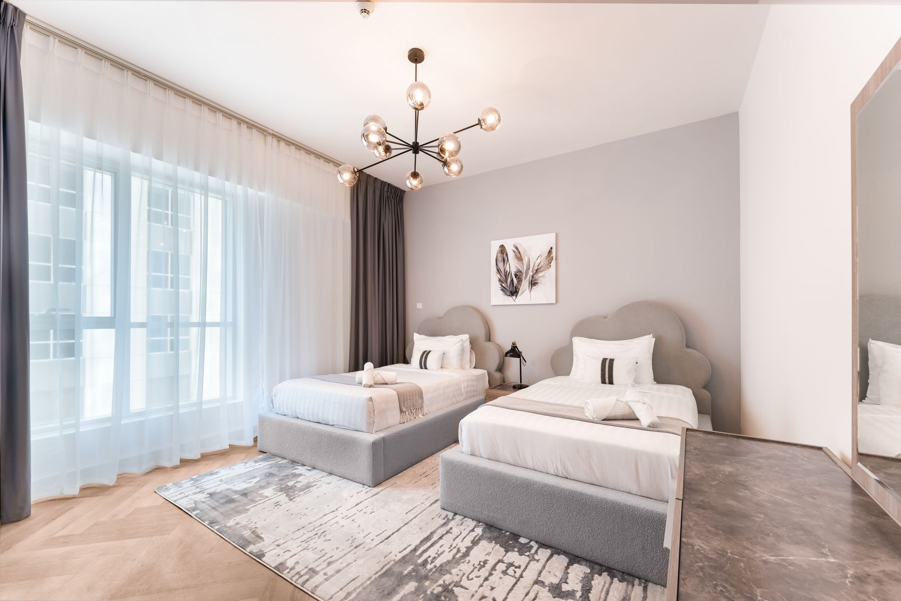
Balance a Shared Bedroom Around Two Routines
Use a common wall color, rug or headboard line to connect two sleepers, then allow bedside storage, bedding weight and reading light to differ. Equal visual symmetry should not override different reach, temperature or wake schedules. Give each person equivalent useful storage and independent control of light. Discuss how much black feels restful to both users; a dark envelope chosen by one person can affect the other's orientation and sense of comfort at night.
Close a Monochrome Workspace After Hours
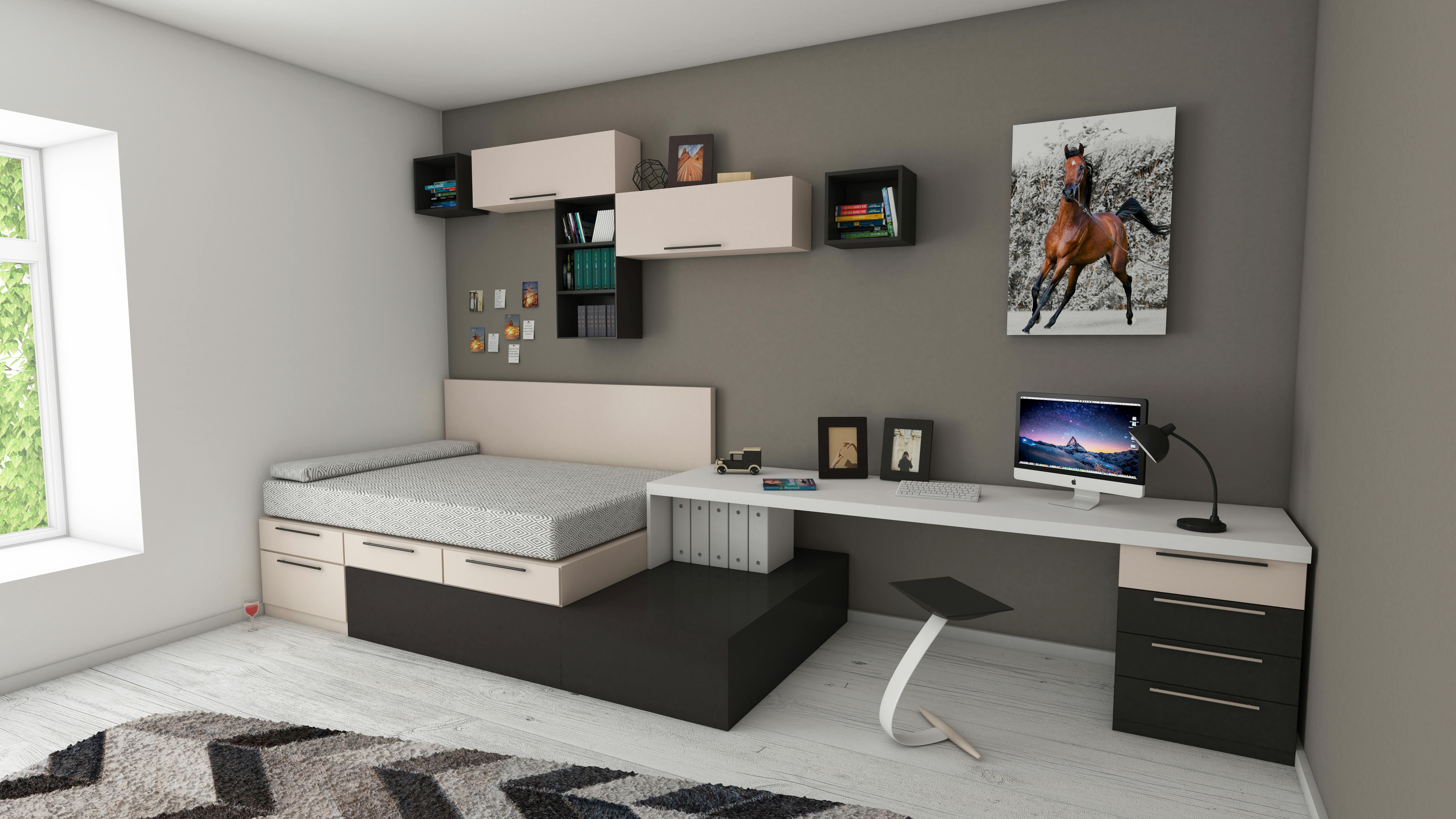
Black monitors and white walls already create strong contrast, so keep cables, papers and status lights controlled. Place the desk outside the direct pillow view where possible, provide focused task light and assign closed storage for equipment. At the end of work, clear the surface, close the laptop and shift to the bedroom's lower light scene. A black desk may recede against a dark wall, but ergonomics, ventilation and replacement access matter more than visual disappearance.
Contrast That Improves Accessibility
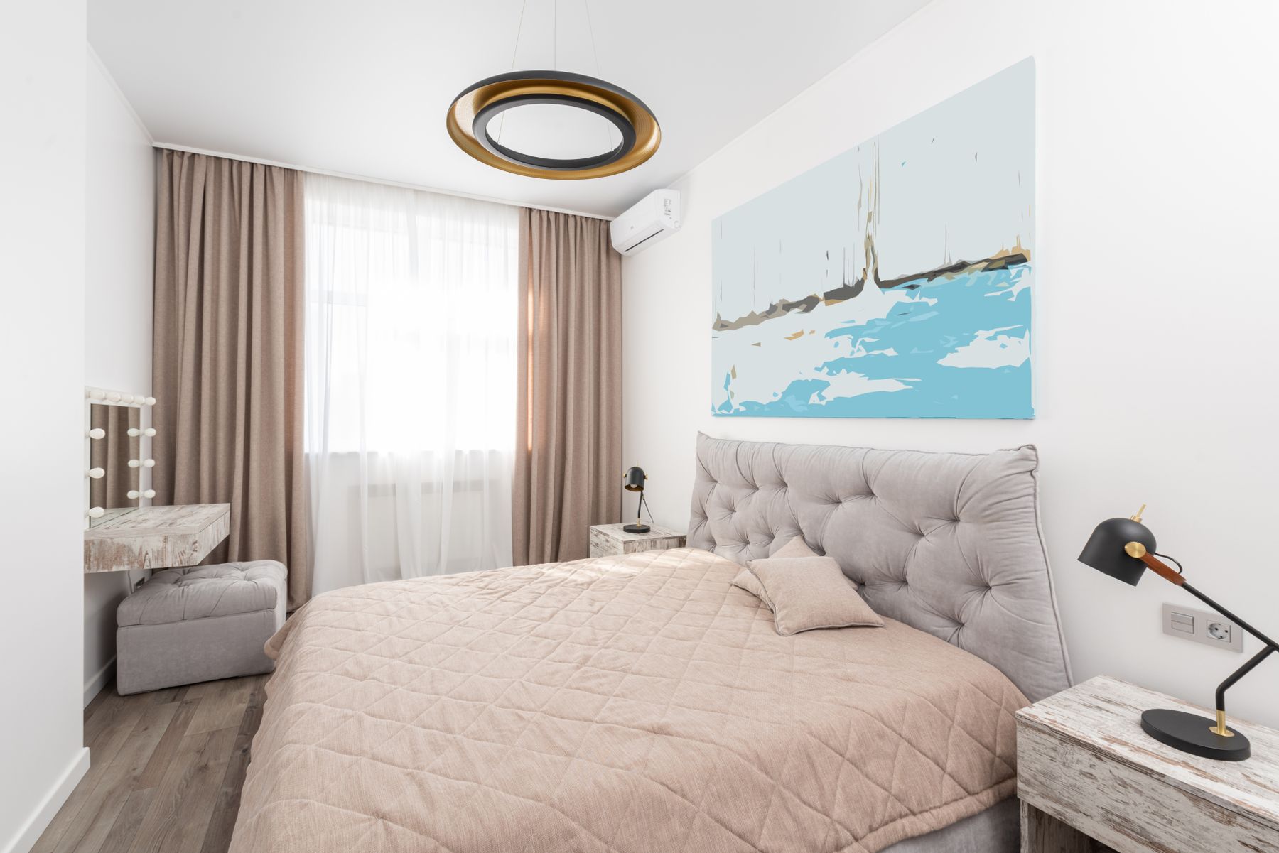
Apply black and white where value difference helps orientation: bed edge against floor, handle against door, switch against wall and threshold against adjacent surface. Avoid high-contrast stripes on walking routes when they may obscure level changes or create visual vibration. Set mattress height, transfer space and controls for the actual user, secure rugs and remove projecting dark furniture from low-light paths. Graphic style should support perception and movement rather than compete with them.
Design for Children, Pets and Washability
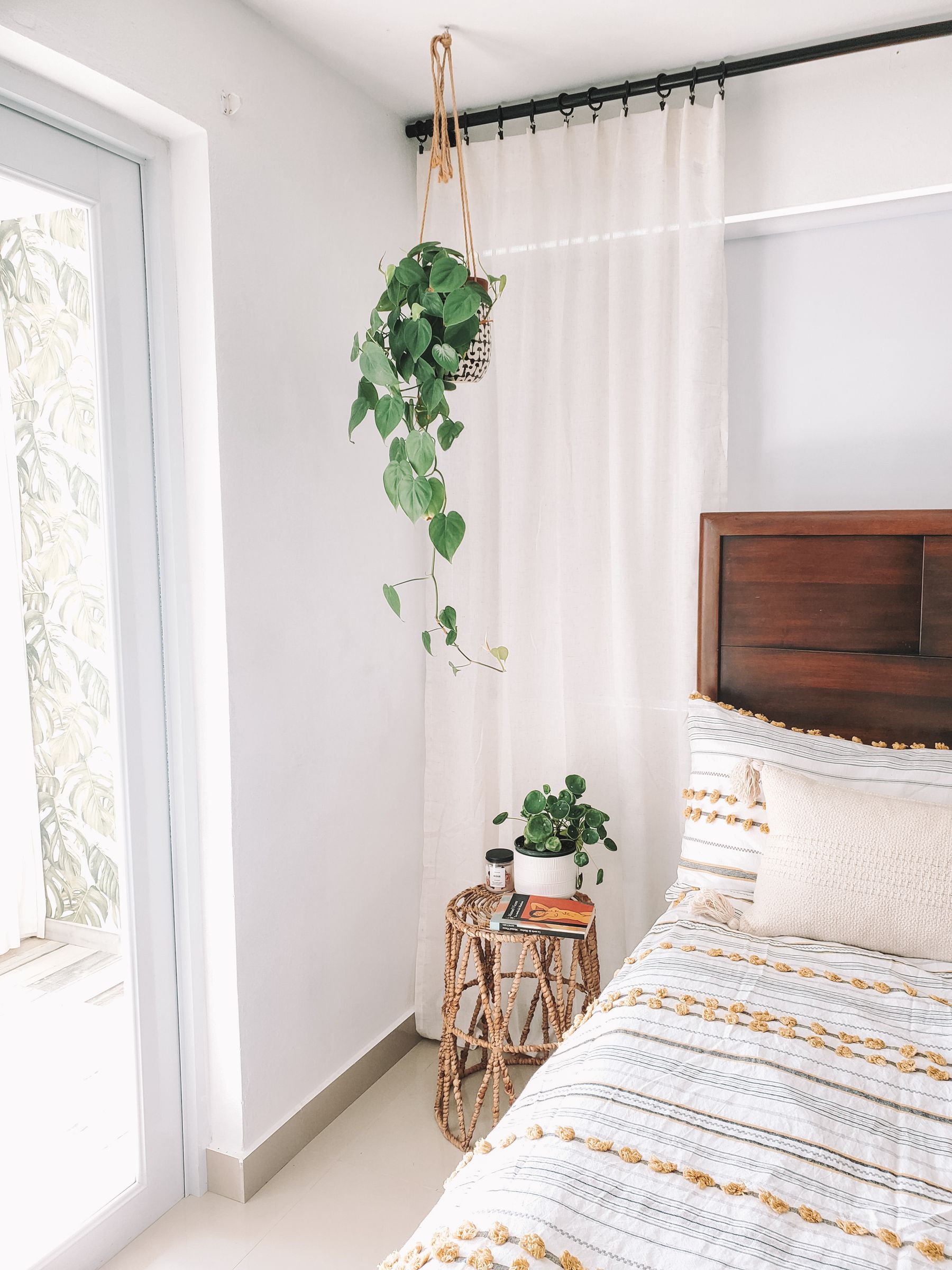
Choose machine-washable pale covers, durable dark upholstery and replaceable patterned layers where spills, fur or play are expected. Secure tall storage, manage blind cords and route black cables where they cannot become trip or chew hazards. White need not mean precious, and black need not hide maintenance. Inspect lint, scratches and dust under real use before specifying glossy finishes. A small amount of timber or color can make the room friendlier without losing the palette.
One Metal Temperature
Blackened steel, chrome, nickel, brass and bronze all work with monochrome, but mixing several at equal strength weakens the clarity. Choose one dominant temperature from existing door hardware, windows or lighting, then allow minor exceptions where replacement would be wasteful. Polished metal increases glare; matte black shows dust and chips. Use metal at handles, lamp stems or one frame, not as a decorative outline around every object.
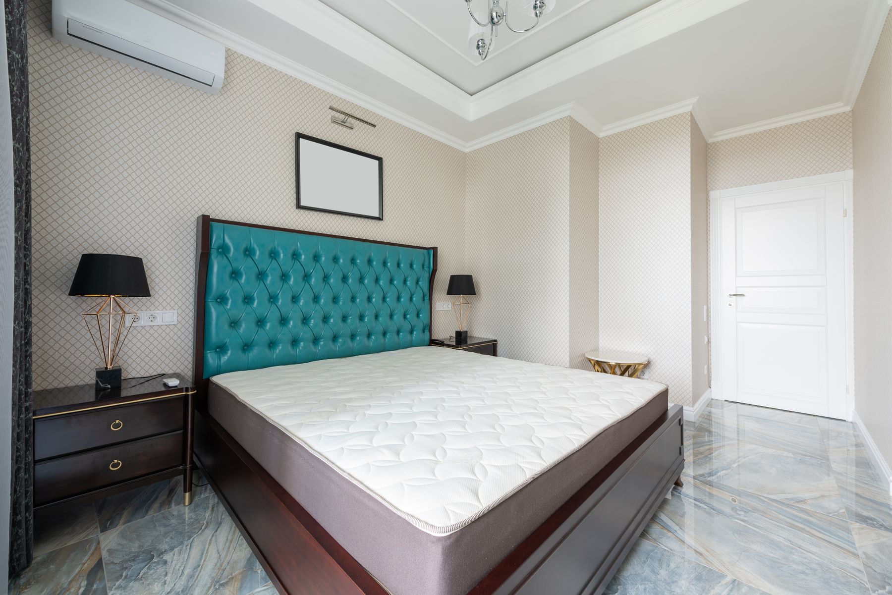
Introduce One Accent Color Deliberately
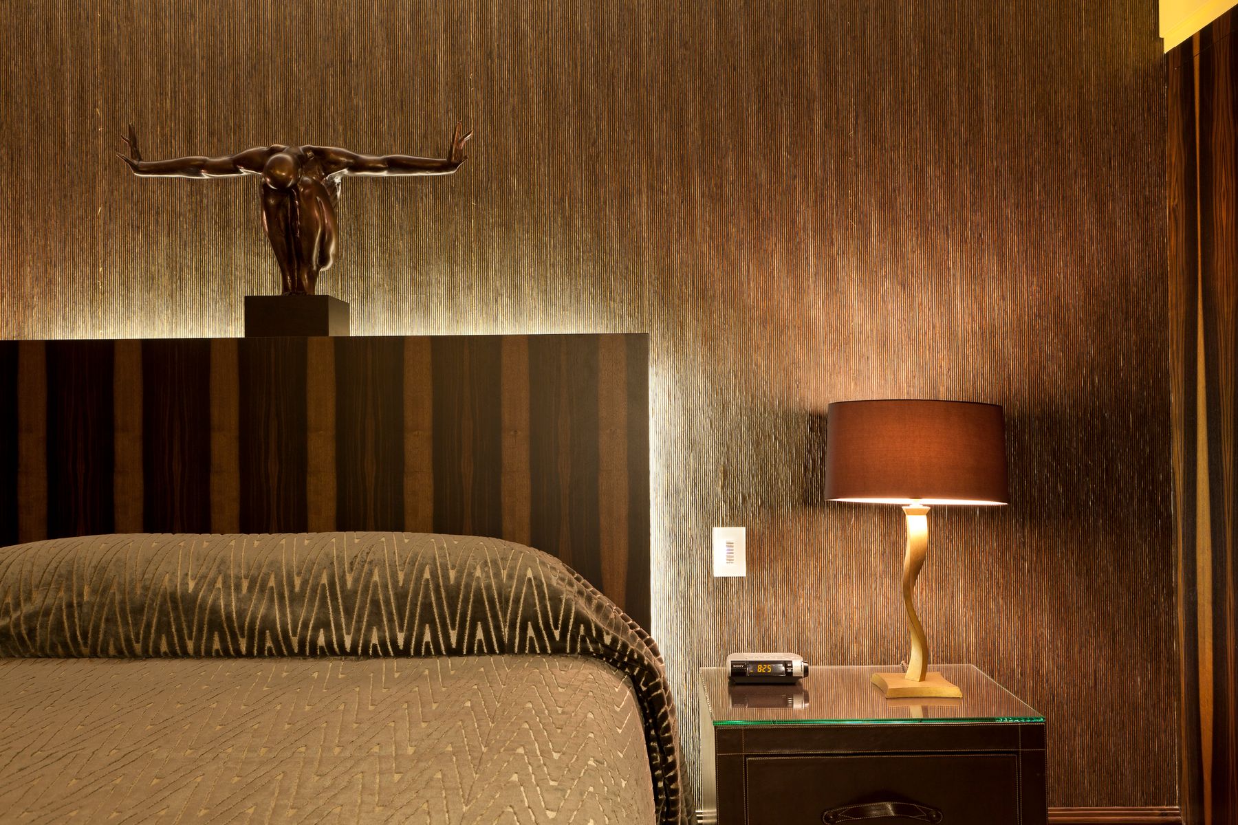
If strict monochrome feels impersonal, add one controlled color through a headboard, artwork, throw or seasonal branch. Teal, oxblood, ochre, green and muted pink can all work when repeated once at a smaller scale. Do not distribute many tiny colored accessories; the room will lose its graphic foundation. The accent should support a personal object or material, not merely imitate a trend. Remove it in a mockup first to confirm the underlying black-and-white plan still works.
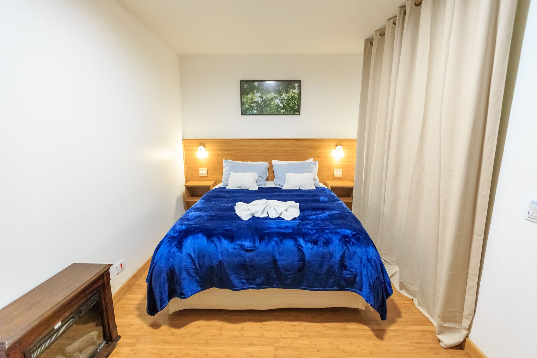
Translate the Palette Across Styles
Black and white is a color framework, not a single style. Modern uses clean planes; Minimalist reduces objects; Art Deco adds geometry and polish; Gothic emphasizes carved form and shadow; Boho relies on woven texture and collected pieces. Choose one stylistic grammar and let the palette clarify it. Combining a fan headboard, farmhouse checks, Gothic mirror and minimalist cabinet merely because all are monochrome creates a costume. Follow [Art Deco Bedroom Ideas](/bedroom/art-deco-bedroom-ideas/) or [Gothic Bedroom Ideas](/bedroom/gothic-bedroom-ideas/) when those forms are the true intent.
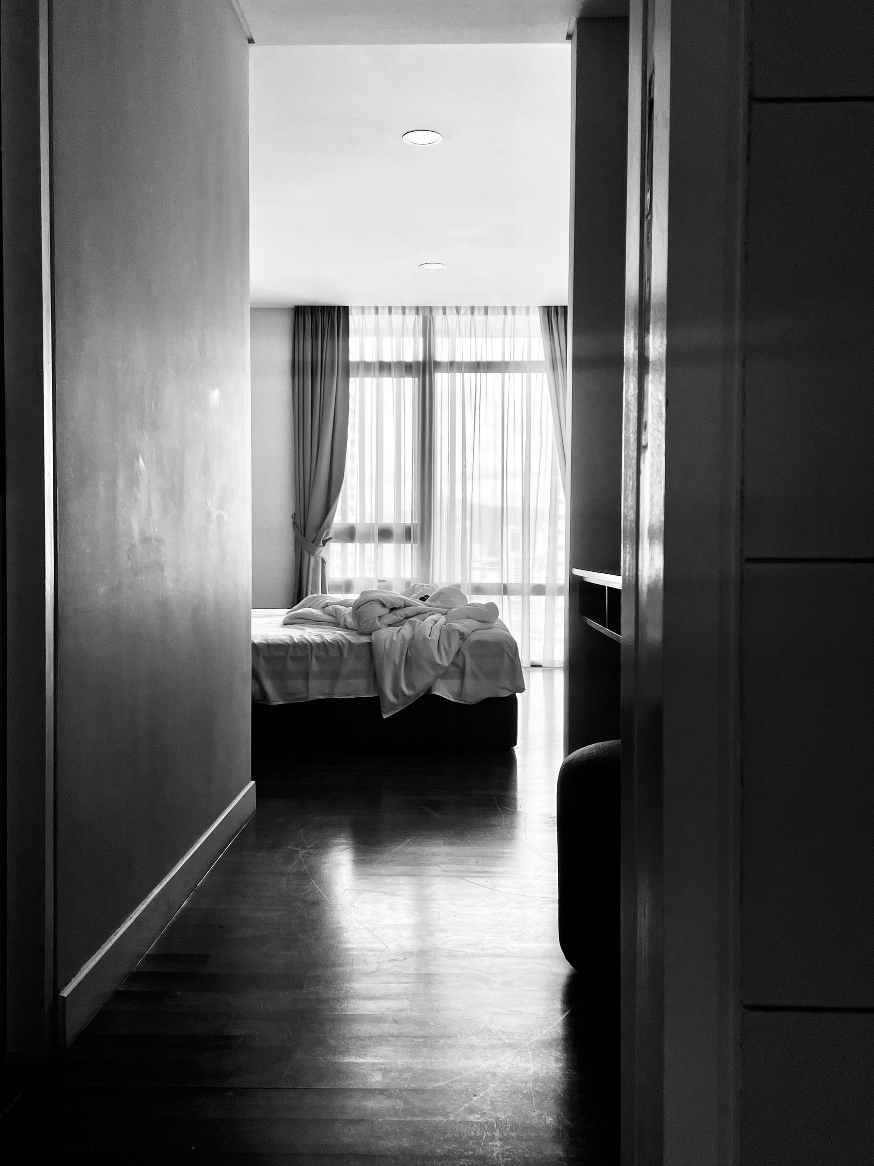
Read the Room in Grayscale
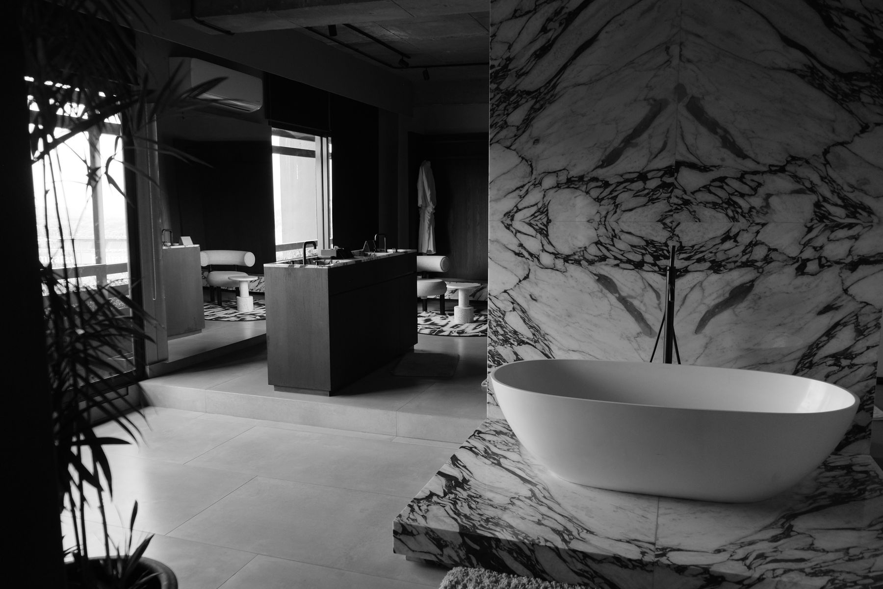
Photographing the room in grayscale is a useful value test even when the real materials contain cream, brown or green. Look for a readable bed edge, a clear route, distinct curtain folds and enough midtone between black and white. If everything becomes two flat blocks, add texture or a middle value; if the image turns into scattered spots, combine accents. This test evaluates structure, not permission to use filtered black-and-white photography as misleading evidence of material color.
Maintain Both Ends of the Palette
Black reveals pale dust, lint and scratches; white reveals yellowing, dark transfer and stains. Choose washable textiles, compatible cleaners and repairable paint before committing to large areas. Keep finish records, spare hardware and care instructions. Ventilate wardrobes and inspect window condensation, mattress undersides and dark corners where problems are harder to see. A weekly reset should be short; if the palette requires constant polishing to look acceptable, the material choices are too fragile for the household.
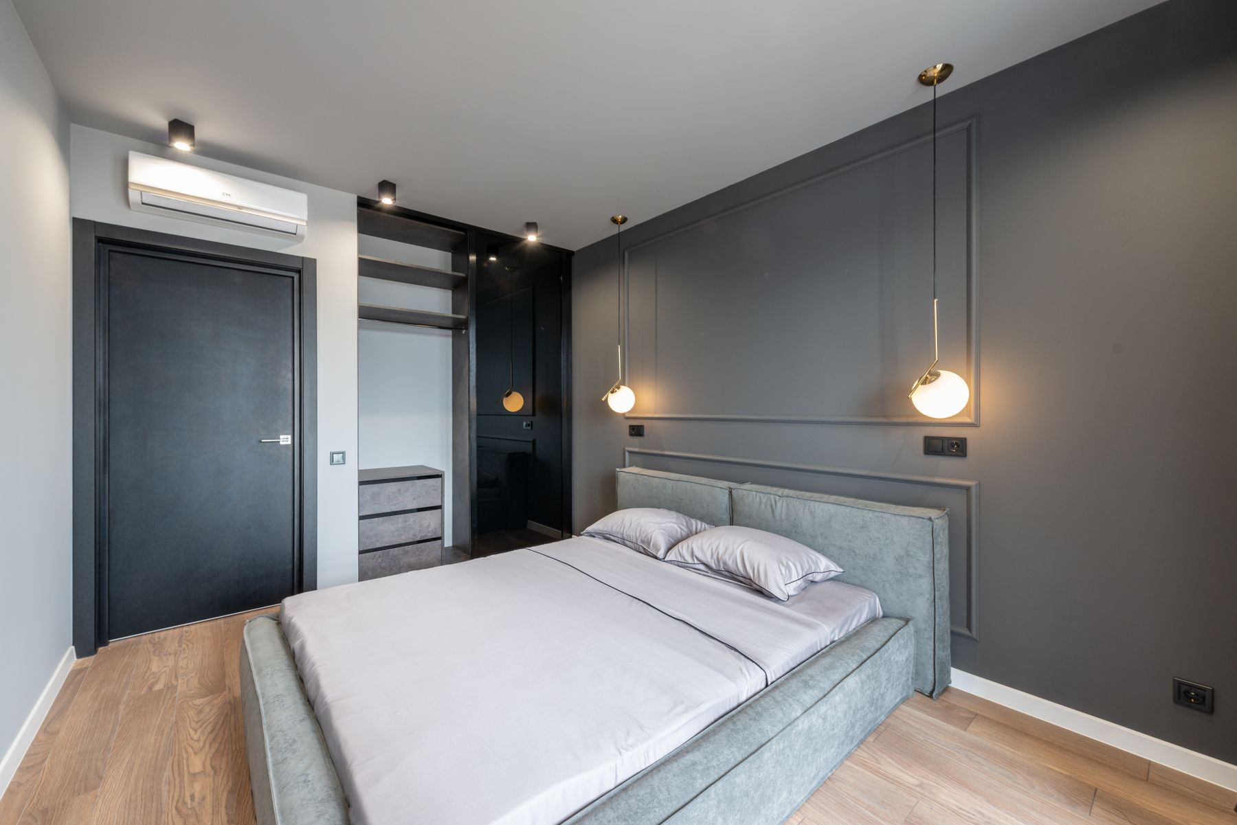
Edit Until Contrast Supports Sleep
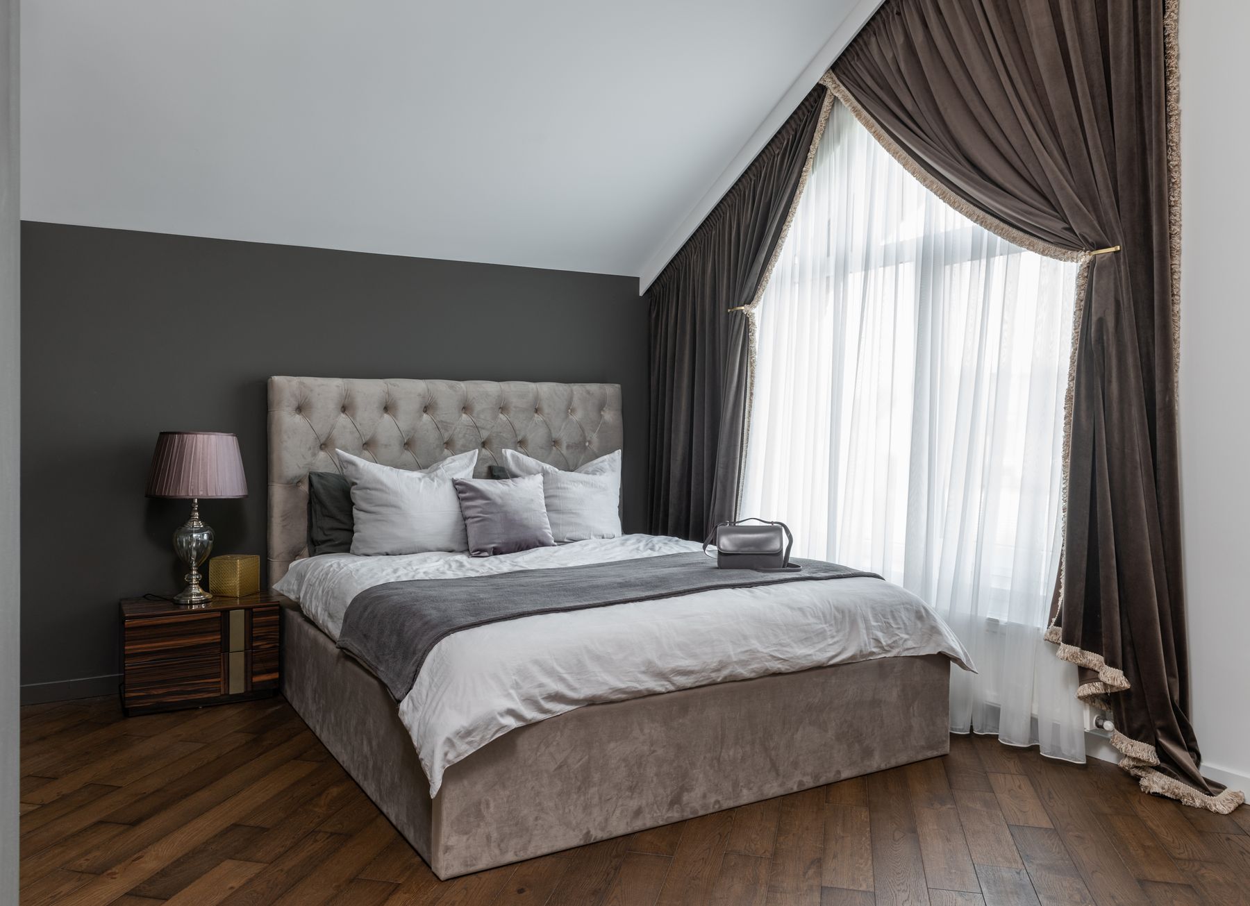
Review the room from doorway, pillow and wardrobe in daylight and the lowest night scene. Remove duplicated black accents, fragile white decor and patterns that compete with the bed. Keep the art, texture, timber or small color note that makes the scheme personal. Confirm darkness, temperature, acoustics, storage and cleanable routes before evaluating visual purity. The palette is complete when contrast clarifies the room and further black or white additions would contribute less than the calm already present.