Define Retro Before Mixing the Decades
Retro usually recreates a recognizable later-twentieth-century mood through color, tile and fixture shape. Vintage is broader and may mix eras; Mid-Century is a design language built around functional modernism, timber and geometry; Art Deco is earlier and more polished. Decide which relationship matters before collecting pink tile, brass, teak and geometric glamour into one room.
Choose an Era Band, Not a Museum Date
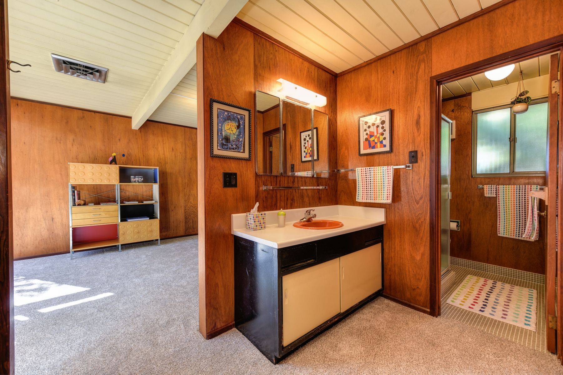
A 1950s-inspired room may favor pastel sanitaryware and small tile; the 1960s and 1970s can support timber, avocado, mustard and bolder geometry; the 1980s may introduce stronger black lines and graphic contrast. You do not need historical accuracy, but a loose band keeps the palette and shapes related. Modern performance can remain invisible behind that visual framework.
Let Colored Sanitaryware Lead
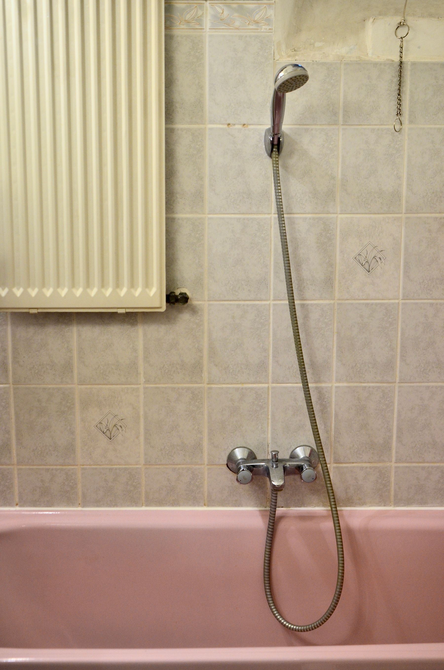
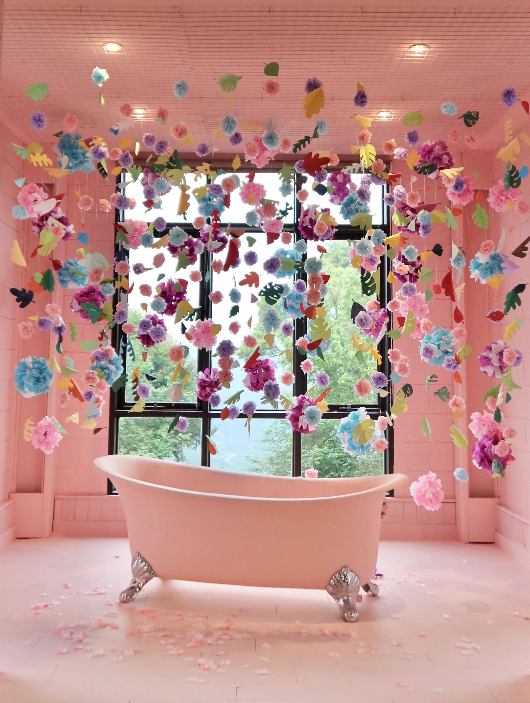
A pink, blue, green, yellow or orange bath can establish the direction more clearly than a room of accessories. Treat the fixture as the largest color decision, then use walls, textiles and hardware as support. When preserving an original suite, check cracks, surface wear, plumbing compatibility, water efficiency and replacement options before making rarity the only reason to keep it.
Use a Checkerboard or Penny Floor as the Graphic Anchor
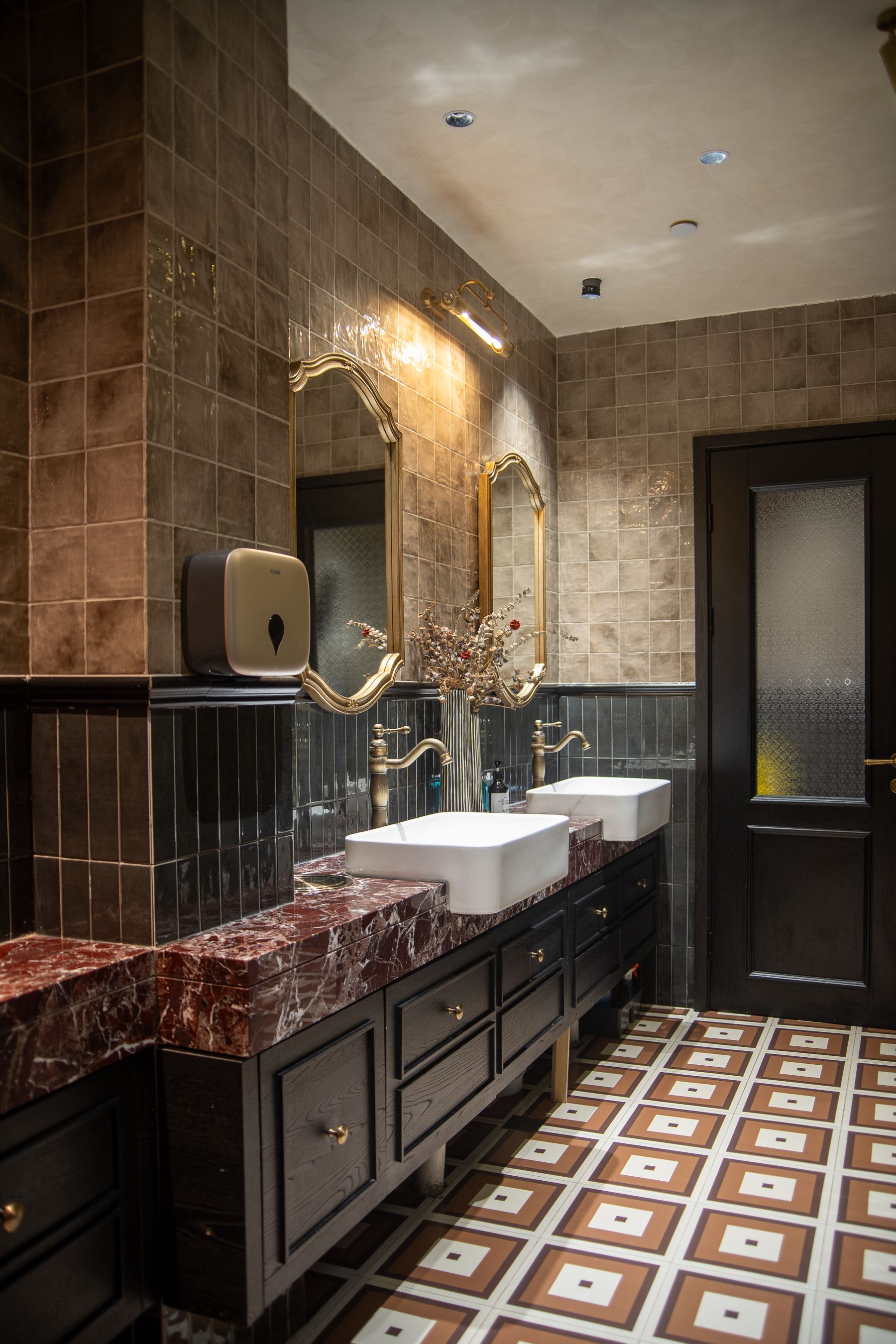
Checkerboard and colorful penny tile create rhythm without requiring every wall to be patterned. Black and white is the clearest graphic route, while cream, green, blue or terracotta combinations feel softer. Specify wet-area slip performance, grout, perimeter cuts and cleaning before approving the pattern from a sample board.
Make the Square Tile Grid Intentional
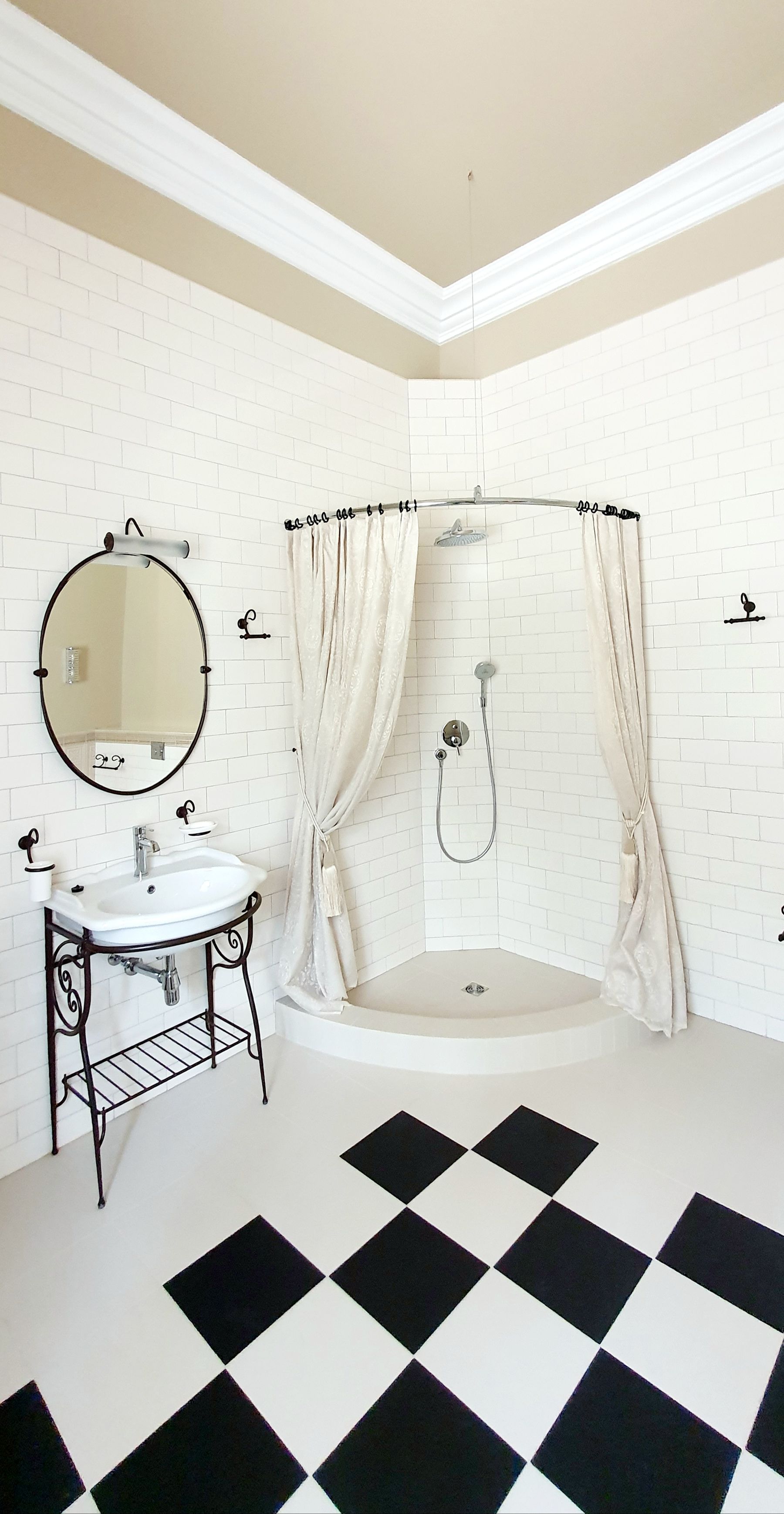
Square tile feels retro because the repeated grout grid becomes visible architecture. Matching grout makes color read as a field; darker or lighter grout emphasizes every module. Coordinate the grid with the bath edge, niche, mirror and corners, and avoid forcing small pieces around controls. The surface can look nostalgic while the substrate and waterproofing remain fully current.

Build a Two-Color Scheme With Clear Roles
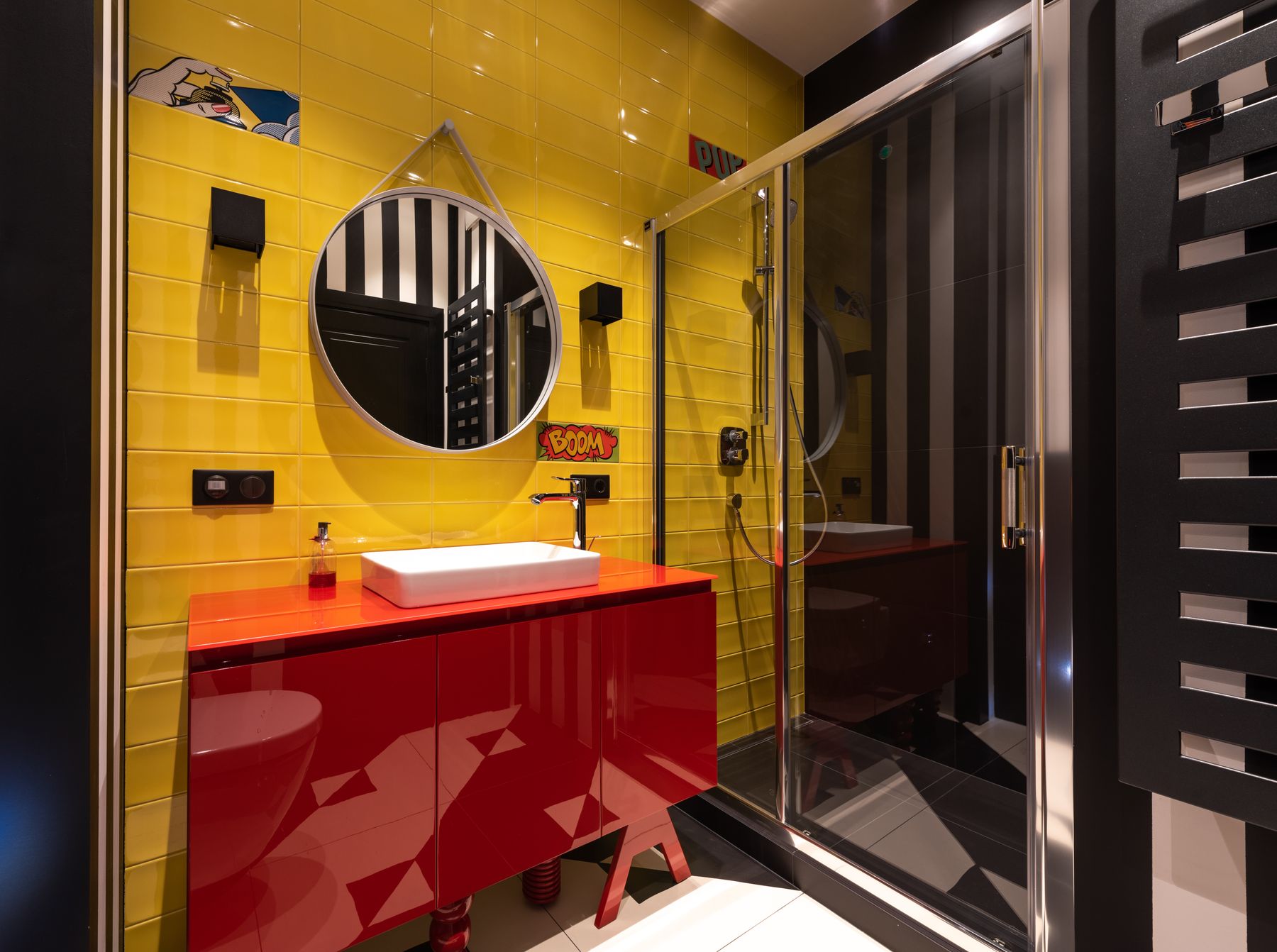
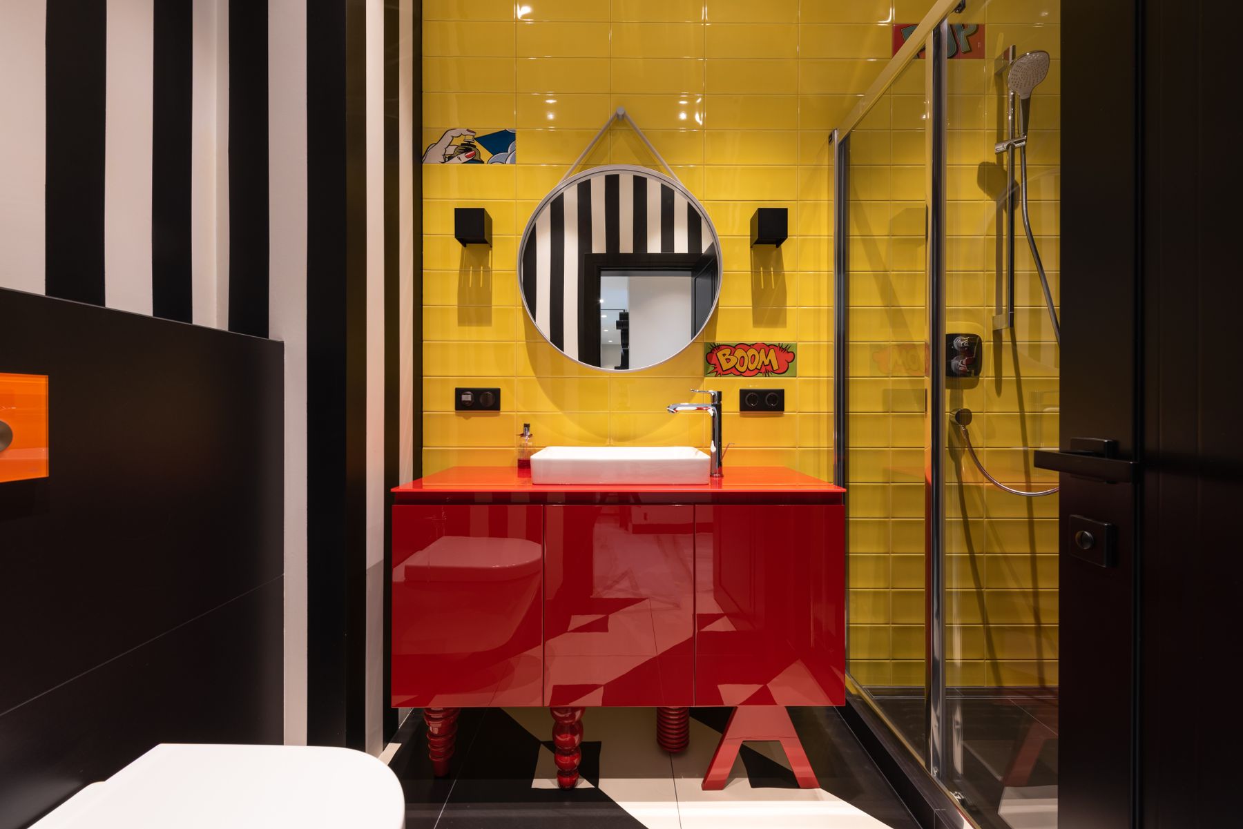
Retro palettes feel confident when colors occupy clear surfaces. A yellow wall with a red vanity reads more intentionally than many multicolored accessories. Assign one dominant hue, one secondary accent and a neutral for ceramic or ceiling. Repeating each saturated color on only one major material prevents the room from becoming visually noisy.
Use Mustard and Yellow as Warm Structure
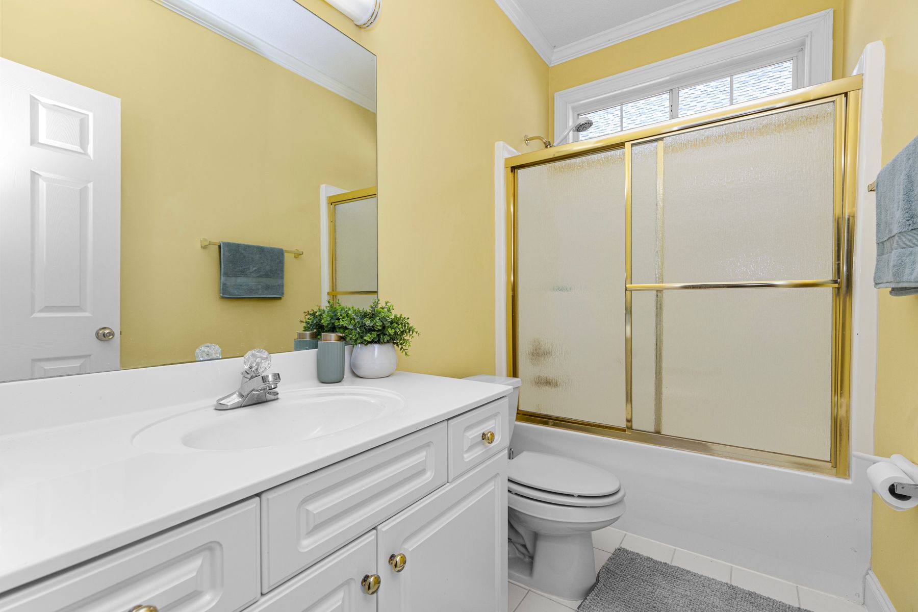
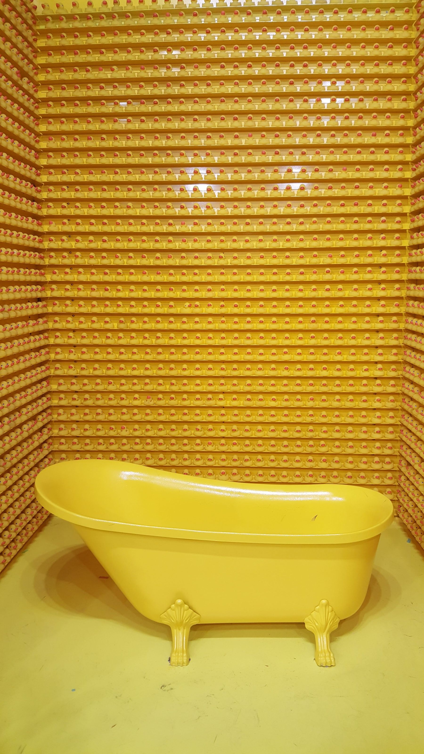
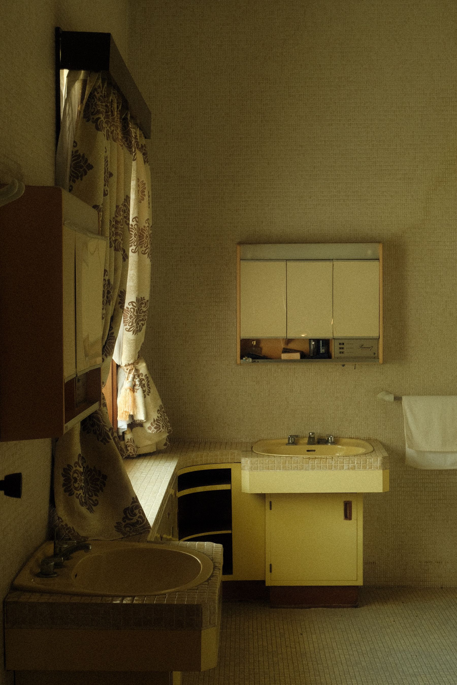
Mustard, ochre and sunny yellow can evoke later-twentieth-century interiors without depending on brown. Use the tone on a bath, vanity or bounded wall, then balance it with cream, timber, green or restrained metal. Strong yellow changes dramatically under artificial light, so review it in the actual room at morning and evening.
Keep Turquoise Fresh With White and Chrome
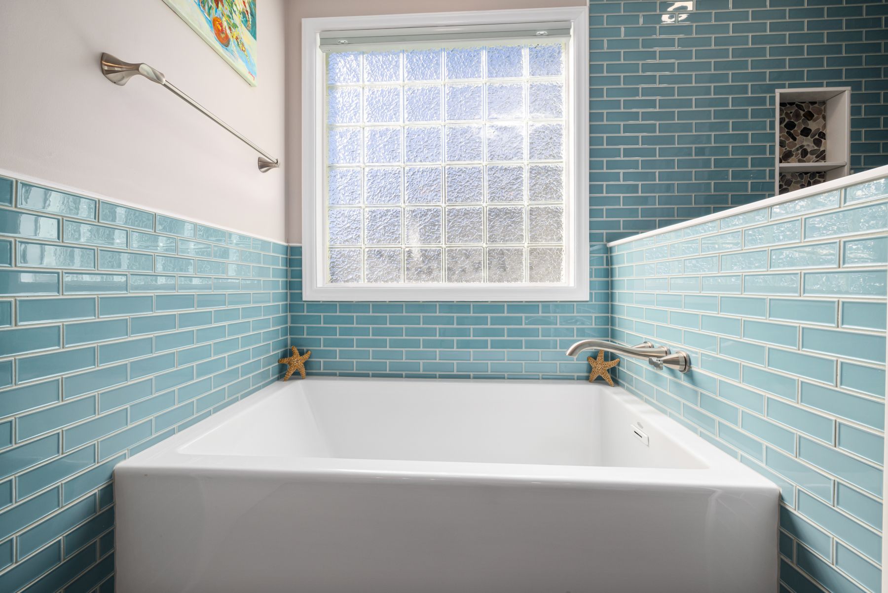
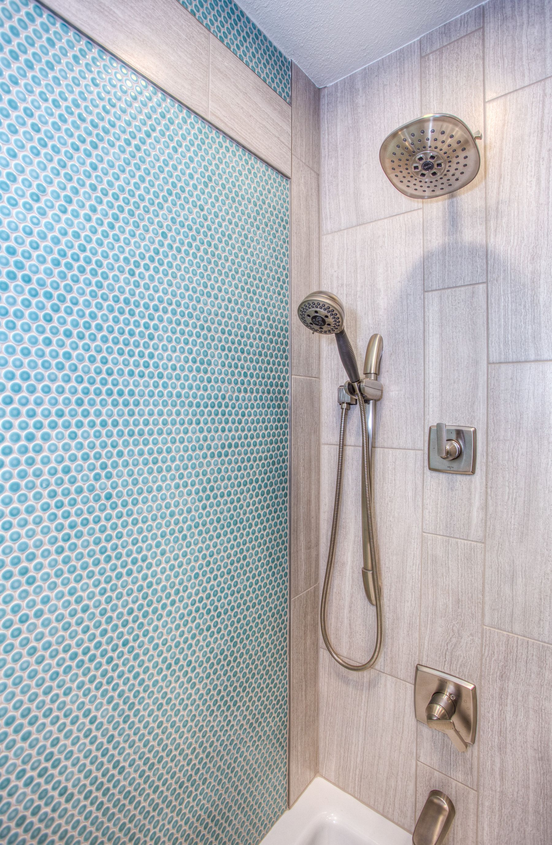
Turquoise and aqua deliver a strong retro signal while white ceramic and simple chrome prevent the room from feeling muddy. Concentrate the color on one tiled wall or bath surround and let daylight reveal the glaze. Warm metal can work, but adding several competing finishes weakens the clean graphic quality.
Balance Pink With One Firm Contrast
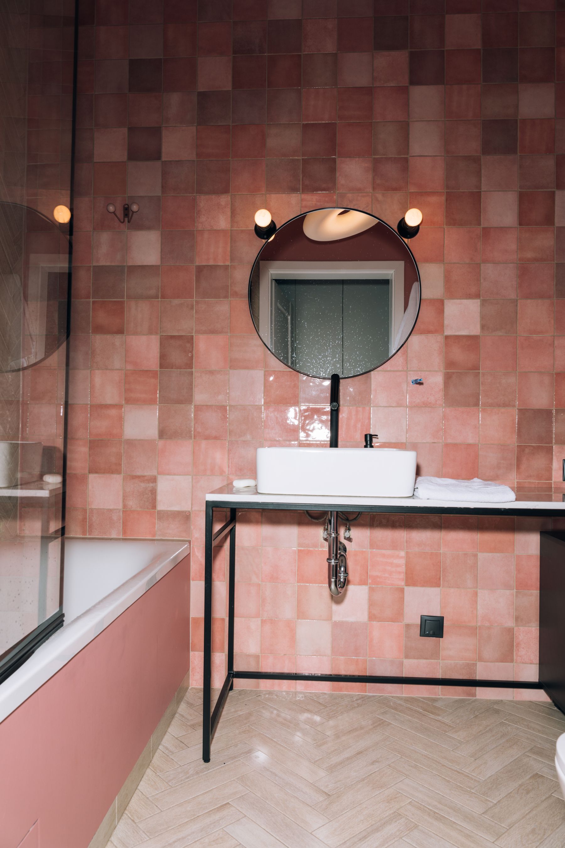
Pink tile or a pink bath can look soft, playful or graphic depending on the contrast. Black frames add definition, chrome feels period-compatible, and warm timber makes the scheme calmer. Choose one of those counterpoints rather than combining all of them at equal strength. The result should work without relying on floral ornaments or novelty objects.
Use the Vanity as a Concentrated Color Block
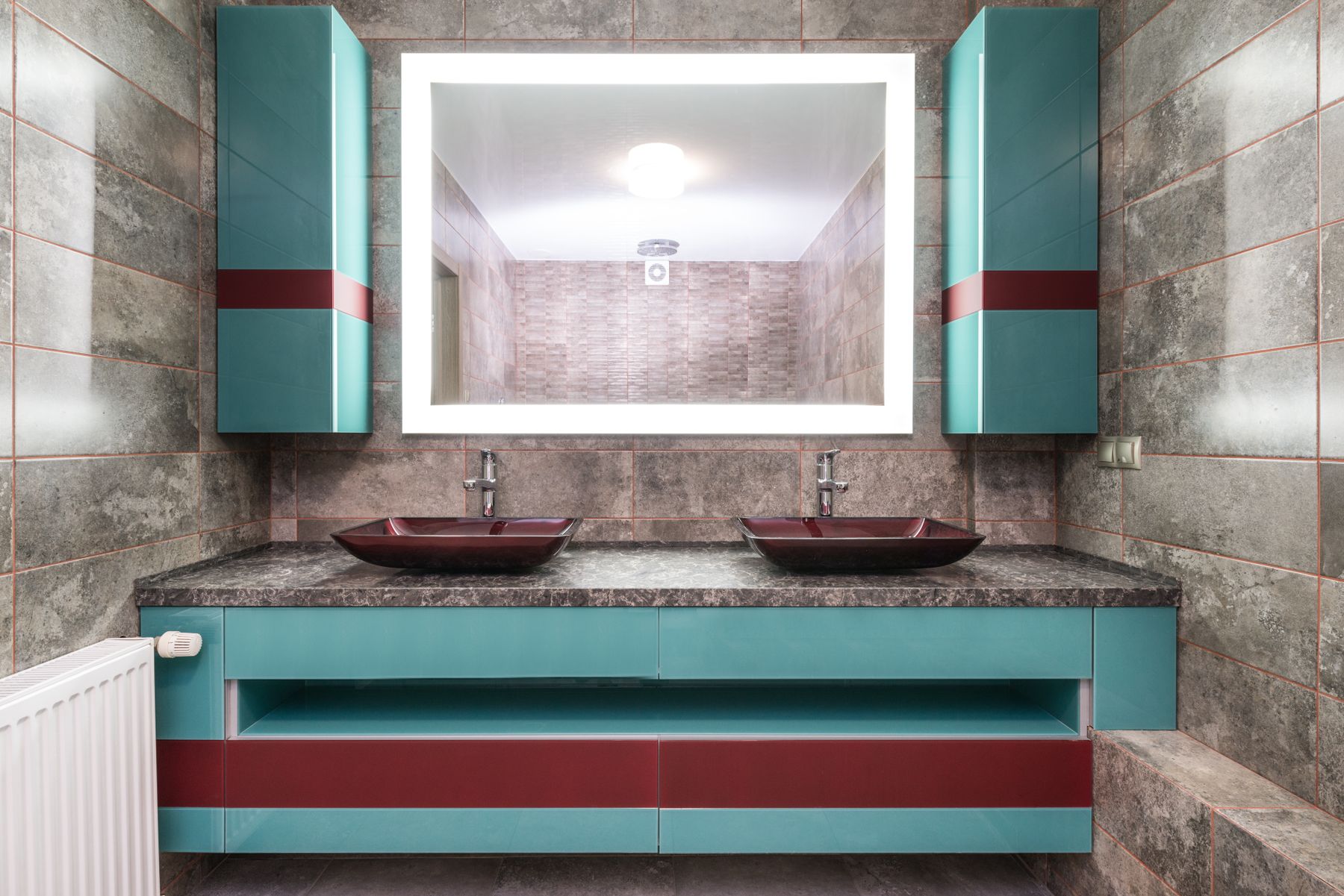
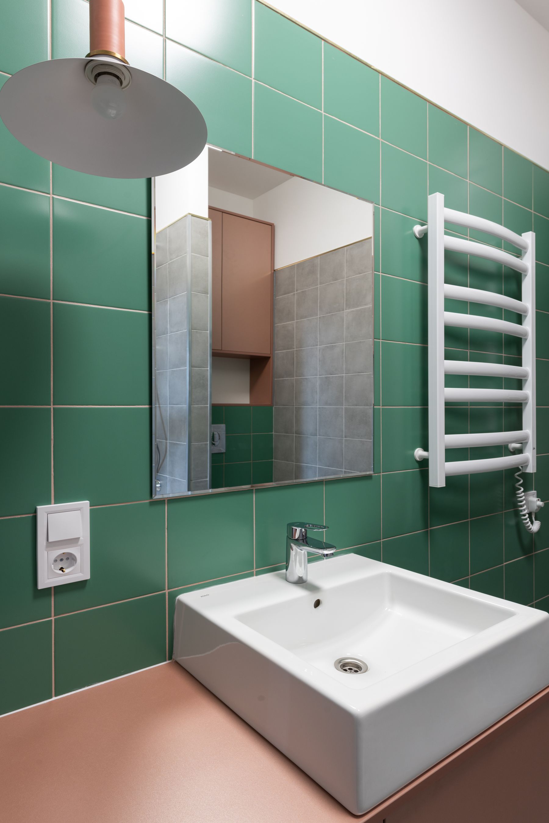
A painted vanity is a practical way to introduce red, cobalt, turquoise or mustard without replacing every permanent finish. Contemporary drawers, outlets and plumbing access can sit behind simple fronts while color carries the nostalgia. Keep the basin and counter legible and resist repeating the same saturated shade on every towel and accessory.
Use Avocado and Green Without Recreating a Time Capsule
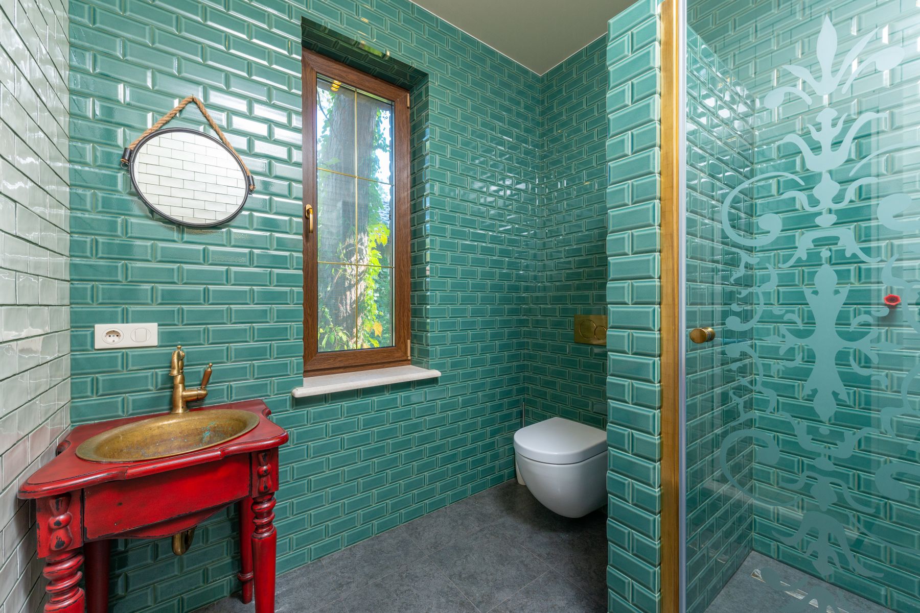
Avocado, moss and glossy turquoise-green tile can feel convincingly 1960s or 1970s when paired with one warm red, timber or cream counterpoint. Avoid matching the toilet, bath, basin, towels and wall paint unless an intact original suite is the intentional focus. A contemporary glass shower or simple mirror can keep the room usable.
Use Blue as a Full Field or a Precise Accent
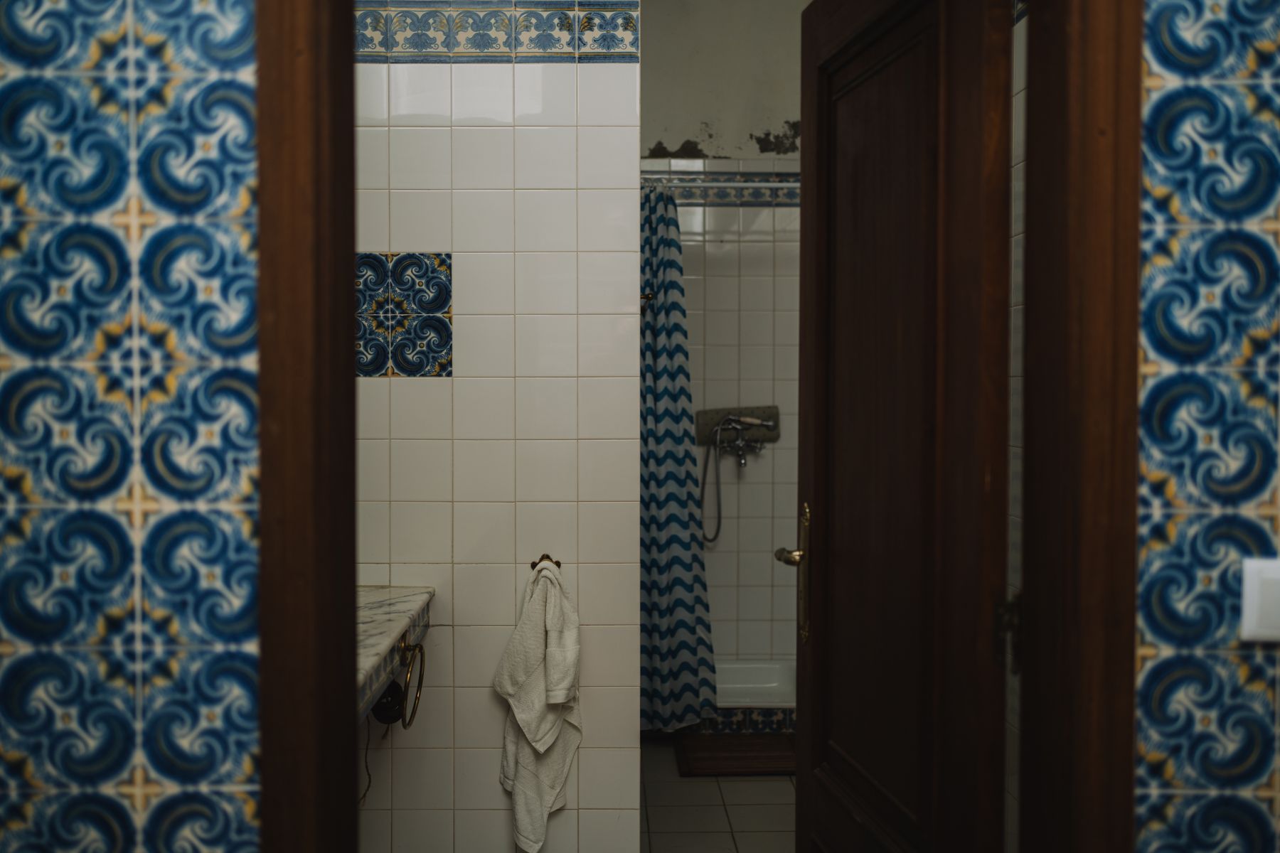
Blue can create a clean postwar tile grid, a bold 1970s wall or a small accent against cream. Decide whether it is architecture or punctuation before mixing formats. If original tile is intact, update grout, light and storage around it rather than covering the color with unrelated contemporary stone.
Use Black and White for Graphic Retro, Not Default Neutral
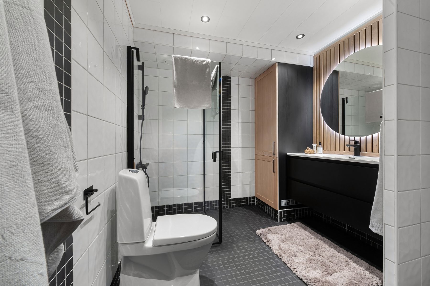
Black and white becomes retro through visible grids, checkerboard, rounded forms and deliberate linework rather than color alone. Use black to define the floor, mirror or hardware and preserve enough white around controls and circulation. Adding one period color can soften a scheme that feels too contemporary.
Keep Borders and Liners Secondary
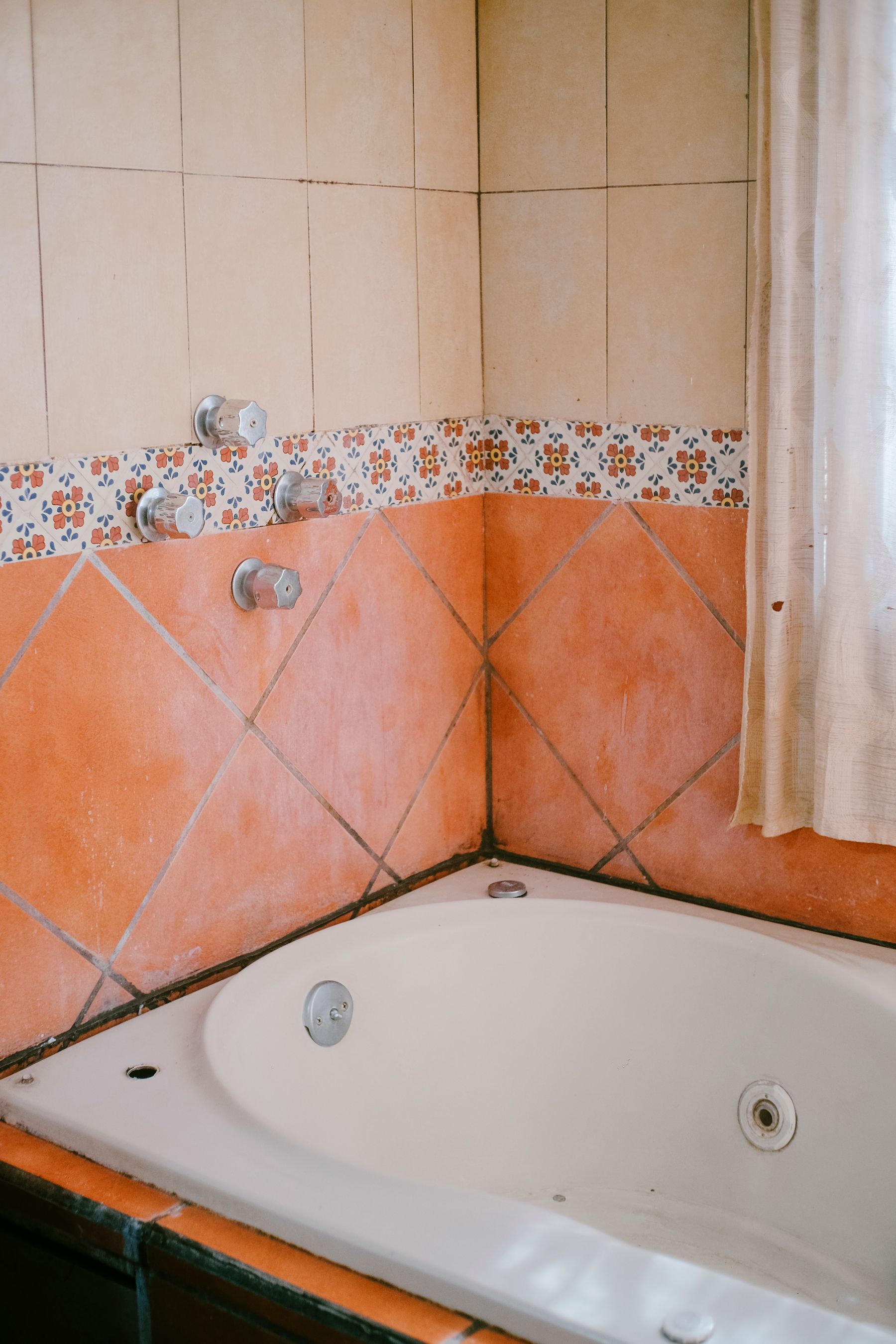
A tile border can frame a shower, wainscot or bath without turning every surface into pattern. Align it with a fixture, ledge or window rather than choosing an arbitrary height. Borders are also useful when retaining old tile and introducing a compatible replacement, but the transition still needs a deliberate edge and practical grout detail.
Put Wallpaper and Drapery in Dry, Ventilated Zones
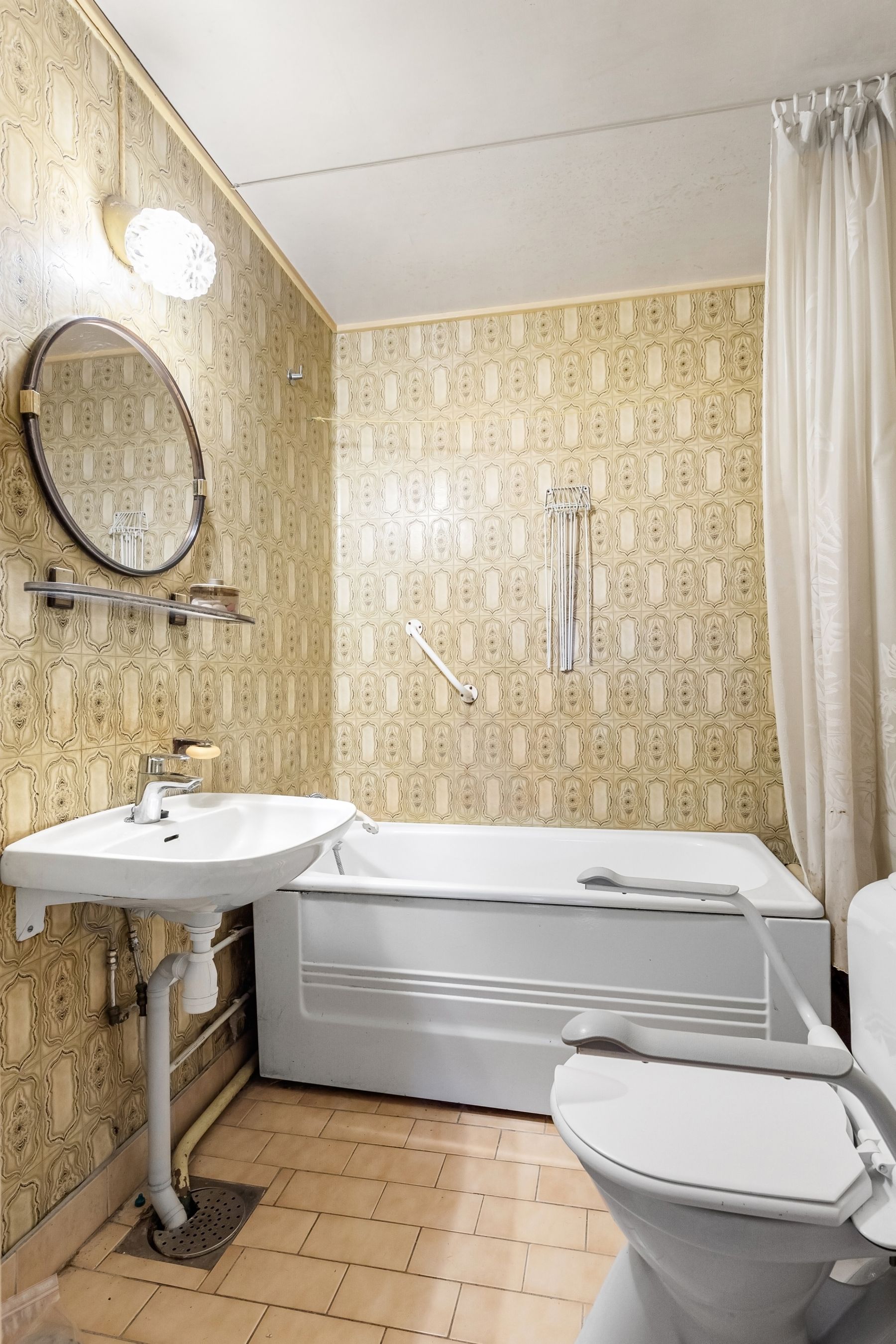
Geometric wallpaper, café curtains and patterned fabric can add a later-century reference while softening tile. Keep wallpaper outside the primary wet zone, confirm product guidance and provide extraction. Window fabric must manage privacy after dark, avoid direct splash and dry fully. Pattern should complement the tile rather than compete with another dominant repeat.
Make the Medicine Cabinet Part of the Architecture
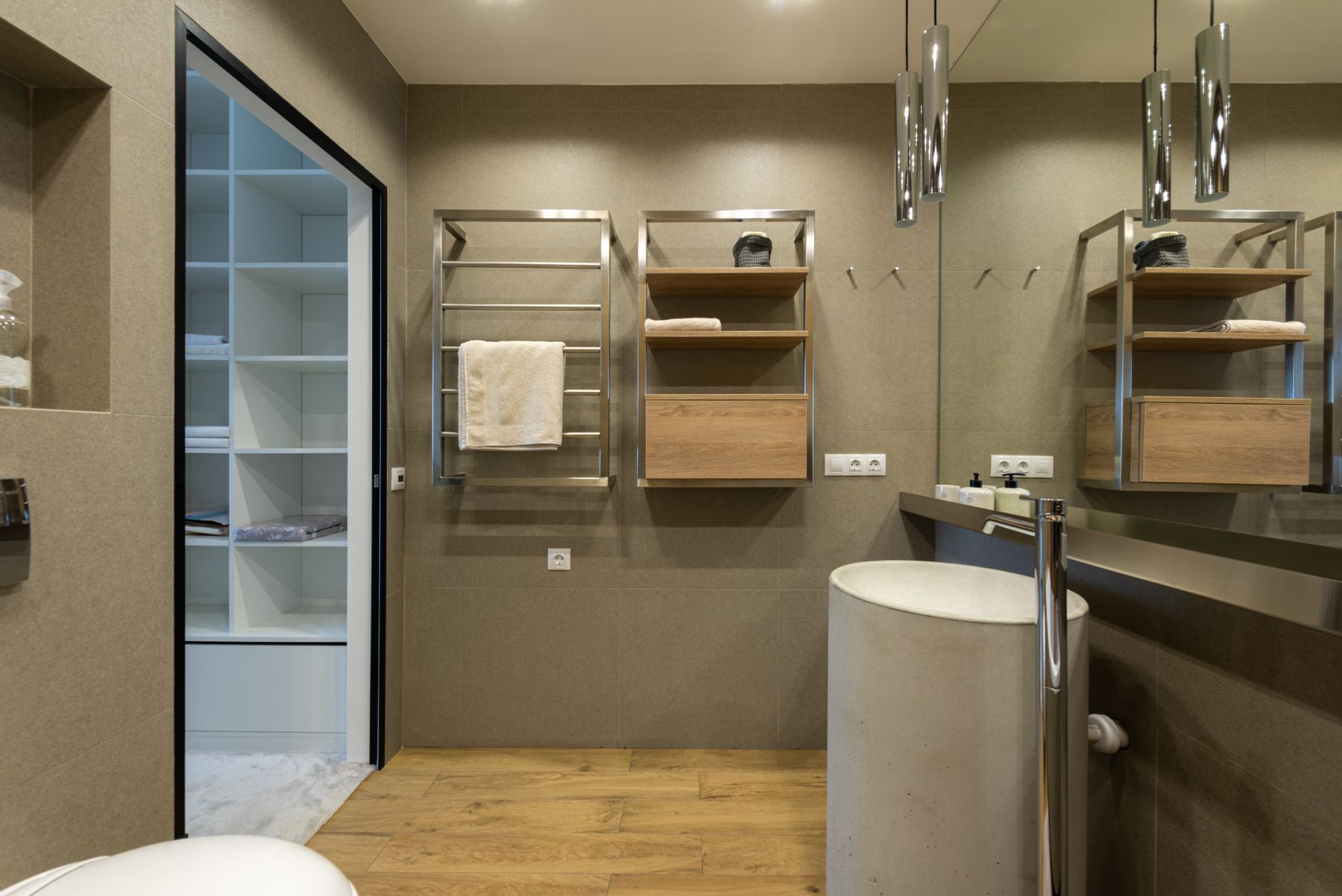
Thoughtful recessed storage allows a colorful room to remain visually clear. A mirrored cabinet can echo the simple rounded or rectangular geometry of the era while hiding toiletries, chargers and medicines. Coordinate its depth and opening with wall construction, lights and taps before the tile layout is finalized.
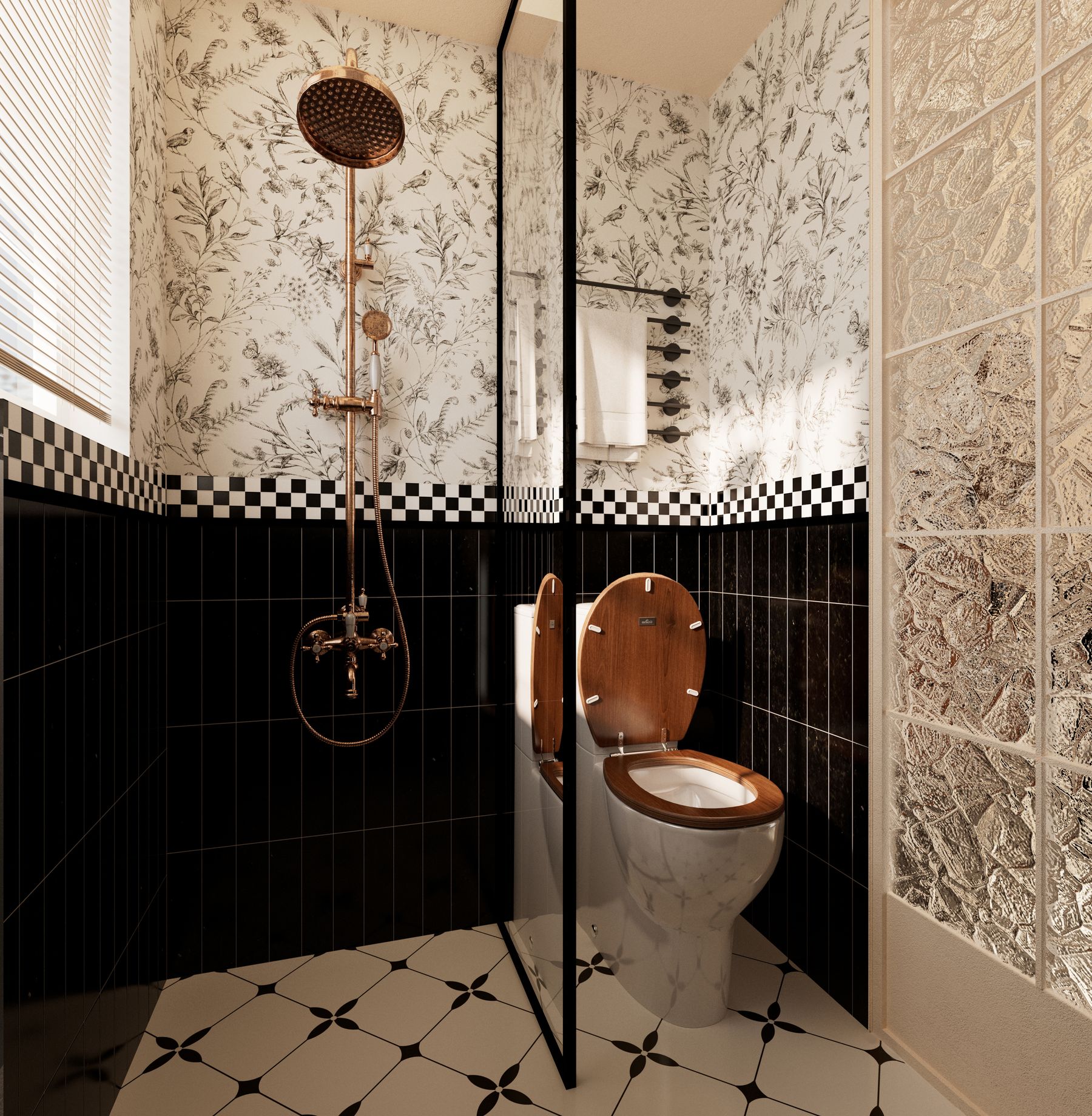
Give a Modern Shower One Period-Compatible Detail
A copper-toned riser, colored square tile or black-and-white grid can make a new shower belong without reproducing outdated construction. Keep drainage, waterproofing, glass, opening width and controls contemporary and serviceable. One visible period-compatible fitting is stronger than several decorative pipes with unclear function.
Use Round Mirrors and Globe Light Without a Matching Set
Round mirrors, globe shades and vertical lights can reference the middle decades of the century without becoming costume pieces. Task light should illuminate the face evenly and the shower and route need their own useful layers. Repeat one curve or metal finish, but avoid buying a complete themed collection.
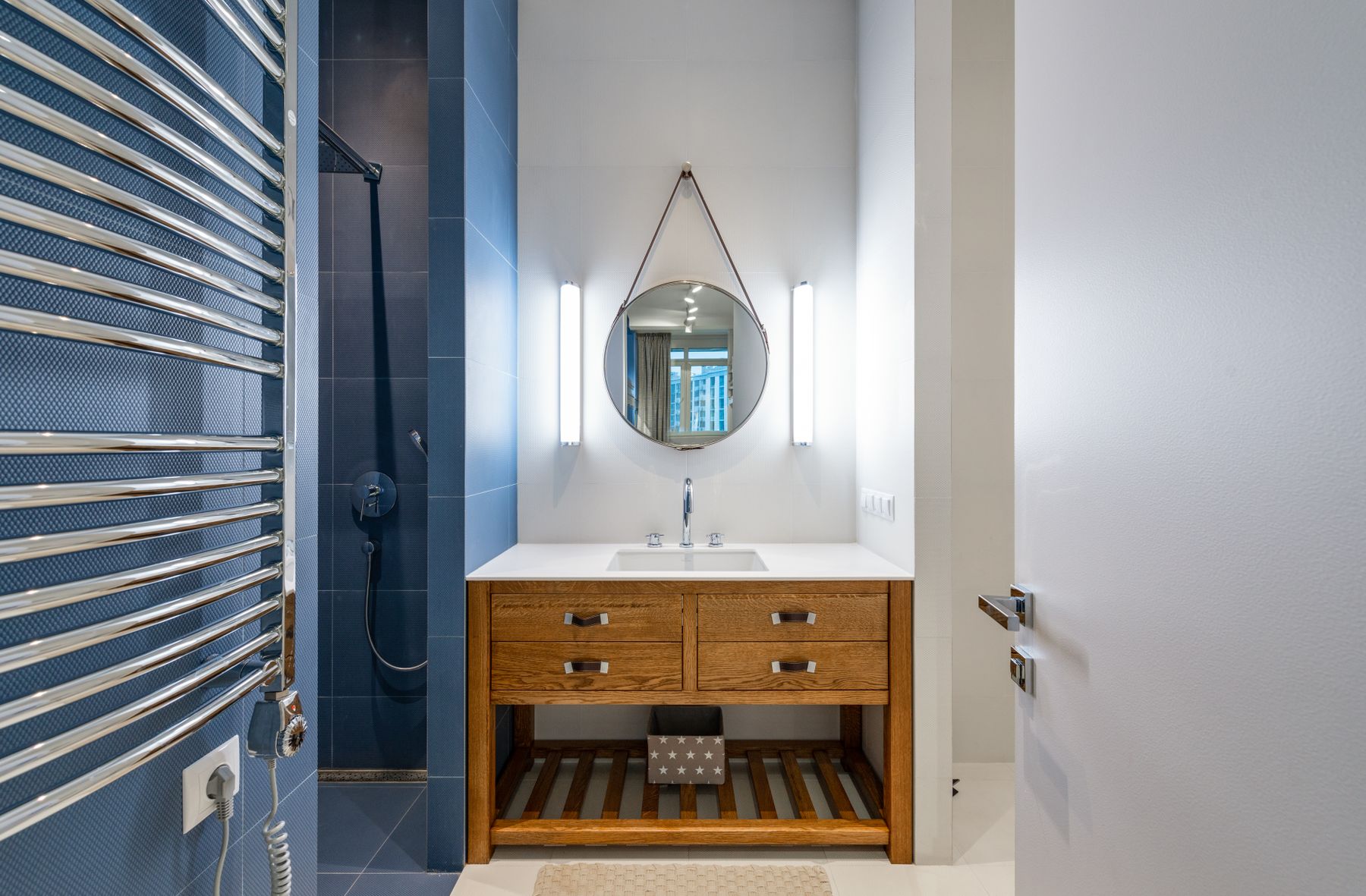
Scale Retro Character for a Small Bathroom
A compact room needs fewer, stronger cues: one colored vanity, a graphic shower wall or a patterned floor can be enough. Protect the door swing, shower opening, storage and clear route before adding a full colored suite. A large mirror and clear glass help the bold surface read without fragmenting the plan.
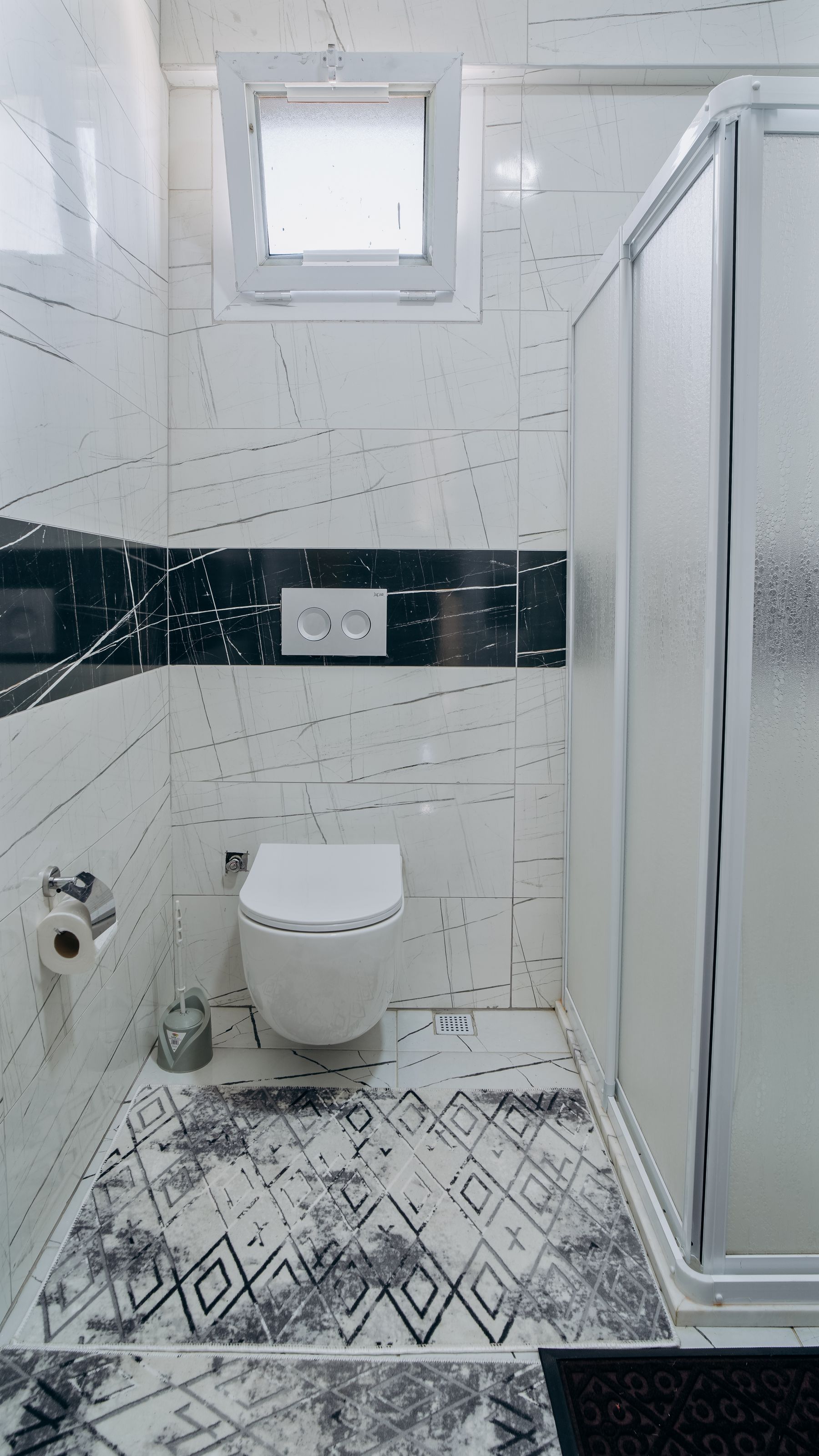
Build Accessibility Into Color and Contrast
A high-sided vintage bath, loose rug or low-contrast tile transition can create barriers. Use color to clarify controls, floor edges and dedicated support rather than hiding them inside the pattern. Structural reinforcement, grab bars, seating and dimensions should follow the users, local requirements and qualified advice.
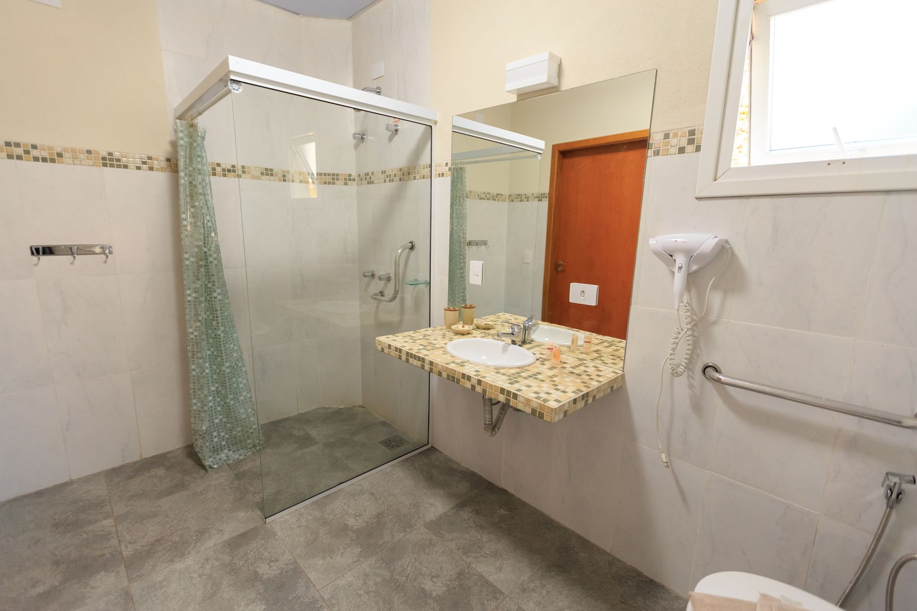
Preserve Original Tile Only After Checking the Substrate
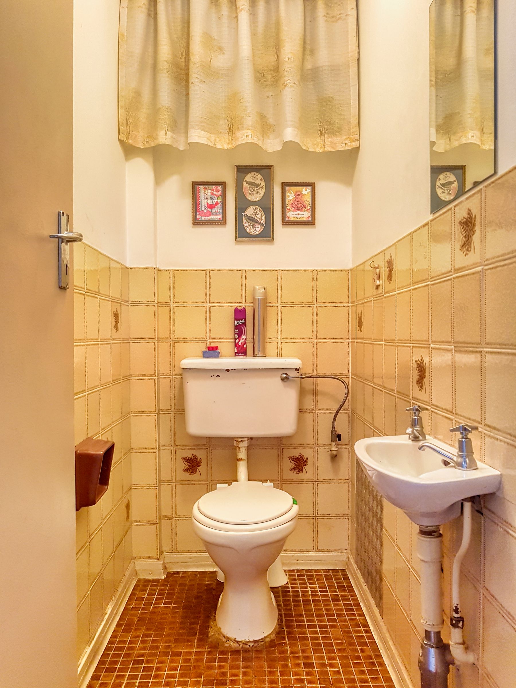
Original blue, green, pink or patterned tile may be the room's strongest visual asset, but surface charm does not prove the wall behind it is sound. Assess movement, failed grout, leaks and waterproofing separately. If the field is performing, selective repairs, improved lighting and quieter new fixtures can protect character better than a complete replacement.
Plan Cleaning Around Grout and Colored Surfaces
Small tile and penny mosaics create more joints, while colored ceramic can make limescale and repairs conspicuous. Review local water hardness, grout type, sealant, ventilation and cleaner compatibility. Provide bright cleaning light even if the evening scheme is warm and atmospheric, and keep ledges accessible rather than filling them with props.
Create a Lower-Commitment Retro Edit
A colored basin, painted vanity, shower curtain, mirror and removable dry-zone pattern can establish the mood without replacing the whole wet zone. In a rental, avoid disturbing seals, tile and plumbing without permission. Choose one functional focal upgrade and repeat only its color or curve rather than adding unrelated nostalgia objects.
Edit the Room Before Nostalgia Becomes Kitsch
The final edit should leave one era band, one dominant color, one principal pattern and a coherent metal family. Remove novelty signs, telephones, diner props and accessories that explain the theme too literally. The room should still feel intentional when towels, bottles and ordinary daylight are present.