
Define Neutral as a Palette, Not an Absence
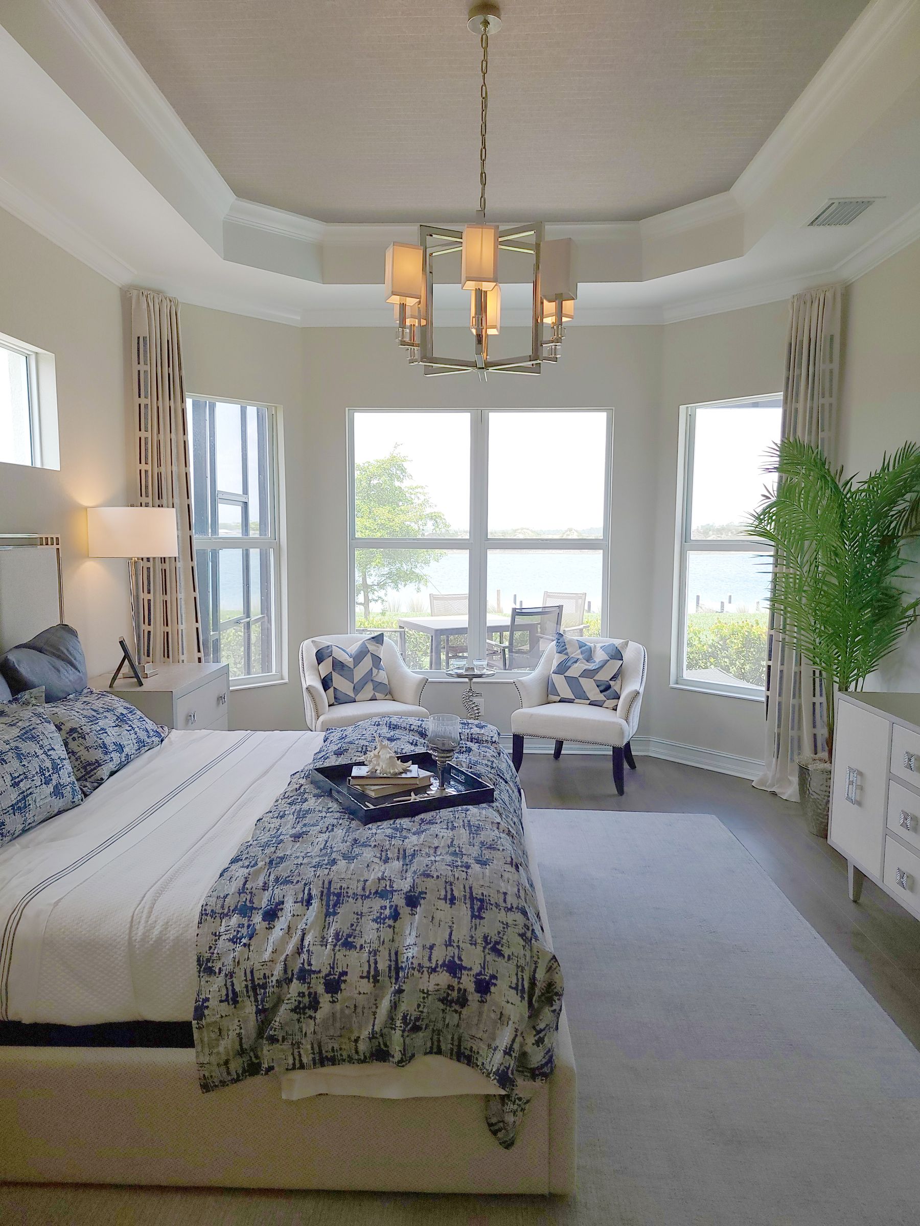
A Neutral Bedroom combines low-chroma colors that sit quietly together: cream, sand, beige, taupe, greige, stone and softened brown are common, but none is mandatory. The goal is not to remove color; it is to control its intensity and relationships. [White Bedroom Ideas](/bedroom/white-bedroom-ideas/) is the stronger destination when white dominates, while Neutral Bedroom needs more than one restrained hue family. Name the light field, middle bridge and grounding value before buying accessories.
Read Hidden Undertones Before Mixing Neutrals
Cream may lean yellow, peach or grey; beige can carry green or pink; taupe may sit closer to brown, violet or grey. These hidden hues become obvious when unrelated neutrals touch, which is why a safe-looking palette can suddenly appear dirty. Compare large samples with plain white paper and every fixed finish. Keep one temperature dominant, then allow a small counterpoint deliberately instead of mixing warm and cool neutrals by accident.
Daylight and Fixed Finishes Come First
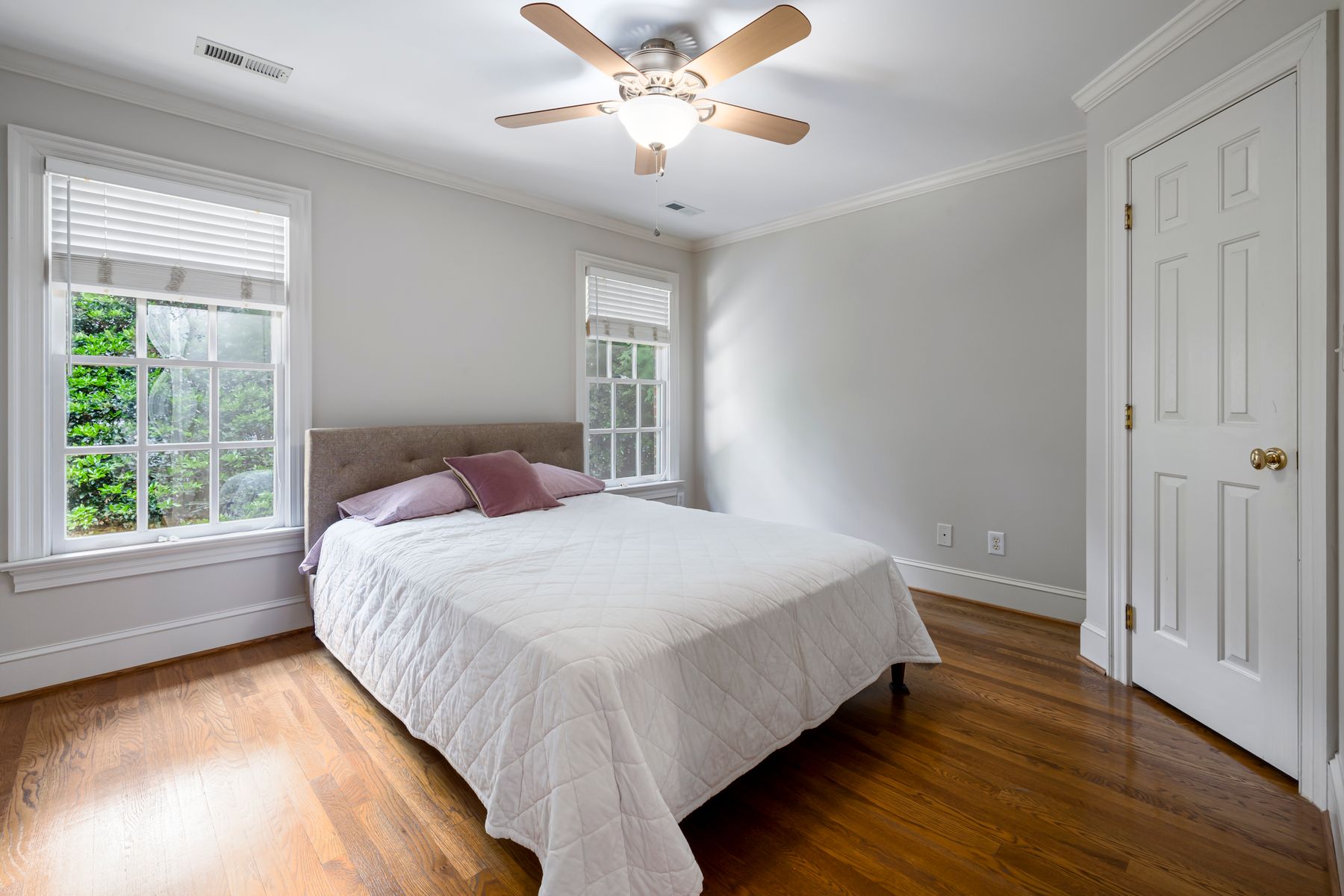
Record window direction, reflected outdoor color, floor undertone, wardrobe finish and any stone or metal that will remain. North light can emphasize green and grey; warm western light can intensify cream and camel. A beige that works in a bright showroom may look flat beside cool carpet. Photograph the room morning, midday and night, then choose the neutral family that supports the permanent materials rather than trying to correct them with scattered decor.
Ivory and Cream Without Drifting Into White
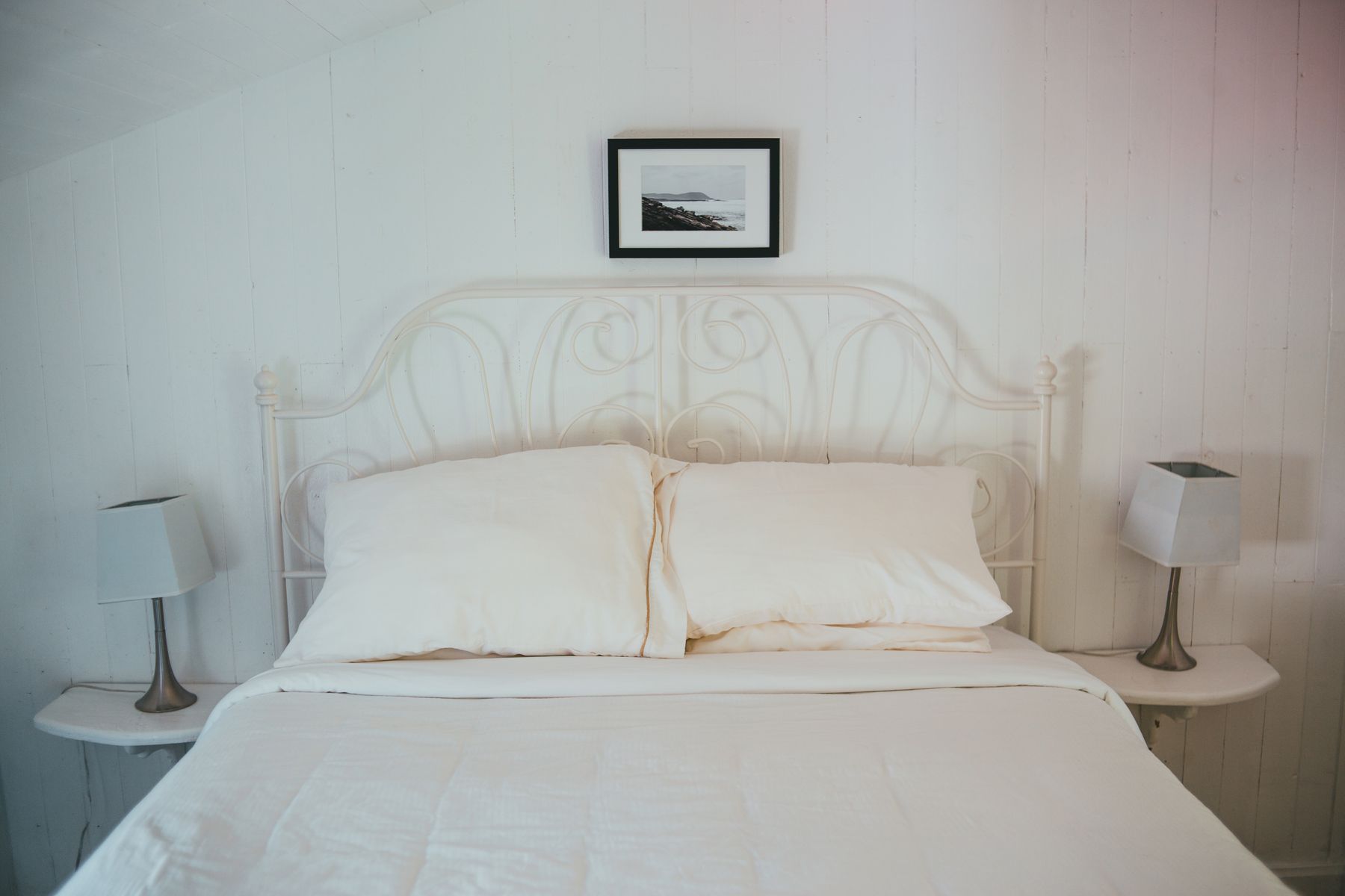
Ivory and cream can form the lightest neutral field, but the room needs a reference that makes their warmth intentional. Natural linen, pale oak, chalk trim or a slightly deeper oatmeal layer can separate cream from a failed white match. Avoid combining blue-white sheets with strongly yellow walls unless the contrast is deliberate. If nearly every major surface remains white or off-white, the page and design logic belong more clearly to White Bedroom.
Beige, Sand and Oatmeal as the Working Field
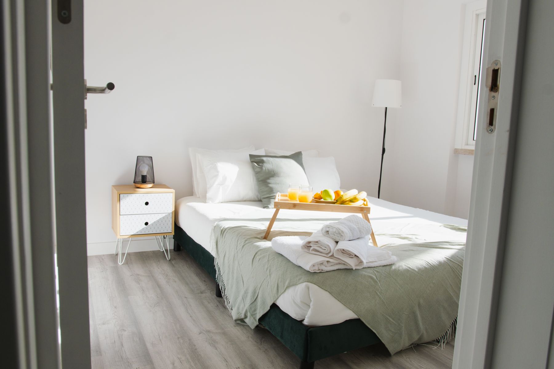
Beige is a broad family, not a single safe paint. Sandy beige feels mineral, oatmeal is softer and textile-like, while biscuit and fawn carry more yellow or brown. Choose one as the broad field and move one step lighter and darker through bedding, rug and furniture. If every item is the same retail beige, edges disappear and the scheme looks packaged. Small clay or ochre notes can clarify warmth without turning the room yellow-led.
Use Taupe and Mushroom as the Middle Bridge
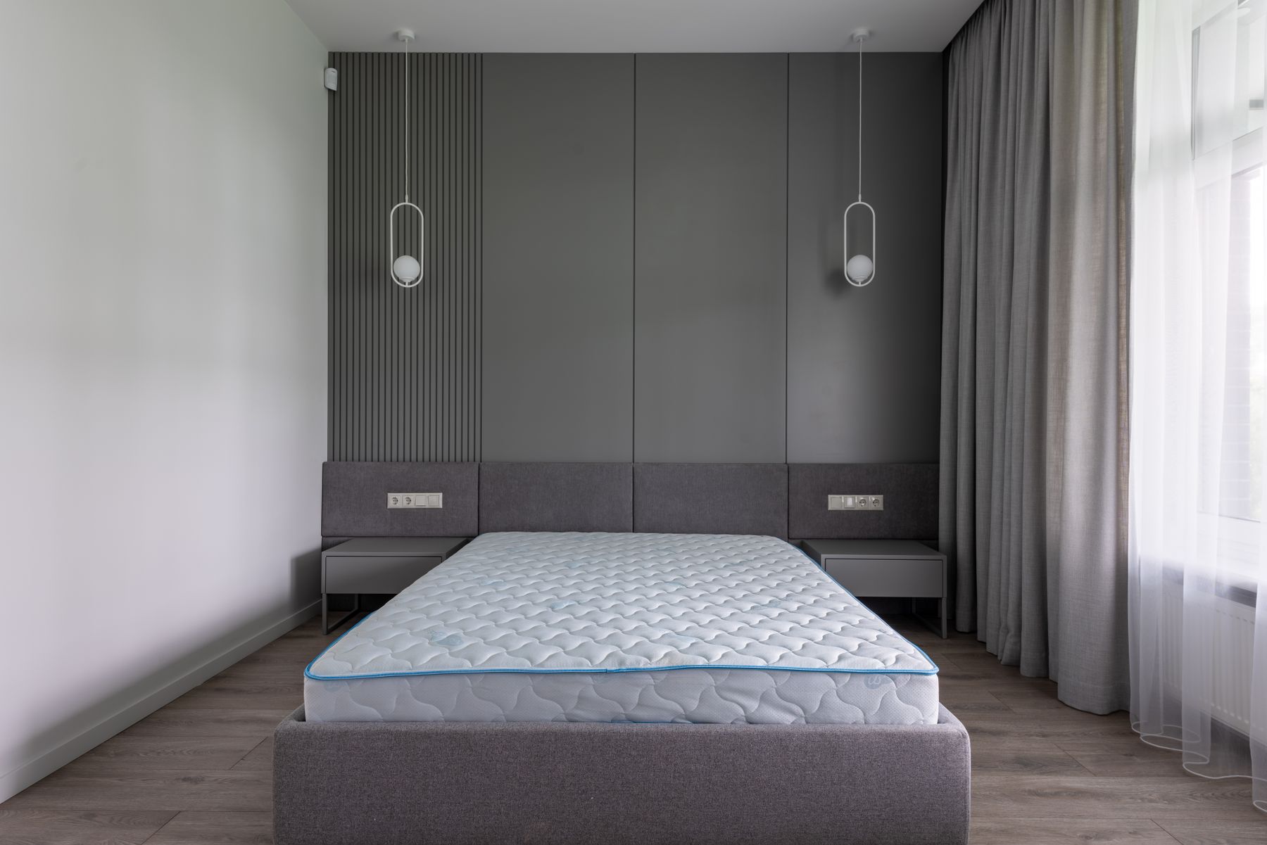
Taupe and mushroom sit between familiar categories, which gives them flexibility and also makes them sensitive to light. Warm taupe can join cream to walnut; cooler mushroom can connect greige walls to stone and black metal. Test both vertically and horizontally because upholstery, carpet and paint reflect light differently. [Grey Bedroom Ideas](/bedroom/grey-bedroom-ideas/) is the stronger destination when grey remains the clear lead; taupe here works as part of a broader neutral spectrum.
Where Greige and Stone Lose Their Warmth
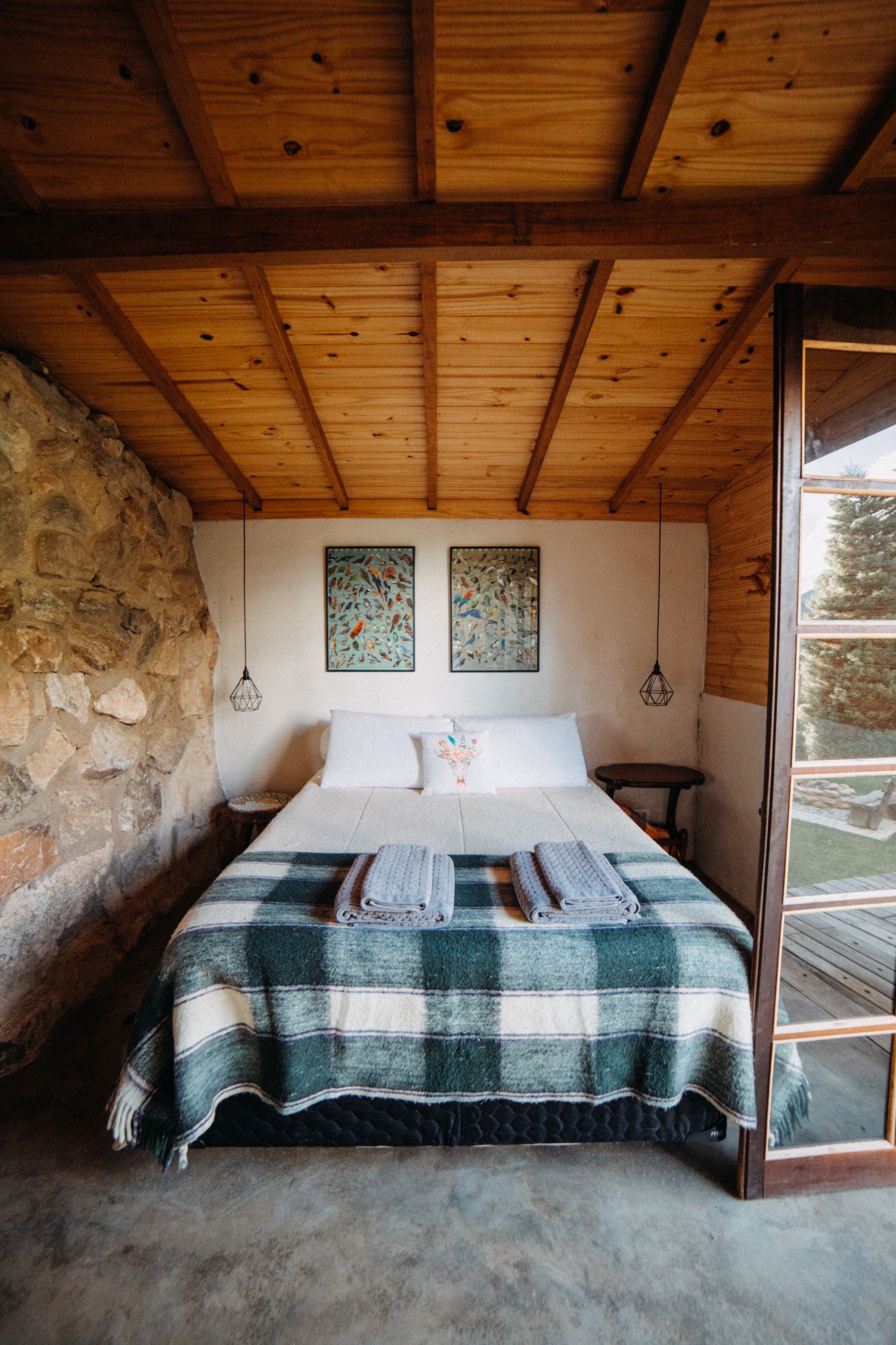
Greige can bridge beige and grey, while stone colors add mineral variation through putty, limestone and pale clay. Neither is automatically warm. Place samples beside the floor and view them on overcast days, when green or violet undertones are easiest to see. Use timber, linen or wool to add warmth through material rather than pushing every paint toward yellow. The result should feel balanced in daylight and still recognizable under dim evening lamps.
Camel and Soft Brown at the Base
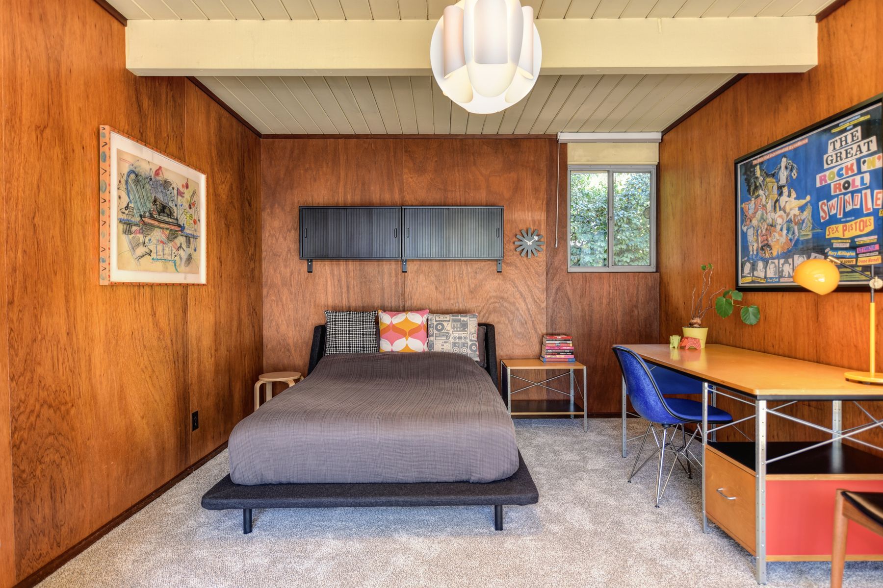
Camel, tobacco, cocoa and softened brown can ground a neutral room without making it dark. Use one on a bed, chair, curtain or timber field large enough to matter, then keep smaller accents restrained. Brown that leans red behaves differently from olive brown or grey brown, so coordinate it with the floor. In a very pale room, a medium brown often creates more natural definition than multiple black accessories scattered for contrast.
Can Muted Green or Blush Stay Neutral?
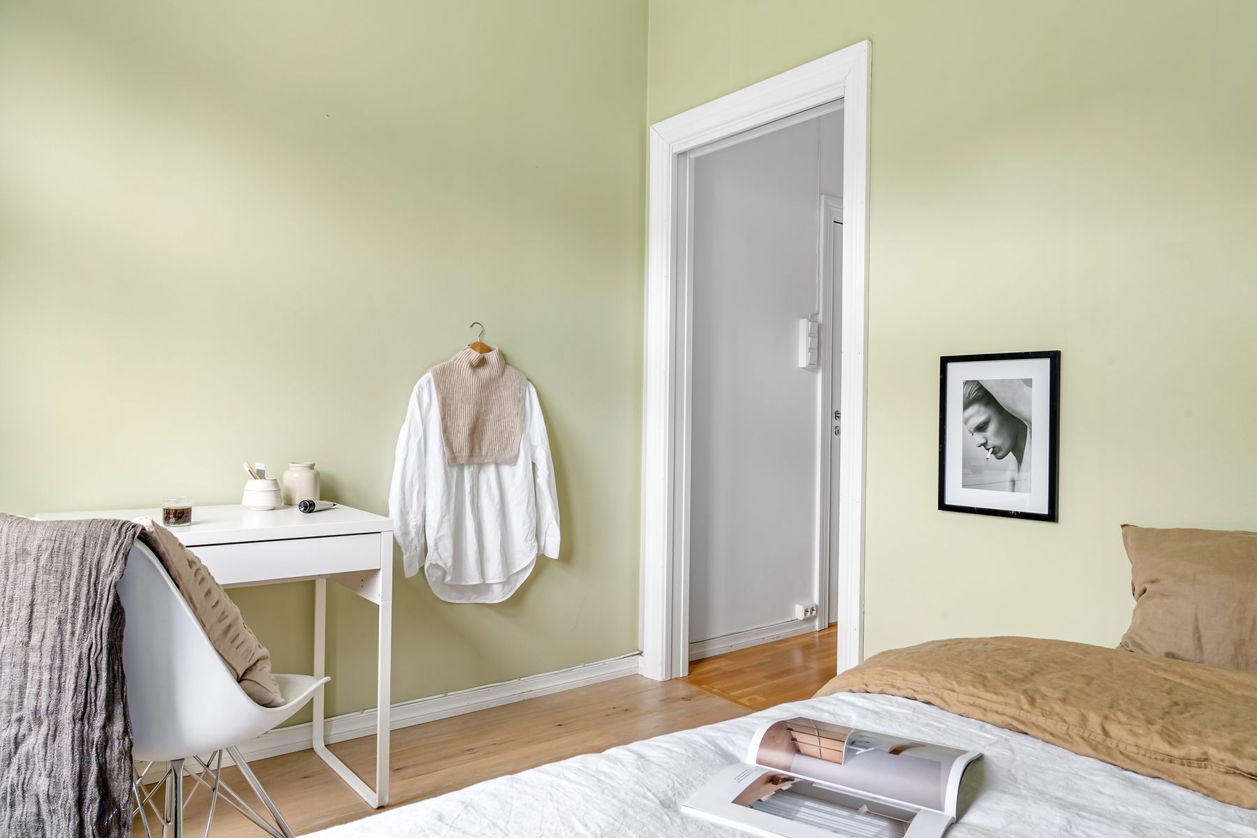
Sage, dusty blush and muted clay can sit inside a neutral palette when their chroma remains low and their undertones connect to the main scheme. Give one a supporting field rather than sprinkling several around the room. If green or pink becomes the first thing seen, the design has shifted into a color-led destination. Near-neutrals are most useful when they solve a relationship—for example, linking garden light to beige or warming a cool stone floor.
Wall Samples at Architectural Scale
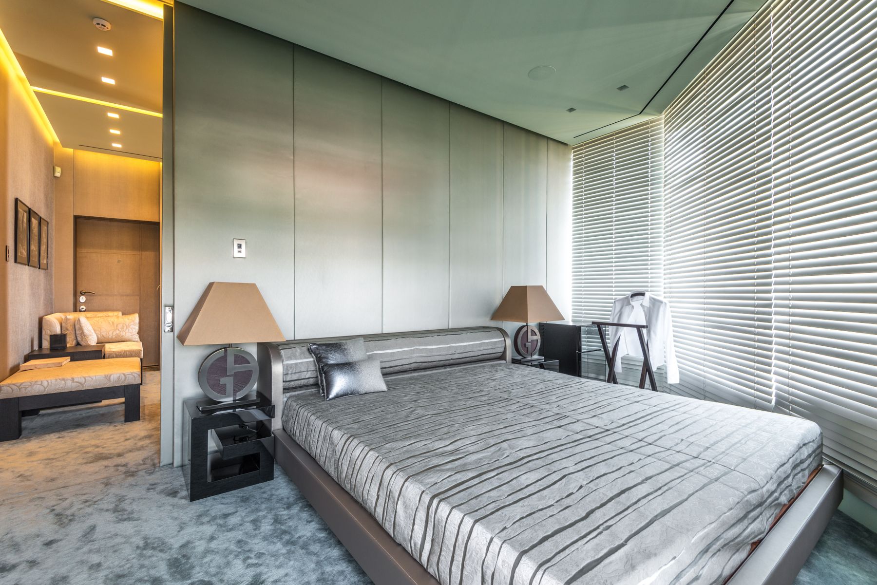
Neutral colors change dramatically across a full wall because surrounding light and reflected finishes influence them. Paint large movable boards with the correct primer, coat count and finish, then test them behind the bed, beside the window and in the darkest corner. Inspect morning, overcast and lamplight conditions. Do not sample many similar beiges directly on the wall; their close boundaries distort one another and make the decision harder rather than more accurate.
Ceiling, Trim and Doors as One Family
Brilliant white trim can make cream walls look more yellow, while exact color drenching can hide useful edges and expose finish differences. Choose whether ceiling and trim should frame, soften or continue the wall field. A lighter related neutral often preserves height without creating a cold stripe. Use durable sheen on doors and contact points, but check glare under bedside light. Sample the full wall-to-ceiling corner because separate chips cannot show the transition.
The Bed as the Main Tonal Anchor
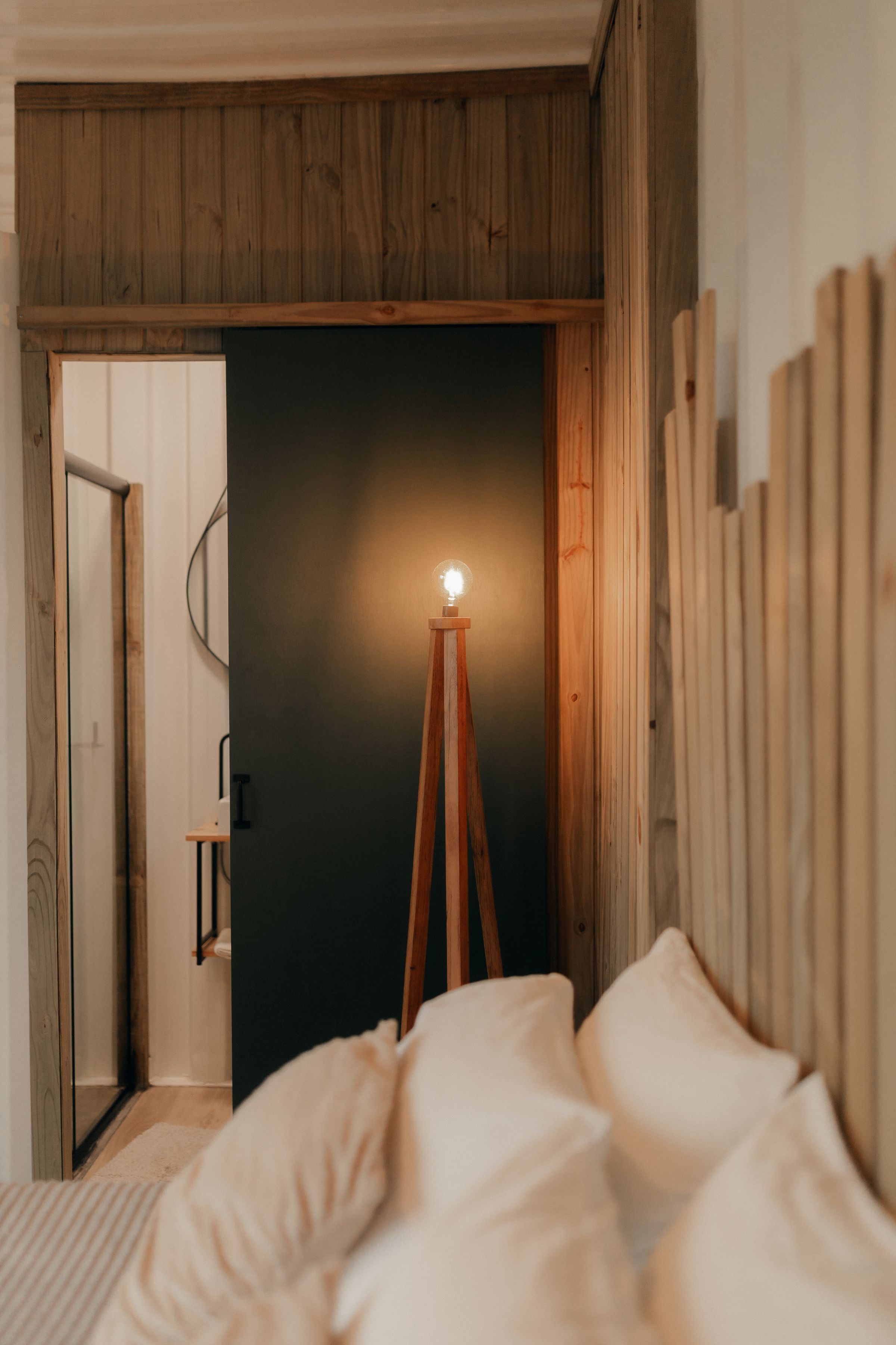
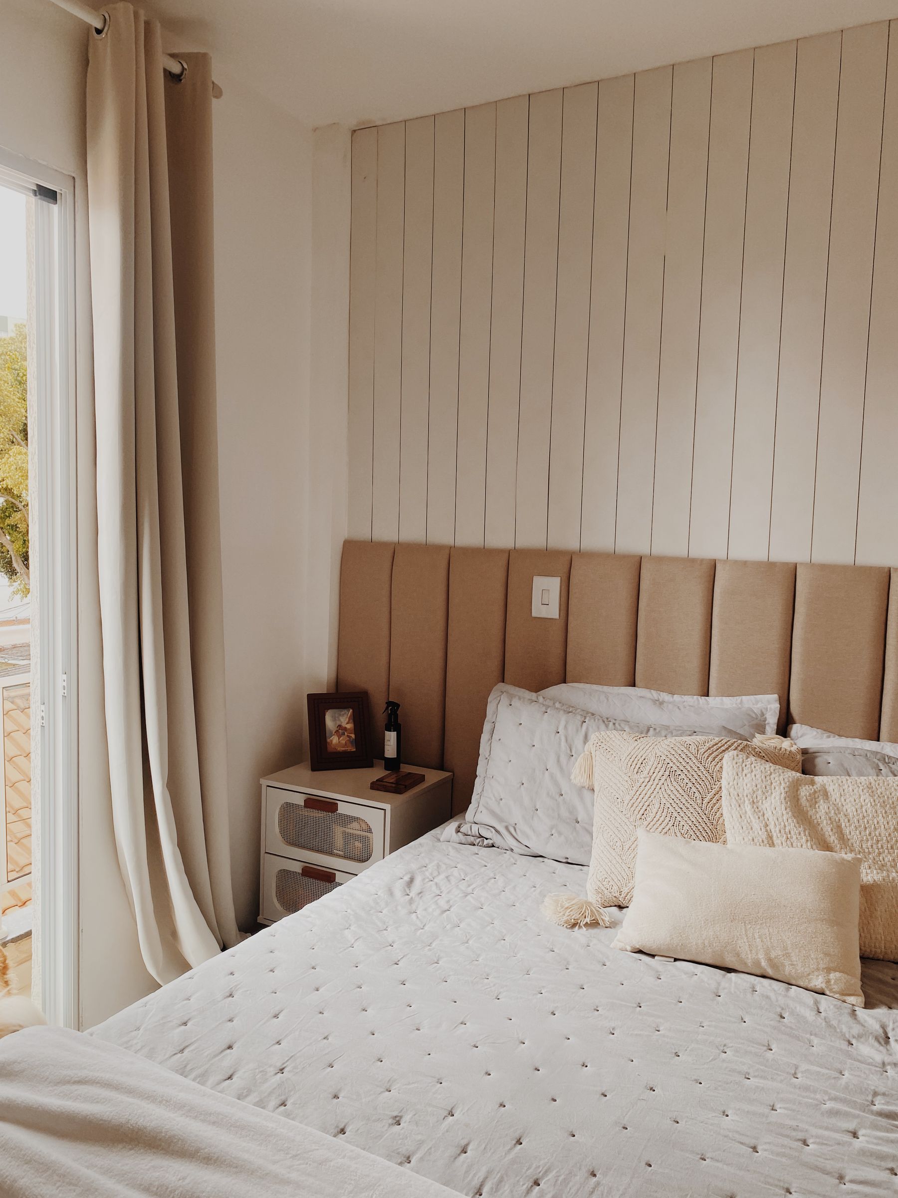
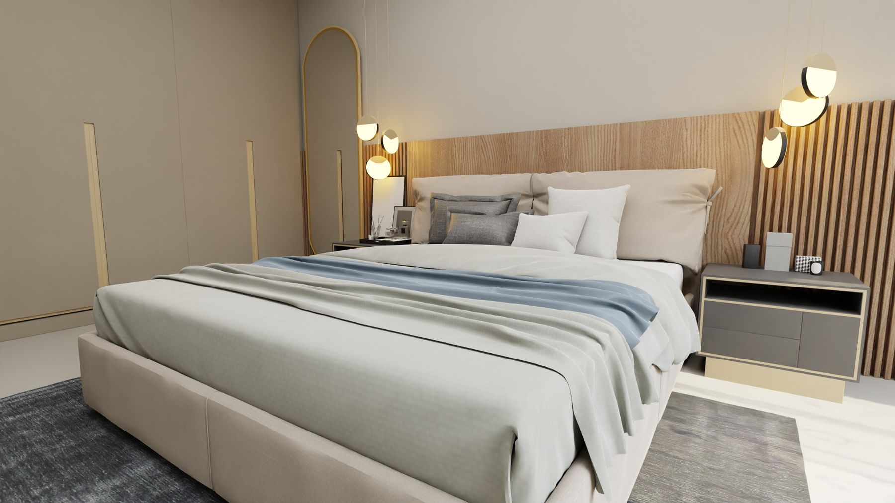
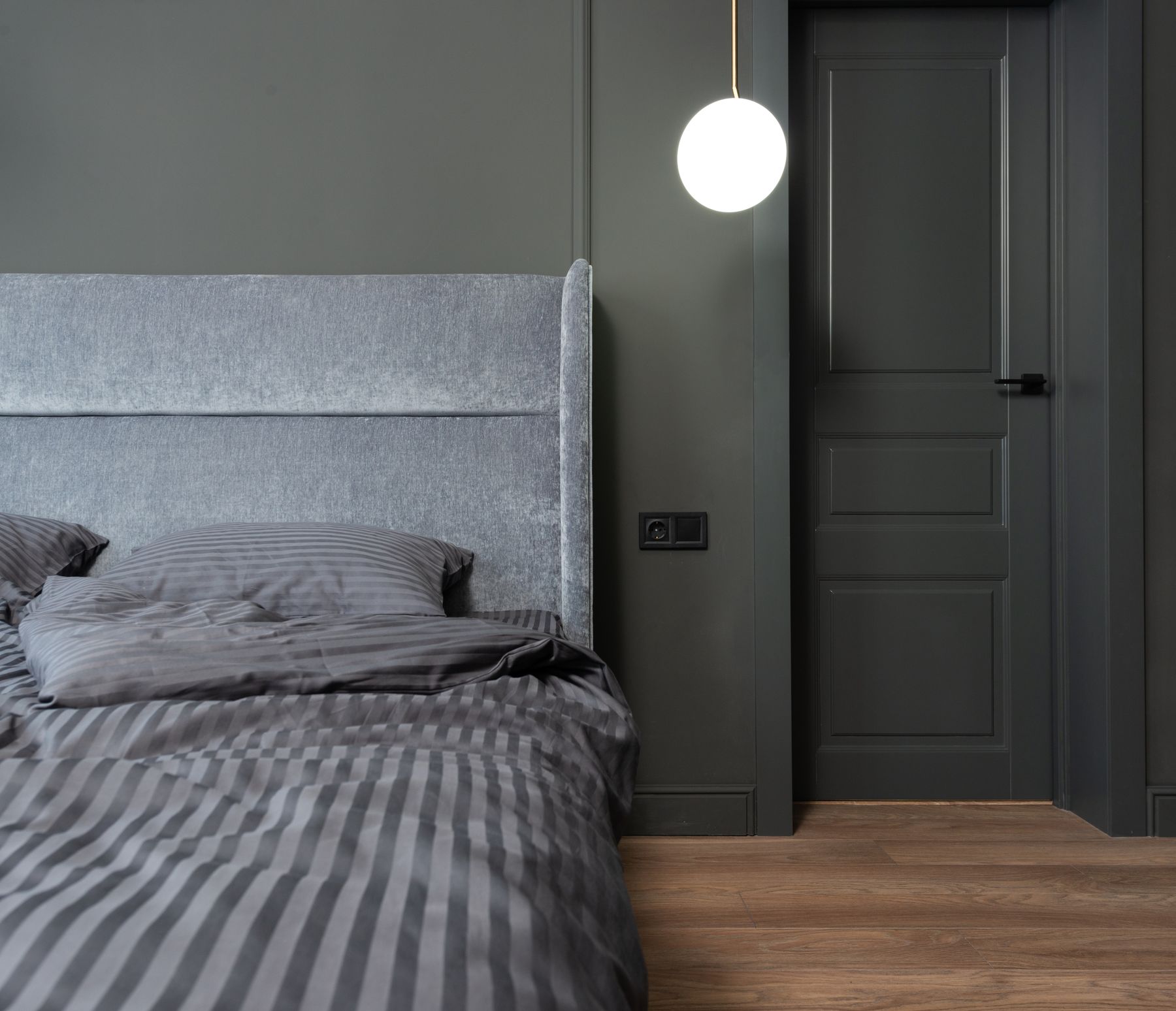
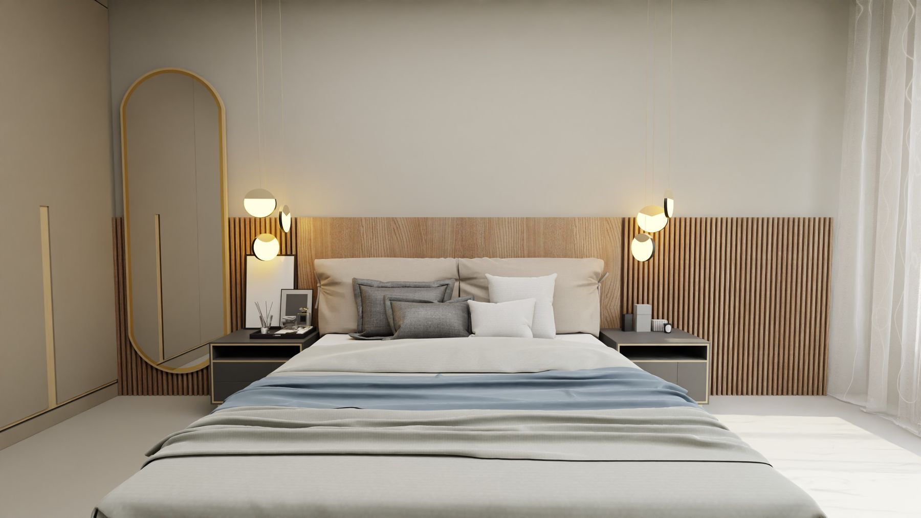
The bed occupies the largest soft volume, so its headboard value and bedding determine whether the palette has structure. A taupe upholstered headboard can bridge cream walls to darker timber; a fluted wood field can add grain and shadow without color noise. Confirm support, cleanability, outlet access and bedside clearance before focusing on tone. If bed and wall are close in value, separate them through texture or a narrow material edge rather than random contrast.
Bedding Depth Through Weave, Weight and Value
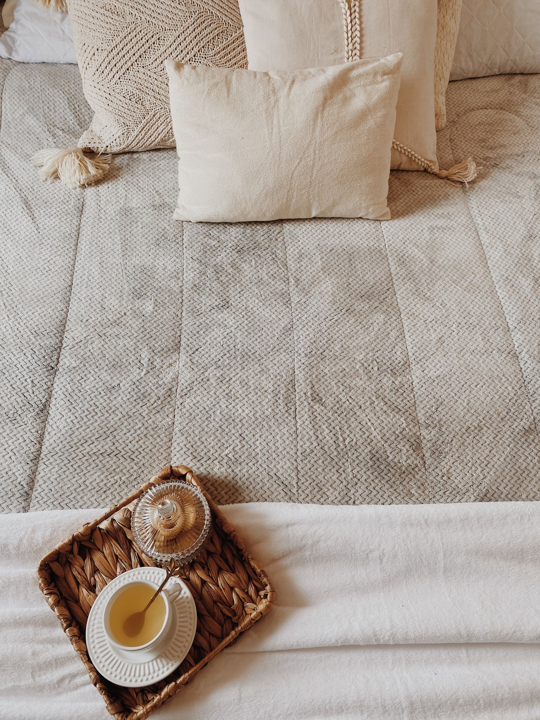
Neutral bedding needs useful material differences more than a large cushion count. Combine breathable sheets, a duvet appropriate to the sleeper, one quilt or blanket and a limited number of supportive pillows across related values. Linen, cotton, wool and boucle reflect light differently, but each must survive realistic washing and skin contact. Avoid buying every cream textile from one matched range; slight value and weave changes make the bed look assembled rather than staged.
Choose One Dominant Timber Family
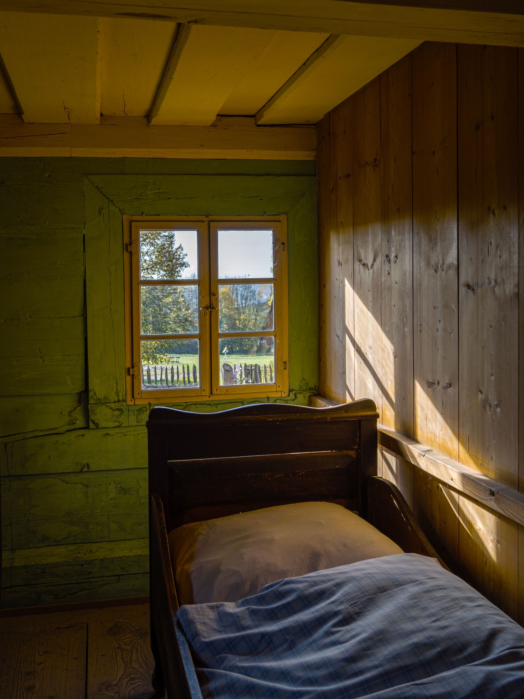
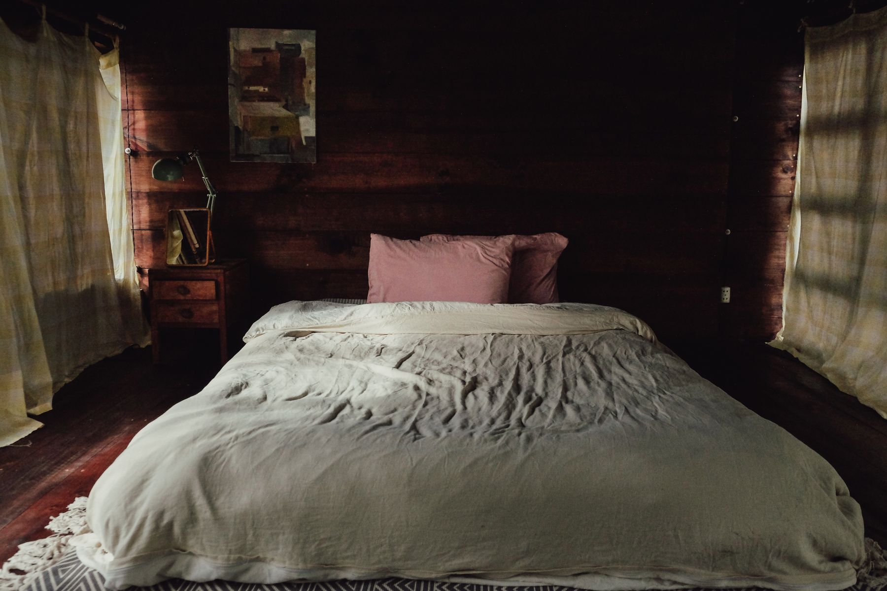
Oak, ash, walnut and stained timber all count as neutral materials, but mixing them indiscriminately creates more color conflict than calm. Begin with the floor or largest fixed wood and repeat its temperature selectively in the bed, nightstands or storage. Pale oak supports airy sand; walnut grounds taupe and cream; orange timber needs a beige that can absorb its warmth. [Rustic Bedroom Ideas](/bedroom/rustic-bedroom-ideas/) develops heavier grain and craft language, while a general neutral room can remain stylistically flexible.
Stone, Plaster and Natural Fiber With a Job
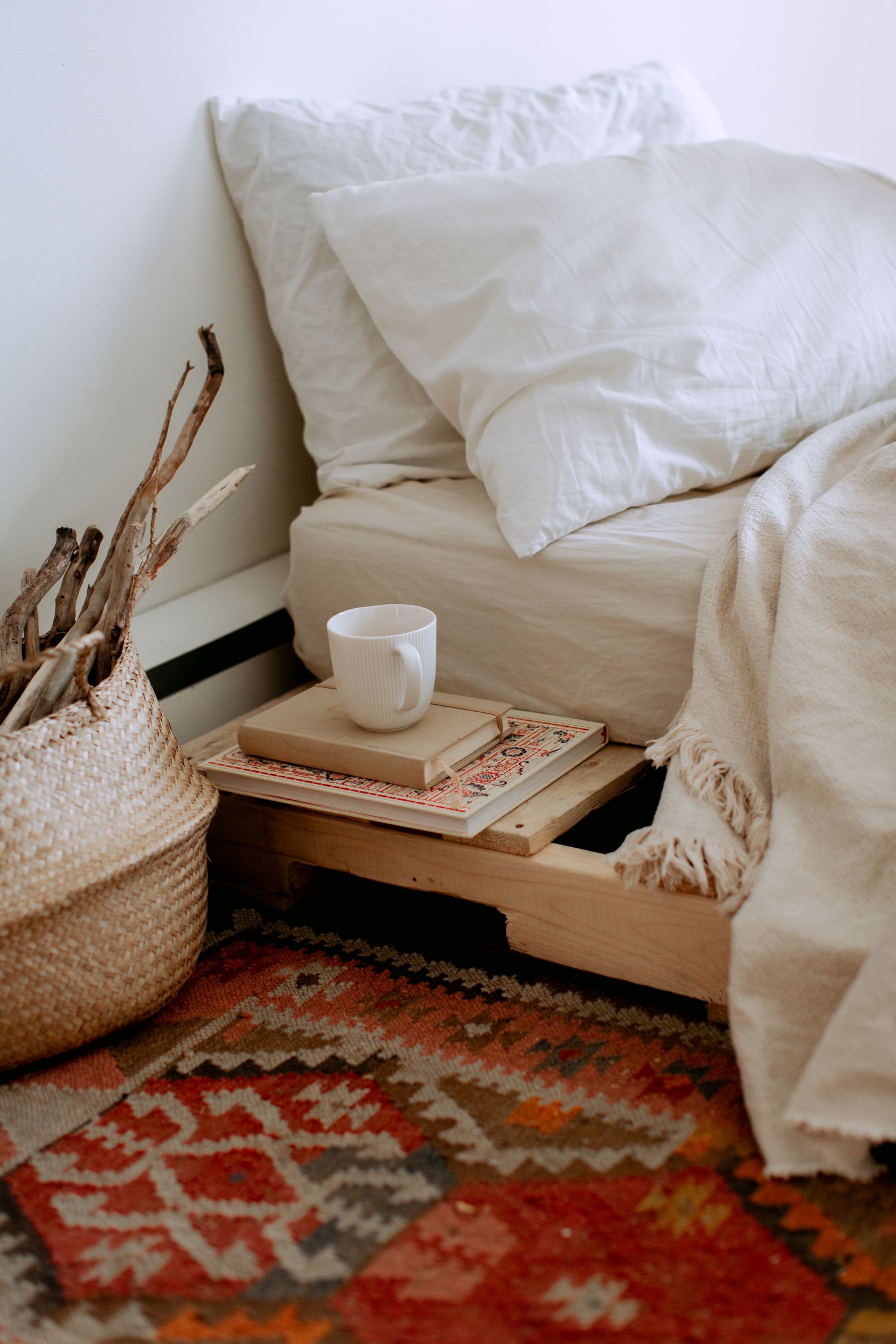
Stone, lime-like wall texture, wool, jute, rattan and woven grass introduce irregularity that keeps neutrals from feeling synthetic. Use each where its properties help: stone for a durable surface, wool for softness and acoustics, rattan for light furniture, plaster for broad shadow variation. [Boho Bedroom Ideas](/bedroom/boho-bedroom-ideas/) layers more objects and craft references; a neutral bedroom should limit materials to those that improve touch, function or longevity.
Use Dark Accents for Information, Not Formula
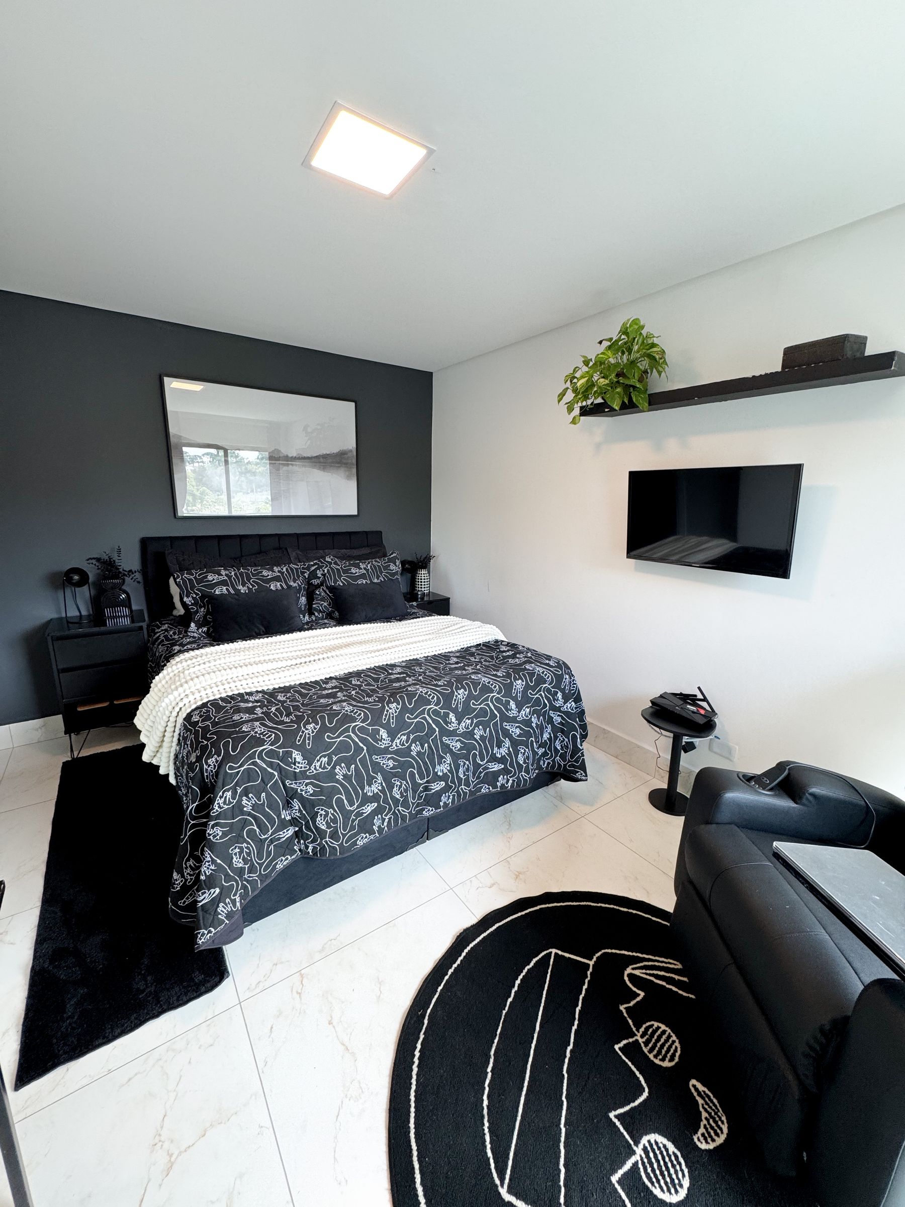
Black, espresso and charcoal are useful where the eye needs an edge: bed frame, lamp stem, handle, switch or picture frame. Repeating black in every corner because a styling rule demands it can make a soft neutral room feel dotted and mechanical. Place contrast at functional points first, then decide whether any decorative repetition is needed. If black carries equal weight with white, the stronger destination is Black and White Bedroom rather than a broadly neutral scheme.
Metal Temperature Before Metal Finish
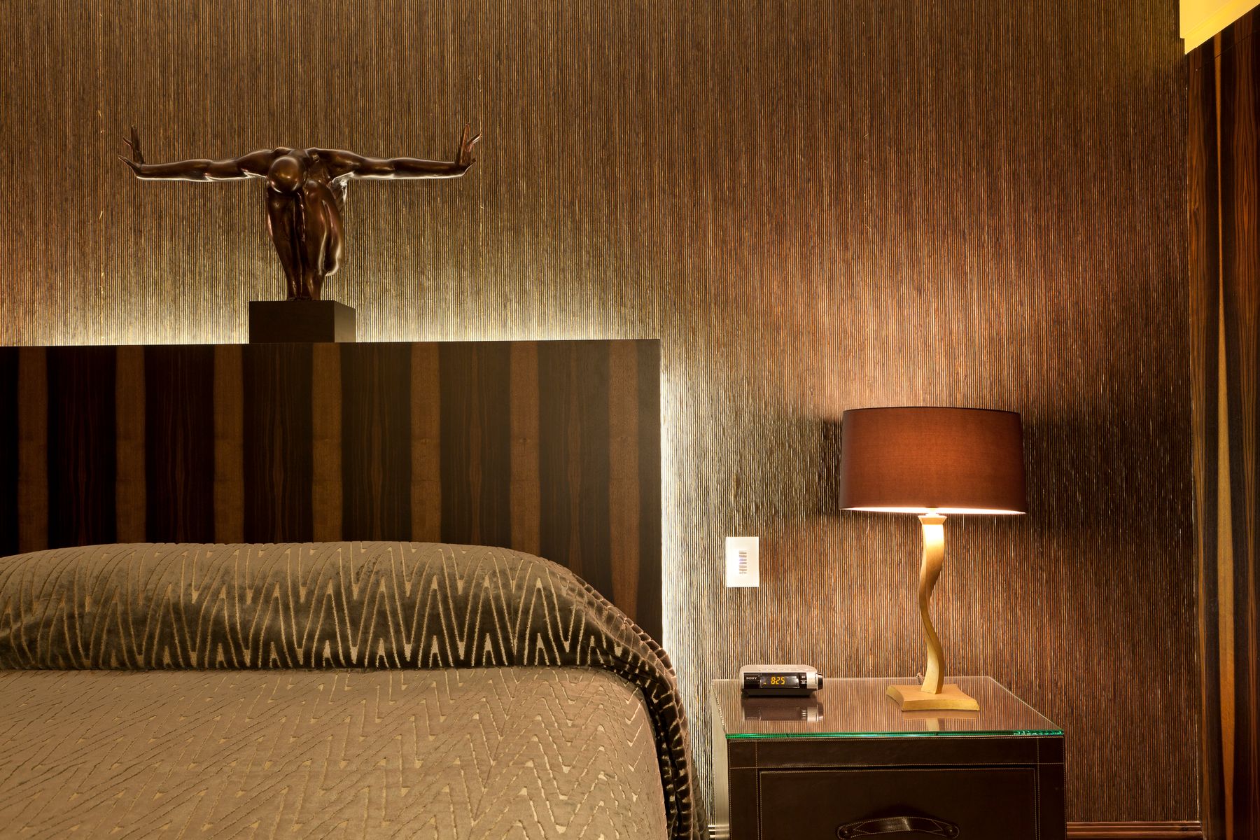
Aged brass can warm mushroom and cream, blackened steel sharpens sand, and nickel can support cooler stone or greige. Start with existing window and door hardware, then choose one dominant metal temperature. Highly polished finishes create stronger highlights and fingerprints; brushed surfaces are quieter but still need coordination. Use metal at lamps, handles and furniture joints where it has a structural job instead of distributing identical gold objects around the room.
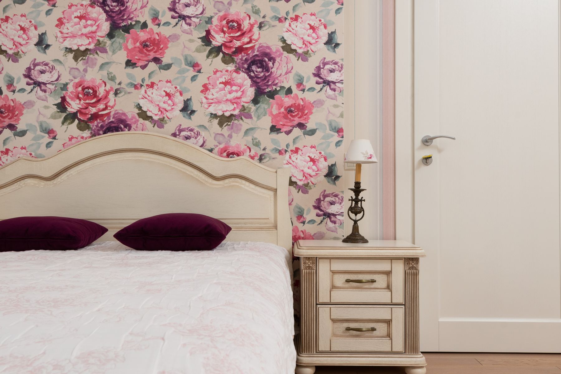
Pattern at the Scale the Room Can Hold
Neutral does not require solid fabric everywhere. Stripe, check, botanical or geometric pattern can create rhythm when its contrast stays compatible with the room and its scale matches the surface. Use one substantial pattern on a curtain, rug, quilt or wall rather than many tiny motifs. Historic or floral pattern may shift the style toward traditional, while simple geometry feels more contemporary; decide whether that implication supports the room before selecting color alone.
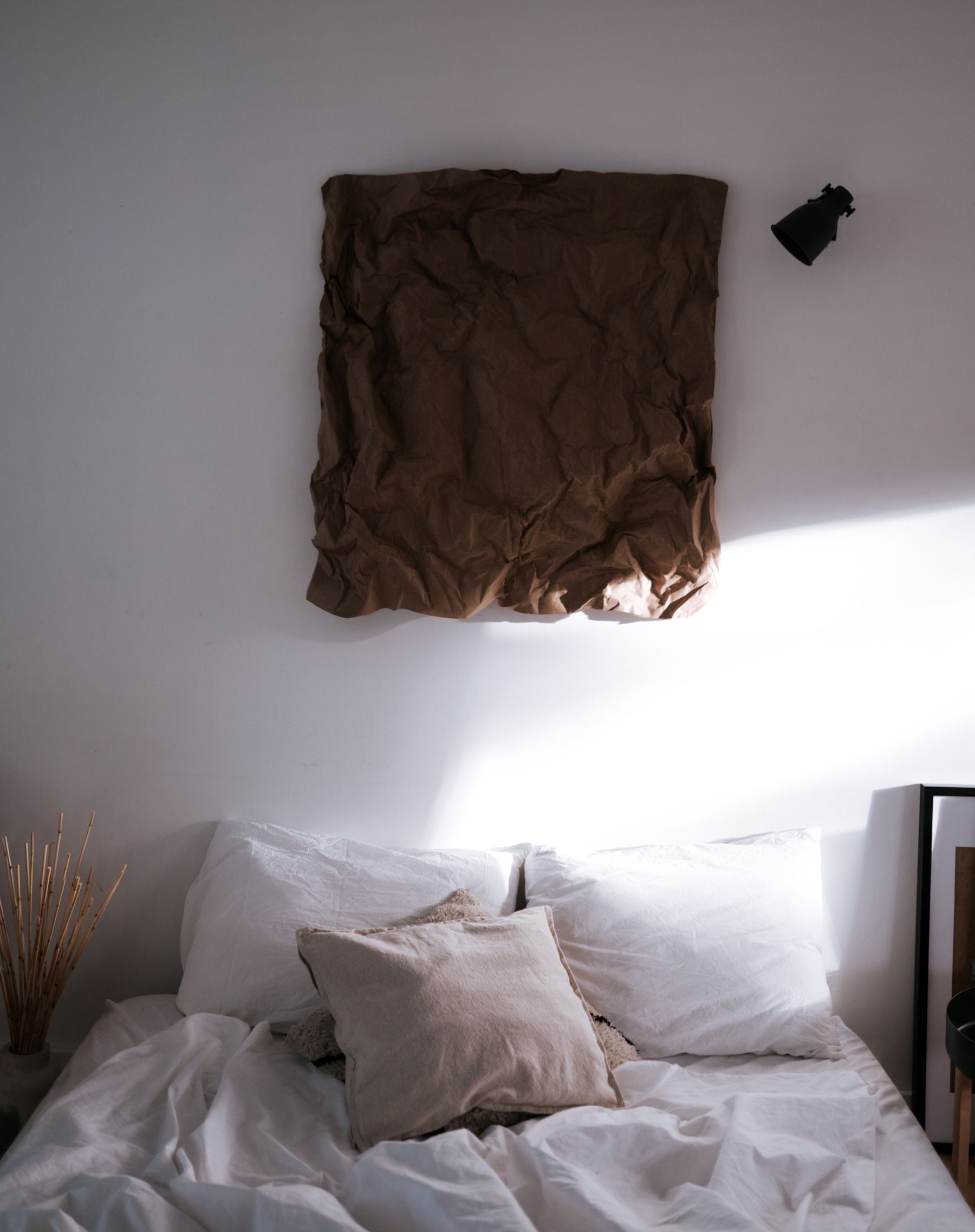
Art With Meaning, Not Random Color
Art can introduce personal history, line and deeper color without breaking a neutral room. Choose work because its subject and scale matter, then let one or two quieter colors connect it to the textiles. Generic beige prints selected only to match can make the room feel anonymous. Check reflections, safe fixing and the view from bed. In editorial media, avoid dominant protected artwork unless rights are clear; in the home, prioritize authentic ownership and meaningful placement.
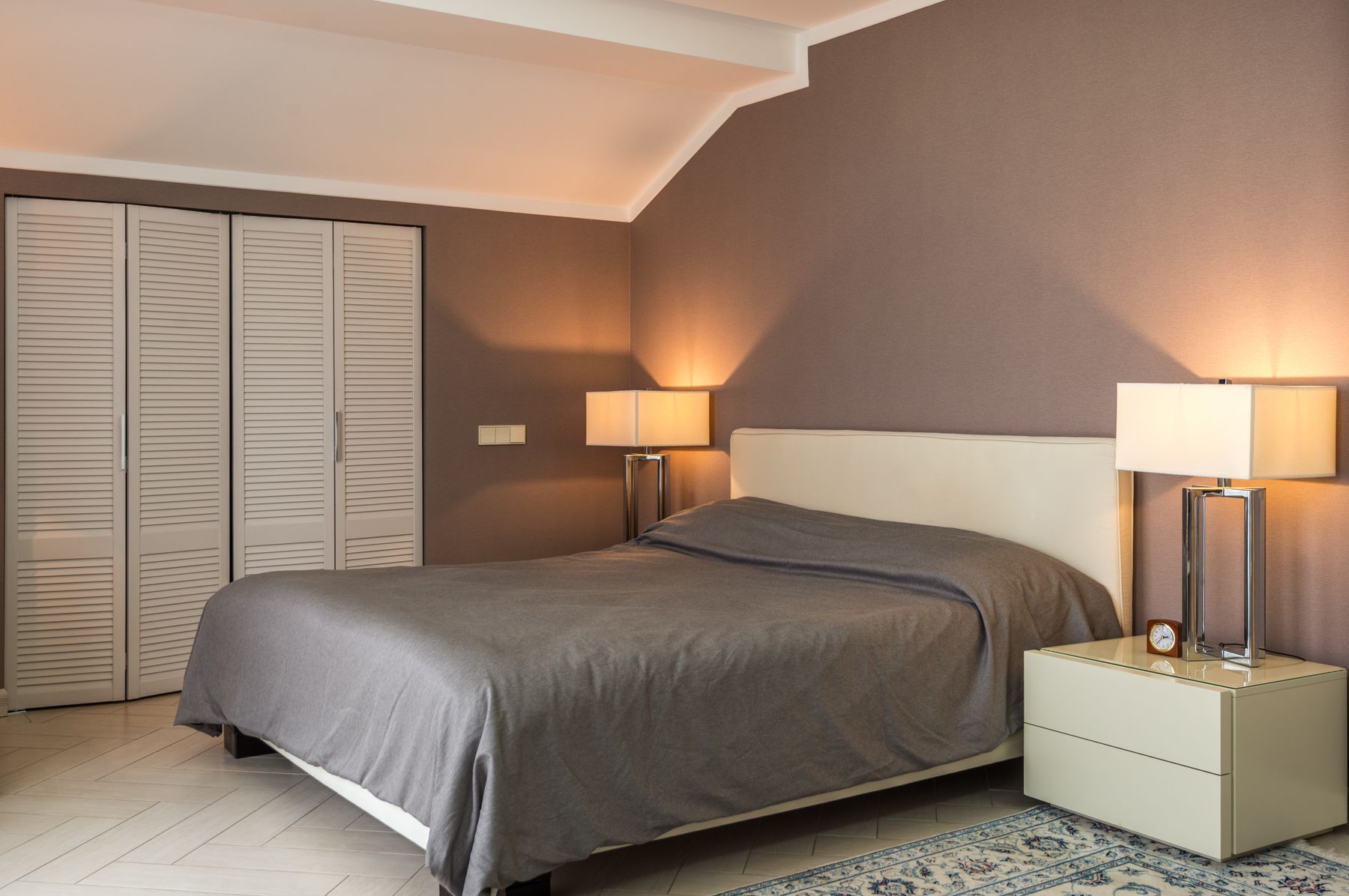
After Sunset: When Beige Turns Orange
Warm light can flatter cream and timber, but very low color temperature may push beige toward orange and flatten taupe. Use dimmable ambient light, independent reading lights, wardrobe illumination and a low nighttime route with good color rendering. Wall washing can reveal plaster and textile texture without high output. [Living Room Lighting Ideas](/living-room/living-room-lighting-ideas/) expands control principles; the bedroom also needs darkness, glare protection and bedside switching.

Window Layers and Unwanted Color Cast
Curtains and blinds are large neutral fields and also change the color of transmitted daylight. Cream fabric can warm a room; grey linen may cool it; lined taupe can look much darker when closed. Separate daytime filtering, privacy, blackout and heat control rather than asking one layer to do everything. Measure stack-back so open fabric does not cover useful glass, and test the closed treatment beside the bed under both window light and lamps.
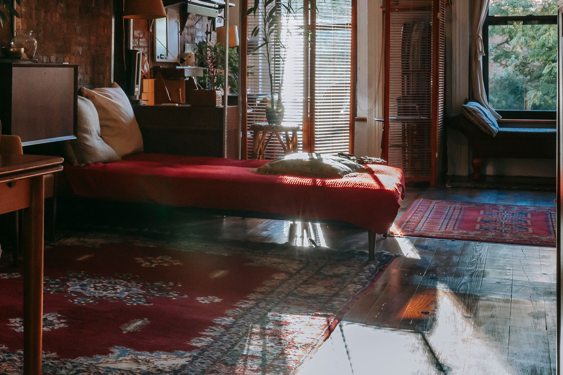
Floor and Rug as the Value Base
Flooring occupies a major color field even when called natural. Honey timber warms beige, grey carpet cools taupe and pale stone may need a softer rug beside the bed. Choose rug size around stable landings, door movement, cleaning and trip risk before pattern. [Living Room Rug Ideas](/living-room/living-room-rug-ideas/) explains material and sizing tradeoffs that transfer well. Bring wall and textile samples to floor level because viewing angle changes their relationship.
Storage Inside the Value Structure
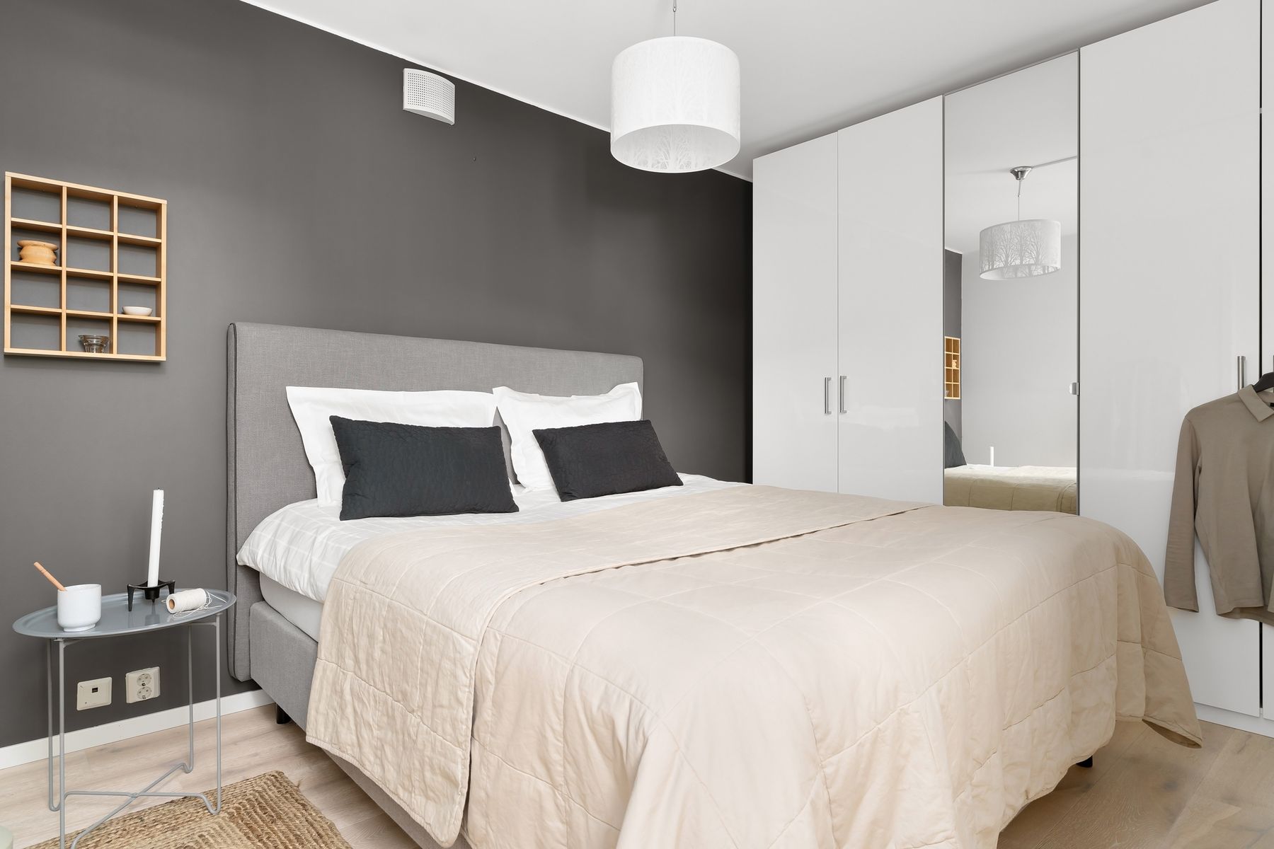
A wall of wardrobes can become the broadest neutral surface, so its value and undertone deserve the same sampling as paint. Matching the wall reduces fragmentation; using a deeper taupe adds architecture and helps doors read. Confirm internal depth, ventilation, lighting, handle contrast and open-door clearance before choosing finish. High-gloss beige records reflections and fingerprints, while textured laminates may trap dust. The calmest storage is still the system that works without overflow.
Editing Clutter Without Performing Minimalism
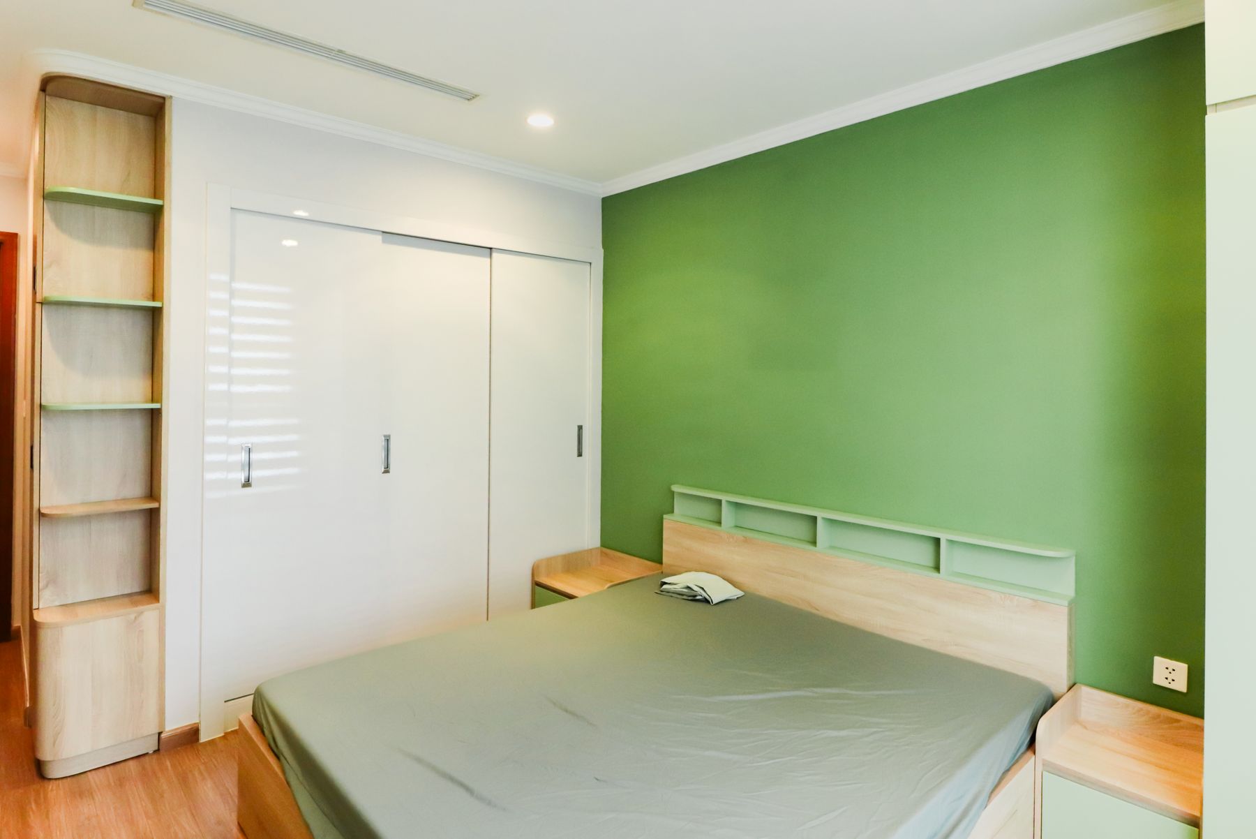
Neutral rooms often get photographed as nearly empty, but calm depends on organization rather than the absence of life. Give daily items reachable closed storage, group a few meaningful objects and leave some tabletop and wall area visually quiet. [Minimalist Bedroom Ideas](/bedroom/minimalist-bedroom-ideas/) is a lifestyle and editing destination; Neutral Bedroom is primarily a palette decision and can support collected, classic or richly furnished rooms as long as the value structure remains legible.
In a Small Neutral Bedroom
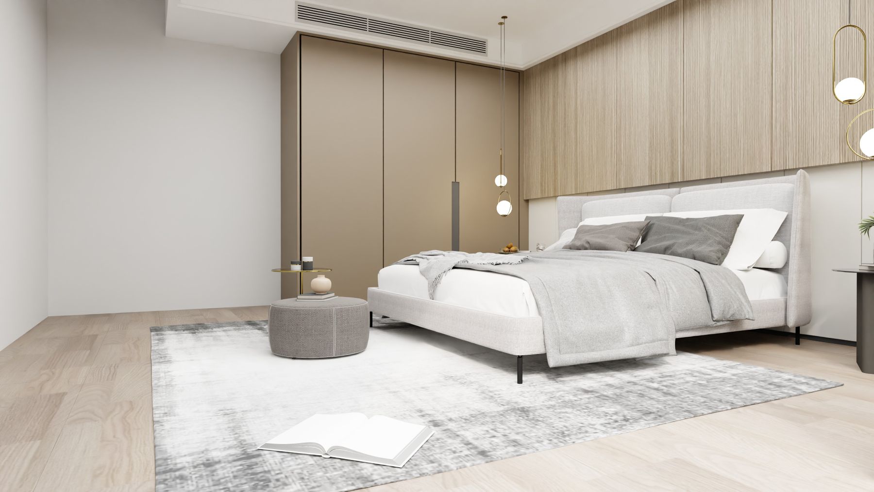
A small neutral bedroom needs clearances before color. Preserve window operation, bedside reach and the active footprint of doors and drawers, then use one continuous pale field to reduce fragmentation. Add a medium-value bed or storage plane so boundaries remain visible. [Small Bedroom Ideas](/bedroom/small-bedroom-ideas/) develops compact storage and circulation in depth. The neutral palette should clarify that plan rather than disguise crowding with beige.
A Large Neutral Bedroom Needs Value Changes
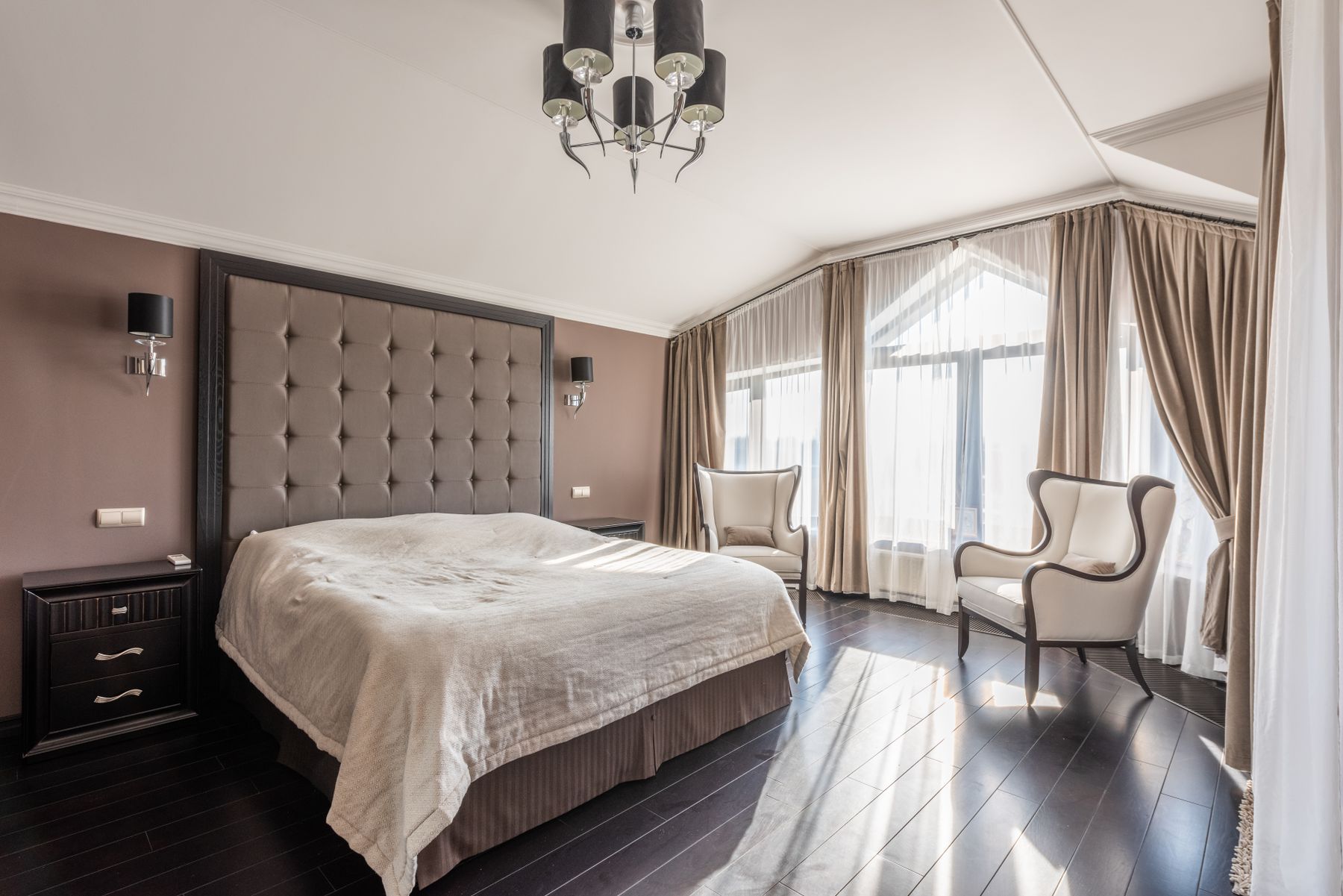
In a large room, one pale beige across every plane can flatten scale and leave furniture floating. Anchor the bed with the deepest neutral, give seating or dressing a related middle value and use separate light scenes. A broad rug or headboard can connect the zones without a matched furniture suite. [Large Bedroom Ideas](/bedroom/large-bedroom-ideas/) covers circulation and proportion; the palette should reinforce those centers rather than fill empty area.
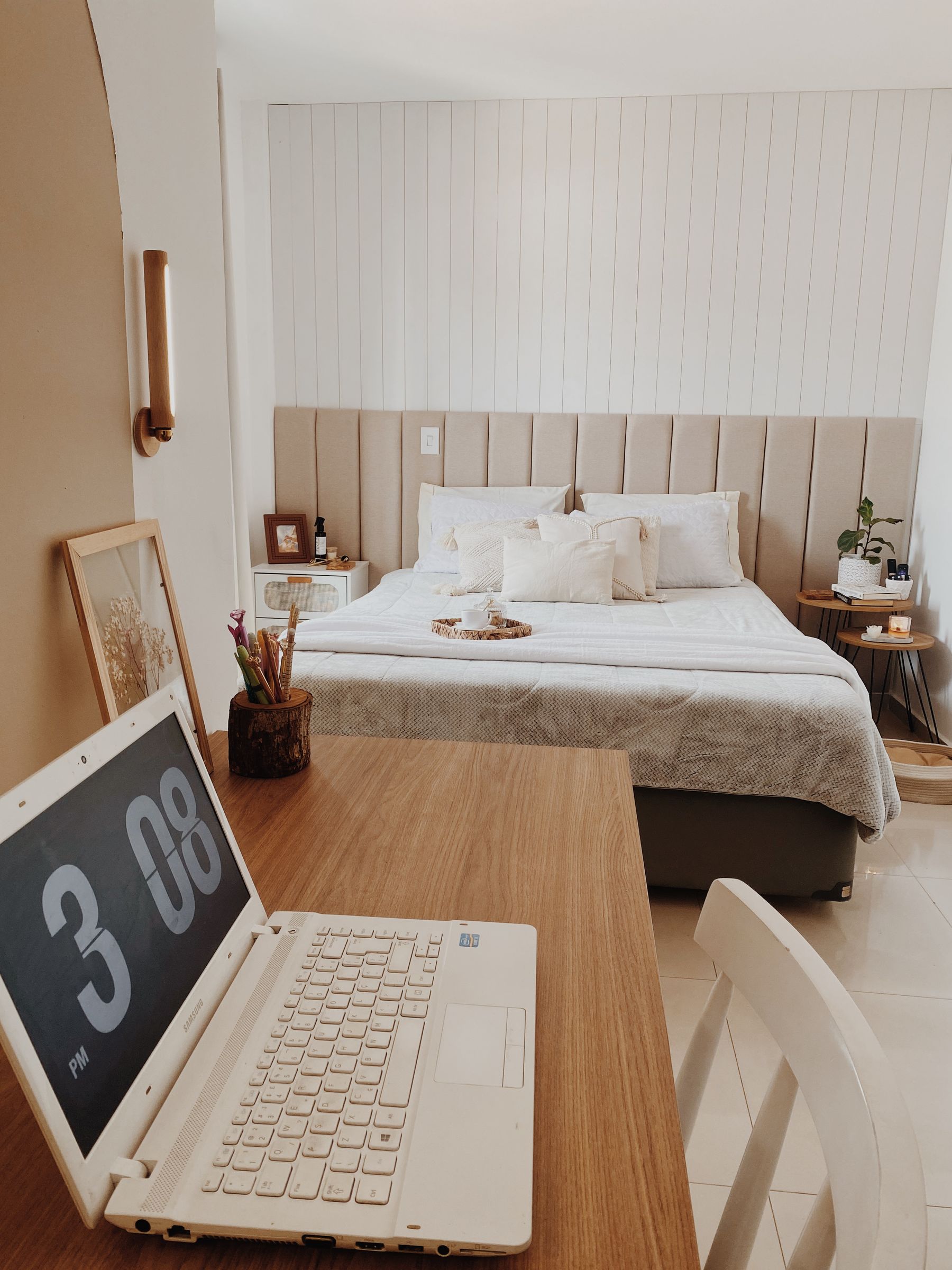
The Closable Neutral Workspace
A neutral desk can blend into a bedroom so completely that work remains visually present all evening. Give the surface enough depth, place daylight to the side of the screen, provide independent task light and contain cables and papers in closed storage. The desk may match timber furniture, but it still needs a clear activity boundary. End the day with a short physical shutdown so beige styling does not camouflage unresolved work clutter.
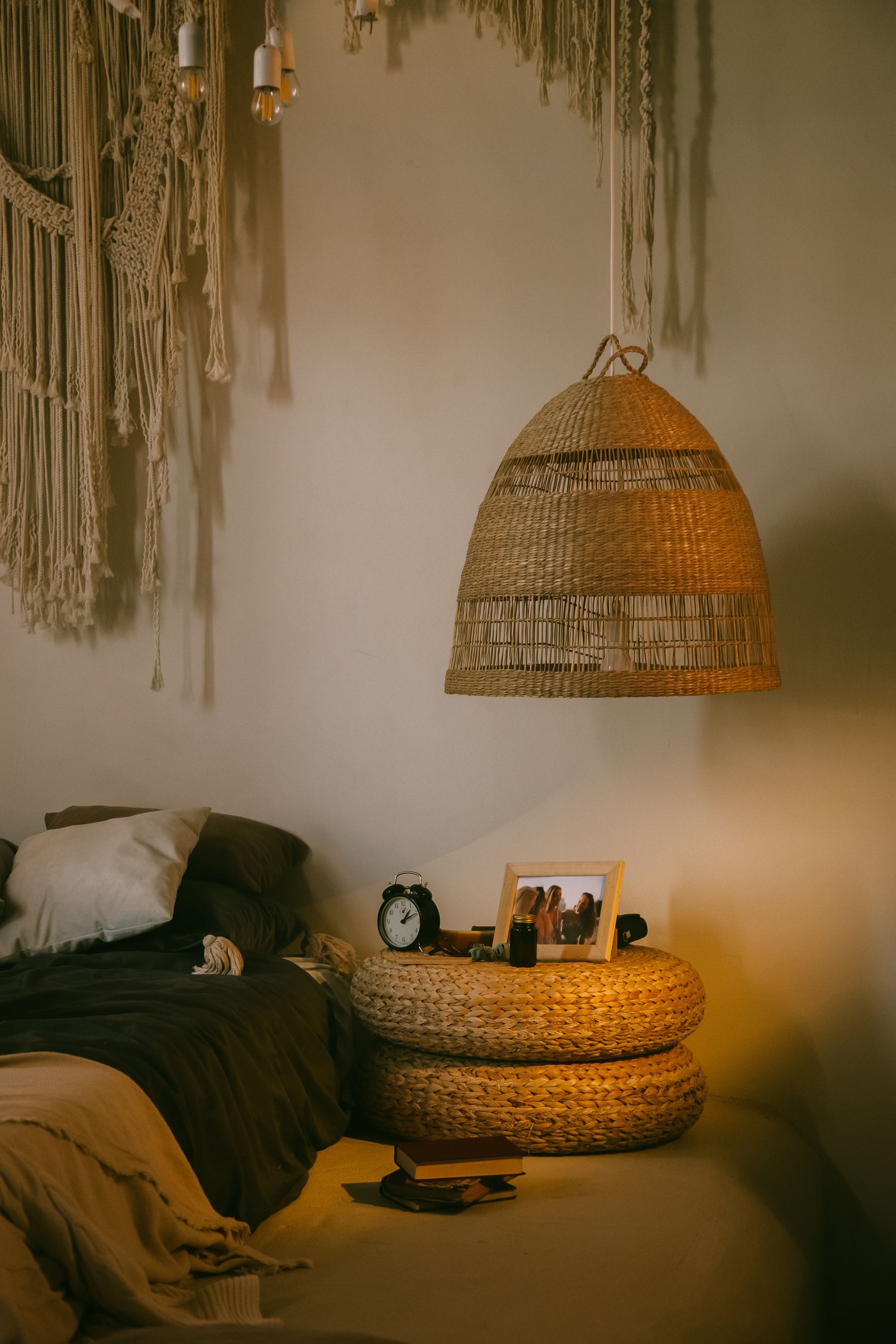
A Reversible Neutral Scheme for Rentals
In a rental, begin with broad reversible fields: bedding, curtains, rug, freestanding headboard and lamps. Use removable storage and a large sample board to coordinate the landlord's wall color rather than fighting it with many accessories. Obtain written permission before painting, drilling or applying film, and retain original hardware. One substantial oatmeal textile or timber piece usually creates more cohesion than a collection of small beige objects.
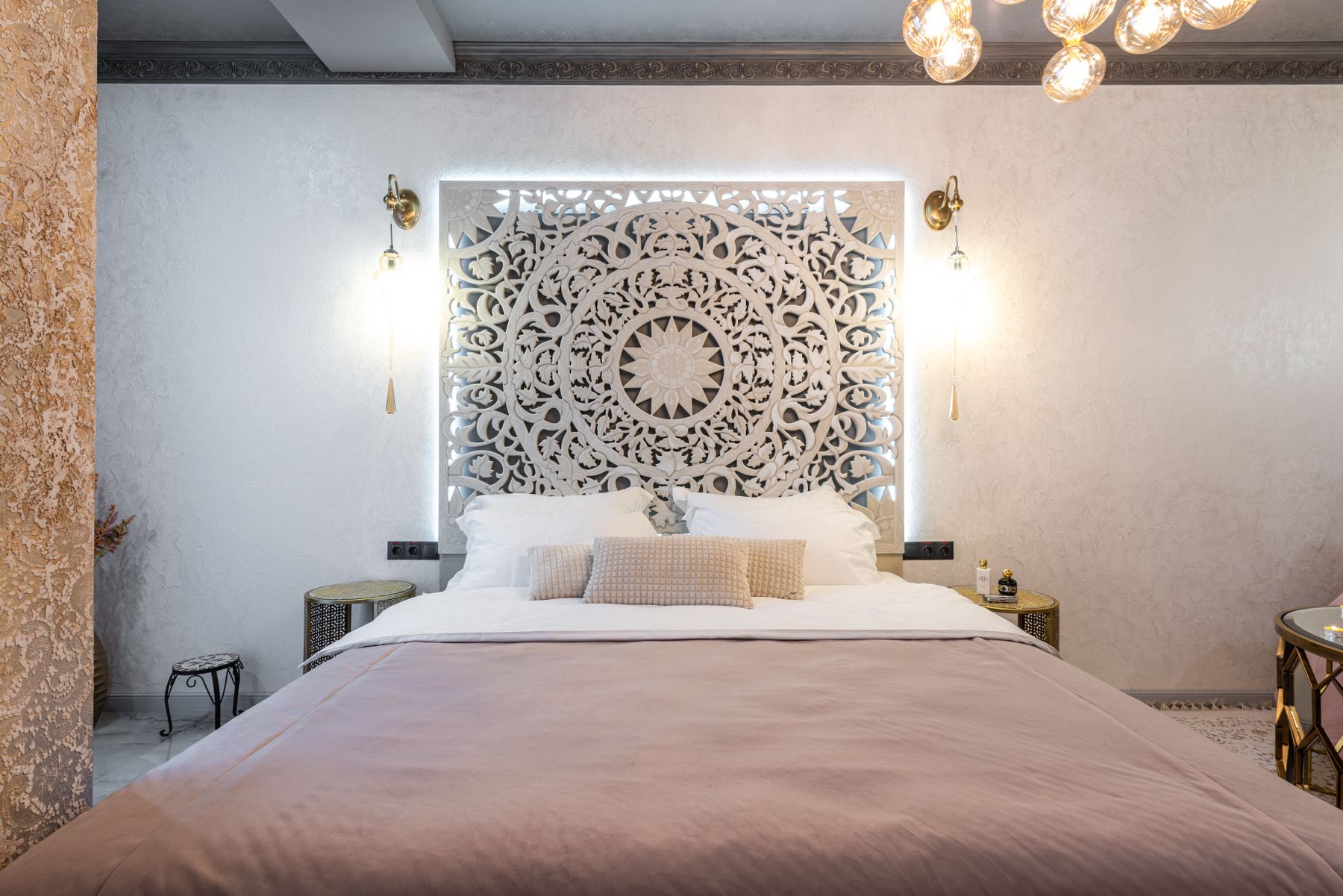
Protect Accessibility in a Low-Contrast Palette
Cream against beige and taupe against brown can produce weak functional contrast. Keep bed edges, handles, switches, steps and bathroom routes visible, and make controls reachable from the bed. Matte surfaces reduce glare; tactile differences help when values are close. Accessibility does not require abandoning neutrals—it requires placing contrast where information and safety matter. Test the room in minimum light and with a blurred grayscale photograph to reveal disappearing boundaries.

Pale Textiles and Textured Surfaces in Real Use
Pale upholstery reveals oils and transfer, boucle traps lint, jute sheds and matte beige paint can burnish where it is scrubbed. Read cleaning codes, choose removable covers where daily contact is high and test a discreet area before using a product. Record paint brand, color, base and finish for repairs. Slight tonal variation often hides normal wear better than a uniform cream surface, but it still needs a realistic cleaning route.
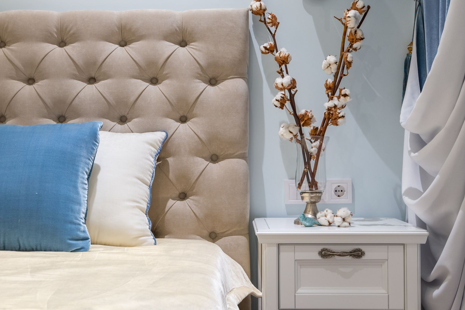
The Daylight, Dusk and Editing Test
Use the room at waking time, on an overcast afternoon, at dusk, for reading and in full blackout. Check whether undertones stay compatible, bed and storage remain legible, lamps reveal texture without orange cast and every object has a reason to remain. Remove the item doing the least work and repeat the test. The room is complete when it feels calm and personal without depending on perfect sunlight, a freshly styled bed or one camera exposure.