Decide Whether Green Is Mineral, Earthy, Jewel or Dark
Sage can sit close to stone and behave quietly, olive carries more earth and yellow, emerald wants stronger hierarchy and forest can become a dark architectural field. Choose that role before choosing the exact shade.
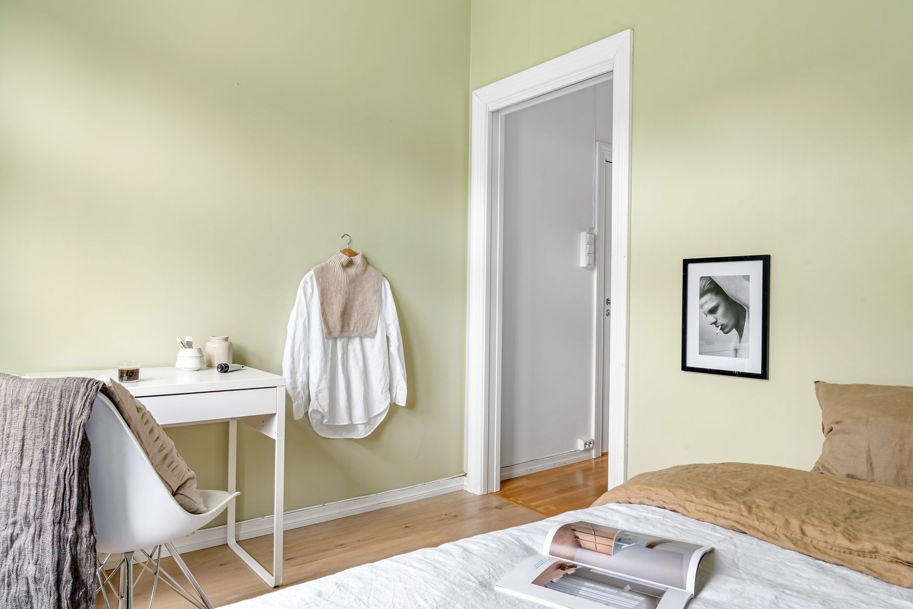
Judge Green Against Materials That Already Look Natural
Timber, wool, stone and foliage already carry yellow, grey or brown, so they can shift green substantially. Compare the sample with the actual floor and dominant timber rather than with white paper alone.
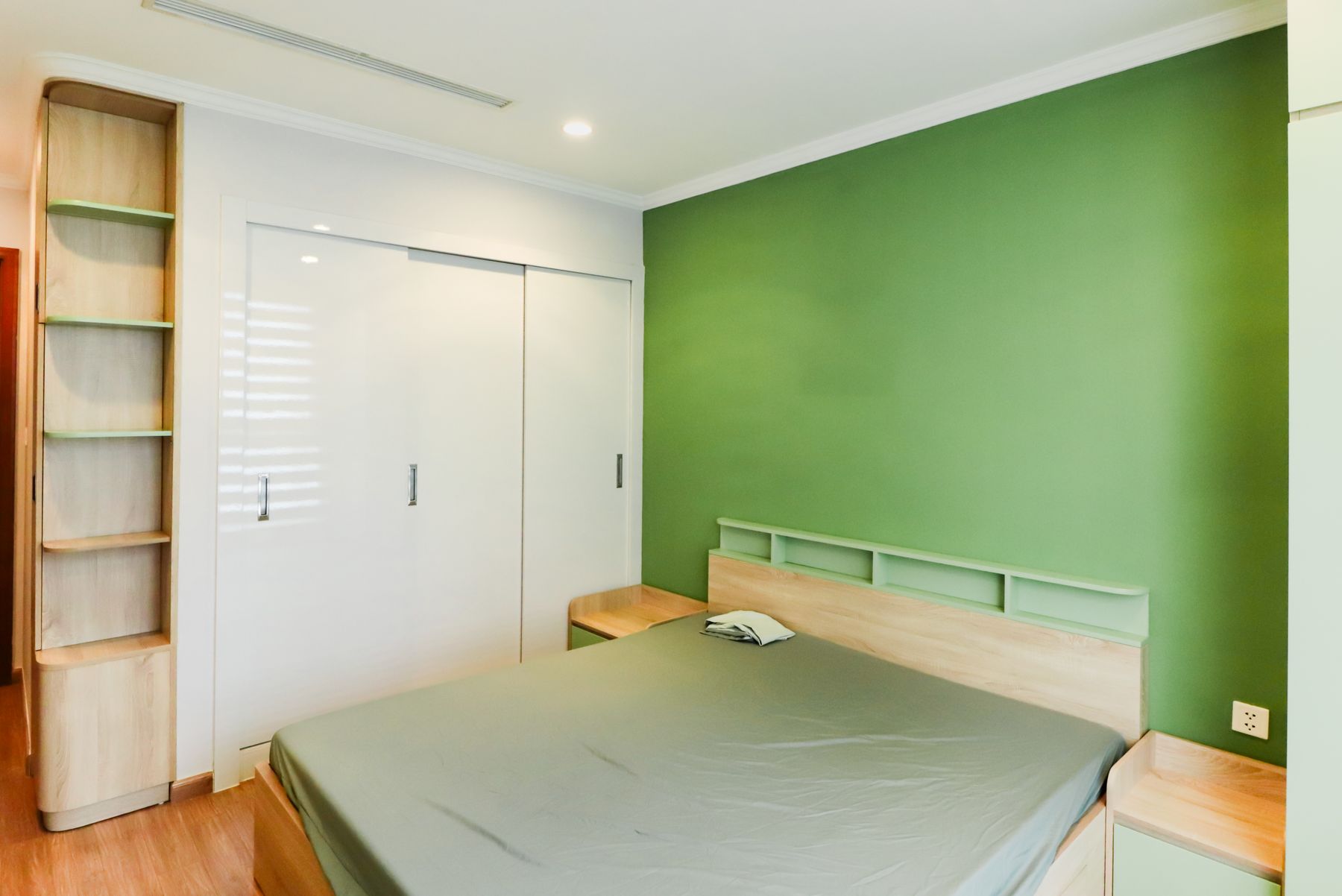
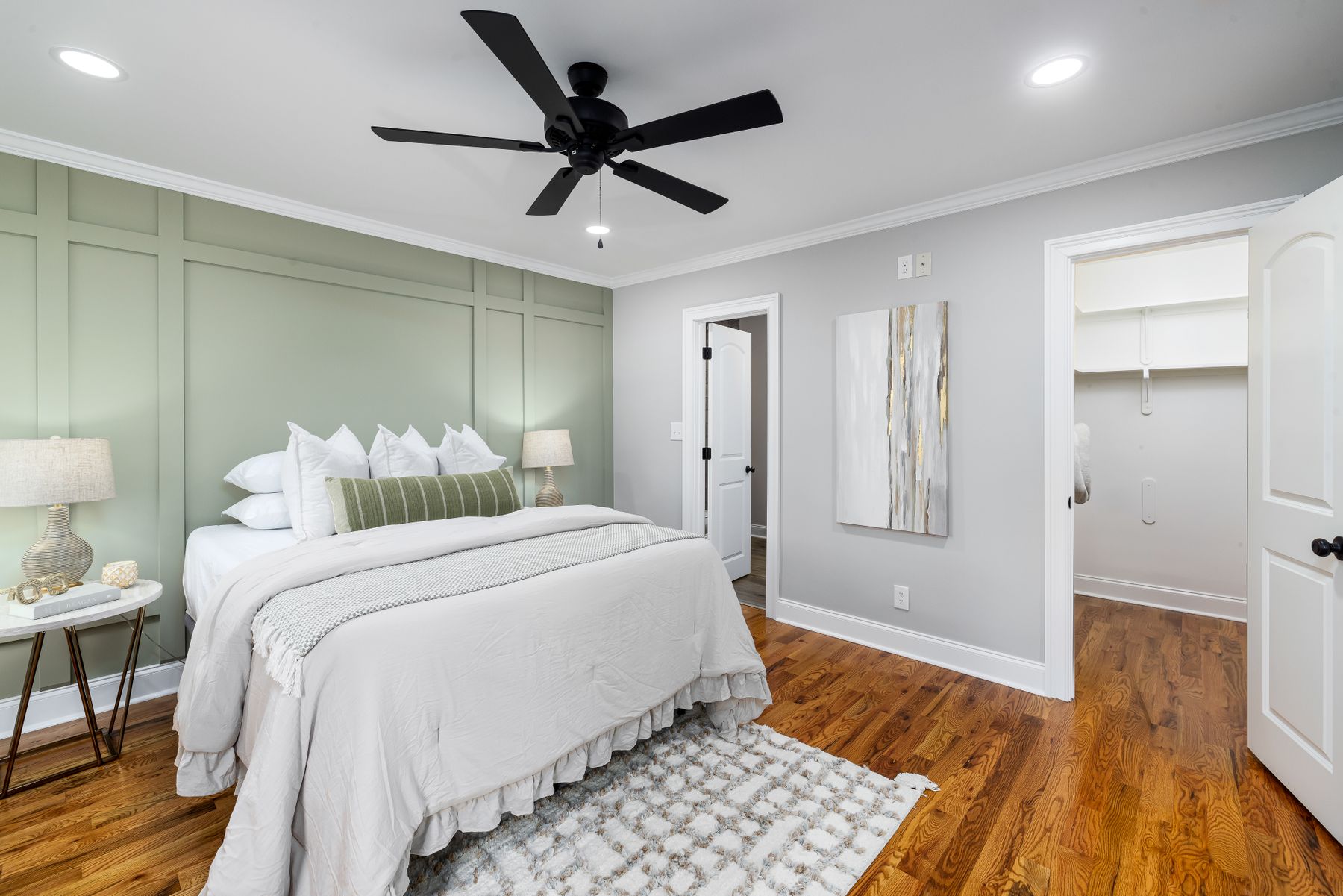
Use Sage as a Mineral Background
Sage is most convincing when it behaves like muted plaster, lichen or stone rather than a decorative pastel. Let it occupy a broad field and keep other greens limited so the room does not become a botanical matching set.
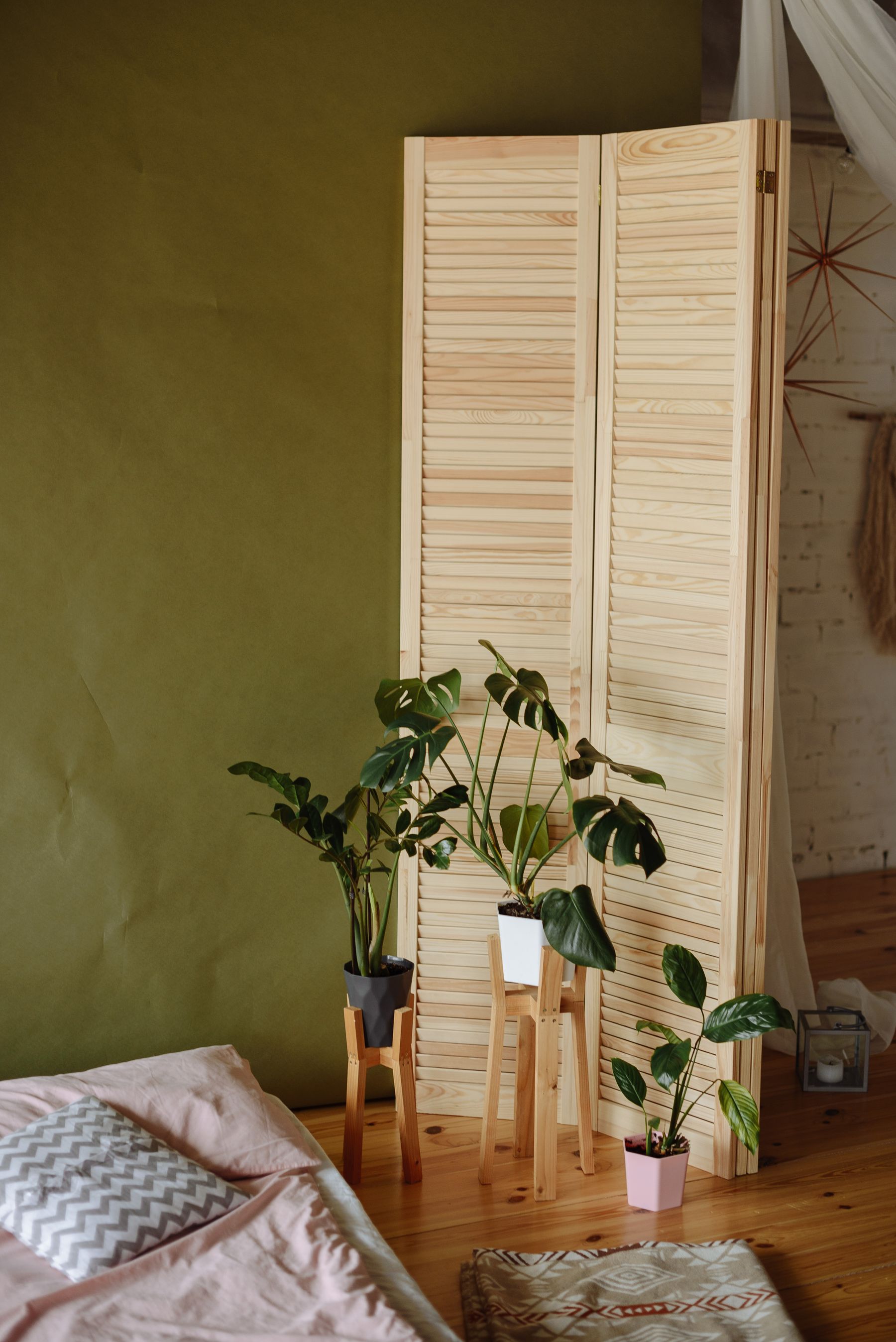
Use Olive as an Earth Tone With Boundaries
Olive bridges timber, leather, clay and warm white, but too many adjacent yellow-brown materials can turn muddy. Give olive one clear field and preserve a lighter or cooler separator nearby.
Know When Forest Green Becomes a Dark Envelope
Forest green can become functionally near-black after sunset. Preserve readable bed edges, switches and route lighting, and decide whether the loss of visible green is intentional before extending it across a full envelope.
Let Emerald Be the One Jewel Surface
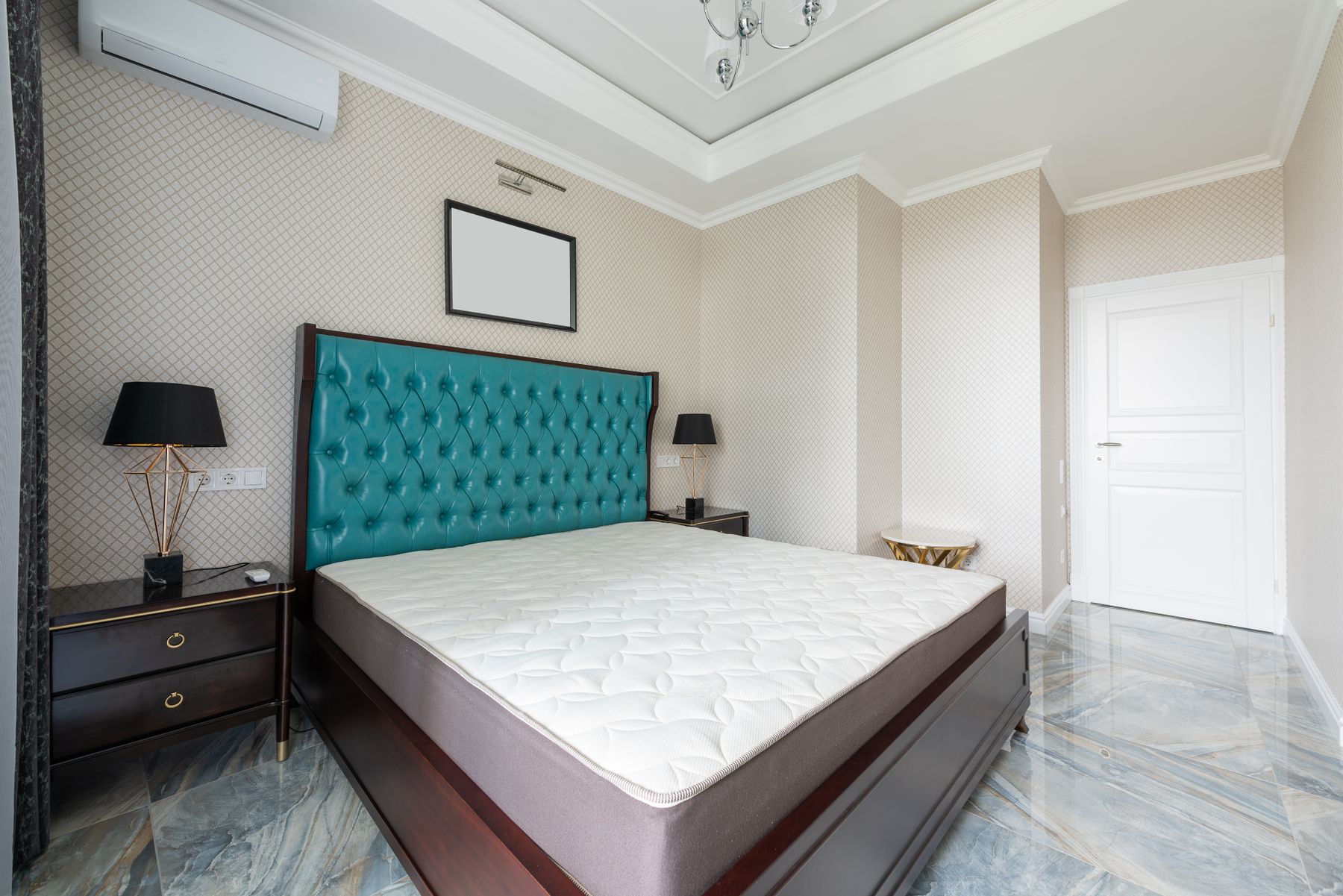
Emerald has enough chroma to become the primary visual event. Use it on one substantial surface—headboard, curtain, wall or cabinet—then allow timber, stone and quieter textiles to absorb the remaining attention.

Blue-Green Needs a Clear Bias
Eucalyptus and teal can cool the palette, but they can also pull the room toward a second blue identity. Decide whether they are supporting green or creating a new color story and keep only one clear bias.
Accent Wall or Full Green Envelope?
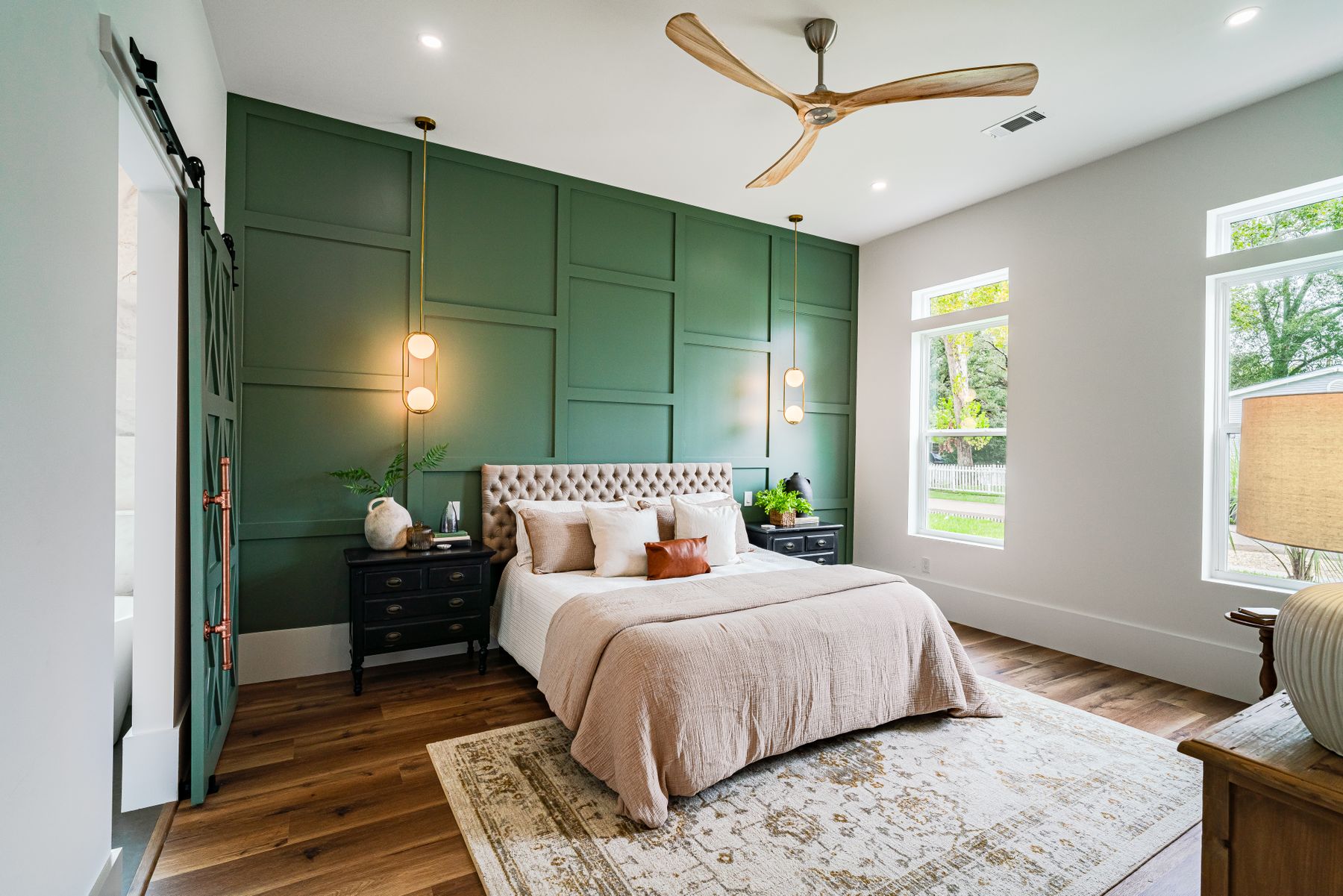
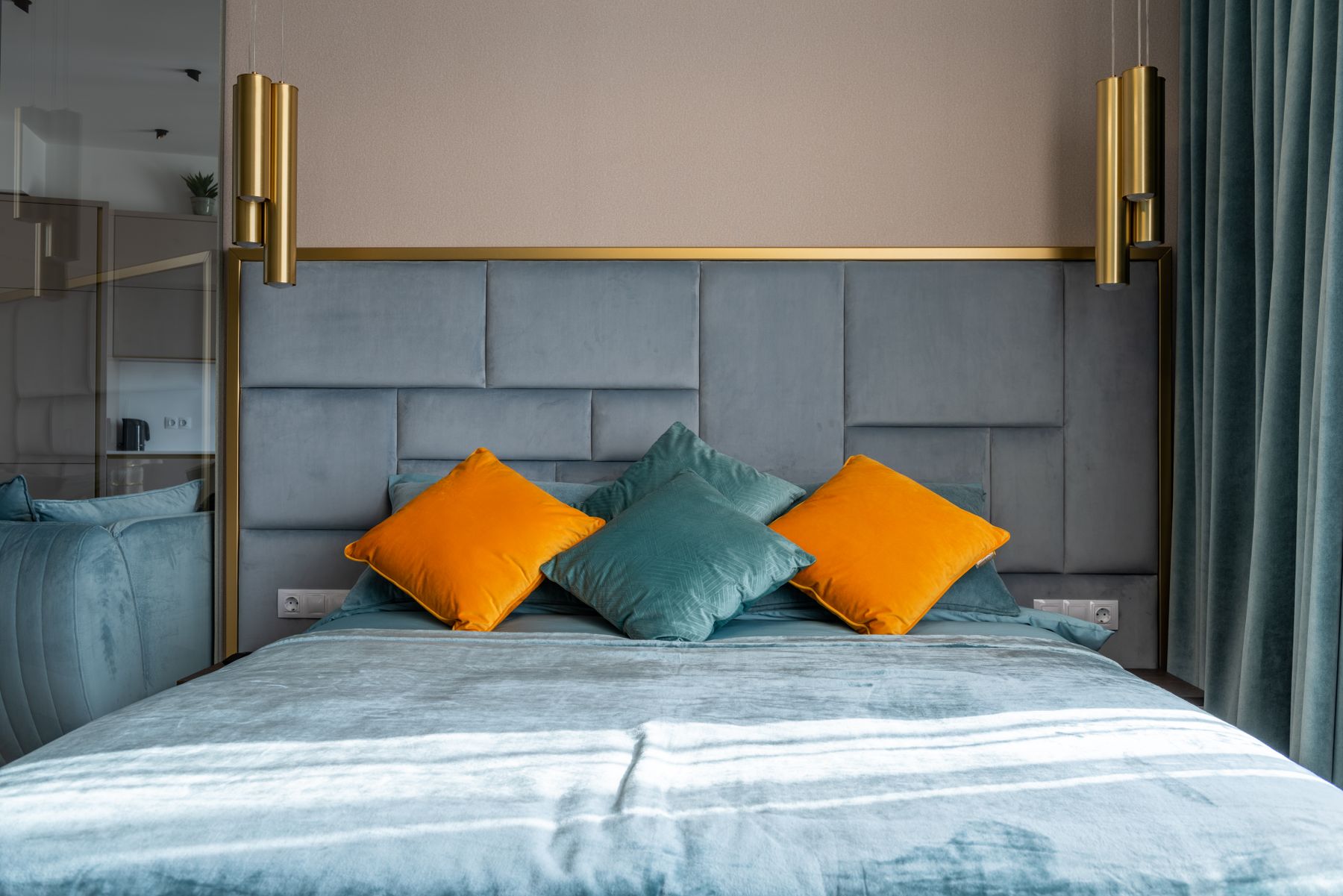
An accent wall makes sense when the bed wall is architecturally important and the remaining surfaces have a clear supporting color. Painting only one wall because green feels risky can leave the other three unresolved. A full envelope is calmer when doors, trim and ceiling transitions are considered together, but it magnifies undertone and lighting mistakes. [Contemporary Bedroom Ideas](/bedroom/contemporary-bedroom-ideas/) demonstrates color integrated with clean architecture rather than applied as a decorative afterthought.
The Bed Carries the Main Green Field
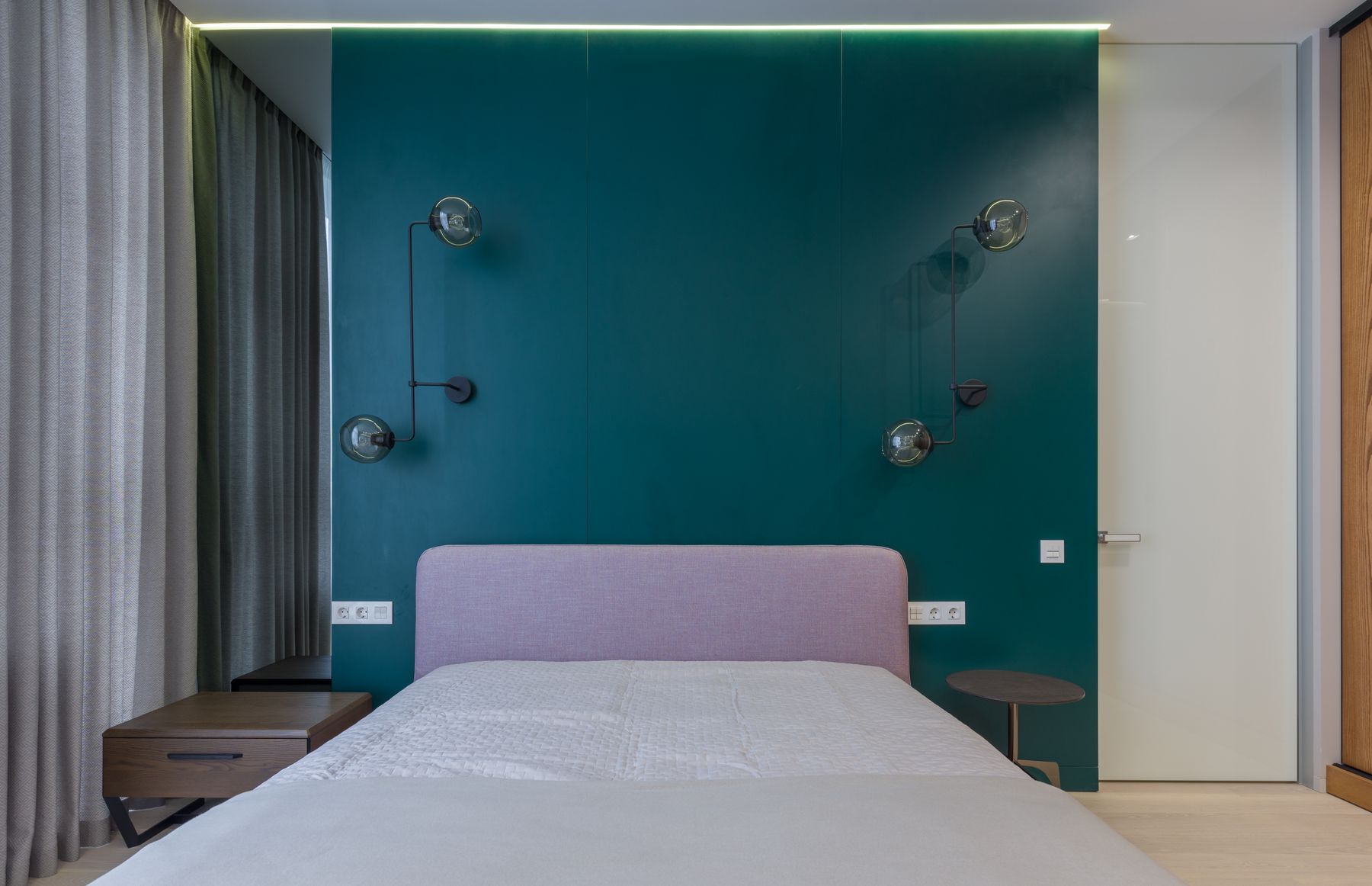
A green upholstered bed or broad headboard makes the hue substantial while walls remain flexible. Check cleaning codes, abrasion, head support and replacement options before selecting color. Velvet shows nap direction and dust differently from linen; pale woven green may reveal oils and transfer. Tape the full headboard outline and confirm bedside clearances. A strong green bed suits rentals and rooms with good existing walls, but comfort, access and maintainability still come before color.
Green Bedding by Value and Weave
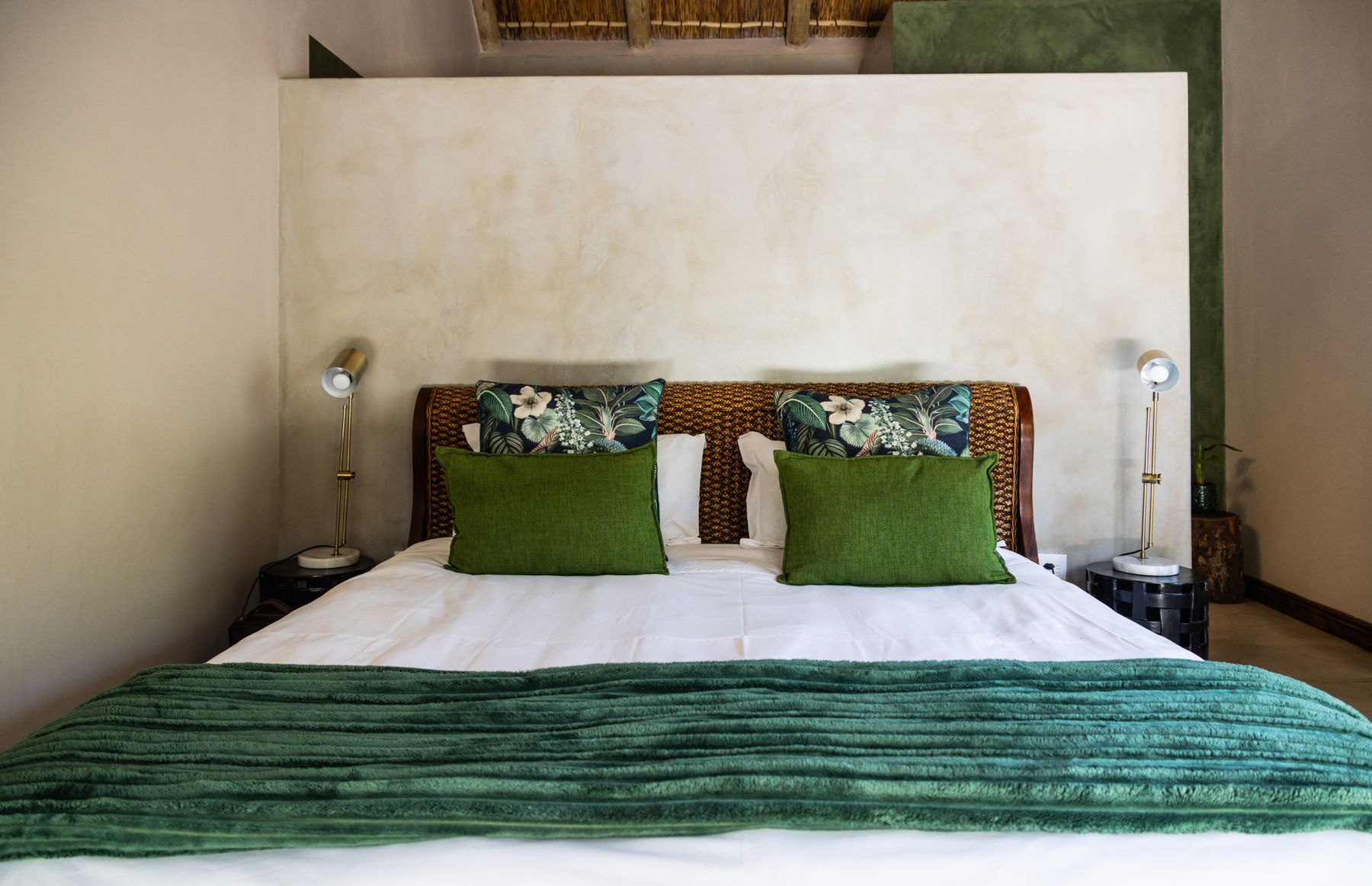
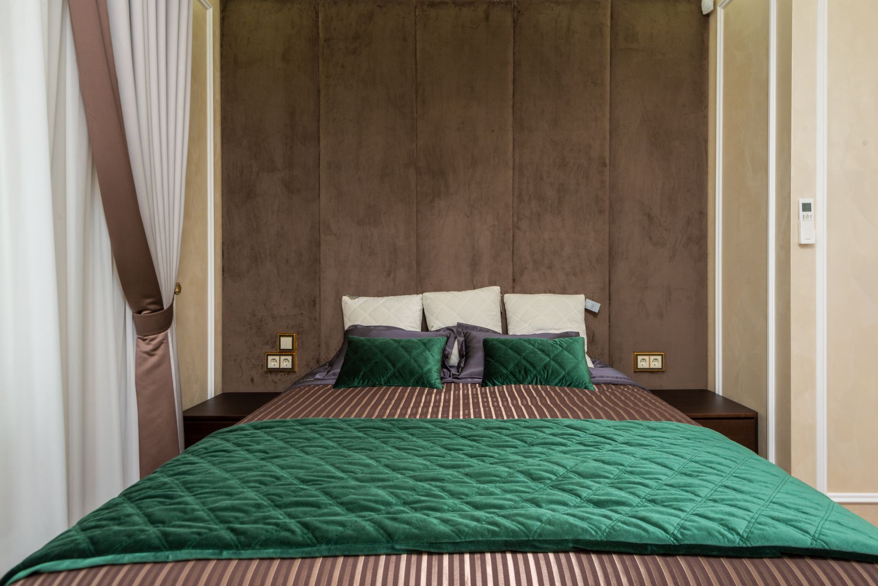
Bedding can move from pale eucalyptus sheets through moss linen to a deep forest throw when undertones agree. Vary weave, loft and value while selecting every layer first for sleep temperature, skin comfort and laundering. Saturated dyes may fade in direct sun or transfer during washing, so check care guidance. Keep only the layers used in real life. A convincing green bed should retain depth when unstyled; decorative cushions should not be doing all the compositional work.
Match Green and Timber by Temperature
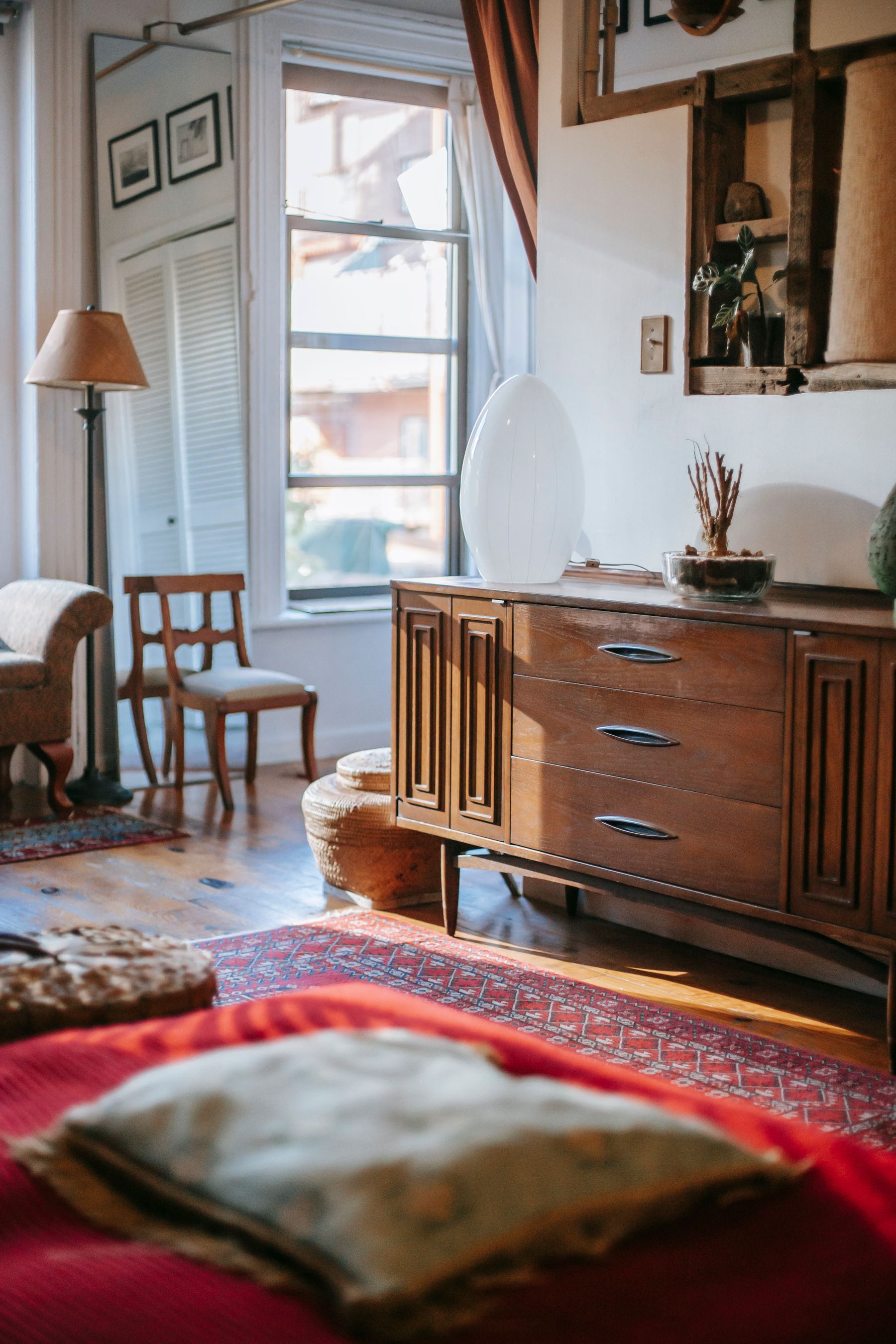
Green and wood do not automatically harmonize. Sage with pale oak, olive with walnut and forest with warmer timber all create different levels of contrast. Choose the pair by temperature and value rather than by the generic idea that both are natural.
White, Cream and Stone as Breathing Space
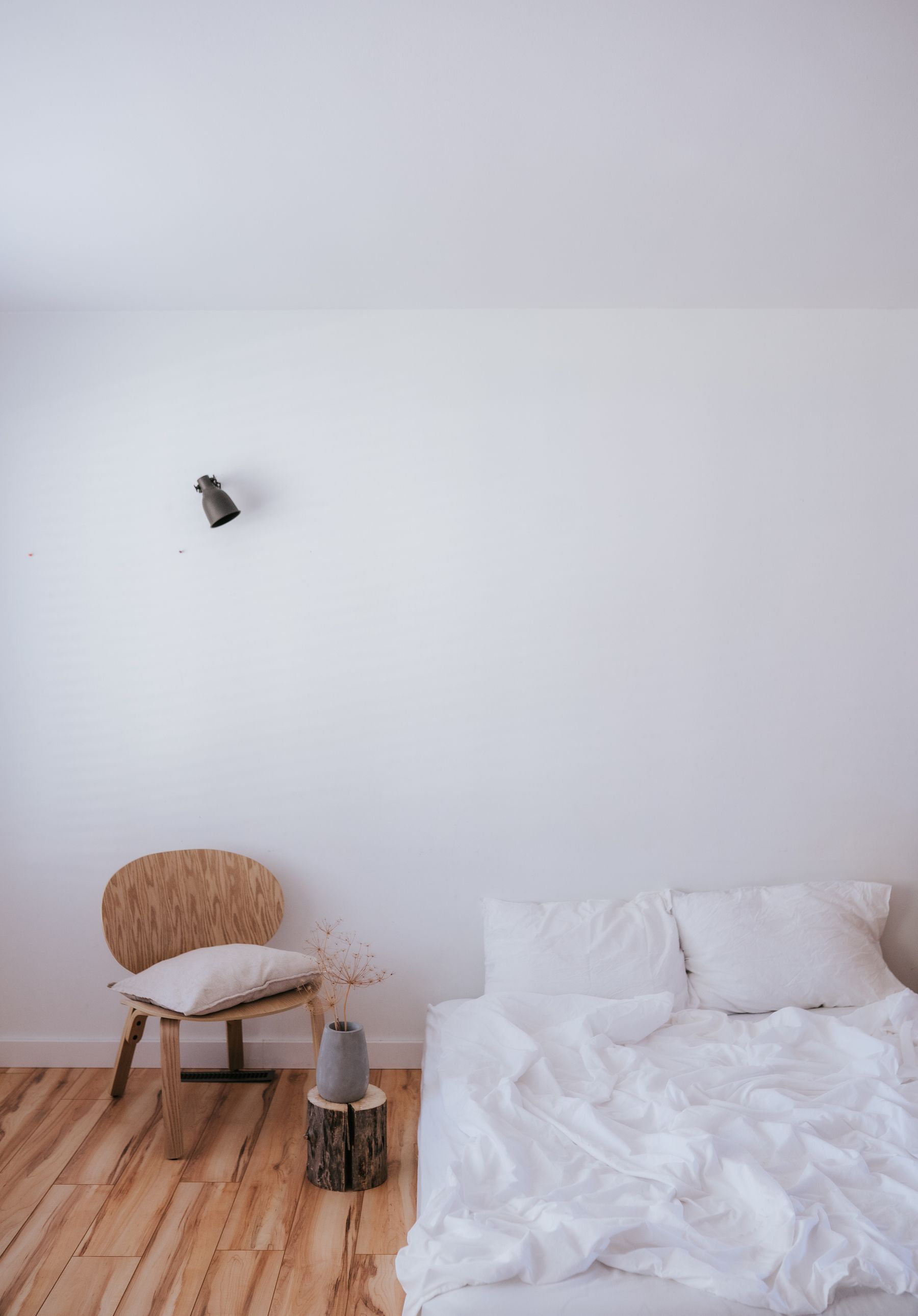
Clean white sharpens mint and teal-green, cream softens olive and forest, and stone bridges grey-sage to natural flooring. Choose the pale support from the green's undertone rather than defaulting to brilliant white. A yellow olive may look harsh beside blue-white; emerald can appear richer beside warm chalk. Use the neutral across a meaningful field such as bedding, ceiling or curtains. Tiny pale accessories cannot balance major surfaces that already conflict.
Clay, Rust, Blush or Ochre in Restrained Doses
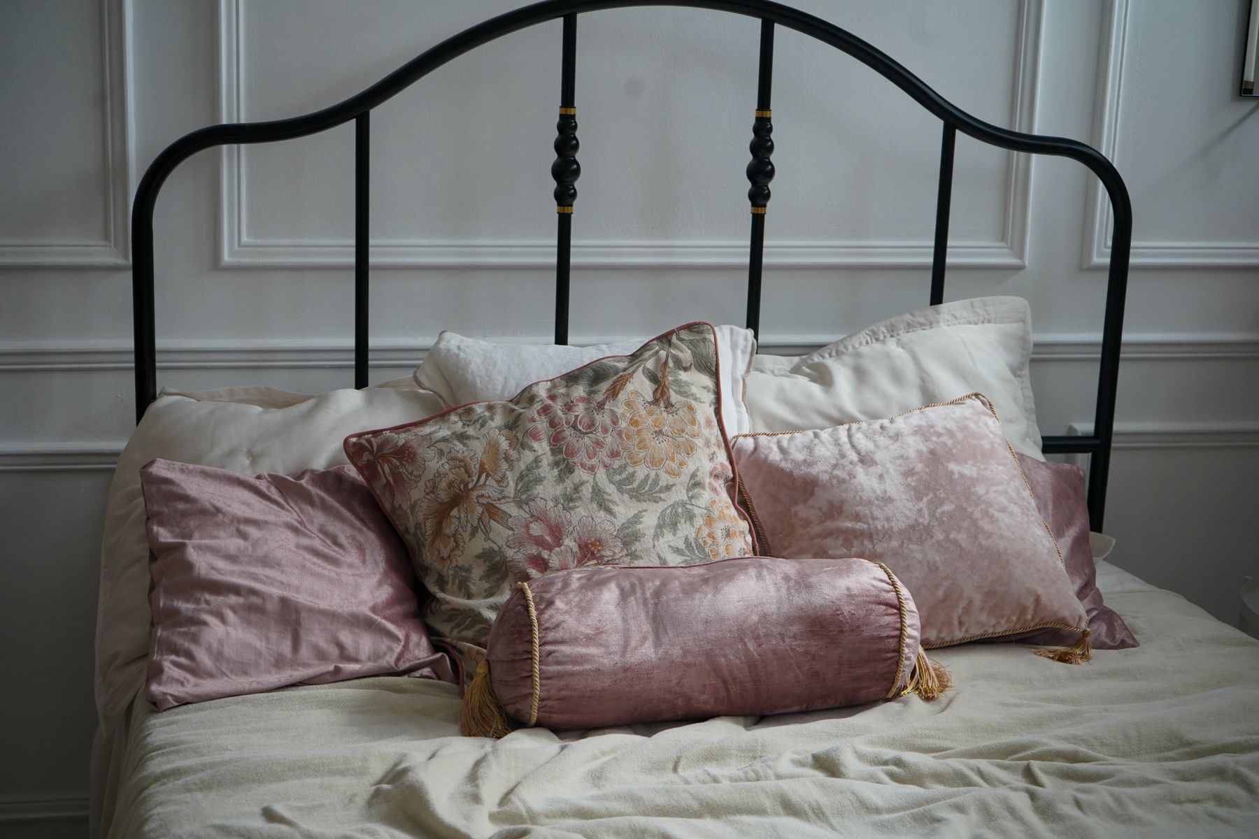
Clay, rust, muted coral, blush and ochre can animate green through warm contrast. Choose one family and introduce it at a meaningful but controlled scale, such as a blanket, chair or artwork. Bright red scattered around green quickly becomes seasonal or thematic; faded terracotta and tobacco usually integrate more easily. Review the accent under bedroom lamps, which can intensify red and yellow. Its role is to bring warmth and life, not to compete with the main green field.
Black as Clarifier, Not Dominant Color
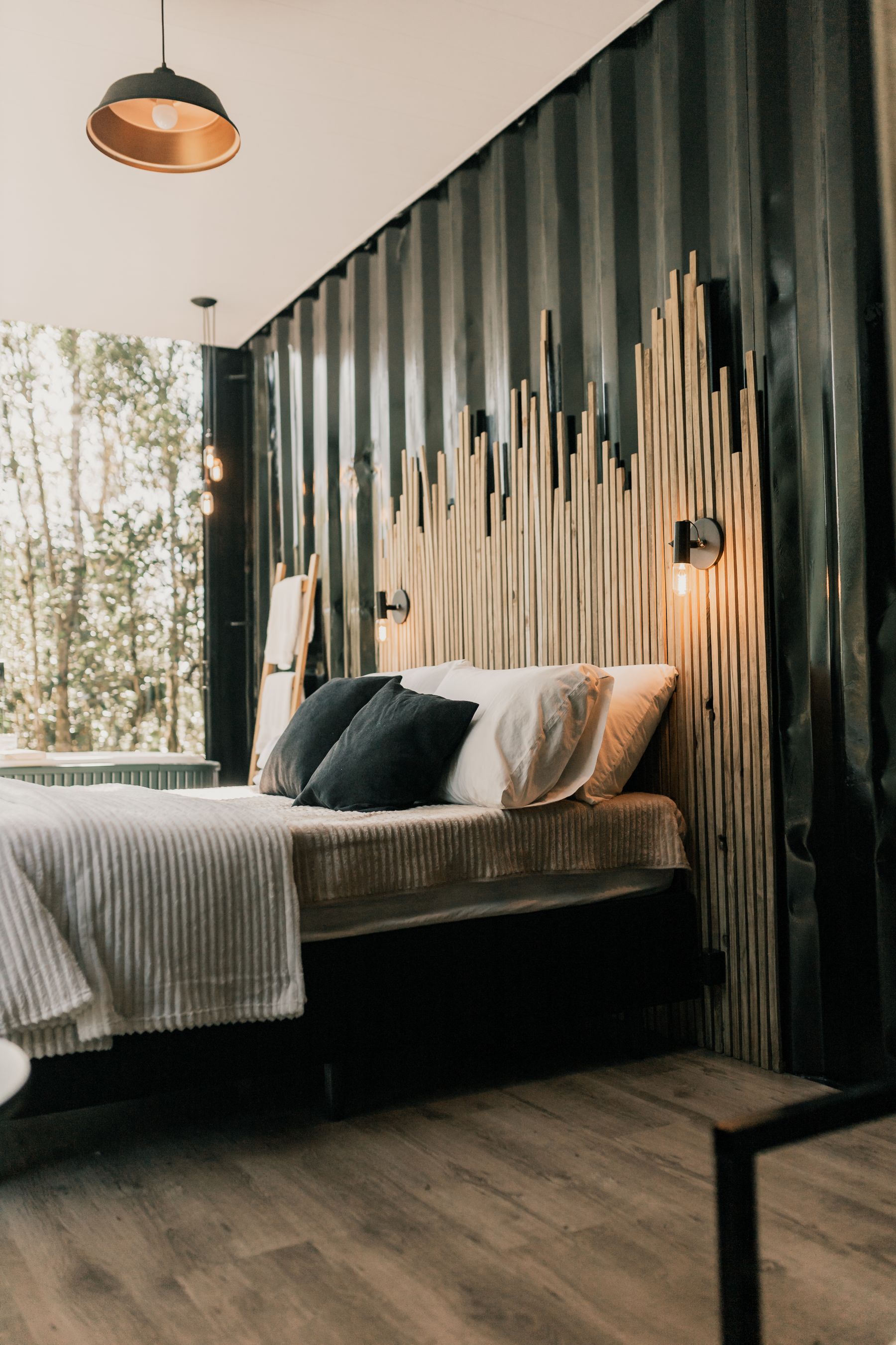
Black can define green at lamp arms, frames, handles and bed bases, especially beside pale sage. Use it where an edge or touch point needs clarity. Repeating black across every accessory can overpower olive or forest and shift the scheme toward [Black Bedroom Ideas](/bedroom/black-bedroom-ideas/). Matte black may disappear beside deep green in low light, so profile and tactile difference matter. The most useful dark detail usually has a functional reason beyond visual punctuation.
Where Green and Grey Lose Their Life
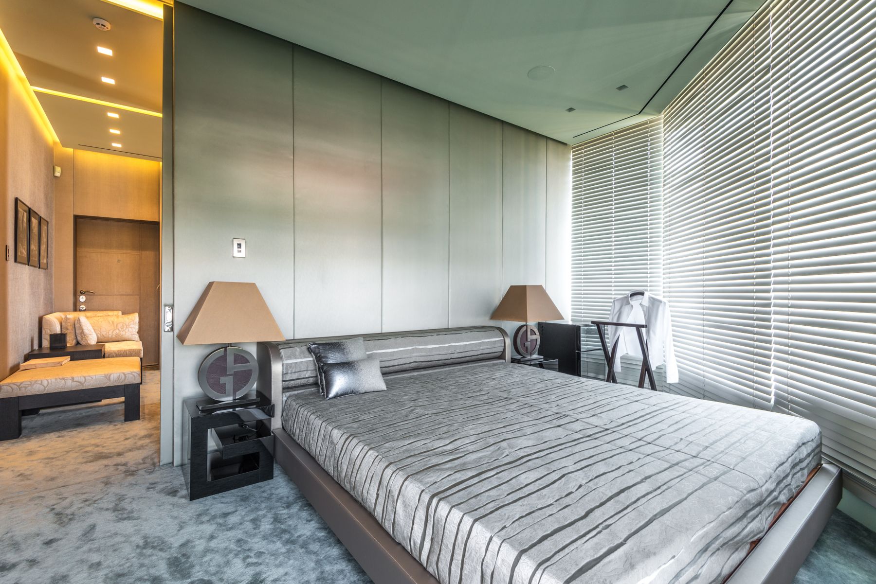
Grey and green share a restrained character when their undertones align. Blue-grey supports eucalyptus and teal-green; warm greige connects to olive and moss. Too much middle-value grey can drain green of identity and produce a flat room. [Grey Bedroom Ideas](/bedroom/grey-bedroom-ideas/) is the better destination when grey leads walls, bed or cabinetry. In a green room, grey should clarify stone, metal or textile structure while the principal hue remains visibly green.
Tune Artificial Light to the Specific Green
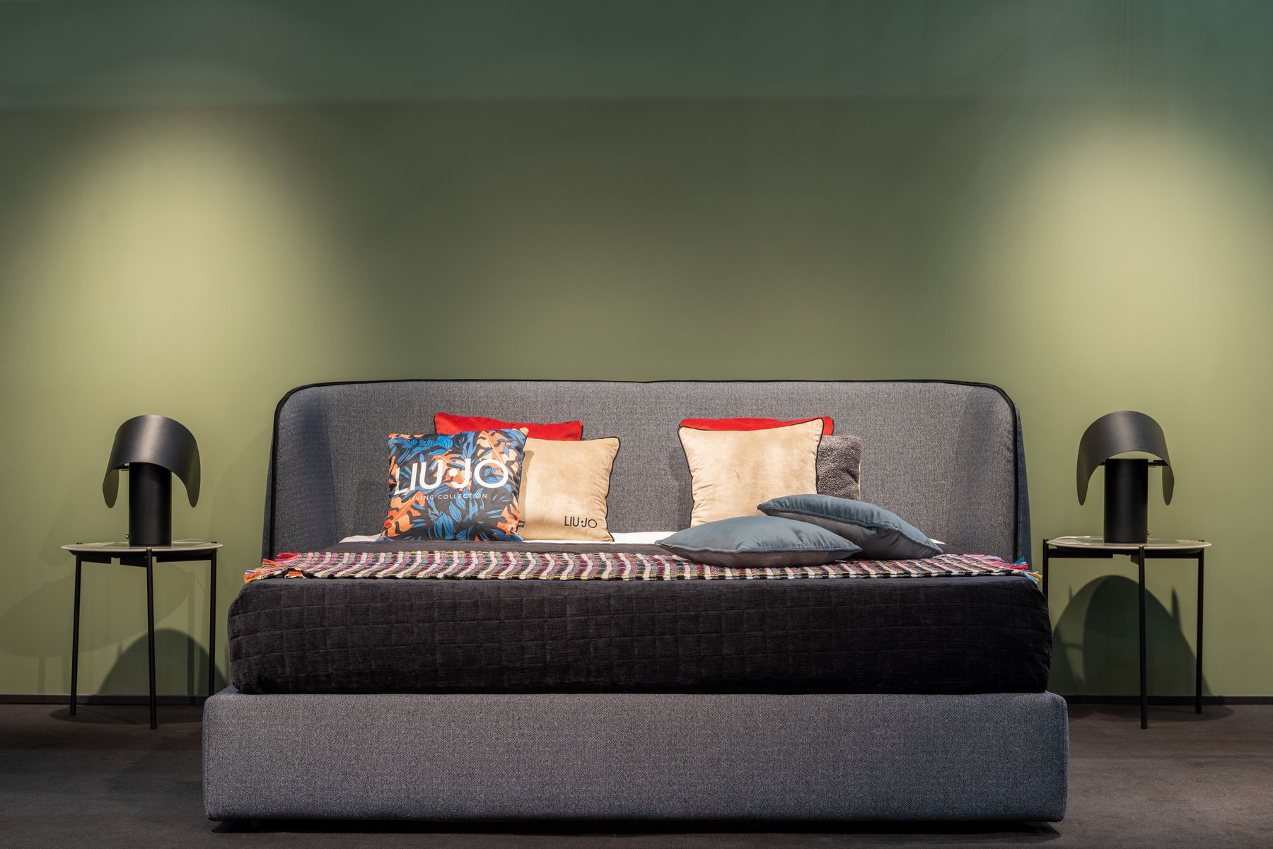
Warm lamps can enrich olive and forest but turn blue-green muddy; very cool lamps may make sage feel institutional. Evaluate color rendering, glare, beam direction and dimming rather than choosing bulbs by warmth alone. Combine dimmable ambient light, independent reading lights, wardrobe light and a low route. [Living Room Lighting Ideas](/living-room/living-room-lighting-ideas/) expands control principles, while the bedroom also needs true darkness, simple bedside switching and no unnecessary electronic indicator glow.

Manage Daylight, Privacy and Blackout Separately
Direct sun, reflected foliage, privacy and blackout are different window jobs. A sheer can soften harsh light; a blind or lined curtain closes at night; neither automatically resolves overheating. Outdoor greenery may cast green light onto walls and distort samples, while strong sun can fade saturated curtains. Measure stack-back so treatments do not cover useful glass when open. The palette should remain coherent in bright daylight, dusk and full blackout without depending on one favorable moment.
Ground Green With Floor and Rug
The floor is a major color field even when described as neutral. Honey timber warms teal-green, grey carpet cools sage, and a patterned rug can bridge olive to cream or rust. Choose rug size around bed landings, door movement, trip risk and cleaning before pattern. [Living Room Rug Ideas](/living-room/living-room-rug-ideas/) explains proportion and material tradeoffs that also apply here. Bring the green sample to floor level because viewing angle and reflected light can shift it.
Integrate Green Storage Without Creating a Block
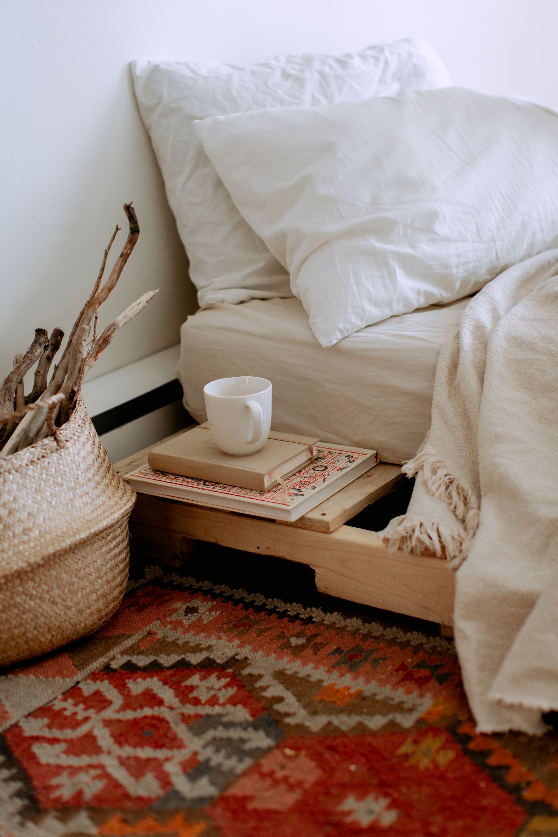
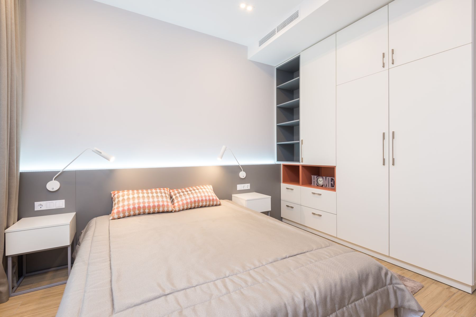
Green wardrobes can read as calm architecture or as one heavy block. Confirm door swings, internal lighting, handle contrast and ceiling relationships before selecting the finish. Matte mid-green often absorbs minor irregularities; deep glossy green exposes reflections and fingerprints. Break up a broad run only when function supports the division. If storage closely matches the wall, make sure edges and handles remain visible. The color decision is successful only when usable depth and access also work.
Mirrors Should Return a Useful Green View
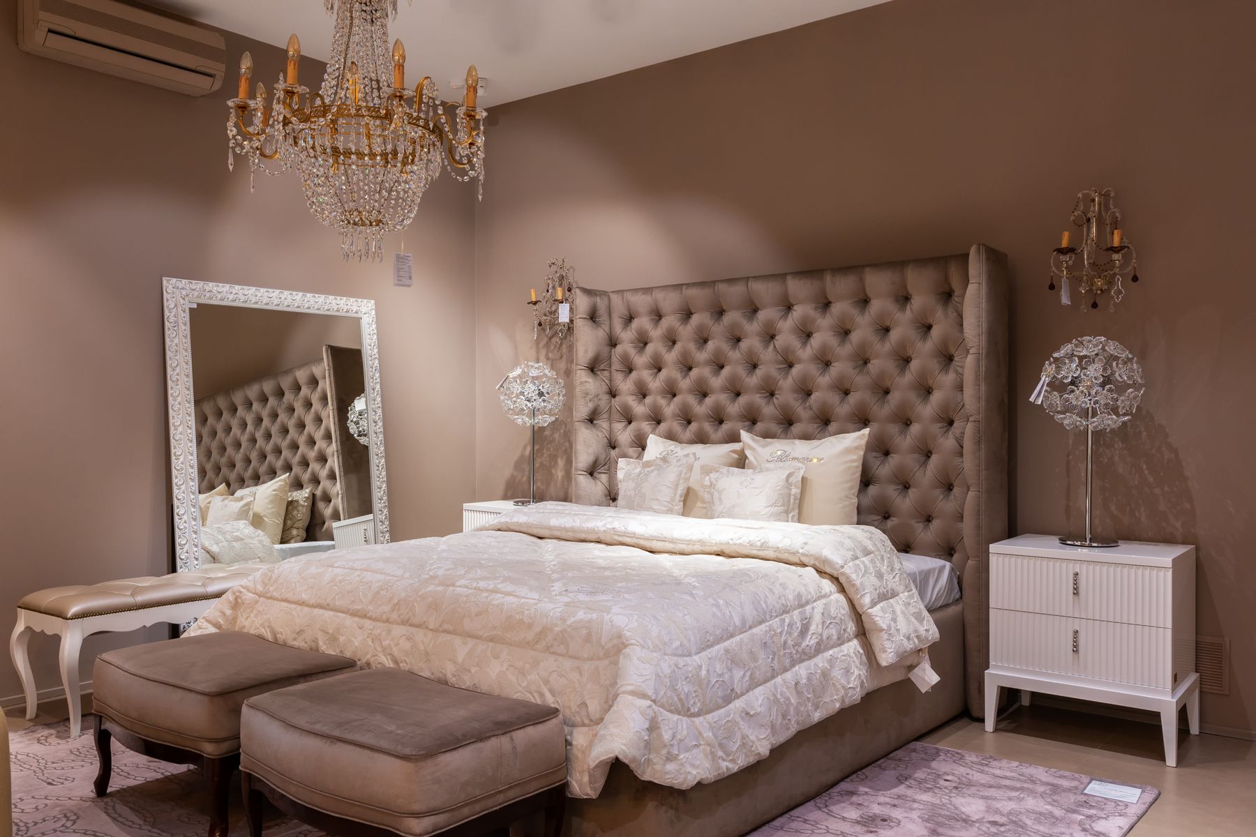
Mirrors can extend a green wall through reflection, brighten a shaded corner or support dressing, but their effect depends on what they return. Check the view from bed and doorway before fixing location. A mirror facing a saturated wall may double its visual weight; one opposite a window may introduce glare or privacy problems. Use safe fixings appropriate to wall construction and preserve circulation. Reflection should solve a spatial or functional problem rather than simply fill an empty plane.
Botanical References Below Green Architecture
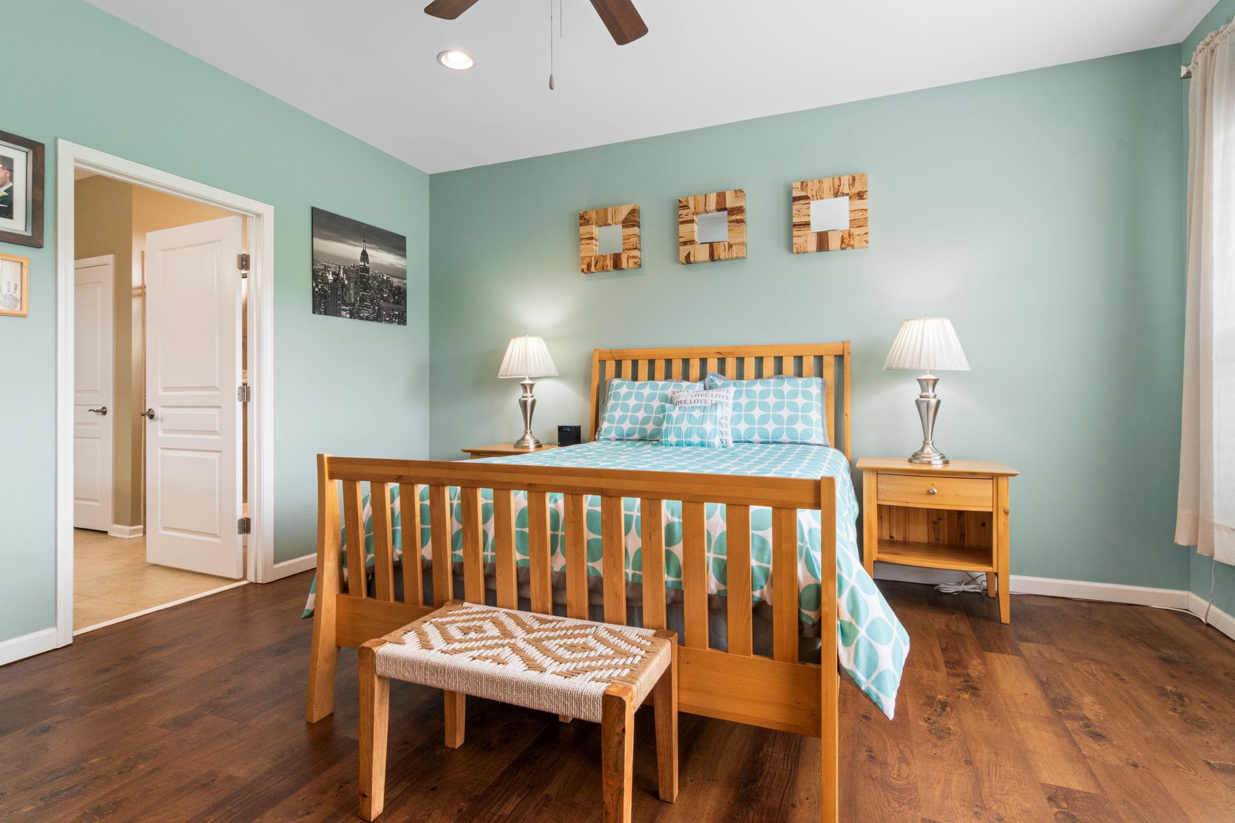
Green walls or upholstery already establish the nature connection. Leaf prints and botanical motifs should not be needed to explain the room. Choose art for meaning, scale or contrast first.
Treat Plants as Living Conditions, Not Theme Proof
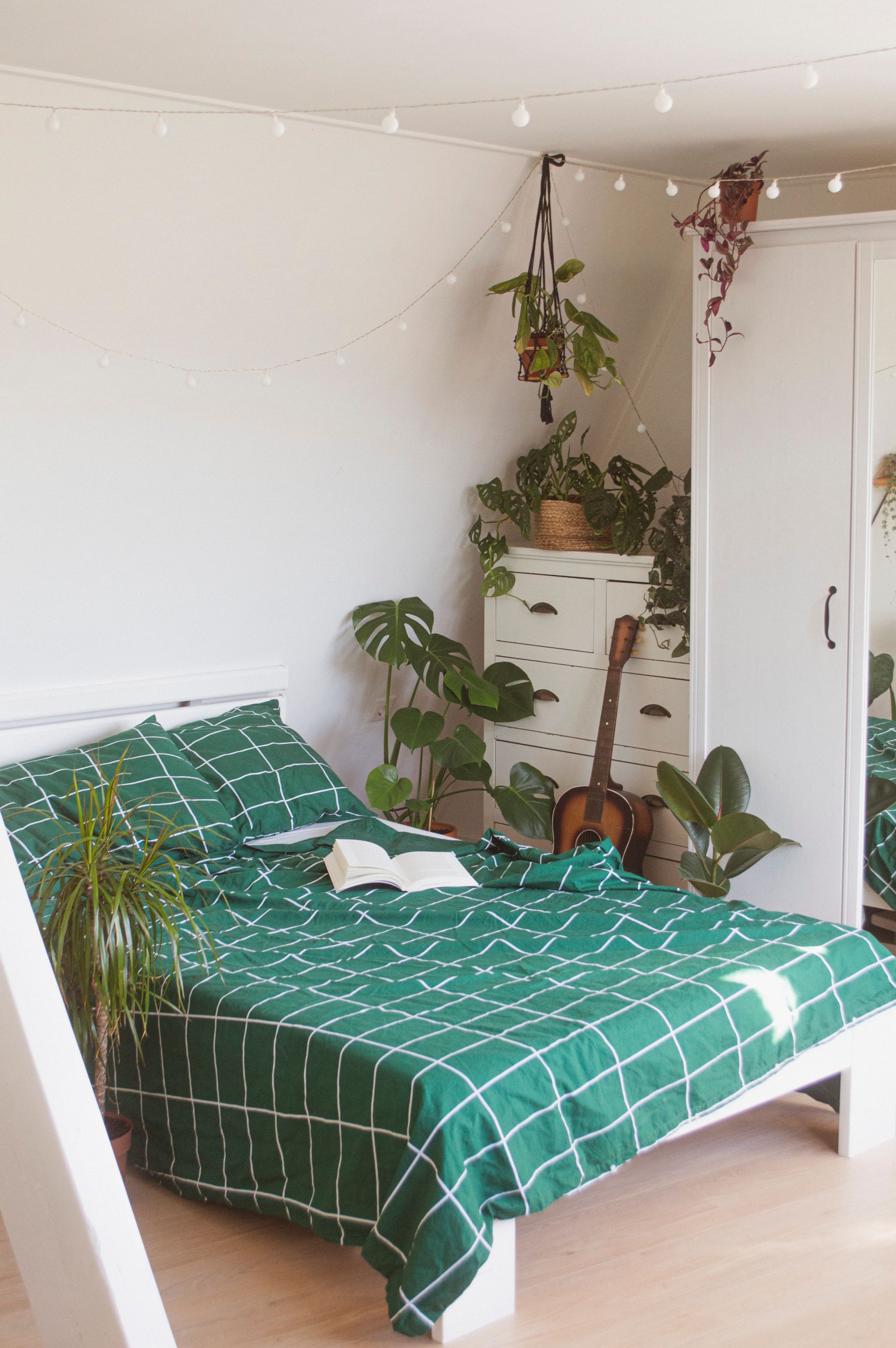
Plants need suitable daylight, temperature, pet safety and a realistic care routine. One healthy specimen can add more living structure than several plants placed only to repeat the palette.
In a Small Green Bedroom, Clearance Leads
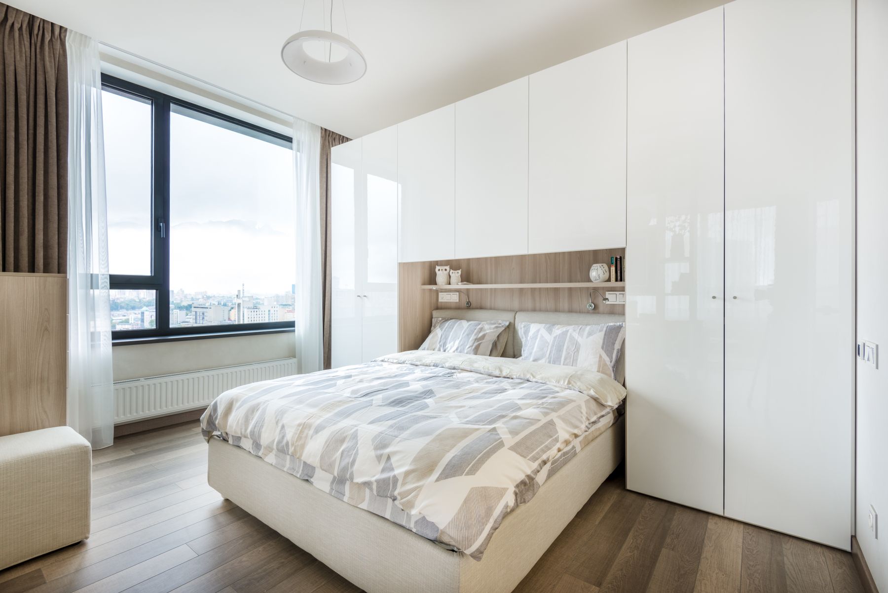
Dark green does not automatically shrink a small room, and pale sage does not fix blocked circulation. Preserve window operation, bedside reach and the active footprint of every door before assigning color. One continuous green wall or wardrobe can reduce visual fragmentation, while a contrasting bed edge improves orientation. [Small Bedroom Ideas](/bedroom/small-bedroom-ideas/) develops clearances and storage in depth. Apply those tests first, then let green support the plan rather than disguise crowding.
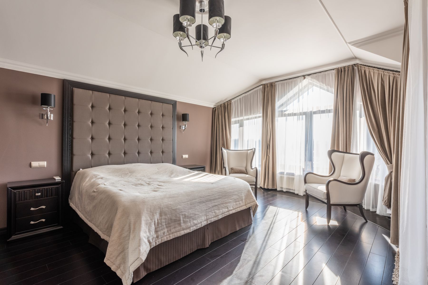
Distinct Zones in a Large Green Bedroom
In a large bedroom, repeating the same green at equal strength everywhere can flatten scale. Anchor the bed with the deepest or most saturated green, then let seating, dressing or work use quieter related values and its own light scene. A broad rug or headboard can connect zones without a matching suite. [Large Bedroom Ideas](/bedroom/large-bedroom-ideas/) develops circulation and proportion; the green palette should clarify those centers rather than simply fill empty floor area.
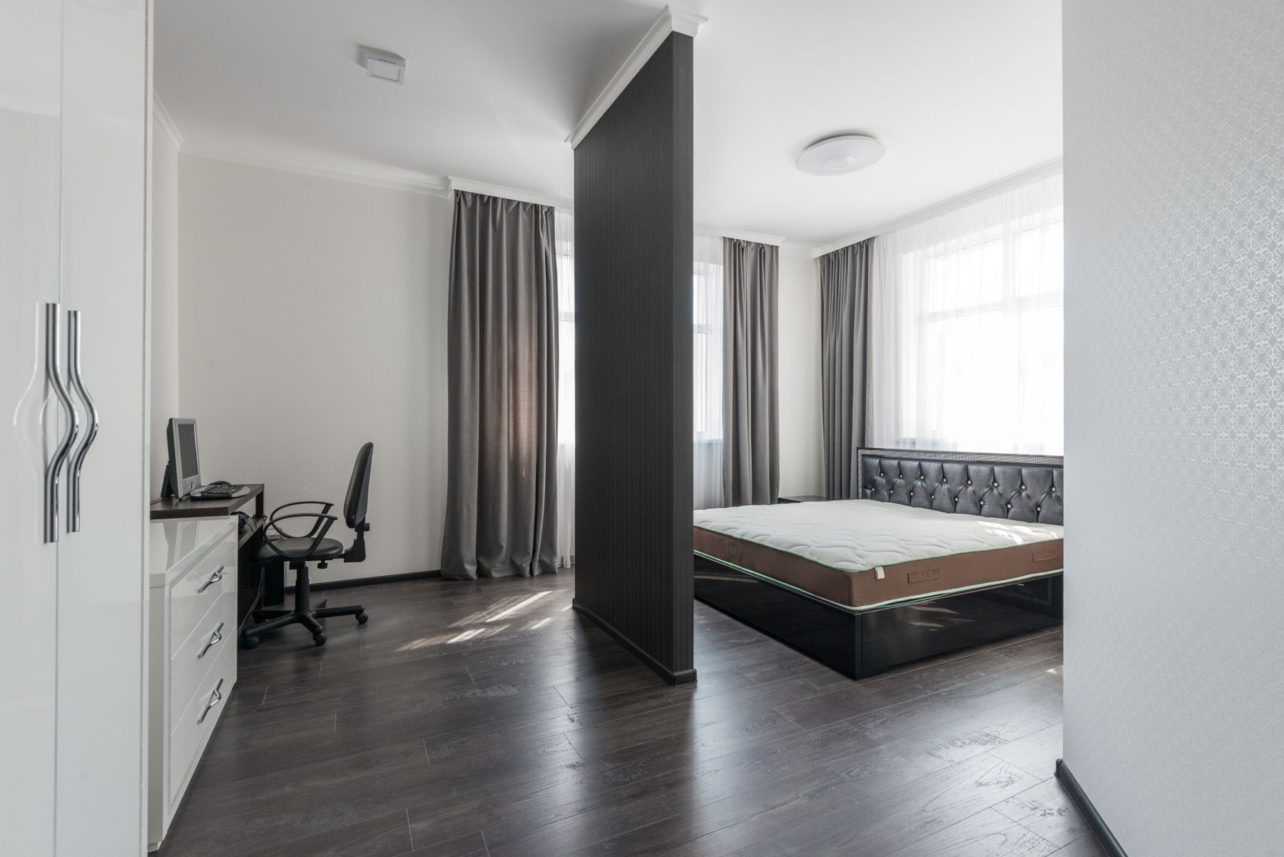
The Closable Green Bedroom Workspace
Green can visually connect a desk to walls or storage, but the work zone still needs usable depth, screen-glare control, power and a chair route that does not block the bed. Use a separately controlled task light and give papers, devices and cables a closed home. A deep green background may reduce wall glare yet make dark equipment difficult to find at night. End work with a simple physical shutdown rather than relying on color to create calm.
Adapt Green for a Rental
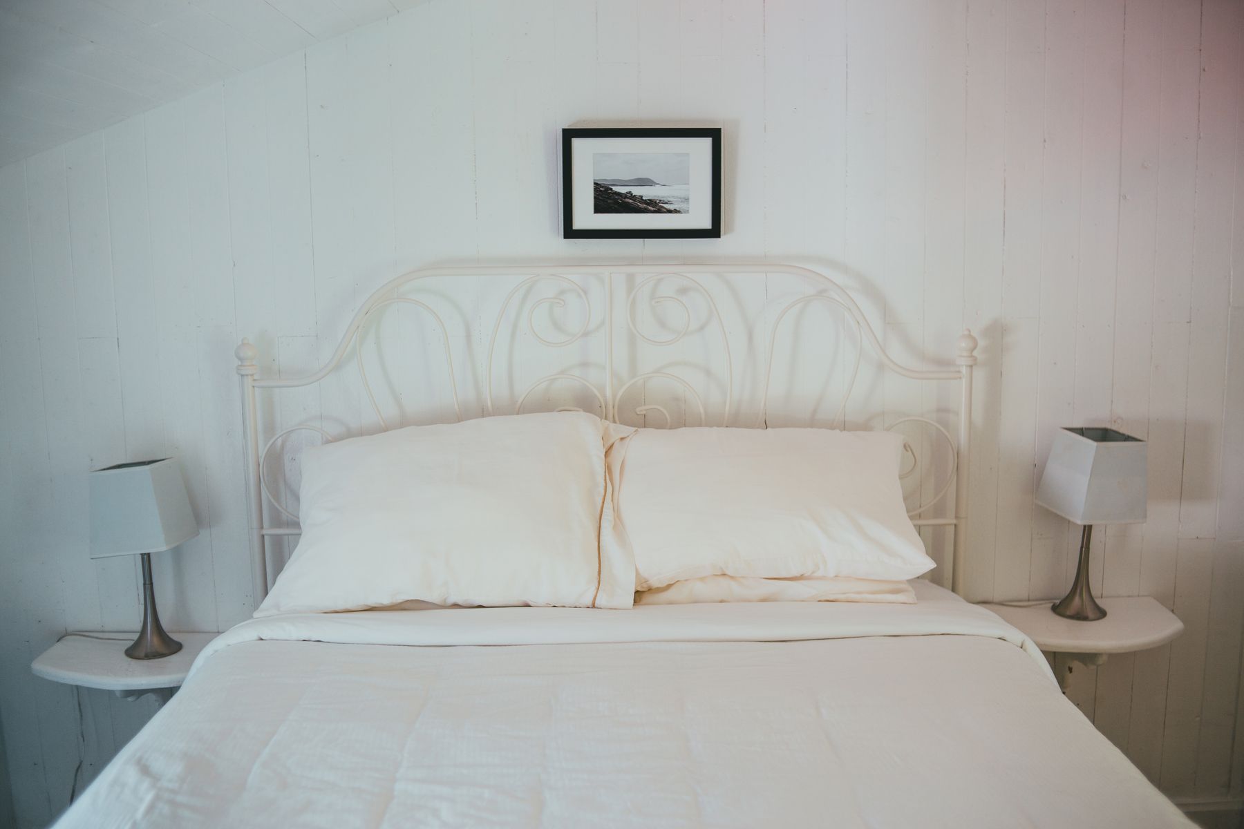
In a rental, build the palette through bedding, curtains, a rug, removable shades or a freestanding upholstered headboard. Obtain written approval before painting, drilling or changing fixtures, and store original hardware. Do not conceal damp or damaged walls with decorative panels. Start with the largest reversible surface rather than collecting small green objects. [Minimalist Bedroom Ideas](/bedroom/minimalist-bedroom-ideas/) offers a useful reduction framework when every temporary green item must earn its place.
Protect Legibility and Comfort
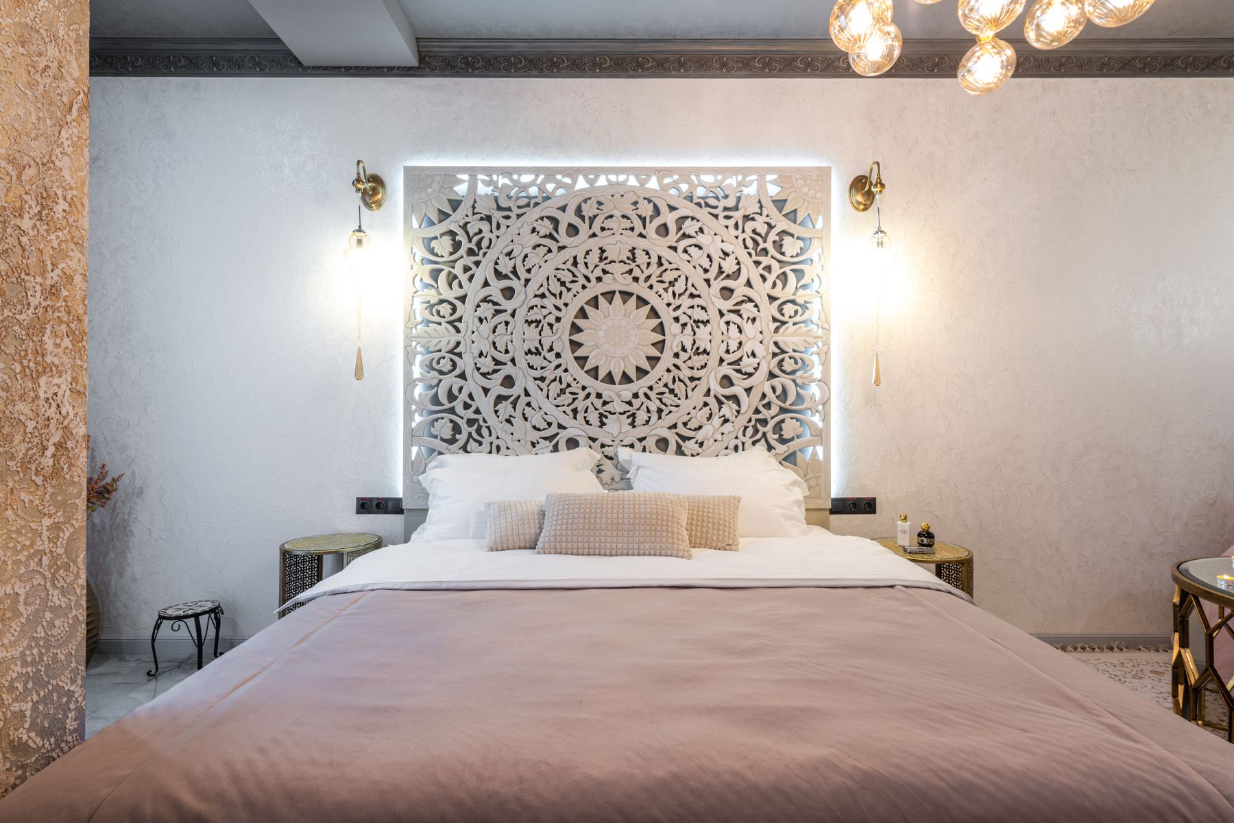
Pale sage against white and forest green against black can both produce weak contrast. Keep bed edges, handles, switches, steps and bathroom routes distinct, and make controls reachable from the bed. Matte surfaces can reduce glare; tactile differences help where values are close. Accessibility does not require abandoning green—it requires placing contrast where information and safety matter. Test the room at minimum light and with a blurred photograph to reveal useful boundaries that disappear.
Maintain Green Without Chasing Perfection
Deep green paint reveals pale dust, filler and scuffs; pale green can expose oils and uneven touch-ups. Record paint brand, color, base, finish and batch, and keep a labeled repair amount. Follow textile washing and lightfastness guidance, especially for emerald and forest fabrics. Use washable finishes where hands contact walls and removable covers where upholstery receives daily wear. A successful green bedroom should remain convincing between normal cleaning cycles rather than requiring constant correction.

Finish With Morning, Dusk and Night Tests
Before committing, photograph and use the room at waking time, midday, dusk, reading and full blackout. Check whether green shifts toward blue, yellow or grey, whether timber still supports it, whether glare appears and whether routes remain legible. Remove the decorative item doing the least work and retest. The room should not depend on one camera exposure, perfect sunlight or freshly arranged bedding. It should remain comfortable and understandable through changing seasons and realistic maintenance.